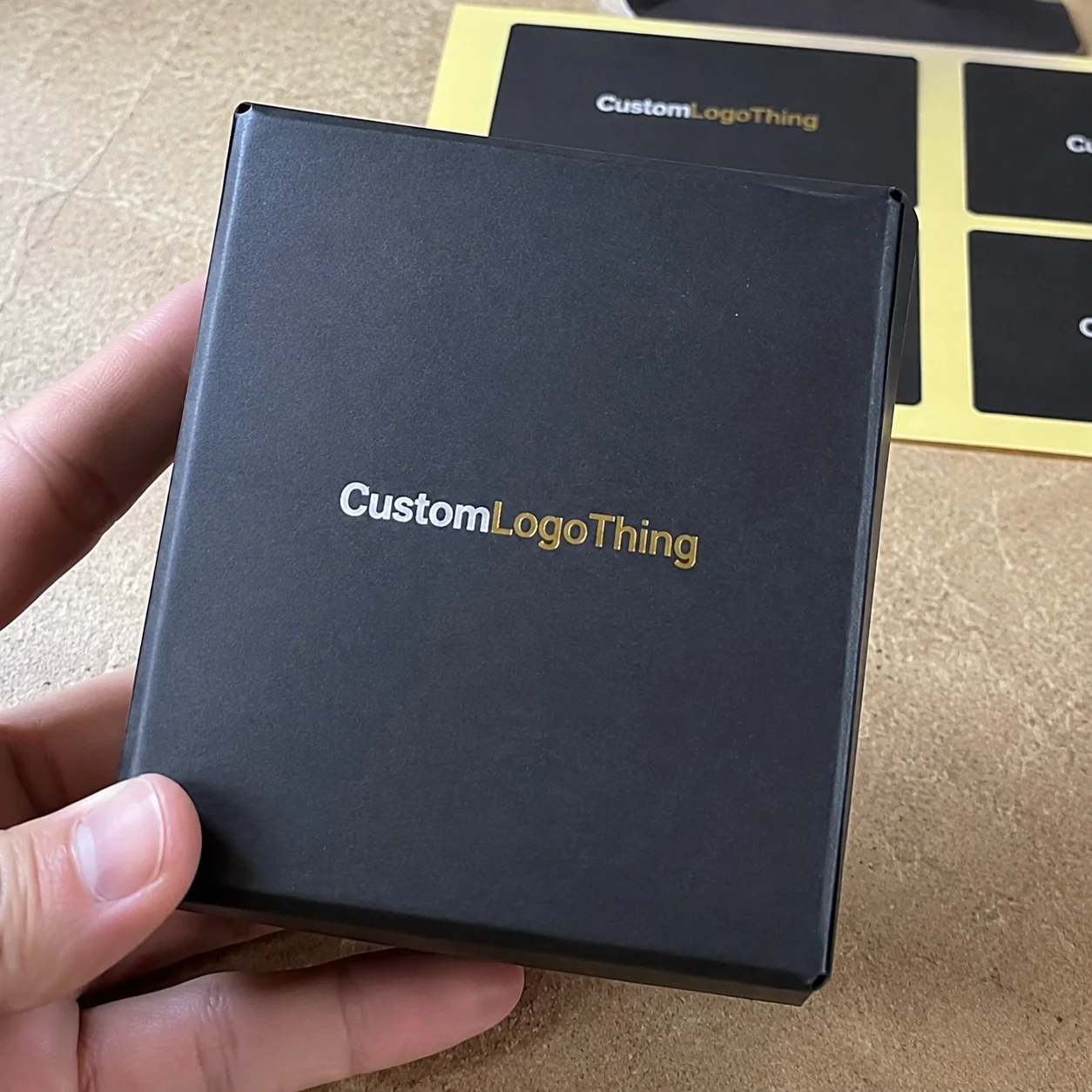
Custom Any Transfer Stickers solve a packaging problem that looks simple until you try to decorate the surface. Curved bottles, narrow lids, textured tins, coated cartons, and small retail containers all push standard labels past their comfort zone. A regular pressure-sensitive label can wrinkle, lift, or leave an obvious border that makes the package look busier than it should. Custom any transfer stickers are used when the goal is a cleaner graphic that feels more integrated with the package itself.
That visual effect is the main reason buyers keep asking for them. A properly applied transfer graphic can look closer to direct decoration than to a conventional sticker, which is useful on premium beverage packaging, cosmetics, candles, specialty food containers, and branded promotional items. The finish is usually restrained, and that restraint is part of the value. It lets the package surface do some of the work instead of covering it up.
There is also a production reason these orders keep coming up. On the right substrate, transfer graphics can reduce visible edge lifting and improve shelf presentation compared with some ordinary labels. For teams comparing decoration methods, the real decision is rarely about the sticker alone; it is about how the material, the surface, and the application method all behave together.
Why custom any transfer stickers fit such specific packaging needs
Packaging buyers usually start looking at transfer-style graphics after a label has failed on a difficult surface. The package may be slightly curved, the coating may be too smooth or too textured, or the available space may be too small for a conventional label panel. A transfer graphic avoids some of the visual bulk that comes with a border, liner, or obvious sticker edge.
That matters more than people expect at retail distance. A small logo on a clean bottle shoulder can make the package look intentional. The same logo inside a conventional label shape can feel heavier, especially when the rest of the package is already carrying text, nutrition panels, or warning copy. On products where the brand mark is the main visual cue, custom any transfer stickers can do a better job of keeping the surface calm.
They are especially useful when the design calls for a short mark, icon, or simple statement rather than a full information panel. Once the artwork starts carrying too much copy, the benefits shrink. At that point a label or printed panel may be the better choice. Transfer graphics are strongest when the design is compact and the surface itself is part of the presentation.
In practical terms, that means they are often selected for:
- small-batch product packaging with a premium look
- decorative logo placement on glass, metal, or coated plastic
- promotional containers where a painted-on appearance matters
- packaging that needs a cleaner look than a full label can provide
The tradeoff is that the method is less forgiving than a normal sticker on a flat box. If the package is highly textured, flexes too much, or changes shape under handling, the result can be inconsistent. A buyer gets better results by matching the decoration method to the real package conditions instead of trying to force one method to cover every surface.
How the transfer process works
A transfer graphic is built to move as a unit from its carrier sheet to the final package surface. The carrier holds the design in alignment, the adhesive side makes contact with the package, and the transfer layer helps release the artwork while keeping the pieces positioned correctly. Once the design is pressed down firmly, the carrier or mask is removed, leaving the graphic behind.
That sounds straightforward, but installation quality depends on how the art was built in the first place. Very fine lines, small counters, and tight letter spacing can become fragile once the design is transferred. A logo that looks sharp on screen can still be too delicate for a curved bottle or a hand-applied run. In production work, simplicity often transfers better than visual cleverness.
- Clean and dry the target surface thoroughly.
- Position the design using a guide or tape if needed.
- Press from the center outward with steady pressure.
- Remove the transfer layer slowly and check the edges.
Surface condition matters as much as the artwork. Smooth glass is generally friendly to transfer graphics. Stable coated metal can also perform well. Some plastics are excellent if the finish is cured and the surface energy is right. Other materials, especially low-energy plastics and heavily textured finishes, can create inconsistent pickup or weak long-term adhesion.
That is why test applications are worth the time. A sample that installs cleanly on one substrate does not automatically prove the same result on another. If the package is changing from one production run to the next, or if the surface supplier changes the coating, the transfer result can change as well. Buyers who treat the first sample as a technical check rather than a formality usually avoid the most frustrating surprises.
Manual application and production-line application also need different thinking. A few hundred pieces can tolerate slower placement and closer attention. A larger packaging run needs repeatability, so the file setup, surface prep, and application method should all be designed with that pace in mind. If the team applying the graphics is not trained, even a good design can finish unevenly.
Materials, finishes, and artwork choices that affect results
Artwork quality is the first gate. Vector files such as AI, EPS, or SVG are usually the safest starting point because they preserve edge quality at any size. Raster artwork can work if it is high-resolution and simplified enough, but thin strokes and tiny text should be reviewed carefully. A graphic that looks polished on a monitor can lose clarity fast once it is reduced to package scale.
The smaller the graphic, the more disciplined the design needs to be. Fine serif text, hairline outlines, and crowded icon spacing can survive a proof and still fail during application. This is especially true for custom any transfer stickers used on narrow shoulders, lids, or curved bottle bodies. If the packaging area is small, the art should be built with generous spacing and strong shape contrast.
Finish affects both look and production behavior. Matte finishes usually feel quieter and more premium. Gloss can make colors look brighter and more saturated. Metallic accents can add strong shelf appeal, but they also make registration errors more visible. Transparent elements can be attractive on clean substrates, although they are less forgiving when the background surface is busy or textured.
Durability should be matched to use conditions rather than assumed. A cosmetic jar that sits indoors has a different requirement from a chilled beverage package or a candle container that may be handled repeatedly. Moisture, condensation, skin oils, and shipping abrasion all matter. For some products, the design only needs to stay intact long enough for display. For others, it needs to hold up through storage, transport, and repeated customer handling.
Buyers also underestimate how much small structural choices affect install quality. A thicker mask can help with handling on larger graphics. A fragile mask can save material but create more placement errors. A highly detailed design may need more careful weeding and more consistent pressure during transfer. None of those choices is dramatic on paper, but they change the result on the line.
If you are comparing decoration methods, remember that transfer graphics are strongest when the package already has a clear structure and only needs a refined mark or limited decoration. They are less useful when the design needs to carry long instructions, regulatory text, or multiple content zones. That is the point where a full printed label or printed box panel often makes more sense.
Cost, MOQ, and what actually changes your quote
Pricing for custom any transfer stickers usually depends on size, quantity, color count, finish, and how difficult the design is to apply. Larger graphics need more material. Smaller quantities carry more setup cost per piece. Multi-color artwork, metallic effects, and complex registration increase production time. Surfaces that are harder to install on can also push pricing upward because they may require more careful prep or testing.
Minimum order quantity is not just a sales rule. It reflects the time needed for artwork review, proofing, mask preparation, and production setup. A short run of 250 pieces can cost more per unit than a longer run of 2,500 because the setup work is the same in both cases. That does not mean a supplier is expensive; it usually means the run is too small to spread the setup cost efficiently.
| Order scenario | Typical unit price range | What usually drives cost |
|---|---|---|
| Small run, simple single-color logo | $0.35-$0.75 | Setup, proofing, and low-volume production |
| Mid-volume, multi-color brand mark | $0.18-$0.42 | Artwork complexity, color registration, and finish |
| Large run, premium finish or special mask | $0.10-$0.28 | Material choice, size, and application tolerance |
These ranges are directional, not fixed. A simple one-color design can still cost more if the order is rush-pressed or if the surface requires extra testing. A larger run can still price high if the artwork is dense or the mask is unusually intricate. The most useful quote is the one that spells out what is included rather than hiding setup, proofing, or freight in fine print.
Ask whether sampling is included, whether artwork cleanup is extra, and how many proof rounds are covered. Those details matter more than a small unit-price difference when the order is still in development. If you are comparing transfer graphics against custom printed boxes or other forms of package decoration, compare the full program cost, not just the first line item. A slightly higher unit price can still be the better option if it reduces rejects or manual rework.
Timeline, proofing, and production realities
Most orders move through a familiar sequence: inquiry, artwork review, proof, approval, production, inspection, and shipment. The proof stage is usually where the schedule slows down. If the file needs cleanup, if the logo must be resized for legibility, or if a compliance team needs time to sign off, the order can sit even when production capacity is available.
For many jobs, once the proof is approved, production can move in about 7-10 business days. More detailed orders, or orders with special finishing, often need 12-15 business days. Rush service is sometimes possible, but it usually depends on simplified artwork and quick approvals from the buyer side.
Delays usually come from a short list of predictable issues:
- artwork supplied in a format that still needs cleanup
- late proof approval from multiple internal reviewers
- last-minute color or size changes after the proof is issued
- surface questions that require test application before release
That last item deserves attention. A package surface can look ideal in the mockup and still create problems in the real world. A coated carton, low-energy plastic, or textured lid may need closer inspection before final production. That is not a delay for its own sake; it is quality control. It is better to identify a surface issue before a full batch is made than after the product is already packed.
Inspection also matters at the end of the run. A good supplier should be checking for clean edges, consistent color, registration accuracy, and transfer behavior before shipment. Those checks are basic, but they are the difference between a clean program and a frustrating reorder. For packaging teams, this is where experience shows up: not in promises, but in how many small problems are caught before the boxes leave the door.
Common mistakes to avoid
The most common mistake is ordering artwork that is too detailed for the final application size. A logo can look excellent at two inches wide and become muddy when reduced to three-quarters of an inch. Thin outlines, tiny type, and close-set design elements are usually the first things to fail.
Another frequent issue is treating all surfaces as if they behave the same. Smooth glass, coated paperboard, textured metal, and low-energy plastics each respond differently. If the surface is unusual, assume the first sample is a test. That is especially true for custom any transfer stickers used in damp, chilled, or high-touch environments.
Buyers also compare quotes without checking the assumptions behind them. One supplier may include a digital proof but charge for revisions. Another may separate freight. A third may include a sample only for standard materials. If those details are not compared line by line, the lowest quote can become the most expensive order once extras are added.
Installation skill is another weak point. A transfer graphic that looks perfect in a mockup can become uneven if the team applying it has no guide marks, no alignment tool, or no training. This is where labor and design need to work together. If the graphic demands extremely precise placement, the process must support that level of precision. Otherwise the shelf result will look inconsistent.
One more practical issue: overbuying before the artwork is truly settled. Reorders are easier when the first run is stable, but large quantities only make sense if the design, substrate, and packaging schedule are unlikely to change. If a label size may still change, or if the package structure is still in development, waiting can be the cheaper decision.
Practical tips for cleaner installs and better reorders
Start with a small validation run whenever the substrate is new or the design is delicate. Ten or twenty pieces can reveal problems with adhesion, placement, or readability long before a full rollout. That is a useful check even when the quote looks solid and the proof looks clean.
Leave room around fragile details. If the design depends on tiny text or narrow internal spacing, give it more breathing room than you think it needs. Clean transfer behavior usually rewards restraint. A slightly simplified graphic often performs better than a technically impressive one that is hard to apply consistently.
Document the approved version carefully. Keep the artwork file, exact dimensions, finish, substrate, and application notes together so the next reorder does not depend on memory. If the package surface, coating, or application method changes later, that record helps identify why the result changed.
Think about reorder timing alongside product cycles. Ordering more than you need only helps if storage, artwork stability, and packaging plans are all settled. If any of those pieces are still moving, a shorter reorder cycle can be the safer option.
For teams managing broader packaging programs, it helps to keep specs aligned with the rest of the packaging system. The more consistent your file naming, size notes, and surface notes are, the easier it becomes to maintain quality from one production run to the next. That is often where custom any transfer stickers deliver the best value: not just in the first application, but in the repeatability of the second and third orders.
Packaging buyers often want a decoration method that looks premium, applies cleanly, and does not create extra clutter in the design. Transfer graphics can do that well, but only when the artwork is restrained, the surface is tested, and the production details are handled with care. The best result is rarely the flashiest one. It is the one that fits the package, the labor, and the timeline without forcing compromises somewhere else.
For specifications that need to live alongside other packaging assets, the broader catalog at Custom Packaging Products is a useful place to keep related components organized, especially when a brand is balancing labels, cartons, and decorative finishes in the same program.
FAQ
What are custom any transfer stickers used for?
They are used for branding on bottles, jars, tins, boxes, and other packaging where a clean applied graphic looks better than a conventional label. They are especially useful when the surface is curved, small, or visually sensitive.
How are custom any transfer stickers different from regular stickers?
Regular stickers usually have a visible backing and a more obvious edge. Transfer graphics move the design onto the surface and leave less visual bulk behind, which creates a more integrated look.
What artwork files work best?
Vector files such as AI, EPS, or SVG are usually best because they hold clean edges and scale well. Raster files can work if they are high-resolution and simple enough for the final size.
How long does production usually take?
After proof approval, many orders fit into a 7-10 business day window, while more complex jobs can take 12-15 business days. The proofing stage often has the biggest impact on the total timeline.
What should I check before reordering?
Confirm the approved artwork, size, finish, and substrate so the new run matches the original. If the package surface or application method has changed, it is smart to retest before placing a full reorder.


