Custom clear address labels solve a very specific annoyance: your shipping label should do its job without taking over the package. Paper labels can look heavy, especially on branded mailers, matte black cartons, or neatly designed retail packaging. Custom clear address labels keep the address visible while letting the box, mailer, or bag stay visually intact. It is a small change, but the effect is immediate.
From a packaging buyer’s point of view, that matters more than it first appears. A label that disappears into the packaging design makes the whole shipment feel cleaner and more intentional, without changing the structure of the box or mailer itself. Compared with redesigning custom printed boxes or revisiting an entire packaging system, it is a relatively low-cost way to improve presentation.
Why custom clear address labels make mail look cleaner fast
Paper labels are functional, and nobody has a problem with a plain white rectangle when the priority is speed. Still, on colored mailers, printed cartons, or textured envelopes, a paper label can interrupt the look of the package. Clear film shifts that balance. The address stays readable, but the package surface remains the main visual element.
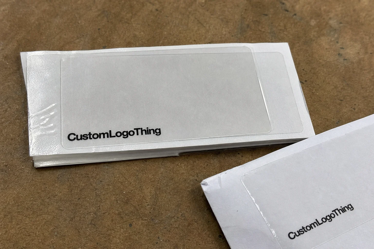
Custom clear address labels are transparent labels printed with recipient or return address information on a clear film face stock, typically paired with an acrylic or hot-melt adhesive and a release liner that protects the sticky side before application. The clear portion blends into the background, while the printed text stands out. When the layout is well planned, the label feels like part of the package rather than a sticker added at the last minute.
The difference from white matte labels is larger than many buyers expect. White labels create a visible block. That is useful when maximum contrast is the goal, but it can look bulky on minimalist packaging. Clear labels often suit brands using colored mailers, branded cartons, or packages with strong logo treatment, because they preserve the surface underneath. They also fit apparel packaging, subscription shipments, and retail orders where the shipping piece still needs to look considered.
There is another practical benefit that gets overlooked: clear labels can make lower-cost packaging look more premium. That is not magic. It is visual consistency. A simple kraft mailer or poly bag looks more deliberate when the label does not fight the rest of the design.
“A better shipping label won’t fix bad packaging, but a bad label can absolutely make decent packaging look cheap.”
If you also need product stickers, barcodes, or inner tags, it helps to keep the full packaging system consistent. Many brands pair clear address labels with Custom Labels & Tags so the outside and inside packaging feel connected rather than pieced together.
How the label material, adhesive, and print process work
Clear labels are simple on the surface and a little more demanding underneath, which is usually how packaging goes. Four components matter here: face stock, adhesive, liner, and print method. If one of them is off, the label either looks wrong, sticks poorly, or becomes hard to read once it is on the package.
The face stock is the clear film you see. For address labels, common options include polypropylene and polyester films, often in thicknesses from about 1.5 mil to 3 mil depending on the application. Thinner films are more flexible and usually more economical. Thicker films tend to resist scuffing better and can feel more substantial. The right choice depends on the package surface and the amount of handling the shipment will face.
The adhesive matters just as much. Permanent adhesive is the default for shipping labels because the address should stay put from packing table to final delivery. Removable adhesive makes sense when a label needs to come off cleanly, but that is less common for standard shipping. If the package will face cold storage, moisture, or abrasion, ask how the adhesive performs on the actual surface instead of assuming all adhesives behave the same way. They do not.
Print compatibility is the other half of the equation. Clear stock works best when the printing method is chosen with contrast in mind. Digital printing is common for small and mid-size runs because it handles variable data well, which is useful for shipping addresses. Thermal transfer can work for certain label formats too, especially when durability is more important than decorative detail. Ink coverage, toner density, and curing or drying all influence whether the text stays sharp or starts to look thin.
On transparent material, readability needs real testing. A label that looks perfect on white proof paper can become difficult to read on a dark carton, patterned mailer, or textured shipping bag. Clear labels are not invisible; they only feel invisible when the background supports them. If the package surface competes with the text, the label loses.
- Best for crisp addresses: dark text, moderate line weight, simple font
- Best for a premium look: matte or low-gloss clear film
- Best for rough handling: thicker film and stronger permanent adhesive
- Best for short runs with variable data: digital print
If you are comparing label formats with other packaging components, take a look at Custom Packaging Products. It is easier to plan the label, box, mailer, and insert together than to treat each item as an isolated purchase.
Key factors that affect quality, durability, and visibility
Quality starts with legibility. If the address is too small, too pale, or squeezed into a corner, the label fails even if the material itself is excellent. For shipping, the safest layout usually uses a clean sans-serif font, strong black or deep navy text, and enough spacing to separate the name, street, city, and postal code at a glance. If the label also carries a barcode, that needs room too.
Glossy clear labels and matte clear labels behave differently. Glossy film can look polished, but it reflects light under warehouse fixtures, near scanners, or on glossy cartons. Matte clear reduces glare and often improves readability on bright surfaces. For labels that will be handled frequently, matte is usually the safer choice. A gloss finish can still work when the goal is a more refined retail appearance, but the text contrast has to be strong enough to survive real use.
Moisture is another very practical concern. Rain, condensation, and damp hands are not glamorous, but they happen. Clear film usually handles moisture better than paper, which is one reason it is used for shipping and logistics. That said, performance still depends on the adhesive and the print quality. A decent label can survive damp handling. A weak one starts curling, smearing, or lifting at the corners. Shipping does not care how thoughtful the packaging concept was.
Surface compatibility can make or break the label. Smooth coated cartons and poly mailers usually provide the best adhesion. Kraft paper also works, though the texture can affect edge hold. Fabric bags are more difficult because the weave creates small air gaps. If the label has to stick to an irregular or fibrous surface, ask for adhesive guidance before placing a large order.
Packaging testing standards are useful here. If shipments move through a more structured distribution process, it helps to think about handling the same way you would with transit testing. Organizations such as ISTA publish protocols used to evaluate packaging under shipping stress. A full lab setup is not always necessary, but the logic is sound: test the label against the package surface, the handling conditions, and the route before scaling the order.
| Label option | Best use | Visibility | Typical cost impact |
|---|---|---|---|
| Glossy clear | Premium-looking branded shipping | Good, but reflections can interfere | Moderate |
| Matte clear | Readable shipping labels on dark or busy surfaces | Very good | Moderate to slightly higher |
| Permanent adhesive clear | Most shipping and fulfillment uses | Depends on print contrast | Usually standard |
| Removable adhesive clear | Temporary labeling or reworkable placement | Good | Often higher |
Custom clear address labels pricing, MOQ, and unit cost
Pricing for custom clear address labels usually comes down to five things: size, shape, quantity, print complexity, and adhesive or finish choice. Standard rectangle labels cost less than die-cut custom shapes. A simple one-color address label costs less than a label with a logo, decorative elements, and multiple print layers. Larger labels use more material and more press time. None of that is mysterious, but it does add up quickly.
Minimum order quantity, or MOQ, has a bigger effect on price than many first-time buyers expect. Lower quantities usually carry a higher per-unit cost because setup work gets spread across fewer pieces. Small runs are useful for testing, but once the label format is stable, larger orders tend to be more efficient. The key is not ordering far more than you can realistically use just because the unit price looks attractive on paper.
Here is a practical order pattern that comes up often:
- Small test order: 500–1,000 labels for new packaging or a seasonal campaign
- Mid-size production run: 2,500–5,000 labels for a stable shipping program
- Higher-volume order: 10,000+ labels when the format is locked in and used regularly
For reference, a standard clear address label might fall in the range of $0.08–$0.20 per unit at higher quantities, while smaller orders or specialty finishes can push the cost above that. Custom shapes, heavier film, or extra print coverage can increase pricing further. That range is not a quote. It is a practical starting point so you can evaluate proposals without assuming every label should cost the same.
If cost control matters, standard sizes usually help. Common rectangle dimensions and common mailer-fit formats keep production simple and reduce waste. Custom sizes are worth it when the package size is unusual or the branding needs a more tailored look. The tradeoff is that specialty sizing can increase setup time and unit cost. Pay for that only when it improves the packaging enough to justify it.
For product packaging programs, it is often smarter to evaluate labels alongside boxes, mailers, and inserts. A slightly more expensive label can still lower the total presentation cost if it lets the rest of the packaging stay simpler.
Production process and turnaround: from artwork to delivery
Most label orders follow the same path: file setup, proofing, printing, finishing, cutting, packing, and shipping. The exact details vary by supplier, but the sequence stays the same. Clean artwork and clear specs shorten the process. Files that are cropped from presentation slides or saved at the wrong resolution tend to slow everything down.
Typical turnaround for custom label work is often 7–15 business days from proof approval, although custom shapes, rush queues, variable data, and revision rounds can extend that. If you need a fixed delivery date, build in a buffer. Freight delays are frustrating enough without adding avoidable artwork corrections to the schedule.
The biggest delay is usually proof approval, not press time. A lot of buyers receive the first proof, spot a spacing issue, and then spend days searching for the correct logo file or contact name. It helps to prepare the essentials before requesting a quote:
- Final delivery address format
- Logo files in vector format if branding is included
- Label size and shape
- Preferred finish: glossy or matte
- Adhesive requirement: permanent or removable
File quality matters more than many people want to admit. High-resolution artwork prevents fuzzy edges and soft type. If the label includes small text, make sure the smallest line is readable at actual size, not just zoomed in on a laptop. That is one of the quickest ways to avoid a bad proof.
For brands that make sustainability claims, the packaging story should stay accurate. If environmental statements are tied to the label, mailer, or outer carton, it helps to understand the basic guidance from trusted sources such as the EPA and sourcing standards from organizations like FSC. Claims and materials need to match. Otherwise the label becomes a compliance risk instead of a packaging detail.
Common mistakes that make clear labels hard to read
The most common mistake is weak contrast. Light gray text on a clear label might look elegant on a screen, but it disappears on black, navy, or patterned packaging. Thin fonts create the same problem. Shipping labels are not the place for delicate typography. The address needs to be visible quickly, both to people and to scanning systems.
A second mistake is choosing a label that is too small. If the font has to shrink to fit, the result is cramped and hard to scan. A label can be technically correct and still look poor in use. Give the address room to breathe. Even a small increase in width can make the layout easier to read.
A third mistake is ignoring the package surface. Clear labels on rough kraft can work well, but the adhesive has to be strong enough to settle into the texture. On textured fabric bags, corners may lift if the adhesive is not suited to the material. On glossy coated mailers, adhesion is usually better, but pressure during application still matters.
A fourth mistake is making the design so minimal that it disappears into a busy background. Clear labels are not invisible by default; they can become visually lost if the package already carries heavy graphics or a dense print pattern. In those cases, a slightly larger label, stronger text, or a matte finish usually works better than adding more decoration.
Expert tips for ordering labels that look polished and ship reliably
Keep the address hierarchy simple: name on top, street line in the middle, city and postal code below. Use dark text and avoid decorative fonts. Fancy typography is fine for invitations. For shipping, it usually works against readability.
Ask for a sample or proof before placing a large order, especially if this is the first run on clear stock. A proof shown on white paper is not enough if the actual packaging is black, kraft, or patterned. Test the label on the real package color. That one step catches more problems than several rounds of email speculation.
Match the label size to the package. A giant label on a tiny mailer looks clumsy. A tiny label on a large box feels forgotten. Good packaging design is as much about proportion as it is about graphics. The label should feel intentional, not squeezed in because someone was trying to make the artwork fit at the last minute.
If the shipment will face moisture, abrasion, or long transit, prioritize the material and adhesive over the lowest price. A cheap label becomes expensive when it fails in the field. Better film or better adhesive usually costs less than reshipping orders, replacing damaged packaging, or dealing with unreadable addresses.
From a buying standpoint, the order of operations is straightforward: finalize the package surface, choose the finish that fits the background, and verify contrast before production starts. That is how you get custom clear address labels that look polished and actually perform as shipping labels.
Next steps for choosing the right clear address label
Start with the real packaging surface, not the mockup. Measure the mailer or box you will actually ship from. Then decide whether gloss or matte is the better fit, whether permanent or removable adhesive makes sense, and what quantity aligns with your shipping volume.
Prepare the artwork with readable text, strong contrast, and a clean layout. If branding is included, keep the logo secondary to the address information. Shipping comes first. Visual polish comes second. That order is usually the right one.
Review the proof carefully, especially on the actual package color. Confirm readability, spacing, and placement before approving the job. Once that is set, build in a realistic turnaround buffer so the labels arrive before you need them, not after the packing table has turned into a temporary office-supply experiment.
Used well, custom clear address labels are a small production choice that improves the look of branded packaging, keeps shipping tidy, and makes the whole package feel more considered without forcing a full redesign. That is a solid return for one label decision.
Are custom clear address labels readable on dark packaging?
Yes, but only if the text uses strong contrast and a clean font. Very light gray or thin type can disappear on black, navy, or patterned packaging. A proof on the actual packaging color is the safest way to check visibility.
What is the best finish for custom clear address labels?
Glossy clear can look sleek, but matte clear often reduces glare and improves readability. If the label will be scanned often, prioritize visibility over shine. The best finish depends on your packaging color and handling conditions.
Do clear address labels stick to poly mailers and fabric packaging?
They can, but adhesion varies by surface texture and coating. Smooth poly mailers usually perform better than rough or fibrous fabrics. Always check adhesive strength before committing to a full run.
How much do custom clear address labels usually cost?
Price depends on quantity, size, material thickness, finish, and whether the shape is standard or custom. Smaller orders usually have a higher unit cost. Bulk ordering lowers unit pricing, but only makes sense if you will use the labels quickly.
What files do I need to order custom clear address labels?
A clean address layout, final logo or brand files if needed, and the label size you want. Vector artwork is best for logos, and text should be supplied in a readable format. A simple proof file with spacing and margin notes speeds up approval.

