Custom color labels: why a small detail changes how apparel sells
Buyers often notice custom color labels before they fully absorb the rest of the garment. That sounds minor, but it is one of those details that quietly changes how a product is read. A label sits at the point of touch, repeats across every unit, and gives shoppers a fast signal about whether the brand has paid attention to the details or simply filled space.
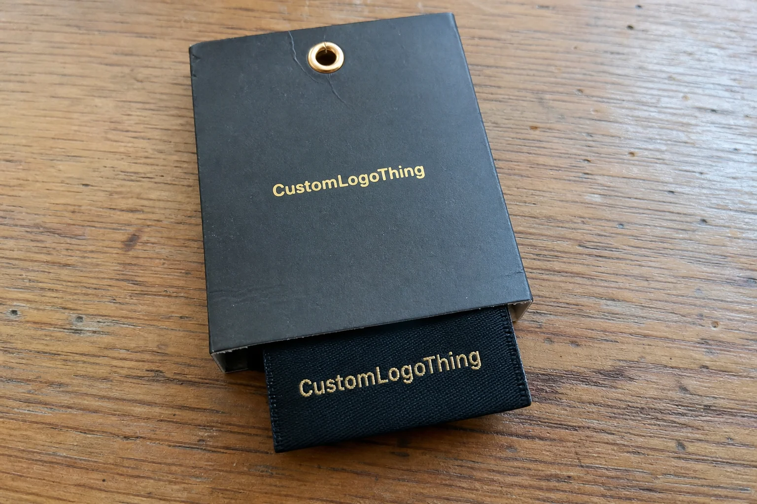
These labels are made in a brand-specific color rather than a stock neutral. They may be woven, printed, satin, cotton, or heat-transfer, depending on the garment and the level of detail required. Brands use them for neck labels, side-seam labels, care labels, size labels, and inside branding on outerwear or accessories. The construction changes the look, the hand feel, the cost, and the amount of control you have over the final color.
Color choice matters because apparel rarely exists by itself. The label should sit comfortably beside hang tags, care labels, tissue, cartons, and any other branded packaging already in the line. If the garment uses a specific ivory, charcoal, navy, or muted earth tone across the rest of the system, the label needs to feel related. A mismatch is easy to overlook on a screen and hard to ignore on the finished product.
The practical effect is simple. A poor shade match can make a premium item look inconsistent. A well-matched label can make a basic tee feel more deliberate. Buyers comparing Custom Labels & Tags should think beyond decoration. Color affects readability, material choice, finishing, and production risk.
Custom color labels are not only a style decision. They are part of the production spec, part of the merchandising story, and sometimes part of the cost control plan. That is why the best results usually come from clear references, a realistic material choice, and a sample check before the full run is approved.
How the labeling process works from artwork to final sample
The workflow is usually straightforward on paper. A brand sends artwork, selects the label type, confirms size and placement, chooses colors, approves a proof, and moves into production. In practice, the first proof often exposes problems that were hidden in the original file. Thin lines disappear. Small type gets crowded. A shade that looked balanced online may sit too bright or too dull on fabric.
Color matching depends heavily on construction. Woven labels usually rely on thread or yarn selection. Printed labels use ink or ribbon color and can reproduce finer detail with less visual texture. Satin tends to soften color, which can help when the brand wants a cleaner interior finish. Damask weave can carry small logos well, but the weave density changes how the color reads. Care labels and size labels have their own constraints because legibility matters more than visual drama.
Most suppliers work from Pantone references, physical swatches, digital mockups, or an approved brand standard. Screens are useful for direction, but they are not a color standard. The same blue can shift under daylight, indoor light, or a compressed file preview. A physical sample or strike-off is still the most reliable checkpoint before a larger order.
Expect some variation between the proof and the final run, especially if the label must survive repeated washing, abrasion, or folding. The label base, thread density, ink laydown, and finishing method all influence the result. A shade that looks perfect on a flat proof can darken slightly once the label is folded, stitched, or heat applied. That is normal. The goal is not theoretical perfection. The goal is a color that stays consistent enough across production to look intentional in use.
Testing matters more for garments that will be washed often or handled heavily before sale. If the label is going into retail packaging or custom printed boxes, it still needs to look clean after packing, shipping, and store handling. A color that survives the sample stage but wears poorly in use creates a weak impression the buyer cannot unsee.
Late changes are expensive. A small shift in size, a new fold style, or a different shade of gray can mean another proof, a new strike-off, or a delayed production slot. Teams that settle the spec early tend to spend less time in revision loops and less money on avoidable rework.
Key factors that affect label color accuracy and durability
Color accuracy is never just about the color itself. The background matters, and so does the garment. A pale label on black fabric needs enough contrast to stay readable. A dark label on a white shirt can look harsher than expected if the brand wants a soft or premium finish. The same blue can feel elegant on satin and heavy on a dense weave.
Material choice changes the visual result. Satin reflects more light, so colors often appear softer and slightly brighter. Woven damask usually gives edges and small text a cleaner profile, but the weave can mute very fine details if the design is too small. Cotton creates a more natural look, which suits heritage or eco-led brands. Heat-transfer labels remove bulk and work well for performance apparel where comfort is a priority.
The technical spec is just as important. Stitch count, weave density, ink coverage, and edge finishing all affect how the brand color reads. A tighter weave may hold a small logo more cleanly, but it can also deepen the overall appearance. Heavy ink coverage can improve opacity, though it may make a label feel stiffer than expected. That trade-off shows up in other branded components too: the more control you want over appearance, the more precise the specification needs to be.
Durability is the other half of the decision. Activewear, workwear, and children’s clothing face repeated wash cycles, friction, sunlight, and folding. UV exposure can fade some dyes. Abrasion can wear down small text at the edge. Washing can blur poorly cured print or make a low-contrast label harder to read after only a few cycles. A care label with tiny type needs enough contrast to stay legible after the garment has been worn and laundered, not just when it is new.
Small typography and logos are especially sensitive. Gradients, thin strokes, and tiny icons can disappear if the label color and background sit too close in value. A choice that looks refined in a proof can become vague once it is stitched into a real garment. Sometimes the correct answer is not a more complex label. It is a simpler one with stronger contrast and fewer fragile details.
Cost and pricing: what drives unit cost, MOQ, and quote changes
Pricing for custom color labels usually comes down to six levers: label type, size, number of colors, quantity, finishing, and whether the supplier needs special matching or multiple versions. That is the short version. The longer version is that each spec changes labor, setup, and material waste in ways that do not always show up clearly on a quote.
MOQ, or minimum order quantity, is simple in theory and frustrating in practice. Lower quantities usually cost more per unit because setup, proofing, and machine preparation are spread across fewer labels. A run of 500 labels will often cost noticeably more per label than a run of 5,000, even if the artwork is identical. That pattern applies to many label and Custom Packaging Products orders as well.
For budgeting, a standard woven label run might fall around $0.08 to $0.18 per unit at higher quantities, while printed satin or more complex constructions can sit closer to $0.12 to $0.28 per unit depending on size, detail, and finishing. Exact color matching, multiple colorways, and premium hand-feel materials can push the price higher. Those are broad market ranges, not fixed quotes, but they give a realistic starting point.
| Label option | Typical strengths | Common trade-offs | Budget impact |
|---|---|---|---|
| Woven label | Premium texture, strong brand feel, good repeat consistency | Fine gradients are difficult; dense weaves can soften tiny details | Often economical at scale |
| Printed satin label | Smoother surface, clearer small type, softer hand feel | Can show wear sooner in harsh laundering if spec is weak | Moderate, depends on print coverage |
| Cotton label | Natural look, good for heritage or eco branding | Less crisp color appearance than synthetic options | Can rise with specialty finishing |
| Heat-transfer label | No bulk, ideal for performance wear, clean interior finish | Requires careful application and wash testing | Varies with size and film type |
Quote comparisons only make sense if the specs match. Compare the same material, size, finish, fold type, and color count. A lower quote may simply reflect a thinner base, a looser color target, or a less refined edge finish. The hidden cost shows up later if the first approval misses the mark and the order has to be revised.
If a supplier asks for a Pantone reference, that is a good sign. If they also ask for garment photos, fabric swatches, and the intended placement, that is better still. The quote becomes more reliable because the risk of rework drops before production starts.
Sample charges can vary. Some suppliers include a basic proof in the order, while others charge separately for a strike-off or physical sample. That cost is usually easier to justify than a full production run based on a guess.
Process and timeline: from approval to production steps
A realistic timeline moves through inquiry, spec confirmation, artwork prep, sample or proof approval, production, finishing, and shipment. For straightforward orders, that can mean about 10 to 15 business days after proof approval. More complex runs, or orders that need a physical strike-off first, usually take longer. If the schedule is tight, say so early. Production delays are easiest to avoid before machines are booked.
Several things slow a project down. Missing artwork files. Unclear Pantone references. Last-minute changes to label size. And the classic problem of trying to decide between two shades that look nearly identical on screen but behave differently in fabric. Seasonal demand can also push lead times out. Apparel launches, replenishment cycles, and holiday windows all compress the calendar.
For brands coordinating a wider package branding system, timing matters beyond the label itself. If tissue, inserts, cartons, and labels are all moving at once, one delay can ripple through packaging design and fulfillment. That is why some teams place labels early, even before the final carton spec is locked.
Build in buffer time for sample review and shipping. A brand that plans for a three-day internal review and then needs a week to gather approvals is usually the brand that misses its launch date. Treat the label as a critical path item if garments cannot be sewn, packed, or relabeled without it.
If sustainability is part of the brief, ask about material sourcing and certifications. FSC applies to paper-based packaging components rather than textile labels, but the discipline is similar: document the material, the source, and any related compliance claims. For broader context on fiber-based sourcing, the FSC site is a useful reference point.
Common mistakes when ordering custom labels for apparel
The first mistake is approving color from a phone screen. That happens far more often than it should. A screen is not a color standard. If the shade matters, ask for a physical sample or at least a controlled proof.
The second mistake is choosing a label color that looks stylish on its own but disappears against the garment. A label can look strong on white paper and nearly vanish on heather gray. Contrast is not optional. It determines whether the label supports the product or gets lost inside it.
The third mistake is ignoring readability. Small type on colored backgrounds gets fragile fast. Care instructions, fiber content, and size markers need enough contrast and enough breathing room. Buyers who already understand carton graphics usually know this instinctively for packaging, but the same rule applies inside the garment.
The fourth mistake is under-ordering. A brand may need extra labels for spoilage, relabeling, replacements, or a surprise replenishment order. Running short can stall sewing lines or force a second purchase at a worse price point.
The fifth mistake is comparing vendors with mismatched specs. A woven label, a printed satin label, and a heat-transfer label should not be judged as if they were the same product. Material, size, finish, fold type, and color target need to match before price means anything. Otherwise the comparison is misleading.
Another common issue is skipping garment testing. A proof that looks clean on paper may not behave the same once it is stitched, folded, washed, or packed. The closer the label sits to skin, the more the hand feel matters. The more it sits on outerwear, the more abrasion and visibility matter. Those practical limits should shape the spec from the start.
Expert tips for sharper color matching and better brand consistency
Use one master color reference across labels, hang tags, tissue, boxes, and digital assets. Consistency across the system makes a brand feel more deliberate and reduces the chance that one piece drifts away from the rest. A label that feels slightly off will stand out more than a label that is merely plain.
Ask for a test against the actual garment fabric, not just a white proof. Color shifts as the background changes. A label that feels balanced on paper may look too strong, too muted, or too cold on the finished garment. That check is especially useful if the labels are part of a broader line that includes custom printed boxes or other branded packaging materials.
Keep label colors simpler when the logo is small. Tiny marks do not benefit from excessive color layering. A single dominant shade with one accent often works better than a crowded palette, especially if the textile construction has limits. Clarity usually beats decoration at this scale.
Seasonal label variations can work, but they should have a reason. A holiday capsule, limited drop, or collaboration may justify a different palette. Core products usually should stay steady. Repetition helps recognition, and recognition is what makes the rest of the system feel connected.
Save the approved specification in a place people can find later. Record the Pantone reference, thread count or print spec, fold style, size, and any sample notes that were approved. That record saves time on repeat orders and cuts down on guesswork across vendors and seasons. The brands that stay consistent are usually the ones that write the spec down and keep it accessible.
Check color under neutral light before signing off. Warm retail lighting can flatter a shade that looks dull in daylight, while daylight can expose a contrast problem that was hidden indoors. A label needs to work in the real conditions where it will be sold and worn, not only in the sample room.
Next steps for ordering the right label version
Start with the garment type, placement, quantity, target color, and required durability. Those five inputs give a supplier enough information to recommend the right construction and quote more accurately. If the label will touch skin, comfort matters. If it sits on outerwear, visibility and abrasion resistance matter more.
Before requesting samples, gather a Pantone reference, logo files, and a photo or swatch of the garment fabric. If the packaging direction is already set, include that too. The label should feel aligned with the rest of the line, not like it came from a separate decision tree. That matters even more for brands building a full presentation around product packaging, in-store display, and online merchandising.
Choose between woven, printed, satin, or heat-transfer construction based on visibility and performance. Woven labels feel premium and hold up well. Printed labels reproduce fine detail more easily. Satin gives a smoother interior hand feel. Heat-transfer removes bulk and works well for performance apparel. There is no universal best option, only the best fit for the garment and the use case.
Request a sample or proof, review contrast under neutral light, and approve only after checking the result against the real garment. Then place the order with a small buffer for replacements. A few extra labels are cheaper than a stalled line.
Document the approved spec for future reorders. That habit protects consistency across seasons, vendors, and product lines. If the goal is a steady brand look, custom color labels should be treated as part of the brand system, alongside the box, the hang tag, and the garment itself.
How do custom color labels for clothing get matched to a brand palette?
Most suppliers match against Pantone references, physical swatches, or approved brand standards. The final result can still shift based on material, weave, ink, and the garment background, which is why samples matter.
What affects the price of custom color labels the most?
Quantity, number of colors, material choice, finishing, and setup complexity usually drive price. Lower quantities and exact color matching often raise unit cost because setup is spread across fewer labels.
How long does production usually take for custom color labels?
Timeline depends on proof approval, quantity, and whether a physical sample is needed first. Build in extra time for revisions, especially when the brand needs exact color accuracy or a coordinated packaging launch.
Which label type is best for color accuracy on clothing?
Printed labels can reproduce fine color detail well, while woven labels offer a textured, premium look. The best choice depends on readability, durability, and how closely the color must match the brand palette.
Can custom color labels be used for care labels and size labels too?
Yes, color can be used on care labels and size labels if readability stays strong. For small text, contrast should be checked carefully so the label remains easy to read after washing.


