Custom envelope address labels do more than carry a name and street line. In a real mailing workflow, they help an envelope look deliberate, keep addresses readable at a glance, and reduce the small handwork errors that creep in when a team is writing or re-writing addresses by hand. That matters whether the job is an invitation series, customer correspondence, sample packets, or a steady stream of office mail that has to move without slowing everyone down.
There is also a brand side to it that buyers sometimes underestimate. The envelope is often the first printed surface a recipient sees, so the label has to feel consistent with the rest of the system. If the typography is clean, the stock matches the envelope, and the adhesive behaves the way it should, the whole mailing feels more organized before it is opened.
That is the practical value: fewer corrections, better legibility, and a cleaner presentation. The label is a small component, but in high-volume mailing work, small components set the tone for everything that follows.
What Custom Envelope Address Labels Actually Do
At the simplest level, custom envelope address labels identify the delivery point. In practice, they also solve three operational problems at the same time: they keep the address visible, they give the envelope a finished look, and they cut down on manual handling. That combination is why buyers keep coming back to them for recurring mailings and short-run projects alike.
If you have ever watched a team assemble envelopes by hand, the bottlenecks are easy to spot. Someone writes or prints the address, someone else checks the spelling, and another person notices the label is a little crooked or too low on the face. None of those problems is dramatic on its own, but repeated across hundreds or thousands of pieces, they slow the job and introduce avoidable mistakes. A printed label removes most of that friction.
It also reduces the risk of transposed suite numbers, missing apartment designations, or inconsistent capitalization. Those details sound minor until a mailpiece lands in the wrong place or gets delayed because the address block was hard to read. In a production setting, consistency is the real value. One label should look and perform like the next, even if the addresses change from line to line.
For recurring work, that consistency matters even more. A standard layout can be reused across campaigns, client mailings, department notices, or fulfillment inserts without forcing the team to rebuild the file each time. That is one reason custom envelope address labels are often paired with other printed components in broader packaging programs. When the envelope label, insert card, and outer materials speak the same visual language, the mailing feels intentionally assembled rather than patched together.
“A good address label disappears into the workflow. It looks simple because the decisions behind it were handled properly: size, stock, adhesive, type, and proofing all lined up before production started.”
The right choice depends on the envelope surface, the print method, how much handling the mailpiece will see, and whether the label has to be permanent or removable. A one-time invitation mailing and a daily office dispatch do not need the same spec. Neither does a project with variable data and a project using the same return address on every piece.
That is why buyers should think beyond the address itself. The label is part of the production system, not just a decorative sticker. If it is selected well, it supports throughput, readability, and presentation without creating extra cleanup work later.
Materials, Adhesives, and Print Finishes That Affect Performance
Material choice changes both the appearance and the behavior of custom envelope address labels. Matte paper is the most common option for standard office mail because it prints cleanly, keeps contrast strong, and works well with everyday laser and digital output. Coated paper gives sharper visual edges and can make small logos or fine type look more precise, though a glossy surface may catch light in a way that is not ideal in busy mailrooms. Synthetic face stocks, usually polypropylene or polyester based, are the durability option when moisture, abrasion, or longer handling cycles are part of the job.
Adhesive deserves just as much attention as the face stock. A permanent adhesive is usually the correct choice for routine mailing because it holds reliably on common envelope papers. Still, envelope stock is not always uniform. Recycled papers, textured kraft, and some lightly coated surfaces can behave differently, so adhesive performance should be tested on the actual envelope, not assumed from a spec sheet. Removable adhesive can be useful for temporary labeling, but it is not the default answer. It trades holding power for cleaner removal, and that tradeoff may not suit every mailpiece.
Finish affects readability more than many buyers expect. A matte or satin surface typically gives the cleanest reading experience because it avoids glare and keeps the address block easy to scan under office lighting. High-gloss finishes can look sharp at first glance, but they are not always the best fit for envelopes that will be handled quickly, stacked, or viewed from different angles.
Print compatibility also matters. Not every label stock behaves the same way across laser, inkjet, and digital equipment. Some papers fuse well with toner but do not dry as cleanly for inkjet. Others are tuned for variable-data digital output and hold detail beautifully, but may cost more than a basic stock. If the job involves preprinted labels rather than blank stock on sheets, the print process should be matched to the material before production begins. A good file on the wrong stock can still produce a mediocre result.
For mail that may sit in a humid storage area, travel through a shared mailroom, or be touched repeatedly, a synthetic label can justify its higher cost. For a standard campaign with normal indoor handling, matte paper usually delivers the best balance of performance and price.
Typical tradeoffs for common options:
| Option | Typical Use | Strengths | Tradeoffs |
|---|---|---|---|
| Matte paper | Standard office mail, invitations, general correspondence | Strong contrast, economical, easy to print | Less durable if exposed to moisture or abrasion |
| Coated paper | Brand-forward mailings and sharper visual layouts | Crisper type and graphics, more polished appearance | Can glare under light, sometimes costs more |
| Synthetic face stock | Higher handling, damp conditions, longer use cycles | Durable, moisture resistant, stable finish | Higher unit cost, not necessary for every job |
| Removable adhesive | Temporary labeling or short-lived applications | Cleaner removal, less residue | Less secure on some textured or coated surfaces |
If sustainability is part of the decision, buyers often ask about recycled content or FSC-certified paper. That is a reasonable question, especially when the rest of the printed program already relies on responsibly sourced paper or packaging board. The point is not to force every order into the same material, but to match the label stock to the actual job instead of choosing a premium material for appearance alone.
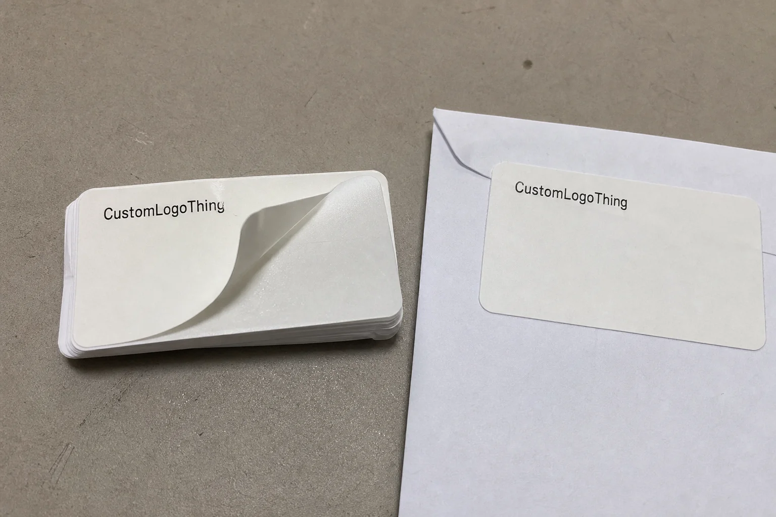
One useful habit is to request a sample or test sheet before committing to a full run. That gives the buyer a chance to check the finish, the adhesive, and the way the label looks against the exact envelope paper being used. In label work, the press proof is only part of the answer; the envelope itself finishes the equation.
Cost and Pricing Factors to Compare Before You Order
Pricing for custom envelope address labels usually comes down to quantity, size, material, color count, adhesive type, and whether the data is fixed or variable. A simple one-color label on matte paper will usually sit at the lower end of the range. Add multiple colors, a specialty stock, or a custom contour cut, and the cost moves up because setup and production complexity increase with each added variable.
Small runs carry more overhead. Proofing, file prep, press setup, calibration, and cutting all have to happen whether the order is 500 pieces or 5,000. That is why short runs often look expensive on a per-label basis. Once the quantity climbs, those fixed costs spread out and the unit price usually drops in a way that is easy to see on the quote.
As a practical benchmark, buyers often find that basic paper labels in moderate volume can land in the low cents per piece, while smaller customized runs may sit noticeably higher because setup is doing more of the work. Specialty stock, variable data, and finish upgrades can push the number further. There is no honest way to pin that down to a single figure without the actual spec, but the pattern is consistent: simple, larger orders are easier to price efficiently than short, highly customized ones.
Here are the main levers that move the total:
- Quantity: Larger orders usually lower unit cost.
- Size: Bigger labels use more stock and can create more trim waste.
- Print coverage: Full-color backgrounds cost more than simple black text.
- Adhesive type: Special adhesives add material cost and sometimes testing time.
- Variable data: Changing names and addresses adds file handling and proofing.
- Finish and cutting style: Soft-touch coatings and custom shapes add complexity.
Shipping and packing format can also affect the final number. Sheeted labels, roll labels, and packaged sets do not all ship the same way, and a quote that looks attractive before freight can change once the job is packed. It is worth checking carton count, pack density, and any rush fee before comparing suppliers. The cheapest unit price does not always equal the lowest landed cost.
A good buying approach is to compare pricing at a few breakpoints, such as 1,000, 2,500, and 5,000 pieces. That shows where inventory starts to become more efficient. If the labels are used repeatedly for office mail, customer outreach, or branded correspondence, ordering a slightly larger quantity can make sense. If the addresses or branding will change soon, a smaller order may be the safer move even if the unit cost is higher.
The other question is whether the label is doing enough work to justify special treatment. Many buyers overspend on finishes that look interesting but do not improve the actual mailing. In most cases, clean typography, accurate data, and a stock that holds up in handling will do more for the project than a decorative effect that only shows up in the proof.
Production Process and Lead Time From Proof to Delivery
The production process is straightforward, but each step affects timing. Artwork intake comes first, where the file is checked for dimensions, bleed, image resolution, and basic structure. Then comes the proof stage, where the buyer confirms the layout, spelling, address placement, and color intent. After approval, the order moves into print production, then cutting or finishing, then quality control, and finally shipment.
Most delays happen before the press starts. Missing fonts, low-resolution logos, incomplete address lists, or a file that does not match the actual label size can all stall the order. A lot of rework comes from simple disconnects between the file on screen and the physical label on press. That is why the handoff matters so much. The more complete the input, the fewer surprises later.
For a standard custom envelope address labels order, turnaround is often measured in business days after proof approval, not after the first conversation. A simple repeat job can move quickly, while a larger or more complex run may need more time for setup and finishing. In practical terms, a buyer might see a typical window around one to two weeks after proof signoff, with rush service available only if stock and the production schedule allow it. If the order requires special material, heavy variable data, or custom cutting, the lead time can stretch beyond that.
Variable data adds another layer of checking. If every label changes, the data merge has to be clean and the proof should reflect the actual file structure. If the same address repeats, production is simpler. Sequential numbering, multiple departments, or multiple ship-to addresses can all be handled, but the file needs to be organized before the order enters production.
There is a practical difference between a label job that is static and one that is data-driven. Static work usually moves faster because there is less room for error. Data-driven work can still run efficiently, but it depends on the quality of the spreadsheet and how clearly the variables were defined at the start. That is often the point where buyers save or lose time.
Quality control is not just about whether the print looks sharp. A proper check should confirm registration, image placement, adhesive consistency, cut accuracy, and whether the printed surface remains legible after handling. For labels that will travel through a mailroom, a simple rub test and a short adhesion check on the actual envelope stock are worth the time. They catch problems early, while the job is still easy to adjust.
How to Choose the Right Size, Layout, and Data Fields
Envelope size usually drives label size. A reply envelope has very different proportions from a business envelope, and a larger outer envelope can tolerate a more spacious layout without crowding the address block. If the label is too large, it may interfere with the flap, seal, or postal marks. If it is too small, the address can feel cramped and harder to scan quickly.
For most mailings, the label should include the recipient name, delivery line, city-state-ZIP, and return address if needed. Some buyers also want a logo or small brand mark. That can work well, but only if it leaves enough white space around the address block. Visual restraint usually helps more than decoration here.
Readable label design is less about ornament and more about discipline. Type size should stay large enough for quick recognition, line spacing should not feel compressed, and contrast should stay strong enough to hold up under office lighting and quick handling. Dark text on a light surface remains the safest choice for almost every mailing. If color is used, it should support the address, not compete with it.
Variable data needs a clean structure. Some teams need one master format with hundreds of unique addresses. Others need the same structure with only the department, region, or location changing. Either way, the data fields should be organized before production starts. A clean spreadsheet with consistent columns saves time and reduces avoidable proof corrections.
Postal practicality still matters. Even though the label is a branding element, it also has to support sorting and delivery. That means keeping the address block in an expected location and avoiding visual clutter near the delivery zone. If a barcode is part of the design, its quiet zone and placement need to be checked carefully so it can be scanned without trouble.
If the label is part of a larger printed system, keep the visual language aligned with the rest of the materials. The envelope label should feel connected to the enclosure card, letterhead, or outer package rather than looking like an isolated add-on. Consistency in type, color, and spacing usually does more for the final result than a flashier treatment ever will.
Common Mistakes That Make Envelope Labels Harder to Use
Low contrast is one of the most common problems. Light gray type on a pale background may look restrained on a screen, but in practice it can disappear under office lighting or in a fast sorting environment. Tiny type causes a different issue. If multiple people need to read the label, the address should not depend on ideal viewing conditions or unusually sharp eyesight.
Adhesive mismatch is another recurring headache. A label that performs well on smooth white envelopes may lift on textured kraft, recycled stock, or lightly coated papers. That is why testing the exact envelope surface matters. If the adhesive cannot hold under the actual handling conditions, the rest of the design does not matter much.
Wrong dimensions create placement problems. A label that is too wide can wrinkle near a seam or curve. A label that is too tall can crowd the flap or cover something important on the envelope face. A half-inch of bad sizing can turn into a production problem if the labels are already moving through a batch workflow.
Skipping a test run is another classic mistake. A proof PDF can make a layout look finished even when the real piece will not behave the same way. The printed result may reveal glare, curl, edge lift, or a visual balance problem that was not obvious on screen. That is not a design failure so much as a reminder that print is physical, not abstract.
Data formatting creates its own set of issues. Buyers sometimes forget to confirm how names and addresses will be supplied, which leads to missing apartment numbers, inconsistent capitalization, or punctuation in the wrong place. If variable addresses are part of the order, the file should be cleaned before it reaches production. That step is not glamorous, but it saves time and avoids rework.
For teams handling broader branded packaging or retail packaging work, consistency matters even more. If the label format, insert card, and outer materials all use different tones or type styles, the system starts to feel improvised. The strongest programs are usually the quiet ones: same typographic logic, same color discipline, same level of care from one piece to the next.
Expert Tips for a Smoother Mailing Workflow
Order a sample or proof batch before you commit to the full run if the mailing matters. That extra step lets you check adhesion, legibility, and the overall feel of the label against the actual envelope stock. In production terms, it is a small investment that can prevent a reprint or a batch of labels that look correct on paper but misbehave in use.
Test the label on the exact envelope surface you plan to use. Same stock, same coating, same texture, same handling conditions. If the envelope will be stacked, stuffed, or moved repeatedly, simulate that. A label can look fine when freshly applied and still fail after a few hours of friction or a little humidity.
A short internal checklist usually helps:
- Confirm envelope size and label size.
- Choose paper, coated paper, or synthetic stock.
- Decide on permanent or removable adhesive.
- Lock the address data format before proofing.
- Verify the proof on the real envelope, not only on screen.
Align the label specification with the actual workflow. If the team uses mail merge files, the variable data should be formatted to match that system. If the work happens in batches, the label count should match the batch plan instead of being guessed after the fact. If the labels are part of a larger printed system, keep the typography and color treatment consistent across the materials so the program feels coherent from envelope to enclosure.
In practical terms, the best approach is usually the least complicated one: define the envelope size, pick the stock based on handling needs, compare pricing at two or three quantities, and verify the proof on the exact envelope that will be mailed. Once those pieces are settled, custom envelope address labels become one of the simplest ways to improve both appearance and workflow without adding unnecessary complexity.
That is the balance worth aiming for. The label should look clean, read clearly, survive handling, and fit into the mailing process without slowing it down. If it does those things well, it has done its job.
Frequently Asked Questions
What should I choose for custom envelope address labels: paper or synthetic?
Choose paper for standard office mail and lower-cost runs when the labels will not face heavy handling. Choose synthetic when you need more durability, better moisture resistance, or a cleaner surface under tougher conditions.
What size are custom envelope address labels usually made in?
The right size depends on the envelope and how much information needs to fit on the label. Most buyers choose a size that leaves enough white space for easy reading without covering too much of the envelope face.
Can custom envelope address labels include variable names and addresses?
Yes, variable data is common and useful for mailings with many recipients. The key is supplying the address list in a clean, consistent format so production can merge it correctly.
What affects the turnaround time for custom envelope address labels?
Turnaround depends on proof approval, stock choice, quantity, current production queue, and whether the order needs rush handling. Clean artwork and complete address data usually shorten the timeline more than anything else.
How do I avoid mistakes when ordering custom envelope address labels?
Confirm the envelope size, adhesive type, print layout, and final address format before approving the proof. Test the design on your actual envelopes if the mailing is important or high volume.
Custom envelope address labels work best when they are treated as a production tool, not a decorative afterthought. The right stock, adhesive, and layout keep the mailing readable and efficient, while a careful proof on the actual envelope catches the problems that digital mockups tend to hide. That is where the quality shows up: in the parts of the process that move quietly, hold together, and keep the mailing on schedule.

