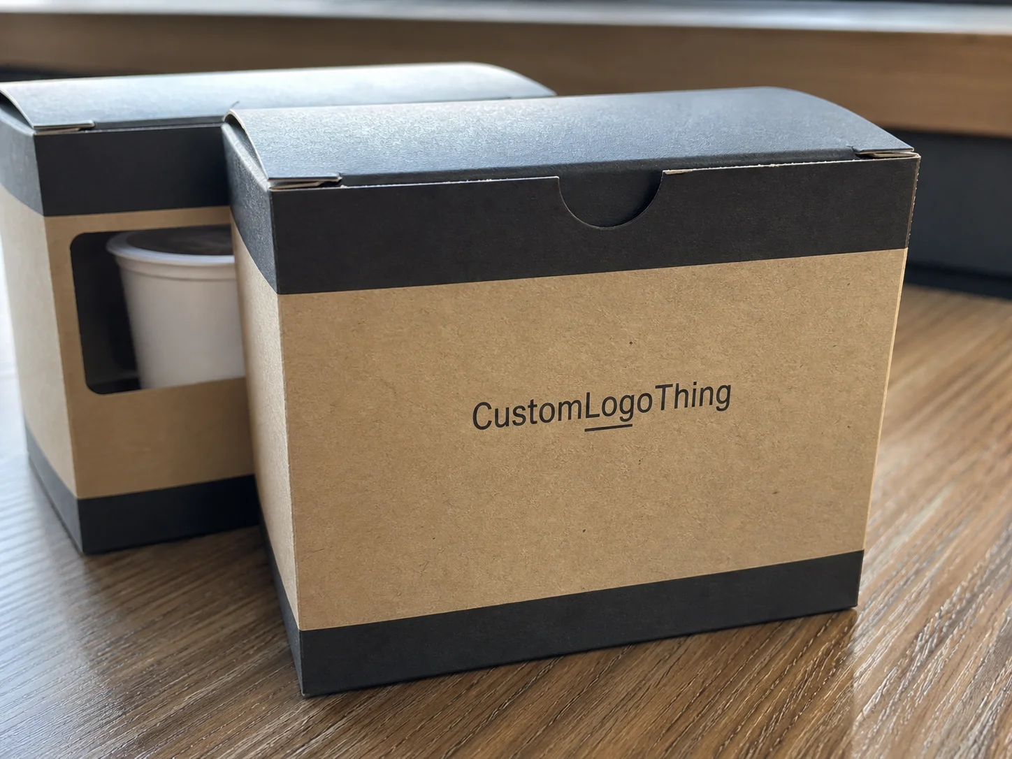
Custom k cup boxes do more than hold pods. They have to keep a light, round product from shifting, present clearly on a crowded shelf, and still make sense for shipping, storage, and fast fulfillment. A carton can look simple in a mockup and still create problems if the internal fit is loose, the board is too soft, or the front panel does not tell shoppers what they need to know in a few seconds.
That is why the packaging decision matters so much. With the right structure, print setup, and finish, custom k cup boxes can reduce damage, make a small coffee line feel established, and improve how the product performs in retail and direct-to-consumer orders. The real work is usually less glamorous than the render suggests: sizing, board strength, closure style, barcode placement, and whether the box can survive the way people actually handle it.
For buyers, the useful questions are practical ones. How many pods go in each pack? Is the box meant for a shelf, a subscription shipment, or both? Does the artwork need to support multiple flavors without turning into visual noise? Those answers drive the structure, the print method, the finishing choices, and the final cost far more than a decorative idea on its own.
Custom K Cup Boxes: Why Small Packs Sell Big
Most coffee pods are individually sturdy, but the carton around them does the selling. Custom printed boxes for K Cups have to communicate flavor, count, and brand position quickly while also protecting the contents and fitting the channel. A pack built for grocery shelving is not the same as one built for fulfillment, and a carton that looks premium on a design board can still fail if it is difficult to stack, slow to erect, or awkward to scan at checkout.
From a packaging buyer’s point of view, the box is doing several jobs at once. It protects the pods. It organizes the flavor line. It supports package branding. It gives retail staff and warehouse teams something easy to handle. When those jobs are balanced well, a smaller launch can look more complete than the product line actually is. Clean dimensions, readable graphics, and a closure that behaves predictably go a long way toward that result.
A good carton does not try to impress by doing too much. It protects the pods, tells the shopper what matters, and stays easy to build, fill, and ship.
The buying process usually starts with three facts: the pod count, the desired channel, and the packing method. A 12-count shelf carton, a 24-count club pack, and a subscription shipper may share the same coffee, but they will not share the same priorities. Shelf packs need fast recognition. Mail-order packs need better crush resistance. Club packs often need stronger stacking behavior because they sit in bulk displays and get handled by more than one person before purchase.
That distinction matters because packaging failures are rarely dramatic. They are usually small and cumulative. A pod rattles against the wall. A corner crushes during transit. A finish scuffs on a display shelf. The product still exists, but the package starts looking tired before the coffee has a chance to sell.
How the Box Structure Supports the Pods
Structure starts with fit. Loose pods can rattle, rub the interior, and crush at the corners if the carton is oversized by even a few millimeters. That movement creates a cheap feel long before any graphics issue shows up. Tight internal sizing, a stable tuck, and the right insert or divider usually matter more than the decorative details buyers notice first on a proof.
The basic anatomy is straightforward: a paperboard shell, a closure style such as a tuck flap or locking bottom, and, in some cases, an insert that keeps the pods aligned. For shelf-ready packaging, many brands choose a carton that opens cleanly, stacks flat, and leaves enough face area for branding and barcode placement. For shipping, the same brand may need a sturdier outer carton or a mailer-style box that absorbs transit stress better than a thin retail pack.
Retail cartons and multipacks
Retail cartons are usually built around straight edges, predictable shelf facings, and quick flavor recognition. A 12-count or 24-count pack often benefits from a snug internal wrap or a simple insert if the pods do not completely fill the cavity. That extra support keeps the box from collapsing inward after repeated handling. It also helps the front panel keep its shape, which matters more than most teams expect once the product sits in a display fixture for a few weeks.
Retail packaging also has to survive the small abuses that happen before a shopper ever sees it. Cases get opened and restacked. A carton gets squeezed by a hand that is checking for stock. A display tray shifts. If the box stock is too weak or the glue lines are inconsistent, the pack starts to sag and the shelf presentation drops off quickly.
Mailers and subscription packs
For direct-to-consumer orders, the structure can be heavier, especially if the carton goes through parcel carriers before it reaches a customer. In those cases, many brands test the pack against transit abuse using procedures aligned with ISTA transit testing standards. That does not make a package invincible, but it gives a much better read than a table-top sample does. A box that survives a single hand test may still fail after vibration, compression, and drop events in the real world.
Board strength matters here too. Caliper, stiffness, and crush resistance affect whether the carton keeps its shape after filling and stacking. A lightweight board can look fine in a flat proof, but if it flexes under pressure, the shelf presentation suffers fast. For brands that want a more responsible material story, FSC-certified paper options can support that message without forcing a major design change.
It also helps to think about the assembly line, not just the finished carton. If the box has a locking bottom that slows down packing by even a few seconds per unit, that cost will show up at scale. If the insert needs hand placement, the labor burden can outweigh the visual benefit unless the pack is positioned at a high enough margin. Those tradeoffs are where good packaging decisions usually get made.
If you are comparing formats, the simplest path is often the most honest one. A straight tuck carton is usually cheaper and easier to produce. A locking-bottom style gives better support. A carton with a custom insert costs more, but it may reduce movement, improve presentation, and lower the risk of damaged units. The right choice depends on the channel and the acceptable level of handling risk, not on how dramatic the sample looks in the review meeting.
Materials, Printing, and Finishes That Change the Final Look
Material choice affects more than durability. It changes how crisp the graphics appear, how much the box costs, how it folds, and how it feels in hand. For many coffee brands, SBS or C1S paperboard in the 14pt to 18pt range is a common starting point because it balances stiffness and print quality well. For heavier packs or boxes that need stronger shipping performance, a thicker caliper or a different board construction may be worth the extra cost.
| Option | Best Use | Typical Strength | Cost Signal |
|---|---|---|---|
| 14pt C1S board | Light retail cartons, clean graphics | Good for shelf packs with modest weight | Lower |
| 16pt to 18pt SBS | Premium presentation, better stiffness | Better feel and improved edge stability | Moderate |
| Coated recycled board | Value-focused or eco-positioned lines | Decent structure, print can be slightly softer | Often lower to moderate |
| Heavy board with insert | Shipping-friendly or club store packs | Stronger protection and stacking behavior | Higher |
Printing method changes the result as much as the board. Digital printing works well for short runs and quick changes, especially when a brand wants several flavor variants without committing to large quantities. Offset printing gives more consistent color and sharper detail at scale, which matters if the packaging design depends on fine type, brand color matching, or a family of SKUs that need to look unified on shelf.
There is a practical limit to what most buyers should expect from small-run digital output. It can be excellent for speed and flexibility, but some deep solids, metallic looks, and very fine registration details behave better under offset. That is not a flaw in the process; it is a reason to match the process to the job instead of forcing one solution to cover everything.
Finishes deserve the same discipline. Matte lamination reads modern and quiet. Gloss adds brightness and contrast. Soft-touch creates a velvety feel. Spot UV pulls out logos or flavor marks. Foil can help a premium line stand apart. Each has a place. None should be added just because it looks attractive in isolation. A finish should match the channel and the handling reality. A soft-touch carton may feel refined, but if it will be tossed into bulk shipping, scuff resistance can matter more than texture.
Another detail that affects performance is ink coverage. Heavy coverage can increase cost, add drying complexity, and make scuffs more visible on dark backgrounds. Large solid areas also show folding pressure more clearly. A restrained layout with strong contrast is often easier to produce well than a design packed with gradients and dark blocks.
There is also a sustainability side to consider. Minimal coatings, recyclable board where appropriate, and a disciplined approach to decoration usually beat overbuilding the package for a lightweight product. Good product packaging does not waste material just to look expensive. It feels intentional because every layer has a reason.
Cost, Pricing, MOQ, and Quote Variables
Pricing for custom k cup boxes moves with the same core variables most paperboard cartons do: dimensions, board thickness, print coverage, finish, insert complexity, and quantity. Buyers often expect quantity to be the main lever, and it is a major one, but setup costs and decoration choices can shift the quote more than people expect. A small change in size or a more complex coating can alter both production time and material yield.
For a simple straight-tuck carton in moderate quantity, many buyers may see pricing in the neighborhood of $0.18 to $0.32 per unit at 5,000 pieces, depending on the board and print area. Add a custom insert, foil, spot UV, or a heavier board, and that number can move into the $0.30 to $0.55 range or higher. Larger runs often lower the unit cost, but not always enough to justify inventory a brand cannot reasonably sell before the next design update.
| Order Scenario | Typical Unit Range | What Pushes It Up | What Keeps It Down |
|---|---|---|---|
| Simple retail carton | $0.18 to $0.32 | Heavy ink coverage, size changes | Standard board, limited finishes |
| Premium shelf pack | $0.30 to $0.48 | Soft-touch, foil, spot UV | Single finish, efficient dieline |
| Carton with insert | $0.32 to $0.55 | Divider complexity, tighter assembly | Simple one-piece insert |
| Short-run launch order | Higher per unit | MOQ pressure, setup spread over fewer units | Digital print, standardized size |
MOQ matters a lot for smaller brands. A modestly higher order can sometimes bring the unit cost down enough to make financial sense, but only if the extra inventory fits the sales plan. A quote should separate structural cost, print cost, finishing cost, and freight so the numbers are easier to compare. Without that breakdown, one option can look cheaper while hiding a more expensive finish or a larger freight footprint.
Special shapes, windows, mixed-SKU color changes, and tight registration requirements can all add to the quote and extend approvals. If you are comparing vendors, ask for the dieline, board specification, finish list, and carton count per master shipper. That information makes it much easier to compare proposals on equal footing, especially across different custom printed boxes.
It also helps to know whether the price includes pre-production support, tooling, and one round of corrections. A quote that looks low may not include the steps that catch issues early. A quote that looks higher may be more complete and therefore cheaper once the revision cycle, freight, and reshipment risk are counted.
For buyers exploring broader branded packaging needs, it can also help to review Custom Packaging Products early, since the box size and finish you choose for K Cups often needs to align with labels, shipper cartons, and other product packaging pieces later.
Production Steps and Lead Time
The production path is predictable, but only if the artwork and dimensions are ready. It usually starts with dieline confirmation, then moves to artwork setup, proofing, plate or file prep, print, finishing, cutting, folding, and packing. If the job includes an insert, a special coating, or a specialty closure, each of those steps can add an extra checkpoint before full production is released.
Delays usually come from a short list of avoidable issues: missing dimensions, low-resolution art, late copy changes, barcode corrections, and unclear flavor naming. The packaging file can be nearly finished and still stall if one panel needs legal text or nutrition details that were not finalized. A buyer who knows this early can save days, sometimes more, simply by locking content before the proof cycle starts.
Quality control deserves attention here because many packaging problems are not obvious on screen. A proof can show the layout correctly and still miss how a particular finish reflects light, how a fold line hits a logo, or whether glue has enough room to bond cleanly. Good prepress teams check die alignment, bleed, safe zones, barcode contrast, and the relationship between artwork and fold areas. On the floor, crews should be checking registration, color consistency, score depth, glue closure, and whether the carton still opens and closes as intended after packing.
Typical lead time depends on the run size and the finishing package, but a simple order often lands in the 12 to 15 business day range after proof approval. More complex jobs, especially those with specialty finishes or custom inserts, may need 15 to 25 business days or longer. Seasonal demand also matters. Coffee launches around holiday periods, retail resets, and promotional windows tend to crowd the schedule.
Many buyers underestimate freight timing as well. A carton may finish production on schedule and still arrive late if shipping windows are tight or the receiving dock is backed up. That is why the timeline should include artwork signoff, production, packing, freight, and the time needed to correct a sample if something is off.
Most brands move faster when they plan backward from the launch date. Leave room for a structural sample, a digital proof, a final color check, and any retailer review that depends on the finished carton. A packaging delay can hold up a product launch even when the coffee itself is ready to ship.
Common Mistakes That Make Coffee Packaging Underperform
The first mistake is oversizing. A box with too much internal space lets pods shift during transit and creates a sloppy shelf presentation. The second is overdesigning. Too many claims, icons, and flavor callouts can make the front panel hard to read at retail distance, especially when the box sits beside louder competitors. The best retail packaging usually gives the shopper one clear path: brand, flavor, count, then supporting details.
Another common problem is ignoring the practical print map. Barcode placement, ingredient copy, regulatory text, and country-of-origin details all need room, and they need to sit where production can actually print them cleanly. If those elements are added late, the whole layout may need to be rebalanced. That is one of the most common causes of avoidable rework.
Finish choice can also backfire. A carton chosen for shine alone may look good under sample-room lighting and then scuff too easily on a store shelf or in a shipper. Likewise, a very soft-touch surface can look refined but show marks faster than a matte or gloss finish would. The point is not to avoid finish; the point is to choose one that fits handling, stacking, and transport.
A box that photographs well but ships badly is not finished packaging. It is unfinished problem-solving.
Finally, many teams order before they confirm the actual pod count, bundle configuration, and fulfillment method. A 12-count carton and a 24-count carton may look close in a mockup, but they behave very differently in production. That is why the fit should be confirmed before final approval, not after the first shipment is already booked.
There is a related mistake that shows up in reorders. A brand changes the coffee formula or the pod supplier, but keeps the same carton spec without checking whether the new pods occupy the same volume. The dimensions still look right on paper, yet the actual product movement changes. That is how a packaging system that once worked starts to fail quietly.
Expert Tips for Better Shelf Impact and Easier Ordering
Start with the buying environment, not the artwork. Club shelves, grocery aisles, subscription boxes, and DTC orders all place different demands on the carton. A shelf-facing design needs fast visual recognition. A shipper-facing system needs enough protection to survive rough handling. If the same pack has to do both, test against the harsher use case first.
One strong focal point on the front panel usually works better than a crowded layout. Put the brand where the eye lands first, then let the side panels carry roast level, flavor notes, origin, count, and any relevant claims. That gives the carton a cleaner read and makes it easier to maintain consistent package branding across multiple flavors.
Standardizing box dimensions across flavors is one of the simplest ways to reduce complexity. If the visual system allows it, shared size formats make inventory easier to hold, reorders easier to track, and fulfillment less confusing. Buyers often underestimate how much time is lost when every flavor needs a slightly different carton, especially if the same line is sold through more than one channel.
A practical spec sheet should include more than artwork. It should list exact board type, caliper, finish, internal dimensions, closure style, quantity per shipper, and whether the carton must pass a drop or compression expectation. That specification gives operations and purchasing a common reference, which reduces the “we thought the other team meant something else” problem that slows most packaging projects.
If the line is still early, ask for a pre-production sample or a close proof. That is the best time to catch color drift, fold issues, and dimension problems before the full run starts. For brands planning a phased rollout, a system that can scale from a small launch quantity to a larger retail order without a full redesign is usually the smartest path. It protects the brand from having to reinvent the pack every time demand grows.
Another useful habit is to check the box in the same lighting conditions where it will actually live. Office light hides some print issues. Retail lighting can exaggerate others. A glossy black panel, for example, may show fingerprints and scratches more visibly than expected once the pack reaches a real shelf. A light, high-contrast layout often ages better under mixed lighting and handling.
For a buyer who wants less guesswork, it often helps to review the structure, then the graphics, then the quantity, rather than trying to solve all three at once. That ordering keeps the project grounded and makes the quote easier to defend internally.
If you need a starting point for your line, browse Custom Packaging Products and compare a few structural options before you lock the artwork. That kind of comparison tends to reveal which details actually affect the result and which ones are only adding cost.
Next Steps for Ordering the Right Box
Before asking for a quote, measure the pod count, bundle format, and fit target. Then gather the dimensions, artwork files, expected quantity, finish preference, and shipping destination. Those details are usually enough for a supplier to narrow the options and avoid the back-and-forth that slows early packaging projects.
It also helps to compare two or three structural options instead of settling on the first one that sounds familiar. One version may protect better, another may stack better, and a third may print more economically. The right decision usually comes from balancing those tradeoffs instead of chasing the lowest quote line by line.
Work backward from the launch date and build time for proofing, corrections, and freight. That sounds obvious, but it is where many coffee brands lose momentum. A packaging schedule that is too tight can delay a product even when the roast, label, and distribution plan are ready.
In the end, custom k cup boxes work best when structure, graphics, pricing, and schedule are planned together rather than treated as separate problems. That is the difference between a carton that merely holds pods and a package that helps the coffee sell with less friction.
What size should custom K Cup boxes be for standard pods?
Size should be based on the exact pod count, insert style, and whether the box is for retail display or shipping. A proper fit keeps the pods from rattling, protects corners, and improves how the box stacks on shelves and in cartons.
What affects the price of custom K Cup boxes most?
The biggest drivers are quantity, board type, dimensions, print coverage, finishing, and any insert or special structure. MOQ and setup costs matter more on smaller orders, while larger runs usually lower the unit price.
How long does production usually take?
Timeline depends on proof approval, artwork readiness, run size, and finish complexity. Simple boxes move faster, while special coatings, inserts, or structural changes can add time to the schedule.
Can custom K Cup boxes be made for retail and shipping at the same time?
Yes, but the structure has to balance shelf appeal with transit protection. Many brands use a retail-facing carton plus an outer shipping solution, or a sturdier carton that can handle both roles.
What should I send when requesting a quote for custom K Cup boxes?
Send dimensions, pod count, target quantity, finish preferences, artwork files, and whether you need inserts or special folding styles. The clearer the information, the faster the quote and the fewer production surprises later.

