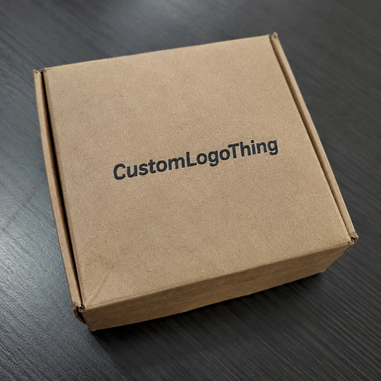
Why Custom Letter Stickers Stand Out on Real Packaging
When a brand name has to sit cleanly on a kraft mailer, a jar lid, a folding carton, or a retail pouch, Custom Letter Stickers often do a better job than a full rectangular label. They leave more of the original surface visible, which keeps the package from looking overbuilt and gives the branding a lighter, more deliberate feel.
That visual restraint is useful. A short logo line on a box flap, a single word on a bottle, or a product name on a shipping insert can read quickly without taking over the package. In packaging, especially on substrates that already carry texture or color, less background area usually means less visual noise.
These pieces are built around typography rather than a block of artwork. Depending on the layout, they may be individually cut letters, a wordmark, or a text-led decal applied as one piece. The result depends on more than the art itself. Letter spacing, film choice, adhesive behavior, and whether the design is die-cut, kiss-cut, or transferred all change how the finished item looks and applies.
For buyers, the appeal is practical as much as aesthetic. You can make the brand visible without making the pack feel busy. That balance matters on product packaging, retail packaging, and promotional mailers where the surface has to work hard and still look intentional.
How the Production Process Works From File to Finished Sheet
Good production starts with clean vector artwork. Vector paths give the cutter precise edges and consistent spacing, while a low-resolution file often brings jagged lines, blurry outlines, or extra prep work. If the lettering is still editable in a design file, it should be outlined before production so the font does not shift during handoff.
Once the file is reviewed, the proof stage defines size, spacing, and cut lines. This is where the shop checks whether the letters can peel cleanly, whether thin strokes will survive cutting and handling, and whether the order should be sheeted or rolled for the easiest application. For larger runs, layout efficiency also matters because tighter nesting helps reduce waste.
The actual production method depends on the design. Simple one-color lettering may be cut from vinyl and weeded so only the desired characters remain. Printed-and-cut versions work better when the job needs color variation, small graphic elements, or a logo combined with text. For more intricate lettering, transfer tape helps move the phrase as a single unit so alignment stays intact.
Complexity affects labor in a very real way. Thin characters, tight inner counters, and script styles take longer to weed and are more likely to tear. That is why a straightforward single-color run usually turns faster than a layered or highly detailed build, especially when the proof needs a revision before approval.
If the goal is a smooth order, the best start is simple: use a proper vector file, keep the text outlined, and check the final size against the actual package. Those basics save time and reduce the chance of a mismatch between the file and the finished piece.
Key Specs That Affect Performance, Cost, and Finish
Material choice changes how the sticker performs and how long it lasts. Vinyl is the common durable choice because it handles moisture and general wear well. Paper can make sense for short-term indoor use or tight budgets. Clear film creates a floating look that works well on bottles, jars, and transparent containers. Specialty stocks can add texture or visual interest, but they are not always necessary.
The adhesive matters just as much as the face stock. A piece that grips a smooth carton may fail on corrugated board, a curved bottle, or a lightly textured surface. For that reason, the surface should be identified before the spec is finalized: coated carton, uncoated paper, glass, plastic, powder-coated metal, or flexible film all behave differently. The right adhesive keeps the lettering flat and reduces corner lift after application.
Finish changes both appearance and usability. Matte softens glare and usually reads well under harsh light. Gloss tends to deepen color and can be easier to wipe clean. Clear materials can look especially refined on minimal packaging, although the final result depends on contrast between the print and the substrate behind it.
Size and stroke weight are not just design preferences. Very small letters are harder to weed, harder to apply, and harder to read at distance. If the package has to be seen from a few feet away, the character height and line thickness need to support that viewing range. On a shelf, a tidy sticker that reads instantly will usually outperform a clever one that takes effort to decode.
| Option | Typical Use | Approx. Relative Cost | Notes |
|---|---|---|---|
| Paper letters | Short-term indoor labels | Lowest | Best for dry environments and lower-cost runs |
| Standard vinyl | General branded packaging | Moderate | Reliable on most smooth surfaces |
| Clear film | Floating look on premium packs | Moderate to higher | Needs careful contrast and color planning |
| Specialty finish | Premium retail packaging | Higher | May add sheen, texture, or unusual visual depth |
For teams thinking about material impact, FSC-certified paper can be worth asking about when the use case fits, and packing choices can be reviewed to limit unnecessary waste. If you are comparing broader packaging programs, the same material logic often applies across Custom Labels & Tags and other Custom Packaging Products.
Packaging standards bodies and shipping test references can also help frame the discussion. Groups such as the ISTA and the EPA do not choose the sticker for you, but they are useful when evaluating transport durability, material behavior, and broader packaging decisions.
Cost and Pricing: What Actually Moves the Quote
Pricing is usually driven by a familiar set of variables: quantity, size, color count, material, cut complexity, and whether the order ships sheeted, rolled, or individually packed. When the lettering is tiny, uses multiple colors, or needs a specialty laminate, the quote tends to rise because setup and labor both increase.
Minimum order quantity also matters. Smaller runs carry a higher unit price because setup costs are spread across fewer pieces. Larger runs are usually more efficient, which is why it helps to compare several breakpoints rather than only one. A jump from 250 to 500 pieces may create better value than the jump from 500 to 1,000, or it may not; the only practical answer is to compare the options side by side.
Artwork prep can influence the total as well. A clean vector file with clear dimensions is faster to prepare than a logo trapped in a low-resolution image with missing fonts and uncertain line weights. When the file needs cleanup, the cost may show up as a setup charge or simply be folded into the base price.
The cheapest sticker is not always the least expensive choice overall. If a low-cost piece curls on a bottle, fails on textured board, or slows down application on the packing line, the real cost climbs fast. In packaging work, a slightly better spec often saves time and avoids reorders.
For budgeting, it helps to request pricing at a few quantity levels and then compare the break points against your actual usage. That makes it easier to see where the best value starts and prevents overbuying just to reach a price tier that does not fit the project.
Lead Time and Production Steps You Should Plan Around
An order usually moves through quote approval, proofing, production, finishing, packing, and shipping. If the artwork is ready and the design is straightforward, that sequence can move quickly. If the file needs correction, the schedule stretches, sometimes more than buyers expect. In many cases, proof approval is the slowest part of the job, not the cutting itself.
Delays tend to appear in the same places: missing vector files, unclear dimensions, late color changes, or a team that takes too long to approve the proof. For launch dates and event-driven packaging, those delays matter more than most people realize. Losing a day in approvals can have more impact than gaining a day in production.
Simple one-color sets generally move faster than layered or highly detailed lettering, and standard materials usually ship sooner than specialty finishes. That is why holiday programs, retail resets, and launch kits should all carry a little buffer time. They are not the place to push the schedule to the edge.
A good planning rule is to leave room for one round of revisions plus transit time. If the order is tied to a hard deadline, keep the timeline loose enough to absorb a minor issue without forcing a rush decision. Once a sticker is on a carton or bottle, rework is rarely graceful.
How to Order the Right Style Step by Step
Start with the end use. Is the piece for product labeling, shipping boxes, a seasonal promotion, or an unboxing detail? That single answer changes the material, adhesive, finish, and even the ideal cut style. A short message on a mailer flap does not need the same construction as a bottle application that has to survive handling, condensation, and retail display.
Next, match the material to the surface and the expected life span. Vinyl is usually the safe default for longer wear. Paper can work well for short-term indoor use. Clear film can look excellent on glass or plastic when the substrate is part of the design, but the lettering needs enough contrast to remain legible. Finish matters too, because matte and gloss change both the look and how the piece reads under store lighting.
Then clean up the artwork. Convert the text to outlines, verify spelling, and check spacing at the actual size. A layout that feels balanced on a screen may collapse at physical scale if the letters are too close together or the strokes are too thin. If possible, ask for a proof on the actual package dieline or on a product photo. That makes proportion problems much easier to catch before production begins.
Samples are worth requesting when the project depends on color accuracy, adhesive strength, or a specific finish. Matte often appears softer than expected, gloss can be brighter under light, and clear materials can disappear in a good way or become hard to read if contrast is weak. Those are production choices, not just taste preferences.
- Confirm the surface type before final approval.
- Measure the exact placement area, not just the artwork.
- Choose the application method that fits the crew’s workflow.
- Order a small buffer quantity for spoilage and reorders.
Before production starts, lock the quantity, shipping date, and pack format. That keeps the run aligned with the deadline instead of forcing a rushed compromise at the end.
Common Mistakes That Lead to Weak Results
The first mistake is usually size. Buyers often approve artwork before checking where the sticker actually lands on the box or bottle, and the result is lettering that feels too small, too crowded, or too dominant once applied. On a screen, scale can be deceptive. On a real package, a few millimeters matter.
The second mistake is font choice. Ultra-thin strokes and decorative scripts may look elegant in a presentation file, but they are harder to cut, weed, and read. If the piece has to survive warehouse handling or retail display, legibility should win. Packaging is not the place where a beautiful font gets a pass for being difficult to use.
File quality causes trouble as well. Low-resolution logos, missing fonts, and unconverted text slow production and can distort the final cut. The more cleanup a file needs, the more likely the schedule drifts. A production-ready file is simple, flat, and unambiguous.
Adhesive mismatch is another common issue. A sticker that works fine on a smooth carton may struggle on textured board, a cold surface, or a container exposed to moisture. It is also smart to test color and finish against the actual substrate because a design that looks clean on a white screen background may behave very differently on kraft paper, clear plastic, or dark-coated stock.
If the order is tied to product packaging or retail packaging, test early on the real material. That one step prevents a lot of expensive disappointment later.
Expert Tips and Next Steps for a Better Order
Keep the wording short. Shorter messages usually allow bolder letterforms, cleaner spacing, and easier application at scale. That is one of the main strengths of custom letter stickers: they let the brand name or short message do the work without needing a full label panel.
Ask for a mockup on an actual package photo or dieline before approving the run. That simple step catches proportion problems early and gives a more honest read on how the lettering supports the overall package. It also helps when comparing matte, gloss, and clear options, because the surrounding surface and light change the result more than most buyers expect.
Keep performance in view, not just appearance. If the order is moving through distribution, think about handling, scuffing, and shipping stress the same way you would think about other packaging components. Materials are not only decorative; they are part of the product experience and need to hold up accordingly.
“The best sticker fit is the one that matches the package, survives handling, and takes less time to apply than to debate.”
Before you submit the order, gather the measurements, confirm the substrate, prepare vector art, compare a few quantities, and lock the timeline. If the project is for custom letter stickers, the final review should confirm size, finish, and application surface. That last check is usually what turns a nice concept into a clean production result.
What are custom letter stickers used for in packaging?
They are used for product names, brand marks, mailers, promotional messages, and unboxing details. They work well when you want a typographic look without a full background label.
Are custom letter stickers better as vinyl or paper?
Vinyl is usually the better choice for durability, moisture resistance, and longer wear. Paper can make sense for short-term indoor applications or lower-cost runs.
How do I know what size custom letter stickers should be?
Measure the actual placement area on the package or product, not just the artwork on screen. Choose a size that keeps the text readable from the intended viewing distance and practical to apply by hand.
What affects the turnaround time for custom letter stickers?
Artwork readiness, proof approvals, material selection, and cut complexity have the biggest impact. Simple designs with final vector files usually move faster than detailed, multi-color, or specialty-finish orders.
How can I lower the unit cost on custom letter stickers?
Order higher quantities, simplify the design, and choose standard materials when premium finishes are not necessary. Compare several quantity breakpoints so you can see where the best value begins.


