Custom mini bottle labels do one job in a very small space: they make a tiny container look finished, credible, and ready to hand to a buyer. That sounds simple until the label has to wrap a 10 ml vial, survive condensation, and still leave room for a logo, ingredient line, and batch code. On a mockup, almost anything looks polished. On the actual bottle, weak decisions show up fast.
Mini formats are less forgiving than full-size packaging. Readability, adhesion, and edge control matter more than decoration. A label that is slightly too wide, too glossy, or too crowded can look crooked the moment it is applied. The same is true for the rest of the package system: if the bottle label feels disconnected from the carton, insert, or outer mailer, the brand starts to look assembled instead of designed.
That is why small-format work needs more precision than people expect. The best results usually come from plain, disciplined choices: the right stock, a clean dieline, enough white space, and an adhesive matched to the surface instead of the sales brochure.
Custom mini bottle labels: what tiny packaging demands
Mini bottles are unforgiving because the label real estate is so limited. A few millimeters can decide whether the design feels balanced or cramped. Shrink the package and the weak points become obvious: small type loses clarity, pale colors disappear, and decorative borders become brittle-looking once the label is cut and wrapped.
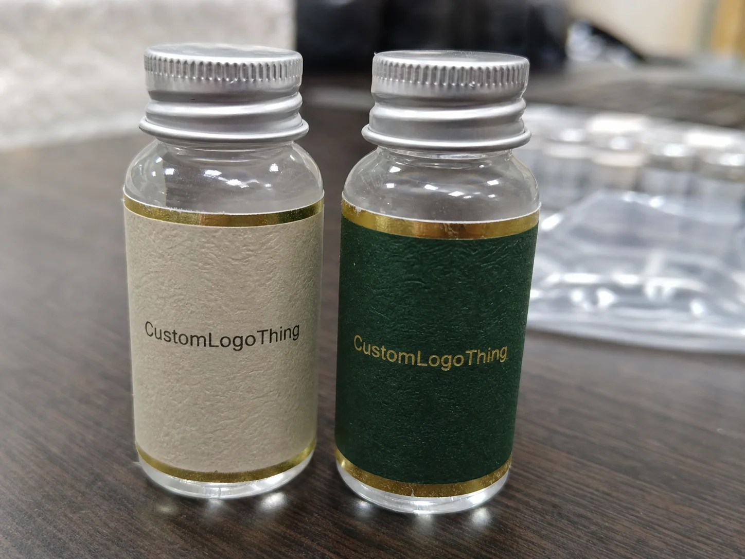
Custom mini bottle labels are not just scaled-down versions of standard labels. They are built around tight wrap areas, short runs, and containers that may taper, curve, or narrow at the shoulder. That includes sample sets, travel products, discovery kits, tinctures, oils, fragrance vials, and promotional bottles where the label still needs to feel like part of a real retail system.
Typical applications include:
- Skincare and cosmetic samples
- Tinctures, oils, and wellness drops
- Perfume and fragrance vials
- Travel-size beverages or mixers
- Gift sets and discovery kits
The most common mistake is treating bottle capacity as a design spec. It is not. Two bottles labeled “10 ml” can have different body diameters, shoulder shapes, and usable label zones. One may tolerate a 1.5-inch-wide label; another will wrinkle before it reaches that width. Measuring the actual wrap area is the only reliable starting point.
On a curved container, the bottle shape decides more than the artwork does. If the surface is tapered, frosted, damp, or oily, the label has to be built for that condition.
For broader line coordination, matching the bottle label to the rest of the package matters too. A sample vial wrapped in a premium label but shipped in a generic outer box looks unfinished. If the packaging system needs to stay consistent across sizes, keep the smaller bottle label aligned with the same visual rules used on your larger Custom Labels & Tags and Custom Packaging Products.
How the label process works from dieline to application
The process starts with measurement, not artwork. Measure the actual flat wrap width, the height available before the shoulder forces the label to curl, and the gap needed so the seam does not overlap. Nominal bottle size is a rough reference. It is not enough to produce a label that applies cleanly.
Once the dimensions are clear, the dieline becomes the working document. A standard template can work for a common bottle shape, but only if the measurements are exact. Otherwise, a custom dieline is safer. Good dielines mark bleed, safe zones, seam placement, and any no-print areas where curvature can distort the design. That is where most layout mistakes get caught before they become expensive.
Artwork placement matters more on a small curved surface than on a flat carton. Thin borders can look uneven after trimming. Text too close to a seam can appear off-center once the label is wrapped. Icons placed too near the shoulder can distort. Small-format packaging leaves very little room for correction, which is why prepress discipline matters more than visual flair.
Application method matters too. Hand application is normal for small runs, but the label must be forgiving of slight placement variation. If the bottle is narrow or the run is large, a format designed for easier alignment is usually the safer choice. A label that looks efficient on a spreadsheet can become slow and wasteful on a production table.
Typical workflow
- Measure the bottle and confirm the wrap area.
- Choose or create the dieline.
- Place artwork with bleed and safe margins.
- Review the digital proof for size, text, and placement.
- Approve a sample if the surface or adhesive is difficult.
- Print, cut, inspect, and pack for shipment.
That proof step is necessary, but it is not enough on its own. A digital proof confirms layout, not real-world behavior. It will not tell you whether a matte stock hides small text on a dark bottle, whether a clear label needs white ink underprint, or whether the adhesive holds on a chilled glass surface. For jobs that must withstand handling and transit, packaging standards such as those referenced by ISTA are useful for framing durability expectations, even when the label is only one part of the shipment.
Small-label production also benefits from a practical print check. Before full approval, inspect the file for bleed, barcode quiet zones if applicable, minimum font size, and any fine reverse text. On miniature formats, tiny type that looks acceptable on a monitor can disappear in print. If the design depends on precision, it needs to be tested at actual size, not estimated from a scaled preview.
Size, finish, and adhesive choices that change the result
Most small-label problems start with the wrong size assumption. Buyers often choose dimensions based on bottle capacity, then discover that the usable wrap area is narrower than expected. The result is a squeezed layout, tiny copy, or a label that has to be cut down after proofing. Measure the flat wrap width, the height before the shoulder, and the seam gap first. Then design.
Shape affects both look and application. Rectangles are efficient and usually lower in cost. Rounded corners are often smarter for hand application because they are less likely to lift. Custom die-cuts can look sharper on premium sets, but they add tooling complexity and can slow production. On a mini bottle, simple geometry often reads as more refined than an overworked shape.
Finish changes how the label performs under light and handling:
- Matte reduces glare and usually improves readability.
- Gloss boosts color saturation and makes graphics feel brighter.
- Soft-touch creates a premium feel, but it costs more and can show wear depending on handling.
- Clear can look elegant on glass, but only if the design has enough contrast, often with white ink underprint.
Adhesive choice is where presentation meets reality. If the bottle will be chilled, stored in a bathroom, or exposed to condensation, use a moisture-resistant face stock with a stronger adhesive. For dry shelf storage, standard permanent adhesive is often sufficient. On oily, textured, or irregular surfaces, test the adhesive before the full run. Adhesion failures usually start at the corners, then travel inward.
Material selection matters just as much. Paper stock is usually acceptable for dry applications and lower-cost sample runs. BOPP, whether white or clear, is the safer choice for moisture, scuffing, and handling. Polypropylene-based films hold up better when bottles are packed tightly or shipped frequently. If sustainability is part of the brief, ask for FSC-certified paper only when the storage conditions suit it; a recyclable claim does not rescue a label that fails in humidity.
| Option | Typical use | Price impact | Notes |
|---|---|---|---|
| Paper, matte finish | Dry sample bottles, low-cost sets | Lowest | Good readability, weaker moisture resistance |
| BOPP, gloss finish | Retail packaging, bright graphics | Moderate | Better scuff and moisture resistance |
| BOPP, clear stock | Glass bottles, premium product lines | Moderate to high | Needs strong contrast and careful print layout |
| Soft-touch specialty stock | Luxury kits and presentation sets | Highest | Strong tactile appeal, but not always practical for tiny formats |
For most buyers, the actual question is not which finish looks best in a mockup. It is which one still looks clean after shipping, temperature changes, and a few passes through human hands. That is the dividing line between attractive packaging and packaging that only worked in the approval file.
One more practical point: labels with small text need realistic type sizing. On mini bottles, very fine copy can become unreadable long before it becomes technically incorrect. If ingredient copy, compliance language, or a batch code must be included, the layout may need to be simplified. A label that reads clearly is usually better than one that tries to hold every word at once.
Cost, MOQ, and quote drivers for small-batch labels
Pricing for custom mini bottle labels depends on quantity, size, material, finish, shape complexity, and whether the order requires custom tooling. Artwork itself usually does not move the price much unless there are multiple versions, variable data, or extra proofing steps.
Small runs usually cost more per label than repeat orders. That is normal. Setup, cutting, proofing, and any tooling costs get spread across fewer pieces, so unit price rises. A common range for small custom jobs can land around $0.18-$0.45 per unit for a 5,000-piece order depending on size, stock, and finishing, with specialty materials or custom shapes moving higher. Very short runs can exceed that range quickly. The smaller the label and the more complex the finish, the more the setup cost matters.
MOQ expectations vary by supplier and print method. Digital label runs usually support lower minimums, while conventional press runs get cheaper as quantity increases. If a supplier advertises low minimums, ask what tradeoffs come with that price: stock limits, fewer finish options, slower turnaround, or higher per-piece cost. A low MOQ is useful only if the finished labels are still suitable for the bottle.
Compare quotes using the full landed cost, not the printed unit price alone. Setup charges, dies, plates, proof fees, shipping, and rush fees can change the real total. A quote at $0.22 each can be more expensive than one at $0.27 if the first one adds higher freight or extra prep. The cheapest line item is not always the cheapest order.
To compare quotes cleanly, separate the numbers:
- Unit cost covers the printed label price.
- Setup cost covers proofing, die cutting, and press prep.
- Shipping can matter more than expected on small orders.
- Rush fees often reduce stock and finishing flexibility.
If the labels are part of a product launch, it can make sense to coordinate them with matching inserts or custom printed boxes so the package line feels planned end to end. Otherwise the bottle label can be finished while the rest of the presentation still feels provisional.
Production steps and turnaround: what happens after approval
After approval, the order moves through prepress checks, printing, cutting, finishing, inspection, and packing. That sequence sounds tidy. In practice, one missing measurement or unclear file can send the job back into proofing and add days. The file stage is where most delays begin, not on the press.
Typical turnaround for custom labels is often around 7-15 business days after proof approval for standard orders, with rush service sometimes shortening that if the stock and finishing choices are limited. Custom dies, specialty films, metallic effects, and physical sample approval usually extend the schedule. That is not a problem to work around. It is a real constraint of production.
Before approving the job, ask for the exact production start date, ship date, and transit time. A three-day turnaround can mean three production days, not three days in your hand. If artwork revisions are still pending, the schedule moves again. Buyers who separate proof approval from shipping time usually avoid the most frustrating surprises.
After the print run, inspection matters more than many buyers assume. A basic quality-control pass should check trim accuracy, color consistency, adhesive behavior, and label count. On small labels, even a slight registration shift can make the logo look off-center. If the order includes barcodes, scan a few. If it includes clear stock or white ink, check coverage under the same lighting the product will see in use.
Think of the label as part of the delivery system, not a standalone item. If the bottle is part of a sample kit, the label should coordinate with the outer carton, mailer, and any insert so the customer sees one coherent package. When those pieces are unrelated, the product feels less considered, even if each individual component is well printed.
Common mistakes that ruin small labels before they ship
The biggest mistake is overfilling the label. Tiny formats do not tolerate crowded layouts. If a logo, product name, ingredients, legal copy, and decorative art are all competing for attention, the label stops reading as designed and starts reading as cramped. The fix is not squeezing harder. It is building hierarchy.
That usually means one dominant line, a secondary line that still reads at arm’s length, and enough white space to let the surface breathe. White space is not wasted area on a mini bottle. It is what keeps the label legible.
Surface conditions cause another category of failure. Frosted glass, curved plastic, condensation, refrigeration, and oily handling can all weaken performance. A label that holds on a dry sample bottle can fail after a few hours in a cooler. Test on the actual substrate before committing to full production, especially when the bottle will live in a bathroom, a refrigerated display, or a shipping environment with wide temperature swings.
Bleed and safe margins are non-negotiable. If artwork sits too close to the cut edge, trim variation becomes visible immediately. On a mini bottle, even a slight shift can ruin the edge alignment. That is why dieline accuracy and prepress review matter more than most buyers realize.
Another trap is approving color from a screen alone. A digital proof can confirm layout while hiding problems in contrast or saturation. This comes up often on clear stock, metallic surfaces, and light-colored art. For a small label, color should be checked at actual size and, if possible, on the intended bottle material. That is especially true when the design depends on subtle type or thin linework.
Application method also gets ignored until the order arrives. If the label is meant to be applied by hand, the format should be easy to place. If it is meant for roll-fed application, the roll direction, spacing, and core size need to fit the equipment. A well-printed label can still create waste if the format does not match the way it will be applied.
A tiny label is not a miniature billboard. It is a production part. If it cannot be applied cleanly, read quickly, and survive the bottle’s actual conditions, it is the wrong label.
Your ordering checklist before you request a sample
Before requesting a quote or sample, gather the basics. The more exact the information, the less time is lost correcting assumptions later.
- Bottle diameter and body height
- Actual wrap width and label height
- Surface type: glass, plastic, frosted, coated, or textured
- Storage conditions: dry, chilled, refrigerated, humid, or oily
- Copy length and legal requirements
- Finish preference: matte, gloss, clear, or soft-touch
- Quantity and reorder expectation
- Application method: hand, roll-fed, or sheeted
If the label has to survive moisture, refrigeration, or repeated handling, test a short run before scaling up. That matters more on launch products than on established lines, because the first shipment is where fit issues, adhesion failures, and contrast problems do the most damage.
Send editable artwork when possible. Be explicit about quantity, not approximate. “About 2,000” is not enough when the quote depends on cut counts, stock usage, and press setup. If there are multiple SKUs, list them clearly. Confused order notes create avoidable delays.
The cleanest order sequence is still the simplest one: measure the bottle, choose the stock, confirm the finish, check the dieline, request the quote, review the proof, and approve only when the real-world details match the design. That is how custom mini bottle labels end up looking like part of the brand instead of an afterthought applied at the last minute.
How do I choose the right size for custom mini bottle labels?
Measure the actual flat wrap area, not the bottle name or nominal capacity. Leave room for curvature, seam placement, and a small gap so the label does not wrinkle, overlap, or lift at the edge.
What material works best for custom mini bottle labels in wet conditions?
Use a moisture-resistant face stock with a strong adhesive if the bottle will touch condensation, refrigeration, or bathroom humidity. Test matte and gloss finishes on the real surface because one may hide scuffs better while the other improves readability. Clear stock often needs white ink underprint to stay legible.
What affects the price of mini bottle labels the most?
Size, quantity, custom shape, finish, and adhesive type usually move the price more than the artwork itself. The first order often costs more per label because setup, cutting, and proofing are spread across fewer pieces. Special finishes and custom dies push the number up faster than simple graphics do.
How long does production usually take for custom mini bottle labels?
Turnaround depends on proof approval, material availability, and whether the order is standard or rush production. Standard jobs often run 7-15 business days after approval, but custom tooling, samples, or specialty materials can extend that. Production time and transit time are separate.
Can I apply custom mini bottle labels by hand?
Yes, many small labels are designed for hand application as long as the bottle shape is consistent and the label size is manageable. If the bottle is very small or the run is large, ask for a format that supports easier placement and fewer alignment errors.


