Custom printed cereal boxes do more than contain flakes, granola, or puffed grains. They carry the first sale, and often the second one too. A shopper may only spend a few seconds with a box, but those seconds decide whether the product feels established, affordable, premium, or forgettable. That is a lot of pressure for folded board and ink.
From a buyer’s standpoint, cereal packaging sits in a difficult middle ground. It has to look good in a retail aisle, survive stacking and shipping, and still leave room for the required nutrition, ingredient, and barcode information. If the graphics are polished but the board feels flimsy, the package looks cheap. If the structure is solid but the design is weak, the brand looks underdeveloped. Either way, the box loses before the product gets a chance.
A cereal carton is part sales tool, part protective shell, and part trust signal. It has to do all three jobs at once.
Why custom printed cereal boxes matter on shelf
Most cereal and dry-food brands do not get much space to explain themselves. The package has to communicate the brand story fast. That is why custom printed cereal boxes matter so much for private label lines, startup food brands, seasonal SKUs, and any product competing against established names in a crowded category.
A well-built carton can make a smaller brand look like it belongs next to national labels. The reverse is also true. Weak hierarchy, muddy color, or awkward proportions can make a good recipe feel untested. Shoppers usually see the logo, product name, flavor cue, and color blocking before they read the fine print. Those design decisions do most of the selling.
That pressure increases in busy environments. Grocery aisles are dense. Club stores are harsher because the packs sit farther apart and the boxes are often viewed in stacks. Online listings add another layer: the carton has to photograph cleanly, hold up in fulfillment, and still look right after being handled by a warehouse, carrier, and customer. Packaging that only works in a mockup is not packaging that works.
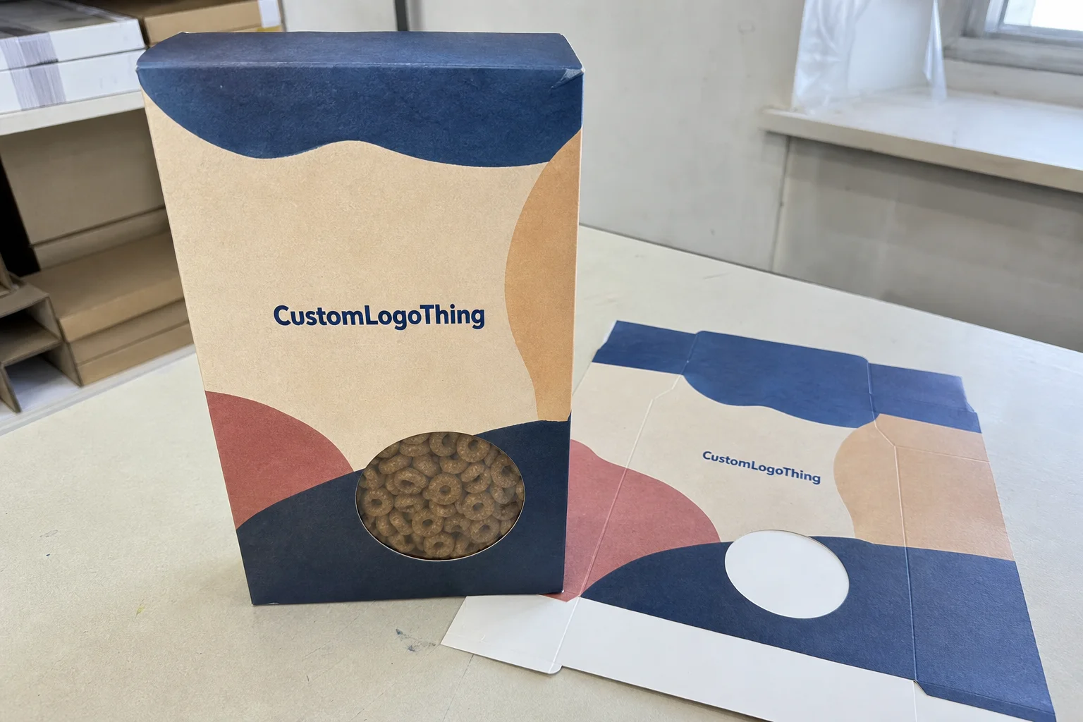
In practical terms, custom printed cereal boxes are folding cartons sized for dry goods such as cereal, granola, snack mixes, and similar products. Most wrap a primary bag or pouch, then present a more polished retail face. That outer box becomes the visible brand layer, and in many cases it is the only layer a buyer sees before deciding whether the product feels credible.
If a brand is building a broader packaging system, keeping the carton style aligned with other Custom Packaging Products can help the line look intentional across SKUs without forcing every item into the same structure.
How cereal box printing and production work
The process starts with a dieline. That flat template marks every fold, glue flap, trim edge, and safe zone. If the dieline is off, the whole job starts on unstable ground. Artwork is then built around that template with bleed and margin allowances in place. A cereal carton is not a poster. Treating it like one usually leads to misaligned copy, cut-off graphics, or barcode problems.
After layout, the supplier sends a digital proof. That proof checks artwork placement, panel sequence, and text accuracy. For new packaging, a physical sample or white sample is often worth the extra step. A screen proof can show the design, but it will not reveal whether the tuck closes properly, whether the pouch sits too loose inside the box, or whether the structure compresses under stacking.
Printing typically happens in one of two ways. Digital printing works well for shorter runs, faster revisions, and jobs that need to avoid plate costs. Offset printing usually becomes more economical at higher quantities because the setup cost is spread across more units. Offset also handles dense color areas well, but it is less forgiving when the artwork keeps changing late in the process. Frequent revisions are where schedules drift.
Common carton styles include straight tuck, reverse tuck, lock-bottom, and cartons with windows. Straight tuck is simple and efficient. Reverse tuck is often used for retail cartons because it fits standard filling workflows. Lock-bottom styles provide more strength for heavier contents. Window cutouts help shoppers see the product, but they need careful placement. A badly placed window can expose the wrong part of the package or weaken the panel more than expected.
Food packaging should also be reviewed for inks, coatings, and compliance. Many cereal cartons use food-safe inks on the printed surface, plus aqueous coating or lamination for scuff resistance. If the brand requires FSC-certified board, recycled content, or a specific sustainability claim, that should be built into the Quote and Spec sheet from the beginning. Rework after approval is expensive, and it usually costs more time than money.
Shipping durability matters too. A carton can look excellent in a flat proof and still fail once it is stacked, palletized, and moved through distribution. Testing standards such as ISTA are useful because they focus attention on real transit stress, not just shelf appearance. If the brand wants certified fiber sourcing, the FSC framework is one of the better-known references buyers recognize.
Specs that change price, appearance, and durability
Three variables move the budget the fastest: board stock, carton size, and print coverage. Everything else tends to sit on top of those. Larger boxes need more board. Heavier board costs more and may crease differently. Full-bleed designs use more ink and often require tighter print control. None of this is complicated, but it gets overlooked when buyers are comparing mockups instead of production specs.
SBS is often chosen for premium retail presentation because it prints cleanly and produces bright, sharp color. CCNB is a more cost-conscious option that still performs well for many dry-food cartons. Kraft-style board supports natural or rustic branding, but it changes the visual tone of the design. Colors tend to print more muted on kraft, which is not a defect. It is simply how the material behaves.
Finish changes the package’s feel and sometimes its perceived value. Matte gives a more restrained, modern look. Gloss increases contrast and makes colors pop. Aqueous coating is a common middle ground because it protects the print without pushing the budget too far. Soft-touch lamination can create a premium tactile effect, but it raises cost and is not always justified for lower-priced cereal.
Spot UV is another option, usually used to highlight a logo or flavor name. Used carefully, it can add a nice point of emphasis. Overused, it starts to look theatrical. The same is true for metallic inks and heavy special effects: they can help the box stand out, but they should support the product position rather than overwhelm it.
Window cutouts and inserts add another cost layer. A window can show the contents or a secondary pouch, but it requires die-cut precision and can weaken the panel if the structure is already busy. Inserts can stabilize the product or make a gift set feel more finished. Each add-on changes both lead time and price, which is why buyers should ask for those options to be priced separately rather than bundled into a vague quote.
| Option | Typical use | Relative cost | Best feature | Main tradeoff |
|---|---|---|---|---|
| SBS board | Premium retail cereal cartons | Higher | Crisp color and clean print | Costs more than economy boards |
| CCNB board | Value-focused dry goods | Moderate | Good cost-to-performance ratio | Less bright than SBS |
| Kraft-style board | Natural or rustic branding | Moderate to higher | Distinct material look | Print tends to look more muted |
| Matte aqueous finish | Everyday retail packaging | Moderate | Scuff resistance with a restrained look | Less shine on shelf |
| Soft-touch lamination | Premium launches | Higher | Distinct tactile feel | Often unnecessary for low-price cereal |
Pricing: what drives the quote
Unit price is mostly a volume story. Setup costs are real, and they are spread across fewer cartons in small runs. For standard custom printed cereal boxes with common dimensions and a typical retail structure, buyers often see ranges like $0.55 to $0.90 per unit at 1,000 pieces, $0.30 to $0.48 at 3,000 pieces, $0.22 to $0.35 at 5,000 pieces, and $0.14 to $0.24 at 10,000 pieces. Those numbers move with size, board type, finish, and print coverage, so they should be treated as market ranges, not fixed rates.
The biggest cost drivers are predictable:
- Quantity - higher volume lowers the unit price.
- Board thickness - heavier stock increases material cost and may require different tooling.
- Size - larger cartons use more board and more freight space.
- Color count - simple graphics cost less than dense full-process artwork.
- Finish - coating, lamination, and special effects add expense.
- Structure - windows, locks, and custom die cuts add setup time.
Quote surprises usually come from the same place: the buyer and the supplier were not pricing the same thing. Setup charges show up. Plate fees appear on offset jobs. Freight appears. Proofing may be included or separated out. None of that is unusual. The issue is comparison. A quote for 18pt SBS with aqueous coating is not equivalent to one for thinner CCNB with no coating, even if the numbers look close on paper.
A better method is to request tiered pricing at 1,000, 3,000, 5,000, and 10,000 units. That shows the breakpoints clearly. If the 5,000-piece price is much better than the 3,000-piece price, the inventory question becomes practical rather than speculative. If the price barely changes, holding more stock may not make sense for the launch stage.
There are ways to reduce cost without weakening the package. Standardize dimensions if the line allows it. Keep the finish to one coating instead of layering effects. Avoid unnecessary windows. Use fewer special inks. A cereal box can look premium through disciplined layout and clear hierarchy. It does not need every available embellishment to do its job.
Timeline: from artwork to delivered cartons
A realistic schedule begins with file review and dieline confirmation, then moves into proofing, revision, production, and freight. For a clean digital run with no structural changes, turnaround after proof approval can sometimes land around 7 to 12 business days. Offset projects are often closer to 12 to 18 business days, especially if the job includes new tooling, specialty finishes, or a more involved color review. Shipping time sits on top of that. Boxes do not arrive instantly, no matter how urgent the launch date feels.
Most delays come from a short list of problems. Missing dielines. Low-resolution artwork. A barcode placed near a fold. Legal copy that has to be reformatted after review. Late color changes. These are common production issues, which is why experienced buyers build time for revision instead of assuming the first proof will be final.
Special finishes can extend the schedule. Window cutouts need accurate tooling. Soft-touch lamination may add time. Custom sizing can require a new cutting form. If the boxes are going to a co-packer, fulfillment center, or warehouse, freight planning matters as much as the print schedule. The goal is simple: the cartons should arrive before fill day, not while pallets are still in transit.
For a product launch, the packaging timeline should be tied to the retail calendar, not the other way around. Seasonal resets, promotional drops, and distributor receiving windows all affect the useful delivery date. A buyer who builds in a little room for proof review and inbound inspection usually has fewer problems than one who plans to the exact day and hopes the logistics behave.
Ordering guide for first-time buyers
First-time packaging buyers usually save time by treating the order like a spec exercise instead of a design gamble. The cleaner the input, the fewer surprises downstream. If you are ordering custom printed cereal boxes for the first time, start with these five steps:
- Define the internal dimensions around the filled pouch or bag, not the empty package. Filled product changes shape more than most teams expect.
- Choose the structure based on shelf presentation, stacking strength, and how the cartons will be packed.
- Prepare artwork with bleed, safe zones, barcode placement, and room for nutrition and ingredient panels.
- Review the proof carefully for dimensions, color expectations, panel order, and legal copy before approving production.
- Confirm quantity and shipping destination so the cartons arrive where the filler, warehouse, or 3PL actually needs them.
If the cereal packaging is part of a wider line, compare the carton against other Custom Packaging Products so the board weight, finish, and print style stay consistent across the range. The goal is not identical packaging. The goal is a coherent brand system.
One practical habit helps avoid avoidable mistakes: ask the supplier to restate the final spec in writing before production begins. That should include dimensions, board type, print process, coating, carton count, and ship-to address. If one piece is missing, fix it before the press starts. Packaging errors are cheaper to prevent than to reprint.
Mistakes that make cereal packaging look cheap
Several design mistakes show up again and again. Tiny type is one. Overcrowded front panels are another. If shoppers have to squint to find the product name or flavor, the carton is already losing attention. Retail packaging needs clear hierarchy. Brand name first. Product type second. Flavor cue third. Supporting claims after that.
Size mismatch causes another set of problems. If the pouch inside is too small, the carton looks hollow and weak on shelf. If the pouch is too large, the box bows or crushes at the corners. That affects stacking, photography, and transit performance. Good packaging design accounts for the filled product, not just the outer dimensions.
Barcode placement and legal panels are easy to get wrong. A barcode near a fold can scan poorly. Reflective finishes can make scanning harder if the code is not positioned carefully. Nutrition and ingredient panels need enough breathing room to remain readable and compliant. When those panels get squeezed to preserve a front-panel design, production and compliance both become more difficult than necessary.
Color drift is another common issue. A screen proof can look bright and balanced, then the printed carton comes back slightly darker or flatter because the substrate and coating behave differently. That is normal within limits. What is not normal is approving artwork without understanding that print reality will differ from a laptop display. Good packaging teams plan for that gap.
The last mistake is the most expensive one: choosing the lowest unit price without checking the board quality, fold integrity, or print consistency. Cheap packaging is rarely a bargain once the product has to sit on shelf, survive shipping, and represent the brand for months. Lower cost is useful. Lower quality disguised as savings is not.
Practical tips before requesting samples
If the cereal line may expand later, it is usually smarter to build one master carton size and use variant artwork rather than creating a different structure for every flavor. That keeps tooling simpler and makes production planning easier. It also reduces the risk of mismatched packaging across the line once the catalog grows.
Before requesting samples, decide what you are trying to test. Structure? Color accuracy? Shelf presence? Shipping durability? A white sample is useful for structure. A printed sample is better for design review. A sample should answer a specific question. If it does not, it is just a nice object that consumes time and budget.
Quotes only become meaningful when they are compared on the same terms. Same dimensions. Same board. Same coating. Same print method. Same quantity. If one quote uses 18pt SBS and another uses a thinner economy board, the numbers are not competing directly. They are describing different products.
For brands planning around custom printed cereal boxes, the most useful next step is simple and unglamorous: gather the dimensions, target quantity, artwork files, required certifications, and delivery deadline, then request a matched quote and a proof. That is the cleanest way to avoid speculation and get a packaging decision grounded in production reality.
FAQs
What is the best material for custom printed cereal boxes?
SBS is often selected for sharp print and a premium retail look. CCNB is a practical option for value-focused cereal cartons. The right choice depends on the brand position, finish, and how much visual brightness the design needs on shelf.
How much do custom printed cereal boxes usually cost per unit?
Pricing depends on quantity, box size, board choice, finish, and print coverage. Small runs cost more per unit because setup is spread across fewer cartons. Tiered pricing is the best way to see where the real breakpoints sit.
How long does production usually take?
Digital printing is usually faster than offset. Artwork approval, proofing, revisions, finishing, and freight all affect the schedule. Custom sizes or special coatings can add time, so a launch schedule should include a buffer.
Do I need a dieline before ordering cereal cartons?
Yes. The dieline defines folds, glue areas, trim, and print placement. It helps prevent barcode problems, incorrect bleed, and panel alignment errors. Suppliers often provide the template, but the artwork should always be built to that exact file.
What should I check on a proof before approving production?
Check dimensions, artwork placement, barcode readability, legal copy, finish choice, and panel spacing. Confirm the carton count, packing method, and shipping details too. A careful proof review prevents most production errors.

