Why custom safety stickers matter on busy floors
A forklift reverses out of a lane, a pallet cart cuts across a staging area, and somebody pauses because the warning on the door has faded into the background. That small hesitation is exactly where Custom Safety Stickers earn their place: they replace a vague reminder with a clear instruction right where the decision happens.
These labels are designed for the surfaces and the pace of the work around them. In warehouses, packaging rooms, maintenance bays, and shipping areas, the best sticker is rarely the most elaborate one. It is the one that matches the viewing distance, the lighting, and the way people move through the space. “Wear eye protection,” “Keep clear,” or “Do not stack here” usually works better than a dense panel of text because the message can be absorbed in a glance.
For buyers, the practical value is consistency. Once safety labels are standardized across doors, bins, machines, dock zones, and handling areas, workers do not have to relearn the visual language every time they change location. That matters in product packaging operations as much as it does on production floors. Clear labels reduce hesitation, and hesitation is where mistakes start to multiply.
“The strongest safety label is the one people recognize instantly and never have to decode.”
There is also a discipline issue here. A facility that already cares about organized packaging design and clear signage can use safety labeling to reinforce that order rather than interrupt it. I’ve seen plants keep the same color logic and typography across retail packaging prep, raw material storage, and freight handling, which gives the whole operation a cleaner, more intentional feel.
How custom safety stickers work in real environments
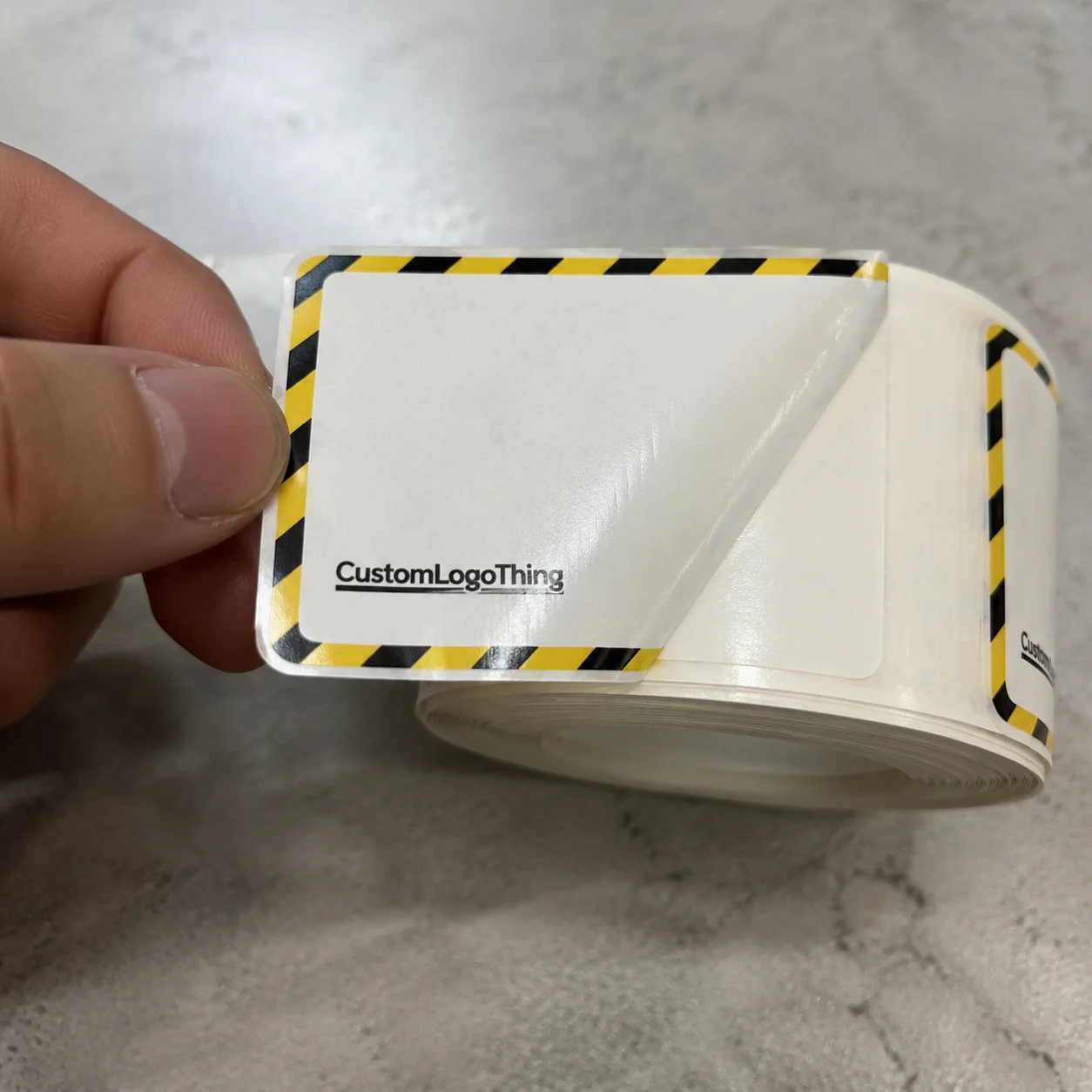
The best safety labels combine color, symbol, icon, and very short copy. Red usually signals prohibition or immediate danger, yellow points to caution, and blue is often used for mandatory actions. That visual language helps workers process the message faster than text alone, especially when they are moving, carrying cartons, or working in noisy areas. Good layouts follow a simple hierarchy: icon first, directive second, detail only if it earns its space.
Material choice matters more than many buyers expect. A sticker that performs well on smooth metal may fail on powder-coated equipment, textured plastic, or dusty corrugated surfaces. For temporary carton use, paper or economy film can be enough. For longer placement on painted steel, stainless equipment, or warehouse doors, polyester or polypropylene face stock usually holds up better. On rough or curved surfaces, the adhesive has to do more of the work, and edge lift shows up quickly if the build is too light.
Adhesive selection is one of the biggest determinants of success. Permanent adhesives fit long-term placement and tamper resistance. Removable adhesives make more sense for temporary notices, seasonal changes, or labels that may need to come off cleanly later. High-tack options help on low-energy plastics and slightly irregular surfaces, but they are not magic. If the surface is oily, dusty, or cold, even a strong adhesive can struggle to bond properly.
Durability depends on what the sticker will face. A label exposed to abrasion, cleaning chemicals, moisture, UV light, or repeated hand contact needs a tougher construction than one that sits quietly on a dry indoor door. For harsher use, buyers often look at laminate overprints, synthetic face stocks, and adhesives rated for a wider temperature range. If the label must survive wipe-downs with common cleaners or daily handling near package flow lines, that should be part of the spec from the start.
Size and placement matter as well. A sticker meant to be read from a walking distance should be larger, with fewer words and stronger contrast. A label used at close inspection can carry a little more detail, but it still needs clean spacing. In practice, the most effective custom safety stickers are the ones that respect eye travel: the user sees the icon, absorbs the action, and moves on without hunting for meaning.
For operations that also manage branded packaging or Custom Packaging Products, the same logic applies. If the packaging line already relies on consistent colors, forms, and placement, safety labels should follow that system so the floor feels organized instead of pieced together.
Key specs that affect cost, pricing, and durability
Pricing for custom safety labels usually comes down to size, quantity, material, print complexity, finish, and adhesive requirements. A small two-color label on a standard film is naturally cheaper than a large laminated piece with full-color printing and a high-performance adhesive. For common production runs, buyers may see pricing around $0.10 to $0.35 per unit, depending on quantity and build. More specialized constructions can sit higher, especially when the adhesive or face stock is doing something unusual. Those numbers are realistic starting points, not fixed quotes.
Minimum order quantity matters because setup cost gets distributed differently across 500 pieces than across 5,000. A longer run usually lowers the unit price, but only when the spec is stable enough to justify the inventory. If one facility uses the same warning format across multiple zones, standardizing a few sizes can reduce production friction and simplify reorders. That is usually better than creating a new layout for every location.
Here’s a simple way to think about the tradeoff between economy and premium construction:
| Option | Best For | Typical Features | Relative Cost |
|---|---|---|---|
| Economy paper or light film | Short-term notices, carton labels, low-abuse areas | Basic adhesive, simple print, limited moisture resistance | Low |
| Standard synthetic film | General warehouse use, doors, bins, indoor equipment | Better moisture resistance, cleaner edge stability, better abrasion tolerance | Moderate |
| Premium polyester with laminate | Long-life machine labeling, chemical exposure, frequent handling | High durability, stronger print protection, better wear resistance | Higher |
| Specialty adhesive build | Cold rooms, textured surfaces, low-energy plastics, harsh environments | High-tack or specialty bonding, application-specific performance | Highest |
Artwork quality can also move the budget. If files are not print-ready, expect extra time for vector cleanup, color correction, or layout adjustments. The same is true for compliance language. If the message is unclear, incomplete, or inconsistent with internal policy, proofing can stretch longer than planned. Buyers get better pricing and fewer delays when they come in with size, quantity, intended surface, and exact message hierarchy already sorted.
One practical rule helps avoid overspending: do not spec a sticker up just because it sounds safer. A low-abuse indoor label does not need the same build as a tag on a washdown machine. Match durability to the actual environment and the numbers usually make more sense. That is the same reasoning used in Custom Labels & Tags for regulated operations, where fit-for-purpose construction matters more than the most expensive option on the sheet.
Process and lead time: from proof to production
A normal order follows a predictable chain: spec review, artwork setup, proof approval, printing, finishing, packing, and shipment. If any one of those steps stalls, the schedule moves. The fastest jobs are usually the ones with clean artwork, clear dimensions, and a buyer who can approve proofs without long back-and-forth.
Typical timelines vary by build, but simple orders often take around 12 to 15 business days after proof approval, while more complex labels with specialty finishes or adhesives can take longer. Rush orders are possible, but they usually narrow the range of available construction choices. A basic die-cut label with standard material will move faster than a laminated, high-durability format with multiple versions or variable data.
The information that speeds things up is straightforward: size, quantity, substrate, adhesive, application surface, and the exact message hierarchy. If the label needs to work on painted steel, powder-coated metal, or textured plastic, say so early. If the final use involves moisture, cleaning chemicals, or outdoor exposure, that should be in the brief too. The more realistic the spec, the fewer surprises later.
Delays usually come from missing vector files, low-resolution logos, unclear wording, or waiting on internal approvals. Sometimes the issue is compliance language that needs sign-off from more than one team. Other times, the artwork is simply overloaded, with too much text and too many elements competing for attention. It is much easier to solve that during proofing than after the order is printed.
Samples can be a smart move before a full rollout. A small test run lets you check adhesion, glare, readability, and edge wear in the real application area. That matters when the label will live near conveyors, pallet staging, or cleaning stations where conditions differ from a desk-side mockup. For site-wide use, a sample can save money by catching the wrong adhesive or finish before it goes across every zone.
For buyers working on broader package branding or printed materials, that same discipline keeps the whole project moving. A clean proof cycle on a label order usually reflects the same level of clarity needed for Custom Printed Boxes and other facility-facing graphics, where the details matter more than the pitch.
Step-by-step guide to ordering the right sticker set
- Identify the message. Decide whether the sticker is a warning, instruction, restriction, or reminder. A good safety label should say one thing clearly.
- Map the environment. Note the surface type, temperature range, moisture exposure, cleaning cycle, and expected abrasion. A label on a dock door has different needs than one on a shrink-wrap station.
- Select the format. Choose size, shape, adhesive, and finish based on visibility and lifespan. Matte reduces glare, while gloss can help color pop in some lighting.
- Build the artwork. Use a clear icon, short directive, and supporting detail only if needed. Keep clutter out of the layout so the message reads quickly.
- Approve and test. Review the proof carefully, then test a small batch in the real location before scaling across the facility.
That sequence sounds simple, but it prevents a lot of common problems. A label that looks fine on a screen may fail under fluorescent glare or on a rough painted surface. Likewise, a message that reads well in a mockup may become too small once it is trimmed to its final size. Testing one or two locations before a full rollout keeps the order grounded in reality.
If the project is part of a broader update to retail packaging, warehouse signage, or shipping-room branding, keep the visual system consistent. The best plants and distribution centers do not make each sticker feel like a separate project. They standardize icons, type weight, and color rules so every label feels like it belongs to the same operating system.
Common mistakes that weaken safety messaging
The biggest mistake is trying to say too much. Tiny typography, dense paragraphs, and crowded layouts slow people down when they should be able to react instantly. Safety labels are not brochures. If the user has to stop and decode the message, the design has already lost some of its value.
Another common issue is choosing a material because it looks fine online, then discovering it performs badly in cold rooms, wet areas, or high-touch surfaces. Paper can be the right answer for some jobs, but it is the wrong answer for many industrial placements. The same is true of adhesives. A sticker that lifts at the corners or peels after cleaning sends the wrong signal about the seriousness of the warning.
Ignoring surface prep is another expensive habit. Dust, oil, release agents, and even residual moisture can weaken adhesion. Facilities sometimes assume the adhesive is defective when the real problem is the surface. A quick wipe-down and proper application pressure can make a real difference.
Inconsistent warning styles also confuse people. If one department uses red triangular warnings, another uses blue instruction labels, and a third uses plain text with no icons, recognition drops fast. Consistency builds trust. When workers learn the visual language, they stop hesitating and start responding automatically.
Skipping application testing creates false confidence. One sticker spec rarely fits every surface in a plant, especially when the site includes painted steel, cardboard, plastic bins, and textured equipment. A small test run is less glamorous than a full launch, but it is usually the smarter move.
Expert tips for cleaner specs and better results
Use a stronger visual hierarchy than you think you need. An icon should do the first job, the short directive should do the second, and any extra detail should appear only if it genuinely improves safety. That keeps the label fast to read and hard to ignore.
Keep language action-oriented. “Keep clear,” “Wear gloves,” “Do not stack,” and “Use hearing protection” work better than vague phrasing. Specific language also helps when labels are used around equipment, storage areas, or handling zones where a worker may only catch a glimpse while moving.
Finish choice affects visibility. Matte finishes reduce glare in bright indoor lighting or near windows, while gloss can make colors feel more vivid in controlled settings. Neither is automatically better. The right choice depends on the viewing angle, the light source, and whether the sticker will be inspected up close or from a distance.
Standardize a small family of sizes and templates where possible. That makes reorders easier, reduces proofing friction, and helps the whole floor look more organized. It also helps buyers managing both custom safety stickers and other printed assets, because a consistent template system lowers mistakes across the board.
Plan for replacement cycles instead of waiting for labels to fade into the background. Even a durable label can lose clarity if it gets scrubbed, scuffed, or exposed to sunlight over time. A simple inspection schedule keeps warnings readable and prevents signage from becoming invisible through neglect.
For materials and layout choices, it helps to think like a packaging buyer who also cares about compliance. Whether the label is paired with branded packaging, shipping signage, or facility graphics, the goal is the same: make the message obvious, durable, and easy to maintain. That is where Custom Labels & Tags can support the structure behind the message.
Next steps for a better custom sticker order
Start by auditing where safety messaging is missing, faded, inconsistent, or hard to see from a normal walking path. Walk the floor, not just the office. You will usually find a few obvious gaps near doors, machines, loading zones, and storage racks where the wrong label has been ignored for too long.
Then list each location with the surface type, exposure conditions, and desired lifespan. That makes quoting faster and makes comparisons meaningful. A sticker for a clean indoor panel is not the same as one for a washdown area or a low-energy plastic tote. If the quote request bundles those together, the pricing will be harder to judge.
Bring artwork, dimensions, and quantity targets to the conversation so the numbers are real. Ask for material and adhesive recommendations based on the actual environment instead of a generic “indoor/outdoor” answer. That one detail often separates a label that lasts from a label that peels too early.
If you are unsure about the build, test a small set first. Confirm readability, adhesion, and finish in the real location, then scale the approved spec across the site. That is the easiest way to keep custom safety stickers clear, durable, and useful without paying for upgrades you do not need.
For broader facility or product line updates, the same careful approach helps everything from safety labels to custom printed boxes. Clear specs, honest testing, and the right construction choices make the whole operation run cleaner.
What should I consider when choosing custom safety stickers for equipment?
Match the sticker to the surface material, cleaning routine, and temperature range. Choose an adhesive strong enough for the environment, but still appropriate if later removal may be needed. Prioritize legibility with clear icons, short wording, and a size that reads from the normal viewing distance.
How do custom safety stickers differ from standard warning labels?
Custom versions are built around your exact message, layout, and application surface. They can be sized and finished for specific durability, branding, or facility workflows. They usually perform better when you need consistent labeling across multiple locations or machines.
What affects the price of custom safety stickers the most?
Quantity, size, material, and print complexity are the biggest cost drivers. Special finishes, high-performance adhesives, and added durability features increase unit cost. Artwork preparation and proof changes can also affect total pricing if files are not ready.
How long does production usually take for custom safety stickers?
Timeline depends on proof approval, material availability, and the complexity of the build. Simple orders often move faster than jobs requiring specialty adhesives or custom finishing. Accurate specs and print-ready files help reduce delays before production starts.
What is the best way to make sure custom safety stickers stay readable?
Use high-contrast colors, concise language, and a layout that supports quick scanning. Choose durable materials for the actual wear conditions, including moisture, abrasion, and UV exposure. Test a sample in the real environment before committing to a full production run.
Well-chosen custom safety stickers do more than fill empty space on a machine, bin, or door. They reduce hesitation, support safer habits, and help a facility stay organized without adding clutter. Match the material, adhesive, and message to the real environment, and the labels will earn their keep every day.


