Buyer Fit Snapshot
| Best fit | Die Cut Sticker Design for Product Packaging projects where brand print, material claims, artwork control, MOQ, and repeat-order consistency need to be specified before quoting. |
|---|---|
| Quote inputs | Share finished size, material target, print colors, finish, packing count, annual reorder estimate, ship-to region, and any compliance wording. |
| Proofing check | Approve dieline scale, logo placement, barcode or warning zones, color tolerance, closure strength, and carton packing before bulk production. |
| Main risk | Vague material claims, crowded artwork, missing packing details, or unclear freight terms can make a low unit price expensive after revisions. |
Fast answer: Die Cut Sticker Design for Product Packaging should be specified like a repeatable production item. The safest quote records material, print method, finish, artwork proof, packing count, and reorder notes in one written spec.
Production checks before approval
Compare the actual filled-product size with the drawing, then confirm tolerance on folds, seals, hang holes, label areas, and retail display edges. Reserve space for logos, QR codes, warning copy, and material claims before decorative graphics fill the panel.
Quote comparison points
Review material grade, print process, finish, sampling route, tooling charges, carton quantity, and freight assumptions side by side. A quote is only useful when the supplier can repeat the same color, closure quality, and packing count on the next order.
Walking the line at a folding-carton plant in New Jersey, I watched a buyer pick up two nearly identical tea boxes, and the one that felt more expensive had a neatly finished die cut sticker design for product packaging sitting across the tuck flap like it had been built into the carton from day one. That tiny shape changed the entire first impression, and that kind of shift happens more often than people expect. A well-planned die cut sticker design for product packaging can make a carton feel intentional, a jar look premium, and a mailer look like it came from a brand that actually sweats the details. On that run, the stickers were printed on 3-inch by 2-inch BOPP with a matte laminate, and the buyer signed off within ten minutes because the package finally looked worth the $18.40 retail price instead of the $12.99 one. Honestly, I’ve seen brands spend thousands on a custom box structure and then completely sabotage the look with a flimsy, awkward sticker. Painful.
After enough years on press floors, in sample rooms, and in supplier meetings, one thing stands out clearly: a sticker is never just a sticker once it meets a real box, pouch, or bottle. The cut line, the material, the adhesive, and even the amount of white space around the logo all change how the package reads from three feet away and how it feels in hand. That’s why die cut sticker design for product packaging deserves the same planning as carton art or bottle labels, because in branded packaging, the small details do heavy lifting. I remember one run in Des Moines where a simple shape tweak saved the whole presentation; the client thought I was being fussy, then the samples came back from the converter in Minneapolis and suddenly everyone wanted to “go with the fussy version.” The final sticker cost $0.17 per unit at 5,000 pieces, and the team said it was the cheapest visible upgrade they had ever made. Funny how that works.
What Die Cut Sticker Design Means for Product Packaging
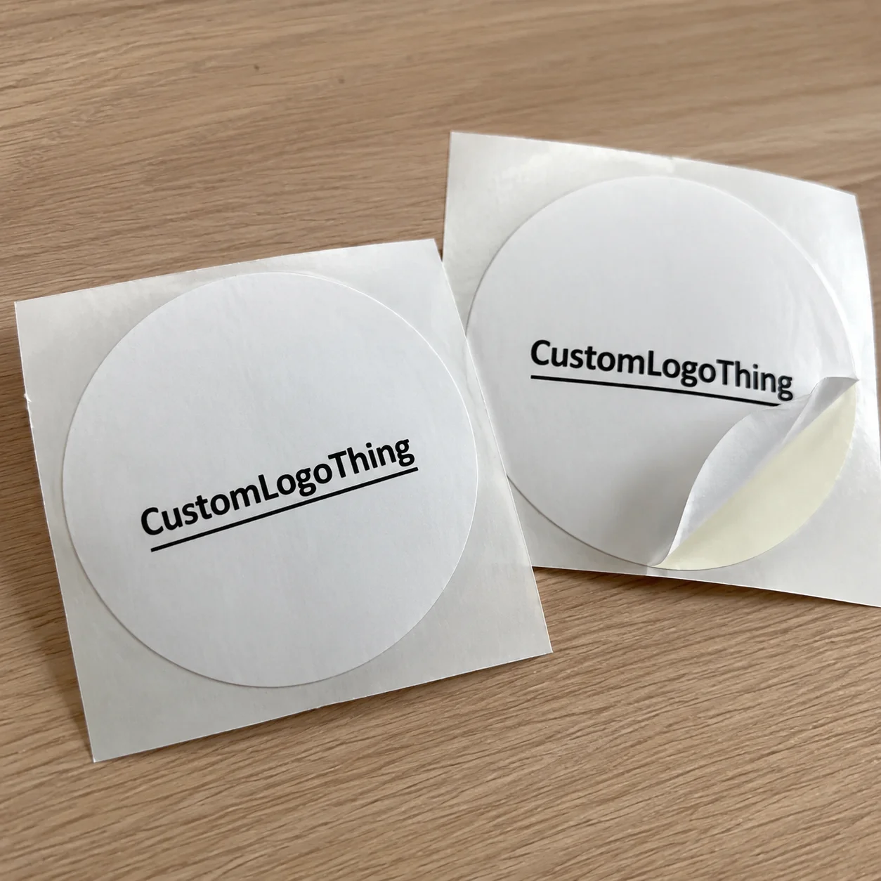
Die cut sticker design for product packaging means creating stickers that are cut precisely to the outline of the artwork rather than to a standard circle, square, or rectangle. The cut follows the image edge, so if your logo has a swoosh, shield, starburst, or bottle silhouette, the sticker can take that exact shape. That outline becomes part of the packaging story instead of sitting there as a plain finishing step, and on a 350gsm C1S artboard carton or a 60-micron BOPP film pouch, the difference is obvious the moment the package lands under warehouse lights.
In practical terms, brands use this approach on shipping cartons, retail packaging, pouch closures, jars, bottles, mailers, and insert cards because a custom shape feels more tailored. I’ve seen a plain kraft mailer go from forgettable to memorable just because the seal sticker matched the brand mark instead of looking like generic inventory. A clean die cut sticker design for product packaging gives the impression that somebody planned the unboxing moment instead of tossing a label on at the last minute. On a 500-piece test run in Portland, Oregon, one bakery used a 2.5-inch scalloped seal sticker to close tissue-wrapped cookie boxes, and customer photos started showing up on Instagram within 48 hours. Customers may not say, “Ah, excellent contour strategy,” but they absolutely feel the difference.
The terminology gets mixed up in a lot of client conversations. A die cut sticker is cut all the way through to the shape of the artwork and backing. A kiss cut sticker is cut through the face material but stays on a larger liner sheet, which can be handy for sticker sets or hand application. A contour cut usually refers to a precise cut path around artwork, often used in digital production, and it may be finished on sheets or rolls depending on the job. For die cut sticker design for product packaging, the right choice depends on how the sticker will be applied, packaged, and handled on the line, whether that line is a manual packing bench in Charlotte or a cartoning cell in Dallas running 40 packs per minute.
Shape carries more weight than many people expect. A scalloped edge can feel playful for confectionery, while a sharp geometric outline may suit electronics or skincare. Negative space matters too, because the empty area around a mark can make the cut line read as crisp rather than crowded. In other words, die cut sticker design for product packaging is as much about restraint as decoration. I know that sounds almost too simple, but I’ve sat through enough packaging reviews in Chicago and Edison, New Jersey, to know that “less visual chaos” is usually the thing that saves the job, especially when the panel space is only 2.25 inches wide.
“The cut is part of the branding. If the outline looks random, the whole package feels random.”
I heard that from a converter in Ohio while we were reviewing a roll-fed label job for specialty food cartons, and it stayed with me because it was dead accurate. The best die cut sticker design for product packaging treats the cut path like a design element, just like typography or color blocking, whether the job is being produced in a shop outside Atlanta or at a finishing plant in Ontario, California.
How Die Cut Sticker Design Works in the Production Process
The production path starts with artwork preparation, and this is where a lot of headaches are either prevented or created. For a strong die cut sticker design for product packaging, the file should be built in vector format, usually AI, EPS, or print-ready PDF, with the cut path placed on its own clearly labeled layer. Printers also need bleed, often 0.125 inch or 3 mm, especially if color extends to the edge of the shape. If the outline is fuzzy or the layers are mislabeled, the proofing cycle drags fast. I’ve watched perfectly good concepts get stuck in revision purgatory because somebody exported the file like it was a social media graphic. That kind of thing makes me want to politely stare at a wall for five minutes.
From there, the shop decides how the sticker will be cut. A steel rule die is common for higher volumes and repeat orders because once the tool is made, it can run quickly and consistently. A digital cutter is often better for shorter runs, highly complex outlines, or jobs that need a faster setup. Laser cutting can work for certain specialty films and intricate shapes, though it depends on the material and the finishing plan. For die cut sticker design for product packaging, the cut method should match quantity, shape complexity, and turnaround instead of forcing every job into the same process. On a 10,000-piece order, steel rule tooling may add a one-time $275 to $650 charge, while a short digital run in Austin can avoid tooling altogether and still ship in 12 to 15 business days from proof approval.
On the print side, rolls and sheets each have their own strengths. Rolls are usually better for automated or semi-automated application lines, while sheets are often easier for hand packing, inserts, and small retail runs. Printers will typically use adhesive stocks with laminate layers or varnish if the sticker needs protection against rubbing, moisture, or shipping wear. I’ve seen matte laminated stickers survive a rough mail-drop test that would have scuffed unprotected paper stock in seconds, and that kind of durability matters when die cut sticker design for product packaging has to travel through multiple warehouses, from a co-packer in Cleveland to a distribution center in Nashville.
Factory setup also affects consistency. If the sticker needs to land precisely across a carton seam, around a curved bottle neck, or over a pouch zipper, the registration has to be right on every pass. On one food co-packing line I visited outside Chicago, the operator showed me how a 1.5 mm drift on a seal sticker turned into a rejection pile by lunchtime because the logo started hanging off the edge of the flap. That’s the reality of die cut sticker design for product packaging: what looks simple on a screen still has to survive real machinery, real speeds, and real hands, whether the line is running 28 cases per minute or 120 cartons per hour.
Proofing is another place where expectations need to stay grounded. A digital proof shows layout, dimensions, cut shape, and copy placement, but it is not the same thing as a production proof or press-side sample. A press proof tells you how ink, stock, and finish behave on the actual material. If your die cut sticker design for product packaging will be used on a textured kraft box or a chilled bottle, I always recommend asking for a real sample or test strike, because the surface changes everything. In a Seattle beverage plant, a chilled bottle label looked fine on PDF but failed after six hours in a 38°F cooler until the team switched from standard acrylic to a permanent freezer-grade adhesive.
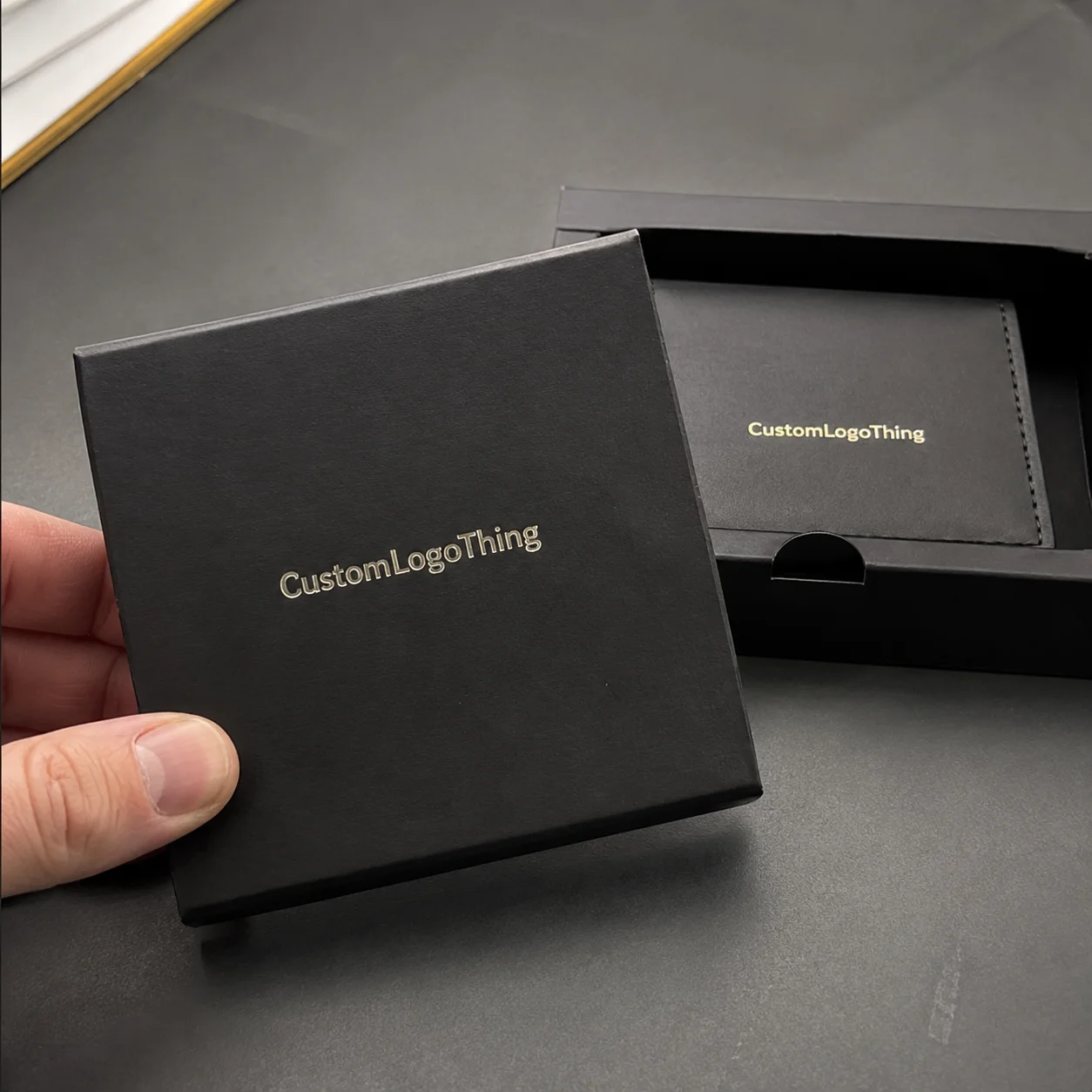
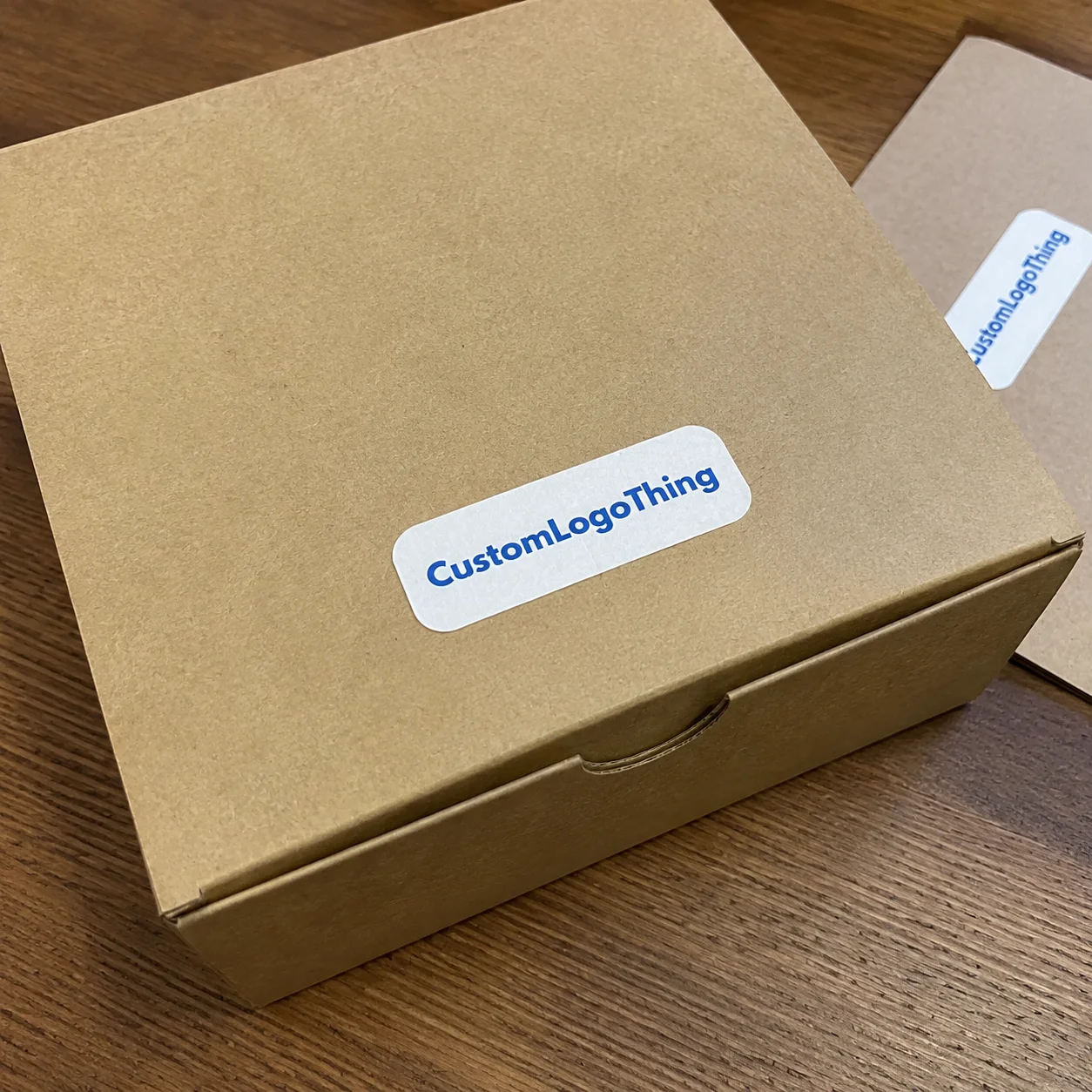
For teams coordinating packaging across multiple components, it helps to think of the sticker as one piece of a broader system. A custom label should sit comfortably beside Custom Packaging Products and other components such as carton inserts, tissue, or tape, while brands that need size and application flexibility often pair stickers with Custom Labels & Tags. That kind of alignment makes the whole package feel planned rather than patched together, especially when the outer carton is printed in Bentonville and the final assembly happens in a 25,000-square-foot facility in Tempe.
Key Design Factors That Shape Cost, Durability, and Shelf Appeal
Shape complexity is one of the biggest cost drivers in die cut sticker design for product packaging. A simple oval or rounded rectangle is quick to cut and easier to weed, stack, and apply. A shape with tiny cut points, internal cutouts, or narrow bridges takes more setup time and can create waste if the cutter or die starts drifting. I’ve watched a clever brand mark turn into a production problem because the outside outline had six sharp points less than 1 mm wide, and those points lifted during handling before they ever reached the carton. Beautiful? Sure. Friendly to a production line? Not even close. On a 1,000-piece order, that kind of design can add 15 to 20 minutes of extra hand finishing, which buyers feel in the quote.
Material choice is just as important. Paper stickers can be a smart fit for dry, low-wear applications and cost-sensitive packaging. BOPP, also called biaxially oriented polypropylene, is a strong option for moisture resistance, while vinyl is often used for tougher handling or longer-lasting use. Specialty films can add clarity or texture, but they bring their own production quirks. In die cut sticker design for product packaging, the material should be chosen for the product environment first and the visual effect second. A 54lb paper stock might be perfectly fine for a bakery box in Kansas City, while a 2.6 mil white BOPP is a much better choice for a refrigerated skincare jar shipped through Phoenix in July.
| Material | Best Use | Typical Strength | General Price Impact |
|---|---|---|---|
| Paper | Dry cartons, inserts, low-wear retail packaging | Good print clarity, lower cost | Lowest |
| BOPP | Jars, bottles, chilled items, moisture-prone packaging | Water resistance, flexible performance | Moderate |
| Vinyl | Rough handling, durable brand marks, long use cycles | Tough surface, strong wear resistance | Moderate to higher |
| Specialty film | Premium branded packaging, transparent or textured effects | Distinct appearance, custom feel | Higher |
Adhesive selection can make or break a run. A carton with smooth coated board behaves differently from a recycled kraft surface with dust and fiber lift. A chilled bottle may need a more aggressive adhesive because condensation changes how the sticker grabs the surface. For die cut sticker design for product packaging, I always ask what the package touches: flat board, glass, plastic, corrugate, powder-coated metal, or something oily like a cosmetic jar. If the adhesive is wrong, the prettiest shape in the world won’t save it. A standard permanent adhesive may be fine on a coated folding carton, but a freezer-grade adhesive with an initial tack of 30 ounces per inch can be the difference between a label that stays put in Minneapolis and one that curls after a two-day cold-chain shipment.
Finish choices also affect shelf appeal and readability. Matte finishes reduce glare and can make typography feel softer and more upscale. Gloss gives stronger color pop, which can be helpful in crowded retail environments. Soft-touch can create a tactile premium feel, though it may not be the best fit for every product line because fingerprints and handling marks can still show. Clear stickers can look elegant on glass or minimalist packaging, but they need careful contrast planning so the design doesn’t disappear under store lighting. These finish choices are part of die cut sticker design for product packaging, not an afterthought, and they often influence whether a buyer in Los Angeles asks for a second sample or approves the run on the spot.
Pricing is usually built from quantity, size, shape complexity, finish, and production method. A run of 5,000 simple BOPP stickers might land around $0.18 to $0.28 per unit depending on size and setup, while a smaller run with specialty film, matte lamination, and a tricky outline may cost noticeably more per piece. A 5,000-piece order using a 2.75-inch contour cut on 60-micron white BOPP with matte laminate and permanent adhesive might price near $0.15 to $0.19 per unit at a plant in Guangdong, while the same shape in a U.S. finishing shop in New Jersey could run closer to $0.22 to $0.31 per unit because of labor and domestic finishing costs. Die tooling, if used, can add a separate setup charge, and the number of colors or any spot effects can also shift the quote. That’s why two jobs that look similar at first can price very differently in die cut sticker design for product packaging.
If you’re comparing options for die cut sticker design for product packaging, ask the supplier to quote multiple quantities. The break between 1,000, 5,000, and 10,000 pieces can be significant because setup costs spread out faster at volume. In my experience, buyers often save more by adjusting the format from sheets to rolls or simplifying the outline than by chasing a tiny unit-price change alone. Honestly, I’ve seen people obsess over a penny a piece and then ignore a cut shape that adds headaches at every single station. That’s the sort of math that makes plant managers mutter into their coffee, especially when the line is already backed up with a 6 a.m. pallet drop in St. Louis.
Step-by-Step: Designing a Die Cut Sticker for Product Packaging
Start with the job the sticker needs to do. Is it sealing a carton flap, promoting a limited edition, identifying a flavor, or serving as a tamper indicator? The answer changes the entire die cut sticker design for product packaging approach. A seal sticker may need a strong center area and a shape that bridges two surfaces cleanly, while a decorative front-panel sticker can afford more visual flourish. On a coffee subscription box in Raleigh, a 3-inch wide tamper seal did both jobs at once, and the brand cut its packaging components from four SKUs down to two.
Next, choose the shape based on the package surface and brand personality. If the artwork is already bold and well-known, a simple outline often works better because it keeps the logo legible from a distance. If the brand mark has a distinctive silhouette, it can be smart to build the cut path around that exact form. The key is to make sure the shape supports the product packaging instead of fighting it. I’ve seen elegant packaging ruined by a sticker that was too busy for the carton panel it lived on, and I’ve seen plain boxes look polished because the shape was calm and deliberate, especially on 4-inch by 6-inch mailers where every millimeter counts.
Then build the cut line with safe margins around type and fine details. In most factories, I like to keep critical text at least 1.5 to 2.5 mm inside the cut edge, and even more if the sticker will be hand-applied on an uncalibrated line. That margin gives the cutter room to work and reduces the chance of clipped letters or fragile corners. For die cut sticker design for product packaging, the safest designs are the ones that respect the realities of cutting and application, including the 0.06-inch registration tolerance that many finishing crews in Vancouver or Indianapolis prefer for short-run jobs.
Artwork should be prepared in vector format with fonts outlined or embedded, color mode set correctly, and the contour layer clearly marked. If the sticker is printed on a roll, the repeat direction should be checked against the intended application method. If the application is by hand, the release liner and orientation may not matter as much, but if it’s automated, it matters a lot. Small setup details like that save time in production and prevent surprises once the order hits the converting floor. A supplier in Monterrey once told me that a clean AI file can shave a full business day off prep time, and on a 12-day schedule that is real money.
Material, adhesive, and finish come next. A paper stock with gloss varnish might be perfect for dry boxed goods, while a BOPP film with permanent adhesive may be better for chilled beverage labels. For a rougher shipping carton, you may need a stronger tack or a more forgiving adhesive system. The best die cut sticker design for product packaging is built around the actual environment, not just the mood board. If the carton is stored in a 45% humidity warehouse in Atlanta and handled by machine at a rate of 60 cartons per minute, the spec should reflect that reality, not just the brand palette.
Finally, review proofs carefully before approving production. I tell clients to compare the art file, the dieline, the dimensions, the quantities, and the intended application method side by side, then confirm whether the supplier is producing sheets, rolls, or individual stickers. If there’s a doubt, ask for a press proof or sample run. Clean approvals speed up the schedule, and for most die cut sticker design for product packaging projects, that can save several business days. A straightforward proof approval on Tuesday can mean finished goods leaving the shop by the following Thursday or Friday, typically 12 to 15 business days from proof approval if the material is in stock and no special tooling is needed.
- Define the purpose of the sticker on the package.
- Choose the outline that suits the brand and surface.
- Build the vector artwork with a separate cut contour.
- Select stock and adhesive for the real environment.
- Approve a proof or sample before full production.
Common Mistakes to Avoid in Die Cut Sticker Design for Product Packaging
One of the most common mistakes in die cut sticker design for product packaging is placing important text too close to the edge. On a screen, that margin may look fine. On press, with cutter drift and material movement, the same text can look cramped or partially trimmed. Even a half-millimeter of bad placement can make a premium sticker feel sloppy, and on a 1.25-inch seal sticker that half-millimeter is enough to clip a tagline or a trademark symbol.
Another problem is designing a shape that looks beautiful in a digital mockup but behaves badly on the factory floor. Tiny interior points, thin bridges, and microscopic cutouts are notorious for causing waste, lift, or slow application. I remember a cosmetics client in Irvine who wanted a snowflake-shaped seal for holiday boxes. The first version had so many delicate tips that the line operator couldn’t peel them without damaging the edges, so we had to simplify the outline before the run could survive normal handling. That’s a classic die cut sticker design for product packaging lesson: elegant on screen does not always mean practical in production. Sometimes the pretty version is the one that causes everybody to swear quietly under their breath.
Adhesive mistakes are just as damaging. A sticker that works on smooth PET bottle plastic may fail on recycled corrugated board or a dusty kraft carton. Cold-chain products add another layer of complexity because moisture can weaken initial tack. If the package is shipped, chilled, frozen, or exposed to oils, the adhesive has to be specified accordingly. For die cut sticker design for product packaging, the surface and the environment matter as much as the artwork. A label that survives a 72-hour dry warehouse hold in Atlanta may peel within six hours in a 34°F cooler in Milwaukee if the adhesive grade is wrong.
Color and contrast mistakes show up quickly on retail shelves. Small stickers on kraft packaging can disappear if the ink colors are too close to the board tone. Dark cartons can swallow fine typography if contrast is low. If you want the label to read from several feet away under harsh store lighting, test the contrast on actual substrate swatches. That advice sounds simple, but I’ve seen more reprints caused by poor contrast than by any other visual issue in die cut sticker design for product packaging. A black logo on a warm brown carton may look refined in the studio and invisible on a fluorescent shelf in Denver.
Skipping sample tests is the last big error. Mockups are useful, but they don’t tell you how the sticker behaves on the real package surface, under real warehouse conditions, or in a shipping lane that might follow ISTA handling standards. If the job matters, test one piece, then test ten, then decide. You can also review broader packaging guidance from the International Safe Transit Association if your packaging is going through distribution testing. A little testing up front can save an expensive reprint later, and in some cases it can prevent a $900 rush fee when a launch date in Boston is only four days away.
Expert Tips for Better Branding, Faster Approvals, and Cleaner Production
The smartest die cut sticker design for product packaging projects start with the substrate in mind. A sticker that looks good on a white monitor can behave very differently on a textured kraft box, a gloss carton, or a curved amber jar. I always encourage brands to tape a sample onto the actual package panel before approving the design. That one-minute test answers more questions than a dozen emails, especially if the package is a 16-ounce glass jar sourced from Ohio or a mailer folded from 32 ECT corrugate in Pennsylvania.
Ask for material swatches if the packaging will face refrigeration, condensation, rough shipping, or heavy-handling retail environments. I’ve seen customers fall in love with a matte paper option only to discover that a chilled beverage line needed a moisture-resistant film instead. Better to find that out with a small sample than after 20,000 pieces are already in transit. Good die cut sticker design for product packaging is as much about risk management as visual style, and a test pack of 25 pieces can save a launch in Seattle, San Diego, or Newark.
If you’re running high volumes, simplify. Straightforward outlines and clean geometry usually apply faster and waste less material. Reserve highly custom silhouettes for limited editions, seasonal promotions, or premium launches where the extra setup cost buys you meaningful brand impact. In busy co-packing environments, a simpler shape often improves line speed and reduces rejects, which matters more than people realize in retail packaging operations. A plant in Grand Rapids running 2,000 cartons per hour will always prefer a sticker that peels cleanly in under two seconds.
From a print-floor perspective, keep your vector paths clean, remove stray anchor points, and avoid hairline elements that may disappear in converting. Give logos enough quiet space so the sticker doesn’t feel crowded once it’s die cut. In one supplier negotiation I sat through in Shenzhen, the production manager kept circling a design that looked beautiful but had far too many tiny shapes for the cut method we were using. He was right, and the final adjusted version cost less, applied faster, and looked better on the box. That’s the kind of judgment that separates pretty artwork from usable die cut sticker design for product packaging, especially when the job is headed to a finishing line that uses 24-inch rolls and a 3-inch core.
It also helps to coordinate the sticker with the rest of the branded packaging system. If the carton uses heavy typography and a warm kraft finish, the sticker should echo that tone rather than compete with it. If the package includes custom printed boxes, tissue, or an insert card, the sticker can serve as a bridge between components, tying together package branding across every touchpoint. That kind of consistency makes the unboxing feel intentional instead of assembled from leftovers, and it matters whether the goods are being packed in a boutique studio in Brooklyn or a fulfillment center in Savannah.
For brands that want to keep the look cohesive, a sticker should also support the broader packaging design language. That may mean matching a logo shape, repeating a border treatment, or using the same accent color found on the box closure. I’ve seen a modest food brand raise shelf confidence simply by matching the sticker outline to the corner radius of the carton flap. Tiny detail, big effect. That’s the kind of practical elegance die cut sticker design for product packaging can deliver, and it often turns a $0.12 stock box into something that reads like a $6.00 premium set.
If sustainability is part of your brand story, look at FSC-certified paper options or recycled-content substrates where available. The Forest Stewardship Council explains certified forest management and chain-of-custody standards on fsc.org, and that can be useful if your team needs documentation for marketing claims. If you’re comparing packaging materials more broadly, the EPA recycling resources can help you understand disposal and recovery considerations. Those details matter because sustainability claims need to be accurate, not just attractive, whether the stickers are printed in Wisconsin on FSC paper or sourced from a converter in Taipei using recycled liner stock.
What to Do Next: Final Checks Before You Order
Before you place an order for die cut sticker design for product packaging, run through a quick preflight check. Confirm the sticker size, outline, bleed, adhesive type, finish, quantity, and intended surface. Make sure your color mode is correct, your fonts are outlined, and your cut contour is on its own layer. If the sticker will be applied by hand, confirm whether the operator needs sheets or singles; if it will run on equipment, confirm roll direction and core size. A 3-inch core on a 500-piece sheetless roll may work fine for one applicator, while a 1-inch core might jam a different line in under an hour.
Then test one sticker on the actual package. Not a render. Not a photo. The real carton, the real jar, the real mailer. A 30-second physical test can reveal issues with adhesion, spacing, or contrast that digital proofs never show. I’ve saved clients from expensive rework simply by asking them to stick one sample to the real board and leave it overnight. That’s a basic habit, but it’s a powerful one in die cut sticker design for product packaging. In one case, a label looked perfect at room temperature but lifted at the corners after 14 hours on a cold kraft tray shipped from Salt Lake City to Boise.
Compare quotes across quantities and finishes before you commit. Sometimes the price gap between 2,500 and 5,000 pieces is small enough that the larger run gives you a better unit cost and a little inventory cushion. Other times the premium finish is worth the extra spend because it strengthens shelf appeal enough to justify it. There isn’t one right answer, and anyone pretending there is probably hasn’t spent enough time on a converting floor. I’ll say it plainly: the cheapest quote is not always the cheapest job once you factor in rejects, rework, and the occasional panic call on a Thursday afternoon. A supplier quoting $0.15 per unit for 5,000 pieces on a simple matte BOPP seal may look pricier than a $0.11 paper quote, but if the paper version fails in humid storage, the “savings” disappear fast.
Gather these items before requesting a quote: vector artwork, dimensions, material preference, application surface, environmental conditions, and target quantity. If you already know the line speed or the packaging method, include that too. The more precise the brief, the faster a supplier can quote and proof the job. That’s especially true for die cut sticker design for product packaging, where the shape and substrate can alter everything from tooling to adhesive choice. A complete brief can cut back-and-forth by two or three email rounds, which often means the difference between a quote returning in one business day or one week.
My honest advice is simple: treat the sticker like a functional packaging component, not a decorative extra. The best die cut sticker design for product packaging supports brand identity, survives real-world handling, and makes the package feel more complete the moment a customer touches it. If you get the shape, material, adhesive, and finish right, the sticker does more than decorate; it helps sell the product. On a well-run line in New Jersey, that can be the difference between a package that gets noticed in 2 seconds and one that gets passed over in 0.5. So before you send the file, check the contour, test the stock, and make sure the adhesive matches the surface you’re actually using. That’s the move.
What is the difference between die cut sticker design and regular sticker design for product packaging?
Die cut stickers are trimmed to the exact outline of the artwork, while regular stickers are often simple circles, squares, or rectangles. For product packaging, that custom outline can make the brand feel more polished and deliberate. The cut line becomes part of the visual identity, so the shape and the artwork should be planned together. A 3-inch die cut seal on a folding carton in Philadelphia usually reads as more custom than a plain 3-inch square label, even when both use the same ink set and finish.
How do I choose the best material for die cut sticker design for product packaging?
Paper works well for dry, low-wear applications and budget-sensitive runs. BOPP or vinyl is usually better if the packaging faces moisture, condensation, or heavier handling. The package surface matters too, because coated cartons, kraft boxes, jars, and chilled products all need different adhesive performance. For example, a 2.6 mil white BOPP with permanent adhesive is often a better fit for a refrigerated bottle in Denver than a 60lb paper stock that may curl after 24 hours in cold storage.
How much does die cut sticker design for product packaging usually cost?
Pricing depends on quantity, size, shape complexity, material, finish, and whether the order is printed on sheets or rolls. Simple shapes and larger quantities usually reduce the unit cost. Specialty finishes, small details, and custom tooling can raise the price noticeably. A straightforward 5,000-piece run may price around $0.15 to $0.28 per unit depending on material and finishing, while a small 500-piece specialty run can easily cost $0.70 to $1.50 per unit because setup costs are spread across fewer pieces.
How long does the die cut sticker design and production process take?
Timeline depends on how ready the artwork is, how quickly proofs are approved, what material is available, and which cutting method is used. Digital-cut jobs can move faster for smaller or more complex runs, while traditional dies may take longer to set up. Clean vector files and quick approvals usually shorten the schedule. In many standard production schedules, finished stickers ship 12 to 15 business days from proof approval if stock is available in the factory, whether the run is happening in New Jersey, Shenzhen, or a finishing plant near Toronto.
What file format is best for submitting die cut sticker artwork?
Vector files such as AI, EPS, or print-ready PDF are best because they keep the artwork and cut path sharp at any size. The contour should be on its own clearly labeled layer. Include bleed, outline fonts, and any notes that help production match the intended die cut sticker design for product packaging. If possible, submit the final art at full size with a 0.125-inch bleed and a separate cut layer so the prepress team can build the proof without guesswork.