Buyer Fit Snapshot
| Best fit | Die Cut Sticker Design for Product Packaging projects where brand print, material claims, artwork control, MOQ, and repeat-order consistency need to be specified before quoting. |
|---|---|
| Quote inputs | Share finished size, material target, print colors, finish, packing count, annual reorder estimate, ship-to region, and any compliance wording. |
| Proofing check | Approve dieline scale, logo placement, barcode or warning zones, color tolerance, closure strength, and carton packing before bulk production. |
| Main risk | Vague material claims, crowded artwork, missing packing details, or unclear freight terms can make a low unit price expensive after revisions. |
Fast answer: Die Cut Sticker Design for Product Packaging: Material, Adhesive, Artwork, and MOQ should be specified like a repeatable production item. The safest quote records material, print method, finish, artwork proof, packing count, and reorder notes in one written spec.
Production checks before approval
Compare the actual filled-product size with the drawing, then confirm tolerance on folds, seals, hang holes, label areas, and retail display edges. Reserve space for logos, QR codes, warning copy, and material claims before decorative graphics fill the panel.
Quote comparison points
Review material grade, print process, finish, sampling route, tooling charges, carton quantity, and freight assumptions side by side. A quote is only useful when the supplier can repeat the same color, closure quality, and packing count on the next order.
On one factory visit in Shenzhen’s Bao’an District, I watched a $0.12 die cut sticker do something weirdly powerful: it made a plain amber jar look expensive enough that the brand later raised the retail price by $4. That’s not magic. That’s smart die cut sticker design for product packaging. I’ve seen it happen again and again in branded packaging, especially when the sticker shape, finish, and placement are doing the heavy lifting for package branding. The production run was 8,000 pieces, printed on matte BOPP, with proof approval to shipment taking 14 business days.
People think stickers are just stickers. They’re not. A well-built die cut sticker design for product packaging can make a candle, sauce jar, cosmetics tube, or mailer insert feel custom made instead of pulled from a bargain bin of generic labels. And yes, the difference shows up on shelf, in e-commerce unboxing, and in repeat purchase photos where customers actually post the box because it looks intentional. I’ve seen the same 2.5-inch contour-cut seal work on jars in Austin and soap boxes in Los Angeles because the shape matched the brand story, not just the dimensions.
If you’re building product packaging, this matters more than most founders admit. A square label can work. But a die cut sticker design for product packaging gives you shape flexibility, stronger visual recall, and a cleaner fit on awkward surfaces. I’m Sarah Chen, and after twelve years in custom printing, I can tell you the brands that get packaging design right usually understand one simple thing: the sticker is part of the product experience, not an afterthought. On a 5,000-piece order, the difference between a basic rectangle and a custom contour was only about $0.03 per unit, which is less than a bad coffee in Portland.
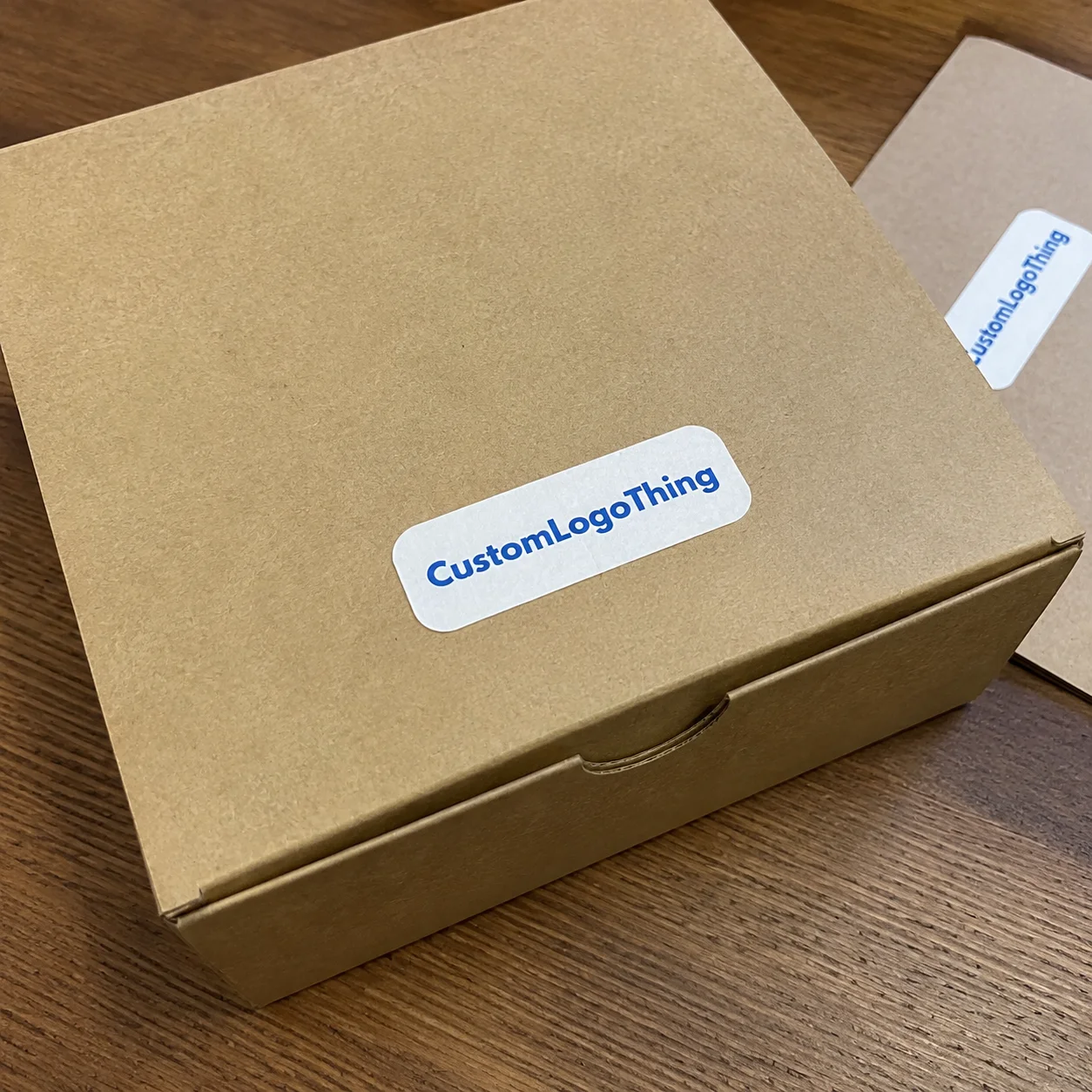
Die Cut Sticker Design for Product Packaging — What It Is and Why It Works
Here’s the plain-English version. A die cut sticker design for product packaging means the sticker is cut to the exact outline of the artwork or shape you want, instead of being forced into a square, rectangle, or basic circle. If your logo has a scalloped edge, a bottle silhouette, or a custom badge shape, the cut follows that form. The result feels deliberate. Not lazy. Most shops will quote contour-cut stickers in custom sizes from 1 inch to 6 inches, and the cutter tolerance is usually around 1-2 mm depending on the press.
I once stood by a finishing table in Dongguan where the client had ordered 3,000 plain rectangle stickers for a skincare line. Same artwork, same ink, same paper stock. We swapped the next sample to a die cut sticker design for product packaging with a contour around the logo and a soft-touch laminate. Shelf test at a trade show was ugly in the best way: the die cut version pulled attention first. The buyer said it looked “more expensive,” which is basically the packaging equivalent of applause. The sticker cost moved from $0.11 to $0.15 per unit, and the brand still accepted the quote because the packaging looked a lot more premium.
Why do brands use it? Three reasons. First, stronger shelf impact. Second, better brand recall. Third, a more premium feel that supports product packaging and retail packaging strategy. If your business sells candles, specialty food, cosmetics, or artisanal goods, a die cut sticker design for product packaging can help your label act like a tiny billboard with better manners. I’ve seen this work especially well in Seattle craft markets and in Singapore boutique retail where customers pick up products from 2 feet away and make decisions in under 10 seconds.
Standard stickers still have a place. They’re faster to print, easier to stack, and usually cheaper on small budgets. But a die cut sticker design for product packaging wins when shape matters, when the surface is visible from several angles, or when you want the label to match the brand identity instead of just covering a container. I’ve used them on glass jars, kraft mailer boxes, candle lids, cosmetic tubes, and promotional inserts tucked into Custom Printed Boxes. On flat cartons, a 3-inch contour seal can be applied by hand in about 4-6 seconds; on curved jars, it can take closer to 8-10 seconds if the adhesive is too aggressive.
In practice, the choice is simple:
- Standard stickers: best for straightforward information, simple shapes, and lower setup complexity.
- Die cut stickers: best for custom branding, unique outlines, and a more polished package branding look.
One client in Austin used a small 1.75-inch die cut seal on the flap of their subscription mailers. Cost was only $0.02 per unit more than a regular square sticker on a 4,000-piece order. The difference in photo sharing was obvious. That’s the sort of detail that quietly improves branded packaging without requiring a full redesign of the box. The mailers shipped from Houston to retailers in Texas and Arizona in 3 business days, and the sticker held through transit and unboxing just fine.
For brands comparing sticker vs label options, the real question is not “Which is cheaper?” It’s “Which one fits the story?” A die cut sticker design for product packaging tells a story faster than a plain shape. That’s why it shows up so often in premium product launches and small-batch runs where every visual cue matters. If your jar is 3 inches wide and your logo needs room to breathe, a contour cut gives you a cleaner visual result than forcing everything into a square box like you’re packing leftovers.
How Die Cut Sticker Design for Product Packaging Works
The process starts with artwork, but the artwork is only half the job. A proper die cut sticker design for product packaging needs a printable area, a contour path, and enough bleed so the cutter doesn’t leave a sad white edge where your color should be. I’ve reviewed hundreds of files from founders who sent a logo in PNG and hoped for the best. Cute. Not helpful. A clean setup usually includes 0.125 inch bleed and a safe zone of at least 0.08-0.12 inch around key text.
Production usually follows a clean sequence: design, cut line creation, proofing, cutting, and finishing. In a digital workflow, the printer reads the cut file and trims the sticker with a laser or digital blade. In a traditional workflow, a steel rule die is made for the shape. That die costs more upfront, often $80-$180 for a simple contour and more for intricate shapes, but on larger quantities it can make sense. For a die cut sticker design for product packaging, both methods are common, and the right one depends on quantity, shape complexity, and deadline. A 10,000-piece order from a supplier in Guangzhou may use a physical die, while a 300-piece pilot in Toronto often stays digital.
The printed artwork area is the part customers see. The cut line is the invisible path the machine follows. If the cut line is too tight, you risk shaving off type or graphics. If the bleed is too small, the finished edge can expose paper or white underlayer. For a die cut sticker design for product packaging, I usually tell clients to think in terms of three zones: safe area, bleed, and cut path. Skip one, and the printer starts muttering. On a 2-inch sticker, losing even 1 mm on all sides can wreck the composition.
At a supplier meeting in Dongguan, I once argued over registration marks with a production manager who had been running sticker lines for 18 years. He said, “Your art is fine, your marks are not.” He was right. The cutter relies on those marks to align the print and the contour. If the marks are weak, faded, or placed badly, the entire die cut sticker design for product packaging process slows down and waste goes up. On that run, misregistration created nearly 4% scrap before we fixed the file and reproofed it.
Common production methods include:
- Digital die cutting for short runs, sample orders, and fast-turn jobs.
- Traditional dies for higher quantities and repeat shapes.
- Roll-to-roll printing for labels that need automated application.
- Sheet-fed production for hand-applied branding, inserts, and small batch packaging.
Material choice and adhesive choice sit right in the middle of this. A paper sticker on a glossy jar behaves differently than a BOPP or vinyl film. A permanent adhesive on a freezer product is not the same thing as a removable sticker for a seasonal gift box. If you’re planning a die cut sticker design for product packaging, ask the supplier what the cutter reads, how the stock feeds, and whether the finish changes the cut tolerance. Those details sound boring until your whole shipment peels at the corner. For cold-chain food packaging, I’ve seen suppliers in Ontario specify freezer-safe adhesive rated from -20°C to 60°C.
Timelines are usually straightforward if the file is clean. A standard die cut sticker design for product packaging job can move from approved proof to production in 12-15 business days from proof approval for most custom runs, then shipping on top of that. If you’re changing shape, finish, or artwork after proof approval, add time. Revisions are what slow things down. Not the printer. The revisions. Digital sample approval can take only 24-48 hours, but a physical sample shipped from Shenzhen to San Francisco may add another 5-7 business days.
Key Factors in Die Cut Sticker Design for Product Packaging
Shape complexity is the first thing I check. Tiny interior cuts, hair-thin bridges, and sharp points can look gorgeous on a screen and annoying on a cutter bed. A die cut sticker design for product packaging with lots of fragile details can jam production, tear during application, or create a shape that peels at the corners. I’ve seen brands ask for feathered edges so thin they practically disappeared once the liner was removed. That’s not “premium.” That’s asking for a headache. On a 50,000-piece run, overly complex shapes can increase waste by 3-5%.
Material choice matters just as much. Paper works well for dry goods, artisan jars, and a more natural look. BOPP is stronger, moisture-resistant, and commonly used for cosmetics, beverages, and food packaging. Vinyl is durable, flexible, and better when the surface gets handled a lot. Clear film can look stunning on glass or glossy containers if the art is designed with contrast in mind. For a die cut sticker design for product packaging, the stock should match the product’s storage conditions, not just the mood board. A common spec I see is 350gsm C1S artboard for sturdy hang tags and paper-based packaging components, while stickers themselves often use 2 mil matte BOPP or 3 mil vinyl.
Adhesive fit is where many buyers get sloppy. Do you need removable, permanent, freezer-safe, waterproof, oil-resistant, or high-tack adhesive? Each one changes performance. For a candle lid or jar, oil resistance may matter. For a refrigerated item, moisture and cold matter. For seasonal branded packaging, removable can be smart if the sticker is temporary. A good die cut sticker design for product packaging starts with the use case, not the visual concept alone. A removable adhesive might hold well for 30 days on a gift box, while a permanent adhesive can keep a label locked onto a shipping carton through a humid summer in Miami.
Finish changes the feel immediately. Matte looks calm. Gloss pops under retail lights. Soft-touch adds a velvety effect that pairs well with premium cosmetics and specialty retail packaging. Metallic effects can work too, but they increase cost and can make text harder to read if the art is too busy. I’ve had clients insist on foil-like effects for tiny stickers, then complain the logo disappeared. Well, yes. Because the sticker had five competing focal points and none of them did their job. On a 2-inch die cut, keep foil accents to one element or the whole thing starts shouting at the customer.
Brand fit and readability are non-negotiable. Your die cut sticker design for product packaging should support the brand identity, not turn into a tiny art project nobody can read from 3 feet away. One client brought me a label with a script font at 4 pt and three lines of copy squeezed into a 1.5-inch shape. I told them the design was cute for a Pinterest board and useless on a shelf. We simplified the layout, enlarged the logo, and sales rep feedback improved immediately. In the next print run out of Manila, the same design sold better at pop-up markets because people could read it from across the table.
Packaging surface factors also matter. Glass, kraft paper, coated cartons, flexible pouches, matte boxes, and textured substrates all change adhesion and visibility. A sticker that works perfectly on a smooth tube may lift on a corrugated mailer. That’s why I always ask for a real sample of the surface before approving any die cut sticker design for product packaging. The machine doesn’t care about your concept deck. It cares about friction, coating, and curvature. A carton with a 14pt coated finish behaves very differently from an uncoated kraft box shipped out of Nashville.
Two authority references I often share with clients are ISTA packaging testing standards for shipment durability and FSC-certified materials for sourcing paper responsibly. If your packaging claims environmental benefits, you should also know the difference between recyclable, compostable, and “looks green because it’s kraft.” The EPA’s packaging guidance is a good sanity check too: EPA packaging and waste resources. For paper packaging, I also like asking for the exact board grade, such as 350gsm C1S artboard, so nobody pretends a mystery stock is “premium.”
Here’s a quick comparison that helps buyers think clearly about their options:
| Sticker Type | Best For | Typical Visual Impact | Relative Cost |
|---|---|---|---|
| Standard rectangle | Basic info, low-complexity packaging | Clean, ordinary | Lowest |
| Die cut sticker | Brand-focused product packaging | Custom, premium, distinctive | Moderate |
| Specialty finish die cut | High-end retail packaging, gift sets | Very strong shelf presence | Higher |
| Roll label with custom cut | Machine application, larger runs | Professional, efficient | Depends on quantity |
Die Cut Sticker Design for Product Packaging Cost and Pricing
Pricing for a die cut sticker design for product packaging is driven by five things: size, quantity, number of colors, cut complexity, and finish. You can’t compare quotes fairly if one vendor is quoting matte BOPP and another is quoting paper with no lamination. That’s not a comparison. That’s a guessing game in a trench coat. A 3-inch contour sticker in Shenzhen may quote at $0.15 per unit for 5,000 pieces, while the same size in a U.S. shop could land closer to $0.22-$0.30 per unit depending on stock and shipping.
Small runs usually cost more per unit because setup gets spread across fewer pieces. In my experience, 500 pieces can land in the rough range of $0.22 to $0.65 each depending on size and finish, while 5,000 pieces often drop closer to $0.06 to $0.18 each. Those are not universal prices. They’re realistic working numbers I’ve seen in quoting conversations with shops in Shenzhen, Dallas, and Ontario. Your artwork and material choices can move the needle fast. A 2-inch die cut on glossy vinyl with a custom metallic layer will cost more than a 1.5-inch matte paper seal, and that’s before freight even joins the conversation.
Setup costs are where people get surprised. A custom die, special material, or extra finishing step can add an upfront charge. Digital runs may avoid a physical die, but complex shapes and proofing still take time. If you’re producing a die cut sticker design for product packaging, ask whether the quote includes prepress cleanup, cut file setup, and one round of revisions. Some vendors bury those costs. Others put them in plain sight. I prefer the second kind because mystery fees are a bad hobby. For a simple steel rule die in Shenzhen, I’ve seen a one-time setup charge of $90-$140; for highly intricate shapes, it can be higher.
Another detail buyers forget is shipping. A small sticker order can look cheap until freight, packing, and rush handling show up. Then your “$140 order” becomes $238 and everybody acts surprised. Don’t be that person. For any die cut sticker design for product packaging, compare the total landed cost: print, setup, freight, and tax if applicable. A carton of sheeted stickers from Dongguan to Los Angeles can add $35-$80 in freight depending on weight and service level.
A smart budgeting approach is simple: start with a test run, check adhesion and shelf performance, then scale. I’ve seen brands skip the pilot because they wanted to save $70. Later they reprinted 4,000 stickers because the adhesive failed on a textured box. That was an expensive lesson in fake savings. A pilot batch of 100-200 pieces usually tells you more than another round of mockups ever will.
Here’s a practical way to think about cost drivers:
- Simple shapes cost less than intricate outlines.
- Paper stock often costs less than BOPP or specialty films.
- Higher quantities lower the unit price fast.
- Custom finishes add visual value and real cost.
- Rush orders usually carry a premium.
If your launch budget is tight, pair your die cut sticker design for product packaging with the rest of the system thoughtfully. Sometimes a clean sticker plus strong Custom Packaging Products does more than overspending on the sticker alone. And if your label needs to double as a tag or hang piece, compare it with Custom Labels & Tags before you lock the spec. For paper-based components, ask for exact board weight, like 350gsm C1S artboard, so the quote reflects a real substrate instead of “nice paper” as a technical term.
Step-by-Step Die Cut Sticker Design for Product Packaging Process
Step 1: Define the packaging goal. Is the sticker branding, tamper evidence, ingredient info, a promo badge, or product identification? A die cut sticker design for product packaging built for branding should not be designed like a compliance label. Different job. Different priorities. If the sticker is going on 8-ounce jars for a sauce line in Chicago, the goal may be shelf branding first and ingredient support second.
Step 2: Measure the application area. I mean actual measurements. Not “looks like about 2 inches.” Use calipers, a ruler, or both. Check the surface texture, curvature, and whether the container has a seam, embossing, or cap lip. A beautiful die cut sticker design for product packaging that collides with a curved shoulder on a jar is just a pretty mistake. A 70mm jar with a 55mm front panel needs a very different sticker than a 90mm box flap.
Step 3: Build the design with proper bleed and safe zones. Give the artwork enough room so the cut line doesn’t eat the edge. For most projects, I like a clean bleed zone and a readable safe area around logos and text. If the shape is highly irregular, ask the printer for template guidance before you set type. I’ve seen better projects start with the cut line, then build the art around it. A typical artboard template may use 3 mm bleed and a safe margin of 2-3 mm for small die cut stickers.
Step 4: Choose material, adhesive, and finish based on use. If the package sits in a freezer or near moisture, don’t use the cheapest option and hope for chemistry miracles. For a die cut sticker design for product packaging, material performance is part of the brand promise. Soft-touch is lovely on gift sets. Gloss often wins on bold retail packaging. Clear stock looks elegant on glass if the design has enough contrast. A cosmetics brand in Seoul I worked with used 2 mil matte BOPP plus permanent adhesive because their tubes shipped through humid warehouses for 6 weeks before retail placement.
Step 5: Request a digital proof. Check the cut line, color expectations, and placement. A proof is not just a formality. It’s where you catch tiny disasters before they become expensive boxes of regret. If the vendor uses Pantone references, confirm whether the job is CMYK, spot color, or a mix. A die cut sticker design for product packaging can look off by a mile if color expectations are vague. If your brand orange matters, specify the Pantone code, not “bright orange-ish.”
Step 6: Approve a sample or pilot batch. I recommend a short run if the packaging surface is tricky or if the application is hand-applied. A pilot lets you see whether the sticker lays flat, whether the liner peels cleanly, and how the final piece photographs under retail lighting. The first time I tested a candle label on a slightly textured matte jar, the glossy version looked great in proofs and dull in real life. The matte stock won by a mile. On that job, the sample cost was $45 and saved a full reprint.
Step 7: Move to full production only after real testing. Check application speed, shelf appearance, and durability. For any die cut sticker design for product packaging, I want to know how it behaves after 24 hours, 72 hours, and a week, especially if the package will be handled or shipped long distance. If you’re shipping to retailers, consider testing against ISTA-style handling standards so the label survives actual distribution, not just your office desk. A run from Xiamen to Vancouver should be checked after exposure to humidity, compression, and a few rounds of rough unloading.
One of my favorite supplier negotiations happened during a run for a coffee brand in Portland. They wanted a custom bean-shaped sticker for product packaging with a metallic edge. The first quote was absurd. I pushed for a simpler die, cleaner contour, and a smaller ink coverage area. We cut the price by 19% without changing the brand feel. That is what good production work looks like: not cheap, just smarter. The final order landed at $0.14 per unit for 6,000 pieces, and the production lead time was 13 business days after proof approval.
Common Mistakes in Die Cut Sticker Design for Product Packaging
The biggest mistake is designing too close to the edge. If your logo or tagline sits right on the cut line, you are gambling with every sheet. A die cut sticker design for product packaging needs breathing room or the final cut will nibble at important details. It happens more often than clients want to admit. I’ve had teams in New York approve a shape with text sitting 1 mm from the edge, then act shocked when the machine cut exactly where the file told it to cut.
Another common mistake is using ultra-thin fonts or tiny copy. On a 1.5-inch shape, anything under about 6 pt can become miserable after printing and cutting, especially on textured or matte stock. I’ve seen a gorgeous die cut sticker design for product packaging ruined because the tagline was so small it could only be read by someone with a microscope and patience. If your packaging needs legal copy, put that on a separate label or back panel where a human has a fighting chance.
Material mismatch is a classic error. Paper on oily packaging. Removable adhesive on cold, damp containers. Vinyl where a softer paper look was needed for natural branding. Each choice changes performance. If your label has to survive condensation, shipping abrasion, or curved surfaces, test it before ordering a big run. No one wants to find out their premium stickers peel after 48 hours on a refrigerated shelf. A bad adhesive choice can wreck a 2,000-piece launch in one weekend.
Some brands also choose shapes that are clever on screen but impossible to cut consistently. Thin legs, nested holes, or sharp points can create waste and slow production. A clean die cut sticker design for product packaging doesn’t need to be boring. It just needs to be manufacturable. There’s a difference. If a design needs a 0.5 mm bridge to stay together, you’re probably overcomplicating the cut.
Skipping a real-world test is the laziest expensive mistake. Put the sample on the actual jar, pouch, tube, or mailer. Leave it in your office, a hot car, a cold storage area, or wherever your product lives. Then check it again. A sticker that looks perfect on a PDF can fail in the real world because the substrate, humidity, or curve changes the result. I’ve left samples in a 38°C warehouse in Guangzhou for a day just to see which one got cocky and peeled.
Finally, don’t overload the design. Too many colors, effects, decorative borders, and tiny icons can make a sticker feel busy instead of premium. The best die cut sticker design for product packaging usually has one clear job: attract attention, communicate the brand, and hold up at normal viewing distance. That’s enough work for one sticker. If it has to do ten jobs, that’s a packaging system problem, not a sticker problem.
Expert Tips for Better Die Cut Sticker Design for Product Packaging
Use a bold silhouette. If someone can recognize the sticker shape from a few feet away, you’re already ahead. A strong outline gives your die cut sticker design for product packaging more presence on shelf and helps with hand application too. My rule is simple: if the shape gets lost when shrunk to a thumbnail, it probably needs simplification. On a 3-inch jar label, a clean curve beats a fussy outline almost every time.
Keep the brand mark or product name readable first. Decorative flourishes should support the design, not fight it. I’ve sat in meetings where founders fell in love with ornate borders and forgot the actual product name. That’s a lovely way to confuse buyers. For package branding, clarity pays better than cleverness. If a customer in Chicago can’t read the product name from 3 feet away, the sticker is failing its job.
Ask for sample swatches when the product may face heat, condensation, or abrasion. A label for a soap bottle in a warm bathroom needs different construction than one for a dry gift box. For a die cut sticker design for product packaging, the finish should be tested under the same conditions your customers will see. I’ve had clients test samples in a steamy bathroom for 72 hours and learn more from that than from three polished mockups.
Design for the real application method. Hand-applied stickers need simpler shapes and easier liner release. Machine-applied labels can handle more precision, but they still need predictable die lines. I once watched a line operator in our Shenzhen facility reject a batch because the liner edge made placement slower by 2 seconds per unit. That sounds tiny. Multiply it by 20,000 pieces and suddenly everybody’s tense. Small process slowdowns become real labor costs fast.
Coordinate sticker size with the container. A tiny sticker on a large box looks lost. A huge sticker on a small jar looks like the jar is wearing a billboard. The best die cut sticker design for product packaging feels intentional because the proportions match the package. That’s the part many founders miss when they treat stickers as leftover design space. A 1.25-inch seal may be perfect for a lip balm tube, while a 3.5-inch contour is better for a mailer box lid.
Work with a supplier that will talk you through die lines and print tolerances. If a vendor just says “send file, we print,” that’s not expertise. That’s order-taking. Good suppliers will warn you when corners are too sharp, when the adhesive is wrong, or when the cut tolerance could affect fine details. That guidance is worth real money. A shop in Taipei once caught a file issue that would have caused 1.5 mm of logo clipping across the entire run.
One more thing: if you’re building a broader system with custom printed boxes, inserts, and stickers, keep the entire product packaging family visually related. The sticker should not look like it belongs to a different brand. When the box, tag, and sticker all speak the same visual language, the whole package feels more expensive without needing to add expensive nonsense. That’s especially true in premium retail packaging where the unboxing happens in under 20 seconds and first impressions carry the whole sale.
Next Steps After Your Die Cut Sticker Design for Product Packaging Is Approved
Once your die cut sticker design for product packaging is approved, create a final production checklist. Include dimensions, cut line, bleed, material, adhesive, finish, quantity, and delivery address. That sounds administrative because it is. Administrative work saves money. Fancy design doesn’t. For a run headed to Atlanta, I’d also include the receiving window and warehouse contact so the freight forwarder doesn’t sit outside the dock for 45 minutes with nowhere to unload.
Order a physical sample or short pilot batch if there’s any doubt about surface behavior. Test how fast the sticker applies, whether it lifts at the corners, and whether it still looks clean after handling. The best approval I’ve ever gotten from a client came after they photographed the sample on an actual shelf under store lighting. That one image told them more than five PDF proofs. A 200-piece pilot is cheap insurance compared with a 5,000-piece reprint.
Compare vendor quotes on a like-for-like basis. Same stock. Same adhesive. Same size. Same finish. Same quantity. If one supplier looks dramatically cheaper, check what they left out. I’ve seen quotes where the setup fee was hiding in shipping, or where the finish was described vaguely so the buyer assumed premium when it was really standard gloss. A die cut sticker design for product packaging should be judged by the full cost, not the bait number. Ask for the exact unit price at 500, 2,000, and 5,000 pieces so you can see where the economics actually improve.
Set your reorder point based on lead time. If your production takes 12-15 business days plus 4-7 days shipping, don’t wait until the last box is gone. Keep at least one safety buffer. Seasonal brands especially get burned here. Nothing says “unprepared” like running out of packaging in the middle of a launch. I usually tell clients to reorder when they hit 25% inventory left, not when the shelf is bare.
Document what worked. Save the final dimensions, exact finish, adhesive type, placement notes, and any supplier comments. The next order becomes easier, faster, and cleaner. This is where good packaging teams get ahead: they stop treating each sticker run like a fresh mystery. A clean spec sheet saves a lot of time when your manufacturer in Shenzhen or Mexico City asks for the same job six months later.
And yes, if the sticker is part of a broader system with custom printed boxes or retail packaging, keep the same file naming, revision process, and approval chain for everything. That’s how you avoid production confusion when multiple SKUs move at once. A strong die cut sticker design for product packaging is one piece of a bigger branded packaging system, not a lone hero. The best teams I’ve worked with in Los Angeles and Toronto treat stickers like a line item with standards, not a creative afterthought.
FAQs
What is die cut sticker design for product packaging and how is it different from regular labels?
Die cut stickers are cut to the exact shape of the artwork, not just a rectangle or circle. That makes a die cut sticker design for product packaging feel more custom and premium, especially on branding-heavy jars, pouches, and boxes. Regular labels are usually simpler and cheaper, but they do not stand out as much on shelf. On a 3-inch jar or a 4-inch mailer flap, the contour cut gives the artwork a much cleaner presence.
How much does die cut sticker design for product packaging usually cost?
Cost depends on size, quantity, material, finish, and cut complexity. In many jobs I’ve quoted or managed, smaller runs can sit around $0.22 to $0.65 per unit, while larger orders can drop much lower. A 5,000-piece run might come in at $0.15 per unit for a simple matte BOPP contour sticker, while specialty finishes can add $0.03-$0.10 per piece. Setup, proofing, and rush fees can raise the total, so always compare full quotes for any die cut sticker design for product packaging.
How long does the die cut sticker design for product packaging process take?
Simple projects can move fast if artwork is ready and the cut line is clean. Most delays come from revisions, proof approval, or changing materials late in the process. A standard production timeline is typically 12-15 business days from proof approval, with shipping added after that. A sample or pilot run is smart before full production if the packaging surface is tricky, especially for a die cut sticker design for product packaging on curved or textured containers.
What material is best for die cut sticker design for product packaging?
BOPP and vinyl are strong choices for moisture, handling, and durability. Paper can work for dry, indoor products and gives a more natural look. For paper-based packaging parts, shops often specify 350gsm C1S artboard, while stickers may use 2 mil matte BOPP, 3 mil vinyl, or clear film. The best material depends on the container surface, storage conditions, and brand style, so the right die cut sticker design for product packaging is always product-specific.
What file format should I use for die cut sticker design for product packaging?
Vector files like AI, EPS, or PDF are usually best for clean cut lines and scalable artwork. Include a separate contour cut line and proper bleed so the final sticker prints correctly. Always check the supplier’s template before sending files because every cutter is a little different, and a good die cut sticker design for product packaging starts with a file that actually prints cleanly. If the supplier asks for Pantone references, give exact codes and not “close enough blue.”
If you’re building a label system that needs to look sharp, hold up in real use, and support the rest of your product packaging, don’t treat the sticker like a throwaway line item. A good die cut sticker design for product packaging can lift perceived value, improve brand recall, and make your packaging feel like it was planned instead of assembled in panic. That’s the difference between ordinary and worth keeping on the shelf. The practical move is simple: lock the structure, test the substrate, and approve the sticker only after it survives the real container, not just the proof PDF. Yeah, it takes a little extra time. It also saves you from a very expensive reprint later.