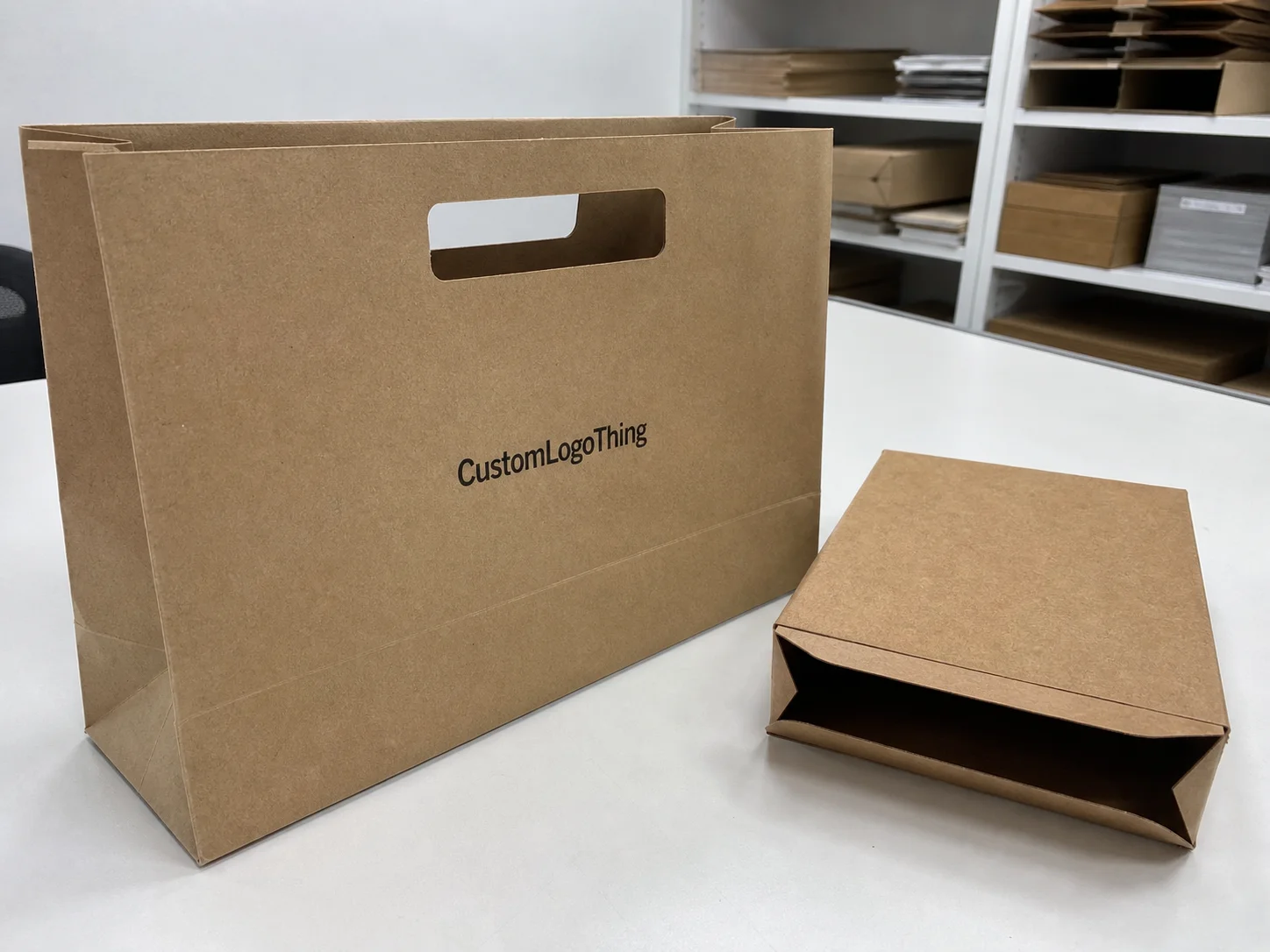
Buyer Fit Snapshot
| Best fit | To Bold Typography Packaging projects where brand print, material claims, artwork control, MOQ, and repeat-order consistency need to be specified before quoting. |
|---|---|
| Quote inputs | Share finished size, material target, print colors, finish, packing count, annual reorder estimate, ship-to region, and any compliance wording. |
| Proofing check | Approve dieline scale, logo placement, barcode or warning zones, color tolerance, closure strength, and carton packing before bulk production. |
| Main risk | Vague material claims, crowded artwork, missing packing details, or unclear freight terms can make a low unit price expensive after revisions. |
Fast answer: To Bold Typography Packaging: Material, Print, Proofing, and Reorder Risk should be specified like a repeatable production item. The safest quote records material, print method, finish, artwork proof, packing count, and reorder notes in one written spec.
Production checks before approval
Compare the actual filled-product size with the drawing, then confirm tolerance on folds, seals, hang holes, label areas, and retail display edges. Reserve space for logos, QR codes, warning copy, and material claims before decorative graphics fill the panel.
Quote comparison points
Review material grade, print process, finish, sampling route, tooling charges, carton quantity, and freight assumptions side by side. A quote is only useful when the supplier can repeat the same color, closure quality, and packing count on the next order.
I still remember a run of Custom Printed Boxes for a small supplement brand in Edison, New Jersey. The prototype had almost no imagery. Just oversized type, disciplined spacing, and two Pantone colors printed dead sharp on 350gsm C1S artboard. People stopped on the shelf anyway. That job taught me something I’ve seen again and again on factory floors in Dongguan and Long Beach: a strong guide to bold typography packaging is not about shouting louder. It’s about making every letter work harder than a whole collage of graphics. Honestly, I think that’s why so many brands keep coming back to it after the “let’s add more stuff” phase goes off the rails.
And yes, brands keep coming back to this style for a reason. The right guide to bold typography packaging can make a carton feel premium, urgent, calm, technical, or friendly without stuffing the panel full of decoration. Done well, the package does the selling before a shopper ever reads the rest of the copy. Done badly? Well, I’ve seen boxes that looked like a PowerPoint slide got into a fight with a label printer in Chicago. Not pretty.
What Bold Typography Packaging Really Is
Bold typography packaging uses large, assertive, highly legible type as the main visual system. It does not treat text like a label afterthought. In a solid guide to bold typography packaging, typography is not just a font choice. It’s the whole way the product introduces itself, from the first 18 inches of shelf distance down to the UPC panel and side flap details. The type is the face of the package. Everything else is backup.
I’ve seen this work beautifully on retail packaging for skincare, canned beverages, haircare kits, protein supplements, and DTC shipper boxes where the unboxing moment needed a clean, confident feel. In Seoul, one beauty client used 2-color offset printing on 400gsm folding cartons with matte aqueous coating, and the type carried the whole launch. Bold type can signal premium without gold foil, fast without neon clutter, and specialized without cramming in a dozen icons. That’s the appeal. It can do a lot without looking like it’s trying too hard.
There’s a difference between bold as a font weight and bold as a visual strategy. A font can be set in heavy black, but if the scale is wrong, the spacing is cramped, or the hierarchy is muddy, the package still reads weak. A real guide to bold typography packaging deals with scale, spacing, contrast, hierarchy, and structural placement, not just whether the typeface has an “Extra Bold” setting. Font weight alone does not save a bad layout. If anything, it just makes the mistakes more obvious.
Here’s what people get wrong: they assume bold typography packaging is only for modern, minimal brands. Not true. I’ve seen it used on branded packaging for rugged outdoor goods in Portland, Oregon, clean-label foods in Austin, Texas, and heritage-inspired products where the type was set in a sturdy serif to signal authority and craft. The style can communicate:
- Premium quality through restraint and white space
- Speed and efficiency through direct, high-contrast messaging
- Confidence through large, unwavering wordmarks
- Simplicity through reduced visual noise
- Specialty positioning through selective typographic emphasis
In my experience, bold typography works best in categories where the shopper wants to understand the product quickly: cosmetics, supplements, beverages, personal care, apparel, and DTC shipper boxes. A strong guide to bold typography packaging starts by asking whether the shopper is making a fast choice or a considered one, because that decides how much the front panel has to say in the first glance. I wish more teams would admit that upfront instead of pretending every package needs to “tell the whole story” in one square of cardboard.
How Bold Typography Packaging Works on Shelf
The human eye does not read packaging like a designer reads a comp page. On a shelf, it scans for shape, contrast, size, and a few familiar cues first. That’s why a good guide to bold typography packaging pays attention to how a box or carton will be seen from 8 feet away, not just how it looks at 100% zoom on a monitor. If the shelf read fails, the rest of the file is basically a pretty file.
I watched this play out in a co-packing plant outside Chicago during a beverage line review. The more illustrated concept looked attractive in a deck, but the bold type version won once we mocked both up on corrugated trays under 4000K warehouse LEDs. The product name and flavor popped in under a second. The illustrated version took too long to decode. That’s the sort of shelf test a practical guide to bold typography packaging should always include. Warehouse lighting is rude, by the way. It does not care about your mood board.
Hierarchy matters more than most teams expect. On a front panel, the shopper should catch the brand name first, then the product name, then the benefit statement, and then the variant like scent, flavor, or strength. Regulatory copy, claims, and barcode placement still matter, but they should not compete with the main message. A clean guide to bold typography packaging keeps the hierarchy strict enough that no panel feels like a ransom note.
Printing and finishing have a huge effect on whether the type feels crisp or dull. Offset lithography gives excellent detail for paperboard cartons, while flexographic printing can perform well on corrugated and some labels if the press setup is tight. Digital print is often the friend of shorter runs and quick revisions. Add hot foil stamping, embossing, debossing, or spot UV, and the type can gain physical presence without adding busy graphics. A smart guide to bold typography packaging does not overuse finishes, but it does choose them with intent. If you pile on every finish in the sample room, the package starts looking like it got dressed in the dark.
Substrate choice changes everything. SBS paperboard usually delivers sharp type and clean solids, while kraft board brings more texture and a warmer, more organic feel. Corrugated board can absolutely support bold typography, but the flutes and liner texture can soften edges, especially on large fills and fine counters. Rigid setup board gives a high-end, premium feel that’s ideal for premium product packaging or gift sets. Matte or soft-touch lamination often helps typography stand out by reducing glare, especially under strong retail lighting. In Vietnam and Malaysia, converters often recommend 350gsm to 400gsm SBS for folding cartons because the sheet holds fine serifs better than thin stock.
Legibility issues are where a lot of otherwise good packaging design goes sideways. Reverse type can fill in if the ink spread is too heavy. Tiny knockout copy can disappear on a porous board. Ink gain on uncoated kraft may make a medium weight font behave like a heavier one than intended. And if the type is too close to the trim line or a score, the fold can split the word in a way that looks careless in finished production. A disciplined guide to bold typography packaging gets tested on the actual die line, not just the artboard.
One more thing I’ve learned on press checks in Shenzhen and New Jersey: the brightest design is not always the strongest. Sometimes a two-color box with carefully spaced typography beats a six-color concept with gradients and a dozen details. A serious guide to bold typography packaging treats print reality as part of the design, not a production afterthought. Print is not the villain, but it also is not your magic wand.
Key Factors That Make Bold Type Work
Typography fundamentals make or break this style. Font family selection, weight, x-height, tracking, kerning, and line spacing all influence whether the front panel reads in half a second or feels awkward and overbuilt. In a practical guide to bold typography packaging, I usually tell teams to think about type the way a press operator thinks about registration: small decisions show up loudly in the final result.
High x-height fonts often improve readability at retail distance, especially for smaller cartons or labels. Tight tracking can create a strong, compact look, but too much compression can choke the counters in letters like “e,” “a,” and “o” once ink hits the sheet. I’ve seen this happen on custom printed boxes where a fashionable condensed font looked stunning on a computer proof and nearly illegible on a kraft mailer made from 280gsm board. A usable guide to bold typography packaging always includes actual substrate tests. Otherwise you’re just hoping the printer feels lucky.
Contrast is another big lever. Black on white is the classic because it works, but white on dark navy, charcoal, deep green, or rich burgundy can feel equally powerful if the press can hold the ink density. A monochrome system with one accent color often keeps the package disciplined, which helps the typography stay in charge. Too many accent colors turn a confident layout into visual chatter, and that weakens the whole guide to bold typography packaging concept.
Brand fit matters more than trend. Bold typography can feel modern and premium in a beauty line, but the same treatment may feel cold or too aggressive if the product is meant to communicate comfort or handmade warmth. I remember a client meeting in Los Angeles where the marketing team wanted “bold and clean,” while the founder wanted “approachable and natural.” We landed on a softened sans serif with generous spacing and an uncoated stock from a converter in California, and that compromise gave them a better package branding story than the harsher initial mockups. That’s the kind of decision a real guide to bold typography packaging has to support. Everybody was happy in the end, which almost never happens in a room full of opinions and coffee.
Compliance still belongs on the front burner. You cannot squeeze required copy, ingredient statements, barcode space, tamper indicators, or claim disclaimers into a cramped layout and expect the package to work. The best guide to bold typography packaging balances sales copy and regulatory copy so the brand message stays clean without creating a labeling problem later.
Structural packaging also changes the equation. Folds, seams, tuck flaps, and score lines can chop words in half if the layout is not built around the dieline. On an RSC shipper, for example, a beautiful wordmark across a seam can become two awkward halves after conversion. In a good guide to bold typography packaging, the typography respects the structure first, then the designer uses the structure as part of the composition.
For reference, standards and testing matter too. If a package is going through distribution, I always like to see the team consider transit testing through organizations like ISTA, and for fiber-based materials and responsible sourcing, the FSC framework often comes up in supplier conversations. A serious guide to bold typography packaging should sit comfortably next to those production realities.
Step-by-Step Guide to Bold Typography Packaging
Step 1: Audit the brand message, target buyer, and shelf environment before choosing type, color, or finish. If you skip this, the entire guide to bold typography packaging becomes style-first and strategy-second, which is usually how teams end up revising the box three times.
Start by writing a one-sentence packaging brief that says who the product is for, what it must communicate in the first five seconds, and what action you want the shopper to take. Is the product fast-moving, high-trust, premium, clinical, playful, or artisanal? The answer tells you whether the guide to bold typography packaging should lean into sharp contrast, restrained spacing, or warmer editorial typography.
Step 2: Build a hierarchy map for the front panel, side panel, top flap, and back panel. Every word should have a job. I often sketch these layouts on paper first, because a simple marker drawing will reveal overload faster than a polished mockup. A disciplined guide to bold typography packaging separates the “must-see now” message from the “nice to know later” details.
Step 3: Select fonts that match the brand promise, then test them at real size. I’ve seen beautiful typefaces become weak when reduced to a retail box scale. Some fonts hold up well in 18 pt on a website but lose their shape on a 3-inch-wide carton. A professional guide to bold typography packaging always includes a size test across the actual dieline dimensions.
Step 4: Prototype on the intended substrate and finish, then review the sample under warehouse lighting, warm retail lighting, and daylight if the product may be photographed or shipped direct to consumer. In one supplier negotiation I sat in on in Minneapolis, a soft-touch lamination at $0.08 per unit on a 10,000-piece run was the difference between “nice” and “luxury,” but it also muted the contrast more than expected. That’s the kind of detail a practical guide to bold typography packaging should uncover early. Nobody enjoys discovering a muted headline after the order is already in motion.
Step 5: Refine the artwork for production. Check bleed, safe zones, ink limits, overprint settings, die cut tolerances, and the exact positions of seams and scores. If you’re using spot colors, verify the Pantone targets with the printer in Guangdong or Ohio, because “close enough” is a dangerous phrase in print production. A thorough guide to bold typography packaging should make the artwork press-ready, not just presentation-ready.
Step 6: Approve a press proof or pre-production sample, then lock the production specification. This is where teams sometimes get nervous and start adding last-minute changes, but in most cases, those tweaks cause more trouble than they solve. A stable guide to bold typography packaging respects the proofing stage as the final safety net before volume production.
If you’re building out a larger packaging system, it helps to pair this work with your broader assortment planning and related Custom Packaging Products. That way, the typography on the main carton, mailer, insert, and label all speak the same visual language instead of each piece wandering off on its own.
Cost, Pricing, and Timeline Considerations
One reason brands like this style is that bold typography can be cost-efficient. If the artwork relies on type, white space, and one or two solid colors, you may avoid expensive illustration development or high-color separations. A good guide to bold typography packaging also warns that the savings can vanish quickly if you add specialty finishing without a clear reason. Fancy finishes are great. Random fancy finishes are how budgets go to die.
Here’s the honest breakdown I usually give clients. Major cost drivers include print method, board grade, color count, foil stamping, embossing, debossing, soft-touch coating, custom structural work, and order quantity. A simple 5,000-unit run of a folding carton on 350gsm C1S artboard might land around $0.15 to $0.45 per unit depending on board and print complexity, while Rigid Setup Boxes or heavy embellishment can rise into the $1.20 to $3.50 per unit range or more. A realistic guide to bold typography packaging should make clear that “simple looking” does not always mean “cheap to produce.”
Print method matters a lot. Shorter runs often favor digital print because setup is lighter and artwork changes are easier, while longer runs may justify offset or flexographic production depending on the packaging format. SBS paperboard cartons with a one- or two-color design can be very efficient, but if the team wants foil, embossing, and a specialty coating, the packaging budget needs to reflect that reality. That’s a key lesson inside any useful guide to bold typography packaging.
Timeline is another place where teams underestimate the work. A normal path includes concept development, dieline setup, prototyping, proofing, revisions, and manufacturing lead time. For many custom box programs in Shenzhen, Ho Chi Minh City, or Greenville, I’d expect 12 to 15 business days from proof approval for straightforward print production, while complex structural packaging or premium finishes can stretch that longer. The more changes after proof, the longer the clock runs. A well-run guide to bold typography packaging should keep those approval stages tight.
And don’t stop at the box price. Shipping, warehousing, kitting, and QC inspection all belong in the total landed cost. I’ve seen brands celebrate a low print quote only to get hit by expensive freight because their finished cartons were palletized inefficiently or because they needed extra inspection after a late artwork correction. A solid guide to bold typography packaging thinks in total system cost, not just per-box cost.
| Option | Typical Use | Approx. Unit Price | Typical Lead Time | Notes |
|---|---|---|---|---|
| Digital print folding carton | Short runs, frequent artwork changes | $0.18–$0.65 | 7–12 business days after approval | Best for lower minimums and fast iteration |
| Offset printed SBS carton | Mid to high volume retail packaging | $0.12–$0.38 | 12–20 business days after approval | Excellent print sharpness for bold type |
| Flexographic corrugated shipper | Transit boxes and DTC mailers | $0.30–$1.10 | 10–18 business days after approval | Good for durable branded packaging |
| Rigid setup box with premium finish | Luxury or gift packaging | $1.20–$3.50+ | 18–30 business days after approval | Higher perceived value, higher material and labor cost |
Those numbers are not universal, of course. Board spec, carton size, ink coverage, and finishing complexity can swing pricing by a fair amount. But they’re a useful starting point for any guide to bold typography packaging conversation with a printer or converter.
If you want a broader sense of packaging sourcing, industry groups such as the Paperboard Packaging Council can be a helpful place to understand material and manufacturing trends, especially when the team is evaluating recycled content, structural formats, or compliance concerns.
Common Mistakes in Bold Typography Packaging
The biggest mistake I see is calling everything bold. If every line is emphasized, nothing is emphasized. The package becomes visually noisy instead of confident, and the shopper has no place to land. A working guide to bold typography packaging needs one focal point, not six competing ones.
Another common issue is using type that is too heavy or too tightly set. I’ve watched black fill-in, ink gain, and poor counters destroy otherwise smart artwork on coated and uncoated boards alike. Small sizes are especially unforgiving. A typeface that looks elegant on screen can become mushy in print if the strokes are too dense. Good guide to bold typography packaging work tests the extremes, not just the hero panel.
Ignoring the dieline is a classic production error. If key words cross folds, seams, or structural cut lines, the package can look broken the second it gets assembled. I remember a cosmetic carton in Toronto where the brand name fell right over a tuck flap; the layout looked fine flat, but in production the name split awkwardly across the closure. That kind of fix is avoidable, and every reliable guide to bold typography packaging should treat structural layout as non-negotiable.
Trendy fonts can also backfire. A typeface that feels current today may feel dated faster than the team expects, especially if it’s overused in DTC packaging. I’m not ضد trend—far from it—but I do think the brand personality should outlast the font fad. That’s a subtle but important point in a strong guide to bold typography packaging.
Finally, teams forget retail and fulfillment needs. The front panel might look beautiful, but if the barcode area is awkward, the shipping carton scuffs easily, or the design is hard to scan at the warehouse, the program becomes a headache. Any real guide to bold typography packaging has to consider scanability, transport durability, and line efficiency, not just shelf aesthetics.
Expert Tips for Stronger Bold Typography Packaging
My first tip is simple: use one dominant message on the front panel and let the rest of the content support it elsewhere. I’ve seen too many packs try to tell the whole brand story on one face. The result is a cluttered box that reads slower, not faster. A sharp guide to bold typography packaging gives the shopper one job at a time.
Test readability at three distances: hand-held, shelf distance, and across the aisle. I like to stand 8 feet away, then step in to 3 feet, then hold the sample at arm’s length. That sequence catches problems that flat proofs hide, especially if the type is condensed or the finish reduces contrast. This simple habit has saved more than one product packaging rollout from avoidable rework.
Choose finishes that reinforce the typography. Matte lamination can create an editorial, calm effect, while foil can sharpen a premium accent or make a logotype feel more deliberate. Spot UV can help one word jump without cluttering the whole panel. I’ve seen soft-touch lamination paired with oversized sans serif type on branded packaging and the result felt expensive without being flashy. That’s exactly the kind of restraint a smart guide to bold typography packaging should encourage.
Ask your printer about ink density, trap settings, and how the press handles fine counters and small text on the chosen substrate. This sounds technical because it is. The same file can print very differently on SBS, kraft, corrugated, or rigid board, and the press operator’s experience matters as much as the artwork. A serious guide to bold typography packaging always benefits from printer input before the proof is locked.
Compare the bold type version against a more image-led concept in side-by-side mockups. I’ve done this in supplier meetings where the creative team was sure imagery would win. Sometimes it does. But other times, the cleaner typographic route is stronger because it lets the brand own a calmer, more legible space on shelf. A disciplined guide to bold typography packaging should make the comparison visible instead of theoretical.
“When we stopped trying to decorate every panel and let the type do the talking, the box finally felt like the product had a point of view.”
How to Apply the Guide to Bold Typography Packaging
Start with a one-sentence brief: who the product is for, what it must say instantly, and what shelf behavior you want to trigger. That single line will keep the whole project honest. If it’s not written down, the guide to bold typography packaging will drift into personal taste debates very quickly. And trust me, no one needs a two-hour debate over whether “the blue feels more premium.”
Next, strip the copy to the essentials. If a phrase does not support the first five seconds of attention, it probably belongs on the side panel, back panel, insert, or website rather than the front. That’s not about being minimal for style’s sake; it’s about controlling visual load. A practical guide to bold typography packaging knows that less copy on the front often means more comprehension, not less information overall.
Then build a small sample board with two or three type directions. Review it with sales, operations, and production before finalizing the artwork. Sales will tell you if the message reads fast enough. Operations will tell you if the pack is practical to ship and store. Production will spot issues with dies, ink coverage, and finishing. A good guide to bold typography packaging brings those groups into the same room before the first large run.
Request a pre-production sample, verify the type on the actual substrate and finish, and make any final edits before the mass print. This is the point where a good vendor becomes invaluable, because a real sample tells the truth in a way a PDF never can. If the counters are closing up or the contrast is weaker than expected, you still have room to adjust. That’s why I trust a guide to bold typography packaging only when it includes physical proofing.
Finally, use the finished look as a brand system. Extend the same typography logic into shippers, inserts, labels, retail display pieces, and even internal sell sheets. That way the package branding stays consistent from the warehouse to the shelf to the unboxing moment. A mature guide to bold typography packaging does not end with one carton; it informs the whole packaging family.
In practice, that means the visual rules should be simple enough to repeat but distinct enough to recognize at a glance. If the consumer sees the same typography rhythm on a mailer, a shelf carton, and a sample insert, the brand feels more deliberate. That’s one of the quiet strengths of a solid guide to bold typography packaging.
From a factory-floor standpoint, I’ve always preferred packaging systems that can survive real-world handling. Forklifts, tape abrasion, pallet stacking, and temperature swings all affect the final look. If a bold type box scratches easily or loses contrast at the corners, the design may be too fragile for its own good. So yes, the guide to bold typography packaging is about style, but it is equally about durability and repeatability.
If you’re building a new line or refreshing an older one, a thoughtful guide to bold typography packaging can help you make faster decisions, reduce visual clutter, and produce a package that feels confident without overcomplicating production. That balance—clean design, clear print decisions, and realistic manufacturing specs—is where the best packaging lives.
FAQ
What is the guide to bold typography packaging trying to solve for brands?
It helps brands win attention quickly by using type as the primary visual device rather than relying on cluttered graphics. It also improves clarity, making the product name, benefit, and variant easier to read at shelf distance. For many categories, it creates a cleaner premium feel while simplifying the overall packaging system. In production terms, it also keeps artwork tighter on a 350gsm C1S carton or a kraft mailer moving through a printer in Shenzhen or Ohio.
Which packaging materials work best for bold typography packaging?
SBS paperboard and rigid setup board usually give crisp type reproduction and strong premium presentation. Kraft and corrugated can work well too, but designers need to account for texture, ink gain, and less refined edge detail. The best choice depends on the print method, finish, and the level of sharpness the brand wants. For many folding cartons, 350gsm to 400gsm board with matte aqueous or soft-touch coating is a practical starting point.
How much does bold typography packaging typically cost?
It can be economical if the design stays simple and uses fewer inks and embellishments. Costs rise when the design adds foil, embossing, specialty coatings, custom structures, or premium board grades. Order volume also matters, since larger runs usually reduce the per-unit price. For example, a 5,000-piece folding carton run may land around $0.15 to $0.45 per unit depending on the board, print method, and finishing stack.
How long does it take to produce bold typography packaging?
A typical timeline includes concept, dieline setup, prototyping, proofing, revisions, and production scheduling. Simple packaging can move faster, while custom structures or premium finishes usually need more review time. The biggest delays often come from artwork changes after proofs or late decisions on finishes. For straightforward programs, production is often 12 to 15 business days from proof approval, though premium rigid boxes in Vietnam, China, or the U.S. can take longer.
What are the biggest mistakes to avoid with bold typography packaging?
The most common issues are overcrowding the front panel, using unreadable type sizes, and ignoring folds or seams. Another frequent mistake is choosing a bold font that looks trendy but does not match the brand personality. Testing the design on the actual substrate before production helps catch these issues early. I’ve also seen teams skip press checks and then wonder why a reverse-white headline fills in on uncoated board in bulk production.
My final advice is simple: treat the guide to bold typography packaging as both a design framework and a production checklist. The strongest packs I’ve seen over two decades were never just attractive on a screen; they were legible at shelf distance, printed cleanly on the chosen board, and built around the realities of manufacturing in places like Dongguan, Chicago, and Juárez. That’s how bold typography packaging earns attention, protects the brand, and holds up in the real world. So here’s the takeaway: pick one clear message, test it on the real substrate, and approve the proof only after it reads fast in the lighting your buyers actually see. Everything else is decoration.