Buyer Fit Snapshot
| Best fit | Packaging Colors for Brand Growth projects where brand print, material claims, artwork control, MOQ, and repeat-order consistency need to be specified before quoting. |
|---|---|
| Quote inputs | Share finished size, material target, print colors, finish, packing count, annual reorder estimate, ship-to region, and any compliance wording. |
| Proofing check | Approve dieline scale, logo placement, barcode or warning zones, color tolerance, closure strength, and carton packing before bulk production. |
| Main risk | Vague material claims, crowded artwork, missing packing details, or unclear freight terms can make a low unit price expensive after revisions. |
Fast answer: Packaging Colors for Brand Growth: Material, Print, Proofing, and Reorder Risk should be specified like a repeatable production item. The safest quote records material, print method, finish, artwork proof, packing count, and reorder notes in one written spec.
Production checks before approval
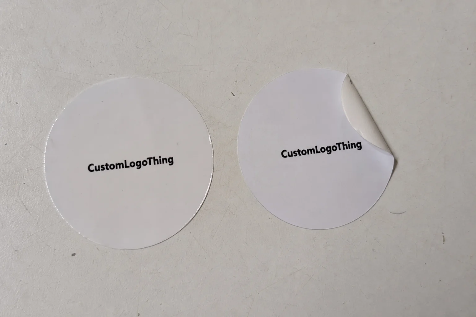
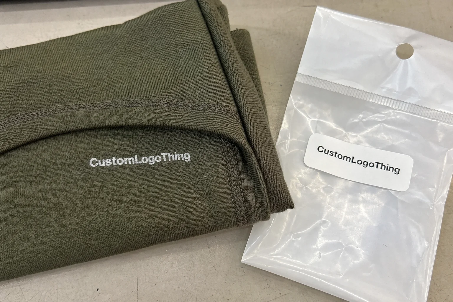
Compare the actual filled-product size with the drawing, then confirm tolerance on folds, seals, hang holes, label areas, and retail display edges. Reserve space for logos, QR codes, warning copy, and material claims before decorative graphics fill the panel.
Quote comparison points
Review material grade, print process, finish, sampling route, tooling charges, carton quantity, and freight assumptions side by side. A quote is only useful when the supplier can repeat the same color, closure quality, and packing count on the next order.
How to Choose Packaging Colors for Brand: Why It Matters More Than Most Teams Think
Shoppers make snap judgments in under three seconds in many retail settings, and color lands first—before copy, before claims, and often before logo recognition. If you’re trying to figure out how to Choose Packaging Colors for Brand growth, you’re working on one of the highest-impact decisions in packaging strategy. I’ve watched brands spend $40,000 on influencer campaigns, then lose shelf pickup because their carton blended into a wall of lookalike tones (and yeah, that is exactly as painful as it sounds).
I remember when I worked with a snack startup in Austin selling protein clusters at a $6.99 SRP. We kept structure, messaging, and finish unchanged, but shifted the accent from muted beige to saturated terracotta (close to Pantone 7592 C), bumped contrast around the product name by roughly 22% by L*a*b* delta, and repeat order rate climbed from 18% to 24% within two DTC reorder cycles. Unboxing shares on Instagram doubled over eight weeks. Same product. Different color system. Honestly, that project permanently changed how I explain how to choose packaging colors for brand—it stopped being “design polish” and became growth infrastructure.
Plenty of teams still frame the conversation as “Which color looks nice?” That question rarely gets you to a profitable answer. A better version sounds like this: how to choose packaging colors for brand consistency, conversion, and memorability across shelf, shipping, and screens. Color decisions shape perceived quality, refund tolerance, trust in claims, and whether someone even notices critical details like dosage, warnings, or usage instructions.
I’ll be clear about scope. You’ll get an operational system here, including specs, costs, and workflow checkpoints. You won’t get abstract color-wheel theory disconnected from print plants. In production, how to choose packaging colors for brand depends on substrate whiteness (SBS versus kraft), ink method (CMYK process versus spot), finish (matte, gloss, soft-touch), and unit economics ($0.18 versus $0.41 per box at 5,000 units is real money, not noise).
Color is not decorative trim. It’s a systems decision.
Treating how to choose packaging colors for brand as a systems decision improves:
- Shelf standout: higher pickup rate in crowded sets (especially in categories with entrenched color codes)
- DTC conversion: stronger thumbnail recognition on marketplaces and paid social
- Brand recall: better memory under delayed purchase conditions
- Perceived quality: tighter alignment between price point and visual signal
- Return/refund sentiment: fewer “not as expected” reactions caused by color mismatch between promise and delivery
If you’re building branded packaging for scale, this topic belongs beside structural design and copy hierarchy. I’ve seen founders obsess over dieline elegance while leaving color to late-stage preference debates. That’s one of the most expensive mistakes in packaging design, and it’s still weirdly common.
How Packaging Color Choice Works Across Psychology, Context, and Print Reality
The mechanism is straightforward but never simplistic. Color triggers emotion first, expectation second, purchase confidence third. That sequence matters in any serious approach to how to choose packaging colors for brand systems that convert. Cool blue can read as clean precision in supplements; in indulgent confectionery, that same blue may feel cold or low-flavor unless warmer accents rebalance it.
One misconception shows up constantly: teams mix up identity color with packaging hierarchy. Your master brand can own a signature hue while your product packaging needs a different dominant field for legibility, variant navigation, or compliance blocks. I’ve seen premium tea brands hold a consistent logo green, rotate deep jewel backgrounds by blend type, and still keep 90%+ brand recognition in blind lineup tests.
Context changes performance quickly. In grocery aisles, your pack competes at two to four feet under 3500K to 5000K fluorescent or LED mixes. Luxury retail allows subtler tonal differences because lighting is curated and browse behavior is slower. eCommerce thumbnails under 200 px reward silhouette and contrast more than nuance. Teams deciding how to choose packaging colors for brand should evaluate each channel before locking one universal palette.
Cross-cultural response matters, though stereotypes usually send teams in the wrong direction. I worked with a personal care brand launching in California and Singapore. Their early assumption was simple: green always equals eco trust. Buyer interviews told a more layered story. In one market, green signaled “natural.” In another, green read “medicinal.” We kept green as support, shifted trust cues into layout, certification badges, and material claims, and saw an 11% lift in click-through in A/B tests with lower post-purchase confusion.
Now to print reality. Monitors emit RGB light. Boxes are ink on substrate. Different physics, different result. Any useful answer to how to choose packaging colors for brand must include production variables and color psychology in packaging translated into manufacturable specs:
- CMYK vs Pantone spot colors: process printing gives flexibility; spot inks hold narrow brand hues more consistently but add setup cost.
- Digital vs offset vs flexo: digital is ideal for short runs and variable data; offset gives stable color at scale; flexo dominates corrugated and films with specific tonal constraints.
- Coated vs uncoated substrates: coated stocks hold vibrancy; uncoated often mutes and warms color.
- Kraft base: natural brown shifts lighter tints unless white underprint is used.
Proofing is mandatory, full stop. I once stood on a press check in a Shenzhen facility where a monitor-approved turquoise printed 12–15% duller on uncoated board. We adjusted ink density and rebalanced black by a fractional curve, but it still cost two days plus rush freight. I’m not proud of the language I used that afternoon, but I stand by the lesson: how to choose packaging colors for brand cannot stop at PDFs. It has to include hard proofs under realistic lighting with explicit acceptance tolerances.
For standards and practical references, use the International Safe Transit Association (ISTA) for transit testing context and the FSC framework if certified material claims are part of your color/material strategy. ISTA and FSC are different systems with different scopes, so avoid treating either as a blanket quality proxy for print color.
Key Factors to Evaluate Before You Lock a Packaging Palette
Teams actively working through how to choose packaging colors for brand should start with positioning. Value brands often benefit from high-contrast clarity that communicates fast. Premium lines tend to use tighter tonal ranges, controlled accents, and more negative space. Eco-focused products usually perform better with material-led palettes that harmonize with recycled textures rather than neon synthetic cues.
Next, map category codes and competitor behavior. Build a fast audit of 20 direct competitors, 10 adjacent brands, and 5 aspirational references. I usually structure a matrix by dominant hue family, contrast ratio, finish type, and claim density. On one pet nutrition project, 70% of competitors leaned on blue/white clinical signals. We moved to charcoal and copper accents with a high-readability ivory panel. Shelf distinctiveness improved immediately in mock tests, and pickup intent rose 14 percentage points among target buyers.
Product truth has to anchor the palette. Citrus home care in deep maroon can create expectation friction if shoppers expect bright/fresh cues. Botanical serum in neon magenta can work, but only if the brand voice and formula story support that choice. This checkpoint sits at the center of how to choose packaging colors for brand: align color with what the product is and how it performs.
Accessibility is non-negotiable. Low-contrast ingredient lists at 6 pt on tinted backgrounds still show up far too often. That’s both a compliance risk and a trust issue. For critical information, use strong contrast (many teams borrow WCAG-style checks for print), avoid color-only warning systems, and test color-blind-safe combinations where function matters. If dosage, directions, or allergens are hard to read in normal store lighting, the strategy failed—kinda simple, actually.
Channel strategy shifts priorities, and this is where brand color palette decisions need real channel logic:
- Retail packaging: win adjacency at arm’s length.
- Subscription/DTC: optimize unboxing, social shareability, and shipping durability.
- Marketplace thumbnails: emphasize large-shape contrast and simpler blocking.
- B2B shipper cartons: keep recognition while controlling print cost.
SKU architecture is where brand coherence often breaks down. Random variant colors erode parent memory quickly. A stronger model for how to choose packaging colors for brand portfolios uses one anchor color, one stable layout grid, and variant ranges defined by rules (fruit flavors in a warm spectrum, functional formulas in a cool spectrum, for example). Keep the logic simple enough for procurement and prepress teams to execute without drift. If your print buyer has to interpret your “vibe,” you’ve already lost control.
If you want benchmarks, study systems in your own category and compare with real execution outcomes in Case Studies. It becomes obvious which color architectures scale cleanly and which collapse by the third line extension.
Step-by-Step Process: How to Choose Packaging Colors for Brand Teams
This is the process I use with founders, creative directors, and sourcing teams. It’s practical, fast, and built to reduce costly revisions. If your central question is how to choose packaging colors for brand, run these seven steps in sequence. I’ve run this with bootstrapped teams and with global teams; pace changes, but the logic holds.
Step 1: Audit existing assets and performance data
Pull brand guidelines, ad creatives, sales photography, customer reviews, and return reasons from the last 6–12 months. Look for color-linked language such as “looks cheap,” “feels premium,” or “hard to read.” In one skincare audit at 120,000 units/year, a spike in “not as shown” complaints traced back to an uncoated label switch that reduced signature lavender saturation by about 18%.
Step 2: Build a competitor color matrix
Create three sets: direct competitors, adjacent categories, and aspirational references. Tag each by dominant hue, secondary hue, finish, and contrast style. This gives objective context for how to choose packaging colors for brand differentiation. If 80% of the shelf runs white plus mint, a thoughtfully executed dark field may be your opening.
Step 3: Define primary, secondary, and functional colors
Assign roles, not just swatches. Primary colors anchor recognition. Secondary colors support hierarchy and story. Functional colors carry warnings, directions, nutritional highlights, and legal blocks. Document use percentages (for example, 60/30/10) and minimum contrast thresholds for critical copy.
Step 4: Develop 3–4 palette routes with clear rationale
Each route should include audience logic, channel assumptions, and print feasibility notes. I label routes with names teams can debate against outcomes—“Clinical Confidence,” “Warm Craft,” “Modern Minimal,” “Vibrant Active”—then map each against buyer psychology and shelf conditions. Conversations stay focused on results, not personal taste. (I’ve also had one route nicknamed “the one the founder’s cousin loved,” and yes, we retired that naming system quickly.)
Step 5: Prototype on real dielines and real substrates
Flat mockups are not enough. Apply routes to final dielines, then print on intended stock (350gsm C1S artboard, E-flute corrugated, textured label stock, and so on). Test matte versus gloss; soft-touch coatings can mute certain hues while lifting perceived premium value. In one beverage accessory program, shifting from gloss AQ to matte plus spot UV improved logo readability at 1.5 meters by 19% in store simulation.
Step 6: Run quick validation tests
Use mixed methods over 7–10 days:
- Preference tests (n=50 to 150 target buyers)
- Click-through or add-to-cart tests on PDP images
- Shelf mock tests with competitor adjacency
- Internal scoring rubric (distinctiveness, clarity, premium fit, SKU navigation)
This is where how to choose packaging colors for brand shifts from opinion to evidence. I like weighted scoring: 30% visibility, 25% brand fit, 20% readability, 15% cost feasibility, 10% production risk. If you can’t gather live buyer data, start with directional internal scoring and note that limitation in the decision log—just be honest about confidence level.
Step 7: Finalize specs and governance
Lock Pantone/CMYK/RGB/HEX values, permissible tolerances, and fallback specs for alternate print methods. Add do/don’t examples, minimum logo clear space, and variant assignment rules. A strong packaging style guide makes how to choose packaging colors for brand repeatable across agencies, suppliers, and internal teams.
From there, connect standards to production-ready formats in Custom Packaging Products so your color system aligns with real print capabilities and MOQs.
Budget and Pricing: What Packaging Colors Really Cost
Let’s get into numbers, because how to choose packaging colors for brand always meets unit economics. Color cost drivers include ink count, spot requirements, white underprint on clear or kraft materials, and specialty finishes such as metallics, foil, embossing, or soft-touch lamination.
Typical cost behavior is predictable. Short-run digital gives fast iteration and flexibility, though per-unit costs can rise above mid-volume thresholds. Offset usually carries higher setup with stronger per-unit economics at scale. Flexo can be very efficient for corrugated and film once plates are amortized, though complex gradients demand careful separations.
| Configuration | Run Size | Estimated Unit Cost | Setup/Plate Cost | Best Use Case |
|---|---|---|---|---|
| CMYK Digital, matte finish | 2,000 units | $0.42–$0.68 | $0–$150 | Testing new palette routes quickly |
| Offset CMYK + 1 spot color | 10,000 units | $0.19–$0.33 | $450–$1,200 | Stable brand color at mid-scale |
| Offset CMYK + 2 spot + soft-touch | 25,000 units | $0.24–$0.41 | $900–$2,000 | Premium custom printed boxes |
| Flexo corrugated, 2 colors | 15,000 units | $0.31–$0.52 | $300–$900 | Branded shippers and transit cartons |
These ranges are directional, based on common U.S. and South China sourcing quotes over the last few years, and your numbers will move with board grade, coverage, and freight timing.
Hidden costs are what blindside teams: extra proof rounds ($60–$250 each depending on format), correction cycles, rush press slots, and separate versioning across SKUs. I’ve seen one avoidable spec mismatch add $3,800 in rework during a 12-SKU launch, and everybody in that meeting suddenly became very interested in prepress documentation.
A dependable cost-control method inside how to choose packaging colors for brand is one hero brand color plus neutral supports (black, white, warm gray), reserving specialty treatments for seasonal or giftable editions. Recognition stays strong while ink complexity stays manageable.
Premium color treatments tend to pay back in high-AOV categories ($80+ skincare sets, gifting, collector products) or social-first brands where unboxing drives acquisition. If AOV is $18 and reorder cadence is high, consistency and readability usually outperform expensive effects. I think this is where teams over-spend most often: they buy visual drama when they actually need visual clarity.
I use a simple decision formula with clients:
- Target gross margin (for example, 62%)
- Allowable packaging cost per unit (for example, ≤8% of COGS)
- Expected reorder cadence (monthly, quarterly)
- Cost of color inconsistency (returns, discounting, brand dilution)
This framework keeps how to choose packaging colors for brand anchored in financial reality, not mood-board momentum.
Timeline and Production Workflow: From Palette Idea to Printed Box
A realistic timeline for how to choose packaging colors for brand and carry it through production usually runs 6 to 14 weeks, depending on complexity. Fast launches happen, though only with tight approvals and well-defined specs.
Typical stages:
- Discovery (5–10 business days): objectives, audience, competitor scan, channel priorities.
- Concepting (7–14 business days): 3–4 palette routes on final dielines.
- Proofing (5–12 business days): digital plus hard proofs, substrate checks, lighting checks.
- Pilot run (7–15 business days): limited run for QA and market validation.
- Full production (12–25 business days): print, conversion, finishing, pack-out.
- Incoming QA (2–5 business days): random sampling against approved standards.
The biggest bottlenecks I see are delayed approvals, vague specs (“make it pop”), substrate swaps after sign-off, and weak supplier handoffs. A palette approved on coated SBS can drift hard on recycled uncoated stock if fallback values were never defined.
Set checkpoints early:
- Prepress sign-off with exact color callouts and overprint rules
- Press check for hero SKUs at run start
- Incoming quality sampling using AQL methods and visual standards
I’ve sat in meetings where marketing wanted saturated gradients, procurement needed lower ink cost, and operations needed shipment two weeks earlier. Shared timeline discipline is the only way those constraints can coexist. A 72-hour slip in one function can push the entire launch window. I remember one program where we saved the date only because the prepress lead and plant scheduler basically performed miracles (and consumed unreasonable amounts of coffee).
First launch cadence differs from line extension cadence. First launches need more proof cycles and at least one pilot. Line extensions can reuse the core system and validate only new variant colors. Another reason disciplined rules for how to choose packaging colors for brand save time over the long run.
Common Mistakes, Expert Fixes, and Your Next Actions
Mistake #1 is choosing by internal preference. I still hear “the founder likes teal” more than I should. Preference isn’t strategy. Data is the fix: quick preference panels, shelf simulation, conversion testing. If your process for how to choose packaging colors for brand skips buyer feedback, you’re guessing.
Mistake #2 is ignoring shelf adjacency. A beautiful pack can vanish if neighboring products share similar hue and value structure. I watched this happen with a wellness brand that printed 30,000 units of pale mint pouches in a pale mint category. Pickup rate dropped below average in two chain tests. We rebuilt contrast and claim panel hierarchy; visibility recovered.
Mistake #3 is approving only on backlit screens. Screens overstate vibrancy and clarity. The fix is printed proofs on final substrate under realistic lighting—store-like and daylight. Build that requirement into your SOP for how to choose packaging colors for brand so it can’t be skipped under deadline pressure.
Mistake #4 is using too many SKU colors and weakening recognition. Variant logic should help shopping, not fragment identity. Keep a stable logo zone, one master brand signal, and controlled variant ranges. This supports stronger package branding while giving each SKU a clear cue.
Expert tips that hold up in practice:
- Create a color testing scorecard with weighted criteria (visibility, readability, fit, cost, risk).
- Document tolerance ranges for acceptable color drift by print method.
- Set fallback specs for alternate substrates or backup suppliers.
- Run quarterly audits: compare production lots to master standards and customer sentiment.
“We thought color was a design decision. It turned out to be an operations decision with marketing upside.” — CPG founder I advised during a 9-SKU relaunch
Your next actions can happen inside one week:
- Run a color audit across current packs, ads, PDP thumbnails, and shelf photos.
- Shortlist two viable palette routes based on audience and category context.
- Request physical proofs on actual substrates and finishes.
- Test with real buyers (even n=50 gives directional truth).
- Finalize a packaging color playbook that answers how to choose packaging colors for brand execution across teams.
If you only do one thing, do this: stop treating color as last-mile decoration. Treat it as a measurable growth lever tied to brand identity, production constraints, and customer behavior. That mindset shift is the true unlock in how to choose packaging colors for brand. It sounds less glamorous than choosing swatches on a sunny Tuesday afternoon, but it works—and it’s gonna save you money.
How to Choose Packaging Colors for Brand Successfully?
Start with market evidence, not personal preference. Build a competitor color map, define your brand color palette roles (primary, secondary, functional), and test 3–4 routes on real substrates before finalizing. For most teams, the strongest process for how to choose packaging colors for brand includes shelf simulation, eCommerce thumbnail checks, and print-proof sign-off standards. If the color system is readable, distinctive, cost-feasible, and production-safe, it is ready to scale.
How do I choose packaging colors for brand recognition without copying competitors?
Start by mapping competitor palettes in a simple matrix (dominant hue, accent hue, finish, contrast style). Then claim open territory with one distinctive anchor hue and a unique contrast pairing. Typography treatment and layout discipline make that color ownable in market reality. Validate with side-by-side recognition tests using 20–40 respondents before final print commitments. That’s the most reliable path to how to choose packaging colors for brand recognition without imitation.
What is the best way to test packaging color options before a full print run?
Print on actual substrate and finish first; digital mockups alone won’t protect you. Run a small pilot batch (roughly 300–1,000 units), compare shelf pickup or PDP click-through, and collect short qualitative feedback on trust, quality, and product fit. Teams refining how to choose packaging colors for brand with this mixed method avoid expensive reprints and lower launch risk.
How much do custom packaging colors add to total packaging cost?
Cost impact depends on ink count, print process, and finishing complexity. Spot colors and specialty effects usually increase setup and sometimes unit cost. Many brands control spend by limiting hero colors, reducing unnecessary variants, and standardizing specs across SKUs and suppliers. If you’re solving how to choose packaging colors for brand on a tighter budget, start with one anchor color system and add complexity only where ROI is clear.
Can I use different packaging colors for each product variant without hurting the brand?
Yes, if the core system stays stable: consistent logo zone, master brand color or shape cue, fixed layout grid, and controlled variant ranges. Assign variant colors by a clear rule (flavor family, function tier, potency) so shoppers can navigate quickly. This is a common challenge in how to choose packaging colors for brand portfolios, and structure solves it.
How long does it take to finalize packaging colors from concept to production?
Most projects land between 6 and 14 weeks including strategy, concept routes, proofing, pilot, and production sign-off. Timelines stretch with specialty finishes, too many stakeholders, or supplier transitions. Delays shrink when specs are locked early and proof approvals are pre-booked in the launch calendar. Planning discipline is central to how to choose packaging colors for brand at scale.
Final thought: how to choose packaging colors for brand is not about picking a favorite swatch. It’s about building a repeatable system that performs across retail, digital, and production constraints. Align psychology, print specs, cost targets, and testing cadence. Then document tolerances, run real proofs, and treat color decisions as operational decisions, not committee taste tests. That is the actionable path: audit, prototype, test, lock specs, and govern relentlessly.