Buyer Fit Snapshot
| Best fit | Packaging Finish Options That Fit projects where brand print, material claims, artwork control, MOQ, and repeat-order consistency need to be specified before quoting. |
|---|---|
| Quote inputs | Share finished size, material target, print colors, finish, packing count, annual reorder estimate, ship-to region, and any compliance wording. |
| Proofing check | Approve dieline scale, logo placement, barcode or warning zones, color tolerance, closure strength, and carton packing before bulk production. |
| Main risk | Vague material claims, crowded artwork, missing packing details, or unclear freight terms can make a low unit price expensive after revisions. |
Fast answer: Packaging Finish Options That Fit: Material, Print, Proofing, and Reorder Risk should be specified like a repeatable production item. The safest quote records material, print method, finish, artwork proof, packing count, and reorder notes in one written spec.
Production checks before approval
Compare the actual filled-product size with the drawing, then confirm tolerance on folds, seals, hang holes, label areas, and retail display edges. Reserve space for logos, QR codes, warning copy, and material claims before decorative graphics fill the panel.
Quote comparison points
Review material grade, print process, finish, sampling route, tooling charges, carton quantity, and freight assumptions side by side. A quote is only useful when the supplier can repeat the same color, closure quality, and packing count on the next order.
How to Choose Packaging Finish Options is one of those decisions that looks cosmetic on a spreadsheet and ends up changing how a product is judged in the first five seconds. I’ve seen the same 350gsm folding carton artwork read as premium, budget, eco-conscious, and even “gift-worthy” just by changing the finish. That is not exaggeration. It happens all the time in product packaging, and the difference can be as small as a matte aqueous coat versus a soft-touch laminate with one foil hit. On a 5,000-piece run in Dongguan, that one choice can move the quote by $0.08 to $0.22 per unit, which is why finish is never just decoration.
Most teams still treat finish like the final checkbox after packaging design is already locked. Bad habit. In practice, how to Choose Packaging Finish Options belongs much earlier in the process because finish changes color appearance, scratch resistance, retail lighting behavior, and the feel customers remember in their hands. A glossy black rigid box with gold foil communicates something entirely different from the same box in uncoated kraft with blind embossing. Same artwork. Different story. Same SKU, too, which is why the finance team eventually shows up asking why one sample costs $1.70 and another costs $2.45 at 3,000 units.
I’m writing this the same way I handle client meetings and factory visits: start with the job the package has to do, then match the finish to that job. If you need custom printed boxes for e-commerce, the finish should survive shipping abrasion from Philadelphia to Phoenix without turning the corners white. If you are building branded packaging for a prestige launch, you may care more about tactile response and shelf glow. If sustainability matters, finish selection gets even more specific. The good news? There’s a practical way to sort through it, and it starts with the board, not the mood board.
That’s what this guide does. We’ll walk through material compatibility, real costs, common mistakes, and a step-by-step framework for how to choose packaging finish options without guessing. I’ll also share a few things I’ve learned after standing beside converters at 7 a.m. in Shenzhen, watching sample runs come off press in Suzhou, and arguing with procurement teams in Chicago over the difference between “cheap-looking” and “cost-effective.” Those are not the same thing, even if someone in finance tries to make them sound identical.
Why Packaging Finish Options Change Everything
Finish is not decoration. It is perception management, damage control, and brand signaling all in one. I’ve watched a simple four-color carton move from “drugstore private label” to “indie luxury” just by switching from standard varnish to soft-touch with spot UV on the logo. Same ink, same layout, same dieline. The finish carried the emotional weight. On a 250gsm C1S artboard box sourced from a factory in Ningbo, that surface change did more than a redesign would have done for half the budget.
When people ask how to choose packaging finish options, I usually start with a blunt explanation: finishes are coatings, films, textures, and surface treatments added to printed packaging to change how it looks and performs. That includes matte and gloss coatings, aqueous coating, UV coating, varnish, lamination, foil stamping, embossing, debossing, soft-touch, and specialty textured films. Each one alters light, touch, durability, or all three. A standard matte aqueous coat might add only $0.05 to $0.09 per unit on 10,000 cartons, while soft-touch lamination plus foil can jump to $0.18 to $0.45 per unit depending on tooling and format.
Color shifts too. That part catches people off guard. A deep blue on gloss stock can look almost wet. Put that same blue under matte, and it loses some visual punch but gains sophistication. Add foil, and attention shifts instantly to the logo or crest. In branded packaging, those shifts are not subtle. They shape the first impression before the consumer even reads the product name. In a fluorescent retail aisle in Los Angeles, I’ve seen a Pantone 289 C go from “high-end navy” to “muddy midnight” just because the finish absorbed too much light.
I had a client in cosmetics who approved a very elegant deep charcoal design on screen, then panicked when the first sample arrived looking flatter than expected. The issue wasn’t the art. It was the finish. We moved from a standard matte varnish to soft-touch with selective gloss on the brand mark, and the box suddenly held the room. That’s the practical side of how to choose packaging finish options: the right surface treatment can rescue otherwise ordinary artwork. The sample run came back from Guangzhou in 14 business days, and the brand team stopped asking for “more premium” without saying what that meant.
There’s also a performance layer. A finish can improve rub resistance, hide minor board imperfections, reduce moisture uptake, or make a pack easier to stack without visible wear. The wrong finish can crack, scuff, yellow, or trap fingerprints. If the package has to survive retail handling, distribution, and customer unboxing, the finish becomes part of the engineering spec, not just the art direction. On a 2,000-piece trial in Atlanta, one glossy black lid showed corner whitening after a 48-hour warehouse rub test. The fix was a tougher topcoat, not a nicer photo render.
Client note from a supplier meeting: “We thought the box was too plain,” a brand manager told me after we changed the finish, “but the sample with the matte base and foil detail looked more expensive than the jewelry inside.” That was the moment they stopped calling finish an add-on. The sample had been made in Wenzhou, and the change added $0.14 per unit on 8,000 pieces, which was cheaper than a rebrand and a lot less dramatic than a CFO panic email.
So before you choose colors or illustrations too confidently, ask a better question: what feeling should the package create, and how much abuse must it survive? That is the foundation of how to choose packaging finish options intelligently. Honestly, I think that one question saves more bad packaging decisions than any trend report ever will. It also prevents the classic mistake of approving a finish based on a mockup rendered at 300 dpi instead of a real sample cut from 350gsm board.
How Packaging Finishes Work on Different Materials
Finish choice depends heavily on substrate. A finish that behaves beautifully on paperboard may be mediocre on corrugated, and a texture that looks rich on rigid packaging may fail on a flexible film. I’ve seen teams approve a finish based on a PDF render, then discover during sampling that the underlying board absorbed more ink than expected. That is not a minor issue; it changes the whole visual result. A 300gsm recycled board from Hebei will behave very differently from a 350gsm SBS sheet out of Shenzhen, even if the artwork file is identical.
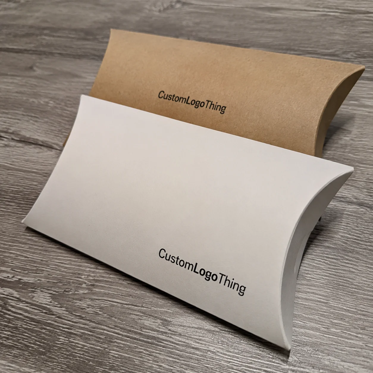
On paperboard, common choices include aqueous coating, UV coating, varnish, lamination, foil stamping, embossing, and debossing. Paperboard is the most forgiving surface for custom printed boxes because it usually accepts print and finish passes well, especially on C1S, CCNB, and SBS grades. A 350gsm SBS carton with matte aqueous coating will usually read cleaner and more refined than the same carton left uncoated. If you want a specific spec, start with 350gsm C1S artboard for cosmetics or 400gsm SBS for heavier retail cartons, then test the finish on both before you commit to a 20,000-piece order.
Corrugated packaging behaves differently. The fluting structure and liner quality can limit fine detail, especially for high-contrast finishes or very delicate embossing. Many brands still use gloss or matte aqueous coatings on corrugated shippers because they need a balance of print quality and scuff protection. For e-commerce, that matters. A box that ships well but rubs through on the corners is a brand problem waiting to happen. In the Dallas fulfillment centers I’ve visited, the worst failures are always the ones that look fine for one day and tired after three truck transfers.
Rigid boxes are where premium finishes often shine. Because rigid packaging is built for presentation, the finish can do more dramatic work. I’ve seen a 2mm greyboard rigid box with black wrap paper and gold foil sell a luxury story before the product was even touched. Add a silk or soft-touch film and the unboxing feels intentional. The tactile response is part of the package branding. On a 500-piece run in Milan, a rigid setup with soft-touch wrap and magnetic closure came in at about $2.10 per unit before inserts, while the same structure with a simple matte wrap was closer to $1.35 per unit.
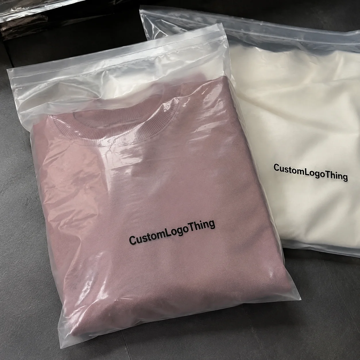
Labels and sleeves bring another layer of decision-making. Pressure-sensitive labels may use gloss or matte topcoats, cold foil, or specialty coatings, but they need to stay compatible with the adhesive, die-cut, and application machinery. Flexible packaging, meanwhile, often uses film-based laminates, reverse printing, or high-barrier coatings. The finish must work with seal performance, migration standards, and line speed. That is why how to choose packaging finish options cannot be separated from the production method. A label finishing line in Taicang running at 120 meters per minute will tolerate different coatings than a hand-applied sleeve in Nashville, and anyone who ignores that ends up paying for scrap.
There are also differences in the way finishes are applied. An aqueous coating is typically water-based and can be economical for large runs. UV coating cures quickly and creates a brighter, often more reflective surface. Varnish can add protection and a slight sheen, but it is usually less dramatic than laminate or UV. Lamination adds a film layer, which can provide stronger abrasion resistance. Foil stamping, embossing, and specialty films tend to be used selectively because they require more setup and carry a higher cost profile. A foil die in Suzhou may cost $60 to $180 depending on size and complexity, while embossing tooling can run $90 to $250 for a standard logo plate.
For a deeper industry context, I often point teams to packaging standards and trade resources such as the Packaging and industry packaging resources and handling test guidelines from ISTA. If your packaging needs to move through distribution reliably, testing matters as much as aesthetics. A package that passes visual approval in Brooklyn but fails a drop test in Memphis is not ready, no matter how good the foil looks under studio lights.
My rule of thumb: start with the substrate, then pick the finish. Not the other way around. That habit saves a lot of waste in how to choose packaging finish options because it keeps the decision grounded in reality rather than presentation software. And yes, I’ve had to say that out loud in meetings more than once, usually after someone falls in love with a finish that only works on a substrate nobody actually quoted.
Key Factors for Choosing the Right Finish
There are five questions I ask almost every client before we talk about specific finishes. They sound simple, but they stop bad decisions fast. How should the package feel? Where will it be sold? How much handling will it see? What is the target price point? And what is the brand trying to say without words? I ask these in every sourcing call, whether the supplier is in Dongguan or Indianapolis, because the answers shape the quote as much as the artwork does.
Brand identity comes first. A minimalist skincare label usually does not need metallic drama. A heritage chocolate brand might benefit from foil and embossing because those cues suggest craft and giftability. A rugged tool kit, by contrast, may need a matte protective coating that communicates durability more than luxury. In other words, how to choose packaging finish options starts with what the brand should feel like in the customer’s hand. A $24 serum in a frosted carton needs different treatment than a $7 hardware kit packed for a Home Depot shelf in Ohio.
Product category matters more than many teams admit. Cosmetics, food, electronics, apparel, and gifting each have different unspoken rules. Cosmetics often reward soft-touch, gloss accents, or metallic touches. Food packaging often needs practical moisture and handling resistance. Electronics packaging often leans toward clean, technical surfaces. Apparel and gifting can tolerate more playful texture or premium embellishment if the price point supports it. A candle brand in Portland can get away with a heavier tactile finish; a nutrition bar shipped through Arizona heat usually cannot.
Budget is where ambition meets math. In one sourcing conversation, a client wanted a premium finish stack—soft-touch laminate, foil, embossing, and spot UV—on a run of 3,000 folding cartons. The finish cost would have been disproportionate to the unit economics. We pared it back to a matte base with one foil detail and saved roughly 18% on the finishing portion alone. That kept the package upscale without turning margin into confetti. Procurement was thrilled. Which, frankly, happens about as often as a sunny day in a loading dock. On that order, the final finish package landed around $0.31 per unit instead of $0.43.
Customer experience is easy to underestimate because it includes things people notice only when they fail. Does the box fingerprint under store lighting? Does the finish photograph well in a phone camera? Does it scuff in a shipping carton? Does it still look crisp after being stacked for two weeks in a distribution center? Those are the details that make retail packaging feel either polished or careless. A matte black carton from a factory in Xiamen can look gorgeous on day one and miserable after three hands, one conveyor belt, and a 12-hour truck ride.
Sustainability goals deserve a real conversation, not a slogan. Some finishes are easier to recycle than others. Water-based coatings and certain recyclable-friendly finishes may be preferable to mixed-material laminations, though local recycling rules differ. If sustainability is central to your brand, ask whether the finish is doing essential work or just adding shine. The EPA’s packaging and materials guidance is a useful reference point for broader materials thinking: EPA Sustainable Materials Management. In practice, I’ve seen brands in Toronto and Austin choose matte aqueous over plastic lamination and save both weight and headaches.
Quantity and scale affect unit economics. Larger runs usually lower the per-unit burden of premium finishes because setup costs get spread across more pieces. Short runs often favor simpler coating systems or a single high-impact detail. That is a major part of how to choose packaging finish options if you are ordering custom printed boxes for a launch, subscription program, or seasonal promotion. A 50,000-piece run in Shenzhen might carry a foil hit at $0.04 per unit, while a 2,500-piece pilot in New Jersey could be $0.19 per unit before shipping.
| Finish Option | Typical Cost Impact | Visual Effect | Durability | Best Use Case |
|---|---|---|---|---|
| Aqueous coating | Low; often $0.03-$0.09 per unit on 5,000+ pieces | Soft sheen or matte | Good | High-volume product packaging and mailers |
| UV coating | Low to moderate; roughly $0.05-$0.14 per unit depending on coverage | Bright, high contrast | Good to very good | Retail packaging needing stronger pop |
| Soft-touch laminate | Moderate to high; often $0.12-$0.28 per unit on 3,000-10,000 pieces | Velvety, premium | Very good | Luxury branded packaging and gift boxes |
| Foil stamping | Moderate to high; commonly $0.08-$0.25 per unit plus tooling | Metallic highlight | Good | Logos, seals, and focal elements |
| Embossing/debossing | Moderate; often $0.06-$0.18 per unit depending on size and depth | Dimensional texture | Good | Premium package branding and tactile cues |
That table is not a universal price sheet. It’s a working map. Actual pricing shifts by size, tooling, material, vendor, and run length. Still, it helps narrow the field, which is the real goal when you are learning how to choose packaging finish options without wasting time on impractical ideas. If a vendor in Foshan quotes foil at $0.01 per unit on 1,000 boxes, they are either leaving out setup or planning to make it up somewhere else.
How to Choose Packaging Finish Options Step by Step
If you want a simple path, use this one. I’ve used it on everything from subscription mailers to luxury rigid cartons, and it keeps discussions focused on outcomes rather than opinions. It is also the most practical way I know for how to choose packaging finish options when a launch deadline is breathing down your neck. On projects with a proof approval date in week one and delivery promised in week four, structure matters more than taste.
Step 1: Define the package job
Ask what the packaging must actually do. Protect the product? Win attention on shelf? Create a memorable unboxing? Reduce damage claims? Support retail display? A box that ships direct-to-consumer has different demands than a counter display carton. If the package has three jobs, write them down in order of importance. I remember one buyer who wanted “luxury, sustainability, and crush resistance” without changing the budget. I almost spilled my coffee. Not from shock. From laughter. On the spot, I asked which of those three mattered most for the 1,200-piece pilot run coming out of Ningbo, and suddenly the conversation got honest.
Step 2: Shortlist two or three realistic finishes
Don’t start with ten options. Start with three. For example, a matte aqueous base, a soft-touch laminate, and a gloss UV with foil accent. Those three can tell you a lot about brand direction, budget ceiling, and tactile preference. In a design review I attended last year, the team fell in love with a fully embossed concept, but the sample test proved a simpler foil-and-matte combination delivered 90% of the visual impact at about 65% of the cost. On a 10,000-piece run, that difference was about $1,100 saved, which is enough to make a merch manager smile and a CFO pretend they planned it that way.
Step 3: Match finish to substrate and print method
Here’s where the technical side matters. Offset printing, digital printing, flexo, gravure, and screen processes all behave differently with finish systems. A finish that works on coated SBS may not hold the same crispness on recycled board. A gloss lamination can sharpen deep blacks, while soft-touch may mute them slightly. If the artwork uses fine type, tiny reverse-out details, or delicate gradients, the finish should support legibility, not compete with it. That is a core part of how to choose packaging finish options wisely. A supplier in Guangzhou once showed me a 6-point serif type line disappearing under heavy matte on a kraft board, and the fix was either a larger font or a different finish. Guess which one cost less.
Practical note: I always ask printers what they’ve seen fail. Their answer is usually more useful than a sales brochure. One converter in Suzhou told me, “If the design depends on a perfect foil edge over a textured stock, we already know the margin for error is small.” That kind of candor is worth its weight in press time. Another press manager in Taipei said the same thing a little more bluntly: “Pretty on screen means nothing if the foil walks.” She was right.
Step 4: Request physical samples, not just digital proofs
A PDF can lie by omission. A physical sample tells the truth about sheen, board feel, fingerprinting, and edge wear. Review samples under retail lighting, natural daylight, and phone flash if possible. If the package is for e-commerce, also check it under warehouse lighting. I’ve seen a beautiful black box look rich on a monitor and flat, streaky, and dusty in a fluorescent aisle. That gap is exactly why how to choose packaging finish options should include tactile testing. A 3-piece sample set from a printer in Shenzhen usually takes 7 to 10 business days after art approval, and that time is worth it if the alternative is reprinting 20,000 units.
Step 5: Compare cost, lead time, and production complexity
This is the part procurement cares about, and rightly so. A special finish may add one more pass, one more vendor, or one more drying/cure step. That can affect the schedule by 2 to 7 business days, sometimes more if tooling is involved. If your launch date is fixed, pick the finish you can actually produce repeatedly, not the one that looks best only in a sample drawer. A simple matte aqueous carton may typically move from proof approval to shipment in 12-15 business days, while a foil-plus-emboss stack can stretch to 18-24 business days if the die needs remaking or the press queue is full in Dongguan.
Step 6: Test for real-world durability
Stack it. Rub it. Tape it. Ship it. Put it in humidity. Put it in a tote bag. Then see whether the finish still performs. If you sell through retail, ask how the box will survive shelf friction and customer handling. If you sell online, test transit wear using ISTA-aligned methods where appropriate. A finish that looks good for 30 seconds and fails after 30 minutes is not a good finish choice, no matter how impressive the first mockup looked. For a batch headed to Amazon fulfillment in Kentucky, I’d rather see a slightly less dramatic finish that survives a 36-inch drop than a fragile premium coat that chips on the first corner.
So, step by step, how to choose packaging finish options becomes a sequence: define the job, reduce the list, match substrate and print method, sample in real light, compare commercial impact, and stress-test the winner. That sequence prevents a lot of expensive do-overs. It also gives your supplier a fighting chance to quote accurately instead of guessing what “premium” means to five different stakeholders.
Cost, Pricing, and Timeline Considerations
Finish costs are rarely just “finish costs.” They spread across setup, materials, handling, proofing, and time. When I’ve negotiated with suppliers, I’ve seen a quoted finishing upgrade add only $0.03 per unit on a 50,000-piece run, but that same upgrade on 2,500 pieces can feel much heavier because fixed setup costs are eating the order. Scale changes everything. A carton line in Shenzhen might quote $0.15 per unit for 5,000 pieces with matte aqueous, then $0.29 per unit for the same spec at 1,000 pieces because the setup is doing all the work.
There are usually two buckets of cost. First, one-time setup or tooling, which can cover plates, dies, or special preparation. Second, recurring per-unit cost, which depends on the actual material and process. Foil stamping, embossing, and specialty lamination may carry tooling or setup charges that make small orders expensive. Aqueous coating or standard varnish is often easier to absorb into the run. In practical terms, a foil die in Shenzhen may be $75, a matching emboss plate $110, and a full soft-touch lamination stack another $0.09 to $0.21 per carton depending on board and quantity.
Lead time is another hidden variable. A plain matte coating may fit comfortably into a normal schedule, while a multi-step finish stack can introduce extra proofing and vendor coordination. If the finish requires film sourcing, special curing, or matching between multiple facilities, the calendar stretches. I’ve seen a six-day delay become a 19-day delay because one specialty film arrived late and the cartons had to wait for a compatible production window. Fun times. Absolutely no one enjoys that phone call. In one case, a factory in Dongguan had the boxes ready in 11 business days, but the foil film from Jiangsu missed the truck and pushed delivery to day 23.
Here’s a useful way to think about the business case behind how to choose packaging finish options: premium finishes can increase perceived value, but only if the market notices. If a $12 item gets a $4 finish package, the math may be upside down. If a $120 item gets the same treatment, it may look undercooked without it. The best finish is the one that aligns with margin, category expectations, and route-to-market. I’ve seen a $38 candle sell better with a $0.12 finish upgrade because the shelf had competition from cheaper jars and louder labels.
There is also the cost of mistakes. A finish that scuffs during shipping, oils from fingerprints, or makes text hard to read can create returns, reprints, and buyer dissatisfaction. That cost is easy to miss because it shows up later. I’ve seen one brand spend more on remediation than it would have spent Choosing the Right finish in the first place. A reprint of 8,000 cartons in Chicago once cost the client $4,600 in rework and freight because the matte varnish cracked at the folds.
If you’re building a budget around Custom Packaging Products, I’d recommend treating finish as a line item with a function, not a flourish. Ask for both a low-risk option and a premium option. Then compare them side by side, not just in price but in the way they influence shelf presence, handling, and customer confidence. Ask the supplier for landed pricing too, because a box that costs $0.18 ex-factory in Shenzhen can still land at $0.31 after ocean freight, carton loading, and domestic drayage.
Rule of thumb: the best finish is not always the flashiest one. It is the one that gives you the right mix of impact, durability, and manufacturability. That’s the heart of how to choose packaging finish options without overspending. If a finish takes your quote from $0.42 to $0.67 per unit and only 8% of buyers notice the difference, that’s not premium. That’s a tax on indecision.
Common Mistakes When Selecting Finish Options
The first mistake is choosing a finish because it looks good in a mockup. Mockups are useful, but they are not proof. A bright gloss effect can look dramatic on screen and too reflective in person. Soft-touch may feel luxurious yet darken the palette more than expected. If the finish is making the design work only in one environment, it’s probably the wrong choice. I’ve seen a matte navy carton in Shanghai look elegant under studio LEDs and nearly black under store fluorescents, which made the typography harder to read from 6 feet away.
The second mistake is ignoring fingerprints, glare, scuffing, and abrasion. Dark matte surfaces can show every touch. Gloss can reflect store lights in a way that interferes with readability. I’ve watched a buyer reject a beautiful black carton because the logo disappeared under overhead lighting from 20 feet away. That was not a design problem alone. It was a finish problem. The sample had come from a plant in Xiamen, and the fix was a different topcoat, not a new logo.
The third mistake is overdoing premium effects. Foil, embossing, spot UV, and texture all have a place. Together, on the same box, they can quickly become visual clutter. Good packaging design needs hierarchy. If every surface is shouting, nothing is leading. That matters in package branding more than many teams realize. A luxury tea box with foil border, embossed logo, spot UV pattern, and textured laminate may sound impressive in a meeting in Chicago, but on shelf in Denver it often just looks busy and expensive in the wrong way.
The fourth mistake is forgetting sustainability implications. Laminations and mixed materials may complicate recycling, depending on local systems and the structure of the pack. If your brand claims environmental responsibility, the finish choice should support that story honestly. Otherwise, the finish becomes a contradiction printed in silver. A brand in Vancouver once insisted on a recyclable claim, then spec’d a plastic lamination that made the carton harder to process in local recovery streams. That mismatch is the kind of thing that earns awkward questions later.
The fifth mistake is misaligning the finish with the product’s price point. A value-driven household item in an ultra-premium box can create confusion. Customers may wonder whether they’re paying for the packaging rather than the product. That doesn’t help conversion. It also weakens the trust signal of the brand. If the product retails at $8.99 in Target, a $0.60 finish stack is probably doing too much.
The sixth mistake is skipping physical testing. Digital proofs, however polished, cannot tell you how a finish behaves under friction or humidity. I’ve seen brands approve based on a JPG, then lose weeks fixing issues after the first sample run. There is no substitute for touch and handling. None. The press room always finds the truth eventually. A humid week in Miami or a dry week in Denver will expose finish problems that a designer’s monitor will never catch.
Expert Tips for Better Packaging Finish Decisions
Use contrast with intent. A matte base with a gloss logo or foil mark often reads more intelligently than a fully glossy surface trying to impress everyone at once. That contrast guides the eye. It also gives the design a focal point, which is especially useful in retail packaging where a consumer may only glance for two seconds. On a beauty carton produced in Suzhou, a matte black base with a single hot foil logo outperformed a fully laminated version because the logo actually had room to breathe.
Think in touchpoints, not just visuals. The outer shipper, the retail box, the insert, and the internal wrap each offer different opportunities. You do not need the same premium finish everywhere. Sometimes a simple outer carton and one elevated inner reveal create a better unboxing than spending the whole budget on the outside. A 2-piece mailer in Los Angeles looked more expensive after we added soft-touch only to the sleeve and kept the inner tray plain white. That saved about $0.11 per unit on a 4,000-piece order.
Test under multiple light conditions. Natural daylight, warm store lighting, LED shelf lighting, and phone photography all change how finish reads. A finish that looks elegant in daylight can look flat under fluorescent retail fixtures. A finish that photographs beautifully may still be slippery or overly reflective in the hand. Customers rarely experience packaging in controlled studio conditions, so neither should you. I like to check samples near a window, then under a 4,000K light, then with a phone flash, because that’s the closest thing to real use.
If the budget is tight, choose one high-value finish element and let it do the work. A single well-placed foil stamp or emboss can outperform three average embellishments. This is one of my favorite truths about how to choose packaging finish options: restraint often looks more expensive than excess. On a skincare launch in Boston, a simple emboss on a 350gsm C1S box did more for perceived value than a full-color metallic flood ever would have.
Ask suppliers specific questions. What is the minimum order quantity? How does the finish affect color shift? Does it work with recycled board? How durable is it under abrasion? Can it be run on your existing equipment, or does it require a special line? Straight answers save time. Vagueness costs money. If a supplier in Dongguan cannot tell you whether a coating adds 12 or 18 hours of curing time, they are not ready to own your deadline.
Keep accessibility in mind. Excessively shiny surfaces can make text harder to read for some users. If the package carries regulatory information, ingredients, warnings, or technical instructions, the finish should not interfere with legibility. That is especially important in regulated categories and in product packaging where clarity matters as much as appearance. A warning panel on a high-gloss panel in a pharmacy aisle can disappear under glare from a single overhead tube.
What to Do Next Before You Approve a Finish
Before you sign off, create a short checklist that includes the brand goal, substrate, budget, shelf effect, durability needs, and production timeline. That alone can prevent a lot of backtracking. I’ve seen teams approve a finish based on taste and then spend the next two weeks trying to make the board, ink, and schedule cooperate. Better to ask the hard questions now. Put them in writing on the spec sheet, right next to the board callout, whether that’s 350gsm SBS or a 2mm rigid wrap.
Request at least two or three physical samples with different finishes. Compare them side by side. Put them next to a competitor’s box, a cheaper alternative, and your current packaging if you have one. You will learn more from a 10-minute table comparison than from a 30-minute video call. I like to use samples produced in different regions too, because a carton from Shenzhen and one from Ho Chi Minh City can reveal differences in coating consistency that don’t show up on a JPEG.
Then review the package in real use. Stack it. Ship it. Photograph it. Handle it with dry hands, then with slightly damp hands if the product category suggests it. Check how the finish wears at corners, folds, and high-touch zones. If the package is for e-commerce, simulate what happens when it lands in a sorting facility or sits in a truck on a warm day. A 72-hour humidity test in Miami will tell you more than a polished mockup ever will, and yes, it’s annoying to wait. That’s still better than reordering 6,000 units after a finished box starts blistering.
Confirm the final choice with your printer or packaging partner before artwork is locked. Once the finish is tied into die lines, color profiles, and manufacturing plans, changes become more expensive. Document the finish in the spec sheet so reorders stay consistent. A note as simple as “350gsm SBS, matte aqueous, foil logo, no lamination” can save a future team from guessing. Add the supplier’s factory location too—Shenzhen, Dongguan, or Suzhou—because packaging specs without manufacturing context invite chaos on reorder.
If you’re still weighing how to choose packaging finish options, remember the first rule: the finish should make the packaging feel right, not just look right. That distinction matters. A package can photograph beautifully and still fail on shelf, or feel luxurious and still wreck the budget. The best choice balances both. I’ve seen too many brands pay for visual drama and then wonder why the margin vanished in the freight quote.
And that is the practical answer to how to choose packaging finish options with purpose. Start with the job, respect the substrate, test in real light, compare costs honestly, and choose the surface treatment that supports the product story rather than distracting from it. If you can get that right, the box stops being just a container and starts doing its actual job, which is to sell the product without making a mess of the budget.
FAQ
How do I choose packaging finish options for a premium look?
Start with a matte or soft-touch base if you want a refined, upscale feel. Then add one accent effect such as foil, spot UV, embossing, or debossing instead of stacking every premium feature at once. The strongest premium cues usually come from controlled contrast and clean execution, not from overloading the box. On a 350gsm SBS carton from a printer in Suzhou, a matte base with one gold foil logo can usually do more than three separate embellishments.
What packaging finish option is most cost-effective?
Aqueous coating and standard varnish are usually among the most budget-friendly choices. They tend to have lower setup complexity and faster turnaround than specialty effects. That said, the cheapest option is not always the best value if it damages durability, shelf impact, or brand perception. On runs of 5,000 to 10,000 pieces, aqueous often lands around $0.03 to $0.09 per unit, which is why so many factories in Dongguan recommend it first.
Which finish is best for preventing scuffs and scratches?
Lamination and durable coating systems generally offer stronger surface protection. Gloss and matte can both work, but the actual performance depends on the substrate, handling conditions, and distribution path. If scuff resistance is critical, request physical samples and run an abrasion test before final approval. I’d rather see a sample rub-tested at 50 cycles in the factory than hear about corner wear after a retail launch in Atlanta.
How do packaging finish options affect production time?
Basic finishes usually move through production faster because they require fewer specialized steps. Specialty effects like foil stamping, embossing, or multi-layer coatings can add setup and proofing time. If your launch date is fixed, confirm lead times early and leave room for sampling. A matte aqueous carton may take 12-15 business days from proof approval, while a multi-step foil and emboss job can stretch to 18-24 business days depending on the plant in Shenzhen or Ningbo.
Can I make packaging finish options more sustainable?
Yes, by choosing simpler coatings, minimizing mixed materials, and avoiding unnecessary plastic laminations when possible. Work with your supplier to identify recyclable-friendly alternatives that still meet durability needs. In many cases, the most sustainable finish is the one that does the job with the fewest added materials. A water-based coating on a 350gsm board from a factory in Hebei is often a cleaner starting point than a mixed-material stack with no real performance advantage.