Buyer Fit Snapshot
| Best fit | Create Branded Packaging Identity That Lasts projects where brand print, material claims, artwork control, MOQ, and repeat-order consistency need to be specified before quoting. |
|---|---|
| Quote inputs | Share finished size, material target, print colors, finish, packing count, annual reorder estimate, ship-to region, and any compliance wording. |
| Proofing check | Approve dieline scale, logo placement, barcode or warning zones, color tolerance, closure strength, and carton packing before bulk production. |
| Main risk | Vague material claims, crowded artwork, missing packing details, or unclear freight terms can make a low unit price expensive after revisions. |
Fast answer: Create Branded Packaging Identity That Lasts: Material, Print, Proofing, and Reorder Risk should be specified like a repeatable production item. The safest quote records material, print method, finish, artwork proof, packing count, and reorder notes in one written spec.
Production checks before approval
Compare the actual filled-product size with the drawing, then confirm tolerance on folds, seals, hang holes, label areas, and retail display edges. Reserve space for logos, QR codes, warning copy, and material claims before decorative graphics fill the panel.
Quote comparison points
Review material grade, print process, finish, sampling route, tooling charges, carton quantity, and freight assumptions side by side. A quote is only useful when the supplier can repeat the same color, closure quality, and packing count on the next order.
Two boxes can roll off the same converting line at nearly the same cost, yet one feels like a $12 product and the other feels like it belongs in a freight bin. That difference is usually the answer to how to Create Branded Packaging identity, and after two decades around print shops, corrugated plants, and rigid box lines, I can tell you the gap is rarely about the logo alone. On a standard run of 5,000 folding cartons in Dongguan, I’ve seen a basic 350gsm C1S artboard box come in around $0.18 per unit while a slightly better-coated version with tighter registration and a matte aqueous finish lands closer to $0.24. Same size. Different feeling. Funny how that works.
I remember standing on a packaging floor in South China, holding two “identical” samples while the brand team argued over which one felt more premium. They were both technically fine. Both passed spec. One just had better restraint. That line of cartons was produced near Shenzhen, and the difference came down to a 2mm logo shift, a softer touch lamination, and a cleaner tuck flap that closed with less resistance. That’s the annoying truth nobody wants to hear: packaging identity is not magic. It’s a stack of decisions that either work together or fight each other like interns on a deadline.
It comes down to structure, material, finish, and the little decisions most buyers only notice when something feels off: a flap that opens too loosely, a kraft tone that fights the brand color, or a foil stamp that looks expensive on screen but muddy under pressroom lights. If you want how to create branded packaging identity that lasts, treat packaging as a manufacturing system, not a one-off art project. That means writing down specs like 1.5mm greyboard for rigid boxes, 12pt clear PET windows for visibility, and a 0.5mm scoring tolerance instead of hoping the factory “gets the vibe.”
What Branded Packaging Identity Really Means
Branded packaging identity is the consistent visual, tactile, and structural language that makes a package recognizable before the product is even touched. In practical terms, it is the mix of logo placement, color rules, typography, materials, finishes, and opening behavior that tells a customer, “this is us,” even from six feet away on a shelf or a stack of parcels at a fulfillment center. For a cosmetics line I reviewed in Milan, that language included a deep burgundy Pantone, a centered 11pt sans serif, and a rigid lid-and-base box with a 1.8mm board thickness that made the whole thing feel deliberate.
In one folding carton plant I visited outside Chicago, the client had two carton designs that used the same board, the same ink count, and nearly the same die. One carton felt premium because it used a deeper matte varnish, tighter type placement, and a more deliberate tuck closure; the other felt generic because every panel was shouting at once. The run was quoted at $0.31 per unit for 10,000 pieces, and the premium version only added about $0.04 for the varnish and foil hit. That’s the part people miss when they ask how to create branded packaging identity: identity is often built from restraint, not decoration.
And yes, I’ve seen brands spend a small fortune trying to “make it pop” when the real fix was just fewer competing elements. Honestly, some packaging looks like it got into a fight with itself and lost. A clean 350gsm SBS carton with one foil logo and one accent color can outperform a box stuffed with three patterns, two taglines, and a shiny finish on every panel.
It also goes beyond surface graphics. A real packaging identity includes the sequence of the unboxing, the shape of the insert, the pull tab, the magnet strength on a rigid box, the way a corrugated mailer folds, and even how a sleeve slides over a jar or candle. I’ve seen brands spend heavily on print and then lose the whole effect because the insert rattled in transit or the lid opened too easily in a premium gift box. A 0.6mm EVA insert can hold a glass bottle steady; a sloppy paperboard insert at 300gsm will let that same bottle bounce around like it’s late for rent.
That same identity has to work across formats: folding cartons, rigid boxes, mailer boxes, corrugated shippers, pouches, sleeves, and retail display packaging. A skincare brand might use a 400gsm SBS folding carton for shelf presence, then carry the same color and icon system into a B-flute corrugated shipper and a PE-lined pouch. The package changes, but the brand language stays intact. That consistency is the backbone of how to create branded packaging identity that customers recognize quickly, whether the order ships from Los Angeles, Toronto, or a fulfillment center in New Jersey.
Here’s the test I use: if a package is sitting in a warehouse, standing on a shelf, rattling in a delivery van, or being filmed by a customer at a kitchen table, does it still feel like the same brand? If the answer is yes, the identity is doing its job. If not, the packaging design is probably too dependent on one beautiful mockup and not enough on real production decisions. A design that only looks good on a 27-inch monitor is not a packaging strategy. It is a mood board with delusions.
Honestly, I think many teams overcomplicate package branding. They chase novelty when they should be building repetition, because repeatable cues are what customers remember. That is the practical center of how to create branded packaging identity: build a system that can be made again, shipped again, and recognized again. In real factories around Guangzhou and Ningbo, the brands that win are usually the ones with the cleanest standards sheet, not the wildest render.
How Branded Packaging Identity Works Across the Customer Journey
Packaging identity shows up in stages, and each stage has a different job. On a retail shelf, it must grab attention in about three seconds. At the doorstep, it has to survive dents, moisture, and carrier handling. During unboxing, it needs to feel intentional. On a repeat order, it should be recognizable enough that customers know what arrived before they open the label. That chain is why how to create branded packaging identity is never just a design question. It is a logistics question, a print question, and a customer psychology question all at once.
Customers usually notice the package in five touchpoints: first glance, pickup, opening, product reveal, and reuse or sharing. If the package looks strong in only one of those moments, it is incomplete. I’ve seen elegant retail packaging fail in e-commerce because the outside shipper was plain brown kraft with no internal print, and I’ve seen simple mailers become iconic because the inside panel carried a bold pattern and a strong brand line. A $0.22 kraft mailer with a two-color interior print can outperform a $1.80 plain rigid box if the customer shares the unboxing on TikTok and the inside message actually lands.
Consistency is what makes the whole thing stick. A customer should be able to identify the brand from color, type placement, pattern rhythm, and box construction alone. Think of a deep teal band, a clean sans-serif at 12pt, a centered logo, and a rigid box with a lift-off lid; those details become memory cues. That is the practical side of how to create branded packaging identity across product packaging and retail packaging alike, whether the box is produced in Vietnam, India, or a plant just outside Osaka.
Texture matters more than people expect. Matte versus gloss changes the emotional read of the package. Soft-touch lamination can make a carton feel expensive even before any foil is added, while a high-gloss aqueous coating can signal energy and speed. In a cosmetics run I reviewed in Shenzhen, the brand debated embossing against spot UV for a hero mark; the embossed version won because the tactile bump still looked polished after the box had been handled dozens of times on a retail floor. That run used 350gsm C1S artboard with a 1.2mm greyboard sleeve, and the tactile difference was obvious even before the shrink wrap came off.
Structural design carries just as much meaning as print. A magnetic closure suggests premium gifting. A tear strip says convenience and speed. A window cutout says transparency and product confidence. Custom inserts can either create a neat presentation or turn into a flimsy afterthought if they are cut too loosely. When people ask me how to create branded packaging identity, I remind them that opening mechanics are part of the brand language. A 3mm foam insert in a rigid box sends one message; a loose folded carton insert sends another.
On the production side, the choices you make are tied to the actual process. Offset printing gives crisp registration for detailed art on custom printed boxes, while flexographic printing is common for corrugated cartons and shipper graphics. Die-cutting determines the exact profile. Finishing lines decide whether your foil is sharp or slightly crushed. If you want a package to feel consistent from the first sample to the tenth reorder, those processes matter as much as the creative brief. In Dongguan, I’ve watched a job go from okay to excellent just because the factory shifted from a worn die to a fresh steel rule die with cleaner corners.
Trust is built in the details. A strong package feels like the brand knows what it is doing, which helps customers trust the product inside. That is not marketing fluff; I have watched merchants choose one supplier over another because one box looked “organized” and the other looked improvised. Good package branding lowers doubt. It also improves recall, which matters when a customer sees the same visual language across a shipping box, a display carton, and a re-order mailer. A tidy $0.15-per-unit mailer at 5,000 pieces can do more for trust than a fancy deck with six mood-board colors and zero factory reality.
If you want a deeper look at standard industry expectations for shipping durability, the ISTA testing standards are worth reviewing, and for sustainability alignment, the EPA packaging and waste resources can help frame material decisions. I bring those up because branded packaging identity has to survive real logistics, not just mood boards. A mailer that survives ISTA 3A testing from Chicago to Phoenix is a lot more useful than a pretty one that caves in at the first bad conveyor belt.
Key Factors in How to Create Branded Packaging Identity
There are a handful of decisions that shape almost every packaging identity system, and if you get these right early, the rest becomes easier. If you get them wrong, you spend weeks fixing color drift, structural mismatch, and expensive rework. Here is the core of how to create branded packaging identity without creating headaches for your factory or your budget. On a 5,000-piece launch in Shenzhen, a few well-chosen specs can mean the difference between a $0.38 carton and a $0.62 carton. That difference matters when you have six SKUs and a launch date that will not wait for anyone’s feelings.
Color strategy
Start with a primary palette and a rule for how it behaves on different substrates. One brand might own a signature navy and a warm white, then use metallic copper only for premium SKUs. Another may use a kraft base with one saturated accent color across everything. The key is consistency: CIELAB values, coated versus uncoated behavior, and how those colors shift on SBS paperboard versus corrugated liners or coated paper wraps. If your brand orange looks strong on a monitor but turns dull on uncoated kraft in Ho Chi Minh City, you need a correction strategy, not another mood board.
I once sat in a supplier negotiation where a buyer insisted on three exact Pantone values across kraft mailers, rigid boxes, and labels. The printer pushed back, correctly, because the same ink formula was never going to look identical on those surfaces. We settled on a color hierarchy instead of a false promise, and the brand saved thousands in reprints. That is the kind of realism that belongs inside how to create branded packaging identity. The right answer was not “make it identical.” The right answer was “make it recognizable.”
Typography and messaging
Typography should be readable at the package size you actually use, not just in a giant design deck. A 7pt legal line on a small sleeve is a bad idea if the package curves or folds. I like a clean hierarchy: logo, product name, one supporting line, then a clear regulatory zone. Keep messaging short unless the format gives you room, because crowded copy makes even premium packaging look anxious. If your 20pt carton has to carry ingredients, compliance, a QR code, and three taglines, something in the structure needs to give.
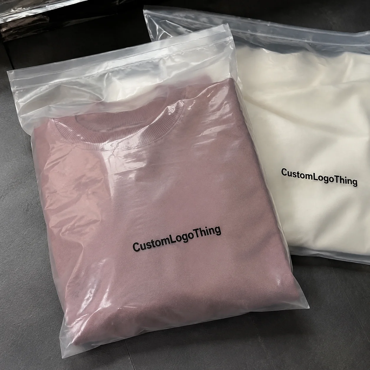
Material selection
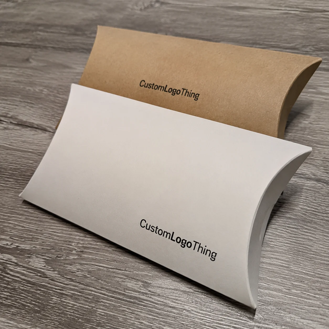
The substrate sets the tone before print even begins. Kraft paperboard gives warmth and a natural cue. SBS paperboard gives a cleaner, brighter canvas for custom printed boxes. Rigid board carries weight and ceremony. Corrugated fiberboard adds protection and shipping strength. Molded pulp can reinforce a sustainability message while holding a product securely. Specialty papers can make a package feel more distinctive, but they often raise cost and lead time. A 350gsm C1S artboard carton out of Guangzhou will behave very differently from a 1.5mm rigid setup made in Shenzhen, especially once the humidity climbs past 70 percent.
For a subscription coffee brand I helped review, the decision came down to a 24pt SBS carton versus an E-flute mailer with a paper wrap. The carton looked sharper for retail, but the mailer was cheaper in fulfillment and more durable in transit. That tradeoff is common in how to create branded packaging identity: the “best” material is the one that supports the channel, not the one that sounds fancy in a pitch meeting. In that case, the E-flute mailer won by about $0.11 per unit at 10,000 pieces, which paid for the custom inside print they actually wanted.
Finish and texture
Finishes change perception fast. Foil stamping suggests ceremony. Debossing adds subtle authority. Embossing creates depth. Spot UV can guide the eye to a logo or product name. Varnish can protect print and alter sheen. Soft-touch coating gives a tactile, almost velvety feel that many beauty and tech brands use because it reads as premium without shouting. In Ningbo, I saw a rigid box spec with matte lamination and copper foil move from “nice” to “wow” with one tiny change: the foil area was reduced from 18% coverage to 6%, which made the brand mark feel intentional instead of flashy.
Structural consistency
Box shape is part of identity, and that is where a lot of teams underspend their attention. A square rigid box with a shoulder neck gives a different emotional read than a slim tuck-end carton. A mailer with locking tabs says practical and sturdy. An insert that cradles the product in a fixed orientation can turn a simple opening into a deliberate reveal. If your structure changes randomly from SKU to SKU, your identity starts to fragment. A 210 x 150 x 60 mm mailer and a 220 x 160 x 75 mm mailer can still feel like the same brand if the closure and interior print language stay consistent.
Sustainability alignment
Many buyers want branded packaging to reflect recycled content, right-sizing, mono-material construction, and better fiber recovery. That does not mean every package must look raw or rustic. You can still build a refined identity with FSC-certified board, water-based coatings, and thoughtful material usage. If sustainability is a brand pillar, it should be visible in the spec sheet, not just in the copy. A 30% recycled-content corrugated shipper from Shanghai can still look premium if the print system is disciplined and the structural fit is tight.
For sourcing and certification context, the FSC site is a useful reference if you need to understand responsible forestry claims and supply chain expectations.
Cost and pricing
Pricing follows complexity, and this is where buyers can get surprised. A simple printed carton might land around $0.18/unit for 5,000 pieces depending on size, board, and print coverage, while a Custom Rigid Box with a magnet closure, soft-touch lamination, and a printed insert can move into the $1.20 to $2.80/unit range very quickly. If you add custom tooling, specialty papers, or foil on multiple panels, the setup fees can climb as well. I’ve quoted 5,000-piece runs in Dongguan where one extra foil pass added $180 in setup and about $0.06 per unit. Small changes. Real money.
| Packaging option | Typical use | Approx. unit price at 5,000 pcs | Lead time | Identity impact |
|---|---|---|---|---|
| Printed folding carton | Retail and small products | $0.18-$0.45 | 10-15 business days | Strong graphics, lower tactile weight |
| Custom corrugated mailer | E-commerce and subscription | $0.55-$1.10 | 12-18 business days | Great for transit and unboxing print area |
| Rigid gift box | Premium retail and gifting | $1.20-$2.80 | 18-30 business days | Highest tactile and structural impact |
| Paper sleeve with insert | Lightweight product branding | $0.12-$0.35 | 8-12 business days | Cost-effective branding layer |
If you want to compare formats before committing, I often point clients to Custom Packaging Products as a starting place, then use Case Studies to see how the same identity rules behave in different industries. That kind of side-by-side review saves money and prevents wishful thinking. A 24pt carton that works for skincare in Seoul may fail for a glass candle in Portland, so the examples matter.
Step-by-Step: How to Create Branded Packaging Identity
When teams ask me how to create branded packaging identity, I tell them to treat it like building a repeatable system. You are not designing one box; you are creating a language that can survive reorders, line changes, and new SKUs. That means the process needs structure from day one, not the classic “we’ll figure it out in sampling” approach that burns through both budget and patience.
- Audit your current brand assets. Gather logos, Pantone or CMYK values, typefaces, photography rules, icon libraries, and any competitor packaging samples you admire or want to avoid. I like to keep everything in one folder because scattered references lead to conflicting instructions later. Include the actual print files, too, not just screenshots from a Figma board.
- Define the packaging job by channel. Retail packaging needs shelf appeal. E-commerce needs shipping strength. Gift packaging needs ceremony. Subscription packaging needs repeatable assembly. If you try to make one box do all of that without compromise, the outcome usually satisfies nobody. A box for a pharmacy shelf in Berlin should not behave the same way as a shipper for a monthly supplement order in Atlanta.
- Build a style board. Combine colors, textures, material references, and structural examples. Use actual board swatches, not just screenshots. The difference between coated white board and uncoated kraft is huge once you put ink on it. A 350gsm C1S swatch taped beside a 32ECT corrugated sample tells the story faster than a hundred adjectives.
- Choose format and substrate. Match the package to the product weight, fragility, and retail environment. A 180g candle in a 20pt folding carton is not the same as a glass serum bottle that needs an insert and a more rigid outer structure. If the product weighs 420g, the board thickness and flute choice matter. Physics is rude like that.
- Create dielines and prototypes. I have seen brands skip this and pay for it later in broken corners and crooked logo placement. A prototype shows closure fit, product movement, and how the material behaves at score lines and folds. On a rigid box run in Huizhou, a 1.5mm board sample revealed that the lid sat 2mm too high, which would have looked sloppy on shelf and worse in photos.
- Proof colors and finish placement. Digital mockups are useful, but press proofs and sample boards are where truth appears. Check barcode contrast, legal copy space, and how foil or embossing lands against the art. If the logo foil only catches light on one side, the final package will look uneven under store LEDs in Dallas or London.
- Test with real users or internal teams. A sales rep opening a box in a showroom and a warehouse picker opening it at 6 a.m. will notice different things. Gather both viewpoints before you lock the design. I’ve watched a beautiful magnetic closure fail because warehouse staff had to open it 500 times a day and the magnets slowed them down by several seconds each.
- Document standards. Build a packaging brand sheet with color rules, logo clear space, material specs, finish placement, dieline references, and acceptable tolerances. This is what keeps how to create branded packaging identity from drifting six months later. Put the actual supplier name, city, and revision date on the sheet, because “Version 2 final final” is not a system.
Here is a detail I learned on a corrugated line in New Jersey: even a one-millimeter shift in insert fit can change the feel of the whole unboxing. A customer may never measure it, but they can feel it. That is why prototypes are not optional. They are the bridge between a pretty layout and dependable product packaging. On a 250 x 180 x 90 mm mailer, a 1mm gap can turn a crisp reveal into a sloppy rattle.
For teams who need to scale this work, I usually recommend one master package first, then a family of variants around it. If you build a strong hero format, future SKUs can inherit the same visual anchors and still adapt for size or product class. That approach keeps package branding coherent without forcing every item into the exact same box. A line built around one master dieline in Chicago and one variant for gift sets in Toronto is a lot easier to manage than six unrelated boxes floating around a warehouse.
Process and Timeline: From Concept to Production
Timeline is where good intentions meet factory reality. A lot of buyers assume that once artwork is approved, the boxes will appear almost immediately. In practice, how to create branded packaging identity is tied to design time, sampling cycles, prepress checks, press scheduling, finishing, inspection, and freight, and each of those steps can add days or weeks. A launch planned for March can easily slide into April if the sample arrives in 96 hours instead of 48 and the art team takes three rounds to fix a barcode.
For a straightforward folding carton with existing tooling and approved artwork, a realistic window is often 10 to 15 business days from proof approval to completion, assuming material is in stock and the plant is not overloaded. Custom Rigid Boxes with specialty inserts, magnetic closures, or foil stamping often need 18 to 30 business days or more, especially if tooling or specialty paper sourcing is involved. In practice, I’ve seen a run in Dongguan take 12 business days for the carton itself, then another 4 days because the insert paper had to be re-ordered from Foshan.
Some choices save time immediately. Standard sizes, existing dies, clean vector artwork, and pre-approved brand colors reduce friction. If you already know your color recipe and can supply print-ready files, prepress can move faster. If the factory needs to rebuild every element from a PDF screenshot and a few loose mockups, schedule pressure grows fast. I once watched a client lose two days because their logo file was in RGB instead of CMYK and the printer had to rebuild the spot plate by hand.
Other choices add lead time in predictable ways. Custom tooling for unusual structures, multiple sampling rounds, imported papers, and multi-step finishes such as foil plus embossing plus spot UV all extend the calendar. I’ve watched a premium cosmetics launch slip by two weeks because a specialty coating had to be sourced from a different supplier after the original run failed rub testing. That was in Guangzhou, and the correction added about $0.08 per unit plus a new approval cycle.
Factory scheduling matters too. Even after artwork is approved, your job still has to fit into the press room, die-cutting schedule, and finishing line. If a plant is running a large beverage carton order or a holiday rigid box campaign, your run may wait its turn. Freight planning also matters because an air shipment of samples and a sea shipment of finished goods are very different animals, both in price and timing. Air freight from Shenzhen to Los Angeles can land in 3 to 5 days; sea freight can take 18 to 28 days depending on port congestion.
A practical rule I give clients is to build a buffer of 5 to 10 business days for sample review, color correction, and packaging line testing. That buffer sounds generous until you discover a barcode needs a wider quiet zone or a closure tab catches on the insert. Those are the kinds of adjustments that can save a launch. A 48-hour rush from a factory in Ningbo sounds exciting until your sales team opens the first carton and finds the lid sits crooked by 1.5mm.
When I visited a folding carton plant in Guangzhou, the production manager told me something I still repeat: “The box is never just the box.” He meant that the same structure can behave differently depending on humidity, board stiffness, coating, and scoring pressure. He was right. If you are serious about how to create branded packaging identity, plan for those variables instead of pretending they do not exist. A winter run in Shanghai and a summer run in Bangkok are not the same job.
Common Mistakes That Weaken Packaging Identity
Most weak packaging systems fail for ordinary reasons, not dramatic ones. The box is usually not broken because the idea was terrible; it is broken because too many choices piled up without a clear system. I see the same mistakes over and over, and they are all avoidable when you understand how to create branded packaging identity with discipline. A launch can go sideways in one week if the brand uses the wrong board, the wrong ink density, and three different closure styles across the line.
- Too many colors, fonts, or finishes. Visual noise makes a package feel less confident, not more premium. Three strong cues usually outperform seven competing ones.
- Designing only for the screen. A layout that looks polished in a PDF can fail under store lighting, after shipping abrasion, or when printed on textured stock.
- Choosing premium finishes too early. A buyer may love foil and embossing, but if the budget forces cheaper board or poor assembly later, the package loses value fast.
- Ignoring structure. Weak corners, loose inserts, or poor closure geometry can ruin the whole experience. A beautiful graphic on a bad structure still feels like a bad box.
- Underestimating print tolerances. Color shift, registration drift, and cut-line variation happen. If the design has no tolerance for real-world variation, it will look inconsistent from batch to batch.
- Failing to document standards. When different teams or vendors build new SKUs without a master guide, package branding drifts and customers notice.
One beauty brand I worked with had a gorgeous first run, then three different regional suppliers made “slight improvements” to the artwork. The result was a shelf full of almost-the-same boxes, which is worse than inconsistency because it looks careless. That experience taught them that a packaging standards sheet is not paperwork; it is brand protection. The first supplier was in Shenzhen, the second in Suzhou, and the third in Kuala Lumpur, and none of them matched each other on logo size or matte finish.
Honestly, the biggest mistake is assuming expensive equals effective. A $2 rigid box with the wrong opening feel can look worse than a well-designed $0.40 carton with one strong signature color and a clean insert. Good product packaging feels intentional, not overloaded. I’d take a $0.28 mailer with a tight spec and a readable inside print over a $1.90 box that makes the customer fight the lid.
Expert Tips to Make Your Branded Packaging Identity Stronger
If you want your system to Stand Out Without becoming chaotic, start with one unmistakable cue. That might be a signature color, a repeat pattern, a bold inside print, or a specific closure style. Once that cue is established, the rest of the packaging identity can support it instead of competing with it. A 12mm teal edge band on a white carton can do more brand work than a full-page print if the rest of the system stays quiet.
My preference is to prioritize tactile memory. A package that feels distinctive can do a lot of work even when the graphics are minimal. I’ve seen a plain white rigid box with deep debossing feel more premium than a heavily printed carton because the hand experience was so controlled. That tactile layer is often what makes how to create branded packaging identity feel memorable instead of merely visible. In a sample room in Hangzhou, the box that won wasn’t the flashiest one. It was the one that closed with the cleanest sound.
Use premium details sparingly and with intent. Foil should reinforce the hero message, not decorate every corner. Spot UV should guide attention, not create random shine. Embossing works best where the light can catch it naturally. When finishes are spread too thin, they stop feeling special and start feeling like budget inflation. If your foil area covers 40% of the lid on a $0.45 carton, you are probably paying for drama instead of identity.
Build SKU rules early. If you sell five flavors, three sizes, and a limited edition line, the system needs a way to distinguish each item without losing the core look. I like using a shared placement grid, a fixed logo location, and one controlled variation point, such as accent color or pattern density. That keeps the family connected while making each SKU easy to shop. In practice, that might mean 15mm top margins, one 14pt product title placement, and a color band that changes by SKU but never by more than 10% saturation.
Work closely with prepress and the production floor. I cannot stress this enough. Designers often imagine perfect print behavior, but the press operator is the one who knows whether a 1pt line will hold on a chosen substrate or disappear into the texture. Good packaging design respects both the brand and the machine. On a line in Shanghai, a 0.75pt rule looked elegant in the file and vanished on uncoated stock; the operator caught it before 20,000 pieces were ruined.
Build a reusable spec sheet that includes material, board caliper, finish callouts, color references, dieline version, barcode zone, and acceptable tolerances. If you want how to create branded packaging identity that survives reorders, that document is your safety net. It keeps new suppliers aligned and makes quoting faster. Put the supplier city, like Dongguan or Suzhou, on the sheet too, because regional production habits vary more than people admit.
For teams that want a practical benchmark, I recommend checking how strong brands handle custom printed boxes across multiple channels, then borrowing the system thinking rather than copying the artwork. What matters is the logic behind the package, not just the visual style. A clean system in Seoul will still feel clean in Melbourne if the spec is disciplined.
What to Do Next to Build a Packaging Identity System
The fastest way to move forward is to collect the evidence you already have. Pull together current packaging samples, customer comments, shipping photos, and brand files into one folder so you can see what is actually working. I’ve had clients discover that their strongest package was not the one the design team liked most; it was the one customers photographed the most. In one case, the winning box was a $0.33 mailer from a plant in Dongguan because the inside message and tape line photographed better than the “premium” option.
Next, define the top three goals for your packaging system. Maybe you need stronger shelf presence, a better unboxing experience, lower damage rates, or more consistent reorders. Pick the goals before you pick the finishes. That order matters because how to create branded packaging identity gets much easier when the package has a measurable job. If the goal is fewer transit damages, a 32ECT corrugated shipper with corner reinforcement matters more than gold foil on the lid.
Then choose one core format to prototype first. Do not try to redesign every carton, shipper, and sleeve at once. Start with the package that sees the most customer interaction or has the highest launch risk. Once that format is right, the rest of the system can follow with less guesswork. For a beauty brand, that might be the serum box; for a food brand, it might be the subscription mailer.
Ask for dielines and sample quotes from a packaging manufacturer so you can compare cost, lead time, and finish options side by side. If you are comparing folding cartons, rigid boxes, or corrugated mailers, ask the supplier to quote the same size in two or three build variants. That makes tradeoffs visible instead of hypothetical. I usually want quotes from at least two cities or regions, such as Shenzhen and Suzhou, because local labor, board sourcing, and finishing capacity can change the unit cost by 10% to 18%.
Test the package in real conditions. Ship it. Stack it. Open it on a workbench. Put it under retail lights. Let somebody unfamiliar with the brand handle it for thirty seconds. Those small tests tell you more than a perfect presentation deck ever will. If the package survives that abuse and still looks like the brand, you are close. If it arrives with crushed corners after a 48-hour regional shipment, the spec is not ready.
Finally, document the system in a simple packaging guide so every future order supports the same identity. Keep the guide readable, practical, and specific. Include approved Pantone references, board types, finish callouts, and a photo of the final sample next to the printed standard. That level of clarity is what turns how to create branded packaging identity from a one-time project into a durable brand asset. Add the production timeline too, such as “12-15 business days from proof approval,” so nobody pretends the boxes will materialize tomorrow.
If you want to see how package systems translate into real products, review Custom Packaging Products and browse a few Case Studies for ideas you can adapt to your own line. The best packaging systems are rarely copied whole; they are built piece by piece with intent. A good reference in Milan, a practical quote from Shenzhen, and a clean die line from Chicago can absolutely coexist in one strong system.
My last piece of advice is simple: schedule a sample review, finalize one packaging prototype, and use it as the standard for the rest of the line. That single decision can save you from months of drift, inconsistent reorders, and avoidable rework. If you stay disciplined about how to create branded packaging identity, your packaging will do more than hold a product. It will carry memory, trust, and recognition every time it leaves the factory. And if that sounds boring, good. Boring systems are often the ones that print on time, arrive intact, and make the brand look like it actually knows what it is doing.
FAQ
How do you create branded packaging identity for a small business?
Start with one or two signature brand cues, such as a color, logo treatment, or box style, rather than trying to do everything at once. A standard packaging format helps control cost, and a distinct finish or insert can still make it feel custom. The most important step is documenting the design rules early so every reorder stays visually consistent. For a small batch of 1,000 to 3,000 units, a 350gsm C1S carton with one foil detail is often enough to build recognition without blowing the budget.
How much does branded packaging identity cost?
Pricing depends on material, print method, order quantity, structural complexity, and finishing details like foil or embossing. Simple printed cartons are usually more economical than rigid boxes with custom inserts and specialty coatings. A 5,000-piece folding carton might run around $0.18 to $0.45 per unit, while a rigid gift box can land between $1.20 and $2.80 per unit. The best way to estimate cost is to compare two or three material-and-finish combinations against the same dieline.
What is the best packaging type for building brand identity?
The best format is the one that matches your channel, product protection needs, and brand tone. Retail products often benefit from folding cartons or display-ready packaging, while premium gifts may need rigid boxes. E-commerce brands often use custom mailers or corrugated shippers with strong interior graphics. If your product ships from a warehouse in Dallas or a 3PL in New Jersey, a corrugated mailer with a 32ECT rating may do more for your brand than a fragile fancy box.
How long does it take to create a branded packaging identity?
A simple packaging refresh can move faster than a fully custom structure with new tooling and multiple finish approvals. Timeline depends on artwork readiness, sampling rounds, material sourcing, and production capacity. For a straightforward carton, production is often 10 to 15 business days from proof approval; a rigid box with specialty finishes can take 18 to 30 business days. Adding a buffer for proofing and real-world testing helps prevent launch delays.
How do you keep packaging identity consistent across different products?
Create a packaging standards sheet with approved colors, logo placements, typography, materials, and finishes. Use a shared design system so product lines can vary without losing the core brand look. Check new SKUs against the master sample before moving into production. If your suppliers are in different regions, like Shenzhen, Suzhou, and Ho Chi Minh City, make sure each one is quoting against the same board caliper, finish spec, and dieline version.