Buyer Fit Snapshot
| Best fit | Create Product Label Design projects where brand print, material claims, artwork control, MOQ, and repeat-order consistency need to be specified before quoting. |
|---|---|
| Quote inputs | Share finished size, material target, print colors, finish, packing count, annual reorder estimate, ship-to region, and any compliance wording. |
| Proofing check | Approve dieline scale, logo placement, barcode or warning zones, color tolerance, closure strength, and carton packing before bulk production. |
| Main risk | Vague material claims, crowded artwork, missing packing details, or unclear freight terms can make a low unit price expensive after revisions. |
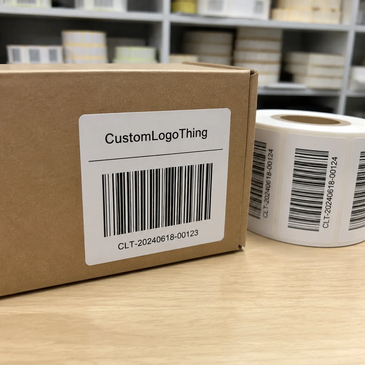
Fast answer: Create Product Label Design: Material, Adhesive, Artwork, and MOQ should be specified like a repeatable production item. The safest quote records material, print method, finish, artwork proof, packing count, and reorder notes in one written spec.
Production checks before approval
Compare the actual filled-product size with the drawing, then confirm tolerance on folds, seals, hang holes, label areas, and retail display edges. Reserve space for logos, QR codes, warning copy, and material claims before decorative graphics fill the panel.
Quote comparison points
Review material grade, print process, finish, sampling route, tooling charges, carton quantity, and freight assumptions side by side. A quote is only useful when the supplier can repeat the same color, closure quality, and packing count on the next order.
When I first started working around packaging lines in Chicago and Milwaukee, one thing became painfully obvious: a shopper can judge a product in about 3 to 5 seconds, and the label carries a shocking amount of that decision. If you’re figuring out how to create product label design, you’re not just making something pretty; you’re building a tiny sales tool, a compliance document, and a brand signal all at once. The best labels do all three jobs without looking strained, even on a 2-inch by 4-inch panel or a 16 oz bottle with a curved shoulder.
Honestly, many brands underestimate labels because they’re small. A 2-inch by 4-inch label may seem minor next to the bottle or jar, but I’ve seen a great label add perceived value to a $6 item in one meeting, while a weak label made a premium formula look like a private-label knockoff. That’s the power of how to create product label design the right way. I still remember one launch in Atlanta where the team spent hours debating cap color, then barely glanced at the label until the end, which made the reprint quote land at $1,840 for 5,000 units. That is a very expensive way to discover hierarchy.
How to Create Product Label Design: Why Small Labels Make Big First Impressions
A product label is the front line of communication. In plain language, how to create product label design means shaping the visual and functional system that tells customers what the product is, why it matters, and whether it feels trustworthy enough to buy. It’s not just decoration. It’s information architecture on a sticker, sleeve, or tag, usually printed on materials like 60# semi-gloss paper, 2 mil BOPP film, or 350gsm C1S artboard for rigid cartons.
In my experience, labels influence trust faster than packaging structure does. I once sat in on a client review in Los Angeles where two nearly identical skincare bottles were tested side by side. Same 30 mL fill. Same amber glass. The only difference was the label: one had a crowded layout with six fonts, while the other used a clean hierarchy and a matte finish. The cleaner version was consistently described as “more expensive” and “safer.” Same formula, different label story. Honestly, I think that’s the part people miss: the label doesn’t just describe the product, it pre-qualifies it in the customer’s mind, often before a tester even opens the cap.
That’s why how to create product label design starts with more than colors and fonts. You need to understand the customer, the package shape, and the environment where the product will be seen. A refrigerated bottle faces condensation. A shipping carton label has different needs from a shelf label on a jar. A label on a cosmetic tube must survive handling; a label on a frozen food pouch may need moisture-resistant film and a permanent acrylic adhesive rated to 40°F or below. The context changes the design, the stock, and the cost.
Many people treat labels like mini posters. A poster can be admired from a distance. A label has to work at arm’s length, under store lighting, in an ecommerce thumbnail, and often in a hand with wet fingers or gloves. If you’re serious about how to create product label design, you have to think like a shopper, a printer, and a regulator at the same time. It’s a slightly ridiculous trio, yes, but they all get a vote, especially when the barcode must scan at 100% grade and the ingredient panel must fit inside a 1/8-inch safe zone.
“A label has about two seconds to earn attention and ten seconds to hold it.” That was a line a brand director told me during a beverage project in Toronto, and it stuck with me because the numbers are brutal but true.
That pressure is why how to create product label design is both creative and strategic. You’re not just choosing a nice font. You’re deciding what the customer sees first, what they read second, and what convinces them to keep reading long enough to convert interest into purchase intent. On a crowded retail shelf in Dallas or a 200-pixel ecommerce thumbnail, that sequence can mean the difference between a click and a pass.
How Product Label Design Works: From Brand Message to Print-Ready File
The workflow behind how to create product label design usually runs through six stages: brand positioning, message hierarchy, layout, material selection, proofing, and production. Skip one, and the rest get messy. I’ve seen projects stall for two weeks because a barcode was placed too close to the trim line or because a regulatory statement was added after the layout was finalized. Those fixes are avoidable, which is why I get a little twitchy when someone says, “We can sort the details later.” No. No, we cannot, especially if the printer is quoting a 12- to 15-business-day turnaround from proof approval.
First comes brand positioning. Ask: is this product premium, clinical, playful, organic, heritage-inspired, or technical? That answer shapes everything from typography to finish. Then comes message hierarchy. A shopper should understand the product name, key benefit, and variant quickly. If they need to decode the label like a puzzle, the design has already lost ground. I’ve seen a brand in Minneapolis move from a dark forest-green label to a cream stock with one accent color and increase shelf clarity almost overnight.
Then there’s the practical side of how to create product label design: durability, adhesion, and regulatory content. Labels must survive the real world. A label on a cold brew bottle needs condensation resistance. A label on a cleaning product may need chemical resistance. A label on a shipping package must stay readable through abrasion, heat, and handling. These details matter more than people think, and they are the kind of details that quietly ruin a launch if nobody checks them. A 0.5 mil overlaminate can help, but only if it matches the substrate and the adhesive.
Shape changes the whole equation. A flat carton gives you predictable space. A curved bottle does not. A narrow jar neck forces different proportions than a wide shampoo bottle. On a pouch, the front panel may compete with seals and gussets. That’s why how to create product label design is inseparable from package engineering. A 16 oz square bottle in Austin needs a different dieline than a 250 mL round bottle in Vancouver, even if the brand uses the same artwork system.
One mistake I saw during a client meeting in southern China, in Shenzhen to be exact, was a cosmetic label designed beautifully on screen but applied to a highly curved bottle without enough compensation for distortion. The text near the edge stretched slightly after application, and the brand had to rework the dieline. It wasn’t a design failure. It was a spec failure. Small difference, expensive outcome. I remember thinking, “Well, that’s a very glamorous way to spend money you didn’t mean to spend.” The fix required a 3 mm reduction in live area and a second proof round.
Digital mockups are useful, but they’re not the same as production artwork. A mockup can show a nice image on a bottle. A print-ready file needs precise bleed, safe zones, vector logos, linked images, correct color mode, and text converted or outlined according to printer requirements. When someone asks me how to create product label design, I always say: design for the press, not just for the presentation deck. The deck does not get rejected by the printer; the file does. Most label vendors want 0.125 inch bleed, 300 dpi images, and PDFs saved as press-ready CMYK.
Labels also interact with the customer journey in three places: shelf, screen, and unboxing. On the shelf, the label competes with neighboring products in 1 to 2 seconds of attention. Online, the label must read in a thumbnail that may be only 200 pixels wide. During unboxing, it reinforces the brand promise the customer bought into. Strong how to create product label design thinking covers all three moments, whether the product ships from Portland, Oregon, or from a contract packer in New Jersey.
Key Factors That Shape Product Label Design Decisions
Brand identity comes first. Fonts, colors, tone, iconography, and spacing should all fit the product line. A botanical tincture and a men’s grooming product should not look like cousins unless that is intentional. In how to create product label design, consistency across SKUs matters because customers use visual cues to navigate ranges quickly. One skincare line I reviewed in Raleigh used the same type family across 12 SKUs and reduced shelf confusion by pairing one core layout with four variant colors.
Audience fit comes next. What does your customer expect in this category? If you sell supplements, clean structure and clear dosage info matter. If you sell craft soda, the label may need stronger shelf pop and more flavor personality. If you’re working on a baby product, clarity and softness usually win. The design language has to match the buyer’s mental model. A $14 artisanal tea and a $14 dog shampoo may both need premium cues, but they need very different ones.
Compliance is non-negotiable. Ingredient lists, warnings, barcodes, net contents, manufacturer addresses, recycling marks, and country-of-origin statements may all be required depending on category and region. I’ve seen good designs forced into expensive revisions because nobody checked the regulatory copy early enough. For any serious how to create product label design process, compliance should be mapped before layout is finalized. If you’re printing for the U.S. and Canada, for example, bilingual text can add 15% to 25% more copy space immediately.
Material and finish influence both appearance and performance. Common choices include paper labels, BOPP film, clear film, waterproof stock, matte paper, gloss film, soft-touch lamination, foil stamping, and embossing. A matte paper label can feel artisanal. A gloss film label can feel crisp and durable. A soft-touch finish often reads as premium, though it can raise unit cost fast. If you’re doing how to create product label design for a wet or refrigerated environment, film usually outperforms standard paper. In many cases, a 2 mil white BOPP label with a permanent adhesive is the practical choice for beverage and bath products.
Cost is where romantic ideas meet the quote sheet. Size, shape, ink coverage, number of colors, specialty finishes, and order volume all affect price. A simple 3 x 4 inch pressure-sensitive label might run around $0.08 to $0.18 per unit at 5,000 pieces, while a version with foil, embossing, and specialty varnish can jump to $0.22 to $0.45 or more depending on specs and vendor. For a plain roll label at 10,000 pieces, some U.S. converters in Ohio or Texas may quote closer to $0.05 to $0.11 per unit. That difference is why how to create product label design should include budget thinking from day one.
Packaging environment matters too. Moisture, heat, refrigeration, freezer storage, friction in transit, and UV exposure can all change how a label performs. I once reviewed a food label that looked excellent in office conditions but started peeling on refrigerated cases because the adhesive wasn’t selected for cold-chain use. The art was fine. The construction was not. That’s the kind of issue that separates theory from real how to create product label design work, especially for products distributed through warehouses in New Jersey in winter and Phoenix in summer.
| Label Option | Typical Use | Approx. Unit Cost at 5,000 Pieces | Strengths | Tradeoffs |
|---|---|---|---|---|
| Paper pressure-sensitive | Dry goods, cartons, jars | $0.08–$0.14 | Good print detail, lower cost | Less moisture resistance |
| BOPP film | Beverages, bath, beauty | $0.10–$0.18 | Water-resistant, durable | Slightly higher cost than paper |
| Clear film | Modern premium look | $0.12–$0.20 | “No-label” effect, clean appearance | Requires careful contrast management |
| Foil or specialty finish | Premium, giftable products | $0.22–$0.45+ | High shelf impact | Higher MOQ and longer lead time |
If you want a practical reference point, the packaging industry standards around transport and distribution testing are useful. For shipping durability and performance context, I often point clients to ISTA resources at ista.org. For sustainability and material guidance, the FSC site at fsc.org is a solid benchmark when paper sourcing matters, especially for 350gsm C1S artboard or recycled paperboard cartons.
How to Create Product Label Design: A Step-by-Step Process
If you’re asking how to create product label design from scratch, start with the product goal and audience before touching software. What is the label supposed to do? Sell a premium story? Clarify a flavor? Meet a regulatory requirement? Support ecommerce conversion? The clearer the objective, the faster the design decisions get. A label for a $9 vitamin bottle in Seattle does not need the same hierarchy as a $28 facial serum in Miami.
Step 1: Define the message. Write down the product name, the top one or two benefits, the variant, and any mandatory information. Keep the “must say” list separate from the “nice to say” list. On a 2.5-inch wide label, space is tight. Every line should earn its place. If the front panel can only hold 40 to 60 words comfortably, stop trying to force in 110.
Step 2: Audit the category. Check 5 to 10 competitors. Look at their font choices, color system, hierarchy, and claims. You’re not copying them. You’re learning the norms so you can either fit in or stand apart strategically. That’s a big part of how to create product label design that sells instead of simply exists. In a crowded aisle in Chicago, a label that respects category cues often gets read faster than one that fights them blindly.
Step 3: Build the hierarchy. Decide what the eye sees first, second, and third. Usually that means brand, product type, then flavor, scent, or variant. Supporting information like ingredients, use instructions, and warnings can sit lower. I’ve seen labels fail because everything screamed at the same volume. When every element is loud, nothing is. A 24 pt product name and an 8 pt legal block are usually a better starting point than three competing headline sizes.
Step 4: Choose typography and color. Fonts should be legible at actual size, not just on a monitor. A script font may look elegant in a mockup, but if it breaks at 7 pt on a curved jar, it’s a liability. Color should support the brand and the category. White space matters too; it gives the design room to breathe and helps the eye land where it should. This is one of the most overlooked parts of how to create product label design. I’ve seen a simple black-and-cream palette outperform a five-color scheme because it read clearly from 6 feet away.
Step 5: Set the dieline and dimensions. The label size must match the container and the printer’s production limits. A 16 oz bottle with a tapered shoulder needs different measurements than a straight-sided jar. If the dieline is wrong by even 1/8 inch, text may land in a seam or wrap improperly. I’ve negotiated enough supplier corrections to know that a clean dieline saves money later. A label printer in Dongguan may even ask for the exact radius of the bottle shoulder before quoting.
Step 6: Create production artwork. Build the design in print software, not just presentation software. Keep bleed at the printer’s spec, usually 0.125 inch, unless your vendor asks otherwise. Maintain safe zones so text stays away from trims and folds. Convert images to the proper resolution, usually 300 dpi for print. In how to create product label design, prepress discipline matters as much as aesthetics. If the printer wants Pantone 186 C and your file is only CMYK, that mismatch can shift the red by enough to matter on shelf.
Step 7: Proof and verify. Check spelling, barcode scannability, ingredient order, legal claims, color expectations, and the actual fit on the package. A flat PDF can hide issues that only show up when wrapped around a bottle. When possible, ask for a physical proof or press proof. Color on screen is not gospel. A proof on the actual substrate—say, white BOPP, clear film, or matte paper—can expose contrast issues in a way the monitor never will.
Timeline-wise, a simple label project can move in 7 to 10 business days if content is ready and approvals are quick. More typical projects take 12 to 20 business days from first concept to approved proof, especially if compliance review or brand revisions are involved. If you’re learning how to create product label design for a launch date, build in buffer time. Decision delays, not design itself, usually slow the schedule. If manufacturing is overseas, add 10 to 18 more days for ocean freight depending on whether the order ships from Shenzhen, Ningbo, or Ho Chi Minh City.
For brands that also need packaging structure support, pairing the label work with Custom Labels & Tags can keep specs aligned across materials and production methods. That kind of coordination prevents the “pretty on screen, impossible in print” problem that I see far too often, especially when one vendor is handling labels in Illinois and another is sourcing cartons from Vietnam.
Common Mistakes When You Create Product Label Design
The first big mistake is overcrowding. People try to fit the whole brand story, three claims, five seals, a mission statement, and a regulation block onto a label that was only meant to carry 120 to 180 words. That’s too much. If you’re studying how to create product label design, learn the discipline of subtraction. White space is not wasted space. A label with 30% more breathing room often looks more expensive than one packed edge to edge.
The second mistake is designing for the screen only. A label can look excellent in a PDF and still fail on the package because the type is too small, the contrast is weak, or the finish reflects store lighting badly. I saw one beverage project in Houston where metallic ink looked spectacular in the mockup but lost legibility under fluorescent lights. The shelf is the test, not the laptop. A quick 5-minute printout on a desktop laser printer could have exposed the issue immediately.
The third mistake is chasing trends at the expense of readability. Ultra-thin fonts, pale gray text, and busy texture overlays may look stylish for a month, then become a problem for the next 24 months of production. Strong how to create product label design work is not about novelty alone. It’s about consistency, clarity, and staying power. A design That Still Works in year three is better than one that wins a mood board contest in week one.
The fourth mistake is ignoring print realities. Bleed, safe zones, minimum line thickness, die-cut tolerances, and substrate behavior are not optional details. A fine line that looks sharp on screen may disappear on a rough paper stock or distort on a curved bottle. You also need to know whether your printer wants spot colors, CMYK, or both. These specs affect output quality directly. A 0.25 pt hairline is often too thin for low-cost flexographic printing in many facilities.
The fifth mistake is leaving compliance for last. That’s the fastest way to trigger a redesign. Once the artwork is nearly complete, adding required text can ruin hierarchy and force a layout overhaul. If your category has regulated claims, get those reviewed before finalizing the design. That’s not bureaucracy; it’s efficient how to create product label design. In regulated categories, one late change can add 2 extra rounds of proofing and another $300 to $800 in revisions.
The sixth mistake is underestimating cost. Specialty effects are seductive. Foil, embossing, soft-touch, clear film, and complex die cuts all add up. If your volume is 2,000 units, some of those choices may make the unit economics ugly. A project that looks luxurious on a mood board can become hard to sell when the quote lands on the table. I’ve seen that happen more than once in supplier negotiations, usually followed by a very long pause and a lot of polite coughing. In one case, a foil stamp alone added $0.14 per unit.
Expert Tips to Improve Product Label Design Results
Use a strong visual hierarchy. That means the shopper can identify the brand and product type in one glance, then the variant, then the supporting details. In how to create product label design, hierarchy does more selling than decoration ever will. You want the label to answer the shopper’s questions in the right order, whether they’re standing in an aisle in Philadelphia or scrolling on a phone in Denver.
Test labels at real size. Print the design at actual dimensions, tape it to the container, and view it from 3 feet away, not just 12 inches from a monitor. I’ve had clients fall in love with a label until they saw it on the actual package. Then the font size suddenly looked “a little ambitious.” That reaction is normal, and it’s useful. A 9 pt typeface can feel elegant on screen and unreadable on a dark glass bottle.
Match the finish to the product story. A clinical skincare product may benefit from matte film and crisp typography. A handmade honey jar may feel better with textured paper and a warm palette. A premium beverage might need soft-touch lamination or spot varnish for shelf pop. That’s where how to create product label design becomes part branding, part material science. I’ve seen a 1.5 mil matte BOPP stock give a cleaner, more modern result than a glossy paper choice at nearly the same price.
Keep the system modular if you have multiple SKUs. If you’re launching five scents or three flavors, build a template with consistent brand placement and flexible variant color blocks. This saves design time later and makes line extensions feel intentional. In one client project in San Diego, a modular system cut revision rounds from 4 to 2 because the structure was already established, and every flavor sat in the same 4-color family.
Ask for samples or press proofs when the finish matters. Paper texture, adhesive strength, opacity, and color shift all change in real life. A physical sample is worth far more than another email thread. If your brand depends on exact color matching, ask about Pantone references and production tolerances early. That is one of the most practical moves in how to create product label design. A printer in Georgia may hold a delta E tolerance of 2 to 3, while another in Guangdong may quote differently, so get the numbers in writing.
Build for scalability. A label system should be able to expand across formats: front labels, back labels, neck labels, cartons, pouches, and ecommerce assets. If the design can’t stretch without breaking, it’s too fragile. Good packaging teams think in systems, not one-offs. That’s where labels become an asset instead of a recurring headache. A clean system can save 6 to 8 hours per new SKU during rollout.
One more thing: if sustainability is part of the brand story, make sure the material choice supports it honestly. Don’t print “eco-friendly” on a label just because the paper is recycled. Check the full package structure, adhesive, inks, and end-of-life claims. For environmental guidance, EPA resources at epa.gov are useful for broader material and waste context, while FSC documentation helps with responsible fiber sourcing. Honest claims travel further than vague ones, and they survive retailer scrutiny in markets like California and British Columbia.
And yes, I’ve seen brands win retail meetings because the label looked confident without trying too hard. That takes restraint. It also takes knowing how to create product label design with a real production budget in mind. My opinion? The labels that perform best are usually the ones that resist the urge to shout, even when the MOQ is 1,000 units and the clock is already moving.
What to Do Next After You Finish Your Product Label Design
Once the design is approved, create a prepress checklist. Include spelling, barcode numbers, dimensions, bleed, safe zones, ink coverage, compliance text, and file format. A 10-minute checklist can save a 10-day reprint. That’s not an exaggeration; I’ve seen it happen in both directions, including one correction that would have cost $425 for a second proof plus freight from Chicago to Reno.
Next, build a print comparison sheet. List substrate, finish, adhesive type, MOQ, unit cost at 1,000 and 5,000 pieces, lead time, and whether proofing is included. This makes it easier to compare vendors without getting distracted by one low quote that hides setup fees. For brands still learning how to create product label design, the quote stage is where clarity pays off. If one supplier in California quotes 12 business days and another in Mexico quotes 18 business days with lower freight, the full landed cost matters more than the headline number.
If the product will sit on shelf, travel through ecommerce fulfillment, or face moisture, order a short run or prototype. A test batch of 250 to 500 units can expose color issues, barcode issues, or application problems before full production. I always prefer a small lesson to a large mistake. A prototype run in Nashville, for instance, can reveal whether a label lifts at the edges after 48 hours in cold storage.
Document the final specs. Save the dieline, artwork version, color references, finishing notes, and printer instructions in one place. When someone asks for a reprint six months later, you’ll be glad you did. Without documentation, every future update becomes a scavenger hunt. With it, how to create product label design turns into a repeatable process instead of a fresh scramble. I usually recommend keeping a folder with PDF proofs, AI files, barcode source files, and a one-page spec summary.
Finally, review the design on the actual package one last time. Confirm the printer’s file requirements, approve the proof, and schedule production only after the last check is complete. If you’re working with a packaging partner, keep communication tight. A clean handoff is often the difference between a launch that feels professional and one that feels patched together. For domestic production, many brands use converters in Illinois, New Jersey, or North Carolina; for offshore runs, Shenzhen and Dongguan remain common label manufacturing hubs.
In my experience, the brands that treat labels as a strategic packaging decision, not an afterthought, get better retail feedback and fewer production surprises. That’s the real value of learning how to create product label design: it gives you control over what customers notice first and what your manufacturing team won’t have to fix later. I’ve seen a $0.12-per-unit label change the perception of a $19 product enough to justify a higher shelf price within one sales cycle.
If you want to move from concept to production with fewer detours, start with the customer, respect the package, and keep the print specs close. That’s how to create product label design That Actually Works, from the first mockup in your studio to the finished roll on a packing line in Ohio.
Frequently Asked Questions
How do I create product label design if I’m not a designer?
Start with three things: your brand message, the required product information, and a simple hierarchy for what should read first. Then hand that material to a packaging designer or printer who can turn it into a print-ready file. If you’re learning how to create product label design without design software, clarity beats decoration every time. A clean structure at 10 pt type is better than a crowded layout full of clever details, especially on a 2.5-inch-wide label.
What information should be included when I create product label design?
At minimum, include the product name, brand, key benefit, net quantity, ingredients or materials, warnings, and barcode if your category needs one. Add any required disclosures before final artwork is approved. In how to create product label design, the front panel should hold the main selling point, while the back or side panel can carry the support information. That keeps the label readable and compliant for markets like the U.S., Canada, or the EU.
How long does the product label design process usually take?
Simple projects can move in 7 to 10 business days if the content is ready and approvals are fast. More complex projects often take 12 to 20 business days because of revisions, compliance checks, and proofing. From my experience, the bottleneck is usually internal decision speed, not the design work itself. That’s a reality check worth planning around if you’re working on how to create product label design for a launch, especially if manufacturing is happening in Shenzhen or a domestic plant in Illinois.
How much does it cost to create product label design?
Cost depends on size, complexity, revision count, print quantity, and finishes. A simple label design can be relatively economical, while foil, embossing, and specialty films raise the price fast. Low-volume jobs often cost more per label than larger runs. When people ask me how to create product label design on a budget, I tell them to spend on clarity first, then add finishes only where they improve the story or the shelf impact. For example, a basic 3 x 4 inch roll label might print for $0.08 to $0.14 per unit at 5,000 pieces, while a foil-stamped version can reach $0.22 to $0.45 or more.
What is the biggest mistake people make when they create product label design?
The biggest mistake is designing for appearance alone and ignoring readability, compliance, and print limitations. A label has to work on the package, in the hand, and on the shelf. Testing the design at actual size catches many problems before they become expensive. If you remember one thing about how to create product label design, make it this: good-looking artwork is not enough unless it survives real-world use on a refrigerated case, a shipping pallet, or a crowded retail shelf.