Buyer Fit Snapshot
| Best fit | Integrate Logo on Rigid Boxes for Premium Brands projects where brand print, material claims, artwork control, MOQ, and repeat-order consistency need to be specified before quoting. |
|---|---|
| Quote inputs | Share finished size, material target, print colors, finish, packing count, annual reorder estimate, ship-to region, and any compliance wording. |
| Proofing check | Approve dieline scale, logo placement, barcode or warning zones, color tolerance, closure strength, and carton packing before bulk production. |
| Main risk | Vague material claims, crowded artwork, missing packing details, or unclear freight terms can make a low unit price expensive after revisions. |
Fast answer: Integrate Logo on Rigid Boxes for Premium Brands: Board, Finish, Dieline, and Unit Cost should be specified like a repeatable production item. The safest quote records material, print method, finish, artwork proof, packing count, and reorder notes in one written spec.
Production checks before approval
Compare the actual filled-product size with the drawing, then confirm tolerance on folds, seals, hang holes, label areas, and retail display edges. Reserve space for logos, QR codes, warning copy, and material claims before decorative graphics fill the panel.
Quote comparison points
Review material grade, print process, finish, sampling route, tooling charges, carton quantity, and freight assumptions side by side. A quote is only useful when the supplier can repeat the same color, closure quality, and packing count on the next order.
If you are trying to figure out how to integrate logo on rigid boxes, I can save you a few headaches: the logo stops being "just a logo" the moment it meets 2 mm greyboard, wrap paper, glue, heat, and a press line running in a factory in Shenzhen or Dongguan. Suddenly it becomes a structure decision, a cost decision, and a timing decision. I have watched a gorgeous mark fall flat after it was wrapped over a 1.5 mm board with soft-touch lamination, and I have also seen a plain one-color logo look expensive because the placement was disciplined instead of theatrical. That part still gets people. For brands ordering custom packaging, the difference is not subtle. On a 5,000-piece run, even a 2 mm shift can change the whole read.
The real answer to how to integrate logo on rigid boxes is to treat the logo as part of the whole build: position, finish, paper, structure, and unboxing flow all need to work together. A logo slapped on at the end usually looks like it was slapped on at the end. Packaging people notice. Customers do too, even if they cannot explain why. They just feel it. Then they move on to the brand that bothered to get it right. I have seen that happen on cosmetic sets from Guangzhou and gift boxes shipped out of Ningbo, where the only difference was a cleaner lid mark and a better foil spec.
How Do You Integrate Logo on Rigid Boxes?
When clients ask me how to integrate logo on rigid boxes, I start with intent, not decoration. Do you want the logo to hit from across a shelf, or do you want it to sit quietly and earn attention up close? Those are not the same job. A printed top panel, foil stamp, blind emboss, deboss, or spot UV mark each gives a different read, and each one reacts differently once you add paper wrap, adhesive, and a press. That is the part people skip when they are excited about a mockup. Then they act surprised when the factory in Dongguan says, "Yes, but..." because the lid seam sits 4 mm too close to the mark.
Printed logos are straightforward. They suit strong brand color, full artwork, and situations where the lid or side wall needs more than a single mark. Foil stamping gives a tighter premium feel, especially with gold, silver, black, or matte metallic foils that catch light without shouting. Embossing lifts the logo. Debossing presses it down. Spot UV creates a gloss contrast that can be subtle or sharp depending on the wrap. Inside-lid branding does something different again; it gives the customer a second reveal after the box opens. If you are still sorting out how to integrate logo on rigid boxes, that is the basic vocabulary. Not glamorous. Useful. A 350gsm C1S artboard shell behaves very differently from a 157gsm art paper wrap, so the same logo treatment can look crisp on one and muddy on the other.
The structure matters just as much as the mark. A 3-piece rigid set-up with a lift-off lid does not behave like a magnetic closure box, and neither behaves like a book-style rigid box with a hidden flap. The logo can live on the lid top, front wall, spine, inside cover, insert card, or closure flap, but each placement changes how the eye moves across the package. If you want how to integrate logo on rigid boxes to feel deliberate, you have to think like a brand person and a production person at the same time. Annoying? Absolutely. Necessary? Also yes. I wish there were a neater answer. There isn't, especially when the box is being built for a client in Los Angeles but produced in Shenzhen and shipped to Amsterdam.
I remember a cosmetics job in a Shenzhen factory where the client brought a perfect vector logo designed for a flat white mockup. Once we moved it onto a black wrap with a 1.5 mm lid reveal and matte laminate, the mark looked too small and too deep on the top panel. We widened the breathing room and increased the foil size by 8 percent. The box finally felt balanced. That is the part people miss. How to integrate logo on rigid boxes is not about the logo in isolation. It is about optical correction after the structure, material, and finish are all in the room together. We fixed it in one afternoon, but only because the factory had a hot foil unit ready and the sample table was under 5000K lighting.
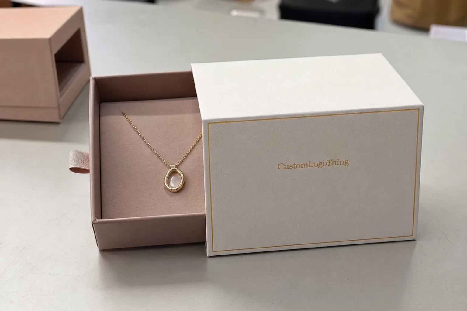
For luxury, cosmetics, electronics, gifting, and subscription packaging, logo placement sets expectations before anyone touches the product. A centered foil logo on a rigid lid can suggest a premium gift before the box is even opened. A cluttered front panel does the opposite. If you are comparing structures, you can review our Custom Packaging Products and see how different board and wrap combinations change the final presentation. On a run of 3,000 gift boxes, a simple gold foil mark can add as little as $0.12 per unit, while a full printed wrap can push the cost up by $0.20 to $0.35 depending on coverage and ink count.
There is a gap between a pretty presentation deck and a box that survives real production. A blind emboss with a very fine line may look excellent on a sample board, then soften when the wrap has texture or the adhesive pulls unevenly across the lid. I have watched that happen more than once, including a job in Foshan where the adhesive bead left a faint ridge under the logo panel. It is one of those tiny factory moments that ruins a buyer's mood for the rest of the afternoon. That is why how to integrate logo on rigid boxes should always be discussed with substrate, finish stack, and quality control in the same conversation. If the factory cannot register the decoration cleanly at scale, the concept does not matter much.
"The logo is the first handshake. If it is crooked, buried, or overworked, the whole box feels cheaper before the customer even opens it. A 1 mm shift on a 90 mm lid is the kind of detail that makes a buyer either nod or wince."
If you care about the standards side of packaging, keep an eye on testing and sourcing too. ISTA helps frame transit testing for shipping performance, and FSC is useful when the brand wants responsibly sourced paper wraps and board. Neither one tells you how to integrate logo on rigid boxes visually, but both matter when the package has to survive shipping from a plant in Ningbo to a retailer in Chicago and still arrive looking sharp. I know, thrilling stuff. Still matters. Especially when the outer carton is stacked 6 high for 18 days in a warehouse.
How to Integrate Logo on Rigid Boxes Through the Production Timeline
The easiest way to understand how to integrate logo on rigid boxes is to follow the job from brief to shipment. I break it into seven checkpoints: brand brief, dieline, artwork placement, material selection, decoration method, sampling, and final inspection. Once the logo choice gets locked into one of those stages, changing it later usually costs more time and more money. Funny how that always seems to happen right after someone says, "It should be a quick tweak." In a typical 5,000-piece project, that "quick tweak" can add 3 to 5 business days and one extra approval cycle.
The brand brief should say more than "premium" or "minimal." It should define whether the logo should feel formal, friendly, technical, gift-like, or fashion-led. If the brand wants quiet luxury, that may point toward blind debossing or a restrained foil color. If the box needs shelf punch, a high-contrast printed logo or brighter foil might be better. This is one of the first places where how to integrate logo on rigid boxes turns into planning instead of decoration. A brief I trust will mention the target market, the retail channel, and the finish budget, such as "$0.15 per unit for 5000 pieces" for a foil-only lid mark.
Then comes the dieline. The dieline tells you where folds, wraps, joints, and safe areas sit. A top-lid logo can look simple until the wrap seam or magnet location lands too close to the mark. I have sat in plenty of meetings where marketing wanted a dead-center logo and the structure said no. We shifted the mark 3 to 5 mm so it would not fight the board wrap. Small adjustment. Big difference. That is part of how to integrate logo on rigid boxes without building rework into the schedule. On a book-style rigid box, I usually keep at least a 7 mm safety margin from the hinge side.
Artwork prep is where technical discipline shows up. Vector files are the standard, and a clean AI, PDF, or EPS file is what most factories want. If the logo will be foil stamped or embossed, line weight matters. Hairlines disappear once the plate compresses the wrap, especially on textured specialty paper. I tell clients to think physically: if a line is too thin to survive a fingertip, it may not survive foil or emboss pressure either. That is the practical side of how to integrate logo on rigid boxes. No romance. Just physics. On a 157gsm art paper wrap, I usually keep minimum line weight above 0.25 pt for foil and closer to 0.5 pt for embossing.
Sampling is the stage many buyers try to skip. That usually ends badly. A monitor proof does not show gloss shift, tactile depth, or how the lid catches light at a 45-degree angle. A physical sample does. In one supplier negotiation in Dongguan, the factory quoted two foil plates: one at $85 and a more precise etched plate at $150. The cheaper plate looked fine on paper, then frayed at the edges under shop lights. We paid for the better plate. The final run looked cleaner. That is exactly why how to integrate logo on rigid boxes should include finish testing, not just artwork approval. I still remember the look on the factory manager's face when he realized I was not going to pretend the cheaper option was good enough. He survived. The cheaper plate did not. The sample lead time was 4 business days, which was worth every hour.
Timing changes with the decoration method too. A simple printed logo on stock wrap may move fast, while foil stamping and embossing need extra days for tooling, die production, and press setup. For a 5,000-piece order, a common timeline looks like this: 2 to 3 business days for proofing, 3 to 5 business days for sampling, 10 to 15 business days for production, and 3 to 7 business days for freight depending on lane and destination. If the logo changes after sample approval, add another 3 to 5 business days. That is why how to integrate logo on rigid boxes should be locked early, not once the line is already booked and everyone is pretending the delay is somehow "manageable." From proof approval to finished cartons, 12 to 15 business days is a realistic floor for most foil or emboss jobs in Guangdong.
Communication slows projects down more than almost anything else. Files arrive in RGB instead of CMYK. Logo marks sit too close to the edge. The buyer has not confirmed whether the board is 1.5 mm, 2 mm, or 3 mm. A factory can only plan so much when those details are missing. I have seen a week disappear because a client approved the lid logo before confirming whether the insert tray was EVA, paperboard, or molded pulp. The tray height changed the reveal and changed how the box opened. That is why how to integrate logo on rigid boxes has to stay tied to the full assembly, not one panel in isolation. If the insert is 18 mm taller than planned, the lid no longer sits the way the mockup promised.
If you are comparing packaging formats, you can also browse our rigid box packaging options and think through which structures support a centered lid logo, a side mark, or a deeper reveal. The right format makes how to integrate logo on rigid boxes easier before any artwork goes to press. On a 2-piece setup, a lid top logo often gives the best value; on a magnetic closure box, the front flap can support a quieter, more controlled mark.
Key Factors That Shape Cost and Pricing
Once a buyer understands how to integrate logo on rigid boxes, the next question is money. The blunt answer: cost depends on much more than the logo. Box size, board thickness, wrap paper, print coverage, finish choice, and quantity all shape the final price. A 2-piece rigid box with a simple printed logo will not cost the same as a magnetic box with matte black wrap, gold foil stamping, and an embossed crest on the lid. Every extra layer asks the factory for more setup and more checks. Nothing is free. That little detail keeps showing up, especially in Shanghai and Shenzhen quote sheets where the base box looks cheap until the finish line items appear.
Foil stamping is the clearest example. The job needs a foil die or plate, accurate heat, pressure, and clean registration against the wrapped lid. Embossing and debossing add tooling and a second physical action, which means more press setup and more quality control. Soft-touch lamination also raises cost because it adds a specialty surface that has to be handled carefully during wrapping. If the logo treatment is layered, such as foil plus emboss or spot UV plus print, the factory may need multiple passes. That is why how to integrate logo on rigid boxes should always be priced as a system. A foil plate might run $60 to $150 depending on size, while a matched emboss die set can run $90 to $220.
Quantity changes the math because it spreads setup cost. A plate or die that costs $100 barely stings on a 10,000-piece run, but it shows up fast on a 500-piece order. Labor works the same way. At low volume, press setup and inspection time can dominate unit price. At higher volume, the unit cost drops because the one-time tooling gets distributed across many pieces. That is the basic economics behind how to integrate logo on rigid boxes at scale. On 1,000 boxes, a $120 die can add $0.12 per unit by itself; on 10,000 boxes, it shrinks to $0.012.
Here is a comparison I use when buyers need to balance presentation and budget:
| Logo Method | Typical Setup | Approx. Unit Impact at 5,000 pcs | Visual Effect | Best Use Case |
|---|---|---|---|---|
| Printed logo | Artwork print only | $0.04-$0.10 | Clear, colorful, direct | Retail sets, subscription packaging, brand color matching |
| Foil stamping | Foil plate + press setup | $0.08-$0.18 | Bright, premium, reflective | Luxury gifts, cosmetics, electronics |
| Embossing | Male/female die tooling | $0.07-$0.16 | Tactile, refined, subtle | Minimal luxury, heritage brands |
| Debossing | Press tooling + alignment | $0.07-$0.15 | Pressed-in, quiet, premium | Modern, understated brand systems |
| Spot UV | Coating plate + alignment | $0.06-$0.14 | Gloss contrast on matte wrap | Fashion, tech, presentation boxes |
Those numbers are ballpark figures, not gospel. A small run, a difficult size, or a specialty paper wrap can move them up. Still, they are a useful starting point when you are planning how to integrate logo on rigid boxes without guessing. I have seen buyers compare only the headline unit price and then act shocked when plate charges, die fees, or sample costs show up later. That is avoidable. It is also the fastest way to turn a pleasant sourcing call into a long silence. On one Shanghai project, the buyer saved $0.03 per box on paper and lost $0.11 per box to extra foil adjustments. Brilliant trade.
There are hidden pieces too. Samples might cost $25 to $120 depending on complexity. Special plates can run $35 to $150. A custom insert, ribbon pull, or magnetic closure can change final assembly labor. Freight and storage matter as well, especially if the boxes are bulky and delivery is staggered. If a logo has to be reworked after approval, the cost is not only the new plate; it can include reproofing, press downtime, and delayed shipment. Anyone learning how to integrate logo on rigid boxes should ask for a quote that separates tooling, unit price, and sampling. If the supplier cannot itemize those three lines, I usually ask for a second quote from a factory in Guangdong or Zhejiang.
Board and wrap selection also matter. A 2 mm greyboard wrapped in 157 gsm art paper behaves differently from a 3 mm board wrapped in specialty paper or PU. The stiffer structure may need more careful edge wrapping, and that can affect how sharply the logo reads near a fold or corner. Honestly, too many buyers obsess over the logo art and ignore the box body. The body is the stage. The logo is the actor. If the stage is wrong, how to integrate logo on rigid boxes gets harder than it needs to be. On a 90 x 90 x 30 mm jewelry box, even a 0.5 mm wrap swell can make a centered mark look off-center by eye.
For a brand that wants a cleaner sourcing path, it helps to look at the whole package family first. You can review our custom insert styles and box builds to estimate where a lid logo, interior print, or side mark makes the most sense before you request pricing. That makes how to integrate logo on rigid boxes easier to quote accurately the first time. It also helps when you are comparing production in Dongguan versus a shorter regional run in Shenzhen or Guangzhou.
How to Integrate Logo on Rigid Boxes Step by Step
The simplest way to answer how to integrate logo on rigid boxes is to walk the job the way a factory sees it. First, define the brand goal. If the box should feel bold, the logo needs size, contrast, and maybe foil. If it should feel quiet, the logo might sit low on the lid and use a blind emboss or a small matte foil. If it is a gift piece, the logo can live on the outside and repeat inside for a layered reveal. That first choice changes everything else. A luxury candle box for a retailer in London might need one centered mark, while a subscription box in California may need a side logo and an inside message card.
Second, build or request the dieline. The dieline shows safe areas, fold lines, glue tabs, and lid edges. A good supplier should not just hand you a flat outline. They should tell you where the logo should sit relative to the structure so the brand mark does not collide with seams or wrapped corners. That is one of the most practical parts of how to integrate logo on rigid boxes because it prevents the classic "great concept, impossible structure" problem. For a lift-off lid, I like to keep the logo at least 5 mm away from the edge so the wrap does not distort it.
Third, prepare the artwork in vector format and define the technical rules. I like to see clean paths, outlined fonts, and Pantone or CMYK values stated clearly. If the logo is foil stamped, note the foil color. If it is embossed, state the depth preference or at least the visual target. If a line is extremely fine, say so in the proof notes. The factory should know whether the brand wants high contrast, a matte feel, or a reflective detail. That level of clarity keeps how to integrate logo on rigid boxes from turning into a guessing contest. A good file package usually includes AI, PDF, EPS, and a 300 dpi preview JPEG for reference.
Fourth, review the mockup physically. I cannot say this enough. Under warehouse LEDs, in retail lighting, and in hand, the box reads differently. I once worked with a skincare client whose black rigid box had a blind debossed logo that looked elegant on the sample table, then nearly vanished under the client's store lights. We added a narrow silver foil edge around the mark, and suddenly the logo had enough contrast without losing the calm feel. That project taught everyone in the room that how to integrate logo on rigid boxes is really about how the box will be seen, not just how it looks in one photo. The fix took one extra sample and 2 business days, which was cheaper than reprinting 2,000 boxes.
Fifth, lock the material stack before the run. If the wrap paper changes from coated art paper to textured specialty stock, the logo may need a bigger stroke, a deeper emboss, or a different foil choice. If the box uses a magnetic flap, the closure area can affect logo placement. If the insert is EVA foam or molded pulp, the interior branding may need a different print method. These are the details that separate amateur packaging from polished packaging. That is why I tell clients that how to integrate logo on rigid boxes is never just a front-panel choice. A 3 mm EVA insert can change the perceived box depth by 2 to 4 mm once the lid closes.
Sixth, confirm the production sample. A plain white dummy and a decorated sample are not the same thing. The blank sample proves structure. The decorated one proves the logo treatment. Check the logo from arm's length, from countertop height, and while opening the box. Look at edge alignment, foil crispness, and whether the logo competes with magnets, ribbons, or insert cards. If a ribbon crosses the lid mark, it can weaken the brand impression. If the inside print is too loud, it can steal the show. This is the moment where how to integrate logo on rigid boxes becomes a final judgment call. And yes, sometimes the answer is "less." Painful for the designer, helpful for the box.
Seventh, freeze the spec sheet and schedule. A one-page spec sheet should include logo size, placement, finish, board thickness, wrap type, quantity, target budget, and timeline. If the factory and the buyer are not quoting the same spec, the numbers do not mean much. I would rather spend 20 extra minutes on a spec sheet than lose two weeks in revision. That discipline is a big part of how to integrate logo on rigid boxes with fewer surprises. I have seen projects in Yiwu and Dongguan slip a full week because the lid logo size was never written down in millimeters.
A detailed approval process also helps with quality standards. For shipping durability, some brands ask for transit testing based on ISTA methods, especially when the box is part of a retail kit or subscription send. If the packaging needs documented sourcing, FSC paper options can support that story too. None of that replaces good logo planning, but it gives the project a stronger technical backbone. In my experience, the best how to integrate logo on rigid boxes decisions are the ones that hold up visually and physically after a 600-mile truck ride and a week in a warehouse.
At this stage, many buyers like to check box families before locking the final choice. If that is you, our premium box and insert range can help you compare whether a lid logo, an inside reveal, or a side-panel mark fits the product better. That comparison makes how to integrate logo on rigid boxes much easier to finalize. It also helps you avoid paying for a decorative feature that nobody sees once the box is on a shelf.
Common Mistakes When Integrating a Logo on Rigid Boxes
Even experienced buyers make the same mistakes when learning how to integrate logo on rigid boxes. The first is low-resolution artwork. A fuzzy file may survive on a website, but it rarely survives embossing or foil stamping cleanly. The second is placing the logo too close to the edge, where wrap tension and corner finishing can distort it. The third is using line weights that are too thin for the decoration method. All three problems are avoidable if the artwork is checked against the production method early. I have seen a 72 dpi PNG ruin a 4,000-box order in Shenzhen because the customer assumed "the designer can fix it later." No. The designer was not on the factory floor.
Another mistake is overcrowding the lid. A rigid box is not a brochure cover. When the top panel carries too many marks, icons, disclaimers, or competing messages, the logo loses authority. I have seen brands try to fit a logo, a slogan, a website, a QR code, and a legal line onto a 90 mm lid panel. The result looked busy and far less premium than a single centered mark would have. If the brand wants to understand how to integrate logo on rigid boxes gracefully, restraint matters as much as decoration. Maybe more, honestly. On a 120 mm square lid, one logo and one short line of copy is usually plenty.
Finish choices can also fight the material. A heavy emboss on fragile paper can crush the wrap. A bright glossy effect on a quiet matte concept can break the mood. A deep foil on textured paper may lose edge definition if the plate or press settings are not tuned properly. Some effects look strong in a deck and weak in hand because the substrate is working against them. That is why I keep saying how to integrate logo on rigid boxes is about matching finish to material, not chasing effects for their own sake. A 157gsm textured wrap and a 3 mm board are not the same canvas as coated paper on 1.5 mm greyboard.
Skipping sample approval is another expensive mistake. Screen color and printed color can be far apart. Under LEDs, a blue-black wrap can read cooler than it did in daylight. Under warm retail lighting, a silver foil can pick up a gold cast. If the client has not held the box, they are still guessing. I have watched a buyer approve a digital proof, then reject the finished sample because the emboss depth felt too shallow. If they had requested a decorated sample earlier, they would have saved time and a bad mood. That is the practical reality behind how to integrate logo on rigid boxes. One sample often saves a whole production batch.
There are also line-side mistakes that only show up during production. Logos too near a fold can crack during wrapping. Foil marks too close to a magnet can register badly. A side-wall logo can get damaged if the box stacks before the adhesive cures fully. And if the factory does not run the decoration cleanly at scale, a beautiful sample can become inconsistent in mass production. I remember those jobs from floor visits because the fix was rarely artistic; it was mechanical. Good how to integrate logo on rigid boxes planning avoids those headaches before the first carton is packed. Saves everyone from pretending the issue is "minor" while the rework pile grows. I have seen that pile reach 300 units in under an hour.
Expert Tips for Stronger Logo Impact on Rigid Boxes
If I had to give one honest piece of advice on how to integrate logo on rigid boxes, it would be this: let one premium finish do the heavy lifting. Too many layered effects make a box feel busy instead of refined. A single foil-stamped logo on a well-wrapped lid can look stronger than foil plus emboss plus spot UV all stacked together. The eye likes clarity, especially on a rigid surface where the box already carries weight and structure. On a 2-piece box in matte black, a single gold foil logo often does more than three decorative tricks fighting for attention.
Match the treatment to the brand personality. Foil stamping fits formal luxury, jewelry, celebratory gifting, and brands that want a polished signal right away. Blind emboss or deboss works beautifully for restrained confidence, heritage, and tactile-first packaging. Spot UV creates contrast that can work very well for fashion, beauty, and tech, especially on a matte background. Inside-lid print can deepen the reveal without crowding the front. That kind of matching is the heart of how to integrate logo on rigid boxes with taste. A brand in Zurich may want a quiet deboss; a startup in Los Angeles may want a brighter foil hit with more shelf pop.
I also recommend testing the box in the exact environments where it will be seen. A premium box can look great in a studio and underperform in a store with mixed lighting or on a phone camera during an unboxing video. I saw that with a skincare brand that wanted a deep navy box with a silver foil monogram. Under warm showroom lamps, the monogram looked rich. Under cool warehouse light, the same foil became harder to read. We shifted the foil to a warmer metallic tone and added a little more negative space around the mark. That small change made how to integrate logo on rigid boxes work across more settings. The fix cost $0.02 more per unit and saved the campaign from looking flat.
Use the inside cover, insert tray, or message card to extend the story. That gives the exterior room to breathe while still adding brand presence inside the package. A printed welcome line, a pattern repeat, or a small secondary logo on the interior can make the unboxing feel considered without crowding the main panel. If you are sourcing complete packaging builds, our custom packaging products page can help you think through the relationship between the outer logo and the internal presentation. For many brands, that balance is the difference between average and memorable how to integrate logo on rigid boxes execution. A 40 mm message card tucked into the lid can carry more brand tone than a crowded outside panel ever will.
Work within the factory's tooling limits. Ask about paper grain, wrap tolerance, foil registration, and the machine's minimum line weight before final approval. In the factories I have visited, the best operators are direct about what they can hold cleanly and what will drift. That honesty saves everyone time. If a logo has tiny interior counters or hairline strokes, the factory should tell you whether those details will survive the chosen finish. That is one of the most useful parts of how to integrate logo on rigid boxes when you want repeatable results. On some lines in Guangzhou, a 0.3 mm stroke is fine; on others, it is asking for trouble.
Finally, think like the customer. What do they touch first, and what do they see second? A lid logo can be supported by a soft-touch wrap and a clean reveal. A side logo can hint at premium construction without overpowering the front. An inside message can reward the open. When those pieces line up, how to integrate logo on rigid boxes stops being a technical chore and starts becoming part of the brand experience. That is the whole point, really. If the box lands well in the hand and looks clean in a 10-second phone video, the packaging did its job.
Next Steps: Lock the Logo, Finish, and Production Plan
The cleanest way to move forward with how to integrate logo on rigid boxes is to create a one-page spec sheet and keep everyone honest to it. Include box dimensions, board thickness, wrap material, finish method, logo placement, quantity, target budget, and ship date. When buyers, designers, and factories all quote from the same page, the project moves faster and with fewer arguments. A miracle, I know. On a 2,000-box run, a proper spec sheet can save 2 revision rounds and at least one frustrated email chain.
Request both a blank sample and a decorated sample. The blank sample proves structure, and the decorated one proves the logo treatment. Compare them side by side in natural light and artificial light. Hold them at arm's length, because that is how most customers will first see them. If the logo feels too small, too busy, or too close to the fold, now is the time to fix it. That discipline is central to how to integrate logo on rigid boxes without expensive changes later. A 1-day delay here can save a 2-week delay after production starts.
Ask for a quote that separates tooling, sampling, and unit price. That habit makes supplier comparisons much easier. A low unit price can hide an expensive plate charge. A higher unit price can still be fair if tooling is included and quality control is stronger. I have sat through enough sourcing meetings to know that the headline number can lie by omission. The smartest buyers understand how to integrate logo on rigid boxes by comparing total job value, not just per-piece cost. A quote from Dongguan that includes tooling, a decorated sample, and 12 to 15 business days from proof approval is often more useful than a bare-bones number from a middleman in Shenzhen.
Build in margin for revisions, finish testing, and shipping delays. Even a well-run line can need a small adjustment after the first decorated sample comes back. If a foil is too bright or the emboss feels too shallow, it is better to correct it before the full run starts. Make sure the approval deadline is realistic. A lot of packaging pain comes from compressing sample review into two days when the project really needs five. That is how to integrate logo on rigid boxes with fewer surprises and a better final result. I usually give at least 3 business days for stakeholder feedback, because one afternoon is not enough for six opinions.
Honestly, the best results come when brand goals, production reality, and cost expectations all meet in the same conversation. A premium logo on a rigid box is not magic; it is a chain of decisions that starts with the artwork file and ends with the customer lifting the lid. If you want that box to feel polished, the work has to be done early and done carefully. That is the real answer to how to integrate logo on rigid boxes, and it is the same approach I would use on a factory floor in Shenzhen, in a supplier meeting in Dongguan, or on a client call from a hotel room in Shanghai. The box will either prove it or embarrass you. Usually both, if you rush it.
What is the best way to integrate logo on rigid boxes?
For most premium brands, the strongest answer to how to integrate logo on rigid boxes is a simple logo on the lid with one clear finish, such as foil stamping, embossing, or spot UV. The best choice depends on the brand personality, the box structure, and how much tactile impact you want during unboxing. On a 5,000-piece run, I usually recommend one main finish and one backup sample, not three competing effects.
Which logo finish works best for luxury rigid boxes?
Foil stamping is a classic choice when the brand wants brightness and a polished luxury signal, while blind embossing gives a quieter, more restrained feel. In practice, the best finish for how to integrate logo on rigid boxes depends on the substrate, logo shape, and whether the brand wants bold contrast or subtle texture. For a 2 mm greyboard box wrapped in 157gsm art paper, gold foil and blind emboss are both common choices in Shenzhen and Dongguan.
How much does it cost to add a logo to rigid boxes?
Cost depends on box size, quantity, finish complexity, tooling, and whether the logo is printed, stamped, embossed, or combined with another effect. Short runs usually cost more per box because setup and tooling are spread across fewer units, which is why how to integrate logo on rigid boxes should be quoted with both tooling and unit pricing shown separately. A simple foil mark might add $0.08 to $0.18 per unit at 5,000 pieces, while a custom die can add $85 to $150 upfront.
How long does it take to produce custom rigid boxes with a logo?
The timeline usually includes artwork review, sampling, approval, production, finishing, assembly, and shipping, so the total schedule can vary widely. More complex logo treatments take longer because they need tooling, finish tests, and extra quality checks, so how to integrate logo on rigid boxes should be planned with realistic approval time. A practical schedule is 2 to 3 business days for proofing, 3 to 5 business days for sampling, and 10 to 15 business days for production after approval.
Can I place different logos on the inside and outside of a rigid box?
Yes, many brands use a subtle exterior logo and a stronger inside reveal to create a layered unboxing experience. The tradeoff is that every extra logo location can add setup time, alignment work, and sometimes extra decoration cost, so how to integrate logo on rigid boxes should always account for the full decoration map. A lid logo plus an inside message card is a common combination for gift boxes, cosmetics, and premium subscription kits.