Buyer Fit Snapshot
| Best fit | Integrate Logo on Rigid Boxes projects where brand print, material claims, artwork control, MOQ, and repeat-order consistency need to be specified before quoting. |
|---|---|
| Quote inputs | Share finished size, material target, print colors, finish, packing count, annual reorder estimate, ship-to region, and any compliance wording. |
| Proofing check | Approve dieline scale, logo placement, barcode or warning zones, color tolerance, closure strength, and carton packing before bulk production. |
| Main risk | Vague material claims, crowded artwork, missing packing details, or unclear freight terms can make a low unit price expensive after revisions. |
Fast answer: Integrate Logo on Rigid Boxes: Board, Finish, Dieline, and Unit Cost should be specified like a repeatable production item. The safest quote records material, print method, finish, artwork proof, packing count, and reorder notes in one written spec.
Production checks before approval
Compare the actual filled-product size with the drawing, then confirm tolerance on folds, seals, hang holes, label areas, and retail display edges. Reserve space for logos, QR codes, warning copy, and material claims before decorative graphics fill the panel.
Quote comparison points
Review material grade, print process, finish, sampling route, tooling charges, carton quantity, and freight assumptions side by side. A quote is only useful when the supplier can repeat the same color, closure quality, and packing count on the next order.
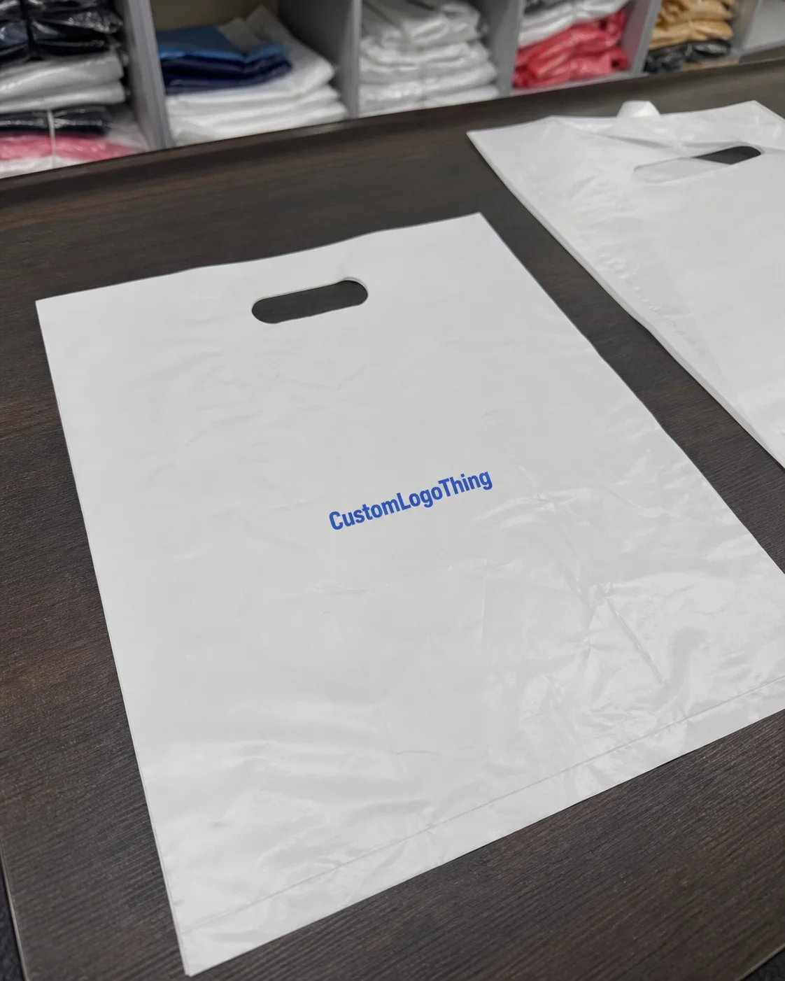
When I first walked a rigid box line in Shenzhen’s Longgang District, a client kept pointing at two samples and asking why one looked like a $48 gift box and the other looked like a $6 leftover. The answer was not the board. It was not the glue. It was how to integrate logo on rigid boxes, right down to the foil pressure, wrap tension, and whether the mark sat 4 mm too high on the lid. On that line, the operator was using 1.5 mm greyboard wrapped in 157gsm C2S art paper, and the logo placement was the whole story.
If you sell a premium product, the box is doing sales work before anyone touches the product. That is not marketing fluff. That is what happens on a retail shelf in New York, in a luxury unboxing video shot in Los Angeles, or in a buyer’s office in Dallas when your sample lands in a stack of ten competitors. Learning how to integrate logo on rigid boxes can change perception fast, and I have seen a plain 2-color structure beat a busy, overdesigned box because the logo was crisp, centered, and calm. One good lid mark can do more than a full-page design circus.
Custom Logo Things works with brands that want packaging to look intentional instead of improvised. And yes, that means caring about things like foil dies, vector artwork, wrap seams, and whether your logo can survive a blind deboss on textured paper without turning into a mushy blob. Fun stuff. Expensive stuff too, if you skip the details. On a 5,000-piece run, one bad decision can add $0.12 to $0.35 per unit fast, which is how a “premium” box turns into a budgeting headache.
How to integrate logo on rigid boxes: why it matters
Rigid boxes are built from thick chipboard, usually 1.5 mm to 3 mm, then wrapped with printed or specialty paper. A common production spec is 1200gsm to 1800gsm chipboard, wrapped in 157gsm art paper or 128gsm textured paper. They feel substantial because they are. That weight and stiffness is exactly why how to integrate logo on rigid boxes matters so much. A logo printed badly on a rigid box looks worse than the same mistake on a poly mailer, because the buyer expects precision. And honestly, once a box feels premium in the hand, people start judging every millimeter. Ruthless? Yes. Predictable? Also yes.
I still remember a client in skincare who insisted on a giant silver logo with a busy border, three gradients, and a tiny tagline. We made one sample in our Shenzhen facility using a 350gsm C1S artboard wrap, and the box looked like a discount perfume clone trying too hard. I had to bite my tongue, which is hard when you have already seen the die cost. We simplified it to a single foil mark with 6 mm clear space around the logo, and sales loved it. Honestly, that was the turning point. The brand looked more expensive because it stopped shouting.
That is the part people miss. How to integrate logo on rigid boxes is not just decoration. It is a production decision tied to perceived value, retail shelf appeal, and the unboxing moment. A logo on the lid top can signal prestige. A mark inside the lid can create a surprise reveal. A side panel logo may be better for stackable retail sets where the front edge is the only visible face. On a 250 mm x 180 mm box, moving the logo from the center to the upper third can make the whole package feel more editorial. Small choices. Big difference. Same box. Very different vibe.
Here’s what most people get wrong: they treat the logo as artwork only. In reality, it affects tooling, plate costs, press setup, registration tolerance, and the final unit price. I have watched buyers spend $1,200 extra because they added three finishes where one strong finish would have done the job. Pretty boxes are great. Pretty boxes that destroy margin are not. I’m allergic to that kind of budget math. On a 3,000-unit order in Dongguan, I once watched a buyer approve a second foil color that pushed the decoration bill from $0.22 to $0.41 per box. For what? A gold outline nobody noticed after the ribbon came off.
And yes, a simple design can outperform an overworked one. I’ve seen a blind deboss on soft-touch black wrap beat a rainbow of effects because the logo had room to breathe. That box felt expensive in hand. Not busy. Not noisy. Just confident. That is how to integrate logo on rigid boxes without turning the lid into a billboard. One clean 10 mm deboss, centered with 8 mm side margins, can look more expensive than four competing finishes pretending to be design.
How logo integration works on rigid box structures
There are several ways to handle how to integrate logo on rigid boxes, and each one behaves differently on press, on the shelf, and in the customer’s hands. The main methods are foil stamping, embossing, debossing, printing, spot UV, and label application. I’ve negotiated all of them with factories in Shenzhen, Dongguan, and Guangzhou, and the “best” method is usually the one that fits the box material, budget, and brand story, not just the pretty mood board. Mood boards are nice. Production reality is nicer.
Foil stamping uses heat and pressure to transfer metallic or pigmented foil onto the wrapped paper. Gold, silver, black, holographic, copper, and custom-colored foil can all work, but each foil behaves differently on coated versus textured wraps. Standard foil setup charges at Chinese factories often sit around $150 to $450 per plate, with production costing roughly $0.08 to $0.18 per unit depending on area and coverage at 5,000 pieces. Embossing raises the logo. Debossing presses it inward. Both can look upscale, and both can fail if the die depth is off by even 0.2 mm. That “a little” turns into a very visible problem, very quickly.
Printing the logo directly on the wrap is practical for larger runs and more colorful branding. Spot UV adds a glossy highlight over a matte base, which can be nice for contrast. Label application is usually the least premium-feeling option, but it has a place for short runs, serialized boxes, or quick product tests. If you are trying to learn how to integrate logo on rigid boxes for a launch with uncertain demand, labels can be a smart bridge before you commit to tooling. Not glamorous, but useful. Like duct tape, except with better branding and a $0.05 to $0.20 per unit price tag.
Placement matters just as much as method. I usually see these locations:
- Lid top for the strongest branding impact, usually centered with 8 mm to 15 mm clear space.
- Side panel for shelf visibility when boxes are stacked, especially on 200 mm-wide retail sets.
- Inside lid for unboxing surprise and brand storytelling, often in a 1-color print or 12 mm foil mark.
- Belly band for seasonal or limited-edition runs, especially on quantities under 2,000 pieces.
- Insert or tray for secondary branding without crowding the exterior, useful on EVA or paperboard inserts.
Material choice can make or break how to integrate logo on rigid boxes. A smooth C2S wrap will hold sharp foil detail better than a rough cotton-textured stock. A 157gsm C2S wrap laminated on a 1.8 mm board usually gives the cleanest edge for fine lines. A soft-touch laminate can look gorgeous, but some foils will crack or lose edge definition if the coating is too slick. Uncoated paper gives a natural feel, but the logo can sink visually and lose contrast. There is no free lunch. Just different tradeoffs. Packaging loves to charge you twice: once in money, once in patience.
Artwork prep is where many projects start going sideways. You need a proper dieline, vector artwork, bleed allowance, and correct placement references. I ask clients for AI, EPS, or PDF vector files, with fonts outlined and all spot colors specified. If the logo needs to sit 12 mm from the top edge and 18 mm from the spine fold, write that down. Don’t trust someone to eyeball it from a screenshot. That’s how you get a logo kissing a seam. And nobody wants a logo making awkward eye contact with a wrap fold. For a standard rigid box run in Shenzhen, I usually ask for a 3 mm bleed and a 1 mm safety zone inside the die cut.
Below is a simple comparison I use when advising brands on how to integrate logo on rigid boxes:
| Method | Best for | Typical setup cost | Look and feel | Notes |
|---|---|---|---|---|
| Foil stamping | Luxury retail, gifts | $150-$450 per plate | High-end, reflective | Strong on smooth wraps; less forgiving on heavy texture |
| Debossing | Minimal, premium brands | $120-$400 per die | Subtle, tactile | Works well with soft-touch and matte finishes |
| Embossing | Fashion, beauty, prestige goods | $120-$400 per die | Raised, dimensional | Needs careful wrap selection to avoid cracking |
| Printing | High-volume retail, colorful branding | $80-$250 per setup | Clean, flexible | Best when the box already uses printed artwork |
| Spot UV | Modern, contrast-driven designs | $100-$300 per setup | Gloss-on-matte contrast | Needs accurate alignment to avoid sloppy edges |
| Label application | Short runs, test launches | $0.05-$0.20 per unit | Functional, less premium | Good temporary option, not my first choice for luxury |
For packaging standards, I also like to reference resources from the ISTA for shipping performance and the FSC for responsible paper sourcing. If your rigid box needs to survive transit from Ningbo to Chicago and still look pristine, packaging is not just pretty graphics; it is performance engineering dressed up for retail. Which is a fancy way of saying: the box has a job, and it should do it.
Key factors that affect logo quality and consistency
If you want to get how to integrate logo on rigid boxes right, you need to understand what makes the logo hold up from one sample to the next. Consistency is the real challenge. A logo that looks sharp on one prototype and muddy on the production run means someone ignored line weight, finish compatibility, or registration tolerance. Usually one of those. Occasionally all three. That’s when my coffee disappears very fast, especially after a 7 a.m. factory call across the Guangdong time zone.
Logo size is the first thing I check. Tiny logos with 0.15 mm strokes can disappear in foil or debossing. I usually suggest minimum stroke thicknesses around 0.25 mm to 0.35 mm for delicate details, and more if the box wrap is textured. A logo that is readable at 100% on a screen can still fail when pressed into paper grain. Screens lie. Paper tells the truth. Paper is brutally honest, actually. On a black soft-touch lid in Yiwu, I have seen a 0.2 mm serif vanish so completely that the logo looked like a punctuation error.
Color contrast matters too. A white logo on black soft-touch laminate can look fantastic, but only if the ink coverage or foil opacity is strong enough. Metallic finishes behave differently under warm store lighting versus cool studio lighting. I once watched a silver logo look champagne under retail LEDs in Shanghai, which was not the brand’s plan, but it still sold because the box had enough contrast and clean spacing. A happy accident, not a design strategy. Still, I’ll admit it looked better than it had any right to.
Box structure affects logo placement more than most buyers expect. A 2-piece rigid box with a lift-off lid behaves differently from a magnetic closure box. Corner wraps can eat into logo margins. The spine edge can distort a mark if it is too close to the fold. Wall thickness also changes how the lid sits, and that can shift the visible logo by a couple of millimeters. In rigid box work, 2 mm is not “basically the same.” It is the difference between centered and crooked. And yes, someone will absolutely notice. Usually the person signing the invoice.
Finish compatibility is another big one. Matte wrap gives a quiet premium feel. Soft-touch adds a velvet-like handfeel, though it can attract scuffs if packed loosely. Gloss makes colors pop, but too much gloss can cheapen a luxury concept if the logo is already shiny. Textured paper adds character, yet it can reduce fine detail in small logos. Uncoated wraps feel natural, but they are less forgiving for small text. That is the real math behind how to integrate logo on rigid boxes. Not glamorous. Very real.
Costs change with each decision. A simple printed logo may add only $0.08 to $0.18 per unit at 5,000 pieces, depending on the size and number of colors. Foil stamping usually adds setup plus per-unit finishing labor, and if you combine foil with embossing, expect a second tooling charge. I have seen small brands get blindsided by $250 in plate fees and another $180 for a custom die because nobody asked the supplier for the full breakdown up front. Suppliers love surprise costs. Buyers, not so much. I certainly don’t.
If you want a clean production path, ask for a quote that separates these items:
- Board and wrap material
- Printing or decoration method
- Tooling or die charges
- Assembly labor
- Packaging insert or tray costs
- Freight and packaging for shipment
One of my favorite client meetings involved a candle brand in Austin that wanted “luxury but affordable.” That phrase makes manufacturers sigh. After I showed them three samples with the same 2-piece rigid construction but different logo finishes, they realized the most expensive option was not actually the smartest. A blind deboss with a small foil accent beat the full-foil version because it looked more refined and saved about 14% on decoration cost. That is how to integrate logo on rigid boxes with both taste and discipline.
If your project has sustainability goals, there is also the material side. FSC-certified wraps, soy-based inks, and lower-odor adhesives can matter, especially for retail programs with eco claims. You can review general packaging and materials guidance through the EPA, but always confirm what your actual supplier can document. Claims without paperwork are just expensive storytelling. I have asked factories in Guangzhou for FSC letters more than once, and the ones who can produce them in 10 minutes are usually the ones worth keeping.
Step-by-step process for how to integrate logo on rigid boxes
Here is the process I recommend for how to integrate logo on rigid boxes without wasting time, money, or everyone’s patience. It starts with the brand goal. Do you want the box to feel luxurious, retail-friendly, giftable, or e-commerce strong? If you do not answer that first, every design discussion gets messy. And every revision email gets longer. Way longer. I have watched a 6-line spec become a 43-email thread because nobody picked the actual use case.
Step 1: Define the job of the box. A beauty brand launching in boutiques in Seoul may need shelf presence and tactile appeal. A subscription brand in Toronto may care more about unboxing and shipping durability. A corporate gift box in London may need the logo to feel formal and restrained. The right logo treatment changes with the use case. A 2-piece box for retail and a magnetic box for gifting are not the same animal.
Step 2: Choose one primary logo method. My honest opinion? Pick one main effect and make it excellent. Foil stamping plus embossing plus spot UV plus a printed pattern can turn a rigid box into a design committee’s nervous breakdown. If the brand is luxury-focused, I usually narrow it to one strong finish and one supporting detail. That keeps costs under control and the visual story clear. Too many finishes, and the box starts trying to win an award nobody asked for. On a 10,000-piece run, the difference between one effect and three can be $0.18 to $0.47 per unit.
Step 3: Prepare artwork correctly. Send vector files. Outline fonts. Confirm Pantone values if color matching matters. Share the dieline with exact logo positioning. A lot of revision waste comes from clients sending low-res PNGs and then acting surprised when the foil die cannot “just scale it up.” No, it cannot. That is not how physics or press plates work. Or reality, for that matter. A factory in Shenzhen will usually ask for AI or EPS, plus a PDF proof with the logo marked at the exact center point.
Step 4: Ask for a sample or pre-production proof. This step saves more money than most people think. A sample lets you check logo clarity, placement, finish texture, and seam behavior before full production. In my old sourcing days, I paid $80 to $150 for a sample run and saved a client thousands by catching a foil crack on a textured wrap. Cheap insurance. Better than finding the problem after 10,000 units are already boxed up and waiting to ship. In many Guangdong factories, a proof after approval typically takes 12-15 business days before bulk cartons are ready.
Step 5: Review the production flow. Typically, the workflow looks like this: file review, quoting, sample approval, plate or die making, wrap printing, logo decoration, board wrapping, box assembly, quality inspection, and packing. Depending on complexity, sample approval can take 3 to 7 business days, tooling another 2 to 5 days, and mass production 10 to 18 business days from approved proof. If you need rush work, expect to pay for the privilege. The factory will smile, and then quote you rush pricing with absolute confidence. For a normal run in Dongguan, I usually tell clients to plan for 12-15 business days from proof approval to packed cartons.
Step 6: Confirm quality standards. For shipping-heavy programs, I ask whether the boxes need ISTA-style transit thinking. For paper sourcing, FSC documents matter. For print consistency, ask the factory how they control color drift and registration. A factory that cannot explain inspection checkpoints probably also cannot explain why your logo is drifting 2 mm to the left on every tenth box. That kind of answer tells me everything I need to know. I want them checking three points at minimum: logo placement, wrap seam alignment, and surface damage before outer carton packing.
Here is a practical timeline table I often use when quoting how to integrate logo on rigid boxes:
| Stage | Typical duration | What can delay it | Buyer action |
|---|---|---|---|
| Artwork review | 1-2 business days | Missing dieline, low-res files | Send vector files and clear placement notes |
| Sampling | 3-7 business days | Finish revisions, plate adjustments | Approve the sample or request one revision round |
| Tooling | 2-5 business days | Complex embossing or special dies | Confirm the logo size and depth early |
| Mass production | 10-18 business days | High quantities, custom inserts, inspection delays | Lock the quantity and sign off quickly |
| Shipping | 5-20 business days | Air versus sea freight, customs | Plan freight before production finishes |
One more real factory-floor story. I once visited a line in Dongguan where operators were applying foil logos to 3,000 rigid boxes for a jewelry brand. The first batch looked beautiful until I noticed the lid wraps were slightly loose on one side. The logo was centered on the die, but the wrap seam made it look off by eye. We adjusted the wrap tension and shifted the placement 1.5 mm. Tiny move. Huge improvement. That is how to integrate logo on rigid boxes in real life, not just in a PDF.
If you need packaging options beyond rigid boxes, take a look at our Custom Packaging Products for related formats and finishes. Sometimes the smartest move is comparing rigid boxes with mailers, foldables, or inserts before you lock in a spec that costs more than it should. I’ve seen teams save themselves weeks by asking that question early. A 280gsm folding carton might beat a rigid setup for a test launch, and I’d rather say that now than after a factory has made 2,000 lids.
Common mistakes when adding logos to rigid boxes
The most common mistake I see in how to integrate logo on rigid boxes is trying to force too much detail into a finish that cannot hold it. Thin strokes, tiny serif fonts, and overly intricate crests often disappear in foil stamping or embossing. If your logo has 0.2 mm lines and you want a deep deboss on textured paper, I’m going to be blunt: that is asking for trouble. A very expensive kind of trouble. I once saw a fashion box in Guangzhou where the monogram looked elegant on screen and like faint dust after embossing. Brutal.
Another mistake is stacking too many effects. Gold foil, gloss spot UV, embossing, and a laminated pattern can all live on one box, but that does not mean they should. The box starts to look overdesigned, and the logo loses authority. I watched one beauty startup spend nearly $900 extra on layered decoration only to tell me later that customers preferred the simpler sample. Painful. Educational. Expensive. I still remember the founder staring at the quote like it had personally insulted her. The quote was not rude. The decisions were.
Alignment tolerances get ignored more often than they should. Rigid boxes have seams, corners, and wrapped edges. If the logo is placed too close to a wrap seam, it can warp visually even if the factory technically hit the die position. The same goes for inside-lid branding that is too close to the hinge. When the lid opens, the logo may vanish into the fold instead of revealing itself. On a magnetic box with a 12 mm hinge gap, you need to leave enough room or the reveal dies on the first open.
Another very common error: testing the logo on a screen instead of on the actual material. A Pantone color that looks rich on a monitor may look dull on coated wrap. A deboss that looks crisp in a mockup may flatten on a soft, absorbent paper. I always insist on a physical sample because screen approvals are polite fiction. Paper samples are the truth. The monitor is just trying to be helpful, which in packaging usually means “not helpful enough.”
Budget creep is the final trap. Buyers often underestimate MOQ, extra tooling, and the cost of revisions. A second plate for a revised logo may add $90 to $250. A new embossing die can add another $120 to $400. If you change the artwork after sampling, you may also reset the production clock. The factory does not care that your CEO changed his mind on Slack at 9:14 p.m. The press still needs new tooling. I have seen that exact message chain. It was not pretty. On a 2,000-piece order, one late logo change can easily add 3 to 5 business days.
From a materials angle, compatibility matters too. A glossy wrap may make the logo look cleaner, but it can also show fingerprints and scuffs. Soft-touch feels premium, yet it can mark during packing if workers handle it with rough gloves. Uncoated paper looks elegant for artisanal brands, but a metallic logo can feel too stark unless the rest of the box supports that look. The box, the logo, and the finish need to agree. If they do not, the result looks confused. I’ve seen this happen on a pale beige wrap from Suzhou, and it was a mistake nobody could hide with lighting.
Expert tips to make your rigid box logo look premium
If you want to master how to integrate logo on rigid boxes, start with negative space. Give the logo room. I know people love to fill empty areas because they paid for the box surface, but premium packaging is not a ransom note. A clean lid with a centered logo, 8 mm to 15 mm of breathing space, and the right finish often beats a crowded design every time. The box should feel composed, not desperate. Even on a 220 mm square lid, restraint usually looks more expensive than decoration.
Match the finish to the brand personality. Foil stamping works well for prestige, gifting, and cosmetics. Blind deboss gives quiet confidence, especially for lifestyle or wellness brands. Spot UV creates sharp contrast for modern tech or men’s grooming packaging. If the product is artisanal, a matte wrap with a debossed mark can feel thoughtful instead of flashy. That is the kind of subtle call that separates a decent box from a memorable one. Honestly, subtle wins more often than people think, especially in markets like Tokyo and Singapore where buyers notice details fast.
Keep logo placement consistent across product lines. If your serum box has the logo centered on the lid, your lotion and eye cream boxes should probably follow the same logic. Consistency helps shelf recognition and makes the brand feel organized. I once worked with a tea company in Vancouver that used three different logo positions across six SKUs. Sales looked messy. After we standardized the placement, the range finally felt like a family instead of a warehouse accident. The buyer called it “brand clarity.” I called it “finally making the boxes stop arguing with each other.”
Ask the factory for material and press recommendations, not just pricing. Good suppliers will tell you if a wrap is too textured for fine foil, or if the emboss depth needs to be reduced for a thinner board structure. I trust a supplier more when they push back on a bad spec. If they say “yes” to everything, they are usually protecting a PO, not your outcome. That’s not a partner. That’s a polite hazard. The best plant managers I met in Dongguan always gave me the annoying answer first, then the correct one second.
“Our best box was the simplest one. The logo was smaller, but somehow the brand felt twice as premium.” — a client I worked with after we cut three decoration effects down to one foil hit and a blind deboss
Here’s a practical rule from supplier negotiations: simpler artwork often saves meaningful money without reducing perceived value. On a 10,000-piece order, removing one unnecessary foil color can save $500 to $1,500 depending on plate size and press setup. That is real money, not decorative math. And if the logo is strong enough, nobody misses the extra sparkle. I’ve had factories in Guangzhou quote a 2-color foil setup at $0.19 per unit and the one-color version at $0.11 per unit. Same box. Better margin. Less drama.
Another tip: test the box under real lighting. Not studio lighting. Real lighting. Retail LEDs, warehouse fluorescents, warm office lamps, even the flashlight on your phone if that is what buyers will use while checking samples. I’ve seen a logo look flat under one light and gorgeous under another. You want to know before production, not after launch. Discovering that after the goods arrive is one of those moments that makes everyone stare at the table and breathe through their teeth. I’ve seen it happen in Chicago, and nobody was smiling.
Finally, remember that how to integrate logo on rigid boxes is as much about restraint as it is about decoration. A box that feels expensive often does so because it avoids visual noise. That principle is boring in theory and brilliant in practice. Boring sells, as long as boring is executed well. A 1-color logo on a 157gsm matte wrap can outperform a busy effect stack if the edges are sharp and the spacing is disciplined.
Next steps for applying your logo to rigid boxes
Start with a fast audit. Ask what your box needs to communicate in three seconds or less. Luxury? Trust? Giftability? Retail impact? Shipping resilience? Once you know that, how to integrate logo on rigid boxes becomes a design and production question instead of a guessing game. That alone saves weeks of back-and-forth. A brand in Los Angeles can make this decision in an afternoon if the brief is tight and the sample photos are real.
Next, shortlist one primary method and one backup option. If foil stamping is your first choice, keep debossing or printing as the fallback. If your budget is tight, compare a printed lid against a foil stamp on the same size, same board, same wrap. Comparing apples to apples matters. Comparing a 150-piece prototype to a 5,000-piece production quote is how buyers get misled and then annoyed. And then everyone pretends the spreadsheet “must be wrong.” It usually isn’t. I’ve had that exact conversation with buyers in Miami and Singapore, and the math did not care about their feelings.
Prepare a simple brand spec sheet before requesting quotes. Include logo files, preferred colors, exact box dimensions, target quantity, desired finish, and any insert requirements. If you already know you want a 2-piece rigid box with a magnetic closure, say so. If you want FSC-certified wrap or a soft-touch exterior, include that too. The cleaner the input, the cleaner the pricing. Simple enough, but people skip this step all the time and then wonder why the quote looks like a ransom note. A clean brief can keep a Shenzhen supplier from quoting you three unnecessary revisions at $75 each.
Then compare samples carefully. Hold them in your hand. Open them three or four times. Check the logo from 30 cm away and again at arm’s length. Look for seam alignment, foil sharpness, color consistency, and surface scuffing. Do not approve a box because the render looked nice. Approve it because the real object supports your brand and your margin. Renders don’t ship. Boxes do. On a proper sample from Dongguan, I want the lid to close square, the logo to sit centered within 1 mm, and the foil to hold clean edges under a desk lamp.
If you are working with Custom Logo Things, we can help you narrow down the best decoration path for your box format, quantity, and target price. We also know when a client should spend the extra $0.12 per unit and when they should absolutely not. That kind of honesty saves time. And money. Especially money. I like honest quoting because it keeps everyone from pretending a premium result comes from a bargain-bin process. If a 5,000-piece rigid box run can be done with a $0.15 per unit logo finish instead of a $0.32 one, I’d rather tell you now than after the PO is signed.
The final move is simple: review a sample, compare it against your brand goals, then approve or revise the logo placement before mass production. That is how to integrate logo on rigid boxes without turning a premium idea into a production headache. Do it carefully once, and the box keeps doing the selling for you. From Shanghai to Amsterdam, that part never changes.
FAQs
How do you integrate logo on rigid boxes without making it look cheap?
Use one strong decoration method instead of stacking too many effects. Keep the artwork clean, leave enough space around the mark, and test it on the exact wrap material and finish before approving production. A logo that is 20% simpler often looks 50% more premium. I know that sounds unfair, but packaging is weird like that. On a 1.5 mm board with 157gsm wrap, restraint usually beats clutter.
What is the best method for how to integrate logo on rigid boxes for luxury packaging?
Foil stamping and blind debossing are the two most common luxury options. The better choice depends on the brand tone. Foil feels bolder and more visible. Blind deboss feels quieter and more tactile. The real answer depends on the wrap material, not just the logo artwork. I’ve seen both work beautifully, and I’ve seen both fail when forced onto the wrong stock. On a textured paper in Guangzhou, a deep deboss might look elegant on paper and dead in person.
How much does it cost to add a logo to rigid boxes?
Costs usually come from setup, tooling, plates, and decoration complexity. A simple printed logo may add only a small amount per unit, while foil, embossing, or multi-step finishes add more. For custom rigid boxes, I usually tell clients to ask for a full breakdown before they compare quotes. Otherwise the “cheap” quote turns into a very expensive surprise later. At 5,000 pieces, a logo treatment might run anywhere from $0.08 to $0.35 per unit depending on the finish.
How long does the process take when you integrate a logo on rigid boxes?
Timeline depends on artwork approval, sampling, tooling, and the production queue. Custom finishes usually add extra time for proofing and adjustments. I recommend planning for at least one sample review before full production so you do not discover a placement issue after the press run has started. Nothing ruins a schedule faster than finding out the logo is half a centimeter off after the glue has dried. A typical factory in Dongguan can move from proof approval to finished cartons in 12-15 business days.
What file type should I send for logo placement on rigid boxes?
Vector files are usually best because they stay sharp at any size. AI, EPS, and PDF are common choices. Fonts should be outlined, colors confirmed, and a dieline included with exact logo placement notes. That cuts revision time and reduces the odds of a costly misprint. Send the right files the first time and everybody stays calmer. Which, frankly, is rare enough to deserve celebration. I also like a separate PNG preview only for reference, not production, because the factory in Shenzhen will not accept “the Instagram version” as a spec.
Related packaging resources
Use these related guides to compare specs, costs, quality checks, and buyer decisions before making the final call.