Liquor custom labels do more than identify a bottle. They shape the sale before anyone tastes the spirit, and they do it fast. On a crowded shelf or in a dim back bar, the label has only a few seconds to signal quality, style, and compliance. That makes it a packaging decision, not a decorative one.
From a buyer’s point of view, the label has to carry two jobs at once: sell visually and hold the information that keeps the product market-ready. That balance is where many launches drift off course. A strong bottle can look ordinary if the stock, finish, or layout is weak. A modest spirit can look premium if the system is disciplined and the print details are controlled.
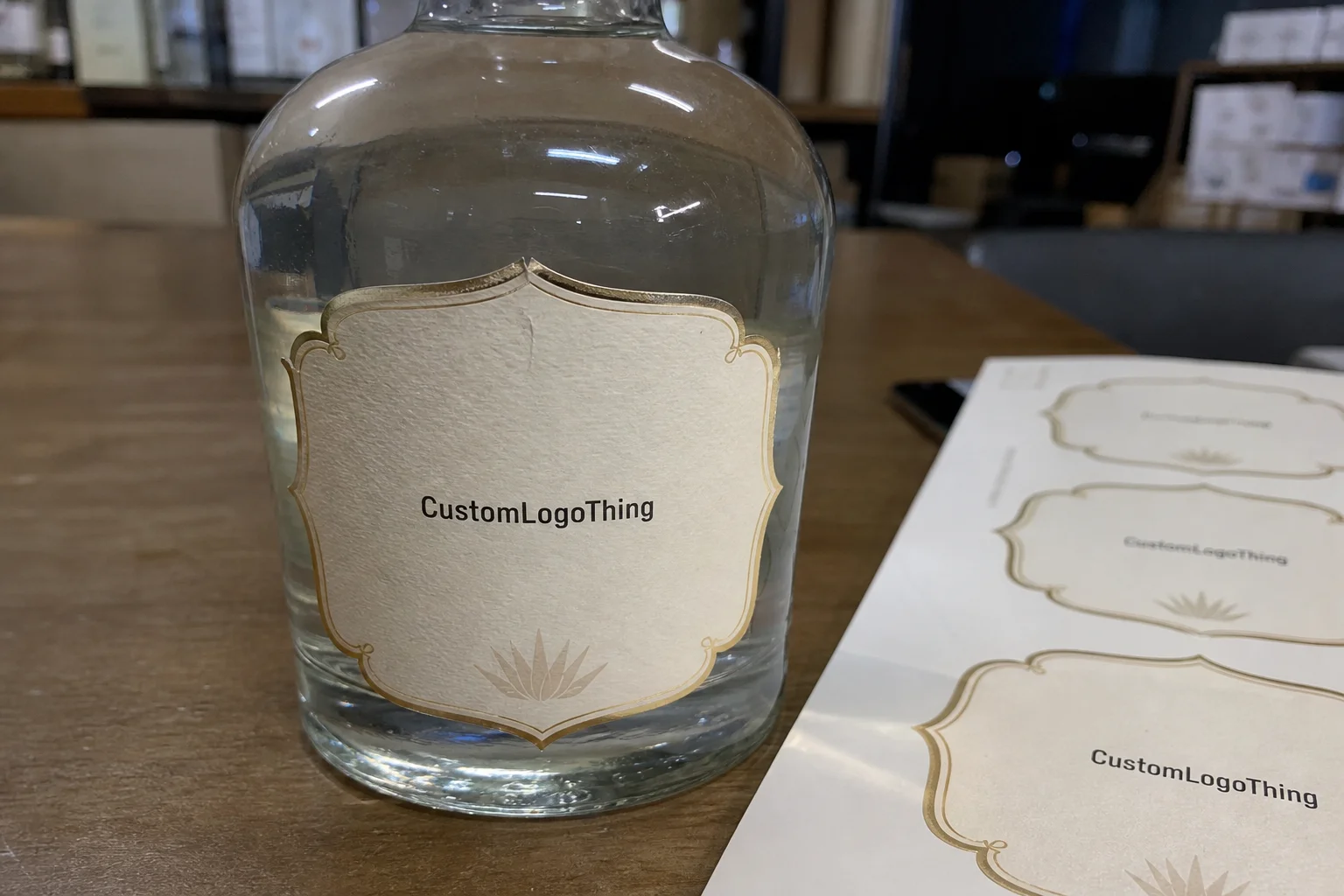
If you are comparing Custom Labels & Tags for a launch or reorder, start with the bottle shape, the neck area, and the front panel width. Then decide what the label must communicate: flavor, origin, batch identity, giftability, or a premium cue that fits the price point. That first pass matters more than most teams expect.
Why Bottle Labels Change the Sale Before the Pour
Shoppers do not study a bottle line by line. They scan. A good front label uses contrast, hierarchy, and finish to make that scan easy. Matte stock with sharp black type reads differently from a gloss label with metallic accents, and that difference shows up quickly in retail packaging and on bar shelves where lighting is uneven and attention is short.
In practice, the label becomes part of the brand’s packaging system. The best designs do not try to say everything at once. They create a clear order: brand name first, product type second, then the detail that helps the bottle earn trust. That may be origin, proof, flavor notes, or a short production cue such as a barrel statement or small-batch note. Too much text crowds the bottle and weakens the signal.
The physical side matters just as much. Bottle curves, frosted glass, textured surfaces, and shoulder transitions all affect how a label sits. A design that looks strong in a PDF can lose impact if the front panel is too narrow or the neck area competes with the main mark. That is why liquor custom labels should be sized to the bottle, not copied from a generic template.
A label that survives condensation, shelf glare, and a 3-second scan is doing real work. Anything less is decoration pretending to be packaging.
One useful test is simple: hold the bottle at arm’s length and ask whether the label still reads clearly. If the answer is no, the hierarchy probably needs simplification or stronger contrast. That is basic packaging logic, but it gets missed because the artwork looks attractive on screen.
Visual proofing should also happen under ordinary lighting, not just in a design file. A dark label that feels rich on a monitor can swallow detail in a bar. A clear label may look refined until the background glass changes the way the ink reads. Good label design is less about novelty than about surviving real viewing conditions.
Process, Proofs, and Turnaround
The order usually starts with a brief, but the real work begins when that brief turns into a proofable file. A responsible label supplier should confirm size, bleed, shape, adhesive, and application method before anything is printed. That early review catches more issues than most buyers realize, especially on first-time runs.
Digital proofs matter because they expose things that look harmless in design software but create trouble in production. Trim lines can drift. A barcode can sit too close to a cut edge. Small text can be readable on a monitor and unreadable on the printed label, especially if the stock absorbs ink or the finish lowers contrast.
A typical workflow looks like this:
- Artwork and bottle dimensions are submitted.
- The printer reviews size, quantity, finish, and substrate compatibility.
- A proof is issued for layout, color, and text verification.
- The customer signs off on the file.
- Press setup and production begin.
- The order ships after inspection and packing.
Turnaround usually slows down in two places: incomplete information and late revisions. If the bottle dimensions are still rough, the proof cycle stretches. If regulatory text changes after approval, the schedule slips again. That is normal, which is why clean specs save time and cost.
For brands that also order Custom Packaging Products, coordination matters. Labels, cartons, inserts, and shipper packs all affect how the final product presents itself. A label that looks premium can lose value if the outer packaging feels generic, so the whole packaging system should be reviewed together rather than one item at a time.
Lead time depends on complexity. A simple digital job can move quickly once art is approved. Specialty foil, clear film, white ink, or unusual die cuts add setup time. If the label also needs variable data, batch coding, or multiple SKUs, the job becomes more operationally sensitive. That does not make it difficult, but it does make timing less forgiving.
One reason this matters is that label approval and bottling schedules rarely stay perfectly aligned. A finished label sitting in inventory still ties up cash, while a late label can hold a launch hostage. The better plan is not just to chase the shortest turnaround. It is to match label timing to filling, packing, and distribution so the run does not stall at the last mile.
Substrate, Adhesive, and Finish Choices That Survive Ice
This is where many buyers underestimate the label. Substrate, adhesive, and finish determine whether the label still looks intentional after a cold chain, a refrigerated back bar, or a few hours in an ice bucket. Moisture is hard on many label constructions, and the wrong spec will fail faster than the artwork ever could.
Paper stocks can work well for dry shelf use and controlled storage. Film stocks, especially polypropylene or BOPP, usually perform better in wet conditions because they resist moisture and scuffing. Clear labels create a clean, modern look, but they ask more of the design because contrast has to come from the ink system, not the background. If sustainability claims matter on pack, paper selection can also tie into FSC-certified sourcing, which should be verified before it becomes part of the brand story.
The adhesive matters just as much as the face stock. A label that sits on chilled glass needs an adhesive that can hold under condensation, while a label on a highly curved bottle may need extra tack or a more forgiving material. Frosted or textured bottles can complicate adhesion because the label has less smooth surface area to grip. That shows up as edge lift, curl, or inconsistent placement.
For testing and distribution thinking, it helps to borrow from logistics discipline. The ISTA framework is a useful reminder that packaging should be tested under realistic handling conditions, not approved only on a screen. If a bottle is going to sit in a wet bucket, travel in cartons, and be handled by different staff, the label spec should reflect that reality.
Finish choices shape perception too. Matte finishes mute glare and often feel more restrained. Gloss sharpens color and can make saturated artwork pop. Soft-touch finishes feel premium but can show wear if the bottle is handled a lot. Foil accents add visual weight, though they usually extend lead times and cost more per unit. Clear labels with white underprint can look expensive, but they need careful color management because transparency changes how ink reads against glass.
| Label option | Typical use | Approx. unit cost at mid-volume | Main tradeoff |
|---|---|---|---|
| Paper stock | Dry shelf display | $0.12-$0.22 | Less durable in moisture |
| BOPP or film | Chilled bottles and ice buckets | $0.18-$0.35 | Slightly higher cost, less tactile than paper |
| Textured premium stock | Craft and gift-oriented packaging | $0.24-$0.45 | Needs testing on curves and small type |
| Clear film with white ink | Modern, minimal branding | $0.26-$0.50 | Requires tighter print control |
| Foil or specialty finish | High-end presentation | $0.35-$0.75 | Longer setup and more waste risk |
The point is not to pick the most expensive option. It is to match the label to the environment. A bottle that will spend time in refrigeration needs a different construction than one sold dry from a shelf. Smart liquor custom labels are chosen with the use case in mind, not just the mood board.
There is also a practical constraint that is easy to miss: more premium does not always mean more durable. A soft-touch laminate can feel refined, yet it may show rub marks sooner than a simpler gloss film. A textured paper can elevate a craft spirit, then become difficult to apply cleanly on a narrow shoulder. The best spec is the one that looks right and still behaves under the actual handling conditions.
What Drives Cost, MOQ, and Unit Pricing for Liquor Custom Labels
Price is rarely about one factor. Quantity, label size, number of colors, substrate, finish, cut shape, and SKU count all matter. If the design is a single static label on a standard roll, the unit price can stay controlled. If it includes multiple versions, metallic effects, or specialty adhesive, the number moves quickly.
MOQ, or minimum order quantity, matters because setup work has to be spread across the run. That is why a short run can look expensive per label while a larger reorder becomes more efficient. In practical terms, digital runs may start in the 250 to 1,000 piece range depending on the supplier, while flexographic production often makes more sense above 5,000 or 10,000 labels. The economics change with volume.
The mistake I see most often is comparing only unit price without looking at failure risk. A label that costs a few cents less but peels in cold storage is not cheaper. It is a reprint. Once freight, rush handling, and schedule disruption are added, the lower quote can become the more expensive choice.
There are also costs that do not show up clearly on the first quote. Revision rounds, file cleanup, sample production, and last-minute freight all affect total spend. If the artwork is not print-ready, expect more prepress labor. If the bottle is unusual, expect more testing. If the label is part of a broader packaging launch, expect coordination costs across design, compliance, and production teams.
Think about the purchase in three modes:
- Launch pilot: higher unit cost, lower risk, faster learning.
- Standard run: better pricing, stable specs, fewer surprises.
- Premium presentation: more finish cost, stronger shelf impact, stricter proofing.
That framing usually tells a better story than raw price alone. A pilot run is not cheap, but it buys information. A standard run is where scale starts to work. A premium presentation should be judged by whether it improves shelf presence enough to justify the extra material and setup cost. If it does not, the spend is vanity, not value.
Step-by-Step Ordering and Approval Workflow
Start with measurements. Not estimates. Actual bottle dimensions, front panel width, neck space, and curvature details give the printer the foundation needed to size the label correctly. Photos help too, especially if the bottle has embossed glass, a tapered body, or an unusual shoulder that changes placement.
A clean order package usually includes:
- Label dimensions and preferred shape
- Estimated quantity and reorder expectations
- Bottle type, material, and finish
- Artwork files and brand assets
- Compliance copy and barcode data, if needed
- Preferred substrate, adhesive, and finish
- Any application conditions such as refrigeration or hand application
Once the file is in review, the printer checks bleed margins, font legibility, contrast, and barcode placement. A proof then locks those details in. If something is off, this is the time to fix it. After approval, every change is expensive because it interrupts a controlled production workflow.
That review stage is where good packaging design shows its value. A label that respects the bottle shape and keeps information hierarchy clean will usually approve faster than one built like a flyer. It also tends to look better on shelf, which matters in retail packaging where the bottle competes against dozens of similar silhouettes.
After approval, production moves into press setup, print, inspection, and packing. The receiving step matters too. If the labels arrive and the first sample bottle looks wrong, do not commit the whole run. Test a few labels first. Look for curl, lift, edge clarity, and color consistency. A small test saves a big mistake.
For multi-SKU programs, version control deserves special attention. A mislabeled proof or an outdated barcode file can create avoidable waste across an entire run. A simple naming system for art files, revision dates, and approved versions protects the project better than scattered email threads do. That is not glamorous, but it is how label programs stay under control.
Common Mistakes That Make Liquor Labels Look Cheap
The fastest way to damage a premium bottle is to treat the label like a poster. A poster can be busy. A bottle label cannot. It has limited space, curved application, and real-world handling to survive. Overpacked layouts, thin fonts, and weak contrast usually look worse once they are printed and applied.
Color management is another trap. Screen color is not press color. A dark blue that feels rich on a monitor may print flatter on paper stock, while a metallic accent may read differently on a coated film. If the brand relies on a specific hue, ask for a proof on the actual stock, not just a digital image.
Regulatory mistakes are more serious. Missing required product details, unclear bottle naming, or unreadable batch fields can turn a beautiful label into a problem. The law varies by market, so compliance copy should be checked before print approval. That part is not decorative, but it protects the brand and avoids rework.
Another common miss is ignoring how the bottle will be used. A label that looks fine in a dry studio may fail the minute it hits condensation. If the bottle will be chilled, tested in an ice bucket, or handled in a busy bar, the adhesive and substrate need to reflect that use case from the start. That is where liquor custom labels prove their value or expose their weakness.
Finally, skipping the sample run is false economy. Even a modest test can reveal the problems that matter most: trim inconsistency, corner lift, scuffing, or a finish that reads too shiny under actual lighting. Packaging buyers who skip this step often pay for it later.
My rule: if the bottle is new, the finish is new, or the adhesive is new, test before you commit. That is standard control for branded packaging.
Another easy way to weaken the final result is to crowd the front panel with too many visual devices. A crest, a medal, a flavor note, a tasting note, a foil border, and a script logo can all coexist on a mockup. On an actual bottle, they often fight. The strongest labels usually use restraint as a tool, not as a compromise.
What to Prepare Before You Request a Quote
If you want a quote that is actually useful, gather the basics first. The more complete the brief, the less back-and-forth you will need later, and the easier it is for a supplier to price the job accurately.
Before you request pricing, prepare the following:
- Exact bottle measurements or a spec sheet
- Front and neck label dimensions
- Estimated quantity and reorder outlook
- Artwork files, ideally vector format
- Compliance copy and barcode data
- Preferred finish, such as matte, gloss, foil, or soft-touch
- Any performance need such as cold storage or water exposure
- Reference bottles or brands that show the look you want
It also helps to ask three direct questions: what proof format will I receive, what is the realistic turnaround after approval, and what happens if the first sample does not match expectations? Those answers tell you more about the supplier than a low quote ever will.
If the bottle is part of a larger launch, align the label with cartons, inserts, and shipper packs. A bottle rarely exists alone on shelf. The label sits inside a larger branded packaging system, and that system should look intentional from pallet to shelf. If the brand story depends on premium presentation, compare the label against the full set of Custom Packaging Products before you sign off.
One more practical point: ask for durability guidance, not just artwork approval. A supplier who can explain substrate behavior, adhesive limits, and handling risks is helping you avoid hidden cost. That is especially valuable for liquor custom labels, because the label has to look finished after printing, shipping, chilling, and display.
When the spec is clean, the quote is easier to trust, the proof stage is faster, and the final bottle looks like it belongs in the market you are targeting. That is the real job of liquor custom labels: make the bottle easier to buy, easier to trust, and harder to ignore.
How do liquor custom labels hold up in ice buckets and refrigeration?
Use a moisture-resistant stock and an adhesive designed for cold or wet conditions. Then test one finished bottle in the same environment it will face in real use before you approve a full run. That single test often tells you more than the spec sheet.
What information should be on custom liquor labels?
Include the required product name, brand name, bottle size, and any compliance text that applies to the market. Decorative elements can help, but they should never bury the information that needs to be readable at shelf distance.
What is a realistic turnaround for liquor custom labels?
Turnaround depends on proof approval, material availability, finish complexity, and quantity. Simple jobs move faster, while specialty foils, unique shapes, or late artwork changes usually add time. The proof stage is usually the first place schedules slip.
Do custom liquor labels require a large MOQ?
MOQ varies by printer and label construction. Smaller runs usually cost more per unit, but they are useful for launches, seasonal bottles, and market tests. If the run is uncertain, ask for a short-run pilot before scaling up.
What files do I need to order liquor custom labels?
A print-ready vector file is ideal, along with dimensions, bleed requirements, and any barcode or regulatory copy. If the artwork is not final, send the best source files you have and request a proof review before production starts.

