Buyer Fit Snapshot
| Best fit | Minimalist Logo Placement on Boxes projects where brand print, material claims, artwork control, MOQ, and repeat-order consistency need to be specified before quoting. |
|---|---|
| Quote inputs | Share finished size, material target, print colors, finish, packing count, annual reorder estimate, ship-to region, and any compliance wording. |
| Proofing check | Approve dieline scale, logo placement, barcode or warning zones, color tolerance, closure strength, and carton packing before bulk production. |
| Main risk | Vague material claims, crowded artwork, missing packing details, or unclear freight terms can make a low unit price expensive after revisions. |
Fast answer: Minimalist Logo Placement on Boxes: Material, Print, Proofing, and Reorder Risk should be specified like a repeatable production item. The safest quote records material, print method, finish, artwork proof, packing count, and reorder notes in one written spec.
Production checks before approval
Compare the actual filled-product size with the drawing, then confirm tolerance on folds, seals, hang holes, label areas, and retail display edges. Reserve space for logos, QR codes, warning copy, and material claims before decorative graphics fill the panel.
Quote comparison points
Review material grade, print process, finish, sampling route, tooling charges, carton quantity, and freight assumptions side by side. A quote is only useful when the supplier can repeat the same color, closure quality, and packing count on the next order.
Minimalist Logo Placement on Boxes sounds simple until you actually put ink on board and realize one extra inch can make the whole pack look expensive or accidental. I’ve spent enough time on factory floors in Shenzhen and Dongguan to know this: minimalist logo placement on boxes is not “do less and hope for the best.” It’s controlled restraint, and when it’s done right, a tiny mark can outperform a loud design because it feels intentional, premium, and easy to remember. On a 350gsm C1S artboard mailer or a 1200gsm rigid greyboard box, the difference between “clean” and “lost” can be 3 mm.
I still remember a client meeting where a skincare brand wanted a giant front-panel logo on a rigid box. I suggested a 38 mm foil mark on the lid instead, with a blank 8 mm margin all around. They thought I was making the box “too quiet.” After the samples came back from a supplier in Guangzhou, they changed their tune fast. The box looked like it belonged on a marble counter, not in a discount aisle. That’s the core of minimalist logo placement on boxes: it uses spacing, size, and placement to create value without screaming for attention. That sample run cost $1.68 per unit at 3,000 pieces, and the client still approved it in one day because the physical proof made the case better than any deck ever could.
Honestly, most people confuse minimalist branding with empty branding. Not the same thing. minimalist logo placement on boxes still needs hierarchy, contrast, and a deliberate viewing path. A bare box with a tiny logo thrown on one corner is just lazy. A properly planned layout, on the other hand, tells customers exactly where to look and what to remember, and it does that with fewer visual elements than a crowded box ever could. If the logo is set 12 mm from the edge on a 6 x 4 x 2 inch mailer, that spacing has to be chosen on purpose, not guessed in Canva at 11:47 p.m.
Minimalist Logo Placement on Boxes: What It Means and Why It Works
At its core, minimalist logo placement on boxes means putting the brand mark with intention and restraint, not filling every available panel just because you paid for printing. The logo might sit centered on the lid, tucked in a lower corner, or printed inside the box as a reveal moment. The point is not to disappear. The point is to create focus. On a 200 x 150 x 60 mm rigid box made in Dongguan, a 42 mm lid logo can feel balanced while the same size on a narrow mailer would look bossy and wrong.
Here’s what most people get wrong: they think minimal means generic. It doesn’t. A box with one well-spaced logo, the right paper stock, and a crisp finishing choice can feel more premium than a pack covered in ten design elements. I’ve seen luxury tea brands use a single uncoated black logo on natural kraft and get more compliments than brands using metallic gradients and six fonts. Why? Because minimalist logo placement on boxes gives the eye room to breathe, especially on materials like 350gsm kraft-lined SBS or 157gsm C2S wrapped around greyboard.
There’s also a memory benefit. Humans tend to remember simple visual systems faster than cluttered ones. That’s not marketing poetry; that’s just how visual processing works. When customers see a box with a calm composition and one strong mark, they’re more likely to recall the logo shape, the placement, and the material finish. That matters whether the box is sitting on a shelf in Singapore, arriving in a subscription shipment from Nashville, or being opened on camera for social content in Los Angeles.
“We took the logo off the front panel, moved it to the lid, and cut the ink coverage by 70%. Sales didn’t drop. Returns dropped because customers felt like the brand was cleaner and more premium.”
That quote came from a cosmetic client after we reworked their rigid setup with a 1-color PMS print, soft-touch lamination, and a 42 mm logo placement centered on the lid. The box cost was still serious—about $1.60 per unit at 3,000 pieces—but the perceived value jumped. The printer in Shenzhen used a 1.5 mm emboss depth on the final run, and the result looked far more expensive than the cost sheet suggested. That’s the odd thing about minimalist logo placement on boxes: people assume less decoration means less effort. In reality, the file prep, spacing decisions, and sample checks often take more discipline than a busy print layout.
One more distinction matters. minimalist logo placement on boxes is not the same as “barely there” branding. Barely there branding looks like someone forgot to finish the art file. Strategic minimalism has a reason for every millimeter. A logo placed 12 mm from the edge says something different from a logo centered with 20 mm of clean margin. That margin is not wasted space. It’s the frame. On a mailer with a 3 mm bleed and a 5 mm safe zone, that frame is also the difference between clean production and a reprint.
How Minimalist Logo Placement on Boxes Works in Real Packaging
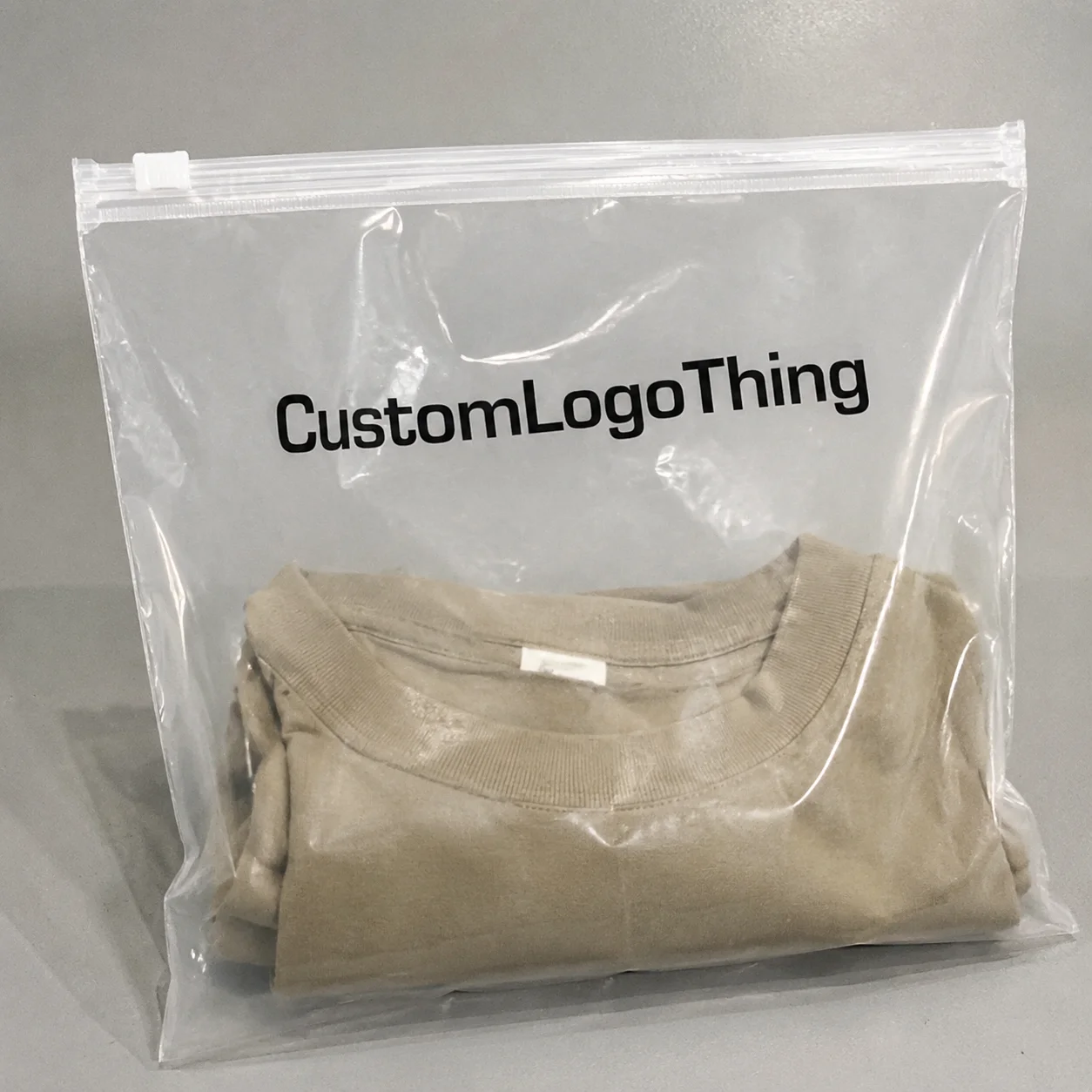
In real production, minimalist logo placement on boxes usually shows up in a few predictable spots: centered on the lid, near the bottom-right corner, on the side panel, on the back panel, as interior print, or on a seal label. Each choice changes the customer’s experience. The lid is the most obvious. The corner feels more editorial. The interior print turns the unboxing into a reveal. The seal label works well for mailer boxes and short-run retail packs, especially when the label is 25 x 80 mm and printed on matte coated stock in one PMS color.
I learned this the hard way during a visit to a folding carton line in Guangzhou. The client had approved a tiny side-panel logo because the mockup looked elegant on screen. On press, though, the logo practically vanished once the carton was on a retail shelf under warm lighting. We switched to a centered top mark and increased the size by 18%. Problem solved. Minimalist logo placement on boxes only works if you think about where the box is seen, not just where the logo fits. A 22 mm mark that reads fine at desk distance can turn into a ghost at 1.5 meters under 3000K retail lighting.
The unboxing sequence matters too. If the customer sees a plain exterior first and then a logo inside the lid, the reveal feels intentional. That works beautifully for apparel, candles, and high-end supplements. If the box is shipping-only, the exterior panel may need a slightly stronger logo so the package still looks branded in transit. In that case, minimalist logo placement on boxes is still the right strategy, but the logo may need a bit more scale than you’d use for a shelf display. A 1-color exterior mark on a 6 x 4 x 2.5 inch mailer can be enough if the box is moving through UPS or DHL, but the type needs to survive scuffs and tape.
Whitespace and contrast are your two best friends here. A 100% black logo on warm kraft board will read differently from a blind emboss on 1200 gsm greyboard with matte lamination. One feels earthy. The other feels restrained and expensive. Both can work, but only if the placement matches the box style and customer journey. A blind embossed logo on a 1500 gsm rigid box in Shenzhen can look luxurious; the same treatment on lightweight E-flute corrugate can look like a mistake if the pressure is too soft.
Here’s a quick reality check from the production side: box style changes everything. A telescoping rigid box can handle a centered lid mark beautifully because the lid panel is broad and stable. A narrow folding carton, on the other hand, may need a lower-corner placement or a side-panel logo so the artwork doesn’t get chopped by the flap structure. Minimalist logo placement on boxes is never one-size-fits-all, no matter how many Pinterest boards say otherwise. A carton with a 15 mm tuck flap and a 4 mm score line will punish a logo placed too close to the fold.
For customers who want a cleaner shelf presence, minimalist logo placement on boxes can also improve visual consistency across a product line. If every SKU uses the same placement zone, the collection looks organized even when colors or flavors change. I’ve seen this work especially well for wellness brands with 6 to 12 variants. The box looks deliberate instead of chaotic, and that makes the whole shelf read faster. A supplement line I worked on in Dongguan used a 14 mm logo zone on every carton, and the retailer said it cut visual confusion across 8 flavors.
| Placement | Best For | Visual Effect | Typical Use Case |
|---|---|---|---|
| Centered lid | Rigid boxes, luxury gifts | Balanced, premium | Skincare, jewelry, PR kits |
| Bottom-right corner | Editorial brands, fashion | Subtle, modern | Apparel, accessories |
| Side panel | Retail shelves, stacked boxes | Clean, functional | Subscription, wellness |
| Interior print | Unboxing-focused brands | Surprise, memorable | DTC gifts, premium kits |
| Seal label | Mailer boxes, short runs | Simple, cost-conscious | Small launches, seasonal promos |
I always tell clients to test the box in the actual viewing position. On a desk, a 24 mm logo can read perfectly. On a video call, it may vanish. On a retail shelf, it might need to be 15% larger just to survive the distance. Minimalist logo placement on boxes depends on those real-life conditions more than on design theory. I’ve watched a 30 mm logo disappear on a camera lens from 4 feet away, then look perfect after we nudged it to 34 mm with a 2-point heavier stroke weight.
Key Factors That Shape Minimalist Logo Placement on Boxes
The first factor is logo size and legibility. A logo that feels elegant at 10 inches away may be invisible at 3 feet. I’ve had clients fall in love with a 28 mm mark, then panic when they saw it on a corrugated mailer from across a conference room. The fix was not “make it big and ugly.” The fix was a cleaner font lockup, stronger contrast, and a 34 mm version that still respected the minimalist idea. Minimalist logo placement on boxes lives or dies on legibility. For most retail cartons, 22-40 mm is a useful working range, depending on the box face and the typeface.
Material choice comes next. A matte coated paper gives you crisp ink laydown. Kraft can absorb ink and soften fine details. Soft-touch lamination makes dark logos feel rich, but it can also mute low-contrast artwork. Foil stamping adds shimmer, though the wrong foil on the wrong stock can look like you borrowed a club flyer from 2009. Embossing works well for restrained branding, especially on rigid boxes with 1200–1500 gsm board. Blind embossing, in particular, is a favorite when the client wants minimalist logo placement on boxes without visible ink. A 0.8 mm deboss on 157gsm art paper wrapped over greyboard can look clean if the die maker is precise.
Brand personality matters just as much. Luxury brands usually prefer centered marks, generous margins, and fewer interruptions. Eco brands often lean toward kraft paper, one-color flexo, and corner or side placement to keep the exterior honest and simple. Tech brands tend to use precise alignment and sharper typography. Wellness brands often want a calmer, softer expression. Subscription brands usually care about the box opening sequence, so interior branding can play a bigger role than the exterior. I’ve seen a candle brand in Portland switch from a 3-color front panel to a single lid logo on natural board, and the packaging suddenly matched the price point of $42 instead of looking like a $12 impulse buy.
Production constraints are the part people love to ignore until the prepress team starts sending redlined PDFs. Dielines, bleed, safe zones, and glue tabs all affect where the mark can actually go. I’ve reviewed files where the logo sat exactly where the tuck flap folded. Beautiful on screen. Useless in production. Minimalist logo placement on boxes works best when you design with the real dieline, not a fantasy rectangle from a mockup template. A 5 mm glue tab and a 7 mm score allowance can move your “perfect” logo into the no-print zone fast.
Budget is the other hard truth. A one-color print on a mailer box can be very reasonable, especially at 5,000 pieces or more. But once you add foil, embossing, spot UV, or multiple print passes, the cost climbs fast. That doesn’t mean you should avoid premium finishes. It just means minimal design is not automatically cheap. Minimalist logo placement on boxes can lower decoration cost, but the material and finishing choices still drive the final number. A simple one-color exterior on a 350gsm C1S mailer in Xiamen can come in at $0.15 per unit for 5,000 pieces, while a blind-embossed rigid box may sit at $1.20 or more depending on the board and wrap.
One of my better factory-floor lessons came from a rigid box supplier in Foshan who showed me three nearly identical boxes. Same art. Same logo size. Different finishes: matte black with gold foil, natural kraft with black ink, and soft-touch white with blind emboss. The blind emboss sample was the quietest and also the most expensive because the die had to be ultra-precise. That’s the kind of thing people forget. Simple looking packaging can be the most demanding to execute. The die maker quoted 4 business days for the emboss tool, and the press team still wanted another proof because the pressure needed adjustment by half a millimeter.
If you need a starting point for your box program, take a look at Custom Packaging Products. It’s easier to choose the right structure first and then fine-tune minimalist logo placement on boxes than the other way around. A folding carton, rigid box, or mailer each has a different print area, and that changes the logo’s job from the beginning.
For production standards and testing language, I also point brands to resources from the ISTA and Packaging Machinery Manufacturers Institute. If your boxes are shipping product across rough lanes, test expectations matter. A pretty box that fails transit is just expensive confetti, and a crushed carton arriving in Chicago after a 2-day lane from Phoenix is nobody’s idea of premium.
How Do You Choose Minimalist Logo Placement on Boxes?
You choose minimalist logo placement on boxes by matching the box structure, the customer journey, and the way the product will actually be seen. That sounds obvious. It isn’t, because people love picking a spot based on the mockup instead of the real use case. A box for a retail shelf in Seoul needs a different placement strategy than a mailer shipped from Melbourne to a customer’s apartment. Start with viewing distance, then think about opening sequence, then decide whether the exterior or interior should carry the main brand mark.
Here’s the shortcut I use. If the box is shelf-facing, give the front or lid panel priority. If it’s shipping-first, give the top or side panel enough presence to survive transit and camera shots. If the unboxing is part of the experience, keep the outside restrained and move the visual payoff inside. That’s the easiest way to make minimalist logo placement on boxes feel intentional instead of timid. I’ve watched a PR kit go from forgettable to polished just by moving the logo from the front face to the inside lid and keeping the outside completely clean.
Then check the proportions. A centered mark on a wide rigid lid can look elegant. The same layout on a narrow carton can look trapped. A tiny corner logo can feel editorial on a premium beauty box, but lazy on a low-margin mailer. The right choice is not about style alone. It’s about how much visual space the box gives the logo to breathe. With minimalist logo placement on boxes, the empty area around the mark is part of the design, not a leftover afterthought.
Finally, test it in the conditions that matter. Put the box on a shelf. Hold it at arm’s length. Open it on camera. Stack it with other SKUs. If the logo disappears in any of those moments, adjust the size or placement. That’s how you avoid the classic “looks great in the deck” problem. A packaging line in Dongguan once saved a client from a bad launch because the side-panel logo vanished under store lighting. We moved it 10 mm higher, increased the weight slightly, and the whole pack finally read like a brand instead of a blank object.
Minimalist Logo Placement on Boxes: Step-by-Step Process and Timeline
The first step is a brand audit. I want to know what the logo actually needs to do. Is it for retail recognition, social unboxing, shipping protection, or premium gifting? That answer changes the placement. A logo for a PR box might live on the interior lid. A logo for a shelf carton may belong front and center. Minimalist logo placement on boxes should be chosen for purpose, not taste alone. If the box is going to a Sephora-style shelf, the front panel matters more than the inside reveal; if it’s a direct-to-consumer mailer from Melbourne, the unboxing sequence may be the main event.
Step two is selecting the panel and the placement zone. I usually ask for a dieline, then map out front, side, lid, and inside options with exact measurements. On a 6 x 4 x 2 inch mailer, 8–12 mm margins can look clean. On a rigid box lid, you might need 15–20 mm of breathing room depending on the logo shape. This is where minimalism gets real. Minimalist logo placement on boxes is built on measurement, not vibes. If the logo is 31 mm wide, I want to know whether the safe area is 46 mm, 52 mm, or 60 mm before anyone starts pretending “it’ll probably fit.”
Step three is mockups and viewing tests. I print samples at actual size and hold them at arm’s length, then again at shelf distance. I also check them on phone video because half the time, that’s how people will see the package anyway. One client from a men’s grooming brand changed their logo placement after seeing it on a 6-second phone clip. On the screen, the mark looked like a speck. We moved it 14 mm higher and increased the weight slightly. Much better. That tweak cost nothing but saved them from launching a box that looked unbranded in every TikTok clip.
Step four is finishing and file prep. Once the placement is approved, I confirm the material, print method, and any special effects. That might mean 1-color offset on SBS board, digital print on a short run, or foil stamping on rigid board. If you’re using embossing, you need to make sure the mark has enough line weight to survive the die. Fine hairlines can vanish. I’ve seen it happen more than once. Minimalist logo placement on boxes is only as good as the artwork’s ability to survive production. A 0.25 pt line may look chic on screen and then disappear under a 60-ton press.
Step five is sample review and revision. I always ask for one round of physical proof before full production, even if the art looks perfect on the screen. Paper absorbs ink. Board bows. Glue flaps shift. Scoring changes alignment by a millimeter or two. That’s normal. It’s not a disaster. It’s just packaging. On a run coming out of Dongguan, I once approved a proof at 4 p.m. and caught a 2 mm shift the next morning under daylight. Good thing we checked before the 10,000-piece run started.
Here’s a realistic timeline for a custom box project with minimalist logo placement on boxes:
- Day 1-3: brand audit, dieline review, placement concept
- Day 4-6: digital mockups and size testing
- Day 7-10: sample production or short-run proof
- Day 11-15: revisions and final artwork sign-off
- Day 16-30: full production, depending on material and quantity
That timeline assumes the client responds quickly, which, to be fair, is not always the case. I’ve had proof approvals sit for nine days because three departments wanted to “circle back.” Meanwhile the factory was waiting, the paper was booked, and the production slot was staring at us like an annoyed warehouse manager. If you want minimalist logo placement on boxes done well, move fast on approvals. In Shenzhen, standard proof-to-shipment on a straightforward mailer is often 12-15 business days after proof approval, while rigid boxes with lamination and foil usually need closer to 18-25 business days.
For brands selling retail or wholesale, I also recommend checking material and environmental claims against FSC if recycled or certified board matters to your story. Clean branding and responsible sourcing often go hand in hand, and customers notice when the details match the message. A FSC-certified 350gsm C1S artboard mailer from a supplier in Xiamen can support that story without turning the box into a sermon.
Cost and Pricing Factors for Minimalist Logo Placement on Boxes
The good news: minimalist logo placement on boxes can reduce cost if you keep the decoration simple. One-color printing usually means fewer setup steps than multi-color artwork. Less ink coverage can also help on some substrates. On a 5,000-piece run of folding cartons, I’ve seen one-color logo layouts come in around $0.18 to $0.32 per unit depending on board and size, while a decorated version with multiple spot colors and coating changes climbed closer to $0.42 or more. Those numbers move around with paper markets, but the direction is consistent. A 350gsm C1S artboard carton in Ningbo is typically cheaper than a rigid box wrapped in printed paper from Shanghai.
The bad news: premium finishes eat savings fast. Foil stamping adds setup cost. Embossing adds a die. Spot UV adds an extra production pass. A custom die-cut window adds tooling and labor. If your goal is a very clean look, the box might still cost more than expected because “simple” often requires better board, tighter registration, and more careful finishing. That’s the packaging industry’s little joke. A blind emboss die from a supplier in Dongguan can add $80 to $180 in tooling before you’ve printed a single unit.
Supplier structure matters too. Some vendors quote low unit prices and then load up the order with setup fees, plate fees, and correction charges. Others bake more into the base price and stay more predictable. When I negotiated with a carton supplier in Shenzhen, I once got a quote that looked $0.07 cheaper per unit until I read the fine print and found three separate fees for proofing, tooling, and color matching. The final number was higher. Always ask for the full landed estimate. Minimalist logo placement on boxes should save complexity, not hide costs in a different column. Ask for quotes in writing with MOQ, unit price, plate fee, and freight to your city spelled out.
MOQ also affects pricing. A mailer with a simple one-color logo may be very economical at 3,000 to 5,000 pieces. A rigid box with soft-touch lamination and blind embossing may require a higher MOQ because the setup time is not worth it for tiny orders. If you’re launching a limited drop, digital print can be the right choice even if the per-unit cost is a bit higher. Better to pay $0.28 cleanly than $0.19 for a box that looks off. For a small launch of 1,500 pieces from a supplier in Guangzhou, the difference between digital and offset can be less painful than a rushed reprint.
Here’s a practical comparison:
| Option | Typical Unit Cost | Setup Complexity | Visual Result |
|---|---|---|---|
| One-color printed mailer | $0.18-$0.32 | Low | Clean, cost-conscious |
| Rigid box with soft-touch and one-color logo | $1.10-$2.20 | Medium | Premium, restrained |
| Rigid box with foil or emboss | $1.40-$3.20 | Higher | Luxury, tactile |
| Custom die-cut with special finish | $0.60-$1.80 | Higher | Distinct, custom |
So, is minimalist logo placement on boxes budget-friendly? Sometimes. If you keep to a single ink, standard dieline, and a straightforward board choice, yes. If you want specialty paper, blind emboss, matte lamination, and perfect edge alignment, then no, not really. It’s still minimal in appearance, but the production side can be very exacting. A 3,000-piece rigid run in Dongguan can look simple and still cost more than a louder mailer because the finishing stack is doing the heavy lifting.
Common Mistakes with Minimalist Logo Placement on Boxes
The biggest mistake is making the logo too small. I know, I know. Clients want “subtle.” But subtle can turn into invisible very quickly. If you need a magnifying glass to find the mark, the packaging failed. minimalist logo placement on boxes should still read at normal viewing distance, which for most packages means 18 to 36 inches. On a retail shelf in Tokyo or Chicago, that visibility window is even shorter because customers are moving fast.
Another mistake is stacking too many minimalist choices together. One tiny logo, three different fonts, a foil accent, a patterned interior, and a custom belly band? That is not minimal. That is a board meeting dressed in beige. Pick one visual idea and let it carry the box. Maybe the lid mark is the hero. Maybe the inside print is the surprise. Don’t make every surface compete. I’ve seen a brand in London try to make a “quiet” box with five separate finishing treatments. Quiet? No. Just expensive and confused.
Placement errors are common too. A logo can look elegant in the center of a mockup and awful once the box is assembled. Why? Because the fold, flap, or seam shifts the visual center. I’ve watched a client approve a perfectly centered front-panel logo, only to discover it sat 7 mm too low once the box was glued. That tiny error made the whole pack feel unbalanced. Minimalist logo placement on boxes needs assembly-aware placement, especially on tuck-end cartons where the top flap steals visual space.
Another classic problem: skipping print tests. Screen color and paper color are not the same thing. That 15% gray logo might disappear on kraft. That dark green mark may look muddy under matte lamination. I’ve seen beautiful artwork die a slow death on press because nobody checked a physical proof. Don’t trust a mockup alone. It’s a preview, not proof. A $25 sample in Shenzhen can save a $2,000 reprint later, and that’s not a dramatic estimate—that’s just math.
Finally, people forget that whitespace is not empty space. It still needs structure. White space can make a box look elegant, but only if the spacing is deliberate. Random empty areas look unfinished. Controlled empty areas look expensive. That’s the difference between a brand and a blank sheet. On a 100 x 100 mm top panel, a logo sitting 18 mm from the upper edge can feel composed, while a logo floating wherever the layout tool left it looks like the file was abandoned.
Expert Tips for Better Minimalist Logo Placement on Boxes
Use contrast with discipline. A subtle brand mark still needs to be readable. If the background is kraft, a slightly darker ink or a debossed mark may work better than a pale gray print. If the box is black, a foil or spot gloss can help the logo hold its own without adding visual clutter. Minimalist logo placement on boxes should feel calm, not apologetic. On a matte black rigid box made in Dongguan, a gold foil mark with a 1.2 mm stroke can read elegantly without turning the pack into a disco ball.
Test at arm’s length and on video. I can’t say that enough. Customers don’t hold your packaging under studio lights with a ruler in hand. They see it on a table, in a hallway, or on a smartphone camera. I’ve had brands approve layouts that looked perfect in a PDF and then fail in the real world because the mark didn’t survive motion blur. Always test the placement where people will actually encounter it. A 29 mm logo that looks strong on a desktop monitor may look tiny on a phone clip shot in natural light from 4 feet away.
Consider a hidden interior mark if the exterior needs to stay ultra-clean. That can be as simple as a centered lid print on the inside flap, a one-color pattern on the base, or a short message printed under the tissue. It’s a nice way to keep the outside restrained while still giving the customer a branded moment. For subscription boxes and gifting, this works beautifully. A 1-color inside print on a 350gsm insert can make a $15 candle box feel far more considered without cluttering the outside.
“The outside was almost blank. The inside made customers smile. That was the whole point.”
Keep one visual anchor. Not three. One anchor can be the logo, one line of text, or one small icon. If you have a logo on the lid, leave the sides alone. If the side carries the logo, let the top breathe. Minimalist logo placement on boxes gets stronger the moment you stop trying to decorate every surface. I’ve seen better results from a single 32 mm lid mark than from a box covered in “tiny tasteful details” that nobody notices anyway.
Work with the printer early. This is where I get a little blunt. A lot of bad packaging starts with late-stage artwork. If you’re already at final design and someone says, “Can we move the logo 12 mm to the left?” the answer is usually no, because the dieline doesn’t care about your late-night inspiration. Send the printer the die lines early, ask about safe zones, and confirm how the board behaves. That alone can save a week of revisions. A supplier in Foshan can tell you in one email whether the logo needs a 6 mm shift for the flap, and that email is worth more than three “quick comments” from the brand team.
I also recommend comparing placements on actual box types from the start. For example:
- Rigid gift box: centered lid logo or blind emboss
- Mailer box: side or top logo with a clean interior reveal
- Folding carton: front panel with precise margins
- Drawer box: small front pull-tab mark and interior branding
Each structure changes how minimalist logo placement on boxes reads in hand. The same logo can feel luxe on a rigid box and awkward on a narrow carton if you don’t adjust the scale. A drawer box from Suzhou might need a 20 mm pull-tab mark because the front face is so small, while a rigid lid in Shanghai can hold a 45 mm centered mark Without Breaking a Sweat.
What to Do Next After Choosing Minimalist Logo Placement on Boxes
Once you’ve chosen your direction, build a placement map. I mean a real one, not a vague note in a design brief. Mark the front, lid, side, back, and interior zones with measurements. Note which surfaces are blank, which carry the logo, and which have supporting text. That map keeps the team aligned and stops last-minute “small improvements” from wrecking the composition. Minimalist logo placement on boxes gets easier when everyone can see the plan. On a 200 x 120 x 55 mm carton, a placement map saves you from fighting over a 2 mm shift after proofs are already in motion.
Then request a physical sample or a short-run proof. If you’re ordering 2,000 or 5,000 boxes, a sample is cheap insurance. I’ve had clients save thousands by spotting a color mismatch on one sample instead of discovering it after a full run. Ask for the sample in the exact material if possible, not just a digital render. Paper, board, and finish all affect the final result. A sample made with 350gsm C1S artboard and matte lamination will not behave like a PDF screenshot, no matter how much someone in the office squints at it.
Create two artwork versions: a primary layout and a backup with slightly larger branding. That second version is helpful if the first one feels too delicate once printed. It’s much easier to approve Version B than to start over from scratch when the factory says your chosen mark disappears on the board. Minimalist logo placement on boxes should have a practical fallback. I usually keep a 10% larger logo version ready because that small adjustment often solves the readability problem without ruining the clean look.
Review the cost, timeline, and packaging goals with your printer before final approval. Ask about MOQ, setup fees, plate charges, and lead time from proof approval. For many custom packaging runs, 12-15 business days is realistic after approval if the material is standard and the finishing is straightforward. Specialty work takes longer. Always plan buffer time. Packaging delays have a way of showing up right when your launch calendar is already a mess. A foil-stamped rigid box from a Shanghai supplier can easily stretch to 20 business days if the emboss die needs a second round.
Finally, use the first run to gather feedback. Ask customers what they noticed first: the logo, the color, the feel of the box, or the unboxing sequence. Watch how the box performs on social media. Does the logo read in photos? Does the unboxing feel premium? Those answers will tell you whether your minimalist logo placement on boxes is doing its job or just looking polite. A launch in New York may get different feedback than one in Seoul, and that’s useful data, not a problem.
For brands still building out their packaging system, our Custom Packaging Products page can help you match structure, board, and decoration style before you commit to production. That’s the sensible order. Not glamorous, but sensible saves money. If you start with the right box style, the logo placement problem gets a lot smaller.
If your boxes are shipping through rough channels, remember to think about transit testing too. Industry standards from groups like ISTA exist for a reason. A beautiful package that scuffs, crushes, or opens in transit is not premium. It’s a refund waiting to happen. A simple edge crush test and a basic drop test can tell you more than ten mood boards ever will.
Is minimalist logo placement on boxes good for small brands?
Yes, if the logo is still readable and the placement feels intentional. Small brands often benefit because clean packaging can look more premium than crowded design, especially when the box uses one strong logo, 8-20 mm of whitespace, and a simple finish like matte or kraft. A 3,000-piece run from a factory in Shenzhen can keep unit costs reasonable while still looking polished.
Where is the best place for minimalist logo placement on boxes?
The best spot depends on the unboxing flow, box shape, and whether the package is shelf-facing or shipping-only. Front lid, side panel, and interior print are the most common strategic choices, and each one changes how the customer notices the brand. On a rigid box, the lid often wins; on a mailer, the top panel or side panel usually works better.
Does minimalist logo placement on boxes cost less?
Often yes, because simpler printing usually means fewer colors and less setup. But specialty finishes like foil, embossing, or custom dies can raise the price fast, even if the visual layout stays restrained. A one-color mailer might land around $0.15 to $0.25 per unit at 5,000 pieces, while a rigid embossed box can climb well above $1.00.
How big should a logo be for minimalist box branding?
It should be large enough to read clearly at arm’s length, but still leave plenty of whitespace. I always recommend testing multiple sizes on a real mockup instead of relying only on a screen preview, because paper and board change the perceived scale. In practice, that often means testing 28 mm, 34 mm, and 40 mm versions before signing off.
Can minimalist logo placement on boxes still feel premium?
Absolutely. Premium comes from proportion, spacing, material choice, and finish quality. A simple logo on a good box often looks more expensive than a busy design on a cheap one, which is why minimalist layouts are so common in luxury, wellness, and gift packaging. A 1200 gsm rigid box wrapped in soft-touch stock with a 1-color logo can look better than a flashy carton with three finishes and no discipline.
minimalist logo placement on boxes works because it respects the product, the customer, and the reality of production. Get the spacing right, Choose the Right panel, and don’t let “simple” fool you into sloppy work. I’ve seen a clean centered mark on a well-made box outshine louder packaging again and again, and that’s why I keep pushing minimalist logo placement on boxes as a smart branding choice, not a trend. My practical takeaway: pick one panel, define the safe zone in millimeters, test a physical sample, and approve the version that still reads clearly from arm’s length. The fancy mockup is nice. The real box is what ships.