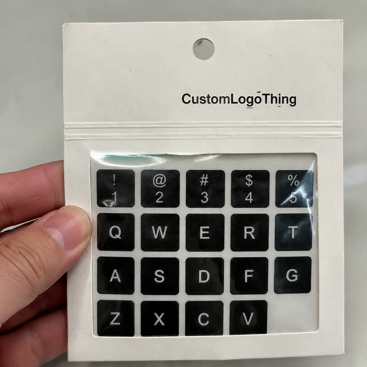
Set two matching jars next to each other, one with a standard printed label and one with gold foil stickers custom produced from the same artwork, and the difference usually shows up almost immediately. Light catches the metallic areas first. The logo gains edge definition. The package feels more finished without changing the structure, color palette, or shape of the container.
That quick visual lift explains why buyers keep coming back to foil for candle jars, gift packaging, stationery, event seals, boutique retail bags, branded mailers, and short-run product labels that need a more elevated read. The shine is only part of the job, though. A strong result depends on matching the foil process, facestock, adhesive, and finish to the way the sticker will actually be used.
Why gold foil stickers custom orders stand out on the shelf

Most buyers use the phrase gold foil stickers custom as shorthand for a pressure-sensitive label or decal with a real metallic decoration layer rather than gold-colored ink. That distinction matters more than it sounds. Gold ink can be attractive and warm, but foil reflects light with a brighter, cleaner metallic sheen that usually reads as more premium in person.
On packaging, foil works because it creates contrast fast. A logo stamped in gold against a matte black candle label can feel refined with very little artwork doing the heavy lifting. A simple round seal on a kraft mailer can make the package feel more deliberate before it is opened. On folded cards, favor boxes, and boutique wraps, a metallic accent adds a physical detail people notice as soon as they touch it and tilt it under the light.
Still, foil cannot rescue weak design. If the typography is too fine, the layout feels crowded, or the material fights the finish, the final sticker can look expensive without looking good. The strongest foil labels have restraint. They use metallic areas to guide the eye, not to coat every inch of the surface. Design and production need to agree with each other, especially on small formats where tiny mistakes become obvious.
A useful way to approach the project is to think in layers. First, decide how the foil will be applied. Next, choose the material and adhesive based on the surface and conditions. Then price the run with quantity, format, and turnaround in mind. That sequence usually produces a better label than choosing a visual effect first and trying to force the technical details to catch up.
A premium label rarely needs to shout. It needs to look intentional from a few feet away and stay crisp once someone picks it up.
How metallic foil decoration works on pressure-sensitive labels
A sticker is a layered construction, not a single sheet with adhesive on the back. The top layer is the facestock, which carries the print and decorative effects. Under that sits the adhesive, and beneath the adhesive is the liner that protects it until application. Foil enters as a separate embellishment step. It is transferred onto selected parts of the label rather than printed like standard CMYK ink.
Several production methods are common. Hot foil stamping uses heat and pressure to transfer metallic foil through a die. That approach is known for strong definition and a classic metallic look, especially on stable artwork and medium to large runs. Cold foil applies adhesive in the target areas and cures the metallic layer in line on press. Digital foil uses embellishment equipment that can target selected areas without the same tooling demands as traditional methods, which can be useful for prototypes, short runs, and artwork that changes often.
Each option has its own setup logic. Hot foil often brings higher upfront setup but excellent edge quality. Cold foil can fit efficiently into certain press workflows. Digital foil reduces some barriers for smaller orders but may carry a higher unit cost. None of those methods is universally best. The right one depends on quantity, artwork detail, schedule, and the visual quality expected from the finished piece.
The facestock plays a huge role in how clean the foil looks. Smooth coated paper and film materials usually support sharper edges than heavily textured or rough uncoated stocks. Matte surfaces often make the metallic effect feel richer because the contrast between dull background and reflective foil is easy to read. Gloss stocks can look polished too, though too much overall shine can reduce the impact of the foil itself.
Foil also has limits that are different from ink. Tiny reversed text, hairline rules, and very dense foiled patterns can lose clarity or break up during production. A better approach is to reserve foil for logos, borders, icons, short words, or larger decorative shapes that benefit from the metallic effect. Deep colors, black fields, and jewel tones tend to make gold foil stand out especially well under mixed retail lighting.
Technical performance matters after the label leaves the press. Registration, handling, abrasion, storage, and transit all affect how the finished stickers arrive and apply. Industry groups such as the Packaging Machinery Manufacturers Institute and the International Safe Transit Association offer useful reference material on packaging systems and transit performance, which becomes relevant once labels are packed, shipped, and handled across different environments.
Specs that shape appearance, durability, and application results
The decorative layer gets the attention, but the specification sheet determines whether the label will still look good after handling, storage, and application. Size, shape, corner radius, facestock, adhesive, laminate, and delivery format all change how gold foil stickers custom perform. A small seal for tissue wrap and a long bottle label for a refrigerated product may both use gold foil, but they rarely need the same construction.
Paper facestocks usually suit indoor, light-duty uses where tactile feel matters as much as durability. They work well for stationery, gift packaging, box seals, paper bags, and labels that will not face repeated moisture or rough handling. BOPP and similar film materials fit better when water, oils, friction, or refrigeration enter the picture. Film labels are common on jars, bottles, personal care packaging, and products that may be wiped down or stored in humid areas. Some flexible vinyl-style materials are used for specialty curved surfaces, though they are not necessary for every project.
The adhesive deserves as much attention as the facestock. Permanent adhesive is the normal choice for most retail packaging and product labeling because it gives a more reliable hold across many common surfaces. Removable adhesive works for promotions, temporary seals, and some reusable packaging, but it should be chosen carefully. Glass, coated cartons, plastic lids, mailers, and textured paper surfaces all behave differently, and the same adhesive will not perform identically on all of them.
Finish changes the whole tone of the piece. A matte laminate often gives gold foil more visual pop because the surrounding field stays soft while the metallic area flashes under light. A gloss laminate can increase scuff resistance and produce a brighter overall appearance, which may fit beauty packaging, gourmet jars, or labels meant to look sleek and polished. Uncoated papers feel natural and tactile but generally offer less protection from moisture and abrasion.
Shape affects both appearance and application. Sharp corners can lift more easily on some surfaces, especially if the label is handled often. Rounded corners usually behave better on jars, bottles, and flexible packaging. Intricate die-cut edges may look impressive on a proof sheet, but they can complicate peeling, alignment, and automatic dispensing. Simpler shapes often deliver better real-world results, particularly for hand application.
Artwork setup is another place where small oversights become production problems. Vector files are preferred because they keep foil edges clean. Bleed should be built correctly. Safe margins need to be respected. Foil areas should be separated clearly from printed elements so there is no confusion during prepress. If the design depends on extremely thin reversed type inside a foil block or ultrafine lines around a die-cut shape, expect some revision before approval. That is not the printer being difficult. It is the difference between a screen mockup and a label that can be manufactured consistently.
Material choices can also connect to sustainability goals. Buyers working with fiber-based packaging often want paper labels and related components to align with broader sourcing standards. In those cases, it helps to verify substrate claims carefully and use established references such as the Forest Stewardship Council for responsibly sourced fiber.
Format matters too. Sheets make sense for low-volume hand application, sample kits, and office use. Rolls are usually the better fit for faster hand application, dispensers, or labeling equipment. That one decision affects labor time more than most people expect, and labor often costs more than the small price difference between formats.
Gold foil sticker pricing: what affects cost, MOQ, and unit cost
Pricing for gold foil stickers custom usually comes down to a handful of variables: base material, print process, foil method, label size, shape, quantity, laminate, and whether the order ships on rolls or sheets. Two labels can share the same artwork and still land in very different price ranges if one uses paper with a simple foil accent and the other uses a custom die-cut film stock with heavier coverage and tighter tolerances.
Foil costs more than standard print because it adds a specialty decoration step. That means setup, tighter registration control, extra consumables, and more inspection during production. Even when the visual effect looks simple, the presswork behind it usually is not. A clean metallic edge has to line up properly with the printed image and die-cut shape, especially on smaller labels where a slight shift becomes easy to spot.
Minimum order quantities often depend on the embellishment method. Traditional foil processes tend to make more financial sense as quantities rise because setup costs can be spread across more units. Digital foil can reduce the barrier for shorter runs and prototypes, but the per-piece price usually stays higher. Buyers often get the best value by comparing a few quantity tiers rather than focusing on a single number.
That comparison becomes clearer in a table:
| Option | Typical fit | Strength | Tradeoff |
|---|---|---|---|
| Paper label with foil accent | Short-run stationery, seals, light-duty packaging | Lower material cost, classic look | Less moisture resistance |
| BOPP label with foil accent | Jars, bottles, chilled products, retail packaging | Better durability and scuff resistance | Higher unit cost than paper |
| Digital foil embellishment | Small runs, variable artwork, fast prototype needs | Flexible setup, good for shorter quantities | Unit cost can stay elevated |
| Traditional hot foil | Stable designs and larger runs | Excellent metallic definition | Setup cost can be harder to justify on tiny orders |
For rough budgeting, simple foil labels can reach very low per-unit pricing only once quantities increase and the build stays straightforward. Short runs, unusual shapes, multiple versions, or detailed foil coverage will move the cost up quickly. A tiered quote for 500, 1,000, and 5,000 pieces often reveals a much more useful buying picture than a single estimate at one arbitrary quantity.
Secondary costs matter too. Proofs, tooling, file revisions, packaging for shipment, split SKUs, and multiple scent or flavor versions can all change the math. If the label program includes several sizes or seasonal designs, setup costs may repeat in ways that are easy to overlook at the planning stage.
For projects tied to broader packaging systems, it can help to compare the foil label budget alongside related pieces such as Custom Labels & Tags or other Custom Packaging Products. That keeps material, finish, and quantity decisions aligned across the full package instead of solving each component in isolation.
Production steps, turnaround, and lead time from proof to delivery
Most foil label jobs follow a fairly predictable path: inquiry, file review, material selection, proofing, approval, production, finishing, inspection, packing, and shipping. The early stages often take more time than buyers expect. Artwork cleanup, spec questions, and proof revisions can slow a project before the press ever starts running.
Lead time and press time are not the same thing. The production window may only take a few business days after approval if the build is straightforward and materials are available. Total lead time also includes proof review, scheduling, die preparation if needed, finishing, and freight transit. For launch dates, pop-up events, seasonal drops, or wholesale deadlines, those surrounding steps often matter more than the actual print window.
Complexity adds time. Custom dies, unusual shapes, difficult surfaces, and detailed foil registration usually require more care. Specialty facestocks can add days if they are not in stock. Repeat jobs tend to move faster because the build is already familiar, while a new label structure with fresh artwork nearly always needs more prepress attention.
Rush requests are possible on some projects, but not all. A straightforward repeat run on a standard material may be able to move quickly. A heavily detailed foil label with unresolved artwork and a hard delivery deadline is much riskier. Building in a schedule buffer almost always leads to a better result than forcing a premium finish through an unrealistic timeline.
Certain details make production much smoother from the start:
- Press-ready vector artwork
- Clear quantity tiers
- Final ship-to address
- Exact application surface
- Confirmed rolls or sheets format
- Approved text, colors, and foil coverage before proof signoff
With those answers in hand, quotes are cleaner, proofs move faster, and scheduling becomes easier to hold. That matters a lot when the label is part of a larger package branding rollout where cartons, inserts, or fulfillment dates are already locked in.
Step-by-step guide to choosing the right foil label configuration
The easiest way to choose a foil label is to start with function and let the finish support it. A beautiful sticker still has to peel, apply, and hold under the conditions it will face.
- Define the use case. Identify the container or surface first. A jar, bottle, folded carton, mailer, candle vessel, and stationery sleeve all create different demands.
- Think about the environment. Moisture, refrigeration, skin oils, abrasion, and repeated handling all affect material choice.
- Choose the facestock. Paper suits many indoor and light-duty applications. Film is usually the safer route for products exposed to water, oil, or frequent wiping.
- Select the adhesive. Permanent adhesive fits most packaging applications. Removable options work best when the surface and use case truly support them.
- Decide where foil belongs. Logos, borders, icons, and short phrases usually perform better than full metallic coverage, both visually and financially.
- Build the art correctly. Separate foil layers, include bleed, respect safe zones, and avoid tiny reversed details.
- Pick rolls or sheets based on application. Match the format to how the labels will be dispensed and applied, not just to the lowest unit price.
- Review the proof with real-world use in mind. Check orientation, contrast, foil placement, readability, and how the label will sit on the actual package.
- Order for realistic inventory needs. A larger run can reduce unit cost, but only if the design will stay current long enough to use the stock.
A simple rule helps if the choice still feels fuzzy. Labels handled often need durability first. Labels viewed from a distance need strong contrast and a clear shape. Budgets under pressure usually benefit from selective foil rather than heavy coverage. That balance keeps the label polished without turning the build into an overcomplicated spec.
For many product lines, a BOPP label with selective gold foil over a dark or neutral background lands in the sweet spot. It reads premium, stays legible, and holds up well in real handling conditions.
Common mistakes with foil labels and the next steps to get a clean quote
The most common mistake is treating foil like ink. Foil has different registration limits, different cost behavior, and different visual strengths. A design built around tiny metallic details or extremely small reversed type may look convincing on a screen and still produce a disappointing physical label.
Material mismatch comes next. Paper on a chilled bottle, lightly protected labels on oily containers, or removable adhesive on a package that needs long-term hold can all create avoidable failure points. Those problems usually begin with incomplete job information rather than bad presswork.
Planning errors cause plenty of trouble as well. Late approvals, missing file layers, unclear quantity targets, and quote comparisons based on different assumptions all make decision-making harder. One estimate may assume paper. Another may assume film. One may include die cutting and foil. Another may not. Unless the specs match, the numbers do not tell a useful story.
The cleanest quote requests usually include the following:
- Final artwork files in vector format if available
- The application surface and whether it is dry, chilled, curved, or handled often
- Quantity tiers instead of one single quantity
- Roll or sheet preference
- Any launch date or hard delivery deadline
- A preferred material or at least a durability target
- Clear direction on foil placement and approximate coverage
Gold foil works best as an accent with purpose. Pair it with bold typography, enough negative space, and a material suited to the environment, and the label usually feels stronger right away. That is the practical reality behind successful gold foil stickers custom projects. The best results come from matching the ambition of the design to the realities of manufacturing, application, and budget.
If the project is ready to move, gather the artwork, confirm the surface, choose a few quantity tiers, and request pricing based on actual use rather than a rough guess. That makes it much easier to compare options and land on a foil label that looks right, applies cleanly, and holds up the way it should.
Are custom gold foil stickers waterproof?
They can be, though the answer depends on the facestock and laminate more than the foil itself. Film materials such as BOPP handle moisture better than standard paper, and adhesive choice still matters on damp, chilled, or curved containers.
What is the difference between gold foil stickers custom and metallic ink stickers?
Foil uses a true metallic layer that reflects light much more strongly and usually produces a sharper premium look. Metallic ink can suggest shimmer, but it generally appears flatter and less reflective than real foil.
Can I order gold foil labels in small quantities?
Yes, in many cases. Digital embellishment methods often make short runs more practical, though the unit cost is usually higher than larger traditional foil orders.
How long does it take to produce custom gold foil stickers?
Timing depends on file readiness, proof approval speed, material availability, production method, finishing requirements, and shipping distance. Repeat jobs with approved artwork usually move faster than new builds with custom shapes or tight foil registration.
What artwork works best for custom gold foil sticker printing?
Vector artwork is the safest choice. Bold logos, borders, icons, and short text usually foil more cleanly than very fine detail, and proper bleed, safe margins, and strong contrast all help the final label reproduce well.