Buyer Fit Snapshot
| Best fit | Order High Contrast Logo Stickers projects where brand print, material claims, artwork control, MOQ, and repeat-order consistency need to be specified before quoting. |
|---|---|
| Quote inputs | Share finished size, material target, print colors, finish, packing count, annual reorder estimate, ship-to region, and any compliance wording. |
| Proofing check | Approve dieline scale, logo placement, barcode or warning zones, color tolerance, closure strength, and carton packing before bulk production. |
| Main risk | Vague material claims, crowded artwork, missing packing details, or unclear freight terms can make a low unit price expensive after revisions. |
Fast answer: Order High Contrast Logo Stickers: Branding That Stands Out should be specified like a repeatable production item. The safest quote records material, print method, finish, artwork proof, packing count, and reorder notes in one written spec.
Production checks before approval
Compare the actual filled-product size with the drawing, then confirm tolerance on folds, seals, hang holes, label areas, and retail display edges. Reserve space for logos, QR codes, warning copy, and material claims before decorative graphics fill the panel.
Quote comparison points
Review material grade, print process, finish, sampling route, tooling charges, carton quantity, and freight assumptions side by side. A quote is only useful when the supplier can repeat the same color, closure quality, and packing count on the next order.
If you want to order high contrast logo stickers that still read on a moving conveyor, a crowded retail shelf, or a matte kraft mailer under harsh warehouse lights, start with contrast before decoration. I’ve stood on lines in Dongguan and Suzhou where a gold-on-brown sticker looked elegant in the design file and vanished the second it hit a dark carton under 4,000K fluorescent tubes. Honestly, that kind of thing makes a person question every “premium” label choice ever made. The stickers that performed best were usually the simplest ones: strong black on white, white on deep navy, or bold brand colors with clean edge definition.
That is why businesses that order high contrast logo stickers are usually thinking like operators, not just designers. They want packaging that gets recognized quickly, seals cleanly, and looks intentional from three feet away and from a phone camera. During a visit to a folding-carton plant outside Shenzhen, one line supervisor told me something I’ve never forgotten: “If the label disappears, the brand disappears.” He was talking about a run of 20,000 adhesive seals for subscription boxes, and he was right. I remember nodding along and thinking, yes, that’s the whole messy truth in one sentence.
At Custom Logo Things, the practical goal stays simple: help you order high contrast logo stickers that hold up on real packaging surfaces, not just on a color-calibrated monitor. Whether the final use is a tamper-evident seal, a thank-you insert, a retail handout, or a shipping carton brand mark, the sticker should read clearly, adhere properly, and match the product you are actually sending out. And yes, the “real packaging surfaces” part matters more than people want to admit, especially when a 12-inch carton is being labeled at 6:30 a.m. before the first truck leaves the yard.
Order High Contrast Logo Stickers That Stay Readable
On busy factory floors, clarity wins. I’ve seen this in corrugated plants in Ningbo, cosmetics packing rooms in Guangzhou, and small e-commerce fulfillment centers in Melbourne where the best-performing graphics were not the most complex, but the easiest to spot in half a second. If you order high contrast logo stickers, you are buying speed of recognition as much as decoration. Buyers, packers, and customers notice a sticker that separates cleanly from the surface color before they notice thin linework or fancy gradients.
High contrast matters because packaging surfaces are rarely neutral. Kraft mailers absorb dark inks in a way that can flatten a logo. Glass jars create reflections. Matte cartons can mute detail. Polybags and soft plastics introduce glare, surface movement, and the occasional wrinkle. When people order high contrast logo stickers, they usually want the mark to stay visible on all of those surfaces, even if the package is photographed under mixed light or stacked in a warehouse. I still remember a black polybag run that looked perfectly fine on the proof and then turned into a reflective nightmare in the actual packing room. Design does not always behave. Packaging, frankly, has a personality disorder.
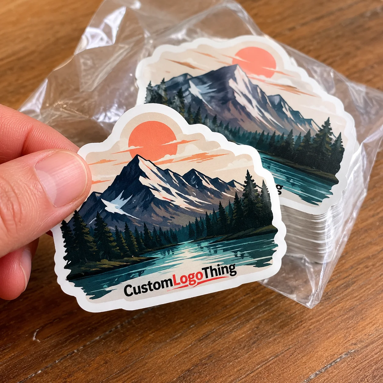
Some brands overcomplicate sticker design. A clean two-color mark with strong value separation often sells better than a crowded full-color layout, especially on a 2-inch or 3-inch label. One food client I worked with in Manchester moved from a low-contrast metallic logo to a black-on-white round seal, and their packing team said it cut visual confusion on the line because the labels were easier to spot and apply correctly. That is the kind of practical reason people order high contrast logo stickers again and again. It’s not glamorous, but neither is redoing 8,000 labels because nobody can see them under warehouse lighting.
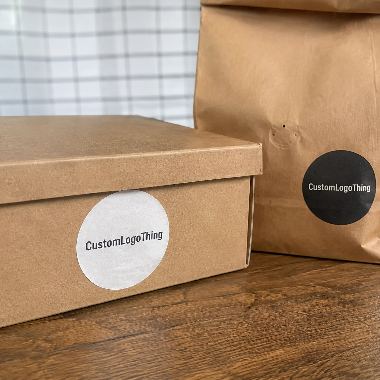
These stickers are not just decorative. They act as a branding tool, a product signal, and sometimes even a light form of quality control. A sharp seal on a box flap tells the customer the carton was closed with intent. A bold logo on a mailer makes the parcel feel more intentional on arrival. A clean event giveaway sticker can keep your brand on a laptop, water bottle, or notebook for months. If you order high contrast logo stickers for recurring use, you are supporting recognition across multiple touchpoints, not just one shipment. I’m personally a fan of any branding element that does useful work without asking for applause.
Common use cases include:
- Retail packaging seals for folded cartons, sleeves, and paper wrap
- Thank-you inserts inside order boxes and mailers
- Promotional handouts at trade shows and pop-up events
- Fulfillment labels used for brand identification or internal routing
- Branded tamper-evident seals for closures and flap locks
When buyers order high contrast logo stickers, they usually want one more thing that gets overlooked: performance under fluorescent warehouse lighting and on camera. In a distribution center in Louisville or a fulfillment hub in Leeds, a label may be read at arm’s length while a cart is moving. On social media, the package may be shot with a phone that exaggerates glare or crushes shadow detail. High contrast solves both problems by keeping the edges clean and the logo legible in real-world conditions. I’ve watched a beautifully designed sticker fail a phone photo test so badly that it looked like a ghost of a brand. Not ideal. Not even slightly.
“The prettiest sticker in the proof is not always the best sticker on the box. The one that reads at a glance usually wins.”
If your brand is trying to build consistency across cartons, inserts, display packs, and mailers, this is the kind of product that earns its keep. You order high contrast logo stickers once, then use them everywhere the same logo needs to be seen fast and remembered fast. That repeatability is the quiet part of branding nobody puts on a mood board, even though it is what keeps the line moving on a Tuesday afternoon in July.
High Contrast Logo Sticker Materials and Finishes
Material choice changes everything, and I mean everything. When you order high contrast logo stickers, the stock, finish, and adhesive decide whether the artwork stays crisp or gets dulled by glare, moisture, or poor hold. I’ve watched buyers save a few cents per thousand by choosing the wrong face stock, only to spend more later replacing stickers that curled, lifted, or looked washed out on the package. That savings turns into a very expensive lesson very quickly, especially on runs of 10,000 or more.
Paper stickers work well for dry indoor use, short shelf life, and lower-cost packaging runs. They print nicely, accept strong colors, and can feel natural on kraft cartons and tissue wrap. If the application is inside a box or on a dry retail pack, paper can be a smart choice when you order high contrast logo stickers for cost control and a matte, hand-applied look. I like paper for certain bakery inserts and thank-you seals because it feels friendly instead of overly engineered. A standard choice here is a 90gsm gloss paper or a 70gsm uncoated paper, depending on the look you want.
BOPP is one of the most practical materials for durability. It resists moisture better than paper, holds color well, and works nicely on product labels, shipping-use seals, and packaging that may see handling or light condensation. If you are shipping through humid climates or want a longer-lasting sticker, I usually steer buyers toward BOPP when they order high contrast logo stickers for real distribution environments. In plain terms: it’s the one I trust when the package might get mildly bullied by weather, transit, or both. A 60-micron white BOPP with permanent adhesive is a very common spec for this reason.
Vinyl is the tougher option when handling is rougher, the surface is irregular, or the label may be touched often. I’ve seen vinyl perform well for reusable tubs, promo containers, and products that sit in stock for longer periods. It is not always necessary, but when buyers order high contrast logo stickers for heavy handling, the added durability can be worth the step up. Sometimes the right answer is simply: choose the stock that won’t give up first. For outdoor or long-life applications, 75-micron or 100-micron vinyl is a common build in factories near Shenzhen and Taipei.
Clear film is useful when the design intentionally uses the package surface as part of the look. That said, clear stock is not the easiest path to high contrast unless you use white ink underlays or bold artwork. On dark cartons or tinted glass, transparent material can disappear if the design is too delicate. For many clients who order high contrast logo stickers, opaque material gives a safer, more predictable result. Clear film is gorgeous when it works, and deeply annoying when it doesn’t, which is usually the moment someone says, “Can’t we just make it a bit subtler?”
Finish matters as much as stock. A gloss finish adds brightness and can make colors pop, but it may create glare on shiny retail packaging. A matte finish reduces reflection and often reads better on camera. Soft-touch lamination can feel premium, though it sometimes slightly softens visual sharpness if the artwork is already too busy. Clear laminate can protect print while improving scuff resistance. The right finish depends on how you plan to use and view the sticker after you order high contrast logo stickers. For most e-commerce cartons, matte or semi-gloss is the safer choice.
For darker logos, white ink underlays and opaque face stocks are often the answer. Thin dark text on a transparent label will not stand out against a busy box print unless there is enough contrast built into the structure of the sticker. Spot colors can also help if your brand palette includes a bold white, bright yellow, deep black, or intense red that reads cleanly on the intended background. When clients order high contrast logo stickers, I often review the background color first and the logo second, because the surface sets the rules. A white ink flood under a 2-inch mark can matter more than the logo color itself.
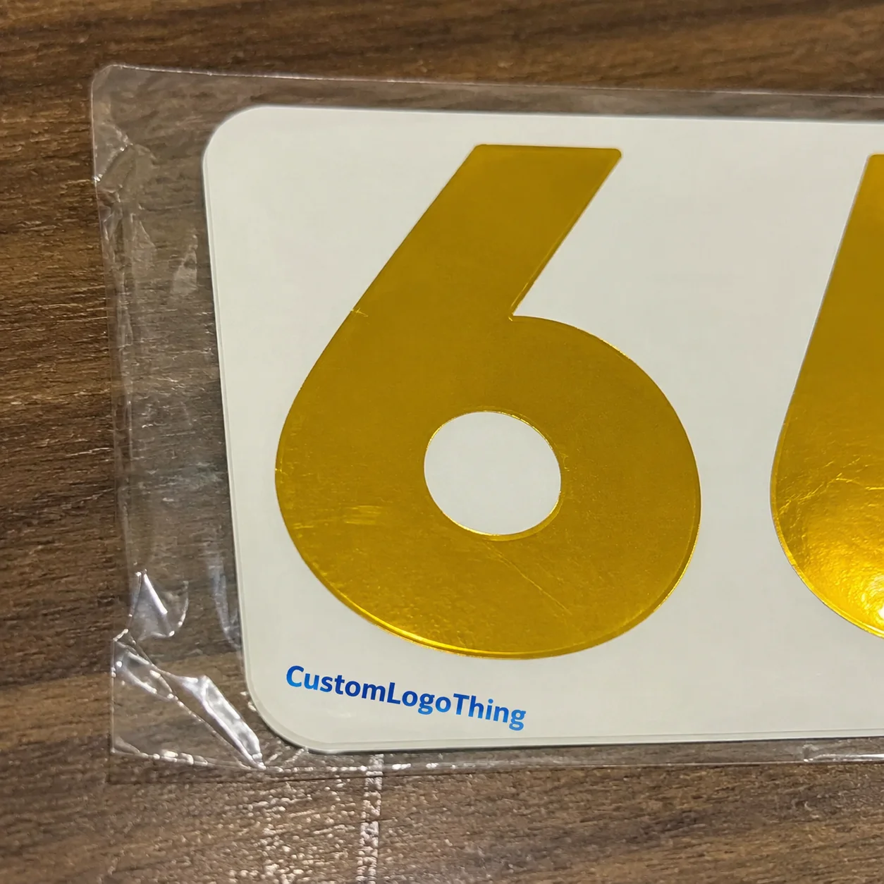
Shape is not just aesthetics either. A circle can simplify a round logo. A square suits blocky marks and QR pairings. A rectangle works well for horizontal logos on carton flaps. Ovals can soften a design without losing readability. Custom die-cut shapes create a memorable outline, but the cut must still support the logo geometry. If you order high contrast logo stickers with a complicated contour, make sure the branding is still readable at the actual size you will use. Otherwise, you end up with a fancy outline that behaves like a tiny obstacle course for your own logo.
Adhesive selection is part of performance, not a side detail. Corrugated boxes often need a standard permanent adhesive with enough grab to handle fiber texture. Coated cartons may allow cleaner laydown. Chilled or refrigerated surfaces need more attention because condensation can interfere with bond strength. Reusable containers may need a stronger adhesive or, in some cases, a removable option depending on the use case. I have seen a beautiful label fail because it was matched to the wrong surface, which is why I always ask where the sticker will live before a buyer order high contrast logo stickers. Adhesive is the part people forget right up until the sticker peels off in the cold room. Then everyone remembers.
| Material | Best Use | Contrast Performance | Typical Notes |
|---|---|---|---|
| Paper | Dry cartons, inserts, light-duty seals | Strong on matte surfaces | Lower cost, good for short runs |
| BOPP | Mailers, product packaging, moisture-prone areas | Very strong with bold inks | Durable, easy to clean, widely used |
| Vinyl | Frequent handling, reusable containers | Strong with proper artwork | Best when extra toughness is needed |
| Clear film | Modern branding, transparent-pack effects | Depends on white ink and background color | Can disappear if contrast is not planned correctly |
Order High Contrast Logo Stickers with the Right Specifications
If you want the order to come out right the first time, nail the specs before production starts. When customers order high contrast logo stickers, the most useful details are size, shape, material, finish, adhesive type, print method, and quantity. Those seven items tell the production team almost everything they need to know about how the sticker should be built and how it will behave on the package. It sounds basic, but basic is often where expensive mistakes hide, especially when a line is expecting 5,000 seals by Friday afternoon.
Size is the first decision, and it affects legibility more than people expect. A 1.5-inch round seal can look excellent on a small jewelry box, but the same logo may need to be 3 inches wide on a shipping carton to stay readable from a distance. Shape has similar consequences. A narrow rectangle can fit more text, while a circle frames a simple mark neatly. If you order high contrast logo stickers with a shape that does not match the logo structure, contrast can be wasted on bad proportions. I’ve seen gorgeous logos squeezed into skinny die-cuts like they were being punished.
Artwork resolution matters because high contrast does not fix blurry files. Thin strokes, tiny type, and intricate linework can break down when reduced to sticker size. I’ve seen a lot of good branding get weakened by a low-resolution JPEG that looked fine on screen but turned fuzzy on press output. Whenever possible, send vector files such as AI, EPS, or PDF with editable paths. That gives the prepress team more control when you order high contrast logo stickers for small-format printing. A 300dpi raster file may be acceptable at final size, but a vector file is still the cleaner starting point.
Color values should be reviewed with the packaging surface in mind. Black on white is the easiest example, but it is not the only one. Navy on white, white on black, and red on cream can all work well if the contrast difference is strong enough. If your package background is already busy, the design may need a white border or an opaque base to stay readable. The point is not just to make the logo look branded; the point is to make it visible when you order high contrast logo stickers for actual use. A contrast ratio that looks good on a monitor can still fail on a corrugated carton with visible grain.
Proofing should never be rushed. A digital mockup helps you see how the sticker sits on the package. A dieline review confirms the cut lines, bleed, and safe area. A print-ready file check catches problems such as missing fonts, low-res graphics, or colors that may flatten on a dark substrate. I’ve sat in more than one client meeting where a 15-minute proof review saved a full production rerun. That is why buyers who order high contrast logo stickers should always approve the proof before anything goes to press. If the proof is approved on Tuesday, the pressroom can typically move faster than if revisions drag into the following week.
Different applications need different specs. A small seal sticker for tissue wrap does not need the same adhesive strength as a shipping carton label. A larger logo for a kraft mailer may benefit from a matte finish to cut reflection. A bottle label may require a more durable film and a stronger adhesive because handling is frequent and surfaces can be curved. If you order high contrast logo stickers for multiple applications, it is often worth splitting the specs instead of forcing one sticker type to do every job. One-size-fits-all sounds tidy on paper; in practice, it usually means one-size-fits-nothing especially well.
Here is a practical pre-order checklist I use with buyers:
- Logo file in vector format when possible
- Preferred size in inches or millimeters
- Quantity needed for launch or replenishment
- Material preference such as paper, BOPP, vinyl, or clear film
- Finish preference such as matte, gloss, or soft-touch
- Target surface like kraft, coated carton, glass, or polybag
- Delivery deadline tied to a campaign or shipment date
If you can send product photos along with the artwork, even better. I once helped a skincare buyer who wanted to order high contrast logo stickers for frosted bottles, and the photo of the bottle finish told us more than three emails ever could. We adjusted the border thickness, switched the adhesive recommendation, and avoided a label that would have looked too faint against the glass texture. That saved everyone from a very preventable headache and kept a 7,500-piece reorder on schedule.
Pricing, Minimum Order Quantities, and Cost Drivers
Pricing is where most buyers want the plain answer, and I respect that. When people order high contrast logo stickers, the final cost usually depends on size, material, finish, color count, quantity, shape complexity, and any special inks or laminates. A simple 2-inch paper sticker in a standard round shape will not cost the same as a custom die-cut BOPP label with white ink and matte lamination. The more the sticker needs to do, the more the build costs. There is no magic trick here, despite what some sales pages would like you to believe.
Minimum order quantity, or MOQ, varies because setup costs are real. Plates, dies, file preparation, press calibration, and finishing all take time. A smaller run is useful for product launches, seasonal promotions, or testing packaging response, but the unit price will be higher. Larger runs usually bring the cost down sharply. That is why companies that order high contrast logo stickers for ongoing use often save money by consolidating sizes or planning a longer production schedule. A 1,000-piece trial run and a 10,000-piece replenishment rarely share the same economics.
Here is a simple way to think about cost drivers. Moving from paper to BOPP generally increases durability and can add a bit to the unit cost. Moving from a standard cut to a custom die-cut adds tooling complexity. Moving from matte to laminated finishes adds another processing step. If you need white ink underlays or specialty effects, the price can rise again. None of that is bad; it just means the sticker is doing more work. When you order high contrast logo stickers, it helps to know which features are necessary and which are just nice to have.
I’ve had buyers tell me they wanted premium impact but were trying to stay under a fixed budget, say $180 for a 5,000-piece run. In that situation, the smart move is usually not to reduce contrast. The smart move is to simplify shape, choose a standard film, and keep the print area efficient. If your logo can stay bold on a square or circle, that can often save more than chasing a fancy contour. That is especially useful when you order high contrast logo stickers for recurring packaging use. Honestly, I think this is where a lot of packaging budgets get tripped up: people try to make the sticker “more premium” in the least practical way possible.
For reference, a buyer might see something like this in a quote conversation: paper round labels at roughly $0.15 per unit for 5,000 pieces, BOPP at about $0.18 to $0.24 per unit for the same quantity, vinyl at a premium for toughness, and custom die-cutting adding a tool charge or a cut complexity fee. The actual numbers depend on size and quantity, but the structure is consistent. If you order high contrast logo stickers in larger quantities, the gap between materials becomes easier to absorb because setup is spread across more units. A 20,000-piece order can change the per-unit economics fast, sometimes cutting the sticker cost by 25% to 40% versus a short run.
Transparent pricing should include more than the print line. Ask about proofing, shipping, and any setup or packaging charges. I’ve seen one job where the sticker price looked attractive until a rushed freight option changed the landed cost significantly. That is why the best quote conversations cover the full picture. If you order high contrast logo stickers for a launch date, the real cost is the sticker plus the timing needed to get it there on time. A two-day air shipment out of Shenzhen or Xiamen can erase a bargain unit price very quickly.
| Choice | Typical Cost Effect | Contrast Impact | Best For |
|---|---|---|---|
| Paper vs. BOPP | BOPP usually costs more | BOPP often holds color better in humid conditions | Mailers, product seals, handling-heavy use |
| Standard cut vs. custom die-cut | Custom cut adds complexity | Neutral if artwork is strong | Branded shapes, premium presentation |
| Matte vs. gloss | Either can vary by finish layer | Matte reduces glare, gloss boosts brightness | Camera-friendly packs, retail display, shelf appeal |
| Single color vs. multi-color with white underlay | White underlay can increase cost | Much stronger on dark surfaces | Clear film, tinted jars, dark cartons |
If you also need companion packaging items, it can be efficient to order them together. Many buyers pair sticker runs with Custom Labels & Tags so branding stays consistent across the whole package line. For larger recurring orders, our Wholesale Programs can help keep the unit economics cleaner when you are planning repeated replenishment.
Production Process and Delivery Timeline
The production path is straightforward when the information is complete. When buyers order high contrast logo stickers, the process usually moves through inquiry, artwork submission, specification review, proof approval, production, finishing, quality check, and shipping. Each stage has a practical purpose. Skip one, and you increase the chance of a delay or a print issue that could have been caught earlier.
Artwork submission is the point where the job either speeds up or slows down. Final vector art, correct dimensions, and clear instructions make everything easier. Specification review comes next, and that is where we confirm material, finish, adhesive, and shape. Then the proof gets prepared for approval. If the proof is signed off quickly, the order moves into production without sitting idle in email threads. Buyers who order high contrast logo stickers and answer proof questions within a day or two usually stay on track much better than teams that wait a week to comment. In practice, that can shave several business days off the front end of the job.
Production timelines vary with the build. Standard paper or BOPP labels in common shapes may run faster than custom die-cuts with special laminate or opaque white ink. A simple job can move through press and finishing in a compact schedule, while specialty work can take longer because each stage requires more setup and inspection. I’ve seen a 10-day estimate stretch to 14 because a custom die shape needed an extra adjustment during cut registration. That is normal. It is one reason people who order high contrast logo stickers should ask about the full timeline before they commit to a launch date. A realistic schedule is typically 12–15 business days from proof approval for standard builds in facilities around Shenzhen, Dongguan, or Xiamen.
Quality checks matter, especially with high contrast designs. The team should verify color fidelity, cut alignment, edge cleanliness, adhesive behavior, and pack-out condition before shipment. A label with a strong black logo on white stock can still fail if the cut is off by even a small amount or the roll is packed poorly. On one client job, we caught a slight skew during the final inspection and corrected it before freight left the dock. That saved the buyer from reworking a 12,000-piece order they needed for a trade show. That is the kind of detail that matters when you order high contrast logo stickers for time-sensitive work.
If your deadline is urgent, prepare these details upfront: final artwork, exact quantity, size, material preference, finish preference, shipping address, and needed arrival date. The more complete the request, the fewer back-and-forth messages you need before the order can be placed. That is especially useful for event kits, seasonal packaging, and retail replenishment where the sticker has to arrive with the rest of the materials. Buyers who order high contrast logo stickers with complete information typically get better guidance and a cleaner schedule. For rush orders, the difference between “ready to print” and “still waiting on fonts” can be a full workweek.
For organizations that care about print standards and shipping conditions, it helps to think beyond the press room. Packaging performance is connected to handling, transit vibration, and storage conditions. Industry references such as the International Safe Transit Association and the Institute of Packaging Professionals are useful reminders that the package needs to survive the journey, not just look good at the proof stage. If you order high contrast logo stickers for product packaging, the real test is whether the final sticker stays readable after shipping, stacking, and handling across routes that may include 800 to 2,000 miles of transit.
Why Buyers Choose Us to Order High Contrast Logo Stickers
Custom Logo Things is not approaching this from the side of a generic print seller. We work with packaging realities every day: carton finishes, label adhesion, shelf presentation, insert packing, and the small production details that decide whether a sticker works in the field. When clients order high contrast logo stickers from us, they are getting recommendations based on factory-floor experience, not just a template quote.
I’ve spent enough time around converting equipment and packing tables to know that a sticker has to do three jobs at once. It has to look sharp on the screen, apply cleanly on the line, and read correctly once it reaches the customer. If any one of those fails, the product feels less polished. That is why we pay attention to the real surfaces you are using: corrugated board, coated cartons, glass jars, polybags, and shipping inserts. We do not assume one stock fits everything. People who order high contrast logo stickers need guidance that starts with the substrate, not the sales pitch.
Brand color matching matters too. A contrast-rich sticker still needs to look like your brand. We help buyers balance color accuracy with legibility so the sticker reads clearly and still feels on-brand across packaging types. One cosmetics client wanted a deep forest green mark to pop on pale pink cartons, and the final result worked because we adjusted the border thickness and used a matte stock that cut glare from the carton lamination. That is the kind of practical recommendation that makes it easier to order high contrast logo stickers with confidence. In a test pack of 1,200 units, the stronger border improved on-shelf visibility without changing the core brand color.
Support matters as much as the print. Clear proofs, practical suggestions, and direct communication save time and reduce confusion. Nobody wants five rounds of vague revisions on a 2,000-piece order. Our goal is to keep the process transparent so you know what will happen, what it will cost, and how the stickers will behave. If you also need help with broader packaging programs, the FAQ page is a helpful place to answer common questions before you order high contrast logo stickers or related packaging items.
In short, we want the stickers to perform consistently across cartons, mailers, retail packs, and hand-applied uses. That consistency is what protects your packaging presentation when the order volume changes, the warehouse gets busy, or the campaign moves from one surface to another. If you are going to order high contrast logo stickers, the best result is one that works the same way on box one and box ten thousand. I’d argue that boring consistency is underrated, especially in packaging, where “surprise” usually means somebody is printing again.
How to Order High Contrast Logo Stickers and What to Prepare
Getting started is easier than most buyers expect. To order high contrast logo stickers, send the logo file, preferred size, quantity, material preference, finish preference, target surface, and delivery deadline. If you have photos of the packaging or product, include those too. A picture of a kraft mailer, black rigid box, glass bottle, or polybag can help the team recommend the right contrast setup and adhesive much faster than description alone. Sometimes one decent photo saves three rounds of “actually, the carton is more gray than brown.”
It also helps to state the purpose clearly. Is the sticker for branding, sealing, resale, or promotional distribution? That one detail changes the recommendation more than people realize. A sticker used as a tamper seal needs dependable adhesion and obvious visibility. A giveaway sticker for an event may prioritize eye-catching contrast and easy peel performance. When buyers order high contrast logo stickers with the function clearly defined, the spec usually comes back cleaner and more accurate.
Here is the best next-step path depending on your situation:
- Need a quote? Send size, quantity, and artwork together.
- Need samples? Ask for material options before final approval.
- Need artwork review? Send the file early, especially if the logo has thin lines or small text.
- Need a rush order? Provide the deadline first so the schedule can be checked before proofing starts.
If you are unsure about the best surface or finish, send photos. I’ve lost count of how many times a quick image saved a back-and-forth thread and prevented a poor adhesive choice. A buyer once wanted to order high contrast logo stickers for a chilled beverage carton, and the photo showed a coated surface with condensation risk. We recommended a different adhesive and a bolder logo border, and the result held up in cold storage far better than the first idea would have. The difference between “likely fine” and “actually fine” is often visible in the first sample.
One more practical point: if you are ordering for a launch, do not separate the specs across multiple emails if you can avoid it. Put the artwork, quantity, timeline, and surface details in one message so the quote and proofing process can start cleanly. That reduces the chance of missed details and speeds up the response cycle. When you order high contrast logo stickers, good organization at the start is one of the simplest ways to protect your deadline.
For buyers planning repeated replenishment, it can help to align sticker orders with broader purchasing schedules. Some customers also review our Wholesale Programs when they know the packaging need will repeat each month or each quarter. That keeps the conversation focused on unit economics, stock consistency, and production timing while you continue to order high contrast logo stickers for the same packaging line. It also makes it easier to plan a 25,000-piece reprint in one factory slot instead of three awkward smaller ones.
My advice is simple: submit the specs and artwork together, review the proof carefully, and only move ahead once the sticker reads correctly on your actual packaging color. That is the moment to order high contrast logo stickers with confidence, because the contrast, fit, and application plan are all aligned before production begins. A clean proof and a realistic timeline are worth more than a rushed yes.
How do I order high contrast logo stickers for dark packaging?
Choose light artwork on dark stock, or use opaque white material with bold colors for the strongest visibility. Ask for a proof that shows the sticker on the exact packaging color before approving production. If the packaging surface is matte or textured, confirm the adhesive will hold securely and that the contrast still reads well in real lighting. For black cartons, white ink underlays and 2- to 3-inch label sizes usually improve readability.
What material is best for high contrast custom logo stickers?
BOPP is a strong option for moisture resistance and durability, while paper can work well for dry indoor packaging and lower-cost runs. Vinyl is better when extra toughness is needed, especially for handling, shipping, or frequent contact. The best choice depends on the packaging surface, handling conditions, and how long the sticker needs to last. A 60-micron white BOPP with permanent adhesive is a common specification for e-commerce cartons and mailers.
What is the minimum order quantity for high contrast logo stickers?
MOQ depends on size, material, shape, and print method, since custom setup costs vary by specification. Smaller quantities can be practical for product launches or testing, while larger runs usually reduce the unit price. It is best to request a quote with your exact size and finish so the MOQ can be confirmed accurately. In many plants, 1,000, 3,000, or 5,000 pieces are common starting points, depending on the cut and finish.
How can I make my logo sticker easier to read?
Use strong color separation, avoid thin fonts at small sizes, and keep background noise out of the design. Increase logo size when possible and simplify fine details that may blur during printing or application. A digital proof on your actual package color helps confirm readability before production starts. For dark packaging, a white border or opaque base can improve contrast immediately.
How long does it take to receive custom high contrast logo stickers?
Timing depends on proof approval, quantity, material, and whether the design uses specialty finishing or custom shapes. Fast approvals and complete artwork files usually shorten the schedule considerably. Ask for the production timeline up front so you can align the order with launch dates, events, or replenishment needs. Standard builds are typically 12-15 business days from proof approval, with shipping added on top based on destination.
If you are ready to order high contrast logo stickers, send the artwork, size, quantity, and packaging photos together so the quote and proof can move quickly. The stronger the contrast and the cleaner the prep, the better the sticker performs on the line, in transit, and in the customer’s hand. That is the kind of result that makes a packaging budget feel well spent, whether the order ships from Shenzhen, Dongguan, or Xiamen.