Personalized Clear Labels: What Actually Makes Them Work on Apparel and Packaging
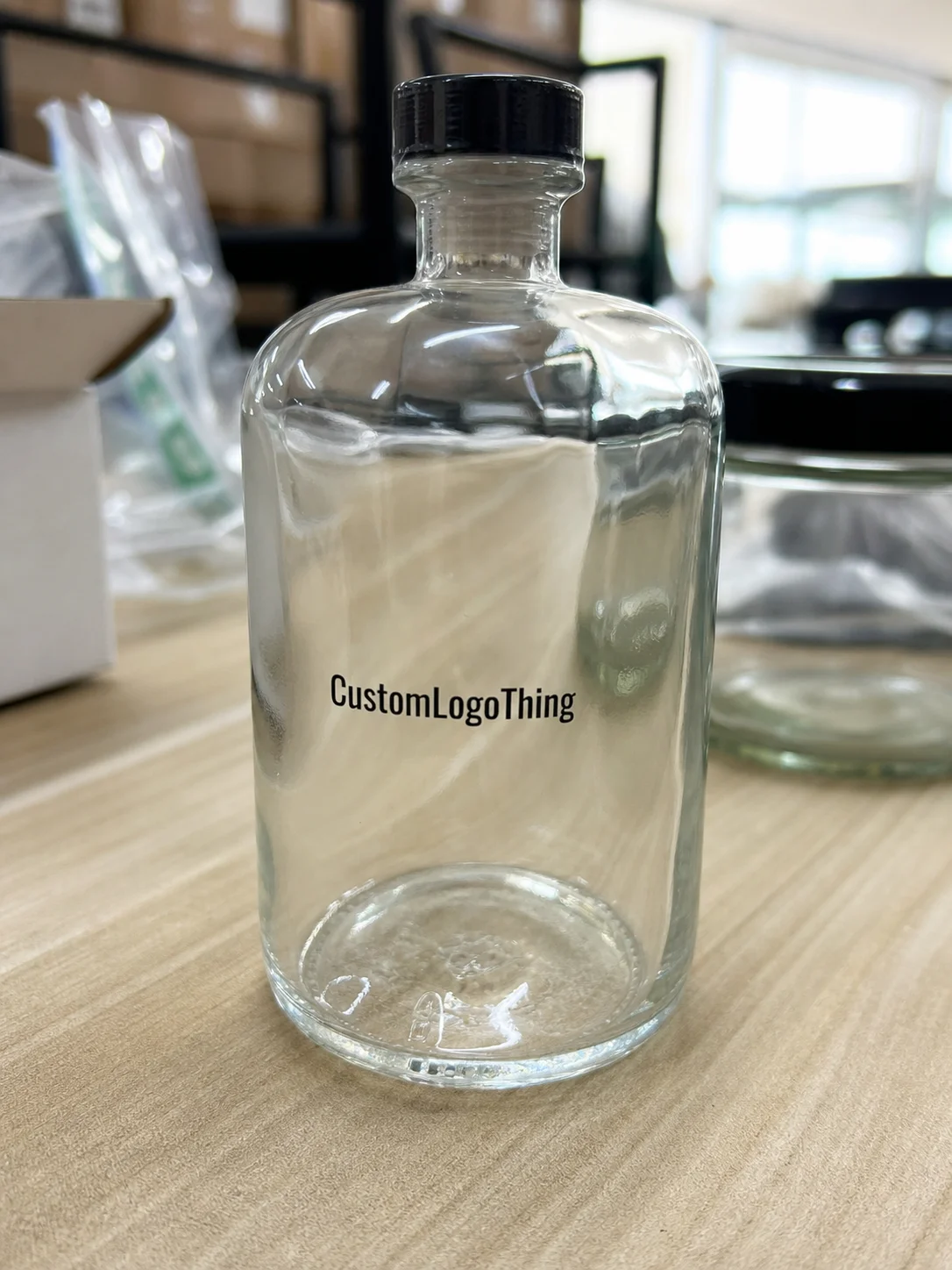
Personalized clear labels solve a simple problem that still catches a lot of brands off guard: how to identify a product without making the packaging look crowded. On folded apparel, retail bags, cartons, and shipping inserts, a transparent label can keep the presentation cleaner than a paper sticker or a thick sewn tag. That visual restraint is the point. The label should help the product look finished, not call attention to itself.
The catch is that clear labels are less forgiving than they look in a mockup. Transparency changes how type, logo weight, adhesive, surface texture, and lighting interact. A design that looks crisp on screen can turn faint on navy fleece, cluttered on a textured poly bag, or oddly reflective under warehouse lights. Buyers who understand those limits usually get better results, because they are working from the material, not from a polished render.
For apparel brands, subscription boxes, and retail programs, personalized clear labels are often a presentation choice as much as an identification tool. That makes the production details matter. If the job is treated like a decorative afterthought, the result can peel, haze, or lose readability faster than expected. If it is built with the right print density, finish, and application surface in mind, the label quietly does its job and stays out of the way.
Why Clear Labels Can Look More Premium Than They Seem
The visual advantage of a transparent label is that it reduces the feeling of a label being pasted on top of the product. The garment or package remains the focus, and the branding sits behind it. That can read as more deliberate than a white label or a heavy tag, especially on products that already carry a lot of visual information through print, trim, or folded presentation.
That said, clear does not mean invisible in every setting. It means the label is less dominant. On light fabrics, it can almost disappear if the artwork is balanced well. On dark or textured surfaces, it may need stronger contrast and more open spacing to stay legible. The best results usually come from matching the label to the material instead of trying to force one artwork file across every product variation.
Most buyers who request personalized clear labels are trying to solve one of three problems. They want a cleaner shelf presence, a less cluttered unboxing moment, or a brand identifier that does not interrupt the garment itself. Those goals are compatible, but they are not identical. A label that looks elegant on a folded tee may not be the best choice for a carton that will be handled repeatedly in transit.
The label should support the product, not compete with it. If the design starts drawing attention before the garment does, the type is usually too thin, the contrast too low, or the layout too busy for the actual use case.
There is also a practical packaging advantage. Transparent materials can make a pack feel lighter and less layered, which is useful for minimalist branding and for programs that want a consistent, tidy look across multiple SKUs. That effect only holds if the label lies flat and the print remains readable. Curling edges, cloudy film, and weak ink coverage undo the benefit quickly.
For teams building a full label system, it helps to keep the options organized under one family such as Custom Labels & Tags. That makes it easier to compare clear, paper, and synthetic formats without treating every order as a separate experiment.
How Clear Label Printing Works on Fabric and Packaging
Most personalized clear labels use a transparent film or clear facestock, printed artwork, and an adhesive or finishing system chosen for the intended surface. The transparency creates the look, but the print layer determines whether the label can actually be read at a glance. If the artwork is too delicate or the ink coverage too light, the label can disappear into the background instead of sitting cleanly on it.
In practice, two visibility rules matter more than anything else. Light garments and pale packaging surfaces usually allow finer detail because the background gives the artwork a clean stage. Dark fabrics, glossy cartons, and tinted poly materials usually need thicker type, stronger contrast, and more breathing room. A logo that looks balanced on a monitor can turn weak once it is printed on black jersey or navy fleece.
Material choice also changes the feel. Clear polypropylene and clear polyester are common options because they hold detail well and can be produced with a clean finish. Glossy film can look sharp but may reflect too much light in retail or warehouse settings. Matte or soft-gloss finishes often read better under mixed lighting because they reduce glare. None of those choices is universally best. The right one depends on where the product will be seen and how much handling it will get before the customer opens the package.
Surface behavior matters just as much. A label on a folded tee inside a poly bag faces different stress than one on a shipping carton or a product sleeve. Adhesion, friction, and storage conditions all change the outcome. A pack that moves through distribution, stacking, and shelf display should be treated as a small system, not as a flat artwork file. For transit-heavy programs, the testing mindset behind ISTA is useful because it focuses attention on vibration, compression, and handling, not only on the proof stage.
That is why personalized clear labels are better understood as a packaging component. The film, adhesive, print density, and application surface all influence performance. If those pieces are not aligned, the label can haze, lift at the edges, or become difficult to read once the product is packed and moved around.
The Design Factors That Control Visibility and Durability
Typeface weight is the first place many clear-label designs go wrong. Thin script and hairline details may look elegant in a brand deck, but they are usually the first elements to fail once the label is printed, cut, folded, and handled. For personalized clear labels, medium-to-bold text almost always performs better than ultra-thin type. Simple shapes age better than decorative ones.
Size matters in a less obvious way. A label can technically fit a logo, size code, care note, and barcode, but that does not mean it will remain readable at normal distance. If the layout is crowded, the transparent background can make the design feel even tighter. A cleaner hierarchy usually works better: brand name first, essential product information second, and only the data that truly needs to be there. If a barcode is included, give it enough quiet space so it scans cleanly and does not compete with surrounding art.
Ink coverage and contrast are equally important. On clear film, the artwork itself has to carry more of the visual load. That often means darker inks, stronger whites, or a more deliberate underprint strategy depending on the substrate and finish. A label that looks fine in an electronic proof may still need revision if the line weights are too fine or the color is too close to the garment shade.
Durability is not one fixed trait. It is a combination of abrasion resistance, adhesive bond, storage temperature, moisture exposure, and handling. A label inside a retail bag may survive easily, while one on a carton that is stacked and shipped may need a more durable construction. If the product will be touched often, packed tightly, or exposed to heat, the label spec should reflect that. Clear material tends to show defects more readily than opaque stock, so any weakness in the base or print can become visible faster.
Before approving artwork, I would check these variables:
- Typeface weight: medium or bold usually survives better than thin decorative text.
- Contrast: darker artwork on light garments, or white and high-opacity ink on dark surfaces, reads more reliably.
- Artwork density: too many tiny elements can make the label look busy and harder to scan.
- Edge clearance: extra breathing room helps prevent a cramped look after application.
- Surface condition: texture, coating, and friction affect both adhesion and appearance.
Process and Timeline for Ordering Clear Labels
The best starting point is not the artwork file. It is the use case. Is the label going on folded apparel, poly bags, cartons, or a mix of surfaces? Does it only need to show branding, or does it also carry a size, care note, SKU, or barcode? Those answers shape material, size, adhesive, and print method before anyone touches a layout.
After that comes proofing, which is where a lot of orders either stay efficient or slow down. A solid production workflow usually includes file review, layout adjustment, proof approval, and then manufacturing. If the file is low-resolution, missing fonts, or built without enough contrast for the chosen surface, revisions are likely. That is normal. The delay usually comes from vague instructions or late-stage changes in dimensions, not from the proof itself.
Simple reorders often move faster because the spec is already established. New artwork, special finishes, and sample-first jobs take longer. A straightforward production run may take about 12 to 15 business days after proof approval. More complex orders can extend beyond that if revisions, testing, or custom construction are involved. If the timeline matters, the fastest way to protect it is to lock the dimensions early, confirm the application surface, and keep the artwork stable once proofing starts.
These are the most common timeline bottlenecks:
- Missing final artwork files.
- Last-minute size changes.
- Unclear contrast on dark garments.
- Delayed proof approval.
- Questions about finish, adhesive, or placement that should have been settled before the quote.
If the labels are part of a broader packaging system, consistency matters more than most buyers expect. Keeping the spec aligned across the full set of Custom Labels & Tags reduces back-and-forth and makes future reorders far easier to manage.
Clear Label Cost, Pricing, and MOQ Basics
Pricing for personalized clear labels usually comes down to five variables: size, quantity, print complexity, finish, and setup. A simple single-color label on standard clear film will not price the same way as a custom-cut label with variable data, special adhesive, or higher-detail graphics. Unit cost usually drops as quantity rises, but setup and prepress still need to be absorbed somewhere, so very small runs carry a higher per-piece burden.
Minimum order quantity is not just a sales rule. It is tied to press setup, waste, and production efficiency. A short run may be possible, but it rarely behaves like a large-volume order on the cost side. Buyers comparing quotes should ask what is included in the price: proofing, sampling, packaging, setup, and any special handling. The lowest unit price is not always the lowest total cost.
| Order Type | Typical Quantity | Approx. Unit Price | What Usually Drives the Cost |
|---|---|---|---|
| Short run sample order | 100 to 500 pieces | $0.40 to $0.90 | Setup, file prep, proofing, and low-volume production |
| Standard production run | 1,000 to 5,000 pieces | $0.09 to $0.22 | Print coverage, cut size, and finish selection |
| Higher-volume order | 10,000 to 20,000 pieces | $0.04 to $0.12 | Material efficiency, simplified artwork, and repeat setup |
| Complex branded format | Varies | $0.18 to $0.35 | Special adhesive, variable data, or higher-detail print |
There is a practical reason buyers sometimes think a low quote is a good quote when it is not. If a cheaper label fades, curls, or loses adhesion after folding and shipping, the savings disappear in returns, repacking, or rework. With personalized clear labels, the better commercial decision is often the one that stays legible and flat through the product’s real handling cycle.
Common Mistakes That Shorten Wear Life
The most common failure is artwork that is too delicate. Thin lines, tiny text, and dense decorative details can look elegant in a digital proof and still fail on the actual surface. Clear labels need a little more visual strength than buyers often expect, especially when the background is uneven, textured, or dark.
The second mistake is choosing the wrong clarity level for the garment color. A proof on a white screen background can hide a lot of problems. Once the label is on black fleece or a heather knit, the artwork may feel muddy or disappear more than expected. A proof on the actual product color is much more useful than a generic render.
Adhesion is another weak point. Coated cartons, textured fabrics, and surfaces with lint or finish residue all change how the adhesive performs. A label that holds well on a smooth poly bag may fail earlier on a ribbed surface or on material that has been handled a lot during packing. If the label is expected to survive shipping, it should be treated as a packaging component, not a decorative sticker.
The last mistake is approving the design under the wrong light. Warehouse lighting, retail lighting, and a desk lamp do not behave the same way. A label that looks sharp in one environment can appear too glossy or too faint in another. That matters more with transparent stock because the background does part of the visual work, and any weakness in the artwork becomes easier to see.
To reduce wear-life problems, check these points before approval:
- Use bolder text than you would on a paper tag.
- Keep small legal copy to a minimum if the label must stay clean.
- Test on the exact garment color, not a close match.
- Review the label after folding, handling, and light abrasion.
- Confirm whether the adhesive is designed for fabric, film, or carton stock.
Expert Tips for Better Readability and Wash Performance
If the label will be applied to clothing, design for handling, not just for a proof sheet. Wider spacing, simpler artwork, and enough negative space usually produce a better result than a crowded layout. Personalized clear labels work best when the brand name can be read quickly even if the product is folded, stacked, or partly obscured.
Testing the same design across multiple garment colors is one of the smartest checks a buyer can make. White, heather gray, navy, and black each change how transparency reads. A label that looks clean on one color may need a slightly larger size, stronger ink density, or more contrast on another. A real sample is more valuable than a polished mockup because it shows how the material behaves under actual conditions.
Ask for a proof or sample that reflects the real application method. If the label will be hand-applied, inspect how it lays down. If it will be packed at volume, check whether the edges stay flat and whether the print remains sharp after handling. If packaging inserts or retail presentation pieces are part of the order, it also helps to compare the label against the rest of the material set, including FSC-certified paper components where they are part of the program. The reference standards and sourcing notes at FSC are useful when the packaging system includes paper-based parts.
Standardizing the spec across collections pays off. The same size, finish, and artwork rules make quality control easier and reduce reorder errors. Even small differences in clear-label contrast can create inconsistency across a line, so a written spec sheet is worth keeping. It does not need to be complicated. Dimensions, adhesive type, finish, and artwork rules are usually enough to prevent the most common mistakes.
Wash performance deserves the same realism. Heat, detergent, folding, storage, and abrasion all matter. If the label will go through laundering, verify the material and adhesive claims instead of assuming the print alone will hold. Honest packaging work starts with the actual conditions the product will face, not with the best-case photo sample.
Next Steps Before You Request a Quote
The easiest way to get a useful quote is to send a short spec sheet instead of a loose email thread. Include dimensions, quantity, garment type, application surface, and whether the label is for branding, inventory, care details, or retail presentation. If the order spans more than one item type, say so directly. Ambiguity here usually shows up later as a delay.
Gather the final logo file, any required size or care information, and a clear note on what matters most: appearance, durability, or lowest unit cost. Those priorities are not interchangeable, and the best material choice changes depending on which one matters most. A label designed for shelf presentation may not be the same one you would choose for repeated handling or shipping.
Before approving production, review the artwork at actual size, on the real garment color, under lighting close to the packing or retail environment. That catches more problems than a long comment chain ever will. If you are choosing between options, compare the proof, sample, and quote as one set rather than three separate documents.
Personalized clear labels work best when they are treated as a small but important packaging component: sized correctly, printed with enough contrast, and checked against the real material they will touch. Done well, they make apparel and packaging look cleaner without adding visual noise.
FAQ
Are personalized clear labels readable on dark clothing?
Yes, but the artwork usually needs stronger contrast, thicker lettering, and more spacing than it would on a light garment. A proof on the actual garment color is the safest way to confirm readability in real use.
What should personalized clear labels include for clothing?
Most buyers include a brand name or logo, size information, and any required care or product details. If the label also supports retail handling or inventory control, a SKU or barcode can be added when space allows.
How long do custom clear labels usually take to produce?
Timing depends on proof approval, quantity, material choice, and whether a sample or revision round is needed. Simple reorders usually move faster than new artwork or orders with special finishes and tighter checks.
What affects the price of clear clothing labels the most?
Size, quantity, finish, and artwork complexity are the main drivers of unit price. Setup cost and minimum order quantity also change the final quote, especially on small runs.
Can I test clear labels before placing a full order?
Yes, and it is worth doing when the label must match a specific garment color or handling condition. Ask for a proof, sample, or short run so you can check readability, adhesion, and overall appearance before scaling up.


