Buyer Fit Snapshot
| Best fit | Personalized Cosmetic Labels projects where brand print, material claims, artwork control, MOQ, and repeat-order consistency need to be specified before quoting. |
|---|---|
| Quote inputs | Share finished size, material target, print colors, finish, packing count, annual reorder estimate, ship-to region, and any compliance wording. |
| Proofing check | Approve dieline scale, logo placement, barcode or warning zones, color tolerance, closure strength, and carton packing before bulk production. |
| Main risk | Vague material claims, crowded artwork, missing packing details, or unclear freight terms can make a low unit price expensive after revisions. |
Fast answer: Personalized Cosmetic Labels: Print Tolerance, Proofing, and Reorder Cost should be specified like a repeatable production item. The safest quote records material, print method, finish, artwork proof, packing count, and reorder notes in one written spec.
Production checks before approval
Compare the actual filled-product size with the drawing, then confirm tolerance on folds, seals, hang holes, label areas, and retail display edges. Reserve space for logos, QR codes, warning copy, and material claims before decorative graphics fill the panel.
Quote comparison points
Review material grade, print process, finish, sampling route, tooling charges, carton quantity, and freight assumptions side by side. A quote is only useful when the supplier can repeat the same color, closure quality, and packing count on the next order.
Walk onto almost any beauty retail floor, and the first product that wins is often the one with the smartest personalized cosmetic labels. I remember standing in a crowded beauty aisle in Chicago with a notebook in one hand and a half-melted coffee in the other, watching shoppers do exactly what brands hope they’ll do: pick up one serum bottle because the label looked cleaner, more premium, and easier to trust than the three products beside it. That decision happens before the cap is twisted, before the formula is sampled, and sometimes before the price is even read. Which is mildly unfair, but also very real.
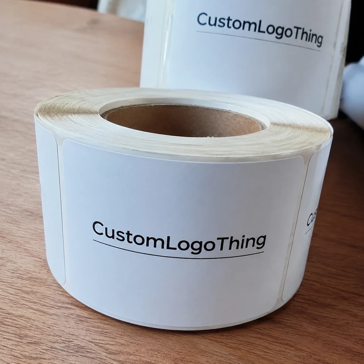
That’s the quiet power of personalized cosmetic labels. They are custom labels built for a specific brand, container, audience, and use case, not a generic sticker pulled from a shelf of one-size-fits-all options. In practice, that means the label shape, adhesive, finish, typography, and required regulatory text all work together for one job: making the product feel intentional. For a 30 mL amber glass serum bottle, that might mean a 2" x 3" front label on 2.6 mil white BOPP with a matte overlaminate, while a 4 oz lotion jar in Los Angeles may need a wrap label in white PET with a high-tack adhesive because the formula is handled in humid bathrooms.
I’ve seen brands spend $8,000 improving the formula by a few percentage points and then lose the shelf battle because the label looked like an afterthought. Honestly, I think that happens more often than founders want to admit. The label is the first salesperson. Sometimes it is the only one. And yes, it is a little dramatic to say that, but not wrong. A label change from a basic paper stock to a soft-touch film can alter perception fast; on a 5,000-piece run, the difference might be only $0.07 to $0.15 per unit, yet the shelf effect can feel much larger than the cost line suggests.
Personalized Cosmetic Labels: Why They Stand Out
Personalized cosmetic labels stand out because they do more than identify a product. They frame the product, signal price point, and set expectations in under two seconds. That timing matters in color cosmetics, skincare, bath products, and private label launches, where consumers make fast judgments from six feet away. Six feet sounds generous until you watch a buyer scan a shelf like they’re late for a train. In a New York showroom, I once watched a merchandising team compare two nearly identical creams; the label with tighter type spacing and a 15% larger product name got picked first, even though the formula cost the same $4.80 per jar to make.
Generic labels tend to blend into the background. They often use standard sizes, standard finishes, and standard layouts, which can be fine for commodity goods but weak for a brand trying to command attention. Personalized cosmetic labels, by contrast, are shaped around the actual container and the actual brand story. A 1 oz glass dropper bottle does not need the same label logic as a 4 oz lotion pump, and a jar for a clinical retinol cream should not look identical to a botanical face oil. A 25 mL bottle with a 1.75" label panel in Austin needs different spacing than a 120 mL tube made in Toronto.
Personalization is not vanity. It is visual strategy plus packaging fit plus compliance discipline. When a label is designed specifically for a 15 mL tube, the typography can breathe, the required text can be readable, and the product can look more expensive without changing the formula at all. In one client meeting in Seattle, a founder told me she wanted her tinted balm to “feel $28, not $12.” We changed the label stock to a 2.6 mil white BOPP with a soft-touch varnish, tightened the layout, and used a 10.5-point product name with 6-point supporting copy. Same balm. Different perception. That still amazes me a little, even after years of seeing it.
On a factory floor in New Jersey, I watched operators reject a batch of labels that looked lovely on screen but wrapped poorly around a curved tube. The branding team had designed for a flat rectangle; the reality was a cylinder with a slight taper. That single mismatch turned a polished concept into wrinkled, shifting artwork. Personalized cosmetic labels are where design meets the actual object. Not the fantasy object. The real one. The one with the curve. A label that is 82 mm wide on paper but 79.5 mm wide on the actual tube will fail quickly, and a production team in Newark will notice it faster than a marketing deck does.
Client quote I still remember: “The label didn’t just change the packaging. It changed the way buyers talked about the product.”
That is especially true for indie brands and private label launches. A small run of 1,000 units can look far more credible with personalized cosmetic labels than with an off-the-shelf label template. In beauty, credibility and shelf appeal are cousins. If one improves, the other usually does too. It’s a little like wearing shoes That Actually Fit; people may not comment, but they absolutely notice. For a startup ordering 2,500 labels in Dallas, even a modest upgrade from paper to moisture-resistant film can shift the product from “sample” to “retail ready.”
There is a practical side too. Personalized cosmetic labels help brands manage readability, warning statements, ingredient lists, net contents, and country-of-origin requirements without stuffing everything into a tiny box of text that no one can parse. That balance between aesthetics and function is where good packaging work lives. A well-planned label can reserve 18 to 24 mm of vertical space for legal text while still leaving enough room for a clean product name, a scent descriptor, and a 2D barcode.
How Personalized Cosmetic Labels Work
The process behind personalized cosmetic labels usually starts with a brand brief. That brief should include the container type, product category, target audience, quantity, launch date, and any regulatory requirements that already apply. If the brief is vague, the label usually becomes expensive by accident. I’ve seen that happen in supplier negotiations in Atlanta where everyone assumed “small label” meant “simple label.” It rarely does. “Small” is often code for “we’ll discover three problems later,” especially if the SKU is only 20 mL and needs bilingual copy plus a batch code.
Once the brief is clear, the team selects a substrate. For many cosmetic applications, that means paper, BOPP, vinyl, PET, or another film-based material. Paper can work well for dry environments and lower-cost lines, while film labels are usually better for moisture, oil exposure, and handling. If a product lives in the bathroom, near steam and water, I lean toward film more often than not. Bathrooms are basically tiny weather systems with better lighting. A 350gsm C1S artboard carton label might look elegant on a dry box, but it is not the same answer as a 2.3 mil BOPP roll label on a face oil bottle.
After material selection comes artwork setup. This is where label size and shape are matched to the container. A wrap label for a 30 mL bottle needs a different approach than a front-and-back label on a square jar. The die line matters. So does the seam. So does the radius of the bottle shoulder. Personalized cosmetic labels fail when someone ignores those dimensions and designs only to a pretty mockup. A 95 mm circumference bottle in Miami, for example, may need a 92 mm wrap with a 1.5 mm gap to avoid overlap at the seam.
The print method is next. Digital printing is often used for shorter runs and variable data, while flexographic printing usually becomes more efficient at larger volumes. Specialty finishes may be added through foil stamping, embossing, debossing, or spot varnish. Each choice affects both appearance and cost. A brand can personalize at several points: material, finish, ink color, typography, shape, and variable data such as batch codes. If a brand needs 250 personalized cosmetic labels for a pilot run in San Diego, digital printing can be the fastest route; for 50,000 units shipped from a plant in Charlotte, flexo usually makes more economic sense.
Adhesive selection is another piece many people underestimate. A label on a refrigerated skincare product, for example, may need an adhesive that performs under condensation. An oil-serum label needs good resistance to edge lift. A bath product that gets handled with wet hands should be tested differently than a dry powder compact. That is not theoretical. It is the difference between a label staying crisp for six months and curling after a week. And yes, I have wanted to scream at a curled corner or two. For cold-chain products stored at 34°F to 40°F, a freezer-grade acrylic adhesive can matter more than the finish itself.
Here is the workflow I usually explain to clients:
- Brand brief and product specs
- Container measurement and surface testing
- Material and finish selection
- Artwork development and regulatory review
- Digital proof or sample run
- Production printing and finishing
- Application, inspection, and launch
That sequence sounds straightforward, but each step can reveal hidden problems. A label might fit on paper and fail on glass. A white ink layer may look clean in daylight and disappear under warm retail lighting. Personalized cosmetic labels reward precision. Sloppiness gets expensive fast. A proof that is approved at 2:00 p.m. in London can still fail after 24 hours on a curved jar if the adhesive edge lifts by even 1 mm.
If you want to understand broader packaging performance standards, the ISTA testing framework is a useful reference point. While ISTA is more associated with distribution testing than labels alone, the same discipline applies: test the actual package under actual conditions, not just on a screen. A 12-15 business day production window from proof approval is common at many suppliers, but only if the artwork, substrate, and container all agree in advance.
Key Factors That Affect Personalized Cosmetic Labels
Material choice is usually the first big decision in personalized cosmetic labels. Paper labels are often less expensive and can give a natural or artisanal feel, especially for clean-beauty or botanical brands. Film labels, including BOPP and PET, typically handle moisture and oil better. Textured stocks can add warmth or luxury, while clear labels can create that “printed directly on the bottle” effect when the container is smooth and the artwork is restrained. A 2.5 mil clear BOPP on an amber bottle in Portland can look expensive without requiring foil at all.
Finish changes perception quickly. Matte often feels minimal and spa-like. Gloss can make color cosmetics pop harder under retail lights. Soft-touch lamination, which often feels almost velvety, can elevate a serum or cream line instantly. Metallic accents can command attention, but they can also tip a label into looking overdesigned if the rest of the artwork is busy. I’ve watched a brand lose elegance by trying to use foil, gloss, embossing, and a busy floral pattern all on one 2-inch label. Too much. The eye has nowhere to rest. It felt like three people arguing in a small room. On a 35 mm compact, one foil border and one spot UV accent usually outperforms four effects fighting for attention.
Compliance is where labels stop being decoration and start being packaging infrastructure. Most cosmetic labels need product identity, ingredient declaration, net contents, warnings, and sometimes origin information. Exact requirements vary by market and category, so this is not one-size-fits-all. A label for a body lotion sold in the U.S. may have different obligations than a serum sold into a different regulatory environment. Brands should verify requirements before final artwork, not after printing 10,000 units. A launch planned for Toronto may also need bilingual text, which can easily add 12 to 18 mm of copy space.
Readability matters more than many teams expect. On a small 15 mL bottle, a 6-point font can quickly become a problem. On a curved jar, text can distort near the edges. And in a bathroom, where steam and reflection are part of the environment, pale text on a glossy background can vanish. Good personalized cosmetic labels protect legibility first. Beauty buyers may admire the design, but they still need to read it. A contrast ratio that looks strong in Adobe Illustrator can still fail on frosted glass under 3000K retail lighting.
Shape and fit are equally important. A square jar supports different composition choices than a tapered tube. A wrap label on a small diameter bottle can create a seam conflict if the artwork lands badly. That’s why measuring the actual container matters, including the shoulder, cap clearance, and label panel width. In a London supplier review I attended, one brand had to reorder because the label extended 3 mm too close to the base curve. Three millimeters. That is all it took. Packaging is petty like that. A 28 mm cap height and a 45 mm label panel can change a whole layout.
Cost drivers are tied to the choices above. Order quantity, material, finishing complexity, number of colors, proofing revisions, and specialty effects all affect price. If you add a custom die-cut, foil, and variable data, the label will cost more than a simple rectangular paper label. That doesn’t make the premium version bad. It just means the budget has to match the design ambition. A 5,000-piece BOPP order in New Jersey may price near $0.15 per unit before freight, while the same design with foil and a custom die may move closer to $0.42 per unit.
Below is a practical comparison many brands ask for:
| Option | Typical Look | Approx. Cost Impact | Best Use |
|---|---|---|---|
| Paper label with matte finish | Natural, clean, simple | Lower setup and material cost | Dry products, starter SKUs, artisan brands |
| BOPP film with gloss finish | Bright, durable, retail-friendly | Moderate increase per unit | Skincare, lotions, bath products, handling exposure |
| Soft-touch film with foil detail | Premium, tactile, high-end | Higher unit cost and setup cost | Luxury lines, hero products, gift sets |
| Clear label with white ink | Minimal, modern, bottle-integrated | Moderate to high, depending on ink layers | Clear containers, clean design language |
For brands trying to balance cost and sustainability, it is also worth looking at paper sourcing or recycled content choices. If fiber sourcing matters to your brand story, the FSC site is a useful starting point. I’ve seen buyers ask for an eco claim first and a label spec second, but the order should be reversed. First make sure the label performs. Then make sure it fits the sustainability story. Otherwise you end up with a lovely green message and a label that peels off in humidity, which is not the vibe anyone wants. Recycled content can be useful, but a label that fails after 48 hours on a shower shelf is still a failed label.
Personalized Cosmetic Labels: Cost, Pricing, and Timeline
Pricing for personalized cosmetic labels usually starts with setup, then moves through material, print method, finishing, and freight. A simple 5,000-piece run of a standard BOPP label might come in around $0.18 to $0.35 per unit depending on size, artwork complexity, and vendor structure. A smaller run of 500 to 1,000 pieces can be noticeably higher per label because setup costs are spread across fewer units. That is the math, and no supplier can fully escape it. I wish I had a dollar for every time someone expected a boutique finish at a warehouse price. For a 5,000-piece order printed in Chicago or Memphis, setup might account for $175 to $450 before the first roll ships.
I’ve had brands call me angry about a quote that looked “too high” until we broke out the line items. Once we separated setup, plate cost, material, finish, and shipping, the number made sense. Not always cheap, but sensible. That distinction matters. Good buyers don’t just ask what a label costs. They ask what drives the cost. A transparent quote from a supplier in Los Angeles might show $0.12 for material, $0.03 for print, $0.02 for finish, and $0.01 to $0.04 for packaging and handling, which is far more useful than one vague total line.
Here are the most common cost factors:
- Quantity: Larger orders reduce unit cost, but increase storage needs.
- Material: Paper is usually less expensive than specialty films.
- Finish: Matte, gloss, soft-touch, foil, and embossing all change the price.
- Print method: Digital can be efficient for shorter runs; flexographic may win at scale.
- Die-cuts: Custom shapes add tooling or setup complexity.
- Revisions: Extra proof cycles can extend both time and budget.
- Compliance updates: Ingredient or warning changes can trigger reprints.
Timeline is tied to complexity. A standard label with a clean layout and common material might move from proof approval to shipment in 7 to 12 business days. A more customized label with foil, embossing, white ink layers, or variable data can take 12 to 20 business days or more. If the artwork is not finalized, add more time. If the container is new and needs fit testing, add more time again. Many factories in Charlotte, Dallas, and Southern California will quote 12-15 business days from proof approval for a standard film label, but the schedule can stretch if the die-cut is new or the ink system needs calibration.
There is another hidden timeline issue: application. Labels that apply by hand are one thing. Labels that must run through a semi-automatic or automatic applicator are another. If the roll direction, core size, or unwind orientation is wrong, production slows down at the plant. I once saw a line in a Midwest co-packer lose half a shift because the labels were wound opposite the applicator’s setup. The label itself was fine. The logistics were not. Everyone stood around looking at the roll like it had personally betrayed them. A 3-inch core, 0.5-inch gap, and center unwind can save hours on the line if the applicator is set up for that format.
Below is a practical pricing-and-timeline comparison to help set expectations:
| Label Type | Typical Unit Cost | Typical Timeline | Notes |
|---|---|---|---|
| Basic paper label | $0.10–$0.20 at mid-to-high volume | 7–10 business days | Best for dry, lower-humidity applications |
| BOPP film label | $0.18–$0.35 at mid volume | 8–12 business days | Good moisture resistance and clean finish |
| Soft-touch premium label | $0.30–$0.60+ | 12–20 business days | Ideal for premium skincare or giftable lines |
| Custom die-cut with foil | $0.40–$0.85+ | 15–25 business days | More setup, more visual impact, more coordination |
That pricing is directional, not universal. Geography, vendor capability, and freight can shift the final number. Still, it helps brands stop guessing. If you are launching a hero SKU, premium personalized cosmetic labels may justify the higher unit cost because they support a higher shelf price. If you are testing a new shade family, a simpler label may be the smarter first move. A premium serum sold in Boston at $42 retail can absorb a $0.38 label more easily than a trial-size cleanser sold at $9.99.
Step-by-Step Guide to Creating Personalized Cosmetic Labels
Personalized cosmetic labels work best when the process is orderly. The first step is defining the product and audience. A serum sold to ingredient-savvy skincare buyers needs a different visual hierarchy than a lip gloss aimed at Gen Z shoppers. The label has to communicate in seconds, not minutes. A 30 mL peptide serum sold in Minneapolis may need more clinical cues, while a 10 mL gloss sold in Houston can afford bolder color and simpler copy.
Step two is measurement. Measure the container with a ruler and, if possible, a caliper. Account for curves, shoulders, seams, and the way the label will be applied. A 50 mL jar with a wide flat panel gives you different design freedom than a cylindrical bottle with a narrow label band. This sounds basic, yet this is where many projects wobble. I have lost count of the number of times a “quick measure” turned into a not-so-quick redesign. A 60 mm panel width that shrinks to 57 mm after mold shrinkage can completely change the final die line.
Step three is selecting the stock and finish. If the product sits in a humid space or gets handled often, a film label often outperforms paper. If the brand identity is earthy and understated, textured paper may communicate better than a shiny surface. If the product is a premium cream, a soft-touch finish might carry the story before the consumer even reads the copy. A 350gsm C1S artboard carton may suit a boxed cream set, while a 2.0 mil BOPP wrap label is better for a bottle that lives near water.
Step four is artwork hierarchy. Put the brand name where the eye lands first. Put the product name second. Put the key claim third. Required information should be visible and compliant, but it should not bury the brand. This is a design balance, not a decoration contest. The strongest personalized cosmetic labels guide the eye rather than fighting it. On a 25 mm tall front panel, a 9 pt brand name and a 7 pt claim line often outperform a crowded block of copy in 5 pt type.
Step five is compliance review. Ingredient lists, warnings, net contents, and other required text should be checked before approval. If a label is already packed edge to edge, there may be no room left when the legal text grows. That is one of the most common reasons labels get reworked late in the schedule. A formula change in Paris or Vancouver can force a revised INCI list, and that can add a full production week if the layout has no spare space.
Step six is proofing and testing. Ask for a printed proof or sample, then apply it to the actual package. Check adhesion after 24 hours. Check it again after exposure to water, oil, condensation, and handling. That real-world test can reveal problems no digital proof will show. I’ve seen a beautiful clear label turn cloudy once it hit a chilled container. On paper it looked perfect. On glass, under cold conditions, it changed personality. Very rude behavior from a label, frankly. For a product shipped from a warehouse in Phoenix to a refrigerated retail case in Denver, that test matters more than the mockup.
Step seven is final approval and delivery planning. Confirm the quantity, roll direction if machine-applied, ship date, and any storage needs. If your launch date is tied to a retailer window or trade show, work backward and add a buffer. A buffer of 5 to 7 business days is often the difference between calm and chaos. If your proof is approved on a Tuesday, and your labels typically ship 12-15 business days later, the calendar should be doing the work before the clock starts doing it for you.
For brands building out a larger packaging system, it helps to review Custom Labels & Tags early, especially if multiple SKUs need to share a visual language without looking identical.
Common Mistakes with Personalized Cosmetic Labels
The biggest mistake I see with personalized cosmetic labels is designing for a flat mockup instead of the real container. A label may look perfect in a presentation deck and still fail on a curved bottle because the artwork stretches, shifts, or overlaps the seam. Packaging is tactile. The mockup is not the shelf. A 2D PDF cannot tell you what happens when a 90 mm label is wrapped around an 86 mm diameter tube in a warehouse in Oakland.
Another common issue is too much text. Brands often try to include a tagline, product claims, ingredients, benefits, usage instructions, warnings, distributor details, and three icons on a label that really only has room for two strong ideas. The result is clutter. Clutter kills legibility. Legibility is trust. On a 1.5" x 3" label, every extra line can force the font down by a point or two, which is often enough to make the copy unreadable at arm’s length.
Finish mistakes happen too. A glossy label can look amazing on a render and then become slippery or reflective in a bathroom setting. A matte finish may read as premium but can scuff if the product is tossed into a travel bag. I once reviewed a salon brand’s labels that marked too easily because the stock was chosen for appearance alone. The color story was good. The wear test was not. That one made me mutter at my desk, which is usually my sign that something has gone annoyingly wrong. A soft-touch lamination can feel luxurious, but if the brand ships to humid markets like Houston or Tampa, it needs to be tested against condensation and abrasion.
Many teams also leave compliance text until the final hour. That is risky. If the ingredient list grows or a warning line must be added, the layout may no longer fit. Reprints are expensive, and rushed revisions usually cost more than a careful first pass. In supplier conversations, I always ask, “Do we have the legal copy locked?” If the answer is no, the schedule is not really a schedule. A 10,000-piece reprint in New Jersey can erase the savings from a bargain quote in a single afternoon.
Visibility under real lighting is another overlooked problem. Foil can disappear under warm light. Pale text can disappear on frosted glass. Metallic backgrounds can interfere with barcode readability. Personalized cosmetic labels should be checked under the exact retail or studio lighting the product will face. That is not paranoia. That is preparation. A label photographed under 5600K studio light may look different from the same label under 2700K boutique lighting in a spa in Scottsdale.
Cost blindness is the final trap. A brand may focus on the per-label quote and ignore setup fees, proof revisions, rush charges, overages, and inventory waste from a changed formula or updated claim. A label that is 4 cents cheaper but causes a reprint is not cheaper. It is a future headache wearing a discount tag. If your supplier quotes $0.15 per unit for 5,000 pieces, but the proof cycle adds $180 and freight adds another $65, the real number deserves a more honest conversation.
Testing matters too. Especially for oils, condensation, and frequent handling. The strongest label designs are the ones that survive reality, not just presentations. If a product is likely to live in a humid shower caddy or a makeup pouch, test for that condition before committing to a full run. A label that survives 72 hours in a damp hotel bathroom in Miami is doing more for the brand than a perfect mockup ever could.
Expert Tips for Better Personalized Cosmetic Labels
Use one dominant visual cue. That might be color, texture, or finish. Not all three at once. A strong cue gives the label memory. The human eye remembers contrast faster than complexity, and personalized cosmetic labels work best when they create a quick visual anchor. A deep cobalt field with one silver accent can outperform a page crowded with gradients, icon rows, and three different fonts.
Prioritize distance and close-up performance separately. From three feet away, the shopper should recognize the brand and product type. Up close, they should be able to read ingredients, warnings, and usage directions without squinting. That two-stage design logic is one of the easiest ways to improve packaging performance. A shopper in a Target aisle in Atlanta may give your label two seconds; a buyer at a private label meeting in Philadelphia may give it twenty.
Think of the bottle, jar, tube, and label as one system. I’ve seen brands design the container first and the label later, and I’ve seen the reverse. The best results come when both are developed together. A high-contrast label on frosted glass can feel very different from the same label on amber PET. The material changes the message. A 50 mL pump bottle made in Ontario needs a different panel width and different text balance than a 15 mL vial sourced from a supplier in Shenzhen.
Choose finishes with intent. Matte often works well for spa, clean beauty, and skincare brands that want calm. Gloss suits bright color cosmetics and playful lines. Clear labels are excellent for minimal branding when the container itself is attractive. Metallic accents can lift a premium line, but restraint matters. A small foil accent on a lip serum can feel expensive. A full field of foil can feel loud. One foil mark, one soft-touch field, and a clean type hierarchy can do more than a dense surface covered in effects.
Plan for extensions. If one product may become three shades or four scents, create a label system that can scale without redesigning from scratch. A flexible template saves time and makes line expansion easier. That is especially useful for indie brands that expect to grow into multiple stock-keeping units. A 2025 launch in Austin might become a 12-SKU family by the following spring if the label grid is built to accommodate it.
Whenever possible, request a sample run or physical proof. A sample can reveal adhesive behavior, color shifts, and handling durability that digital files cannot show. I’ve had a client change a label film after one sample because the first material lifted at the corners after 48 hours on chilled bottles. One sample saved a production headache. In many cases, a proof approved on Tuesday and tested by Friday is cheaper than 10,000 labels that fail in week two.
Brands that follow standards tend to make better decisions too. EPA guidance can be useful when teams are evaluating material choices, waste reduction, and packaging compliance in a broader sense. Even when a label itself is small, the decisions around it are not. A roll label made in Richmond, Virginia with a lighter liner and less waste per roll can reduce material use without compromising performance.
What to Do Next with Personalized Cosmetic Labels
If you are planning personalized cosmetic labels, start with a checklist. Measure the container, write down the required text, define the brand colors, decide on finish preferences, confirm target quantity, and lock the launch date. That simple list prevents the majority of avoidable mistakes. If you already know the run size—say 3,000 units for an online launch in June—you can ask for more accurate pricing immediately instead of waiting for a vague estimate.
Then audit one existing product line and choose the biggest weakness to fix first. Is it readability? Shelf appeal? Durability? Compliance spacing? One improvement at a time is easier to manage than trying to redesign everything during a launch window. A serum line in San Francisco may need better contrast; a body wash line in Orlando may need moisture resistance; a lip oil line in Minneapolis may need stronger shelf impact.
Compare at least two or three material-and-finish combinations before deciding. A paper matte option, a film gloss option, and a premium soft-touch option can tell you a lot about where the brand should sit in the market. Compare them under bright light and in a bathroom-like environment if that is where the product will live. If you can, check them at 2700K, 4000K, and 5000K lighting to see how the label changes between retail, studio, and home settings.
Test one physical prototype on the actual container. Not a render. Not a PDF. The actual bottle, jar, or tube. Hold it under the same lighting your customers will see. If the product will sit on a shelf, look at it from 6 feet away. If it will be sold online, photograph it in natural light and studio light. The label should perform in both cases. A 2.5" x 4" label that looks polished on a monitor can still fail if it shifts 2 mm on the bottle shoulder.
Set your timeline backward from launch and leave room for revisions. A 2-week cushion can save a brand from paying rush fees or accepting a compromise that weakens the packaging. That cushion matters even more if the product launch is tied to a seasonal campaign, influencer drop, or retailer submission. If your proof approval lands on March 8, then a typical 12-15 business day production run may still leave shipping and inspection dangerously close to your go-live date.
Use the first label project as the template for the next one. Once the brand has a clear label system, future SKUs become easier to build, quote, and approve. That is how packaging gets smarter over time. Not by chance. By repetition and discipline. A brand with one standardized label grid can cut development time from three weeks to one week on its next launch, especially if the supplier is already familiar with the container family.
My honest view? Personalized cosmetic labels work best when branding, compliance, and production realities are solved together. If you nail all three, the product feels more credible, more polished, and more worth the price. And if you want your next launch to carry that kind of confidence, start with the label before you worry about the headline copy. A strong label designed in Miami, printed in Chicago, and checked in your warehouse in Newark can do more than decorate a bottle. It can quietly raise the product’s value by several dollars in the buyer’s mind.
FAQs
What are personalized cosmetic labels, and how are they different from standard labels?
Personalized cosmetic labels are custom-designed labels made for a specific product, container, and brand identity. Unlike standard labels, they can be tailored in shape, material, finish, color, and layout to match the product and audience. They are often used to improve shelf appeal, strengthen branding, and fit compliance text more effectively. For example, a 2" x 3" BOPP label on a 30 mL serum bottle will behave very differently from a generic rectangular paper sticker on a box made of 350gsm C1S artboard.
How much do personalized cosmetic labels usually cost?
Pricing depends on quantity, material, print method, finish, and whether specialty effects are included. Smaller orders usually cost more per label because setup costs are spread across fewer units. Premium finishes like foil, embossing, or custom die-cuts raise costs but can also raise perceived value. As a rough example, a 5,000-piece run can price around $0.15 to $0.35 per unit for standard film labels, while premium soft-touch or foil versions can move closer to $0.40 to $0.85 per unit depending on the supplier and city of production.
How long does it take to produce personalized cosmetic labels?
Timelines vary based on design complexity, proofing speed, and production method. A simple label can move faster than a highly customized or specialty-finished label. Planning ahead helps avoid rush fees and gives time to test adhesion and readability on the actual container. A typical schedule is 12-15 business days from proof approval for a standard run, while custom die-cuts, foil, or variable data may take 15-25 business days.
What information must be included on personalized cosmetic labels?
Most cosmetic labels need product identity, ingredient information, net contents, warnings, and other required compliance details. The exact requirements depend on where the product is sold and how it is classified. Brands should always leave enough space for required text before finalizing artwork. If the label is only 1.5 inches tall, the legal copy may need to be reduced or moved to a secondary panel to stay readable and compliant.
What are the best materials for personalized cosmetic labels that need to resist moisture or oils?
Film-based and waterproof label materials usually perform better than basic paper in wet or oily environments. The adhesive should also be matched to the container and product conditions. Testing on the actual package is the best way to confirm the label will stay intact in real use. For bathroom products or oil serums, 2.0 to 2.6 mil BOPP or PET with a moisture-resistant adhesive is often a stronger choice than standard paper stock.