What personalized hand sanitizer labels need to get right
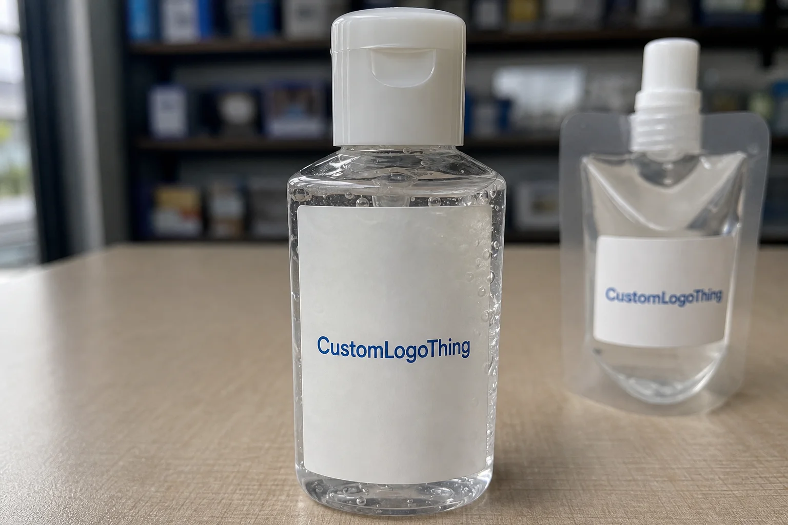
Personalized hand sanitizer labels have a short window to do real work. The bottle is small, the printable area is tight, and the label has to identify the product, carry the brand, and survive handling, travel, and occasional moisture. That makes the label a packaging component, not just decoration.
Sanitizer bottles show up in retail checkouts, hospitality kits, school events, office restrooms, and onboarding packs. In every case, the label needs to stay attached and readable while the bottle is being picked up, tossed into a bag, or stored near sinks and desk surfaces. A label that looks fine in a mockup can fail quickly in that kind of use.
From a buyer’s perspective, the main question is durability versus cost. A paper label can be acceptable for dry, short-life giveaways. On a bottle that will be handled often or exposed to condensation, paper is usually the first thing to fail: corners lift, ink scuffs, and the panel wrinkles. On a small bottle, even minor failure makes the whole product look cheaper.
The other constraint is information density. Many sanitizer bottles are 1 to 4 ounces, which means the label must fit branding, product name, warnings, ingredient text, and sometimes a barcode or lot area into a very small space. If the type is too small or the hierarchy is unclear, the label stops working as packaging and becomes hard to read.
A good sanitizer label is judged in use, not on a screen. If it stays legible after shipping, handling, and a few weeks of use, it is doing its job.
That is why the first buying question should be about the bottle environment, not just the artwork. Dry kit, retail shelf, sink-side dispenser, or travel pouch all point to different material and adhesive choices. If that part is unclear, the order is not ready yet.
How the label process and timeline actually works
The production path is straightforward: artwork intake, proofing, press setup, finishing, trimming, packing, and shipment. The schedule stays clean when the bottle dimensions, stock choice, and file format are already settled. If any of those are still changing, the timeline slips quickly.
For personalized hand sanitizer labels, the most common delay is the file package. Missing bottle measurements, low-resolution logos, unclear finish selection, and approval before the label is checked on the actual container all create avoidable back-and-forth. On a small bottle, a few millimeters can change the way the front panel reads.
Lead time is usually driven by quantity, print method, and finishing complexity. Smaller digital runs can move faster because setup is lighter. Larger flexographic jobs can be more efficient at volume, but they need more planning up front. Add specialty film, custom die-cutting, or multiple SKU versions, and the schedule gets longer.
A simple run with complete artwork can often move in about 7 to 12 business days after proof approval. Larger quantities, specialty materials, or multi-version orders are more often in the 12 to 18 business day range. Rush jobs are possible, but only if the files are complete and the material is available. A rush order with unfinished artwork is not really a rush order.
It also helps to separate turnaround time from lead time. Turnaround is the production window after approval. Lead time includes proofing, revisions, and any waiting on art files or signoff. If launch timing matters, the approval window needs to be part of the plan from day one.
For multi-event brands or seasonal kits, the safest quote request includes bottle dimensions, artwork version, finish, quantity, and ship date. That keeps vendor pricing aligned to the same job and makes comparison meaningful instead of theoretical.
Material, adhesive, and finish choices
Material selection is where most performance risk lives. Paper is usually the lowest-cost option, and it can work for dry kits, short-duration promotions, and controlled indoor use. Once moisture, repeated handling, or transit enter the picture, synthetic films generally perform better. Polypropylene and similar waterproof films resist scuffing, tolerate condensation, and are less likely to wrinkle when temperatures change.
Adhesive choice matters just as much. A straight-sided bottle gives you more flexibility. A curved, tapered, or squeezable bottle does not. Travel-size sanitizer bottles often need an adhesive that stays put without lifting at the corners when the bottle flexes or gets picked up repeatedly. If the label is near a shoulder or seam, application tolerance becomes a real production issue.
Finish affects both appearance and readability. Gloss can sharpen color and help branding pop, but it can also create glare under bright retail lighting. Matte is calmer and often easier to read, though it shows wear differently. Soft-touch adds a more tactile feel, but it is usually hard to justify on a low-margin giveaway item. Clear labels can look excellent on a clean bottle design, but they also make print flaws more visible, not less.
Sanitizer chemistry and storage conditions are another practical constraint. Alcohol-based formulas, cold-chain storage, and temperature swings during transit can all affect adhesion and print stability. If the stock and adhesive are not matched to the use case, corner lift and face haze become more likely.
Application temperature is worth checking too. Some adhesives are fine in a controlled finishing room and less reliable on a cold warehouse floor or a hot dock. That detail sounds minor until a full pallet starts showing edge lift.
For teams that care about sourcing standards, FSC-certified paper can make sense for certain retail or corporate kits when moisture exposure is low. See the standard at fsc.org. For shipping and transit concerns, ISTA publishes useful testing guidance at ista.org. Neither solves the label selection for you, but both help frame the quality conversation in concrete terms.
The best material is the one that fits the bottle’s actual environment, not the one that sounds premium in a quote.
Cost, pricing, and MOQ drivers
Pricing for personalized hand sanitizer labels comes down to a few levers. Quantity is the biggest one. A 500-piece run and a 5,000-piece run may share the same artwork, but setup costs and press efficiency are spread very differently, which changes the unit cost fast.
As a working range, small-run labels often land around $0.18 to $0.45 per unit, depending on size, coverage, stock, and finish. Larger runs can come down if the design is simple and the material is standard. Specialty films, custom dies, metallic effects, or premium coatings push the price higher. If a quote is far below that range, the missing cost usually shows up later as a compromise on material or finish.
The minimum order quantity matters because it changes how setup is amortized. A buyer who orders just above the MOQ may get a better price per label than someone who tries to cut the run to the absolute minimum. That can be the smarter move if the labels will be used across a rollout, a delayed event, or a likely reorder.
| Option | Typical Cost Pressure | Best For | Tradeoff |
|---|---|---|---|
| Paper stock | Lowest | Dry, short-duration packs | Less moisture resistance |
| Waterproof film | Moderate | Retail, travel, office use | Slightly higher unit price |
| Premium synthetic with special finish | Highest | Gift kits, hospitality, branded events | Higher MOQ sensitivity |
What pushes the quote up? Rush schedules, multiple label versions, exact color matching, specialty coatings, and odd bottle shapes that require a custom die. Proof revisions do it too. Every revision costs time, and time is part of print pricing whether the invoice says so directly or not.
A useful quote should show the label dimensions, material, adhesive, finish, quantity tier, number of versions, and proof terms. Without those details, comparisons are basically theater. Two vendors can appear to be quoting the same product and still be pricing very different builds.
That is also why sample checks matter. The price difference between a label that is merely acceptable and one that survives transit can be small enough that the better-performing option is the better buy. On a small bottle, failure is visible quickly.
Step-by-step order setup for fewer reprints
The cleanest orders start with measurement, not design. Measure the actual bottle, not just the product listing. Confirm the label panel width and height, then note the curvature, shoulder, seam, and any area blocked by a pump or cap. A bottle that looks flat in a photo can still be difficult to label once you apply a real wrap.
Once the physical dimensions are locked, build the artwork around the label. Add proper bleed, keep critical text away from trim edges, and leave enough breathing room so the layout does not feel crowded after cutting. Small sanitizer bottles are unforgiving; type that feels comfortable in a mockup can become cramped once printed on a curved surface.
Barcode placement and regulatory copy deserve attention too. If the bottle needs ingredient text, warnings, directions, or a scannable code, the label has to carry that information without becoming a wall of tiny copy. That means prioritizing contrast and clear hierarchy.
Ask for a digital proof before production starts, then check it on the actual bottle if possible. A flat proof confirms copy and layout, but the container shape can change how the label reads once applied. A label that looks centered on-screen can still appear high or low on the bottle because the eye follows the curve.
These are the details worth locking before approval:
- Final quantity and split by SKU
- Artwork version number
- Material and adhesive type
- Finish, such as matte, gloss, clear, or soft-touch
- Shipping date and receiving window
After approval, save the final version in a file structure that someone else can understand later. Tie the artwork to the SKU. Keep the bottle dimensions in the same record. Store the sample note with the production file. For repeated orders, that discipline prevents the common “which file was final?” problem that causes bad reprints.
For brands using multiple packaging pieces in the same kit, keeping the sanitizer label spec aligned with other branded items, such as Custom Labels & Tags, helps the set feel cohesive. That does not mean every piece needs the same finish. It means the system should look intentional, not assembled from unrelated parts.
Common labeling mistakes that raise rework risk
The biggest mistake is choosing a label size from a screen mockup and assuming it will behave the same on a real bottle. It usually does not. Flat artwork hides curvature, seams, taper, and the small realities of application. The result is often a label that looks slightly off even when the print itself is fine.
Text problems come next. Sanitizer bottles are small, so the brand mark, product name, ingredient copy, and usage information all compete for space. If contrast is weak or type is too small, the label starts to look cluttered fast. Once that happens, buyers stop reading and start scanning for what looks wrong.
Skipping sample testing is another expensive habit. Humid storage, cold shipments, and repeated handling in a purse, backpack, or desk drawer can reveal failures that a PDF proof will never show. A label that looks perfect on a desk does not always survive real movement.
Version control causes more trouble than people admit. A team approves one label, then reorders from an old file after a logo tweak or regulatory update. That mistake often shows up after the goods are already printed. At that point, the cost is not just the reprint. It is the time lost explaining why two batches do not match.
These are the failure patterns that show up most often:
- Using the wrong bottle dimensions
- Ignoring curvature and seam placement
- Overcrowding small copy areas
- Approving artwork before testing on the real bottle
- Reordering from an outdated file
If the bottle shape, adhesive, and artwork are not designed together, the label becomes the weak point in the package. The label should disappear into the product experience, not call attention to a problem every time someone picks up the bottle.
Next steps for a cleaner reorder and better shelf read
The easiest way to improve results is to gather the right inputs before requesting pricing. Have the bottle spec, quantity, deadline, target price, and finish preference ready. That gives vendors something concrete to quote and cuts down on the version of the process where everyone is comparing different jobs.
Then choose the material based on the bottle’s environment. A label for a conference kit has different needs than a label for a sink-side dispenser or a travel-size retail item. One may need moisture resistance first. Another may need shelf presence first. Those are not interchangeable priorities, even if the bottle size is the same.
Save one approved sample if you can, and keep the record with the artwork file and production notes. Include what worked, what failed, and how the label behaved after application. Did it go on cleanly? Did the corners stay down? Did the finish scuff in transit? That kind of note turns a one-time job into a repeatable spec.
For brands that reorder often, a simple checklist beats loose email threads every time:
- Confirmed bottle dimensions
- Approved artwork version
- Chosen material and finish
- Quantity tier and SKU split
- Sample approval or test note
The best personalized hand sanitizer labels are matched to the bottle, the setting, and the production window before the order is placed. Miss any one of those and the cheapest part of the package starts causing the most visible trouble. Get them right, and the label just does its job quietly.
What material works best for personalized hand sanitizer labels?
Waterproof synthetic films usually perform better than paper when bottles are handled often, stored near moisture, or shipped in variable conditions. Paper can still work for dry, short-life applications, but it is less forgiving once condensation or repeated handling enters the picture.
How do I size custom hand sanitizer labels for different bottle shapes?
Start with the flat label panel, then account for curvature, seams, shoulders, and any area blocked by the pump or cap. If the bottle tapers, request a sample or test one application before approving the full run. A label can be technically the right size and still look wrong once wrapped.
What affects pricing the most for personalized sanitizer labels?
Quantity, material, finish, and print complexity usually move pricing more than anything else. Rush production, multiple label versions, custom dies, and specialty coatings can raise the quote because they add setup, handling, or revision time.
How long does production usually take for custom sanitizer labels?
A simple order with complete artwork can often move in about 7 to 12 business days after proof approval. Larger runs, specialty materials, or multi-version jobs usually take longer. Fast approvals shorten the schedule more reliably than asking for a generic rush.
Can I reuse the same personalized label design on different bottle sizes?
You can reuse the artwork, but the layout usually needs resizing or rebalancing for each bottle dimension. Keeping a separate file for each SKU reduces mistakes and makes future reorders much cleaner.