Personalized jam labels do one job fast: they tell people what the jar is before they ever twist the lid. That sounds simple. It is not. On a market table, in a gift box, or on a retail shelf, the label carries most of the first impression. The recipe still matters, but the label decides whether someone reaches for the jar in the first place.
Why Personalized Jam Labels Matter on Crowded Shelves
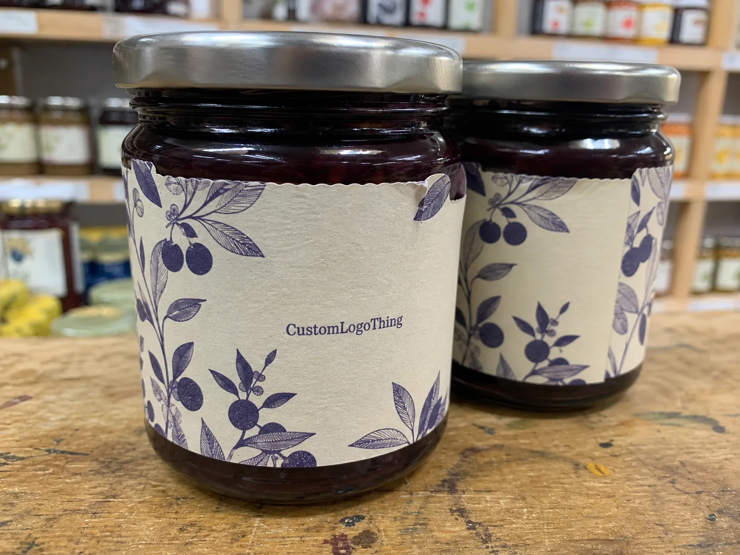
A jar of jam has a narrow window to make sense. The buyer glances, decides whether it feels homemade, premium, or generic, and moves on. That judgment happens before the flavor gets a chance to do any work. Personalized jam labels shape that first read in seconds.
On a crowded shelf, small design choices carry more weight than people expect. A clean hierarchy makes the product feel intentional. Clear typography suggests care. A bright fruit palette can signal freshness, while a more restrained layout can push the product toward a premium gift item. The label is not just decoration. It is part of the price signal.
That matters because jam often sits in a weird middle space. It can be homemade and small-batch, but still needs to look stable enough for resale. It can be a pantry staple, but also has to compete with giftable specialty foods. The label has to do both jobs without sounding confused.
Buyers also respond to trust cues, even if they never say so out loud. If the flavor name is hidden under decorative graphics, or if the text is crowded against the edge, the jar feels less finished. A label that reads cleanly gives the impression that the product process is controlled. That is one of the few packaging tricks that actually deserves the word "practical."
Different sales channels reward different looks. Farm-stand jars can handle a warmer, more handmade style. Retail shelves usually need stronger contrast and a tighter layout. Gift boxes sit somewhere in between, where the label has to feel special without becoming hard to read. A single design can cover all three, but only if the structure is disciplined.
Practical rule: if the flavor name is not obvious at arm's length, the label is doing too much.
If you are building a label system from scratch, it helps to compare the jam label against the rest of your packaging instead of treating it as a one-off design job. The broader your line gets, the more important consistency becomes. For a starting point, see the Custom Labels & Tags category. Matching formats across jars, gift packs, and seasonal runs keeps the brand from looking improvised.
What to Specify Before You Design a Jar Label
Before artwork starts, get the physical details out of the way. Jar height, jar diameter, shoulder shape, lid size, and the exact label placement all change the final layout. A straight-sided jar gives you more predictable space. A curved jar with a narrow shoulder does not. A full wrap label behaves differently from a front panel sticker, and the design needs to account for that from the beginning.
The content list is just as important as the measurements. Most jam labels need the brand name, product name, flavor, and net weight. If the product is sold rather than gifted, the layout may also need ingredients, allergen text, business details, and other compliance copy. Leaving that until the proof stage usually leads to clutter. Better to plan for it early and let the design breathe around the required information.
Batch structure matters too. A single flavor can use one simple format. A seasonal line with strawberry, blueberry, and peach usually works better with a shared system: one base design, color variation, and fixed placement for the variable text. That approach keeps the range recognizable without rebuilding the file every time.
There is a real difference between labels made for gifting and labels made for retail. Gift labels can be lighter on regulatory copy. Retail labels usually cannot. If the jars will be refrigerated, shipped, or stacked, the label also needs enough quiet space that handling does not make the design feel cramped. White space is not wasted space. On food packaging, it is part of legibility.
For buyers who want a practical reference point, food packaging and labeling groups such as the Packaging & Label Manufacturers Institute are useful for understanding how presentation, materials, and compliance overlap in real production work.
Process and Turnaround: From Artwork to Delivery
The production sequence is usually predictable. The buyer requests a quote. Specs get submitted. The printer reviews dimensions, quantity, stock, and artwork. A proof comes back. After approval, printing, cutting, finishing, packing, and shipping follow. The steps are ordinary. The delays are not.
Most schedule problems show up in the proof stage. Small edits are normal. A misspelled ingredient, a barcode adjustment, a shift in font size, or a tighter margin can be fixed without drama. What slows everything down is structural change. Switching from a simple front label to a wrap, changing stock type, or resizing around a new jar usually means a fresh setup. That adds time.
For a straightforward run, a typical turnaround after proof approval may land around 12 to 15 business days. Custom shapes, specialty finishes, film stocks, and multiple flavor versions can push that longer. Rush jobs exist, but they are less forgiving when the artwork is still changing. If the launch date is fixed, the proof needs to stop moving.
Shipping and packaging also affect the final result. Labels should arrive flat, protected, and packed so they do not curl or collect dust before application. If the production room is busy, the difference between good packing and lazy packing becomes obvious very quickly. A stack that arrives clean saves time. A stack that arrives warped creates avoidable friction before the first jar is labeled.
Real-world use can be harsher than the mockup. If the product is going through mail, refrigerated storage, or seasonal temperature swings, durability matters more than the file looks on screen. Standards bodies such as ISTA publish useful packaging and transport guidance, and the logic applies here: if the label cannot survive handling and environment changes, the design is incomplete.
A clean workflow usually looks like this:
- Measure the jar and confirm label placement.
- Choose stock, finish, and adhesive type.
- Prepare final copy, including required compliance text.
- Review the proof line by line at actual size.
- Approve color, quantity, and timeline in writing.
The sequence is simple because it should be. The real risk is assuming the label is only a graphic file. It is not. It is a production item with physical limits.
Cost, Pricing, and Minimum Order Tradeoffs
Quantity drives price more than anything else. Bigger runs spread setup costs across more labels, which lowers the unit cost. Small runs do the opposite. The setup work does not disappear just because the order is short. For a small jam business, the minimum order quantity can matter more than the headline unit price.
Several variables move the quote. Material type, adhesive performance, finish, shape complexity, number of versions, and whether the artwork needs special handling all affect cost. A plain rectangular paper label is one thing. A waterproof film label with rounded corners, foil, and three flavor variants is another. Those are not close substitutes, even if they look similar in a mockup.
In practice, the cheapest label is not always the cheapest option. If a paper label curls in cold storage or smears after handling, the savings disappear in reprints and wasted labor. The safer comparison is total pack-out cost: label price, application time, spoilage risk, and reorder frequency. That gives a better answer than unit cost alone.
| Label Option | Typical Use | Pros | Typical Cost Impact |
|---|---|---|---|
| Paper label | Gift jars, dry display, short shelf life | Lower price, familiar look, easy to print | Lowest setup cost; best for simple runs |
| Waterproof film | Refrigerated jars, transport, repeated handling | Better moisture resistance, stronger durability | Higher unit cost, often justified for resale |
| Premium finish label | Retail gifting, specialty lines, higher-margin items | Stronger shelf presence, more tactile appeal | Highest unit cost, but can support premium pricing |
Minimum order tradeoffs are usually about inventory risk. If flavors rotate often, a smaller batch protects cash and avoids boxes of obsolete labels. If the product sells steadily and the design is stable, a larger run can make sense because the per-label cost drops enough to absorb some forecasting error. The wrong move is not "small" or "large" by itself. The wrong move is printing for a sales volume that does not exist.
One useful buying habit: ask for the same artwork in two or three stock options. That makes the differences visible. Sometimes the premium is paying for real performance. Sometimes it is just a nicer feel in hand. The second one is fine if the product price supports it, but there is no reason to pretend they are the same.
Material, Adhesive, and Finish Choices for Sticky Jars
Jam jars create annoying conditions for labels. They sweat. They get handled with damp hands. They sit in coolers. They travel in boxes. A label that looks perfect on a flat sample may fail once it hits a curved glass jar in a humid room. That is normal. It is also why material choice matters more than most first-time buyers expect.
Paper stock works well for gift jars and dry display, especially if the visual direction is rustic or handmade. It is usually the most economical choice, and it can look very good on small batches. Film stock is the safer option for refrigerated product, shipping, or repeated handling. It resists moisture and generally holds up better when the jar is not living a comfortable life.
Adhesive choice deserves the same attention as print quality. A label needs to stay flat on curved glass and survive cold storage without lifting at the edges. Too weak, and the corners peel. Too aggressive, and application becomes messy. The right adhesive depends on jar shape, surface texture, and the environment where the labels are applied. That is why a kitchen production setup and a retail-ready line do not always use the same spec.
Finish changes how the product reads. Gloss can make colors pop and fruit imagery feel sharper. Matte cuts glare and usually helps the text stay readable under bright market lighting. Soft-touch adds a premium tactile feel, but it is not a free upgrade. If the design is already light on contrast, that finish can mute the label more than people expect.
Shape matters too. Rounded corners tend to survive handling better than sharp ones. A proper margin around the artwork helps the label look intentional once it wraps around glass. These are not glamorous choices, but they are the ones that keep the labels looking clean after the first week of use.
For buyers thinking about end-of-life behavior and broader packaging goals, the EPA recycling guidance is a useful reference. It will not answer every packaging question, but it does help frame the tradeoff between presentation and disposal behavior.
A useful shorthand: paper is lighter and cheaper, film is tougher, and premium finishes help the jar read as higher value. None of those is automatically right. The correct choice depends on where the jar lives. A shelf, a refrigerator, and a shipping box are not the same environment, even if the label template is.
Common Design Mistakes That Hurt Readability and Sales
The easiest way to make a jam label look weak is to overload it. Too many claims. Too many graphics. Too much decoration squeezed into a tiny space. The label starts to feel like a flyer, and the flavor disappears under the noise. A crowded label rarely looks premium. It usually looks uncertain.
Typography causes plenty of trouble too. Small ingredient text that looks fine on screen can become unreadable in print, especially on glossy stock or curved jars. Thin fonts can vanish under glare. Script fonts can look charming in a mockup and annoying in real life. Food packaging needs clarity first. Style comes after that.
Contrast is another place where good intentions fail. Cream, berry red, and pale fruit tones can look attractive on a monitor and still wash out on the printed label. The fix is easy enough: review the design at actual size, not only in a digital mockup. A print-sized proof catches more problems than a polished screen comp ever will.
Flavor naming should also stay consistent across the line. If one jar is "strawberry preserve," another is "summer strawberry spread," and a third is just "berry jam," the range starts to feel scattered. That may seem small. It is not. A consistent naming system makes the brand feel deliberate, and buyers notice that even if they never say it out loud.
Proofing mistakes are the expensive ones. Wrong dimensions, wrong net weight, wrong ingredients, mismatched cut lines, and bad spacing can all force a reprint. Most of those errors are preventable if someone checks the proof like a production file instead of a thumbnail. The label is going on a jar, not living in a folder.
The best labels are not the loudest labels. They are the ones that read instantly at arm's length, then still hold up when a buyer picks up the jar and inspects it more closely. That is the real job of personalized jam labels: make the product look trustworthy, specific, and worth buying without overexplaining it.
Next Steps: Build a Print-Ready Brief and Place the Order
The cleanest way to move from concept to production is to build a brief before asking for quotes. Include jar measurements, label placement, quantity, flavor list, finish preference, and deadline. If there are multiple versions, note which elements stay fixed and which ones change. That keeps the quoting process efficient and reduces back-and-forth during proofing.
One physical mockup is more useful than a stack of assumptions. Print the design at actual size on plain paper, wrap it around the jar, and check the fit near the shoulder, curve, and lid. A file can look balanced on screen and still feel crowded on glass. The jar tells the truth quickly.
Confirm proof details in writing before approval. Copy, color expectations, size, and application conditions should all be locked down. That matters even more if the jars will move across seasons, storage temperatures, or sales channels. The more variables in the product life cycle, the more exact the label brief needs to be.
If the product is new, a pilot run is usually the smarter first move. A smaller order gives you real feedback on readability, adhesion, and buyer response without tying up cash in a design that has not earned a larger print run yet. Once the label proves itself, reorders are easier and the production system gets simpler.
That is the practical shape of a good label decision: define the jar, choose the stock, check the proof carefully, and buy only what the forecast can justify. Do that well and personalized jam labels stop being a decorative afterthought. They become part of the product's sales logic.
How many personalized jam labels should I order for a small batch?
Start with the number of finished jars, then add a small buffer for spoilage, test fills, and application mistakes. If the flavor changes often, keep the order modest so obsolete labels do not pile up. If sales are stable, a larger quantity can bring the unit cost down enough to justify some extra inventory.
What label material works best for refrigerated jam jars?
A moisture-resistant film is usually the safer choice for refrigerated jars. It handles condensation better and is less likely to curl or lift at the corners. Paper can still work for gift-only jars, but it is not the best bet if the product spends time in cold storage or gets handled often.
Can personalized jam labels include ingredients and net weight?
Yes, and for resale those details are often required rather than optional. Build the layout around them from the start so the brand name and flavor do not get squeezed into a cramped front panel. If space is tight, split the information across front and back panels or use a wrap format.
How long does the production process usually take?
Timing depends on proof approval, quantity, material choice, and whether the label needs a custom shape. A simple run may finish in roughly 12 to 15 business days after approval, while specialty materials or multiple versions can take longer. Fast proof approvals shorten the schedule more than most buyers expect.
What is the biggest mistake people make with custom jam label pricing?
They compare only the quote total and ignore total cost of ownership. A slightly higher label price can still be cheaper if it applies faster, lasts longer, and avoids reprints. The better decision matches batch size, shelf life, and actual sales velocity instead of chasing the lowest headline number.


