Personalized mason jar labels do more than dress up a container. They identify what is inside, support the brand or event, and help a plain jar feel intentional. The catch is that the label still has to survive curved glass, condensation, handling, shipping, and temperature changes without lifting or scuffing.
For a buyer, the useful questions are practical: Does the label fit the usable panel? Will the adhesive hold in cold storage? Is the finish readable under bright light or on a kitchen shelf? A design can look polished on screen and still fail on glass if the shape, stock, and application method were chosen casually.
The best starting point is the jar itself. The container defines the real dimensions, the curve limits how much artwork can fit, and the intended use determines how much durability is required. A wedding favor, a pantry spice jar, and a refrigerated dessert cup do not need the same spec, even if the artwork is similar.
Why personalized mason jar labels work harder than they look
The best jar labels do three jobs at once: identify the contents, support the message, and stay intact long enough to matter. That last part is often underestimated. A label that peels, scuffs, or fogs up undermines the product faster than a modest design ever could.
Glass adds constraints that paper packaging does not. Mason jars are rarely perfectly flat, and the shoulder, seam, and curvature affect where a label can land. If the face stock is too rigid, it bridges instead of settling. If the adhesive is not suited to moisture, the corners lift. If the label is too large for the flat panel, even a straight application can look off.
Measure the usable panel, not the nominal jar size. That avoids reprints. The practical dimensions are the straight or gently curved area where the label can sit without hitting a shoulder, ridge, or seam. A useful spec includes panel width, panel height, overall diameter, and whether the jar tapers. Those numbers affect cut size, bleed, and safe copy placement.
Buyers comparing Custom Labels & Tags should think beyond print quality. A label can be sharp and color-accurate and still be wrong for the job if it cannot survive refrigeration, stacking, or repeated handling. The goal is to put the right material on the right jar and keep it stable long enough to do its job.
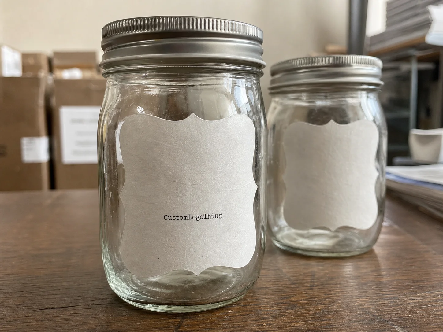
A label that looks right in a PDF can fail on glass if the stock, adhesive, and jar shape are mismatched.
How custom jar labels are produced from artwork to application
The production path is straightforward: measurement, artwork setup, proofing, print production, finishing, and application. On a small order, labels may be applied by hand. On a larger run, a placement jig or simple applicator can keep them aligned and reduce drift from jar to jar.
Artwork should be built for the actual label, not for the concept of the label. A wrap label needs overlap allowance and a seam strategy. A front-panel label needs margins that keep text away from the curved edge. Small jars are less forgiving than expected, and copy placed too close to the border can become hard to read once the label wraps around glass.
File setup matters. Vector artwork is ideal for logos and line work. Raster images should generally be at least 300 dpi at final size. A layout with true dimensions and a 0.125 inch bleed is safer than a loose image file that still needs resizing later. Thin type, weak contrast, and compressed artwork become obvious quickly at actual scale.
The proof stage is the best place to catch mistakes. Check dimensions, color intent, spelling, and the placement of legal or ingredient text. It also helps to confirm how the layout reads after wrapping around a rounded surface. A design that feels balanced on a rectangle can look crowded on a jar.
For short runs, digital printing is usually the practical route because it handles smaller quantities and design changes well. Larger runs may move to roll labels or flexographic production depending on volume, finish, and repeatability. None of that matters if the setup is sloppy. A clean setup is what makes the second order match the first.
Application should be treated as part of the production plan. Hand application works at low volume, but once the count rises, consistency becomes a labor issue as much as a design issue. A crooked label or shifted seam looks unplanned even if the print itself is excellent.
Materials, adhesives, and finishes that change label performance
Material choice determines both appearance and failure mode. Paper labels give a classic, gift-style look and are usually the most economical. BOPP, a polypropylene film, is better suited to moisture, rubbing, and chilled environments. Clear film creates a clean, floating effect on glass. Metallic and specialty films push the package toward a premium presentation, but they also raise the stakes on contrast and registration.
The right stock depends on how the jar will be used. A dry pantry jar is one job. A refrigerated dessert jar is another. A favor jar that may be handled, transported, and reused is different again. The cheapest option only makes sense if the environment is forgiving. Once condensation, transport, or repeated contact enter the picture, the savings can disappear fast.
| Label stock | Typical unit cost at 5,000 pcs | Best use | Performance notes |
|---|---|---|---|
| 60# paper, uncoated or semi-gloss | $0.08-$0.16 | Dry gift jars, favors, pantry items | Strong print quality, lower moisture resistance, classic feel |
| 2.0-3.0 mil BOPP | $0.12-$0.24 | Refrigerated products, handled jars, shipping-sensitive packs | Better against condensation and scuffing, slightly less paper-like |
| Clear film | $0.14-$0.28 | Minimal designs, premium glass presentation | Lets the jar show through, but contrast must be planned carefully |
| Metallic or specialty film | $0.18-$0.35 | Premium gift packaging, limited editions | Higher visual impact, usually higher cost and tighter design control |
Adhesive selection matters as much as face stock. Permanent acrylic adhesive is the default for many product labels because it stays put under normal handling. Removable adhesive is better for reusable jars, event favors, and temporary promotions where clean removal matters. If the jars will be refrigerated, the adhesive should be specified for cold conditions and condensation, not just room temperature.
Finish changes the reading experience. Matte reduces glare and usually makes small text easier to read. Gloss lifts color and gives a brighter retail appearance. Soft-touch can create a muted premium feel, but it is not always the best choice for wet hands or colder environments. Clear labels can look elegant on glass, though the design has to work harder because the background shows through.
For projects with procurement review, paper sourcing can matter. FSC-certified options are often requested when buyers want documentation for responsible fiber sourcing, and the program is a recognizable reference point: FSC-certified materials. For shipping-heavy programs, it is also useful to think in terms of transit stress, abrasion, and vibration. The ISTA test methods are a sensible framework for evaluating how packaging behaves during distribution.
Cost and pricing factors for short runs and bulk orders
Pricing is shaped by more than quantity. Size, shape complexity, stock, finish, adhesive, and any special handling all affect the quote. A simple square paper label with a matte finish is usually less expensive than a die-cut clear film label with foil accents and a cold-rated adhesive. That difference reflects setup time, material cost, and how precisely the job has to be controlled.
Per-unit cost usually improves as volume rises because prepress, proofing, and setup are spread across more labels. A 250-piece order for an event or test launch may be rational, but it will almost always carry a higher per-label price than a 5,000-piece run.
Here is the kind of pricing spread buyers often see on short-to-mid runs:
| Order type | Typical price pattern | What drives the cost up | What lowers it |
|---|---|---|---|
| Short run, basic paper | Higher setup share, lower material cost | Custom die shape, multiple proofs, rush timing | Standard size, simple one-color or four-color print |
| Mid-volume BOPP | Moderate setup, moderate material cost | Moisture resistance, special finish, rounded corners | Repeat artwork, efficient panel size, standard adhesive |
| Bulk premium label | Lower per-unit cost, higher total spend | Specialty film, foil effects, tighter registration | Stable design, larger quantity, consolidated shipping |
The cheapest option is not always the least expensive in practice. If a low-cost paper label peels in refrigeration, the waste is not limited to the label itself. Labor, rework, product presentation, and delayed fulfillment all add cost. The same logic applies to poor sizing: if a label has to be replaced because it was too wide for the usable panel, the mistake should have been caught in measurement.
When requesting a quote, include exact dimensions, the intended finish, the adhesive requirement, and whether the labels will be applied by hand or by machine. A supplier can only price accurately when the job is defined clearly.
- Exact label dimensions and shape.
- Jar diameter or a sample jar for measurement.
- Material and finish preference.
- Adhesive type, especially for cold or reusable jars.
- Quantity, delivery target, and whether application support is needed.
Process and timeline: from proof to delivery
The schedule usually begins with artwork submission and measurement confirmation. After that comes the proof, then approval, then production, finishing, and shipment. Simple jobs move faster. Jobs with custom shapes, specialty materials, or multiple review rounds move slower.
For standard label work, a typical lead time from proof approval is often around 7-15 business days, though quantity and finishing can push that longer. Rush work may be possible if the material is already in stock and the artwork is clean. Waiting on a corrected logo file or an unanswered measurement question can add days before the press starts.
The common delay points are predictable:
- The jar dimensions are approximate instead of measured.
- The artwork needs text corrections or logo cleanup.
- The proof sits unapproved while the launch date stays fixed.
- The requested finish requires a material that is not in stock.
- The application method is unclear, so the label size keeps changing.
Seasonal packaging tightens everything. Holiday gifting, wedding favors, and promotional bundles often compete for the same production window. If an order needs to land close to an event or launch, it is safer to build in time for proofing, shipping, and one possible correction.
Before production is released, one final spec check should be standard: size, stock, adhesive, finish, quantity, and application method. Once those are locked, the order becomes much easier to control.
Common mistakes that make jar labels fail early
The most common failure is choosing the wrong stock for the environment. Paper is fine on a dry shelf. Paper in a cold, wet cooler is different. Condensation weakens the bond, softens the face stock, and can trigger edge lift sooner than expected. If the jar is handled often, a film stock usually makes more sense.
Size errors are just as common. A label that is too wide for the usable flat area will bridge the curve and stress the adhesive. A label that is too tall can run into a shoulder or ridge. Either problem can make the label look crooked even when it was applied carefully. The issue is the spec, not the installer.
Readability gets overlooked far too often. A label can be attractive and still fail at its main job if text is too small, contrast is weak, or copy is too close to the edge. Ingredient text, product details, and legal copy need space. Once the label wraps around a curved surface, small type becomes smaller in effect.
Skipping a real-world test is another mistake. Looking at a proof is not the same as applying a label to the actual jar and checking alignment, adhesion, and finish. A quick test under the conditions the product will actually see is one of the cheapest forms of quality control available.
If the label has to survive shipping, refrigeration, condensation, or reuse, test it under those conditions before the full run prints. That is basic risk control.
Next steps for ordering labels that fit, print cleanly, and last
Start with the jar. Measure the usable label area instead of guessing from the container name. If you have a sample jar, use it. Then decide how the jar will live: on a shelf, in a cooler, in a shipping box, or in someone’s hand. That use case determines the material and adhesive more than the artwork does.
Keep the design hierarchy simple. The brand or product name should read first, followed by support text and then any smaller informational copy. On small jars, it is easy to overfill the space, which makes the label feel busy and often harder to read once it is wrapped around glass.
Approve a proof before production, and if the order matters, test a sample on the actual jar. That one step shows whether the label sits flush, whether the finish suits the contents, and whether the layout still feels centered once the container is in use.
Build in schedule margin for shipping, inspection, and final adjustments. That matters most for launches, events, and seasonal gift packaging, where one missed detail creates more cost than a slightly earlier approval. For teams comparing finished custom label sets, the right spec sheet keeps the order on budget and out of reprint trouble.
FAQ
What size should personalized mason jar labels be for standard jars?
Measure the usable panel on the jar rather than relying on the jar name alone. Leave room for the curve, the shoulder, and any seam so the label sits flat and reads cleanly.
Are personalized mason jar labels waterproof or fridge-safe?
They can be, but only if the stock and adhesive are specified for moisture and cold exposure. Ask directly about condensation, refrigeration, and wash resistance before approval.
How many jars do I need before unit cost gets better?
Higher quantities usually reduce the per-label cost because setup and proofing are spread across more pieces. The break point depends on size, finish, and whether the order needs special handling.
Can I apply custom mason jar labels by hand?
Yes. Hand application is common for small runs and event packaging. For larger quantities, placement guides or simple applicators help keep the labels consistent.
What should I send for a quote on personalized mason jar labels?
Send jar dimensions, label size, quantity, artwork files, finish preference, and whether the labels need moisture resistance. Include the delivery target so the production path and lead time are priced correctly.


