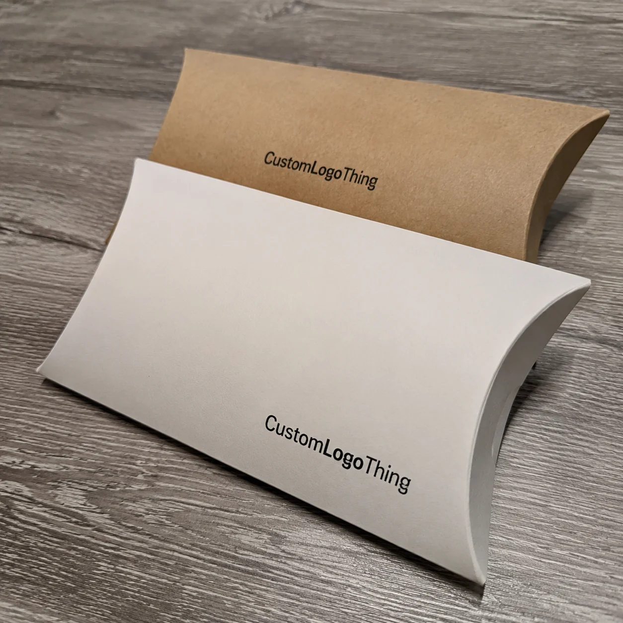
Buyer Fit Snapshot
| Best fit | Transparent Sleeve Branding That Stand Out projects where brand print, material claims, artwork control, MOQ, and repeat-order consistency need to be specified before quoting. |
|---|---|
| Quote inputs | Share finished size, material target, print colors, finish, packing count, annual reorder estimate, ship-to region, and any compliance wording. |
| Proofing check | Approve dieline scale, logo placement, barcode or warning zones, color tolerance, closure strength, and carton packing before bulk production. |
| Main risk | Vague material claims, crowded artwork, missing packing details, or unclear freight terms can make a low unit price expensive after revisions. |
Fast answer: Transparent Sleeve Branding That Stand Out: Material, Print, Proofing, and Reorder Risk should be specified like a repeatable production item. The safest quote records material, print method, finish, artwork proof, packing count, and reorder notes in one written spec.
Production checks before approval
Compare the actual filled-product size with the drawing, then confirm tolerance on folds, seals, hang holes, label areas, and retail display edges. Reserve space for logos, QR codes, warning copy, and material claims before decorative graphics fill the panel.
Quote comparison points
Review material grade, print process, finish, sampling route, tooling charges, carton quantity, and freight assumptions side by side. A quote is only useful when the supplier can repeat the same color, closure quality, and packing count on the next order.
When I first started auditing shelf-ready packaging, I made the same mistake a lot of teams make with tips for transparent sleeve branding: I assumed clear meant easy. It does not. A transparent sleeve exposes everything—ink density, seam placement, registration, even the way a bottle catches light under a supermarket fixture in Chicago, Toronto, or Dallas. In one client review, a 1.5 mm shift in the panel looked trivial on screen and looked sloppy on a 12-ounce carton in person. I still remember staring at the sample and thinking, “Well, that tiny line just wrecked a very expensive afternoon.” That’s the reality of clear packaging: it is unforgiving, and that is exactly why it can look so premium when done well.
Transparent sleeve branding, in plain language, means using a clear film, wraparound overlay, or sleeve format to carry branding while still letting the container or product show through. The visual payoff is strong. You get product visibility, a minimal aesthetic, and a chance to let color, texture, or shape do part of the selling. But the package becomes honest. Traditional opaque labels can hide plenty; clear sleeves reveal what’s aligned, what’s rushed, and what needs another proof. If you want the best tips for transparent sleeve branding, start there: restraint, precision, and a respect for how much the package is already saying. A common production spec is 60–80 micron clear PET film with a 350gsm C1S artboard insert for secondary components, and that combination changes the visual result more than most teams expect.
I think that’s why this format keeps growing across beauty, beverages, supplements, and specialty food. It supports visual branding without burying the product. It can lift brand recognition because the product itself becomes part of the identity system. It often improves customer perception, especially for brands trying to signal quality without making the pack feel heavy or overdesigned. Clear sleeves are not about adding more graphics. They are about making smarter decisions with fewer elements. That’s the real point of tips for transparent sleeve branding. And yes, it can be a little annoying that “less” requires so much more thinking, especially when a 5,000-piece run can still need three proof rounds before approval.
Tips for Transparent Sleeve Branding: Why It Feels So Hard to Get Right
Transparent sleeves look simple in a mockup. Then the samples arrive, and suddenly every millimeter matters. I’ve watched teams spend weeks debating logo size on an opaque carton, only to discover that the clear sleeve version amplifies tiny flaws in the substrate, the seal line, and the print file. With tips for transparent sleeve branding, the challenge is not just visual; it is structural. Clear film asks you to think about the package, the product, the shelf, and the room lighting at the same time. In practical terms, that means your proof at a converter in Shenzhen or Guangzhou may look finished, but the real test happens under 4,000K retail LEDs in a store aisle.
What makes this format tricky is that it creates a visual negotiation. The product, the logo, the white space, and the environment all compete for attention. If you overload the package, the transparency stops feeling elegant and starts feeling busy. If you under-design it, the sleeve can disappear. I visited a beverage converter in Dongguan where a transparent overwrap looked stunning under studio lights but nearly vanished in a warm retail aisle because the amber liquid behind it blended with the light amber typography. That’s one of the most common lessons in tips for transparent sleeve branding: a design that works in a PDF is not automatically a Design That Sells on shelf, especially when the shelf is 6 to 8 feet from the shopper’s first glance.
In operational terms, transparent sleeve branding is the use of a clear or semi-clear film to display a logo, message, regulatory copy, or decorative elements while leaving some or most of the packaging visible. The film might be a shrink sleeve, a clear label, or a wraparound overlay. On a cosmetics jar, that can preserve the premium look of the glass. On a supplement bottle, it can keep dosage visibility intact. On a specialty food container, it may let the product color do part of the branding work. The format can feel lighter than an opaque label and more modern than a fully printed carton, particularly when the sleeve is cut to a 0.5 mm registration tolerance and applied at 120 to 160 units per minute.
“Clear packaging is brutally honest. If your alignment is off by a few millimeters, the whole pack feels off.” That’s what a production manager told me during a line audit in Shenzhen, and I still think about it whenever a team asks for transparent sleeve branding on a curved container.
Compared with traditional opaque packaging, clear sleeves demand much tighter discipline. Opaque designs hide seams, minor registration drift, and substrate variation. Transparent designs expose them. The upside is that consumers often read that honesty as quality. If the structure is clean, the package feels premium fast. If it is not, customer perception drops quickly. That is why the best tips for transparent sleeve branding are less about adding decoration and more about balancing visibility, readability, and restraint. A $0.15 per unit sleeve on a 5,000-piece order can look expensive if the seam is wrong by 2 mm; it can look far more valuable if the alignment is clean.
How Transparent Sleeve Branding Works on the Shelf
The physical structure matters more than most teams expect. A sleeve may slip over a container, wrap around a carton, or shrink to fit a bottle. Branding can be printed directly on the clear film, built into a label panel, or placed as a partial overlay. Each format changes how the eye reads the package. In a retail setting, that means the same artwork can perform very differently depending on whether it is sitting on a matte carton, a glossy PET bottle, or a frosted jar. A sleeve made in Ho Chi Minh City may also behave differently from one produced in Monterrey or Shenzhen if the film gauge and shrink curve are not matched to the container.
Transparency changes visual hierarchy. On an opaque package, you control the canvas. On a clear one, the container and product are part of the layout. That shifts the balance of power. White ink becomes a design tool, not just a technical requirement. Negative space becomes a signal. Typography needs stronger weight. And yes, the shelf environment starts to matter a lot more. I’ve seen a sleeve with crisp blue branding lose half its impact because it was placed in a cooler next to similarly colored packaging, which made the whole row look like a single block. That is one of the more overlooked tips for transparent sleeve branding: shelf context can either amplify or flatten the design, and a 20-foot aisle view is very different from a 12-inch prototype check.
Lighting is another variable that sneaks up on teams. A clear sleeve that looks clean under daylight can reflect too much under overhead LEDs or get muddy under warm retail lighting. Product color matters too. A ruby-red beverage, for example, can make a silver logo pop beautifully. A pale lotion can do the opposite and make the same logo seem washed out. In e-commerce imagery, the package may look almost invisible unless the photographer controls the background and angle carefully. That is why brand consistency needs to be planned across shelf, photo, and social placements—not just in the CAD file. A photography setup in New York can make a clear sleeve feel completely different from the same pack shot in Seattle or London if the light temperature shifts by 500K.
Transparent sleeve branding is especially common in cosmetics, beverages, specialty foods, supplements, and gift packaging. Those categories benefit from a “see-through” effect because it supports trust and often raises perceived quality. I worked with a beauty client in Los Angeles that moved from an opaque tube label to a clear sleeve over a satin-finish bottle. The product looked more expensive immediately. Not because the graphics were louder. Because the pack stopped hiding the bottle. That is a subtle but powerful point in the best tips for transparent sleeve branding: visible product often does more selling than another banner line ever will, especially when the sleeve is paired with a 350gsm C1S outer carton or a 60-micron PET overlay.
For brands comparing packaging systems, it can help to look at related structures like Custom Labels & Tags alongside sleeve options. The same artwork often behaves differently depending on whether it is built as a clear label, a shrink sleeve, or a hanging tag. The format choice affects shelf impact, assembly time, and the final unboxing experience if the item is sold direct-to-consumer. In one comparison, a label system priced at $0.12 per unit for 10,000 pieces showed better line speed than a sleeve, but the sleeve delivered more shelf visibility in a 48-store test.
Key Factors That Shape Tips for Transparent Sleeve Branding
Material choice is the first decision that changes everything. PET, PVC, PLA, and other specialty films each bring a different mix of clarity, stiffness, recyclability, and print response. PET is popular because it offers good clarity and can feel premium, but it may not suit every shrink application. PVC can print well and conform easily, though sustainability expectations have pushed many brands to reevaluate it. PLA can help on the sustainability story, but performance and cost need careful testing. If you want strong tips for transparent sleeve branding, start with the film spec, not the artwork. A 50-micron PET sleeve for a straight-walled bottle is a different project from an 80-micron film on a tapered container in Barcelona or Osaka.
Print method is the next fork in the road. Digital printing works well for shorter runs and variable data, but unit economics change fast as volumes climb. Flexographic printing often makes sense for larger runs and disciplined color control. Screen printing can deliver strong opacity and bold white ink, though it may not be the best fit for every design. I once sat through a supplier negotiation where the client wanted a fine-line gradient on a clear shrink sleeve, a frosted panel, and a metallic accent on a 3,000-piece run. We got there, but not without revising the print method twice. That sort of detail is central to practical tips for transparent sleeve branding because the wrong method can wipe out the visual intent before the sleeves even hit the line, and the difference between digital and flexo can be 10 to 14 business days in production planning.
Opacity strategy deserves its own planning session. Do you want the entire sleeve transparent? Do you want frosted sections? Do you need white ink under the logo? Do you want to block the back panel completely so the front panel reads cleanly? The answer depends on legibility, product color, regulatory copy, and the visual identity you’re building. A full-clear sleeve feels lighter. A selective white underlay gives structure. Frosted effects can soften the look, though they may reduce contrast. The right choice is not aesthetic alone; it is functional. That is one of the most practical tips for transparent sleeve branding I can offer, and it is especially useful when the artwork must leave a 3 mm clear border around barcodes and ingredients.
Brand contrast matters more on transparent film than on nearly any other substrate. The more transparent the package, the more the brand must rely on typography, controlled color palettes, and disciplined spacing. If your brand uses pale gray on clear film, you may be creating a legibility problem that no amount of graphic polish can fix. Strong contrast helps on shelf, helps in photos, and helps at a glance. In packaging terms, it improves both brand identity and speed of recognition. A black logo on a clear sleeve over a light product may read in 1 second from 8 feet away; a silver logo over a similar background might take 3 seconds or never register at all.
Package compatibility is another issue that gets underestimated. Curved bottles, irregular jars, tapered containers, and odd seam locations all complicate the final appearance. Clear film can distort across a shoulder curve, and a seam placed in the wrong spot can split a logo or make the back panel look awkward. I’ve seen a jar sleeve where the brand mark sat beautifully on the flat artwork but looked skewed by 4 degrees once applied to the actual container. Nobody notices that on a proof sheet. Everyone notices it on shelf. This is where tips for transparent sleeve branding become very practical: measure the real package, not the idealized one, and confirm the drawing against the exact 68 mm bottle diameter or 120 mm jar height you are shipping from.
Shelf context finishes the picture. A transparent sleeve that looks elegant in isolation can disappear if the category is already full of similar clear or frosted designs. Competitor analysis is not just for color matching. It tells you whether your sleeve needs more contrast, a stronger logo lockup, or a different finish to stand out. I like to put 6 to 10 competitor packs on a table and photograph them from 8 feet away. That simple exercise often reveals whether the sleeve is doing enough work or fading into the background. It is one of the easiest tips for transparent sleeve branding to apply before you approve a final design, and it takes about 15 minutes with a phone camera and good daylight.
For brands that want to learn from actual launches, our Case Studies page is a useful place to compare packaging outcomes by format, audience, and decoration style. Seeing what changed between concept and production can save a lot of guesswork, especially when a project moved from a sample in Chicago to a full run in Mexico City or Ahmedabad.
| Option | Typical strength | Typical tradeoff | Best use case |
|---|---|---|---|
| Clear PET sleeve | High clarity, premium feel | Needs strong contrast and precise fit | Beauty, premium drinks, specialty food |
| Frosted film | Softens the look, adds sophistication | Can reduce product visibility | Cosmetics, skincare, gift sets |
| Clear film with white ink | Excellent readability | Higher print complexity | Regulated products, bold brand marks |
| Selective opaque panels | Strong hierarchy and shelf control | Less “bare” transparency | Multi-message packs, line extensions |
Step-by-Step Process and Timeline for Transparent Sleeve Branding
The first step is to define the objective in one sentence. Are you chasing a premium look, tamper evidence, sustainability signaling, product visibility, or some combination? If the brief tries to do all five equally, the design usually gets muddy. Clear sleeves reward focus. In my experience, the cleanest projects begin with a simple statement: “We want the bottle to stay visible, but the logo must read from 6 feet away.” That kind of direction makes the rest of the process easier and keeps the team aligned on the real purpose of tips for transparent sleeve branding. A focused brief also shortens approvals by 2 to 3 days in many projects.
Second, gather the physical specs. You need container dimensions, taper angles, curvature, fill level, surface finish, and whether the sleeve must be removable or shrink-fit. If the product level changes after filling, that matters too. A sleeve that looks perfect on a full bottle may look odd on a partially filled one. I once reviewed a supplement line where the sleeve artwork was built around the assumption of a constant fill level. On the actual production line, the fill varied by 12 to 18 mm, and the logo landed too high on some packs. That sort of miss is why the best tips for transparent sleeve branding always include real measurements, not just nominal dimensions from a sales sheet.
Third, build a design system rather than a single pretty mockup. Set logo placement rules, safe zones, font minimums, and transparent versus printed areas. Decide where the seam will sit. Decide what must remain clear. Decide whether the back panel should carry compliance copy or whether that content belongs somewhere else. This is where good brand consistency gets made. Without rules, line extensions become a mess six months later. For a 12-SKU beverage family, a one-page system sheet can prevent 12 separate artwork arguments.
Fourth, request proofs and samples, then inspect them under multiple conditions. Natural daylight. Retail lighting. Handheld viewing. Even the camera on a phone. I’ve seen sleeves that looked fantastic in a controlled proof room and less convincing on a warehouse floor with mixed LEDs. Test with the actual bottle or carton. Not a substitute. Not “close enough.” Real materials. Real angles. Real reflections. That is one of the most repeatable tips for transparent sleeve branding I can give. If your supplier is in Dongguan and your customer is in Atlanta, the sample needs to survive both print logic and retail reality.
Fifth, approve a pilot run before full production. A pilot catches seam placement issues, color shifts, and registration problems while the cost of correction is still manageable. It also gives the sales team something to photograph and the operations team something to test on the line. If the sleeve needs 12-15 business days from proof approval to production on a standard run, a pilot can add several more days depending on sample revisions and vendor scheduling. That delay is not wasted time. It is risk reduction. On a 5,000-piece order, one wasted rerun can cost more than the pilot itself.
The timeline depends on whether you are using stock clear film with custom print or a fully custom structure that needs special tooling and supplier coordination. For a straightforward project, concepting and prepress might take 3-5 business days, proofing another 2-4 business days, and production 10-15 business days after sign-off. If you need specialty white ink control, unique die lines, or multiple approval rounds, the schedule stretches. That is normal. The fastest route is rarely the safest route. Good tips for transparent sleeve branding include building enough time for decisions people do not want to make until they see the sample, especially if the project is managed across New York, Shenzhen, and Rotterdam.
For brands that want to compare formats, I often suggest a short field test: one shelf photo in store lighting, one product in hand, one e-commerce mockup. Three images. Three perspectives. You will learn more from that than from a polished presentation deck. And if you want a technical baseline for shipping and durability expectations, the International Safe Transit Association publishes useful guidance at ISTA, especially when the sleeve must survive distribution without scuffing or slipping. A 250-unit pilot shipped from California to Texas can reveal scuffing that never appears in a local lab test.
Cost and Pricing Factors to Budget Before You Start
Transparent sleeve pricing usually comes down to material thickness, film type, print coverage, color count, special finishes, and whether you need white ink or specialty coatings. A minimal clear sleeve with one-color print is usually less expensive than a multi-layer design with frosted effects, metallic accents, and tight registration. That sounds obvious, but the cost difference can be dramatic. In one supplier quote review, a client went from $0.18 per unit at 5,000 pieces for a basic clear sleeve to $0.41 per unit after adding white underprint, a frosted panel, and a second pass of print. Same size. Same shape. Very different production burden. In another quote from a supplier in Poland, the same structure landed at $0.15 per unit for 5,000 pieces only because the design stayed one-color and print-ready.
Low-volume orders almost always cost more per unit because setup, proofing, and press calibration are spread across fewer sleeves. If you need 1,000 units, the press still needs to be set, the artwork still needs checking, and the waste still needs to be managed. That is why it is smart to think in terms of total project cost, not just per-sleeve pricing. The real line item includes design iteration, samples, pilot runs, and expected spoilage. I’ve seen teams underbudget by 20% to 30% because they only priced the printed sleeve and forgot the surrounding work. That is a very expensive oversight in the world of tips for transparent sleeve branding. A project budget that ignores $150 to $300 in proofing and courier fees can quickly become false economy.
Custom shapes and variable data can also lift the price. So can unusually tight registration requirements. If your brand mark must sit exactly over a molded ridge, production tolerance tightens and spoilage risk rises. Specialty finishes—frosted effects, soft-touch coatings, heavy white coverage, or spot varnish—can make the pack feel more premium, but they may slow output or complicate quality control. Packaging decorators do not charge for the concept. They charge for the precision. A sleeve with a 0.25 mm registration tolerance will not cost the same as one with a relaxed 1.0 mm tolerance.
Here’s a practical view of the cost structure:
| Cost driver | Lower-cost choice | Higher-cost choice | What changes on the line |
|---|---|---|---|
| Material | Stock clear film | Specialty PET or PLA | Different clarity, stiffness, and sourcing |
| Print coverage | One-color logo | Full-wrap graphics with white ink | More press time, more setup, more checks |
| Run quantity | Higher volume | Short run | Setup cost is spread differently |
| Decoration | Flat print only | Frosted, metallic, spot effects | More process steps and more spoilage risk |
The most useful pricing question is not “How cheap can this be?” It is “What is the sleeve expected to do for the shelf?” If a clear sleeve lifts conversion by even 2% to 4% in a category where margins are tight, the math can justify the extra decoration. That is not always the case, of course. But good tips for transparent sleeve branding should connect package cost to business value, not just decoration cost to an accounting line. A 3% lift on a $12 product sold in 30,000 units can easily cover a $0.06 per unit increase in packaging.
From a sustainability and compliance angle, it helps to think about what materials and claims are actually supportable. The U.S. Environmental Protection Agency has practical guidance on waste reduction and packaging impacts at EPA, and the Forest Stewardship Council provides a useful framework for responsibly sourced fiber-based components at FSC. Not every clear sleeve needs a sustainability claim. Sometimes the smartest move is to keep the message simple and accurate, especially if the final structure combines clear film with a 350gsm C1S insert or a paperboard shipper.
Common Mistakes That Undercut Transparent Sleeve Branding
The biggest mistake is weak contrast. If the logo or copy cannot be read once the sleeve is applied, the entire package starts failing at the first glance. Clear packaging is not forgiving about pale type, thin fonts, or low-contrast color choices. A client once insisted on light silver text over a pale green serum bottle because it looked “luxurious” on the comp. On the actual shelf, it looked invisible from 4 feet away. That is not luxury. That is a readability problem. Strong tips for transparent sleeve branding usually begin with contrast because nothing else matters if the brand name cannot be seen, even on a high-margin $28 skincare item.
Overcrowding is another issue. Transparent sleeves tend to benefit from restraint, not dense blocks of information. When designers try to make the clear surface carry too much copy, the package starts to feel anxious. Keep the message focused. One visual hero. One supporting cue. Maybe one short claim. Anything more should be justified by regulatory needs or usage instructions. A sparse layout often feels more confident and improves customer perception. A 5% empty-space increase can do more for perceived premium quality than adding a second tagline.
Ignoring product color is a subtle but costly error. If the formula changes by flavor, batch, or variant, the same transparent sleeve can behave differently from one SKU to the next. A blueberry supplement and a citrus supplement may demand different contrast treatment even if the bottle shape is identical. This is why line extensions need rules. Otherwise, the brand drifts. And once drift starts, brand consistency gets harder to recover. I’ve seen it happen in under a quarter, especially in category rollouts managed from Atlanta, Miami, and Vancouver at the same time.
Fit testing is non-negotiable. If you do not test actual sleeves on actual containers, you may miss seam issues, shrink behavior problems, or artwork distortion. Curved shoulders can warp type. Seams can split logos. Labels beneath clear film can create visual clutter. Small issues become visible fast. One supplier I worked with had a 2 mm seam offset that only showed up after the first 300 units were packed, because the bottle shoulder threw the sleeve slightly to one side. That is the kind of problem that a good pilot run catches early, and it can save a rerun that would otherwise add 7 to 10 days to the schedule.
Trendy effects can also backfire. A finish that looks great in a rendering may smear, stretch, or reflect badly under production conditions. I love ambition in packaging, but ambition needs discipline. If the effect cannot survive the line speed, the scuff test, or the customer’s hand, it is not ready. Regulatory or functional details can also get squeezed out. Barcodes need quiet space. Ingredients need legibility. Compliance copy cannot be sacrificed for decoration. Those are not optional details in the real world of tips for transparent sleeve branding. If your copy needs 6-point type to fit, the layout is already working too hard.
Finally, teams sometimes treat the sleeve as a one-size-fits-all solution. It is not. One design rarely works across every bottle size, flavor variant, or container geometry. If the family is expanding, build a system that can flex without breaking. That means versioning, not cloning. It also means planning for reorders from suppliers in different regions, because a print run in Mexico City may need different registration controls than a later run in Kuala Lumpur or Prague.
Expert Tips for Transparent Sleeve Branding That Actually Converts
Lead with one visual hero. Not three. If the product color is beautiful, let it show. If the logo is the strongest asset, give it room. If the container shape itself is the differentiator, stop fighting it. The strongest tips for transparent sleeve branding often come down to deciding what not to show. That restraint can improve brand identity faster than another decorative layer ever will. On shelf, a single clear message often beats a crowded sleeve that tries to do everything in 1.5 inches of panel space.
Use white ink strategically. White underprint is one of the most effective tools for clear packaging because it creates contrast without completely killing the transparent effect. A full white block can feel heavy. A targeted underlay behind the logo or critical copy can preserve readability and still let the container do its job. Think of white ink as a spotlight, not a wall. In practical production terms, a 20% white coverage zone can be enough for brand marks while leaving the rest of the film visually open.
Treat empty space as part of the system. On transparent packaging, open space does more than make the design feel modern. It tells the customer that the brand is confident enough not to fill every square millimeter. I learned that lesson on a skincare line review where the client wanted more claims, more icons, and more decorative elements. We removed 40% of the visual clutter, and the pack instantly felt more premium. That is one of the most counterintuitive tips for transparent sleeve branding: less decoration can increase perceived value, especially when the sleeve sits against a frosted jar or a tinted bottle.
Test at multiple distances. Shelf distance. Handheld distance. Thumbnail distance. A sleeve must work in aisle photography, on a retail shelf, and in an e-commerce tile that may show only 180 pixels of width. That means the hierarchy has to survive three different viewing environments. The same logo lockup may need to be bolder for shelf and simpler for digital. This is where visual branding and commerce meet. A pack that reads at 6 feet, 18 inches, and 180 pixels is doing real work.
If sustainability matters to your audience, keep the material story simple and credible. Do not overclaim. Do not cram the sleeve with vague green language. If the film is recyclable under a specific program, say so clearly and accurately. If it is a lower-material option, explain that in one sentence. Consumers are skeptical, and for good reason. Honest packaging language improves trust more than inflated claims do. That is one of the more mature tips for transparent sleeve branding, and it is especially useful for brands shipping into California, Ontario, and the European Union where claim scrutiny is higher.
Use a versioning approach for line extensions. Keep a consistent logo zone, a predictable typographic system, and one variable cue for flavor or variant. Maybe the product color changes. Maybe a small accent band shifts. But the system should still read as one family. That protects brand consistency and makes reorders easier. It also keeps the shelf from looking chaotic when the range grows from 3 SKUs to 12, or from 12 to 24 once a retailer asks for regional exclusives.
One more practical point from a factory floor: ask about installation, not just print. I once watched a team design a gorgeous clear sleeve for a two-piece jar, only to find that the applicator operator needed an extra 6 seconds per unit to align the seam. That killed throughput. The design was good. The process was not. Good tips for transparent sleeve branding always include line speed, handling, and installation reality. If the line is rated at 90 units per minute but the sleeve slows it to 72, that cost shows up fast.
When you want to compare sleeve execution against other packaging routes, our project examples in Case Studies can be helpful. They show how artwork, material choice, and print method interact in production—not just in a mood board. Seeing the actual spec sheet and final shelf photo side by side often clarifies more than a long presentation.
Actionable Next Steps for Transparent Sleeve Branding
Start with an audit of your current package. Photograph it in real light, not studio light. Take one image under daylight, one under warm retail LEDs, and one from arm’s length. Then ask three questions: Is the logo readable? Does the product help or hurt the design? Where does the alignment fail? This quick check often reveals the simplest and most important tips for transparent sleeve branding before any design money is spent. In many cases, a 10-minute audit in a store aisle beats a 10-slide deck.
Next, write a one-page brief. Include container dimensions, fill level, material preferences, target quantity, target unit cost, timeline, and must-have print effects. If you know the sleeve must be removable, shrink-fit, or tamper evident, say so plainly. If your launch depends on a specific shelf date, work backward from that date by at least 2 to 3 weeks for proofing and correction. A vague brief creates expensive back-and-forth. A clear brief saves time and protects the final result. A realistic launch schedule for a custom sleeve often lands at 18 to 25 business days from first artwork to final approval.
Then request two or three material samples and compare them against the actual product. Do not compare film A versus film B in the abstract. Put them over the real bottle or carton and check clarity, glare, and contrast. If possible, photograph the sample on the shelf next to competitor products. You will see quickly whether the sleeve blends in or stands out. That side-by-side test is one of the most practical tips for transparent sleeve branding because it replaces opinion with observation. A sample tested in Toronto can reveal a very different result from one shown under the fluorescent lights of a distribution center in Phoenix.
Run a small proof test before you commit to full production. A pilot of 250 to 500 units can reveal more than a dozen design meetings. Check seam placement, stretching, scuffing, and how the sleeve behaves during shipping. If the pack is for direct-to-consumer fulfillment, simulate packing pressure and box friction too. Packaging rarely fails in the same clean way twice; it fails in the way your process forgot to test. If your vendor quotes 12-15 business days from proof approval, add time for one correction cycle so you are not forced into rush freight.
Document final design rules so future reorders do not drift. Write down safe zones, font sizes, white ink usage, seam placement, and acceptable color variance. Keep those rules in one file and one folder, not scattered across email chains. That small habit protects brand recognition and saves the production team from re-litigating old decisions on every reorder. A good rule set can also prevent a 1 mm logo shift from turning into a repeated brand problem over a 50,000-unit year.
After launch, review performance. Check shelf visibility, customer feedback, and handling durability. If sales staff say the package “pops” from 10 feet away, that is useful. If retail buyers say the fine print is hard to read, that matters too. If the sleeves scuff in transit, fix the material or the secondary packaging. Measurement beats assumption every time. A weekly review in the first 30 days can catch issues before a second production lot is ordered.
One of the clearest lessons from years of packaging work is this: the best tips for transparent sleeve branding are the ones you can test, measure, and repeat. If a change improves readability by 20%, reduces spoilage by 8%, or shortens line setup by 5 minutes, keep it. If it just looks nice in a presentation, be cautious. A packaging decision that saves 3 minutes per run across 40 runs a year is not small; it is operationally meaningful.
For deeper context on what strong packaging systems look like in the market, our Case Studies page offers examples with actual specs, production considerations, and shelf outcomes. That’s often more useful than a pretty mockup. And if you are pairing sleeves with other components, Custom Labels & Tags can help you compare formats before you commit to a final structure. A sleeve plus label combination may also make sense if your pack needs both transparency and regulatory copy.
FAQ
What are the best tips for transparent sleeve branding on curved containers?
Use generous safe zones so text stays away from seams and shoulder curves. Test the sleeve on the exact container shape, because a 2 mm curvature shift can distort a logo faster than most teams expect. Keep typography bold, simple, and large enough to read from at least 4 to 6 feet. If possible, request a sample on the real bottle from a converter in Shenzhen, Istanbul, or São Paulo before signing off.
How do I make transparent sleeve branding readable without losing the clear look?
Add selective white ink under the logo or key copy so contrast stays strong. Limit the number of colors and avoid thin fonts that disappear against the product. Leave open space around the main message so the package still feels light and transparent. A 25% to 35% white underlay is often enough to improve readability without turning the sleeve into a white label.
What affects the cost of transparent sleeve branding the most?
Material type, print coverage, and special finishes usually drive pricing first. Lower quantities raise unit cost because setup is spread across fewer pieces. Complex shapes, white ink, and tight registration can increase both production time and cost. As a rough example, a 5,000-piece run may price at $0.15 to $0.41 per unit depending on coverage, film, and finishing.
How long does the transparent sleeve branding process usually take?
Simple projects can move quickly if the material and dimensions are already known. Custom designs often need time for proofing, fit tests, and sample revisions. Build in extra time if you need a pilot run or multiple approval rounds. A typical schedule is 12-15 business days from proof approval for production, plus several additional days if the artwork needs another revision.
What mistakes should I avoid when applying tips for transparent sleeve branding to a new product line?
Do not assume one sleeve design will work for every flavor, size, or container shape. Do not skip real-world testing under retail lighting and handling conditions. Do not overload the design with too much text or decoration, because transparency magnifies clutter and weakens shelf impact. Also avoid changing seam placement or film thickness without rechecking the entire line, because even a 1 mm shift can affect the final appearance.
If I had to reduce all of this to one sentence, it would be simple: tips for transparent sleeve branding work best when you treat the clear film as part of the product story, not just a decoration layer. Get the contrast right, respect the fit, test in real lighting, and keep the message disciplined. Do that, and the sleeve can strengthen visual branding, improve unboxing experience, and build brand consistency without shouting for attention. In many categories, that is exactly what sells in the first 3 seconds on shelf.