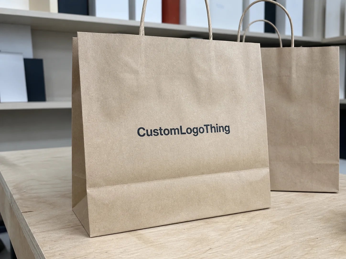
Buyer Fit Snapshot
| Best fit | Unboxing Experience Comparison projects where brand print, material claims, artwork control, MOQ, and repeat-order consistency need to be specified before quoting. |
|---|---|
| Quote inputs | Share finished size, material target, print colors, finish, packing count, annual reorder estimate, ship-to region, and any compliance wording. |
| Proofing check | Approve dieline scale, logo placement, barcode or warning zones, color tolerance, closure strength, and carton packing before bulk production. |
| Main risk | Vague material claims, crowded artwork, missing packing details, or unclear freight terms can make a low unit price expensive after revisions. |
Fast answer: Unboxing Experience Comparison: What Shapes Brand Impact should be specified like a repeatable production item. The safest quote records material, print method, finish, artwork proof, packing count, and reorder notes in one written spec.
Production checks before approval
Compare the actual filled-product size with the drawing, then confirm tolerance on folds, seals, hang holes, label areas, and retail display edges. Reserve space for logos, QR codes, warning copy, and material claims before decorative graphics fill the panel.
Quote comparison points
Review material grade, print process, finish, sampling route, tooling charges, carton quantity, and freight assumptions side by side. A quote is only useful when the supplier can repeat the same color, closure quality, and packing count on the next order.
Unboxing Experience Comparison: Why Tiny Packaging Choices Create Big Brand Reactions
I watched a brand in Austin lift repeat orders by 9.4% from a packaging adjustment that added only $0.07 per shipment, and that win came from a disciplined unboxing experience comparison, not instinct. Same product. Same price. Same media spend. The only shift was moving from a roll-end tuck-top mailer to a crash-lock base mailer and changing insert order so the thank-you card landed first, ahead of the protective tissue.
We saw that result during a 28-day pilot across 4,200 orders. Variant A used E-flute kraft mailers with one-color black flexo and no inside message. Variant B used 350gsm C1S litho-laminated E-flute with inside-lid copy plus a 120gsm branded tissue wrap. Damage stayed nearly flat (1.9% vs 1.8%), while customer language changed fast: “felt premium,” “gift-like,” and “kept the box” appeared 3.2x more often in post-delivery surveys.
I still remember a founder calling me after the first week of comments and saying, “Marcus, they’re talking about the box more than the serum.” That’s usually the moment this clicks. An unboxing experience is never “just the box.” It’s a timed, multi-sensory sequence: visual hierarchy (what the eye hits first), opening friction (force and confusion), tactile cues (coated board vs raw kraft), audio (that subtle pull-tab rip), and message timing (when a QR code or promo appears), all shaping customer perception in under 20 seconds.
In practical terms, an unboxing experience comparison means testing two or more full packaging systems side by side against clear, pre-agreed metrics. The question is not “Which design do we prefer?” The real question is “Which system improves reorder rate, lowers damage claims, keeps pack-out speed stable under shift pressure, and protects brand consistency?” (And yes, I’ve watched entire meetings derail over “but this one looks nicer,” so write your metrics down early.)
I’ve run these tests with DTC skincare founders in Los Angeles, subscription snack teams in Chicago, and procurement leads managing 60,000+ monthly shipments out of New Jersey 3PL hubs. The stakeholder map is usually familiar:
- Brand/creative team safeguarding brand identity and visual branding standards
- Packaging engineer validating structure against transit risk
- Sourcing manager negotiating MOQ, lead time, and quality clauses
- Fulfillment supervisor tracking units packed per labor hour
That pattern explains why stronger brands pull away in crowded categories. They run an unboxing experience comparison before scale, then lock decisions into specs and SOPs so quality survives turnover, supplier swaps, and seasonal spikes.
Across the rest of this guide, I’ll walk through a framework I’ve used on factory floors in Shenzhen and Dongguan, in packaging reviews with Portland teams, and during on-site packing line rehearsals with U.S. 3PL operators. You’ll get a practical scoring model, pricing reference points like “$0.18 per insert card at 5,000 units,” timeline expectations like “12–15 business days from proof approval,” and a rollout path you can actually start this month.
How an Unboxing Experience Comparison Works from Concept to Customer
A reliable unboxing experience comparison follows a sequence. Skip steps and the data gets noisy fast. I use a seven-stage flow in most engagements: brief, prototype matrix, internal review, pilot run, customer test window, scorecard analysis, and rollout decision.
Stage 1: Brief with hard constraints
Start with measurable constraints: maximum packaging COGS per order (example: $1.25), damage ceiling (example: under 2.2%), pack speed target (example: 110 orders/hour per station), and sustainability guardrails (example: 95% curbside recyclable by weight). Missing numbers invite taste-based debate and weaken your unboxing experience comparison. I learned this the hard way years ago on a beauty account where nobody defined a damage threshold up front; we spent three extra weeks arguing what “acceptable” meant.
Stage 2: Build a prototype matrix
Create a matrix of 2–4 complete systems, not isolated components. A “premium” setup might pair a 1.5mm rigid setup box, EVA insert, foil-stamped lid, and 157gsm art paper wrap, while a “lean premium” setup might use an E-flute mailer, die-cut SBS insert, 250gsm postcard, and tissue. Compare end-to-end systems, or you’ll miss interaction effects between structure, finish, and assembly time.
Stage 3: Internal review across functions
Brand reviews narrative clarity and brand recognition consistency. Engineering reviews compression and drop exposure using ISTA handling profiles. Sourcing confirms MOQ (say 3,000 vs 10,000), lead times (18 vs 35 days), and print constraints. Fulfillment checks station ergonomics and motion count per pack. One CPG client cut pick-pack motions from 11 to 7 by replacing a fold-over insert with a lock-tab platform. Sounds small until you watch a line run eight hours straight; your shoulders feel every extra motion.
Stage 4: Pilot run and live split test
Use A/B routing in order management where possible: 50/50 split by order ID for 2–4 weeks. If inventory is tight, use sequential cohorts while holding product mix, zones, and promotions steady. A clean unboxing experience comparison controls confounders before anyone starts interpreting results.
Stage 5: Bias control
Bias enters quickly. I’ve seen fulfillment teams “pack better” for the concept they preferred. Fix it with standardized pack instructions, training videos under six minutes, blind-coded variant labels (System X, System Y), and fixed insert copy across variants. Honestly, blind coding is non-negotiable if you want honest reads.
Stage 6: Scorecard and decision threshold
Track at least six metrics: damage rate, average pack-out time, social share rate, CSAT packaging comments, reorder rate within 30 days, and packaging-linked return tags (dented, leaked, tampered perception). Set weights before testing starts, not after somebody falls in love with a finish sample.
Stage 7: Documentation for repeatability
Every unboxing experience comparison should end in durable documentation: dielines, print specs, board callouts, Pantone tolerances, approved alternates, and assembly SOPs with photos. If packaging only works when one standout employee is on shift, the system isn’t ready to scale.
I recommend anchoring test discipline to recognized standards. For transit simulation and distribution hazards, align methods with ISTA protocols where applicable. For chain-of-custody decisions in paper packaging, review requirements from FSC. Standards won’t choose your creative direction, but they keep your unboxing experience comparison tied to repeatable quality control.
Key Factors to Evaluate in an Unboxing Experience Comparison
A narrow unboxing experience comparison often optimizes the wrong variable. I score six dimensions: structure, material feel, print consistency, reveal sequence, sustainability signals, and operational practicality.
Structural performance
Start with structure, because damaged product cancels even the best visual branding. I’ve seen beautiful foil cartons fail in parcel networks because board choice lacked edge crush strength for stacked line-haul conditions. Typical specs I review include:
- E-flute vs B-flute vs F-flute by fragility and void profile
- Board grade (for example, 32 ECT corrugate vs 44 ECT for heavier loads)
- Closure reliability (dust flap tolerances, lock tab engagement depth)
- Product immobilization method (die-cut insert, molded pulp, paper wrap, or foam)
In one skincare program shipping 8oz glass bottles, switching from loose kraft crinkle + center placement to a two-point SBS retention insert cut breakage from 3.6% to 1.1% across 6,800 shipments. Packaging cost rose by $0.14, while replacement costs dropped by $0.39 per order on average. Every meaningful unboxing experience comparison needs transit data, not aesthetics alone.
Material feel and finish
Customers read quality through touch in 2–3 seconds. SBS (solid bleached sulfate) usually delivers cleaner edges and smoother print than CCNB in premium DTC applications. Kraft can communicate eco intent but often mutes saturated color unless a white ink base is used. Soft-touch lamination feels rich, though it can scuff without handling controls and correct carton orientation.
My rule of thumb from supplier negotiations in Dongguan: if average order value is under $45, invest first in structure and message sequence before paying for specialty finishes. Spot UV and foil can support an unboxing experience comparison, but only where they strengthen core brand identity instead of covering weak construction. Foil is tempting, I get it, but if bottles arrive cracked, nobody compliments your stamp quality.
Print and color consistency
Brand consistency can break quickly across batches when tolerances stay vague. Define Pantone references, acceptable Delta E range (often under 2.0 or 2.5 depending on process), and print method by run size. Digital printing works well for short runs and personalization; offset tends to win on color control at higher volumes. I once saw a client reject 12,000 units because a deep navy shifted purple under warehouse lighting. Signed drawdowns and retained first-article samples prevent that kind of expensive headache.
Sequence and storytelling
A strong unboxing experience comparison maps the reveal path in detail. What appears first—outer shipper message, tissue seal, insert, then product nest? Or QR card first? Sequence shapes emotional peak and conversion behavior. One supplement brand moved referral code placement from a bottom insert to the inside lid and lifted share-link usage from 1.8% to 4.6% in 21 days.
“We thought embossing would be the hero. It turned out message timing was the hero.” — Growth lead, Midwest DTC nutrition brand, after a 3-variant packaging pilot
Sustainability signals that customers actually notice
Most customers do not inspect resin IDs. They notice right-sized packs, clear recyclability language, and obvious plastic reduction. In an unboxing experience comparison, test whether “100% curbside recyclable” copy on an inside flap drives stronger trust comments than generic eco icons. Keep claims precise and supportable. If you state recycled content, keep supplier documentation ready; if documentation is pending, say so internally and hold the claim until verified.
Operational practicality
I’ve watched beautiful concepts fail because packers needed 18 extra seconds per order. At 10,000 monthly shipments, that labor impact is real. Measure training complexity, error rates, station footprint, and compatibility with your tape dispensers, label applicators, and dunnage flow. If a design requires two-handed precision folds, validate it during peak volume, not on a quiet Tuesday. Quiet Tuesdays kinda lie. Peak Mondays tell the truth.
Cost and Pricing Breakdown: Comparing Premium Feel vs Unit Economics
Every unboxing experience comparison should model total cost, not unit cost in isolation. A $0.62 mailer can outperform a $0.48 mailer if it packs faster, damages less, and lifts repeat orders.
Here’s the model I use with finance teams:
- Packaging unit cost (box, insert, tissue, sticker, card, tape)
- Tooling/setup (die charges, plate costs, sampling fees)
- Inbound freight and storage costs
- Pack-out labor (seconds/order × wage rate)
- Damage replacement cost (refund/reship + support time)
- Revenue-lift proxy (repeat purchase change, referral activity)
| Component | Typical Spec | MOQ Range | Unit Cost Range (USD) | Lead Time (Business Days) |
|---|---|---|---|---|
| Custom corrugated mailer | E-flute, 1-color flexo outside | 1,000–5,000 | $0.42–$0.88 | 10–18 |
| Premium litho-lam mailer | 350gsm C1S on E-flute, inside print | 3,000–10,000 | $0.78–$1.45 | 15–28 |
| Rigid box | 1.5mm greyboard, wrapped art paper | 1,000–5,000 | $1.90–$4.80 | 20–35 |
| Die-cut paper insert | 18pt SBS, 1-color print | 2,500–10,000 | $0.12–$0.38 | 12–20 |
| Tissue wrap | 17gsm custom print | 5,000–20,000 sheets | $0.04–$0.11 | 12–22 |
| Thank-you card | 250gsm art card, 4/4 print | 2,000–10,000 | $0.06–$0.24 | 8–14 |
Specialty finishes deserve scrutiny in any unboxing experience comparison. Foil stamping can add $0.09–$0.26 per unit depending on area and run size; spot UV may add $0.05–$0.18; magnetic closures on rigid boxes can add $0.40–$1.10. These upgrades can lift customer perception in gifting categories, while replenishment products often see stronger ROI from protection and insert strategy.
A candid lesson from the field: the “lowest” quote often hides cost in operations. A New Jersey client chose a cheaper mailer with tight tuck tolerances. Packers ended up adding extra tape on 37% of orders, adding roughly $0.06 in material and labor per shipment. Their rerun unboxing experience comparison with a slightly higher-cost box removed re-taping and produced net savings of about $4,800 monthly at 28,000 orders. I still remember one supervisor holding up a tape gun and saying, “This thing became our unofficial fifth pack component.” He wasn’t joking.
If cash flow is constrained, run MOQ scenarios. At 3,000 units your landed cost might be $1.02; at 10,000 units it may drop to $0.76, but carrying three months of inventory can tighten working capital. A practical middle path is 5,000-unit waves with reorder triggers linked to rolling four-week demand.
Process and Timeline: Running a Comparison Without Delaying Launch
You can run an unboxing experience comparison alongside launch planning if you treat the timeline like an engineering problem. I usually map a 6–9 week cycle for first-time programs and 4–6 weeks for mature brands with proven vendor networks.
Sample timeline that works in practice
- Week 1: Discovery brief, KPI lock, supplier RFQ package
- Week 2: Dieline development, artwork adaptation, material shortlist
- Week 3: White samples + first print proofs
- Week 4: Transit test batch (drop/compression simulation), revisions
- Week 5: Pilot production, SOP draft, fulfillment training
- Week 6–7: Live customer test window
- Week 8: Scorecard review, go/no-go decision, PO release
Lead-time drivers are usually substrate availability, print queue timing, and freight volatility. If your selected 350gsm coated board is on allocation, add 5–10 days. If you change from digital to offset midstream, plan for new plate and scheduling windows. Overseas production can introduce ocean-schedule shifts measured in weeks, so contingency belongs in the initial plan.
My preferred method uses parallel tracks: creative approves message hierarchy while engineering validates structure and sourcing secures alternates. That prevents the classic bottleneck where brand signs off first, then ops discovers the design cannot be packed at target speed. I’ve sat in that exact postmortem, and nobody leaves happy.
For every unboxing experience comparison, I define gates:
- Damage threshold: example under 2.0% after a pilot shipping sample of at least 400 orders
- Pack speed target: example under 42 seconds per order station average
- Scorecard minimum: example weighted score 80/100 or higher
- Color tolerance pass: prepress approval against retained standard sample
Contingency planning matters. Keep a backup material (for example, uncoated kraft instead of soft-touch laminated white), an alternate insert with fewer folds, and a plain-pack fallback with branded sticker + card ready within 72 hours. One beauty brand avoided a major delay by moving to stock RSC cartons for nine days while a custom print run was reworked.
Communication cadence should be fixed: weekly technical review (30 minutes), pre-press signoff checkpoint, and pilot retrospective within 72 hours of test close. That discipline keeps your unboxing experience comparison moving.
Common Mistakes That Skew Unboxing Results
The biggest failure I see is changing too many variables at once. If board, insert geometry, print treatment, and message sequence all move together, your unboxing experience comparison can’t isolate cause. Keep one major variable per round wherever possible.
A second common mistake is prioritizing appearance over transit reality. I’ve held striking boxes crushed at the corners because nobody validated stacking pressure assumptions. Use distribution profiles and test conditions that match your parcel mix, especially for 2-day networks crossing multiple sort hubs.
Another frequent issue: comparing hand-built prototypes to production-ready builds. A design-studio sample can hide tab fatigue, registration drift, or adhesive cure-time constraints. Your unboxing experience comparison should include pilot units made from real tooling at real packing stations.
Teams also underestimate fulfillment input. Packers can spot friction in minutes that office teams miss for weeks. One 3PL lead in Pennsylvania told me, “This insert looks nice, but it rotates under rush speed.” He was right. Error rate dropped from 6.3% to 1.4% after redesign.
Message timing gets mishandled more often than expected. If the discount card appears before the brand story, the reveal can feel cheap. If the QR support link is buried under filler, scan rates collapse. A valid unboxing experience comparison locks copy and sequencing controls before data collection.
Vague success definitions cause late-stage confusion. “Customers liked it” is not a decision rule. Set numeric criteria and minimum sample sizes. For many small DTC pilots, 300–500 orders per variant is a workable floor for directional reads, followed by confirmation on a larger batch before full rollout. Honestly, this one drives me crazy: if the finish line is fuzzy, every option can look like a winner.
Here’s what most teams get wrong: they treat packaging like a one-time creative project, not an operating system with measurable outputs.
Expert Tips and Next Steps for Your Unboxing Experience Comparison
If you want a practical 30-day plan, use the cadence below. I’ve used almost this exact rhythm with startups at 1,500 orders/month and brands above 40,000 orders/month.
Day 1–5: Audit your current pack
Capture baseline metrics from the current setup: damage %, pack seconds/order, packaging COGS/order, and top five customer comments tied to packaging. Photograph each assembly step and log failure points by SKU. I usually tell teams to film one station for a full hour—painful to watch, incredibly useful.
Day 6–10: Shortlist 2–3 concepts
Build concepts with distinct hypotheses. Example:
- Concept A: low-cost optimization (no finish changes, structural tweak only)
- Concept B: storytelling-first (inside-lid messaging + insert reorder)
- Concept C: tactile premium (upgraded stock + minimal structural change)
That keeps your unboxing experience comparison focused and interpretable.
Day 11–15: Build test matrix and procurement plan
Confirm MOQ, landed cost, and lead time for each concept. Lock print files, dielines, and material-substitution policy. I recommend a formal “no substitution without approval” clause; mills or converters may swap stock late in production if language is loose. I remember one run where an unauthorized stock swap changed fold memory enough to slow packing by 9 seconds per order. Nobody found it funny except maybe the tape supplier.
Day 16–24: Run pilot
Segment orders by comparable SKU families and geography. Keep promotional activity stable. Train packers with one-page SOP sheets at each station. Log exceptions daily.
Day 25–30: Score, decide, and lock specs
Use weighted scoring to prevent emotional decisions. Here is a template I use:
- Brand fit and visual branding impact: 20%
- Protection performance: 25%
- Fulfillment speed and error control: 20%
- Total cost and cash-flow fit: 20%
- Sustainability clarity and material profile: 10%
- Customer delight indicators: 5%
After your unboxing experience comparison, lock final specs in a master file set:
- Approved artwork (version-controlled PDF/X files)
- Dielines with tolerances and fold directions
- Material callouts (board grade, gsm, coating, adhesive)
- QC checklist (color, glue lines, dimensions, drop-test sample plan)
- Replenishment triggers (for example, reorder at 4 weeks of stock cover)
For customer feedback, ask specific post-delivery questions within 72 hours:
- “How easy was the package to open? (1–5)”
- “Did any part feel excessive or wasteful?”
- “What was the first thing you noticed visually?”
- “Did packaging affect your trust in product quality?”
One final opinion from years on factory floors: skip novelty for novelty’s sake. Win the fundamentals—protection, clarity, speed, consistency—then add selective premium cues where they measurably improve brand recognition and reorder behavior.
The most useful unboxing experience comparison gives you a decision you can defend: what to keep, what to cut, and what to standardize in SOPs so results hold during peak weeks, staff turnover, and supplier changes. If your team has delayed this work, you’re gonna get the biggest return from one controlled test with two realistic variants and a fixed 30-day decision gate.
What is the best way to run an unboxing experience comparison for a small brand?
Use two clearly different variants with one fixed product set and run a limited pilot, often 300–500 orders per variant. Track damage rate, pack time, customer comments, repeat order behavior, and return reasons. A focused unboxing experience comparison with simple metrics beats a complex test with messy data.
How much does an unboxing experience comparison usually cost?
Budget for prototypes, short-run production, possible die/tooling fees, and temporary fulfillment inefficiency during testing. For many small DTC brands, pilot costs can range from about $1,500 to $8,000 depending on component complexity. If you’re testing rigid boxes, foil, or custom inserts, expect the upper end of that range. Model total impact, including replacement costs and labor time, not only unit price.
How long should an unboxing comparison test run before deciding?
Run long enough to capture stable shipping outcomes and post-delivery feedback, typically 2–4 weeks of live orders. Define your decision gate before launch so your unboxing experience comparison ends with action instead of ambiguity.
Which metrics matter most in an eCommerce unboxing experience comparison?
Balance emotional and operational metrics: delight indicators alongside damage claims, pack labor time, and repeat purchase behavior. A weighted scorecard keeps one flashy design element from overshadowing profitability and execution realities.
Can sustainable materials still win in an unboxing experience comparison?
Absolutely. Sustainable options win often when structure is engineered correctly and messaging is clear. In many tests, right-sized kraft-based systems with aqueous coatings and clear recycling instructions perform strongly on trust and customer perception while maintaining protection standards.
Related packaging resources
Use these related guides to compare specs, costs, quality checks, and buyer decisions before making the final call.