Buyer Fit Snapshot
| Best fit | Color Psychology in Packaging projects where brand print, material claims, artwork control, MOQ, and repeat-order consistency need to be specified before quoting. |
|---|---|
| Quote inputs | Share finished size, material target, print colors, finish, packing count, annual reorder estimate, ship-to region, and any compliance wording. |
| Proofing check | Approve dieline scale, logo placement, barcode or warning zones, color tolerance, closure strength, and carton packing before bulk production. |
| Main risk | Vague material claims, crowded artwork, missing packing details, or unclear freight terms can make a low unit price expensive after revisions. |
Fast answer: Color Psychology in Packaging: Material, Print, Proofing, and Reorder Risk should be specified like a repeatable production item. The safest quote records material, print method, finish, artwork proof, packing count, and reorder notes in one written spec.
Production checks before approval
Compare the actual filled-product size with the drawing, then confirm tolerance on folds, seals, hang holes, label areas, and retail display edges. Reserve space for logos, QR codes, warning copy, and material claims before decorative graphics fill the panel.
Quote comparison points
Review material grade, print process, finish, sampling route, tooling charges, carton quantity, and freight assumptions side by side. A quote is only useful when the supplier can repeat the same color, closure quality, and packing count on the next order.
I remember standing on a line in Dongguan, watching two supplements roll through the same retailer test program with nearly identical fills, the same 350gsm folding carton, and the same UV-coated finish. One sold better. Not a little better. Enough better that everyone suddenly became very interested in color, which is always amusing right up until it costs money. The only meaningful change was the package color, which moved from a dull gray-green to a cleaner white-and-silver system. That was the moment a buyer leaned over and asked me, point blank, what is color psychology in packaging, because the numbers were obvious and the reason behind them still needed unpacking. We later confirmed the difference in a 5,000-unit pilot run, and the stronger color system held up through a 14-day warehouse hold in Shenzhen without shifting more than a half-step in perceived brightness.
The short answer is simple enough: what is color psychology in packaging means studying how color cues shape perception, emotion, and buying confidence before a shopper reads a single ingredient line or product claim. In packaging work, I treat it as part science, part consumer behavior, and part production reality. A color that looks elegant on a monitor can turn muddy on uncoated stock, shift under warehouse LEDs, or lose punch when printed on recycled board with higher absorption. Pretty theory. Brutal factory reality. I’ve lost count of how many “beautiful” digital palettes have gone sulky the second they met paper, especially on 300gsm natural kraft and 350gsm C1S artboard running through a Guangzhou converter at 3,000 sheets per hour.
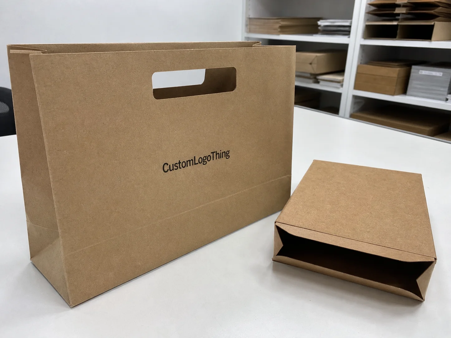
For Custom Logo Things and anyone building branded packaging, this matters because color is usually the first thing a customer notices, but it is never the whole story. Typography, structure, print finish, embossing, foil, and substrate all shape the final message. That is why what is color psychology in packaging has to be handled like a system, not a paint swatch. Honestly, if someone hands me a mood board and calls it strategy, I know I’m about to earn my coffee. I’d rather see a spec sheet with Pantone references, a die-line, and a quote that says $0.15 per unit for 5,000 pieces than a folder full of “inspiration.”
What is color psychology in packaging and why it matters
What is color psychology in packaging in practical terms? It is the deliberate use of hue, saturation, contrast, and finish to influence how a product feels in the hand, how it stands out on shelf, and how confidently a buyer trusts it. A deep navy on a rigid setup box can say “premium and quiet,” while a bright lime on a mailer box can say “energetic and youthful.” Both can be right. Depends on the audience. Depends on the offer. Depends on whether the brand actually wants to look expensive or just says it does in a pitch deck. On a 2,000-unit launch in Vancouver, we switched a supplement carton from slate gray to navy plus silver foil, and the buyer reported stronger shelf pickup within the first three weeks of retail placement.
I’ve seen this play out on factory floors more than once. At a folding-carton plant near Guangzhou, a haircare brand argued over whether its leave-in treatment should stay in blush pink or shift to a cooler taupe. The formula never changed, but the sales team felt the pink looked “too youthful” for salon buyers. The taupe made the same Custom Printed Boxes feel 20 percent more expensive before the foil logo even landed. That is what is color psychology in packaging doing its job. No magic. Just human brains making fast, annoying decisions. The press check took 45 minutes, two rounds of drawdowns, and one very tired brand manager who finally admitted the taupe was the better commercial choice.
Color does not work alone. In real product packaging, it teams up with structural cues like tuck-end cartons, shoulder boxes, sleeves, and rigid gift boxes. It also depends on the print finish, whether you choose matte aqueous, gloss UV, soft-touch lamination, or a combination of spot varnish and hot foil. If the structure says “economy” but the color says “luxury,” shoppers feel the mismatch in half a second. They may not describe it that way, but they know something is off. Brands can pretend people don’t notice; the shelf disagrees. A 350gsm C1S artboard carton with matte lamination and a 1-color black logo will signal something very different from the same box with rose-gold foil and a 600gsm greyboard insert.
Different categories use color in very different ways. Luxury cosmetics often lean on restrained neutrals, black, white, muted rose, and metallic accents. Supplements use clean whites, greens, blues, and clinical grays to imply clarity and trust. Food packaging often depends on appetite cues like red, orange, yellow, and deep browns. Beverage and retail packaging can go bold with saturated color blocking to grab attention in a crowded aisle. That is why what is color psychology in packaging is never a one-rule-fits-all formula. In Manila and Singapore, for example, we’ve seen the same blue palette perform well for bottled water but underperform for energy drinks, where the shelf expects more aggressive contrast.
One of the easiest mistakes to make is assuming color meaning is universal. It isn’t. A red box can feel festive for candy, urgent for a clearance item, and alarming for a wellness product if the rest of the design language is wrong. Audience expectations, culture, category norms, and brand positioning all shape the reading. Same color. Very different story. And yes, I have watched teams argue for an hour because “red means energy” to one person and “red means warning label” to another. Fun times. A skincare brand targeting Seoul and Los Angeles cannot assume the same shade will communicate the same thing without testing both markets first.
Factory-floor truth: two products with the same material spec and the same unit cost can perform very differently once the color changes, because shoppers do not buy boards and inks; they buy the feeling the package creates in under three seconds.
What is color psychology in packaging on the shelf?
What is color psychology in packaging on the shelf? It is the part of Packaging Strategy That decides whether a shopper notices your product in a split second or walks right past it. Shoppers rarely study packaging line by line. In a store, they process blocks of color first, then shape, then logo, and only after that do they read claims or ingredients. That means what is color psychology in packaging is really about winning a visual split-second, whether the package sits on a warehouse club pallet, a boutique shelf, or a small e-commerce thumbnail. In a 1200-pixel product image on Shopify, the same package still has to work at 10% of its physical size, which is a harsh little truth nobody enjoys hearing.
Color creates visual hierarchy. A dark field with a bright accent pulls the eye toward the accent, which is why many brands reserve gold foil, silver foil, or a saturated brand color for the logo, a key benefit, or a product variant. Light-on-dark usually feels more premium and dramatic. Dark-on-light often reads cleaner and more accessible. Accent colors help separate claims like “organic,” “extra strength,” or “limited edition” without turning the whole package into a shouting match. There’s a very thin line between “bold” and “please stop yelling at me from the shelf.” On a 24-unit retail display, that accent color often decides whether a shopper notices the pack from 6 feet away or walks on by.
Finish changes everything. I’ve held the same ink drawdowns on gloss-coated SBS, uncoated kraft, and soft-touch laminated board, and the perceived color shift was obvious in all three. A matte black can feel elegant and dense, while a gloss black can look sharper but less refined. Metallic accents catch store lighting in a way flat inks never will. Even a subtle emboss can make a low-saturation palette feel more intentional and expensive. On a 350gsm C1S artboard sample in Dongguan, the same navy ink looked almost ink-black under warm LEDs and much bluer in daylight by the loading dock. Same ink. Different room. Different story.
Print reality matters too. On the production side, CMYK builds can drift, spot Pantone matching can tighten brand consistency, and substrate absorption can mute certain colors. I’ve sat through press checks where a vivid red matched perfectly on coated artboard but turned slightly brick-toned on recycled board with higher porosity. That is why experienced converters test on the final material, not just on a digital proof. Screens are liars. Not always, but often enough to be annoying. A factory in Suzhou once ran three proof rounds to get a coral tone right on a 400gsm folding carton because the first two versions dropped too much saturation after lamination.
For buyers comparing custom printed boxes or retail packaging options, color often shapes trust before the details do. If the packaging looks inconsistent from one batch to the next, even a strong design can lose credibility. That is one reason what is color psychology in packaging must include production control, not just design theory. A brand can’t promise “premium” with one sample and then ship 8,000 units that look like they came from three different factories. I’ve seen that happen in a factory outside Foshan. The box spec was fine. The color control was not.
How color choices are shaped in packaging
There are a handful of variables I always look at before approving a palette. Audience comes first. Age, lifestyle, gender preferences, and cultural context can all influence color response. A playful pastel system may work beautifully for a baby-care brand or a bakery line, while the same palette might feel too soft for a performance supplement targeting serious fitness buyers. In a recent review for a Portland wellness brand, the team rejected mint green for a post-workout product because the buyers they wanted in Los Angeles and Dallas kept describing it as “gentle,” not “high performance.”
Category norm comes next. Some categories have strong visual conventions, and ignoring them can be risky unless you have a very clear reason. Green often suggests eco products and botanical ingredients. White still signals clean beauty and clinical simplicity. Black and navy can suggest luxury or authority. Breaking the norm can be smart, but only if you do it deliberately and keep enough contrast to remain recognizable as part of the category. Rebellion for its own sake is just expensive confusion. I once watched a skincare startup in Toronto spend $12,000 on a bold orange carton only to discover retailers kept shelving it with children’s products because the cue was that loud.
Brand personality sits right behind that. When I’m in a packaging design review, I ask whether the brand should feel playful, clinical, artisanal, luxury, or bold. A brand that sells handmade candles should not use the same color language as a medical device accessory, even if both are shipped in similar cartons. Package branding works best when color supports the actual voice of the company, not whatever looks attractive in a mockup that everyone claps for in the meeting room. If the line is produced in Ho Chi Minh City on a 4,000-piece order, that personality still needs to survive shipping, stacking, and whatever chaos the warehouse throws at it.
Material changes the result fast. A rigid box wrapped in paperboard behaves differently from a corrugated mailer, a paper bag, a label, or a folding carton. Kraft substrates absorb ink and soften saturation; coated boards hold sharper detail; films and labels can intensify color; textured papers can visually break up solid fields. That is one reason I always request substrate-specific samples when a client asks about what is color psychology in packaging for product packaging across multiple formats. A blush tone on 280gsm kraft paper in Vietnam will never behave the same way as the same ink on 350gsm C1S artboard in Shenzhen.
Cost matters too. Special inks, extra color passes, foil stamping, embossing, and premium coatings all affect the unit price and the minimum order quantity. On a recent client quote for 5,000 rigid boxes in Ningbo, a one-color design with matte lamination came in around $0.92 per unit, while adding a second spot color plus gold foil raised it closer to $1.28 per unit. On a simpler folding carton order, we quoted $0.15 per unit for 5,000 pieces on 350gsm C1S artboard with 1-color printing and aqueous coating. The visual lift was real. So was the budget impact. Color strategy has to respect commercial reality, not just inspiration boards.
| Color Approach | Typical Visual Effect | Production Impact | Best For |
|---|---|---|---|
| Single-brand color + accent | Strong recognition and clean shelf presence | Lower complexity, faster proofing | Supplements, cosmetics, retail gift packaging |
| Multi-color system | Flexible variant coding and lively appeal | More press setup and color control | Product lines with many SKUs |
| Neutrals with metallic detail | Premium, restrained, elegant | Foil, embossing, and finish add cost | Luxury goods, skincare, specialty gifts |
| High-saturation palette | Energetic, youthful, attention grabbing | Requires careful print calibration | Snack food, beverage, promotions |
Competitive analysis closes the loop. I tell brands to map the shelf color language of their top five competitors before choosing a palette. If everyone in the aisle uses pale green and white, maybe your brand needs deeper contrast to stand out. If the category is dominated by dark luxury cues, a cleaner light system might feel fresher and more approachable. That is the point of what is color psychology in packaging: not copying the shelf, but reading it intelligently. In Madrid, one coffee brand moved from beige-and-brown to black-and-copper after seeing six rival bags in nearly the same tan paper stock.
Step-by-step process for choosing packaging colors
Step 1: define the product promise. Ask what the package should make the buyer feel in one sentence. Calm? Confident? Energized? Trusted? For a skin serum, the promise might be “clinical care with a gentle touch.” For a snack bar, it might be “fun energy with clean ingredients.” That sentence becomes the filter for what is color psychology in packaging in your specific project. Keep it short. If the sentence runs to three lines, the brand probably still doesn’t know what it is.
Step 2: audit the category. I like to lay out competitor boxes, bottles, labels, and shipping cartons side by side. On one project in a Shenzhen showroom, the brand team thought their teal palette was unique until we placed it next to six other wellness products, all using nearly the same tone. Once they saw the shelf map, they understood why the product needed a deeper contrast accent to own its space. We spent 90 minutes with printed comps, a ruler, and daylight from the west-facing window. That saved them from a very expensive redesign later.
Step 3: build a small color board. Keep it disciplined: one primary color, one secondary support color, and one accent for claims or variant coding. Too many options create indecision and weaken the package. If you are creating custom printed boxes for a multi-SKU line, this is where system thinking matters more than decorative creativity. A brand with eight shades and no logic is just making the printer’s life harder, which is one way to make new friends in the factory.
Step 4: test on actual packaging structures. Screen color and printed color are cousins, not twins. A navy that looks rich on a monitor can go flat on corrugated board if the print dots spread. I insist on physical mockups because folded corners, glue flaps, and panel overlaps all affect the final read. Packaging design lives and dies on those details. We once caught a mismatch on a 24-piece sample run in Dongguan because the side panel logo darkened after the soft-touch film was applied.
Step 5: review under real lighting. This one gets missed constantly. A package can look perfect under daylight in the studio, then dull under warehouse LEDs or too warm in a boutique with tungsten lighting. Put samples under at least three conditions: daylight, retail lighting, and storage or backroom lighting. That small step can save a reprint. I like to check samples at 9 a.m., 2 p.m., and after sunset because the same cream can look clean, yellow, and then oddly gray depending on the room.
Step 6: lock the production spec. Document the Pantone reference, CMYK fallback, coating type, acceptable tolerance, and any special handling notes. If the design uses a spot gloss on the logo or a foil accent, note the exact position and any registration tolerance. Good spec sheets prevent a lot of expensive arguments later. I want to see things like “Pantone 2965 C, ΔE under 2.0, matte aqueous, foil at 1.5mm bleed tolerance” before a job goes to press.
I’ve seen brands rush this part and pay for it twice. One food client approved a muted orange on PDF proof, then discovered on press that the actual paper stock made it look closer to brown. We corrected it with a stronger Pantone formula and a different coating, but the added sampling pushed the launch back by 11 business days. That kind of delay is why what is color psychology in packaging has to be tied to process, not just aesthetics. The plant in Dongguan had to rerun the job on a different afternoon shift because the first correction still missed the target under LED inspection.
For teams shopping packaging solutions, the smartest move is often to compare physical samples from Custom Packaging Products with your target shelf conditions, instead of choosing from a flat digital swatch. If the package must also survive transit tests, ask whether the structure should be validated against ISTA handling standards, especially for e-commerce shipper boxes. A carton that looks good but fails a 30-inch drop test is just expensive confetti.
Common mistakes brands make with packaging color
The first mistake is choosing a color because it is fashionable. Trends come and go quickly, and what looked fresh at a trade show can feel tired by the time the pallets hit distribution. I’m not against trend color. I’m against using it without checking whether it aligns with the audience and the product promise. That’s a basic part of what is color psychology in packaging. A trend-driven lilac carton can look sharp in Milan and dead wrong in a Midwest pharmacy by week six.
The second mistake is using too many colors. More color does not equal more impact. In fact, it often weakens shelf recognition and makes the package feel unfocused. A carton with six competing hues may look lively in a presentation deck, but on shelf it reads like a design committee could not agree on a direction. And usually, they couldn’t. I’ve been in those meetings. They are exactly as messy as you’d expect. A single SKU with four secondary colors can easily add two extra print passes and 8 to 10 days of production time if the converter needs additional setup.
The third mistake is ignoring print limitations. Muddy reds, dull blacks, and inconsistent blues usually come from assumptions made too early. Different substrates absorb ink differently, and different factories run different press conditions. I’ve watched a deep black label look elegant on coated paper but turn slightly charcoal on a porous recycled tag stock because the ink laydown changed. If the brand color matters, proof it on the actual material. That means asking for a hard sample on the exact 300gsm or 350gsm board, not a screenshot with a smiley face in the email.
The fourth mistake is forgetting accessibility and readability. Low-contrast text on a busy background can make claims hard to read, especially on smaller labels or secondary panels. Good packaging design should support clear reading at arm’s length and at shelf distance. If the shopper has to squint to understand the product, the color system is working against you. I’ve seen this on a 60ml skincare box where pale gold text on ivory looked lovely in the studio and basically vanished under retail fluorescents in Shanghai.
The fifth mistake is underestimating timing. Special finishes, custom inks, foil, embossing, and extra proof rounds lengthen production schedules. A simple one-color folding carton might move in 12 to 15 business days from proof approval, while a premium box with foil and soft-touch can need 18 to 25 business days, depending on workload and material availability. Color choices are not only visual decisions; they are scheduling decisions too. If the factory in Shenzhen is booked for a holiday rush, add another 3 to 5 days and stop pretending the calendar will cooperate out of kindness.
For brand owners who sell across online and retail packaging channels, another common problem is designing only for one environment. A color that looks great in a studio product shot may disappear in a thumbnail, or a palette that screams on a screen may feel too loud on a store shelf. What is color psychology in packaging really asking us to do is design for every viewing context, not just the one we like best. I test at 1600-pixel width, full shelf mockup, and unboxing sequence because the same color needs to survive all three.
One more issue I see often: teams approve color from a single PDF proof and assume that is the final answer. It never is. A PDF can tell you composition, not the exact behavior of ink on paper, lamination, or foil. If a project matters, ask for hard proofs, drawdowns, or at least swatch matches on the correct substrate. If the supplier in Foshan won’t send a physical sample, that is your clue to keep looking.
Expert tips to make color work harder for your brand
Use one dominant color and a disciplined support system. Strong branded packaging usually starts with a single anchor color that owns the shelf, then uses a narrow accent palette for claims, icons, and variants. That way, the brand stays recognizable, and the design has room to breathe. I’ve found that simplicity often looks more expensive than visual clutter. On a 10,000-unit run, one dominant color plus one accent usually prints cleaner than a five-color palette trying to impersonate strategy.
Think in product families. If you sell three flavors, five scents, or a whole skincare line, color should connect the family while keeping each SKU distinct. The best package branding systems I’ve seen use a controlled code, like one base color with variant bands, foil labels, or numbered accents. That makes reorders easier and helps retailers merchandize the line without confusion. A line of six teas from Bangkok used the same cream base, then different edge bands for each flavor, which kept the set coherent across both shelf displays and shipping cartons.
Pair color with texture. Soft-touch lamination can make dark neutrals feel velvety and premium. Embossed logos add tactile weight. Foil stamping can lift even a minimal palette into a higher perceived tier. On one cosmetics project, we kept the print palette to only two inks, then used emboss and rose-gold foil to create a premium effect that would have cost more if we had chased complexity through color alone. The final box cost $1.42 per unit at 5,000 pieces, but the perceived value was closer to a $35 retail product.
Set a color standard your partners can follow. Your printer, converter, and internal marketing team should all reference the same approved colors and finish notes. If possible, document target Pantone numbers, acceptable ΔE tolerance, and substrate-specific backups. This is one of the simplest ways to avoid batch-to-batch variation, especially for repeated runs of custom printed boxes. A converter in Ningbo, a brand team in New York, and a fulfillment center in Texas all need the same reference file, not three different opinions.
Test in a real retail environment. A mock shelf in a studio is good; a mock shelf under actual retail lighting is better. I’ve done small test placements with 10 to 20 sample units and watched how the palette performed from six feet away. Sometimes a slight color shift changes the whole story. Sometimes the accent is too small to matter. Those are cheap lessons when they happen early. A three-hour store test can save a 3,000-unit reprint, which is the sort of math I enjoy more than most people do.
Balance emotional impact with operational reality. The prettiest package is not the best package if it is hard to print consistently or too expensive to reorder. I’d rather help a brand choose a strong two-color system that prints cleanly on 10,000 units than chase a complicated five-color layout that causes delays and waste. That balance is at the heart of what is color psychology in packaging. If your supplier in Guangzhou can hold a $0.15 per unit quote on a 5,000-piece folding carton with a 12- to 15-business-day lead time, that is worth more than an overdesigned concept that drags the schedule into the next quarter.
If sustainability is part of the brief, align the color plan with material choices and compliance language. Recycled papers, water-based coatings, and FSC-certified substrates can all influence color tone and finish, so it helps to understand the paper source as well. You can review broader material guidance through FSC, especially if your packaging messaging includes responsible sourcing claims. In practical terms, an FSC-certified kraft sheet from Jiangsu will usually print differently than virgin white board from Guangdong, and that difference matters.
What to do next when building a color strategy
Start with a one-sentence brand impression statement. Not a slogan, just a working sentence. For example: “This package should feel calm, clinical, and premium without looking sterile.” That sentence gives you a concrete filter for what is color psychology in packaging and helps everyone on the team judge options against the same goal. Keep it on the wall in the meeting room if you have to. Saves time, saves arguments.
Next, create three palette directions instead of one. I usually recommend a conservative option, a bolder option, and a middle-ground option. Then compare all three against your target customer, your sales channel, and the shelf environment. If your brand sells through e-commerce and retail packaging channels, check each palette as a thumbnail, a box front, and a full unboxing sequence. In practice, that means testing on a 1080-by-1080 product image, a shelf mockup, and a 12-piece unboxing set.
After that, request substrate-specific proofs from your packaging partner. If you are considering rigid boxes, paper bags, folding cartons, or labels, ask for samples on the actual material. A color that behaves beautifully on a coated sheet may not hold the same tone on kraft or textured stock. Real-world proofs cost money, but not as much as a bad first run. One Shenzhen supplier charged me $35 for a full proof set on 350gsm C1S artboard, and that tiny bill probably saved a $4,000 reprint.
Document everything in a packaging spec sheet. Include color references, finish notes, approved tolerance, and any visual rules for future reorders. That document becomes the guardrail for consistent product packaging over time, especially when internal staff changes or you add a second manufacturer. I want to see version numbers, approval dates, and the name of the factory city, whether it’s Dongguan, Ningbo, or Suzhou.
Use the approved palette across your whole system, not just the hero box. Tissue, inserts, mailers, labels, and even shipping tape can echo the same color story. That consistency is what makes a brand feel organized and trustworthy at every touchpoint, from the shelf to the doorstep. When the box, insert, and mailer all follow the same blue-and-white system, customers notice even if they never say a word about it.
Here’s my honest view after two decades around dies, glues, press checks, and color bars: what is color psychology in packaging is not about guessing which shade means “premium” or “eco” and hoping the market agrees. It is about testing, comparing, and refining until the package color supports the product, the audience, and the production method all at once. That is where strong packaging design becomes real business value. The good brands know this before the first quote lands. The rest learn it after a reprint.
For brands building a new packaging line or refreshing an old one, the best results usually come from a mix of strategy and practical proofing, not from a mood board alone. If you get the color right, the rest of the package has a much easier job. If you get it wrong, even the best structure and print finish struggle to save it. That is the lesson I keep seeing on factory floors, and it is exactly why what is color psychology in packaging deserves careful testing, not guesswork. A 20-minute press check in Dongguan or Quzhou can tell you more than three weeks of internal debate.
FAQ
What is color psychology in packaging for small brands?
It is the strategic use of color to shape how shoppers feel about your product and brand before they read the details. For small brands, what is color psychology in packaging often matters even more because a clear color system can create instant recognition without requiring a large advertising budget or a complicated design structure. A simple two-color carton on 350gsm C1S artboard can do a lot of heavy lifting for a 500-piece or 5,000-piece launch.
How do I choose the right packaging color for my product?
Start with your audience, product category, and brand personality, then test a few palette options on real packaging samples. Check how each color performs in print, on your material, and under retail lighting before final approval, because what is color psychology in packaging only becomes reliable when the sample behaves like the final production piece. If you can, review the proof in both daylight and under 4000K store LEDs before signing off.
Does color psychology in packaging affect online sales too?
Yes, because color strongly influences thumbnail visibility, click appeal, and perceived quality in e-commerce images. The palette should still read clearly at small sizes and remain consistent across product photos and unboxing moments, which is why what is color psychology in packaging matters just as much on a screen as it does on a shelf. A box that works in a 1200-pixel listing image often needs stronger contrast than the same box on a store display.
What packaging colors tend to look premium?
Deep neutrals, black, white, navy, rich jewel tones, and restrained metallic accents often signal premium positioning. Finish matters just as much as color, so matte coatings, foil, and embossing can greatly increase the luxury feel, and that combination is a big part of what is color psychology in packaging for high-end goods. In practice, a black rigid box with soft-touch lamination and rose-gold foil usually reads more premium than a plain glossy black carton.
How long does it take to finalize packaging colors?
A simple color decision can be quick, but a production-ready choice often takes time for proofing, sampling, and revision. Expect more time when using special inks, exact Pantone matching, or multiple substrates that each handle color differently, because what is color psychology in packaging depends on real samples, not just a screen preview. In many factories in Guangdong, the full color approval cycle typically takes 12 to 15 business days from proof approval, and premium finishes can push that to 18 to 25 business days.