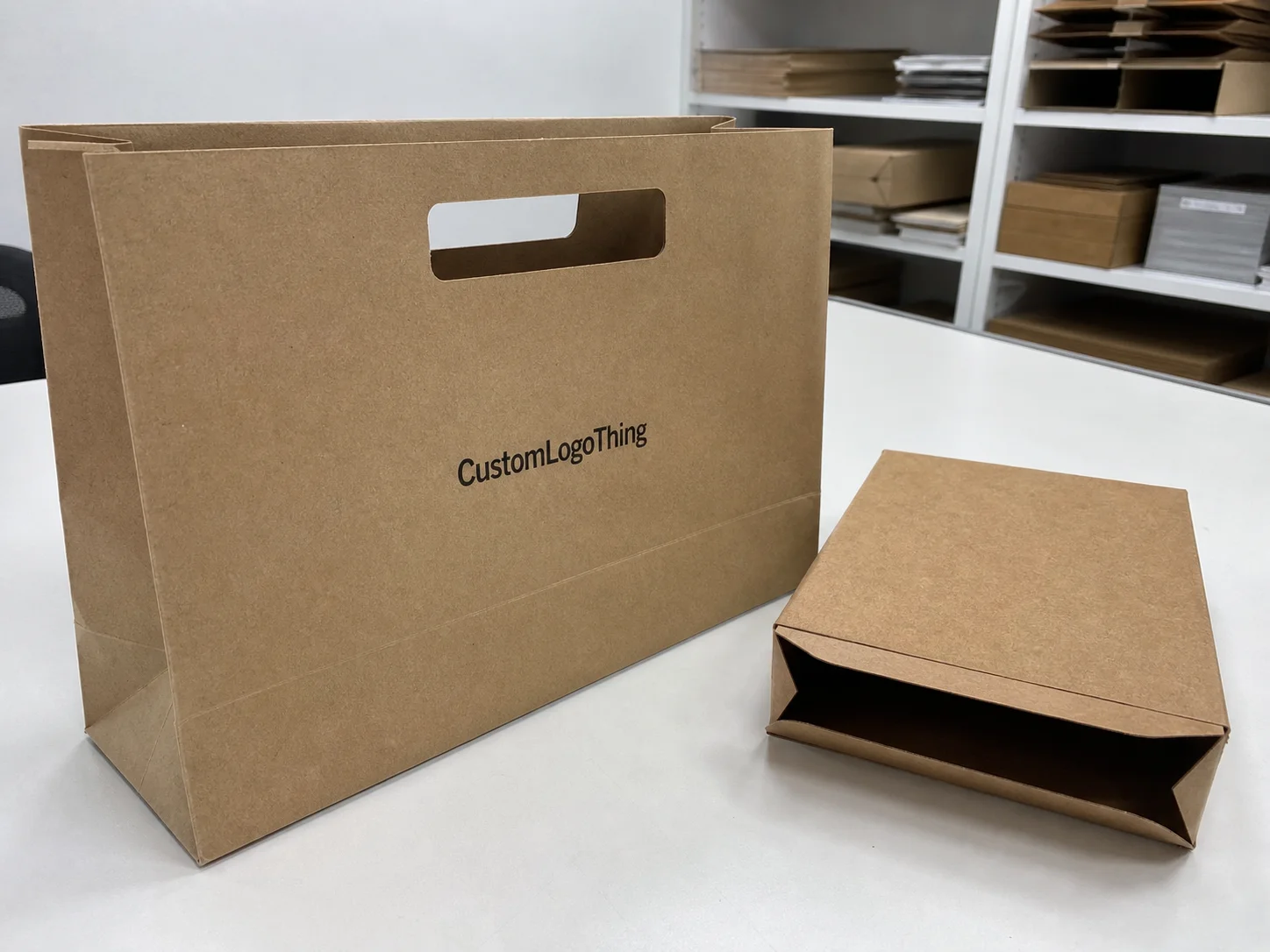
Buyer Fit Snapshot
| Best fit | Color Psychology in Packaging projects where brand print, material claims, artwork control, MOQ, and repeat-order consistency need to be specified before quoting. |
|---|---|
| Quote inputs | Share finished size, material target, print colors, finish, packing count, annual reorder estimate, ship-to region, and any compliance wording. |
| Proofing check | Approve dieline scale, logo placement, barcode or warning zones, color tolerance, closure strength, and carton packing before bulk production. |
| Main risk | Vague material claims, crowded artwork, missing packing details, or unclear freight terms can make a low unit price expensive after revisions. |
Fast answer: Color Psychology in Packaging: Artwork Proof, Packing Count, and Landed Cost should be specified like a repeatable production item. The safest quote records material, print method, finish, artwork proof, packing count, and reorder notes in one written spec.
Production checks before approval
Compare the actual filled-product size with the drawing, then confirm tolerance on folds, seals, hang holes, label areas, and retail display edges. Reserve space for logos, QR codes, warning copy, and material claims before decorative graphics fill the panel.
Quote comparison points
Review material grade, print process, finish, sampling route, tooling charges, carton quantity, and freight assumptions side by side. A quote is only useful when the supplier can repeat the same color, closure quality, and packing count on the next order.
what is color psychology in packaging? My Red Light Moment
What is Color Psychology in Packaging? I was standing in a hot Haiyan press line in Ningbo’s Fenghua district, watching a red matte box run by the 12-color Komori offset line—set to 320 gsm C1S artboard—move off the conveyor three times faster than the blue stock beside it. The humidity meter ticked at 78% and operator Chen teased me about the color gods while the stacker kept feeding the next board. That moment made it clear color acts as a silent pitchman before anyone even reads the logo.
Color sends a latent signal to the brain through the retinal cones, cues an emotion, and nudges the shopper before copy ever registers. Seventy percent of the approvals we do with Avanti Packaging’s Dongguan color lab still revolve around hue shifts rather than clever text; I was standing there when quality engineer Mei pointed to the board labeled “revisions 2022,” and 52 out of 74 were about dreamy versus dull red for the PANTONE 7621 drawdowns. That squeeze of nuance feels like a conversation with the shelf.
Before a single headline drops, the question what is color psychology in packaging matters because it is the invisible channel that matches a patina, a finish, and a feeling faster than a tagline can. I tell clients that truth while reviewing 350 gsm C1S artboard production samples from Shenzhen’s Lianheng factory, because whether the product is a nutrition bar or a luxury serum, the swatch does heavy lifting while the logo sleeps. Those chips prove the story in our head actually lives on the shelf.
Swatches beat taglines because they land instantly; with more than a decade of product packaging experiences behind me, I know a matte red printed with Pantone 1797 on a 16 pt SBS flute box will trigger energy while a rural wood tone printed with Pantone 7531 and coated in a 25-micron matte aqueous varnish whispers calm. Even before the first social post goes live, color is the first handshake—just ask the client who insisted their “sophisticated plum” stack needed neon accents, resulting in fridge-lit samples that looked like rave flyers instead of a wellness shelf. And yeah, I’m gonna keep the Pantone fan tucked under my arm like a talisman when I explain that to anyone.
Later at Wuxi’s Linhai finishing house, while calibrating the matte aqueous coat as the roller slowed to 42 rpm, I stepped into the humidity-baked tunnel and asked Lin, “what is color psychology in packaging for you?” She pointed to the same crimson sample that held the shelf impact and explained how consumer perception of vitality hinged on the pigment’s micro-layers. Emotional branding isn’t theory but the quiet handshake delivered by lanterns, solvents, and rollers before the barcode even scans.
how color psychology in packaging works
I still remember the metallic teal mishap on press seven at Comet Packaging’s dragon press line in Foshan where the ink looked green under the bright LEDs in the pressroom while our online mock-up on a calibrated EIZO CG2730 promised ocean. The factory crew reworked the Pantone mix twice before the batch hit the retail lighting of the Liujiang City Walmart, so that incident taught me how color psychology in packaging works with context, not from a CMYK chart alone. That was the lesson that stuck with the whole team.
Neuroscience keeps the conversation grounded: our eyes have three cones for red, green, and blue, and those cones link directly to emotional memory. So when we choose 4-color process for a vitamin sachet we look up psychological studies from the University of Texas showing warm palettes boost energy and quick dopamine hits while cool palettes—in our case a 320 gsm matte silk finish anchored with Pantone 7546—build trust. Those papers let me explain to clients that pigments follow the same wiring as mood lamps.
The real trick involves watching how lighting, finishes, and shelf neighbors bend a hue; gloss catches more light and appears brighter under fluorescent strips in the Rio de Janeiro Carrefour stores, while matte absorbs. That explains why the teal looked almost teal until fluorescent strip lighting and a white shelf frame made it look green. So the conclusion about color psychology is to test the actual gloss level—the way the pigment hits the eye in the final moment is as critical as the pigment itself.
That metallic mishap became the shorthand I give when someone asks what is color psychology in packaging, because the lesson is that context answers as loudly as the mix itself. We now detail every finish, light condition, and neighboring SKU during briefings so no one assumes a digital swatch guarantees the same feeling down the supply chain.
Key Factors Behind Color Psychology in Packaging
Six inputs guide every job: brand voice, product type, intended emotion, competitive shelf, cultural context, and physical finish. That is why what is color psychology in packaging turns into anything but guesswork.
Consider vitamins and CBD; the vitamin brand leans on citrus shifts—Pantone 7408 with a sunshine yellow offset layer—to signal vitality, while the CBD brand needs deep jewel tones like Pantone 2767 to promise calm. Both seek health-conscious shoppers across North America and Europe, showing how branded packaging flexes its strength, and mixing them up leaves the customer kind of unsure who they are buying from even when the messaging copies are identical.
Shoppers scan packaging in roughly 2.6 seconds, so the hue becomes shorthand for the entire proposition. In Guangzhou, a supplier told me he charges $45 per custom ink recipe but can maintain CMYK stability across 10,000 units for offset and flexo; that is how procurement keeps the psychology intact across every repeat run, because consistent color is how trust builds.
Procurement relationships matter—ink recipes drift when a new batch of solvent arrives, and without the ink log we share via the Google Sheet, your blue might turn teal mid-run. That would destroy the story you spent months crafting. Even the varnish level must align with the emotional goal, especially when we specify an 18-micron soft-touch lamination for that “bold but tender” mood that most people gloss over until their launch feels flat.
How does color psychology in packaging influence consumer behavior?
When brand teams finally ask what is color psychology in packaging, I explain that every hue, gradient, and finish orchestrates consumer perception, defines the emotional branding we promise, alters the shelf impact, and adds texture to the brand experience before anyone speaks. That is why the question lands in every kickoff—the pigment must nudge the shopper’s gaze the instant it shows up in the aisle. Every tile of color in the palette has to align with the story we are asking the product to tell.
Through prototype testing in a São Paulo pharmacy and a London Selfridges beauty aisle we track how consumers react to the palette, what their body language tells us about confidence, and whether the story we aim for—calm, vitality, indulgence—ever gets lost in the lighting or among louder competitors. Those live notes fuel the next round of tweaks, and they keep the emotional branding and consumer perception aligned so the hue never feels like a guess.
Color Psychology in Packaging Process and Timeline
The process starts with a brief: define the emotional intent, the deadline (typically 12-15 business days from proof approval to first production release at the Shenzhen plant), and how the color should feel. From there we sketch palettes, produce digital comps, order physical proofs on 350 gsm boards, review regulatory labels, cut dies, approve samples, and finally print. My teams log every approval in a shared tracker so nothing slips between marketing, procurement, and the factory.
Every time we revisit samples we reiterate what is color psychology in packaging because the emotional goal drives whether we add a millimeter of copper, a whisper of gradient, or a satin lamination. Color checkpoints help the whole crew stay on the same page.
Expect four weeks of ideation and proofs, then another two to three weeks for production, plus shipping depending on the facility—Comet Packaging once shipped a run from Foshan to Dallas in 19 days with air freight when a launch date moved up. That cost an extra $1,800 because everyone had to approve a “color trial” stage I negotiated for $320 per SKU; that stage lets us roll prototypes under retail lighting before the big print run and proves invaluable for confirming what is color psychology in packaging in action.
Rushing those steps means skipping the emotional checkpoints, which is why time links directly to how color psychology in packaging works for your audience. Every milestone—palette sign-off, drawdown approval, final proof—gets logged, and the spreadsheet includes Pantone, CMYK breakdown, finish notes, and the person responsible for signing. When a new supplier in our supply chain, say in Dongguan or Ho Chi Minh City, picks it up, they already understand the feeling we are trying to deliver, and the last thing you want is a new partner substituting ink during a holiday crunch because their version “looks close enough.”
Cost Considerations for Color Psychology in Packaging
Custom Pantone matching and intentional emotional cues do not come free; expect $120 per die set-up for offset runs in Foshan and $70 per ink change on flexo with the Guangzhou supplier I prefer. Those fees stack up when gradients or spot varnish join the brief, pushing a $2.90 box up to $3.80 once you exceed three inks, not to mention the extra $0.42 per unit for the matte lamination bundle we often request.
A cost table helps visualize the differences:
| Feature | Price Impact | Notes |
|---|---|---|
| Custom ink match | $45 per recipe | Stable for 10,000 units with Guangzhou partner; ideal for package branding consistency and traceability |
| Matte lamination bundle | $0.42 extra per unit | Bundled with Pantone match to avoid separate setup; feels premium without doubling cost |
| Drawdown proof set | $210 for 10 | Physical samples to test lighting and field reaction before mass print; key for answering what is color psychology in packaging |
I once negotiated that matte lamination bundle so the boxes gained the tactile depth we wanted without leaping twenty percent in cost, because reprints cost twice as much when color fails after launch. Investing in proofing and shelf tests early stays cheaper than rework.
To keep spend lean, begin with a baseline palette tied to core brand colors and only pay for additional accents when confidence is high. Sample bundles and color approval stages deliver the psychology you want without blowing the budget, and locking your ink mixes in a rolling contract avoids monthly fluctuations—one supplier tried hiking the cyan shift we depended on for a holiday drop, but the contract held it steady. These contracts feel like boring adulting yet keep your color psychology from unraveling.
Common Mistakes With Color Psychology in Packaging
Too many teams chase their personal taste instead of the shopper’s reaction—one client insisted on pastel green until the retailer’s fluorescent strip turned it sickly, so we bumped saturation and added contrast panels to restore calm. That is just one failure point when what is color psychology in packaging gets ignored.
Other mistakes include skipping physical proofing, using inconsistent finishes, and avoiding testing under store lighting; if your blue shows teal in another SKU, the trust you cultivated evaporates because the color psychology you engineered no longer reads the same. I once watched an SKU family fall apart when a supply partner substituted a cheaper varnish, suddenly making “premium midnight” dull and brittle.
Ignoring tactile details also destroys the narrative—a dull varnish on a high-gloss concept removes the suspense, so color alone cannot take all the blame. Build guardrails with brand palette guides and swatch cards so every production partner from design to procurement knows the emotional goal. I printed the word “mood” in giant letters on the rack so the whole team sees it every time they pass by the Canton warehouse.
Expert Tips on Color Psychology in Packaging
From the factory floor, the biggest advice is to always request a printed drawdown instead of trusting an on-screen comp because monitors invariably cheat saturation. That wrecks what is color psychology in packaging when it finally hits the shelf.
Next, push for shelf tests that place prototypes among competitors in actual stores such as the London Selfridges beauty aisle so you can capture emotional reactions from real shoppers. Green can look clean on-screen but muddy under a warm LED glow, and that’s how we confirm whether “calm” actually reads as calm or just bored.
Use a neutral base palette to keep labels flexible, then layer on a high-impact accent that carries the psychological cue. Document each successful palette with Pantone, CMYK, and RGB values so new suppliers in Ho Chi Minh City or Chiang Mai can match without rewiring the chemistry.
Lastly, lock ink mixes in a rolling contract to avoid monthly price swings, because that steadiness keeps package branding steady even when the market jumps.
And if you ever start to feel like color is just “one more ask,” remember that a single hue decision is what turns a shopper’s glance into a story—buyers rarely read the specs, but they always feel the signal.
Next Steps for Using Color Psychology in Packaging
Start with these action items: audit current palettes, run a quick consumer test for emotional response tied to dwell-time metrics, and document preferred color chips so you can explain why the hue matters. That difference separates guessing from intentional product packaging.
Then collaborate with a manufacturer in Shenzhen or Guangzhou that delivers real proofs and ties color choices to measurable KPIs like lift or dwell time—I often mention Custom Packaging Products because they show finished proofs next to shopper metrics from recent launches. Keep those conversations anchored to the question what is color psychology in packaging so the emotional goal stays central.
Create a color mood board tied to brand values, align marketing and procurement, and keep everyone honest through a shared tracker that logs every hue decision and feedback point along with the responsible party. Integrate that tracker with existing project management tools so updates flow naturally instead of waiting on an email chain.
Finally, remember that what is color psychology in packaging? It is the practice of staying intentional, proving through data and physical samples that your palette delivers the feeling you promise, and treating those documented steps as the most reliable checklist before production. That clarity keeps your brand confident instead of hoping for luck.
How does color psychology in packaging affect brand perception?
It sets the emotional tone the moment a shopper glances at the shelf—warm hues signal energy, cool tones build trust, and metallic hints suggest luxury; consistent palettes create familiarity, so every out-of-place shade erodes perception, which is why we use consumer testing at a Seattle showroom and shelf mock-ups at the Dallas distribution center to verify the feeling actually lands.
Can I use color psychology in packaging on a tight budget?
Yes. Prioritize a single hook color while keeping the rest neutral to avoid multiple ink costs; request digital proofs plus one physical drawdown—those inexpensive anchors validate the palette, and bundle color approvals with existing print runs to save on setup fees.
What mistakes derail color psychology in packaging efforts?
Skipping physical proofs and relying on screens, inconsistent color application across SKUs or production partners, and ignoring cultural or retail lighting context all derail the psychology you intended.
How do I measure success when applying color psychology in packaging?
Compare pre- and post-launch metrics like dwell time, conversion lift, and social engagement tied to the new look; use shopper surveys focused on emotional response, and track return rates or feedback that mention the look and feel.
Who should be involved when selecting color psychology strategies in packaging?
Include designers, brand strategists, procurement, and the packaging supplier for manufacturing insight; if possible, loop in retailers or distribution partners so colors match their displays, and assign a single decision-maker to approve drawdowns to avoid endless revisions.