Buyer Fit Snapshot
| Best fit | Ai Generated Poly Mailer Artwork for Better Prints projects where brand print, material claims, artwork control, MOQ, and repeat-order consistency need to be specified before quoting. |
|---|---|
| Quote inputs | Share finished size, material target, print colors, finish, packing count, annual reorder estimate, ship-to region, and any compliance wording. |
| Proofing check | Approve dieline scale, logo placement, barcode or warning zones, color tolerance, closure strength, and carton packing before bulk production. |
| Main risk | Vague material claims, crowded artwork, missing packing details, or unclear freight terms can make a low unit price expensive after revisions. |
Fast answer: Ai Generated Poly Mailer Artwork for Better Prints: Film, Print, MOQ, and Carton Packing should be specified like a repeatable production item. The safest quote records material, print method, finish, artwork proof, packing count, and reorder notes in one written spec.
Production checks before approval
Compare the actual filled-product size with the drawing, then confirm tolerance on folds, seals, hang holes, label areas, and retail display edges. Reserve space for logos, QR codes, warning copy, and material claims before decorative graphics fill the panel.
Quote comparison points
Review material grade, print process, finish, sampling route, tooling charges, carton quantity, and freight assumptions side by side. A quote is only useful when the supplier can repeat the same color, closure quality, and packing count on the next order.
Ai Generated Poly Mailer Artwork Tips: Why It Matters
I’ve stood beside enough flexo presses in Shenzhen and Dongguan to know this much: artwork that looks flawless on a laptop can still fail the moment it meets a moving web of polyethylene film, and that is exactly why ai generated poly mailer artwork tips matter so much. The biggest headaches I’ve seen were not caused by bad intent or sloppy branding; they came from thin lines that vanished, gradients that banded, and tiny type that turned into gray fuzz once the ink hit a 50-micron or 60-micron mailer. I still remember one late-night proof where a “simple” slogan looked crisp in Photoshop and then turned into a faint whisper on press — honestly, it was the sort of thing that makes a prepress room go very quiet for about five seconds. In one Guangzhou run using a 6-color flexo line, a 0.4 pt border disappeared entirely on the first pass, and the fix took another proof cycle plus 2 extra business days.
When people say AI-generated artwork, I mean the concept stage, not a finished print file. It can be a layout idea, a mascot illustration, a background pattern, a color mood board, or a full front-and-back mailer mockup created in a generative design tool and then refined for production. That distinction matters because a poly mailer is not a poster, not a brochure, and certainly not a social media graphic. It is a flexible packaging surface with seal zones, gusset behavior, zipper or adhesive constraints, and a print process that rewards simplicity and punishes loose thinking. A standard ecommerce bag might use 2-inch side gussets, a 1-inch top seal, and a 50-micron coextruded LDPE/LLDPE film, which means every millimeter of artwork placement has a physical consequence. Packaging has a way of humbling everyone eventually.
In my experience, brands get the fastest results when they treat AI as a sketchbook, not a press operator. The best ai generated poly mailer artwork tips I can give are the ones that keep you honest about what the film can actually hold. A beautiful concept still has to survive plate making, ink mixing, registration tolerances, and the pressure of a production run that may be 5,000 pieces or 100,000 pieces. If the design cannot be printed cleanly on a moving web, it is not ready. On a 5,000-piece order, a straightforward two-color mailer might print at roughly $0.15 per unit after setup, while a more complex 4-color build can climb closer to $0.24 to $0.32 per unit depending on plate count and ink coverage.
There is also a practical brand lesson here. AI can speed up ideation, but it cannot replace print-prep knowledge, material awareness, or the judgment of someone who has seen what happens when a logo crosses a tear notch or a barcode lands too close to a seal bar. Most people underestimate the gap between “inspiration artwork” and “press-ready artwork.” That gap is where real packaging work lives, and ai generated poly mailer artwork tips are most useful when they help close it. I’ve seen teams in Dongguan and Nanhai lose a full approval cycle because an AI layout ignored the 8 mm quiet zone needed around the seal bar.
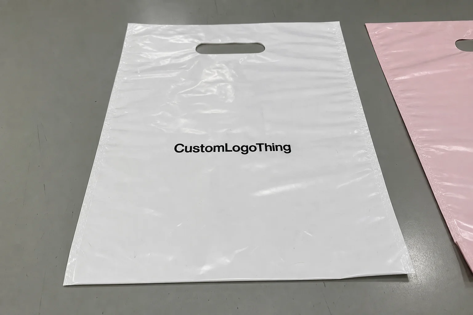
My goal here is simple: help you turn AI concepts into manufacturable, brand-safe, cost-efficient mailer graphics for Custom Poly Mailers, whether you are doing a one-color promo run or a fully branded e-commerce shipment bag with a more complex illustration system. If you’re buying packaging across channels, you can also cross-reference these ideas with our broader Custom Packaging Products selection, because the same discipline shows up in boxes, bags, inserts, and labels too. A lot of teams in Los Angeles, Chicago, and Austin now use the same brand artwork rules across poly mailers, tissue paper, and carton labels, and the consistency pays off quickly in customer recognition.
How Ai Generated Poly Mailer Artwork Tips Work in Real Production
The workflow starts long before the first plate is made. Good ai generated poly mailer artwork tips begin with a prompt that describes the brand voice, the target customer, the retail or subscription use case, the acceptable color family, and the actual mailer format you are designing for. If you are making a 10 x 13 inch poly mailer with a 2-inch flap and a tamper strip, say that up front. If the art must sit away from a 1-inch seal zone or a gusset fold, include that too. Otherwise, the AI will happily create something gorgeous that ignores the bag’s geometry completely, which is a very expensive kind of optimism. In practice, I like prompts that also name the substrate, such as a matte white 60-micron film or a glossy coextruded bag with 1-color black ink, because the output gets more realistic when the prompt is tied to the actual material.
From there, the strongest concept direction is usually selected from several AI-generated options, then rebuilt in Adobe Illustrator, ArtPro, or another professional package. That rebuild step is where many projects become real. At the factory floor level, we are looking at die line alignment, repeat length, ink coverage, plate limits, and whether the design can be separated cleanly for flexographic or gravure production. I have watched operators at a film-printing line reject a gorgeous concept because the text stroke was only 0.2 pt and disappeared on the first pass. On-screen, it looked elegant. On press, it looked like a mistake. A prepress team in Shenzhen can usually tell within 60 seconds whether a file is headed for a smooth 12- to 15-business-day production window or a longer revision loop that adds another week.
AI-generated assets tend to fall into a handful of categories that work especially well on mailers: logos, repeating patterns, mascot art, background textures, promotional panel layouts, and simple icon systems. Each one behaves differently under production conditions. A bold mascot with two or three flat colors often prints beautifully. A photorealistic floral scene with soft shadow transitions and a lot of fine detail may need serious cleanup, or it may need to be simplified entirely. That is one of the clearest ai generated poly mailer artwork tips I repeat to clients: if the idea needs twelve shades to feel rich, it is probably too busy for a flexible film surface. On a 60-micron matte mailer printed in Suzhou, a clean 3-color layout typically outperforms an 8-tone image every single time.
Human review is non-negotiable. A designer or prepress technician should check typography, spacing, legal usage rights, and brand consistency before any file moves forward. I’ve sat in supplier meetings where a marketing team loved an AI-generated pattern, but one look at the file showed a logo that had drifted 12 mm off center and a font that was not part of the approved brand system. That is not a creative problem; it is a production and brand control problem. The people who save the most time are the ones who catch it before proofing begins. In many factories around Guangzhou, that review happens before a plate quote is even issued, and it saves both sides from paying for a needless proof.
Color behavior also changes the game. A design that glows on an RGB screen can print flatter on polyethylene film, especially if you are using a matte white mailer or a recycled film blend with a slightly uneven surface. Flexographic and gravure processes do not reward every visual trick equally. Deep blacks, bold spot colors, and well-separated brand accents usually hold better than high-noise textures and tiny tonal shifts. If you want the short version of ai generated poly mailer artwork tips: design for the press, not the prompt. On a recycled-content bag made with 30% post-consumer resin, I would expect slightly softer ink holdout and a longer proof discussion, often 1 extra round if the palette is tightly color-critical.
Key Factors to Review Before You Approve AI Artwork
The first thing I review is file format. If the artwork arrives as a screenshot, a flattened low-resolution JPG, or a PDF with no editable layers, I know revisions will take longer and cost more. For Custom Poly Mailers, you want source files that can be edited, separated, and scaled without distortion. Vector artwork is ideal for logos, type, and line work, while raster elements should be high resolution at final size, usually 300 dpi or better for smaller graphics. This is one of the most practical ai generated poly mailer artwork tips because bad file hygiene is one of the fastest ways to lose time. A clean AI concept converted into a layered AI, EPS, or editable PDF usually moves through prepress in 1 to 2 business days, while a flattened file can add 3 to 5 days of back-and-forth.
Color management comes next. AI tools often create beautiful hues that are not directly printable without conversion. If your design depends on a neon lavender, a muted sage, or a metallic-looking blue, the packaging partner Needs to Know whether you are targeting CMYK build, Pantone matching, or a specific ink recipe. On film, color does not behave like it does on coated paper. Ink density, substrate opacity, and white backing all change the final look. I’ve had a buyer in a factory meeting insist that a tone “looked right on his monitor,” and the proof on film came back nearly 20 percent darker because the substrate was translucent. That sort of surprise is exactly why color review is one of the best ai generated poly mailer artwork tips anyone can follow. For a white PE mailer printed in Dongguan, a Pantone 286 C reference can still shift enough that the proof needs a 5% to 10% lightness correction.
Line weight and resolution deserve a hard look. Thin rules under 0.5 pt, tiny icons under 8 mm, and microtype below 5 pt can disappear when the mailer is filled, folded, and handled by couriers. A poly mailer is not a rigid carton; it flexes, scuffs, and sometimes stretches at the seals. A design with a lot of hairline detail may look clean at first proof and then weaken during actual shipment. That is why, when I talk about ai generated poly mailer artwork tips, I keep coming back to bold shapes, clear negative space, and readable hierarchy. On a 10 x 14 inch mailer, I usually prefer type no smaller than 6.5 pt for secondary copy and 9 pt or larger for anything customer-facing.
Brand consistency is another area where AI can drift. The tool may invent a font that feels close to your identity but is not actually approved, or it may alter the spacing around your logo in a way that makes the mark feel off. If your brand guide specifies 18 mm clear space around the logo, keep that. If your core palette uses a specific blue and white combination, do not let an AI suggestion replace it with five trendy accent colors. A mailer is often the first physical touchpoint a customer has with your brand, so consistency matters more than a clever visual trick. That is one of those ai generated poly mailer artwork tips that sounds simple until a production run proves why it matters. A 350gsm C1S artboard proof may look forgiving, but a 60-micron film bag will reveal every drift in spacing and contrast.
Then there are the mechanical zones on the mailer itself. Seal areas, tear notches, zipper tracks, adhesive closures, and mailing labels all need quiet space. I’ve seen a crisp design ruined because a barcode sat across a seal zone, and the scan failed at the fulfillment center. I’ve seen a beautiful front graphic clipped because someone forgot the artwork had to wrap around a gusset. These are not theoretical issues; they are the everyday details of packaging manufacturing. One more reason to keep ai generated poly mailer artwork tips anchored to the physical bag, not just the concept art. In a typical 10 x 13 inch mailer, I like to leave at least 6 mm around barcode panels and 10 mm near folded edges whenever possible.
Cost follows complexity more closely than most buyers expect. Extra colors, multi-step cleanup, additional proof rounds, and plate changes all add setup time. A clean two-color design with one strong illustration can be dramatically cheaper to prepare than a busy seven-color concept with layered effects. The difference may show up as a lower plate bill, fewer revisions, and a shorter approval cycle. On one run I reviewed, simplifying the artwork cut the proof process by four business days and trimmed enough setup work to make the order materially easier for both sides. That is the sort of quiet savings that good ai generated poly mailer artwork tips can unlock. On a 20,000-piece order in Jiangsu, that kind of simplification can easily shave $300 to $800 off the art and setup portion alone, depending on plate count and proof changes.
Step-by-Step Process for Turning AI Concepts into Print-Ready Mailers
Step 1: Start with a detailed prompt. Include the brand personality, the customer type, the exact mailer size, the number of print colors you want to keep in play, and the mood you want the bag to communicate. If you are building a luxury skincare shipper, say so. If the goal is playful and budget-conscious for apparel, say that too. The better the prompt, the less cleanup later. That is one of the oldest ai generated poly mailer artwork tips in the book, even if the tool is brand new. A prompt that names a 12 x 15 inch matte mailer, a 2-color palette, and a clean e-commerce aesthetic usually produces better concepts than a vague “make it cool” request.
Step 2: Generate several concept directions and compare them for readability, simplicity, and brand fit. Do not pick the one that merely looks the most dramatic on screen. Pick the one that can survive print constraints, courier handling, and real customer viewing distance. I often tell teams to view the design from arm’s length, because that is closer to how a shopper sees it on a porch or in a warehouse than a zoomed-in monitor. Good ai generated poly mailer artwork tips always include a reality check like that. A design that reads clearly at 1.5 meters will usually perform better than one that depends on tiny details noticed only at 20 centimeters.
Step 3: Rebuild the chosen concept in professional design software. This is where scaling, path cleanup, color separation, and layer control happen. AI can draft the idea, but Illustrator or equivalent software turns the idea into something measurable. Fonts should be outlined or embedded correctly, shapes should be vector-clean, and any raster detail should be checked for sharpness at the final print size. When I visited a converting shop that handled high-volume e-commerce bags, the prepress team showed me how a simple rebuilt file reduced plate adjustment time by nearly an hour per job. That kind of efficiency is why these ai generated poly mailer artwork tips are so valuable. A tidy rebuild can also shorten proof review from 3 rounds to 1 or 2 rounds if the brand team is decisive.
Step 4: Place the artwork on the actual dieline. This is not optional. The dieline tells you where the flap ends, where the seal bites, where the gusset folds, and what content will stay visible after the bag is filled. If a logo sits too close to the edge, it may trim awkwardly. If a slogan crosses a seam, it can split visually when the bag is packed. I’ve seen teams lose an entire approval round because the AI layout looked beautiful on a rectangle, but the real poly mailer had a flap and the design did not account for it. The best ai generated poly mailer artwork tips respect the shape of the package first. For a 14 x 19 inch bag, even a 5 mm shift can change how the top brand line reads once folded.
Step 5: Convert colors, verify contrast, clean edges, and make sure all fonts are handled correctly. If a design depends on a delicate gradient, decide whether it needs to be simplified or rebuilt as a more stable tonal block. If the artwork includes a mascot illustration, check for stray pixels or odd artifacts that AI tools sometimes produce in hands, eyes, or texture transitions. This cleanup stage is where a prepress technician earns their keep. If the file is not stable here, it will not become stable in the pressroom. In a Shanghai prepress house, I watched one file lose 17 tiny artifacts and 2 hidden clipping masks during cleanup, which saved a return proof and helped keep the schedule inside 12 business days.
Step 6: Request a digital proof or press simulation and compare it with the intended substrate. A proof on glossy paper is not the same as a proof on a white polyethylene mailer with a matte finish. The finish changes how the color appears, how highlights sit, and how much contrast you need. If possible, ask for a sample on actual film. I prefer that whenever the artwork is heavily branded or color-sensitive, because a sample often reveals one issue that a PDF will hide. That alone can save several days of back-and-forth, which is a practical benefit of following solid ai generated poly mailer artwork tips. For critical launches, I usually recommend a physical sample within 5 to 7 business days of proof approval if the factory is already stocked with the right film roll.
Step 7: Approve only after you have checked the art from both directions: visual appeal and manufacturing feasibility. A design can be attractive and still wrong for production. A design can also be technically sound and still weak as branding. The sweet spot is both. For a straightforward bag with one logo, a simple layout may move from concept to approval in a short window. For a more edited AI concept with custom illustration, multiple revisions, or special color matching, I would expect extra proofing time and a few more internal reviews. That is normal, not a failure. The best ai generated poly mailer artwork tips are the ones that leave room for that reality. If the final sign-off takes 2 rounds instead of 1, that is often the right tradeoff for a cleaner production run.
| Artwork Option | Typical Setup Effort | Approx. Revision Risk | Print Behavior on Poly Film | Best Use Case |
|---|---|---|---|---|
| Simple logo + one-color pattern | Low | Low | Very stable, strong contrast | Apparel, supplements, promo mailers |
| AI mascot with flat color fills | Moderate | Moderate | Good if line weight is controlled | Subscription boxes, youth brands, DTC campaigns |
| Detailed photorealistic scene | High | High | Risk of banding and soft detail | Rarely ideal unless simplified |
| Gradient-heavy promotional layout | Moderate to high | High | Can shift on film and vary by ink density | Best used only after proof approval |
Common Mistakes with AI Generated Poly Mailer Artwork
The first mistake is treating AI art like it is automatically cleared for commercial use. It is not. Copyright, trademark, and licensing questions still apply, and a brand can get into trouble if it uses imagery too similar to a protected character, logo, or product look. I have had more than one client bring in a “great” concept that felt suspiciously close to a known retail mascot, and we had to stop and redesign before any production work could continue. That is a legal and brand protection issue, not just a design tweak, and it sits squarely inside responsible ai generated poly mailer artwork tips. A quick rights review before proofing can prevent a painful delay that might otherwise add 7 to 10 days to the schedule.
The second mistake is sending screenshots instead of source files. A screenshot may be fine for internal review, but it is not a production asset. Once you zoom in, the edges pixelate, the type softens, and the artwork becomes hard to separate for print. If the file cannot be edited, resized, and color-corrected cleanly, it is going to slow everything down. A clean source file, by contrast, gives the prepress team a fighting chance to do good work quickly. In practical terms, a source AI or layered PDF can save a factory in Guangdong 1 full revision cycle and avoid an extra proof charge.
The third mistake is crowding too much detail into a small print area. Poly mailers are often seen from several feet away, tossed in bins, or stacked on pack-out tables. Fine texture, dense text blocks, and decorative clutter may feel impressive on a computer, but the real bag needs distance readability. I’ve watched a team approve a stunning AI layout that had twelve tiny claims around the border. Once printed, the border read like static noise. Simplifying the composition would have produced a stronger package and saved money too. On a 9 x 12 inch bag, anything less than 6 mm icon sizing tends to get lost fast.
The fourth mistake is forgetting how film behaves. Polyethylene stretches, scuffs, folds, and reflects light differently depending on finish. A bold black may show rub marks if handled roughly. A metallic effect may need a special treatment, and not every operation can replicate that cleanly without raising cost. Color drift is also common when comparing screen mockups to actual ink on film. This is where seasoned ai generated poly mailer artwork tips matter more than trend-driven design advice. A gloss film from one Shanghai line may look 10% richer than the same art on a matte recycled bag from Ningbo, so material choice has to be part of the design conversation from day one.
The fifth mistake is ignoring quiet zones. Seal margins, tear lines, zipper tracks, and mailing information need breathing room. I’ve seen beautifully printed mailers rejected at fulfillment because the barcode sat too close to the edge and the scan rate was poor. That turns an art decision into an operational problem. A good packaging designer knows that a 4 mm shift can prevent a lot of downstream pain. For a carrier label panel, I usually allow 10 mm to 12 mm of clearance on at least two sides whenever the dieline permits it.
The sixth mistake is assuming the first color proof will match the final run without question. Sometimes it will. Sometimes it will not. That depends on substrate batch, ink viscosity, print speed, press calibration, and even ambient humidity in the plant. I remember one evening shift where a white-backed bag tested slightly warmer under the shop lights than it did under daylight, and the buyer nearly approved the wrong tone until we compared it outside. If you remember only one thing from these ai generated poly mailer artwork tips, let it be this: proof on the actual material whenever you can. A physical sample on the exact 60-micron film is worth more than three screen mockups.
Expert Ai Generated Poly Mailer Artwork Tips from the Factory Floor
My strongest advice is to build around one bold idea instead of five competing ones. Poly mailers read better when the visual hierarchy is simple: one hero logo, one message, one memorable graphic system. A crowded mailer can still look polished, but it often prints less predictably and costs more to approve. In one client meeting, we took a cluttered AI-generated concept, stripped it down to a single mascot and a deep blue field, and the result was cleaner, sharper, and easier to manufacture. That is one of the most reliable ai generated poly mailer artwork tips I know. On a 50,000-piece run, that simplification also cut the proof discussion from 3 rounds to 1 final approval.
Use AI for ideation, then hand the art to someone who understands flexographic setup and film behavior. The tool can suggest, but the packaging specialist should decide what is practical. If your design partner knows plate limits, registration tolerance, and how ink looks on a glossy or matte film, they can prevent expensive surprises. I have seen prepress technicians save jobs by moving one element 6 mm or simplifying a gradient before the plate was committed. Those fixes are tiny on paper and huge in production. A pressroom in Dongguan can adjust a plate layout in under an hour if the file is clean, but a messy rebuild may push the order back by 2 full days.
Keep seasonal designs modular. If you run holiday mailers, campaign-specific mailers, or influencer drops, build the layout so only one panel changes while the core brand block stays locked. That makes future revisions faster and keeps costs under control. It also gives your team a prompt library for future AI generation, which means you are not rebuilding brand language every time you need a new mailer. This is one of the more practical ai generated poly mailer artwork tips because it turns a one-off experiment into a repeatable system. A modular setup also helps when you are ordering 3,000 pieces for a spring launch and 25,000 pieces for Q4, because the brand block stays stable while the campaign art shifts.
Test prints matter more than people expect. Even a low-cost sample proof can reveal whether your contrast is strong enough, whether the typography is too thin, or whether the substrate finish dulls the image. Film texture changes the final look dramatically. A matte mailer can mute a design that feels bright on screen, while a white glossy film may make dark colors look sharper than expected. If the run is large or the brand stakes are high, ask for the sample. That usually costs less than reworking a bad approval. In many Chinese factories, a digital or plate-less sample can be turned around in 3 to 5 business days, which is a small delay compared with fixing a full production error.
Communication with your packaging partner can shave days off the schedule. Send exact dieline notes, approved reference images, Pantone targets if you have them, and a mood board that clearly shows what you want and what you want to avoid. If you can point to a sample mailer you like, even better. Specific direction reduces guesswork. That is not a soft skill; it is a production efficiency tool. Clear information is one of the most underappreciated ai generated poly mailer artwork tips because it lowers the odds of back-and-forth revisions. A good brief can keep a project inside a 12- to 15-business-day timeline after proof approval, while vague direction often stretches the process to 18 business days or more.
Price control also improves when the design is disciplined. Cleaner artwork often means fewer colors, fewer proof changes, simpler plates, and less time spent on corrections. I’ve seen a buyer cut setup friction simply by dropping one decorative accent color that did not add much brand value. That change reduced approval noise and made the final piece stronger. Sometimes the cheapest route is not the cheapest-looking design, but the one that reaches the press fastest without drama. On a 10,000-piece run, removing one unnecessary spot color can trim the setup by roughly $120 to $250 depending on the supplier and plate system.
For brands working with regulated categories or sustainability claims, I also recommend checking internal standards and external references before finalizing art. If you are printing environmental claims, don’t guess. Review supplier data carefully and, where relevant, compare practices against authority sources such as ISTA for transit testing and FSC for paper-based certification context, while keeping in mind that poly mailers themselves may be subject to different material and certification rules depending on your supply chain. Packaging decisions are always easier when the claims are backed by the right documentation. If your mailer uses a recycled-content blend from a factory in Zhejiang, ask for the exact resin percentage and supporting paperwork before those claims appear in the artwork.
Next Steps for Better AI Generated Poly Mailer Artwork
The smartest next move is to create a brand-safe prompt sheet. List your approved colors, fonts, tone of voice, icon style, and the kinds of imagery you do not want. If your brand never uses neon colors, say so. If you dislike overly glossy sci-fi textures, put that in writing. A short, disciplined prompt sheet can save hours of cleanup later and improve every round of ai generated poly mailer artwork tips you use after this one. I like to keep this sheet to one page so marketing, design, and procurement can all review it without a long meeting.
Build a prepress checklist before you submit the file. Include resolution, bleed, dieline alignment, logo clear space, color conversion, and legal clearance. Add a place to verify whether the artwork avoids seal zones, tear notches, and mailing areas. That checklist turns a subjective creative handoff into a repeatable process, and repeatable processes are what packaging plants run on every day. The more your workflow behaves like a production sheet, the fewer surprises you will face. A checklist used consistently can reduce avoidable revisions by 30% or more on recurring bag programs.
Compare at least two AI concept directions and one manually refined version. That small discipline often reveals whether your team is choosing the design because it is interesting or because it is actually printable. I’ve seen teams fall in love with a detailed concept that looked impressive but was expensive to clean up, while a simpler option delivered better brand clarity and lower setup effort. Those side-by-side comparisons are one of the easiest ai generated poly mailer artwork tips to apply, and one of the most effective. If possible, compare the concepts at actual print size on a 10 x 13 inch mockup instead of a fullscreen mockup, because scale changes perception fast.
Talk to your packaging supplier before you lock final art. Ask about substrate guidance, proof options, lead times, and any print limitations tied to the exact bag construction you want. A supplier that works with 50-micron, 60-micron, or recycled-content film every day will usually spot issues long before they become expensive. For a simple mailer project, you may move from concept to proof quickly; for a complex design, allow extra time for color correction and approvals. That planning step can save both schedule pressure and money. In many cases, a factory in Shenzhen can turn a final proof in 1 to 2 business days, but only if the artwork arrives in a usable format.
What I’ve learned over the years is that AI is strongest when it is part of a disciplined packaging process, not a shortcut around it. Use it to brainstorm, to test moods, and to accelerate early exploration. Then let the realities of flexographic or gravure printing, film behavior, and brand standards shape the final result. Follow these ai generated poly mailer artwork tips, and your next mailer design should move from clever concept to production-ready packaging with far fewer surprises. If the order is straightforward, a small run can often be completed about 12 to 15 business days from proof approval; if the art is heavily revised, expect the timeline to stretch accordingly.
For the cleanest result, lock the dieline first, keep the design to one or two strong visual ideas, and approve only after the artwork has been checked on the actual film sample rather than just on screen. That one habit saves more rework than any other.
For brands exploring more packaging formats, our team at Custom Logo Things can help you compare options across Custom Poly Mailers and other Custom Packaging Products, so the artwork stays consistent whether it lands on film, paperboard, or a mixed packaging kit. A coordinated brand system is especially useful if you are ordering mailers in one shipment from Guangdong and cartons in another from a paperboard converter in East China.
For additional technical context on shipping and packaging performance, you can also review industry references from the Packaging School and packaging industry resources and testing guidance from EPA where sustainability and materials handling intersect with packaging decisions. That background helps keep artwork choices aligned with the broader supply chain, not just the design file. It also gives your team a firmer basis for selecting materials like 50-micron coextruded film, recycled LDPE blends, or paperboard inserts with a specified 350gsm C1S artboard finish.
What are the best ai generated poly mailer artwork tips for beginners?
Start with a simple prompt, strong contrast, and a clean layout instead of trying to create a highly detailed scene. Always review the final art for printability, especially text size, line thickness, and placement near seals or edges. A 10 x 13 inch mailer with a 2-inch flap is a good starter format because the dieline is easier to manage and the approval cycle is often shorter.
Can AI-generated artwork be used on custom poly mailers directly?
Usually not directly without cleanup, because AI files often need resizing, vector correction, color adjustment, and dieline alignment. A prepress or packaging designer should verify the file before it goes to production. In most factories, that cleanup step takes 1 to 3 business days, depending on how complete the source file is when it arrives.
How do ai generated poly mailer artwork tips help with cost control?
They help reduce expensive revisions by keeping the design simpler, more readable, and easier to print accurately. Cleaner artwork can also lower setup complexity by reducing color changes and approval delays. On a 5,000-piece run, that difference can be as small as $0.03 to $0.08 per unit, but across larger orders it adds up quickly.
How long does it take to turn AI artwork into a print-ready mailer design?
Simple artwork can move quickly if the file is already clean and the dieline fit is straightforward. Heavily edited concepts may need extra proofing time, especially when colors, fonts, or detailed graphics need correction. A common production window is 12 to 15 business days from proof approval, though complex projects can run longer if multiple revision rounds are required.
What should I check before approving AI-generated poly mailer art?
Check file quality, color accuracy, logo placement, legal rights, and whether important details sit safely away from seals and edges. Request a proof or sample whenever possible so you can confirm the design on actual packaging material. If the sample is printed on a 50-micron or 60-micron film rather than paper, your approval will be far more reliable.