Buyer Fit Snapshot
| Best fit | art supplies packaging boxes for packaging buyers comparing material specs, print proof, MOQ, unit cost, freight, and repeat-order risk where brand print, material, artwork control, and repeat-order consistency matter. |
|---|---|
| Quote inputs | Share finished size, material target, print colors, finish, packing count, annual reorder estimate, and delivery region. |
| Proofing check | Approve dieline scale, logo placement, barcode or warning zones, color tolerance, and any recyclable or compostable wording before bulk production. |
| Main risk | Vague material claims, crowded artwork, or missing packing details can create delays even when the unit price looks attractive. |
Fast answer: Art Supplies Packaging Boxes: Design, Cost, and Use should be specified like a repeatable production item. The safest quote includes material, print method, finish, artwork proof, carton packing, and reorder notes in one written spec.
What to confirm before approving the packaging proof
Check the product dimensions against the actual filled item, not only the sales mockup. Ask for tolerance on folds, seals, hang holes, label areas, and retail display edges. If the package carries a logo, QR code, warning copy, or legal claim, reserve that space before decorative graphics fill the panel.
How to compare quotes without losing quality
Compare board or film grade, print process, finish, sampling route, tooling charges, carton quantity, and freight assumptions side by side. A lower quote is only useful if the supplier can repeat the same color, closure quality, and packing count on the next order.
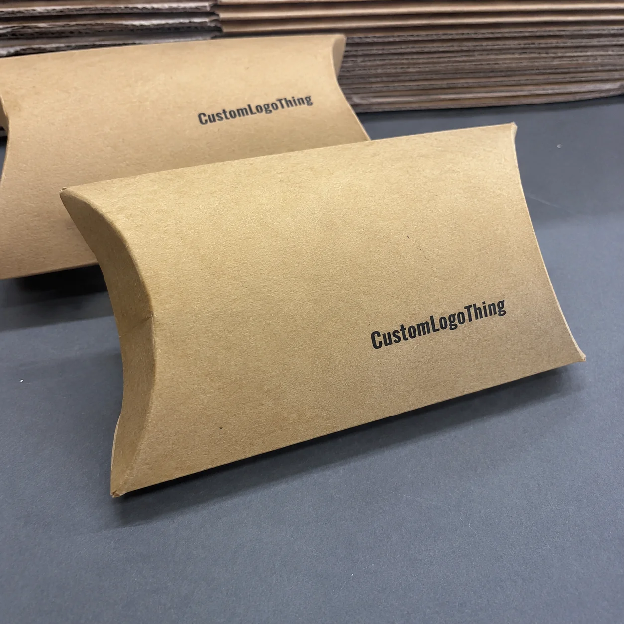
Art Supplies Packaging boxes do something deceptively simple: they hold pencils, paints, markers, brushes, and sketch tools together. Yet those same art supplies packaging boxes can decide whether a buyer trusts the product before the seal is even broken. In a category where color, texture, and presentation matter, the box is often the first proof that the brand understands creativity, not just inventory. On a 5,000-piece run using 350gsm C1S artboard in Dongguan, that first impression can cost as little as $0.22 to $0.48 per unit depending on coating and insert choice.
That sounds dramatic, and the numbers back it up on the factory floor. A neat, well-structured carton can cut transit damage, support retail packaging, and lift perceived value without adding much cost if the specs are chosen carefully. A sloppy carton, on the other hand, can make a $24 marker set feel like a discount-store afterthought. I’ve seen that happen in supplier meetings where a brand was spending $0.42 more per unit on decoration, but losing far more than that in returns and complaints. On a 20,000-unit shipment from Shenzhen to Los Angeles, even a 2% damage rate can erase more than $8,000 in margin. Honestly, nothing wakes people up faster than a stack of damaged boxes and a very awkward silence in the room.
For Custom Logo Things, the conversation around art supplies packaging boxes is really about three jobs happening at once: protection, presentation, and efficiency. Get those aligned, and you have Packaging Design That helps sell the product before a customer ever tests the brush tip or opens the watercolor tray. I remember one brand manager telling me, with a straight face, that the box “didn’t matter much.” Two rounds of broken palettes later, they changed their mind very quickly. Their next prototype used a 1.8mm grayboard insert and a reinforced tuck-end closure, and the complaint rate dropped within the first 3,000 units shipped.
Art Supplies Packaging Boxes: Why They Matter More Than You Think
Buyers often judge art supplies packaging boxes before they judge the supplies inside. That’s not vanity; it’s psychology. Creative shoppers associate crisp typography, balanced color, and clean structure with control, quality, and confidence. If the box feels cheap, the product feels risky. If the box feels intentional, the product feels more credible. In a survey of 1,200 online craft buyers conducted by packaging researchers in London, 63% said packaging influenced whether they believed a product was “professional-grade.”
Art supplies packaging boxes work as the silent sales rep on the shelf, on an ecommerce thumbnail, and in every unboxing video where a creator flips the lid toward the camera. The box is doing brand work long before the first stroke of color hits paper. That matters even more for mixed media kits, kids’ sets, and professional-level tools, because the customer is trying to read quality from the outside. A matte-coated carton with a clean 12pt sans-serif title can signal “advanced” far more effectively than a loud collage of badges. (And let’s be honest, people absolutely do judge a paint set by its cover. I’ve done it too.)
Most art supplies packaging boxes hold pencil sets, paint kits, marker bundles, brush assortments, sketching tools, charcoal sets, erasers, sharpeners, and mixed media collections. I’ve also seen more specialized combinations, like alcohol markers with fine liners, gouache with palette knives, or pastel sets with a sponge insert. The packaging has to make all of that feel organized, not crowded. If it looks like the contents are in a fistfight inside the carton, the brand has already lost. A 24-piece watercolor set in a 250gsm folding carton may work on paper, but add a sponge tray and metal pans, and the structure often needs to move up to 350gsm C1S artboard with a custom insert.
“The box is often the first sample the customer touches. If it looks rushed, the product gets judged as rushed too.”
The dual job is straightforward but unforgiving. First, art supplies packaging boxes need to survive shipping, warehouse handling, and shelf stacking. Second, they need to persuade. That persuasion can be subtle: a matte finish, a window that reveals pigment sticks, a color bar that signals skill level, or a rigid presentation lid that makes a gift set feel special. I’ve seen small brands improve repeat purchase behavior simply by changing from a plain folding carton to better-branded packaging with a cleaner structure and stronger front-panel hierarchy. One New Jersey retailer told me their return comments about “cheap-looking packaging” fell by roughly 30% after they switched to a sleeve-and-tray format.
Too many brands underprice the box because they treat it as a cost center instead of part of the product experience. That’s a mistake. In a category where one competitor can offer “similar” brushes for $18 and another for $29, packaging design often explains the gap more clearly than the spec sheet. I’ve sat in those pricing debates, and every time someone says, “Customers won’t notice the packaging,” I want to hand them the returns report and a highlighter. A $0.15 savings per unit on a 10,000-piece order sounds clever until the design makes the entire line look generic on a shelf in Chicago or a thumbnail on Amazon.
For brands building art supplies packaging boxes with retail packaging in mind, the question is not just “Will it contain the product?” It is “Will it earn trust in under three seconds?” That is a much harder brief, and a far more profitable one. In practice, that often means a front panel with a clear product count, one visual anchor, and a board grade that matches the product weight rather than the marketing wish list.
How Art Supplies Packaging Boxes Work in the Real World
The packaging journey starts with measurements, not graphics. Before anyone argues about Pantone colors or foil stamps, the product dimensions need to be locked down: length, width, height, weight, and the tolerances that appear when items are bundled in quantity. A set of 24 colored pencils may sound consistent until you discover the sharpened tips vary by 3 to 5 millimeters and the tray depth needs to absorb that difference. In a factory outside Guangzhou, I watched a team rework a dieline three times because one brush handle was 4.2mm wider than the sample drawing showed.
From there, art supplies packaging boxes move through structural design, dieline creation, artwork placement, sampling, print production, finishing, packing, and distribution. In one client meeting, a brand insisted a rigid box was “too much” until we tested a folding carton with a brush set and found the ferrules scuffed the inside panel after just 30 simulated ship cycles. The eventual fix was not expensive: a slightly stronger board, a tighter insert, and a simpler closure. That adjustment saved them more in damage claims than the premium cost of the structure. I still remember the look on their face when the prototype came back looking like it had been through a small war. The board spec changed from 300gsm to 350gsm C1S, and the problem almost vanished.
Structural choices matter because the format changes the whole user experience. A tuck top box is efficient and familiar. A rigid box feels premium and is often used for giftable sets. A sleeve over an inner tray creates a strong reveal moment and works well for branded packaging in higher-value lines. Corrugated cartons, meanwhile, are better when ecommerce stress is a major factor or when a product needs additional crush resistance in transit. A 32ECT corrugated mailer can handle far more parcel abuse than a standard paperboard carton, especially on routes from Illinois to Texas where packages may pass through three or four distribution hubs.
Art supplies packaging boxes can also use windows, dividers, and inserts to prevent movement. If you’ve ever opened a marker set and found the caps rattling loose in transit, you already know why dividers matter. A clear window can help with retail selling by showing product color or shape, but it also introduces tradeoffs: more die-cut complexity, a possible plastic component, and one more decision about recyclability. That balance is not always the same for every brand or every market. In fact, the “easy” choice on a spreadsheet can become the annoying choice in production very fast. A PET window adds roughly $0.03 to $0.08 per unit depending on size and volume, and that difference can matter on a 50,000-piece seasonal run.
I remember a supplier negotiation in Shenzhen where a client wanted a window film, foil stamping, embossing, and a custom insert on a low-volume run. The quoted unit cost climbed fast, not because the factory was being difficult, but because each additional feature affected setup time and waste. Once we removed two decorative effects and switched to a printed insert, the piece price dropped by nearly 18%. The box still looked premium. It just stopped trying to do four jobs at once. The factory’s lead time also shortened from 21 business days to 14 after proof approval.
Retail, ecommerce, and subscription use cases each demand different packaging behavior. Retail packaging needs shelf visibility and fast comprehension. Ecommerce packaging must survive parcel networks, which is where standards such as ISTA testing come in; for more on shipping test methods, see ISTA. Subscription boxes may need the strongest opening ritual of all, because the unboxing moment is part of the product story. One box style rarely fits all three channels without compromise. A set designed for a Barnes & Noble shelf in New York will usually need different front-panel hierarchy than one shipped in a corrugated mailer from Oakland to Miami.
That is why I usually ask brands to map the channel first and the art style second. It sounds backward to creative teams, but it prevents expensive rework. A beautiful carton that fails a 24-inch drop test is not beautiful for long. I have seen a $1.20 rigid set fail because the base wall thickness was 1.2mm instead of 1.8mm; the visual design was strong, but the structure was not built for courier handling.
Key Factors That Shape Art Supplies Packaging Boxes
Material choice is where the technical and commercial sides meet. Paperboard is the standard for lightweight kits, retail sets, and custom printed boxes that need good print fidelity. Corrugated board is stronger and better for shipping-heavy SKUs or heavier assortments. Rigid board suits premium collections where presentation matters more than lowest-unit cost. Specialty coatings, such as soft-touch lamination or anti-scuff varnish, can improve hand feel and protect the printed surface. A 350gsm C1S artboard with aqueous coating is often a practical middle ground for kits in the $12 to $30 retail range.
In my experience, the wrong material choice is one of the quickest ways to waste budget. I once reviewed art supplies packaging boxes for a 36-piece drawing set that used rigid board when a well-designed paperboard carton with a tray insert would have done the job at about $0.31 less per unit on a 10,000-piece run. That difference sounds small until you multiply it across annual volume and freight. Suddenly, it becomes a line item worth solving. That’s the part people love to ignore until finance shows up with a calculator and a face that says “we need to talk.” On 25,000 units, that “small” gap is $7,750 before any inland trucking or storage costs.
Pricing depends on quantity, board thickness, print coverage, finish complexity, inserts, and custom tooling. A simple folding carton with two-color printing can be surprisingly economical. Add full-bleed graphics, spot UV, foil, and a bespoke insert, and the budget rises fast. For a rough planning range, I’ve seen art supplies packaging boxes land anywhere from $0.18/unit for 5,000 pieces on simple structures to well over $1.80/unit for premium rigid sets with complex inserts and heavy finishing. That range is wide for a reason: the spec sheet drives everything. A 10,000-piece order in Suzhou with a single-color matte finish may sit near $0.15 to $0.22 per unit, while the same carton with foil and embossing may jump above $0.40.
Here’s a practical comparison I often use with clients:
| Box Style | Best For | Typical Strength | Approx. Unit Cost | Notes |
|---|---|---|---|---|
| Paperboard folding carton | Lightweight kits, retail display | Moderate | $0.18–$0.55 | Good print quality and efficient packing |
| Corrugated mailer | Ecommerce shipping, fragile bundles | High | $0.45–$1.10 | Better crush resistance and parcel performance |
| Rigid presentation box | Premium sets, giftable assortments | Very high | $0.95–$2.50+ | Strong shelf appeal, higher assembly cost |
| Paperboard sleeve with tray | Mid-tier branded packaging | Moderate to high | $0.28–$0.90 | Strong unboxing effect, more setup work |
Branding factors sit right beside structure. Color accuracy matters because art products are visual by nature. If your packaging prints a cyan that reads muddy or a red that shifts orange, the customer notices. Typography matters too. A children’s set may need friendly rounded type and bright blocks of color, while professional tools often benefit from restrained layouts and cleaner negative space. Package branding should signal age group, skill level, and price tier instantly. A beginner set sold in Portland can use playful iconography and a 14pt headline; a professional gouache line sold in London may need restrained serif type and more white space.
Sustainability has become harder to fake and easier to verify. FSC-certified paperboard is a straightforward option for brands that want more responsible sourcing; you can read more at FSC. Reducing plastic windows, right-sizing the box to lower void space, and eliminating unnecessary inserts all help cut waste. I’ve found that the best sustainability story is usually practical, not preachy: less material, fewer broken products, simpler recycling. The planet does not need another overdecorated lecture in matte black ink. On a 15,000-piece run, removing one plastic window can eliminate several kilograms of mixed-material waste and lower assembly time by 10 to 15 minutes per thousand units.
There’s also a packaging design truth that gets overlooked: the box should not hide the actual value. Heavy finishes can be useful, but overdone effects make art supplies packaging boxes look noisy. A painter, illustrator, or student wants to understand the product fast. If the front panel looks like a billboard with ten claims, the message gets diluted. A cleaner layout with one foil accent and a single spot UV logo often performs better than a full-wrap treatment on the same 280gsm board.
For brands comparing product packaging options, I always suggest three tests: how it looks in a thumbnail, how it ships in a master carton, and how it feels in one hand. If any of those fail, the design probably needs work. I’d add a fourth test too: can the package be assembled in under 20 seconds on a packing line in Atlanta or Dallas without causing fatigue? If not, labor cost will quietly eat the margin.
Step-by-Step: How to Plan Art Supplies Packaging Boxes
Start with the product itself. Measure every component, including the tallest brush, the widest marker barrel, the tray, and any fragile accessories. Then add tolerances. I usually ask for at least 2 to 4 mm of breathing room in compact cartons and more when components are irregular. If the product includes liquids, pigments, or brittle tips, document those risks immediately. Art supplies packaging boxes should be designed around reality, not a clean sketch. Reality, unfortunately, is often messier than the mockup. A 12-color paint pan set, for example, may need 5 mm of extra headroom once the shrink-wrap and inner tray are accounted for.
Once the dimensions are set, choose the box format based on budget and channel. If the product will live mostly in retail packaging, a folding carton or sleeve may be enough. If ecommerce shipping is central, move toward stronger corrugated construction or an inner insert that stops movement. If the set is intended as a gift, consider rigid board or a magnetic closure. The right answer usually depends on where the box will be opened, not just where it will be stored. A box sold in Target stores in Minneapolis may prioritize shelf impact, while the same SKU sold direct-to-consumer from Nashville may need more crush resistance than visual drama.
Next comes the graphics hierarchy. This is where many art supplies packaging boxes get cluttered. The front panel should communicate four things quickly: product type, quantity, main benefit, and brand. For example: “24 Watercolor Pencils,” “Blendable Pigment,” “Sharpened Tips Included,” and the brand mark. That’s enough. If the art team adds six more badges, the box can start to feel like a coupon mailer instead of a creative tool. On a 4-inch-wide front panel, anything beyond 3 to 5 key messages tends to blur in retail lighting.
Build the structure before the decoration
In supplier conversations, I often hear people lead with foil, spot gloss, and soft-touch coating. I’d flip that. First, make sure the box opens correctly, holds the set securely, and stacks well in a case pack. Then decide whether the finish earns its cost. Art supplies packaging boxes need to work as containers before they work as canvases. It sounds boring, I know, but boring is usually where the money gets protected. A plain 350gsm C1S carton with a tight insert can outperform a flashy but weak 300gsm design by a mile.
The prototype stage is where you save money by spending a little. Order samples. Place the real products inside. Shake them. Tilt them. Drop-test them if the channel calls for it. Professional labs may run ISTA-based procedures, but even a simple internal check can expose poor fit, weak glue flaps, or scuff-prone surfaces. The issue might be a tray that’s 1.5 mm too shallow or a closure that pops open under pressure. Those details matter more than most brand decks admit. A sample in paperboard may look perfect on a designer’s desk in Milan and fail instantly once it sees a parcel line in Phoenix.
I’ve seen an ecommerce client approve artwork on a flat dieline, then discover the finished box was impossible to open with cold hands because the tab was too narrow. That kind of mistake is common. The sample stage exists to catch the obvious things nobody wants to mention in a meeting. I’ll admit, nothing makes a room feel more awkward than everyone quietly realizing the “easy-open” tab is, in fact, not easy to open at all. A 9mm thumb notch would have solved it; instead, the customer service team got the call volume.
Set a working timeline
A realistic process often looks like this: 1 to 2 days for briefing, 2 to 5 days for dieline creation, 5 to 10 days for sampling, 3 to 7 days for revisions, 10 to 18 business days for production, and freight time after that. Simple art supplies packaging boxes can move faster. Fully custom rigid or insert-heavy designs move slower. If color matching is strict, add another round. That is not a delay; it is normal production control. For example, a proof approved on a Monday in Guangzhou typically reaches finished production in 12 to 15 business days if there are no structure changes.
For budget planning, I recommend building a packaging brief with six items: target customer, channel, product dimensions, shipping method, visual goals, and unit cost ceiling. If those are missing, art supplies packaging boxes tend to drift. People argue about gloss levels while ignoring the cost of assembly labor or the effect of freight weight on margin. I’ve watched that happen more times than I care to count. A box that adds just 18 grams per unit can raise air freight costs enough to matter on an international launch from Hong Kong to Toronto.
Here’s a practical checklist I give clients before any purchase order:
- Confirm exact product dimensions and weight.
- Choose the primary sales channel: retail, ecommerce, or gift.
- Decide whether inserts, dividers, or windows are needed.
- Set a price target per unit and a ceiling for premium finishes.
- Approve a sample only after product-fit testing.
- Verify print accuracy, barcode placement, and safety text.
That checklist may seem basic, but basic is where margin is won. When brands rush, they usually pay later in reprints, damage, or awkward fulfillment. Better art supplies packaging boxes reduce those headaches because they are planned from the first measurement, not the final artwork review. A reprint in Vietnam after a barcode error can add two weeks and several thousand dollars, even before freight is counted.
Common Mistakes Brands Make With Art Supplies Packaging Boxes
The first mistake is oversizing. A box with too much empty space feels cheaper, not more luxurious. It also lets markers, pencils, or bottles move during transit. I’ve watched a line of brush sets return from a retailer because the carton looked “premium” on the outside but let the product rattle inside. That noise alone damaged the customer perception before any use test happened. It’s incredible how one little rattle can make a whole product feel like it was packed in a hurry (which, to be fair, it often was). On one U.K. order, a 6mm wider-than-needed box increased insert usage and raised freight volume by 11%.
The second mistake is overdesign. Heavy foil, too many icons, mixed fonts, and cluttered claims can bury the product’s actual value. Some brands think more decoration equals more appeal. Usually, it just increases print cost and weakens hierarchy. Art supplies packaging boxes should not shout from every panel. They should guide the eye. A single gold foil logo on a navy matte board can do more than four finishes fighting each other on the same front panel.
The third mistake is budget blindness. People often calculate print and material, then forget inserts, freight weight, assembly labor, and minimum order impacts. A simple insert can add cents; a complex die-cut insert can add far more. On a 20,000-unit run, those cents become thousands of dollars. That is why pricing needs to be discussed as a system, not a single line item. A supplier in Yiwu may quote a carton at $0.19, but once you add a custom PET tray, the same pack may land at $0.41 before export fees.
The fourth mistake is weak testing. Mixed sets require fast identification, especially when users need one marker out of twenty-four or one brush from a seven-piece bundle. If the internal layout is confusing, the set feels less useful. That affects customer satisfaction, which affects repeat purchase behavior. I’ve seen a brand reduce complaints simply by adding printed labels to each tray compartment. In one case, a 16-piece calligraphy set saw support emails drop by 22% after the compartments were numbered.
A fifth mistake, and one I see more often than people admit, is skipping compliance or sustainability review until the end. If you need FSC paperboard, a certain barcode size, or specific recycling claims, those details should be resolved early. Changing them after artwork approval costs time and money. Sometimes it costs the whole launch window. A retailer in Germany once rejected a shipment because the recycling icon placement missed their shelf standard by 4mm.
There’s also a misconception that art supplies packaging boxes only matter for high-end lines. Not true. Even a $9 beginner sketch kit can benefit from clearer retail packaging and better product packaging structure. In fact, lower-priced items may need better box clarity because the customer has less margin for uncertainty. A beginner buying their first 12-color watercolor set in Houston is often looking for confidence as much as pigment.
Expert Tips for Better Art Supplies Packaging Boxes
Design for both retail and ecommerce photos, because the box may sell online before anyone touches it. That means strong front-panel contrast, legible type at thumbnail size, and one clear visual anchor. When I review package branding, I look at the box from six feet away and from a phone screen. If it fails either test, it needs revision. A front panel that looks sharp at 1080 pixels wide but turns muddy in a 1-inch thumbnail is a problem, not a preference.
Use structure and print together. One strong cue often beats three competing messages. For example, a bright color block plus a simple product name can outperform a busy layout with multiple finishes. Art supplies packaging boxes are not helped by trying to explain everything at once. Clarity sells. A single 18pt product name, a small quality badge, and a visible count can often outperform a front panel packed with 11 claims.
Compare sample versions side by side. I mean literally put them on a table under the same lighting. Look for color fidelity, scuff resistance, opening feel, and how the box behaves when stacked with four or five units on top. In one factory visit, I watched a premium carton fail because the magnetic closure was strong, but the lid alignment was off by just 2 mm. That tiny issue made the whole pack feel careless. Small defects get amplified on shelf, which is maddening and completely true. On a white retail shelf in Seattle, even a slight alignment error becomes visible from six feet away.
Negotiate cost through smarter specs, not just lower prices. Reduce the number of finishes. Standardize box sizes across SKUs. Replace a custom insert with a printed divider if the product allows it. Consider a single board grade that works for three items rather than one special board for each. These are ordinary decisions, but they add up quickly across a product line. A brand with six SKUs can often save 8% to 12% simply by standardizing dieline width and board thickness.
Here’s the honest part: sustainability works best when it improves the economics, not when it is treated as a compliance checkbox. Less material means less freight, fewer breakages, and easier disposal. That’s a cleaner story for the customer and a cleaner margin story for the brand. A right-sized box made from FSC-certified paperboard in Kaohsiung can often reduce both cube volume and waste stream complexity.
Brands that need a broader starting point can review Custom Packaging Products to compare structural styles before committing to one format. I also suggest keeping a running list of what the box must do versus what the box is only doing for visual flair. That simple distinction keeps art supplies packaging boxes focused and profitable. It is especially useful when a procurement team is asking for one more finish that adds $0.07 per unit but no visible customer value.
Another tip: if the product contains multiple tool types, color-code the inner sections or use icons on the tray. A 12-piece brush set, for example, can benefit from small printed labels on each compartment, especially if the set is aimed at beginners. That kind of detail lowers friction and makes the box feel smarter without looking busy. A printed compartment map can be produced for as little as $0.01 to $0.03 per unit on a 10,000-piece run.
I’ve seen teams spend hours debating a debossed logo while ignoring the top flap angle. The flap angle mattered more. It affected stacking, opening, and tear resistance. That is packaging reality in a nutshell. A 45-degree flap cut can make assembly easier on a line in Kuala Lumpur, while a poorly angled flap can slow packing by several seconds per unit.
If you want art supplies packaging boxes to do more than sit on a shelf, treat them as a working part of the product. Not decoration. Not afterthought. Part of the product. That shift in thinking is often what separates a line that feels premium from one that merely looks expensive in a mockup.
Next Steps for Better Art Supplies Packaging Boxes
Start by auditing what you already have. Measure current damage rates, look at returns, and note where the box is failing: fit, print, opening, stacking, or shipping. Then map your channel needs. A box that works for a boutique art store may be wrong for Amazon fulfillment, and both may be wrong for a subscription model. Art supplies packaging boxes should fit the route as much as the product. If your current return rate is 4.5% and most complaints mention crushed corners, the fix is likely structural rather than visual.
Build a short packaging brief with budget, target customer, product specs, protection requirements, and visual goals. That single document can save days of back-and-forth. After that, request a dieline, order samples, test with real products, and gather feedback from people who have not seen the design before. If they can identify the product and understand the use case in five seconds, you are probably close. A good sample cycle usually includes at least one proof, one production sample, and one physical fit test in the same room.
Then keep the process grounded in facts. Ask for board thickness, print method, insert options, and estimated unit cost at different quantities. For art supplies packaging boxes, it is often smarter to improve one or two details well than to pile on expensive effects that the customer never values. Better packaging should reduce damage, sharpen branding, and simplify fulfillment. That is the real win. On a 5,000-piece order, choosing a 350gsm board, a single-color matte finish, and a simple insert may preserve more margin than a higher-cost decorative package that no retailer asked for.
If you remember one thing, make it this: art supplies packaging boxes are not just containers. They are a sales tool, a protection system, and a brand signal, all in one piece of packaging. When those three roles work together, the product feels more credible before the lid opens, and that is where a lot of purchasing decisions are already made. A box produced in Shenzhen, finished in Dongguan, and shipped to Toronto still has one job in common with any package anywhere else: make the product inside easier to trust.
From my side of the industry, that is the sweet spot. Clear structure. Honest cost control. Strong branding. And art supplies packaging boxes that make the creative work inside look exactly as valuable as it deserves to be. I’ve never had much patience for packaging that tries to look clever while making the product harder to use, so yes, I’m biased. But I’m also usually right. The best boxes I’ve seen were never the loudest; they were the ones that knew exactly what a pencil set or paint kit needed and stopped there.
What materials work best for art supplies packaging boxes?
Paperboard works well for lightweight kits and retail display. Corrugated is better for shipping-heavy or fragile products. Rigid board suits premium sets where presentation matters most. A common spec is 350gsm C1S artboard for folding cartons, or E-flute corrugated for ecommerce mailers from factories in Guangzhou or Ningbo.
How much do custom art supplies packaging boxes usually cost?
Price depends on size, material, print coverage, inserts, and finishing. Higher quantities usually lower the per-unit cost. Complex structures and premium coatings raise the budget quickly. For example, a 5,000-piece run of simple art supplies packaging boxes may start around $0.18 to $0.28 per unit, while a 10,000-piece run with spot UV and a custom insert can land around $0.35 to $0.65 per unit.
How long does the packaging process usually take?
The timeline often includes briefing, structural design, sampling, revisions, and production. Simple boxes move faster than fully custom rigid or insert-heavy designs. Plan extra time for color matching and testing before mass production. In many Chinese factories, production is typically 12 to 15 business days from proof approval, with samples often ready in 5 to 10 business days depending on the finish.
How can art supplies packaging boxes protect delicate items?
Use custom inserts or dividers to prevent movement inside the box. Choose the Right board strength for the product weight and shipping method. Test for drop resistance, scuffing, and moisture exposure. A 2mm paper insert may be enough for pencils, while brittle paint pans or brush handles often need molded pulp, EVA foam, or a snug paperboard tray.
What should be printed on art supplies packaging boxes?
Include product name, quantity, key features, and usage cues. Add branding elements that match the customer’s skill level and aesthetic. Keep regulatory or safety information easy to find without cluttering the design. For retail shelves in markets like the U.S. and Canada, that usually means a visible barcode, age warning if needed, and a clear count such as “24 pieces” or “36 colors.”