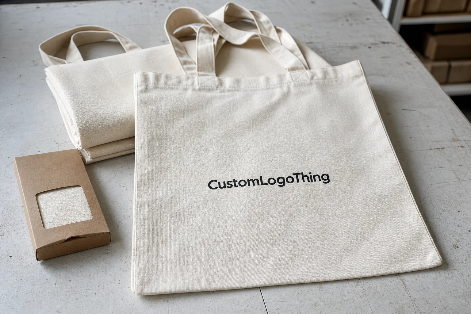
Blank tote bags for printing are one of the few promotional items that keep working after the handoff. People reuse them at grocery stores, offices, campuses, trade shows, and weekend markets. That reuse matters. A bag that stays in circulation for months earns more impressions than a gadget that gets tossed in a drawer or left in a hotel room.
The bag itself does a lot of the heavy lifting. If the blank is cheap, thin, or badly proportioned, the print can only do so much. If the blank is chosen well, even a single-color mark can look cleaner, sharper, and more expensive than the budget suggests. That is why buying the right tote is not a side issue. It is the job.
Most buyers start with a blank for practical reasons. A blank tote gives control over size, fabric weight, handle length, color, and imprint placement. It also lets the artwork fit the bag instead of forcing the bag to fit the artwork. That difference shows up fast once production starts.
Why blank tote bags for printing are the smartest low-cost branding canvas
From a procurement standpoint, tote bags sit in a useful middle ground. They are cheaper than many hard goods, easier to stock than apparel, and more visible than small desk items. They also travel. A printed tote can move through public spaces long after the original event ends, which gives it a lower cost per impression than many giveaway items.
The material options are broad enough to fit different budgets and use cases. Cotton canvas usually feels more premium. Non-woven polypropylene is the workhorse for high-volume event programs. Recycled blends support sustainability messaging if the sourcing is real and documented. Heavier woven fabrics push the bag toward retail quality, though they also raise the unit price.
Buying blank stock also gives the team more control over the print area. Some programs need a large front panel. Others need a small logo placed high enough to stay visible when the bag is carried. Handle style matters too. Short handles keep the bag close to the body. Shoulder-length handles tend to get more exposure in public, which is good for branding but changes the fit and drape.
One thing buyers often miss: the tote behaves a lot like packaging. The substrate shapes the message. A rough, wrinkled, or overly thin blank can make good artwork look like an afterthought. A clean blank with the right surface finish helps the same artwork read as deliberate and more valuable. That difference is not subtle once the bags are in hand.
For broader branded programs, totes often sit alongside inserts, hang tags, or retail packaging. In those cases, the bag may use screen print or embroidery while the supporting pieces use offset printing or flexographic printing. The materials differ, but the same rule applies: the substrate and the method have to match the job.
How the printing process works from blank bag to finished promo piece
The production path is usually straightforward. It starts with selecting the blank, then confirming the artwork size, then choosing the decoration method, then approving a proof. If the order is more involved, a physical sample or pre-production piece comes next. Only after that does the run move into full production.
Fabric and print method have to work together. Smooth woven fabrics usually produce crisp lines and strong logo edges. Textured canvas can look better in the hand, but small type can soften. Non-woven polypropylene handles bold graphics well, especially when the design uses large shapes and clear typography. Delicate artwork and woven texture rarely make friends.
The common decoration methods each have a real use case:
- Screen printing is the safest choice for simple logos, spot colors, and repeat orders. It keeps unit cost under control and usually holds up well.
- Digital printing is useful for gradients, detailed artwork, and shorter runs where flexibility matters more than raw speed.
- Heat transfer can reproduce fine detail, but durability depends on the quality of the transfer and how the fabric accepts heat.
- Embroidery gives a more premium finish, though it works best on heavier fabrics and cleaner, smaller marks. Very thin details can distort.
Artwork prep matters more than most buyers expect. Spot color is usually the cleanest route for a logo with one or two solid colors. CMYK is better when the design needs more tonal variation or photographic detail. The wrong file type can drag the process down. Vector art stays sharp when scaled. A low-resolution image file rarely does.
Print finishing also changes the final result. Placement can be centered, offset, or high on the panel depending on the desired look. Some jobs need folding, bagging, tagging, or carton labeling. Those details sound minor until the bags arrive and half the logo is hidden by a handle fold or placed too low to be visible when carried.
If the proof looks weak, the finished tote will not rescue it. Printing can improve presentation, not fix bad sizing, bad contrast, or a rushed layout.
Key factors that affect quality, durability, and unit feel
Fabric weight is the first thing to check if the bag needs to feel substantial. Heavier cotton canvas or denser woven fabric holds shape better and usually reads as more premium. Lighter non-woven bags are fine for events, but they can sag sooner and show creases more easily. If the tote needs to hold books, a laptop, or a boxed retail purchase, that difference matters.
Structure matters almost as much. A flat tote is cheaper to produce, but it has limited capacity. A gusset adds depth and gives the bag more usable volume. It can also create a larger print zone, which is useful if the logo needs room to breathe. Handle length changes how the bag is worn, and that affects visibility. Shoulder-length handles usually give the brand more public exposure because the bag sits where people can see it.
Color is not just an aesthetic choice. Dark bags often need more ink or an underbase to keep the logo opaque. That improves visibility but adds cost and sometimes extends setup time. Light bags are easier to print on, though they do not always fit the brand tone. A natural canvas tote gives a different signal than a bright white non-woven bag. One feels closer to retail. The other feels more functional and event-driven.
Artwork style should match the surface. Large type, bold lines, and generous spacing survive the most abuse. Thin strokes, tiny copy, and crowded logos are risky on textured materials. The issue is not only print quality. Legibility matters. If people have to squint to read the logo, the bag loses much of its promotional value.
Sustainability claims need proof, not just nice language. Recycled-content bags are useful if the content and sourcing can be documented. For buyers making environmental claims, look for chain-of-custody support where relevant and keep the language accurate. Resources from FSC and EPA recycling guidance are useful reference points when internal messaging has to stay defensible.
For shipments that move through multiple warehouses or event kits, packaging and transit planning matter too. If totes are boxed for retail or kitted with inserts, ask whether the outer cartons and packed units are handled with relevant transit expectations in mind. The ISTA testing framework is a practical benchmark for orders that need to survive distribution instead of just looking good on a sample table.
Cost, pricing, MOQ, and unit cost: what buyers should expect
Tote pricing breaks into a few buckets: the blank bag, the print setup, the decoration itself, artwork prep, packaging, freight, and any rush fee. Buyers often compare only the blank price and ignore the rest. That is how a low sticker price turns into a more expensive landed cost.
MOQ changes the math quickly. Small runs carry a heavier setup burden per unit, so the cost per bag climbs. Larger runs usually improve the unit price, but only if the blank and artwork stay stable. The right question is not “What is the cheapest tote?” It is “What is the total landed cost for the full program?”
| Option | Typical blank cost | Common print cost | Best use case |
|---|---|---|---|
| Non-woven polypropylene tote | $0.35-$0.90 | $0.25-$0.60 for a one-color screen print | High-volume events, conferences, awareness campaigns |
| Cotton canvas tote | $0.85-$2.20 | $0.50-$1.20 for screen print; more for extra colors | Retail-style branding, premium giveaways, reuse-driven programs |
| Heavier recycled blend | $1.10-$2.80 | $0.60-$1.40 depending on coverage and method | Sustainability messaging and mid-to-premium campaigns |
| Embroidery-ready fabric tote | $1.50-$4.00 | $2.00-$4.50 for a stitched logo | Executive gifts, boutique retail, higher perceived value |
Coverage drives cost faster than almost anything else. A small front logo is inexpensive. A large panel print, multiple colors, or a second imprint location raises the price fast. Specialty inks do the same. If the tote needs a front logo, a back mark, and a gusset print, expect the unit price to climb.
Material and method also interact. A simple one-color screen print on a standard blank is usually the cheapest clean option. Detailed graphics can justify digital printing or a transfer if the artwork really needs it. But not every design needs a complex method. A crisp, well-sized spot-color logo often reads better than a crowded multi-tone image on a textured bag.
Ask suppliers to break the quote into blank bag cost, decoration, and freight. That makes comparison easier and exposes hidden charges early. A cheap blank with expensive shipping or a high setup fee can end up costing more than a better option sourced closer to the delivery point.
Process and timeline: from quote request to production steps
The cleanest orders follow a predictable chain. The buyer sends quantity, size, material, print location, artwork, and delivery date. The supplier confirms stock and pricing. A proof is issued. If the job is high-visibility, a sample or pre-production piece may be worth the time. After approval, the full run starts.
Lead times depend on stock, art readiness, and the decoration method. A simple in-stock tote with one-color screen print can move quickly if the artwork is clean. A multi-location order with specialty finishing takes longer. A fair working estimate for many standard tote programs is 12-15 business days after proof approval, but that is not a guarantee. Stock shortages, artwork changes, and freight delays can push the calendar.
The most common schedule problems are preventable. Low-resolution files slow the proof cycle. Missing vector art leads to cleanup work. Last-minute color changes create more proof rounds. Unclear placement instructions can stall production because no one wants to guess where the mark should sit.
Event-driven orders make the pressure worse. Trade shows, school calendars, product launches, and holiday campaigns all squeeze the same windows. It helps to lock specs early and leave room for approval, production, and shipping. That is especially true if the tote is part of a larger kit assembled through our Manufacturing Capabilities.
If the order includes folding, polybagging, kitting, or carton labeling, those steps should be part of the original timeline. Handoff delays usually happen there. The more touches involved, the more schedule padding is needed. That is a practical rule, not a nice-to-have.
Common mistakes when ordering blank tote bags for printing
The first mistake is buying on price alone. A thin bag, weak seams, or an awkward shape can ruin the final impression even if the print itself is clean. Some teams discover too late that the tote cannot actually hold what they planned to put in it. Others find that wrinkles and poor structure make the logo harder to read in use.
The second mistake is ignoring artwork limitations. Tiny typography, thin strokes, and low-resolution files are risky on textured surfaces. The problem is not just sharpness. It is readability. If the audience has to decode the print, the tote loses value as a promotional piece.
Color mismatch causes plenty of avoidable damage. A dark tote can make a light logo look washed out if opacity is not handled properly. A bright bag can push brand colors into a harsher range than expected. That is why proofing matters. A screen mockup cannot reveal every contrast problem.
Skipping a pre-production sample is another false economy. A sample catches misalignment, oversizing, awkward placement, and color issues before the full run starts. Once the blank inventory is committed, fixing mistakes is expensive. Reprinting is almost always the more painful option.
Under-ordering is the last common miss. Teams try to stay lean, then run out at the event or launch. The reorder usually costs more, and the second run may not match the first perfectly if stock or ink batches changed. A small cushion is usually cheaper than a rushed second order.
Expert tips for choosing a blank tote bag that prints cleanly
Ask for swatches or sample pieces when the tote has to support a premium message. Catalog photos hide surface texture, weave quality, and color tone. A swatch gives a better read on how the fabric will accept ink and whether the surface looks right for the brand.
Use vector artwork whenever possible. That keeps edges clean and makes resizing predictable. Tote print areas vary more than people expect, so art that looks fine on a laptop screen can fail once it is resized for a smaller imprint zone. Bold shapes and clear letterforms hold up better than delicate detail.
Match the method to the art. Screen print is the sensible option for simple logos and repeat campaigns. Digital print works better for richer artwork or shorter runs with more variation. Heat transfer can solve certain detail problems, but it should not be treated as a shortcut around poor art setup. If the bag is textured, give the design more breathing room.
Test the tote in the real world before approving it. Put a laptop in it. Load it with groceries. Carry it by the handle for a few minutes. That tells you more about the construction than a flat mockup ever will. A bag can look fine in a proof and still fail in use if the handles are too short or the seams are too light.
Another useful trick is to print the same artwork on two or three blanks with the same method. The differences in weave, opacity, and finish become obvious fast. That side-by-side comparison is usually more useful than a long spec sheet, because it shows how the final brand presentation will actually feel.
If you need help comparing bag style, print method, and finishing options, the production range on our printing capabilities page is the fastest place to start. Seeing the options together makes the tradeoffs easier to judge.
Next steps for comparing samples, specs, and ordering confidently
Before asking for quotes, write down the basics: intended use, quantity, preferred material, print area, color count, budget ceiling, and delivery date. That keeps the conversation specific and helps the supplier quote the right bag instead of a generic substitute.
Ask for physical samples when the tote is tied to a retail brand, nonprofit, sponsor, or premium event. Photos help, but they do not replace the real thing. You want to see how the fabric hangs, how the handles sit, and whether the logo reads at arm’s length. If the bag is going into public circulation, field testing matters more than the mockup.
Compare at least two or three blank options with the same art. That removes guesswork. You can see which surface holds the logo cleanly, which bag feels more substantial, and which option makes sense once shipping is included. It also makes internal approval easier because stakeholders are comparing like for like.
Confirm packaging and shipping details early. If the totes need to be kitted, polybagged, or split across destinations, that belongs in the quote stage. The same goes for carton labeling or retailer requirements. Waiting until production starts usually creates friction that costs money and time.
Once the specs are locked, move quickly on proof approval. Delays compress production and freight at the exact point where the schedule needs room. The practical formula is simple: Choose the Right blank, verify the imprint, and keep the job moving until it lands where it needs to be. For blank tote bags for printing, that discipline is what keeps the final piece useful, durable, and worth carrying more than once.
What material works best for blank tote bags for printing?
Canvas and cotton usually give the cleanest print and the most premium feel. Non-woven polypropylene is often the lower-cost choice for high-volume events. The best material depends on how the bag will be used, how much weight it needs to carry, and how detailed the artwork is.
How do I choose the right print method for blank tote bags?
Screen printing is usually the best fit for simple, bold logos and repeat orders. Digital printing or heat transfer can handle more detailed artwork or smaller runs. The right method depends on fabric texture, color count, and how durable the imprint needs to be.
What affects the cost of blank tote bags for printing the most?
Material type, bag size, print method, and quantity usually have the biggest impact. Setup fees matter more on small runs because they get spread across fewer bags. Extra print locations, specialty finishes, and rush production can push the price up quickly.
How long does it usually take to produce printed tote bags?
Lead times vary with stock availability, artwork readiness, and decoration method. Simple in-stock jobs can move faster, while larger or more customized runs need more buffer. The safest approach is to approve proofs early and leave room for shipping.
Can I print detailed artwork on blank tote bags?
Yes, but the bag Material and Print method need to support that level of detail. Smooth surfaces and larger imprint areas usually produce better results. In many cases, simplifying the design improves readability and reduces production risk.


