Personalized Mailing Address Labels are a small part of packaging, but they affect a lot of downstream work. When the sender line is wrong, unreadable, or slow to apply, returns get misrouted, sample kits go out late, and packing teams lose time correcting avoidable mistakes.
For apparel brands, the value is practical: fewer handwritten labels, more consistent return addresses, and a cleaner handoff between the pack bench and the carrier network. The right label should fit the surface, hold through transit, and be easy to reorder without rebuilding the file every time.
Why personalized mailing address labels have outsized impact
Teams usually notice labels after something goes wrong. A return ends up at the wrong facility. A reissue ships with an outdated sender line. A customer service rep has to confirm an address that should already be standardized. None of that is dramatic, but it creates labor, delay, and rework.
Personalized mailing address labels reduce that friction by making sender information consistent and legible. They remove handwriting from the process, limit typos, and give the packing team a repeatable format. That consistency matters more than design polish because it prevents exceptions and keeps the workflow moving.
They also improve presentation. A clean return address on a mailer or carton looks more intentional than a marker note or a generic office label. For samples, wholesale shipments, and press mailers, that matters because the package is already communicating brand quality before it is opened.
If a label cannot be read quickly, it is not doing its job. The package may still move, but the risk moves with it.
They work best when planned with the packaging system around them. A label should fit the surface, the box or mailer size, and the team’s actual packing method. If it slows the line or forces people to improvise, the label is creating work instead of removing it.
Brands that already use Custom Poly Mailers usually get better results when the mailer and address label are considered together. A matte surface, a simple return block, and enough whitespace make placement easier and readability better.
How personalized mailing address labels fit into packing, returns, and shipping
The right way to think about these labels is as an operational component, not office stationery. They sit alongside barcodes, carton seals, and inserts as part of a repeatable packing process. Once the format is locked, no one has to decide how the sender details should look each time a box is packed.
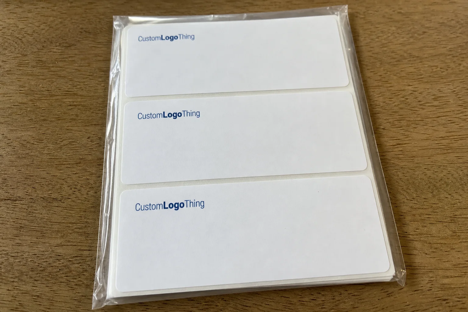
Sheet labels fit smaller teams and low-volume use. They are easy to store, easy to grab, and practical when one person is packing orders between other tasks. If labels are only used a few dozen times a week, sheets are usually enough.
Roll labels make more sense once application becomes repetitive. They feed faster, reduce handling, and work better at a packing station that processes a steady stream of parcels. If the goal is throughput, rolls are usually the better choice.
Individual cut labels still have a place. They work well for sample kits, media mailers, and mixed-purpose jobs where the team applies labels by hand and does not want roll hardware. The format should follow the workflow, not the other way around.
Returns are where the benefit becomes obvious. A return address should be easy to find, easy to read, and easy for a warehouse or carrier to sort by eye. The same logic applies to store replenishment and press shipments: if a box must land in a specific place, the label cannot be vague.
Keep the layout simple. Overbuilt label files with extra graphics, decorative borders, or too much text slow down packing and increase error risk. A clear address block and enough blank space for straight placement is usually enough. Add routing codes only if the receiving process actually uses them.
For brands shipping across multiple channels, the most useful labels are the ones that survive small variations in use. A label that works on a poly mailer, a kraft carton, and an office return envelope is more valuable than one optimized for a single surface.
Specs that control readability, adhesion, and shelf life
Most label failures are ordinary: curling edges, peeling during transit, smearing when damp, or text that becomes hard to read under warehouse lighting. Those problems usually come from material choices, not from the concept of the label itself.
Paper stock works for many low-moisture applications and is usually the lower-cost option. It suits office use and packaging that stays dry. Synthetic stock is the better choice when moisture, friction, or longer storage are part of the process. If labels may sit in staging for weeks before use, durability starts to matter.
Finish changes readability. Matte is easier on the eye, especially under bright or mixed lighting. Gloss can look sharper in a mockup, but glare can make an address harder to read. For address labels, legibility is more important than shine.
Adhesive needs to match the surface. A label that holds on a matte carton may struggle on a coated mailer or a recycled surface with dust on it. Some adhesives work better on smooth films, some on rougher substrates, and some need more pressure to bond. If the brand uses more than one packaging surface, ask for adhesive guidance for each one.
Font size and contrast matter more than most teams expect. Small text in a pale color may look refined on screen and still fail in a packing area. The sender line should be readable at a glance. If a logo is included, it should support the address, not crowd it.
Storage conditions also affect performance. Bulk labels may sit for months before use, and heat, humidity, or direct light can change adhesive behavior and print stability. A label that looks perfect on delivery can behave differently after a season in a warm storeroom.
For teams that want to align packaging standards with real transport conditions, ISTA and packaging.org are useful references for handling and testing. They will not choose a spec for you, but they help frame the right questions.
What drives cost, pricing, and unit cost
Pricing is usually driven by quantity, stock, adhesive, finish, shape, color count, and speed. Quantity is the biggest lever. Setup costs are spread across more units as the run gets larger, so unit price usually drops as volume rises.
At low quantities, per-piece pricing looks high because the setup work does not shrink much. At higher quantities, the unit cost falls but the total order value increases. Comparing only unit price misses the real tradeoff: a cheaper label that has to be reordered often may cost more over a quarter than a better-spec label bought in a larger run.
Special shapes, coatings, premium stocks, and rush timing all push cost upward. Multiple versions of the same label, such as separate return addresses for different warehouses, add art and setup time as well.
| Format | Best use case | Typical unit cost | Tradeoff |
|---|---|---|---|
| Sheet labels | Low-volume packing, office use, occasional returns | $0.06-$0.18 per label at modest quantities | Easy to store, slower to apply in volume |
| Roll labels | Packing stations, repeat application, higher-volume fulfillment | $0.03-$0.09 per label at larger quantities | Faster use, more efficient at scale |
| Individual cut labels | Sample kits, hand-packed mailers, mixed-purpose use | $0.08-$0.22 per label depending on size and stock | Flexible, but not the cheapest for high volume |
These are planning ranges, not quotes. A simple one-color label on standard stock will land lower than a custom die-cut label on synthetic material with specialty adhesive. One-time setup fees are also common, often in the $35-$95 range depending on the supplier and order complexity. Shipping, proofs, split shipments, and rush fees can add to the total.
Before comparing quotes, ask direct questions:
- Is there a minimum order quantity?
- Does the quote include proofing?
- Are reprints covered if the supplier makes the error?
- Do mixed versions or split shipments carry extra charges?
- Is the adhesive appropriate for the exact surface the label will touch?
If you already source other branded packaging pieces, it can help to compare labels alongside those orders rather than separately. A brand that also orders Custom Labels & Tags may be able to align artwork, reduce file handoffs, and simplify approval.
Production steps and timeline from proof to delivery
The production path is straightforward, but it is unforgiving when files are incomplete. A typical order moves through file review, proof creation, proof approval, print setup, printing, cutting or slitting, quality control, packing, and shipping. Most delays start when the artwork raises a question.
For simple orders, turnaround is often about 5-10 business days after proof approval. Specialty stock, custom shapes, or multiple versions usually push that to 10-15 business days. Rush jobs are possible in many cases, but they cost more and reduce scheduling flexibility.
Files create more delays than the press. Low-resolution logos, missing bleed, tiny text, and unclear address instructions force back-and-forth. If the supplier has to confirm whether the return line should read “Returns Department,” “Customer Service,” or a warehouse code, the clock keeps moving.
Proofing should happen at actual size, not just on a monitor. A layout that looks balanced on screen can become crowded in print, especially if the label includes a tight address block, logo, barcode, or routing mark. A full-size review catches that before production starts.
Quality control should verify more than color. The sample pull should confirm print legibility, edge quality, adhesive performance, and cut accuracy. If the order includes multiple versions, each one should be checked.
Version control matters too. If the address changes after approval, most suppliers will treat it as a revised order, not a correction. Keeping one current source file for the sender block prevents avoidable reruns.
Lead time also includes logistics. Shipping transit, carton availability, and any special packing requirements can affect delivery. A simple project can take longer if it needs split drops or specific carton sequencing.
Common ordering mistakes that make labels fail in the field
The most expensive failures usually come from assumptions. A clean proof can still produce a poor result if the label is matched to the wrong surface or the sender data is stale.
Low contrast is common. Gray type on kraft paper may look fine on screen and still be hard to read under warehouse lighting. Tiny fonts create the same issue. Decorative type rarely helps; the goal is immediate recognition.
Adhesion failures usually trace back to the surface. A label that stays put on a matte carton may lift on a coated mailer, a dusty recycled surface, or a parcel handled in a humid room. Temperature swings can also affect bonding. If the labels will sit before use, test them on the actual packaging under real conditions.
Old data is another recurring problem. Return addresses change more often than teams expect. Warehouses move. Returns processors change. A packing team keeps using the old file because it is close enough, and the wrong parcel goes to the wrong place.
Overbuilt designs also cause trouble. A label that tries to carry the logo, return address, website, slogan, and routing marks does too much at small sizes. White space is not wasted on a functional label; it is what keeps the address readable.
Final approval should always include a full-size check on the intended surface. A layout that feels balanced on a laptop can shift after print. Margins tighten, small elements disappear, and edges can clip. That is why a full-size proof matters more than a polished screen mockup.
Some brands try to use the same visual system across product stickers, carton markings, and mail labels. That can work only if the files are managed separately and the production requirements are clearly split. Otherwise one revision cascades into every packaging piece.
Practical next steps before you request a quote
Before asking for pricing, gather the details that affect the quote: the exact return address text, logo files, label dimensions, quantity, preferred material, packaging surface, and whether you need sheets, rolls, or cut labels. Having those basics ready reduces the revision loop immediately.
Then check the label at actual size. Screen previews are useful for layout, but they do not show how the label behaves in print. Readability, spacing, and contrast need to be tested at the size the warehouse or customer will actually see.
Next, compare cost against labor. A lower-priced sheet label may be fine if the team packs slowly and in small batches. A roll label may cost more upfront and still save money if it cuts application time at a high-volume station. The real cost includes speed, rework, and the risk of a labeling error.
For most clothing brands, personalized mailing address labels should be reliable first and branded second. They do not need to be loud. They need to be legible, durable, and easy to reorder. If the size is right, the material matches the surface, and the proof is checked at full scale, the label does exactly what it should.
Are personalized mailing address labels better than handwriting return addresses?
Yes, once volume gets beyond a few parcels a week. Printed labels are faster to apply, easier to standardize, and less likely to carry a typo that sends a return to the wrong place. They also make samples, wholesale shipments, and customer returns look more consistent.
What size should mailing address labels be for clothing mailers?
The right size depends on the return address length and the available surface area on the mailer or carton. The label should leave enough room for postage, tracking marks, and clean margins. A size that fits neatly on screen is not automatically the right size in production.
Should I order personalized mailing address labels on rolls or sheets?
Sheets work well for low-volume packing and office use. Rolls are better for repeated application at a packing station or fulfillment line because they move faster and reduce handling.
How fast can custom mailing address labels be produced?
A straightforward order can often move through production in about 5-10 business days after proof approval. More complex jobs, including custom shapes, specialty stocks, or multiple versions, can take 10-15 business days or longer.
What should I check before approving the proof?
Confirm the address text, logo placement, font size, spacing, and contrast at actual print size. Also verify the quantity, format, and adhesive suitability for the exact surface the labels will be applied to.
What causes labels to peel or fail after printing?
Most failures come from the wrong adhesive, a surface that is too dusty or coated for the label, or storage conditions that affect the stock before use. If the label will sit for a while before application, testing it under the same conditions matters.


