Canning Jar Labels Personalized: What Buyers Need to Get Right
For jam makers, honey sellers, spice blends, and gift jars, canning jar labels personalized do more than decorate glass. They set the tone in one glance. Flavor, brand name, net weight, and the overall feel of the product all have to land fast, usually on a curved surface that does not care how good the artwork looked on a screen.
That is why label work is packaging work, not just design work. A jar can look organized, premium, and intentional with the right stock and finish. It can also look cheap in a hurry if the label is too busy, too small, or built for the wrong surface. The practical goal is simple: choose a label that still looks right after handling, refrigeration, shipping, and shelf time. For buyers comparing formats, the Custom Labels & Tags page is a useful place to start.
There is a reason small-batch brands spend time on this. Jars are often standard. The label is the main variable. That means the label carries more of the brand burden than people expect. It also means the details matter more than the marketing copy usually admits.
Why canning jar labels personalized stand out on shelf
A shopper reads the label faster than they read anything else on the package. From a few feet away, they catch the color block, font weight, spacing, and whether the jar feels homemade, polished, or somewhere in the middle. A good label does not shout. It communicates quickly and leaves no doubt about what is inside.
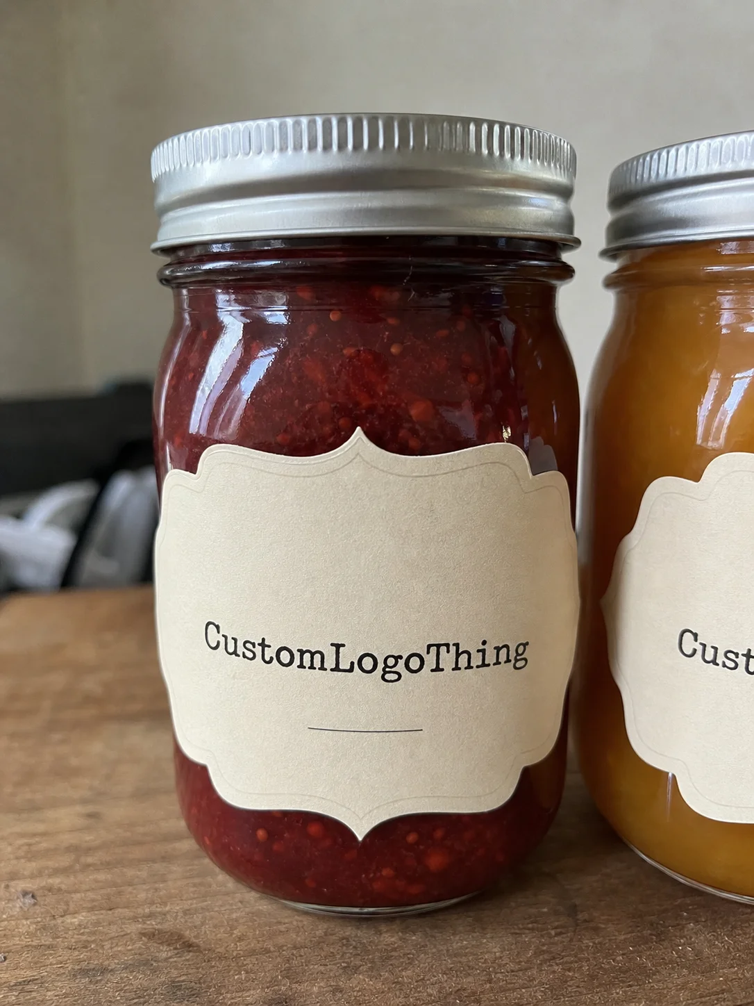
This is especially useful for seasonal preserves, wedding favors, private-label sauces, pantry goods, and farmers market products. The jar itself is usually standard. The label has to carry the identity. A simple oval can soften a rustic jam jar. A square label with generous margins can make a small run look retail-ready. Shape is not decoration here. It changes how the whole product reads.
Finish matters too. Matte paper tends to feel warm and handmade. Satin film gives a cleaner edge and holds color better under mixed lighting. Gloss can make colors pop, but it also shows glare faster. There is no universal winner. The right choice depends on the product, the sales setting, and whether the jar will live in a dry pantry, a chilled case, or a crowded kitchen where people touch everything with slightly sticky fingers.
Personalization also covers the unglamorous parts: batch coding, flavor separation, short ingredient panels, and seasonal variation. That is where these labels stop being cosmetic and start saving time. Fewer mix-ups on the packing table. Less relabeling. Less guesswork when a line has six flavors and someone is moving too fast.
How custom jar labels are printed and applied
The workflow looks simple enough. Artwork is prepared, the dieline is matched to the jar, adhesive is chosen, then the labels are printed, cut, and finished. In real production, each of those steps can change the result. Glass is smooth, but condensation changes how a label behaves. A stock that works fine on a dry pantry jar may fail on chilled jam or a jar that gets wiped down during service.
Application method matters just as much. Hand-applied labels give you a little flexibility, but only if the label has enough margin to tolerate minor variation. Machine-applied labels need tighter consistency on roll direction, spacing, and backing format. If the order is going on by hand at a prep table, the spec can be more forgiving. If it is running through an applicator, tolerances matter. A lot.
Proofs are where most bad orders get rescued. A design that looks fine on a monitor can fall apart in print, especially thin fonts, small ingredient text, and low-contrast color combinations. On glossy stock, fine lines can read differently than expected. On paper, edges can soften a bit. A proper proof answers the questions that matter: Is the brand name readable at arm’s length? Does the flavor stand out? Does the net weight stay clear? Does the design still hold together under bright light?
Buyers who want better transit performance should think past the label itself. Jars move inside cartons, cases, trays, or gift boxes. If the outer pack and the label are being developed together, shipping standards such as ISTA can help frame the conversation around handling and distribution. Not every label order needs formal testing, but the packaging choice should fit the real travel path.
Materials and finishes that hold up in real use
Paper and film both have a place. Paper stocks usually feel warmer and more handmade, which suits preserves, honey, spice blends, and gift jars. Film stocks are the safer option when moisture, refrigeration, or repeated handling are part of the job. If the jar will be wiped down, packed cold, or touched often at a retail counter, film tends to keep its shape better.
Finish changes both the look and the behavior. Matte reduces glare and makes small type easier to read. Gloss adds color intensity and a more polished shelf presence. Satin sits between the two with a controlled shine and decent stain resistance. The right answer depends on the product, the brand position, and the environment the jar will live in. Pretty obvious once you see the samples in person. Less obvious before that.
For buyers who want a more responsible paper choice, FSC-certified stock is worth asking about. The FSC system matters when paper sourcing is part of the brand story or when the material spec needs to be documented clearly. It is useful for premium pantry goods, gift sets, and retail lines where material choices are part of the pitch.
There is also a difference between a label that looks good in a sample and one that still looks good after a few days of actual use. Ink durability, topcoat behavior, and surface friction all affect whether the label stays clean. A jam jar may get touched by wet hands. A sauce jar may sit in a warm kitchen. A honey jar may be handled all day at a market table. None of that is theoretical. It is what shows up after the order ships.
| Label Option | Best For | Typical Strength | Typical Unit Cost at 5,000 Pieces |
|---|---|---|---|
| Paper, matte | Dry pantry products, rustic preserves, craft gifting | Warm look, easy readability | $0.10-$0.18 |
| Paper, gloss | Color-forward branding, brighter shelf appeal | Stronger color pop, moderate scuff resistance | $0.12-$0.20 |
| Film, satin | Refrigerated jars, handled products, wipe-clean needs | Moisture resistance, cleaner edge durability | $0.18-$0.28 |
| Film, gloss | Premium retail presentation, bold graphics | High visual impact, strong color depth | $0.20-$0.32 |
Artwork, sizing, and adhesive details that prevent fit issues
Most label problems start with measurement, not print quality. A jar has a body, a shoulder, a lid, and usually a curved transition between them. That means the usable area is smaller than the full height of the container. Buyers should measure the straightest usable panel, not just the circumference or the total jar height. A label that is too tall can wrinkle near the shoulder. A label that is too wide can hit the seam or crowd the wrap point.
Typography deserves the same discipline. If the label has a product name, flavor, ingredients, and a small logo, everything still has to be readable from a normal viewing distance. Thin script fonts can fail fast on small jars. Dense blocks of copy can make the label feel heavier than the product itself. The strongest canning jar labels personalized usually make the eye move naturally from brand name to flavor to supporting details without making the reader hunt for them.
“A label that looks good on screen and still behaves on glass are two different jobs. The proof has to answer both.”
Adhesive choice should match the job, not just the design. Permanent adhesive is the right choice for labels that need to stay put through handling and storage. Removable adhesive makes sense when jars will be reused or when cleanup matters. Freezer-friendly adhesive is its own category and should be called out clearly if the product may face cold storage or temperature swings. If the label goes on cold glass, condensation tolerance needs to be discussed before the run, not after the first sample batch.
Shape matters here too. Flat-front jars are the easy case. Round jars, tapered jars, and narrow-neck jars need more careful sizing and more realistic expectations about where the label can sit. A wide label can look great in a mockup and then misbehave on the actual jar. A good supplier will usually ask for a sample jar, a drawing, or actual measurements before locking the dieline. That is not paperwork for sport. It is how fit problems get avoided.
Cost, pricing, MOQ, and unit cost for custom labels
Pricing makes more sense once the variables are separated. Size, material, finish, quantity, print coverage, and artwork setup all influence the quote. A small label with one or two colors will usually cost less than a larger full-bleed design on film with special finishing. If the artwork is print-ready and the dieline already exists, setup is lighter. If the supplier has to clean up files or build a new layout, time and cost go up.
MOQ, or minimum order quantity, usually reflects press setup, material waste, and finishing setup more than anything else. It is not a random number someone picked out of a hat. The real question is whether the minimum fits the product plan. For a one-time event favor, a large MOQ may not make sense. For a retail product with repeat demand, a higher quantity can lower the unit cost enough to justify the inventory.
For small producers, the pricing conversation usually falls into three buckets:
| Order Profile | Typical Qty | Likely Unit Cost | Buyer Takeaway |
|---|---|---|---|
| Short seasonal run | 500-1,000 | $0.22-$0.40 | Good for testing demand or gifting, but higher per-unit cost is normal. |
| Small production run | 2,500-5,000 | $0.12-$0.28 | Often the sweet spot for local brands balancing price and flexibility. |
| Repeat retail program | 10,000+ | $0.08-$0.18 | Best when the design is stable and the label will stay in circulation. |
The cheapest unit price is not always the best buy. A slightly higher spec can save labor, reduce relabeling, and keep the product presentable after packing. I have seen buyers shave a fraction of a cent off the label and then lose far more when adhesive lifts or the finish scuffs in the box. That is false economy. If the jar has to look right on shelf and survive real handling, price needs to be weighed against performance, not just against the quote sheet.
For teams still sorting through options, it helps to compare a few formats side by side on the Custom Labels & Tags page before asking for formal pricing. That keeps the discussion grounded in actual stock, finish, and application needs instead of vague words like “premium” or “budget.” Those terms are not specs.
Process, timeline, and lead time from proof to shipment
The cleanest orders usually follow the same path: request specs, submit artwork, review the proof, approve a sample if needed, then move into production and packing. It sounds simple. It only stays simple when the buyer sends complete information up front. Missing dielines, low-resolution logos, unclear copy, and last-minute text changes are the main reasons the timeline stretches.
For first-time jobs, proof review can take longer because the supplier has to confirm size, bleed, color, and finish. Reorders move faster because the artwork and specs are already locked. Special adhesives, metallic finishes, or custom shapes can add production time. Shipping time is separate from production time, which people forget the second the packing date gets real.
A straightforward reorder may land in roughly 7 to 12 business days after proof approval. A new custom label order often takes 12 to 18 business days depending on complexity. That range shifts with quantity, finishing, and how fast approvals come back. If the order has multiple SKUs, expect a longer proof cycle because each flavor or batch variant needs its own check.
If the labels are part of a broader packaging system, think about how they move through the rest of the line. Cartons, cases, trays, and gift boxes all affect the final condition of the jar. Shipping and handling standards such as ISTA are useful when the product has to survive distribution, not just look good in a mockup. That is not overkill if the jars are going from a prep room into retail or fulfillment.
Common mistakes to avoid before you place the order
The first mistake is overcrowding the label. A jar label does not need to say everything at once. If the product name, flavor, ingredients, weight, and logo are all fighting for the same space, the label starts to feel cramped and hard to trust. Negative space is not wasted space. It is what lets the eye rest and the brand breathe.
The second mistake is forcing a flat design onto a curved container without checking the jar geometry. A label can look balanced in a file and still fail on the jar because the shoulder curve eats the top line or the bottom edge lifts near the seam. Real measurements beat assumptions every time.
Another common error is choosing the wrong stock for the environment. Standard paper on a refrigerated jar can edge-lift, wrinkle, or stain if condensation is normal. A removable adhesive on a permanent retail product can create avoidable problems later. These are basic choices, but they are the ones that hurt most when they go wrong.
Color expectations need care too. A monitor does not print ink. Soft creams, dark greens, and subtle neutrals all shift depending on substrate, finish, and press conditions. That does not mean the order is flawed. It means the buyer should judge color against the chosen stock and proof, not against the screen alone. If consistency matters across a product line, ask for that comparison before the run starts.
Useful quality checks before approval are pretty plain, which is exactly why people skip them:
- Check legibility at arm’s length, not just on a zoomed-in file.
- Confirm the label clears the shoulder and seam on the actual jar.
- Rub the sample by hand to see whether ink, scuffing, or edge lift shows up.
- Test the label after chilling if the product will live in cold storage.
- Verify that every SKU uses the same measurement logic, not guesswork.
What to prepare before you request quotes
Good quotes start with good inputs. Before asking for pricing, gather the jar dimensions, the label placement area, the quantity, and any special conditions such as refrigeration, condensation, or outdoor selling. If the jars will sit in heat at a farmers market or pack into chilled cases, include that. It changes the material conversation right away.
Artwork should be as clean as possible. A print-ready file with outlined fonts, correct bleed, and readable text saves time and cuts down on back-and-forth. If the design needs compliance details, include the exact wording for product name, ingredients, net weight, and any required statements. A supplier can only quote accurately when the content is close to final.
It also helps to decide what matters most. Some buyers care most about the lowest unit cost. Others need the fastest turnaround. Some need the strongest moisture resistance. Others care more about shelf presentation. Those are different goals, and they point to different material and adhesive choices. Be explicit about the priority so the quote reflects the actual use case.
If the label is part of a larger packaging system, ask how it fits with other formats in the line, including custom label options for different jar sizes or seasonal SKUs. That keeps the visual system consistent without boxing the brand into one rigid template.
For food products sold in the U.S., label copy still needs to be checked against current regulatory requirements before printing. That includes the obvious pieces and the boring ones people regret skipping later. Boring is cheaper than reprint.
In the end, the best canning jar labels personalized are the ones that match the jar, the packing flow, and the sales environment without creating extra work. Measure carefully. Choose the Right stock and adhesive. Keep the artwork readable. Do that, and the label will do its job quietly. Which is exactly what good packaging should do.
What size works best for canning jar labels personalized on standard jars?
Measure the flat panel on the jar, not just the full height or circumference. Leave room for the seam, shoulder curve, and any text that must stay readable at arm’s length. On smaller jars, even 1/8 inch can change how the label sits.
Do personalized canning jar labels need waterproof material?
If the jars will be refrigerated, handled with wet hands, or wiped clean, a moisture-resistant film is usually the safer choice. Paper stocks can work for dry pantry use, but they are more vulnerable to scuffing and edge lift.
How much do canning jar labels personalized usually cost?
Cost depends mostly on size, material, finish, quantity, and whether the artwork is production-ready. Unit cost usually improves with larger quantities, but only order up if the design and product lineup are stable enough to justify the inventory.
What is the typical turnaround for a custom label order?
Simple reorders move faster than first-time designs because there is less proofing and fewer setup decisions. Lead time can increase if the order needs special adhesives, unique finishes, or multiple proof revisions before production starts.
Can I order canning jar labels personalized in a small batch?
Yes, but the minimum order may be higher than a generic label because custom setup and material waste still have to be covered. Small batches make the most sense when you are testing a flavor, preparing a seasonal run, or validating a new brand presentation.


