Cloth Clothing Labels Personalized for Brand Orders
The smallest branded part of a garment often has the longest life. A hang tag gets removed. A carton gets thrown out. The label inside the seam stays through wear, wash cycles, folding, resale, and the customer’s second opinion after the first try-on. That is why cloth clothing labels personalized for a brand order deserve more attention than they usually get.
Buyers tend to treat labels as a final trim decision, but the better approach is the opposite. The label should be specified with the same care as fabric, stitching, or packaging because it affects comfort, compliance, shelf presentation, and long-term brand recall. If the label scratches the neck, frays at the edge, or turns unreadable after a few washes, the whole product feels cheaper than it should.
There is a second reason to slow down here: the right label can do several jobs at once. It can identify the brand, support size and care information, help with origin compliance, and still look intentional. The wrong one forces compromise after compromise. That is where most buyer frustration starts, especially when the artwork is approved before the application method, fold type, and wash requirements are pinned down.
What cloth clothing labels personalized actually cover
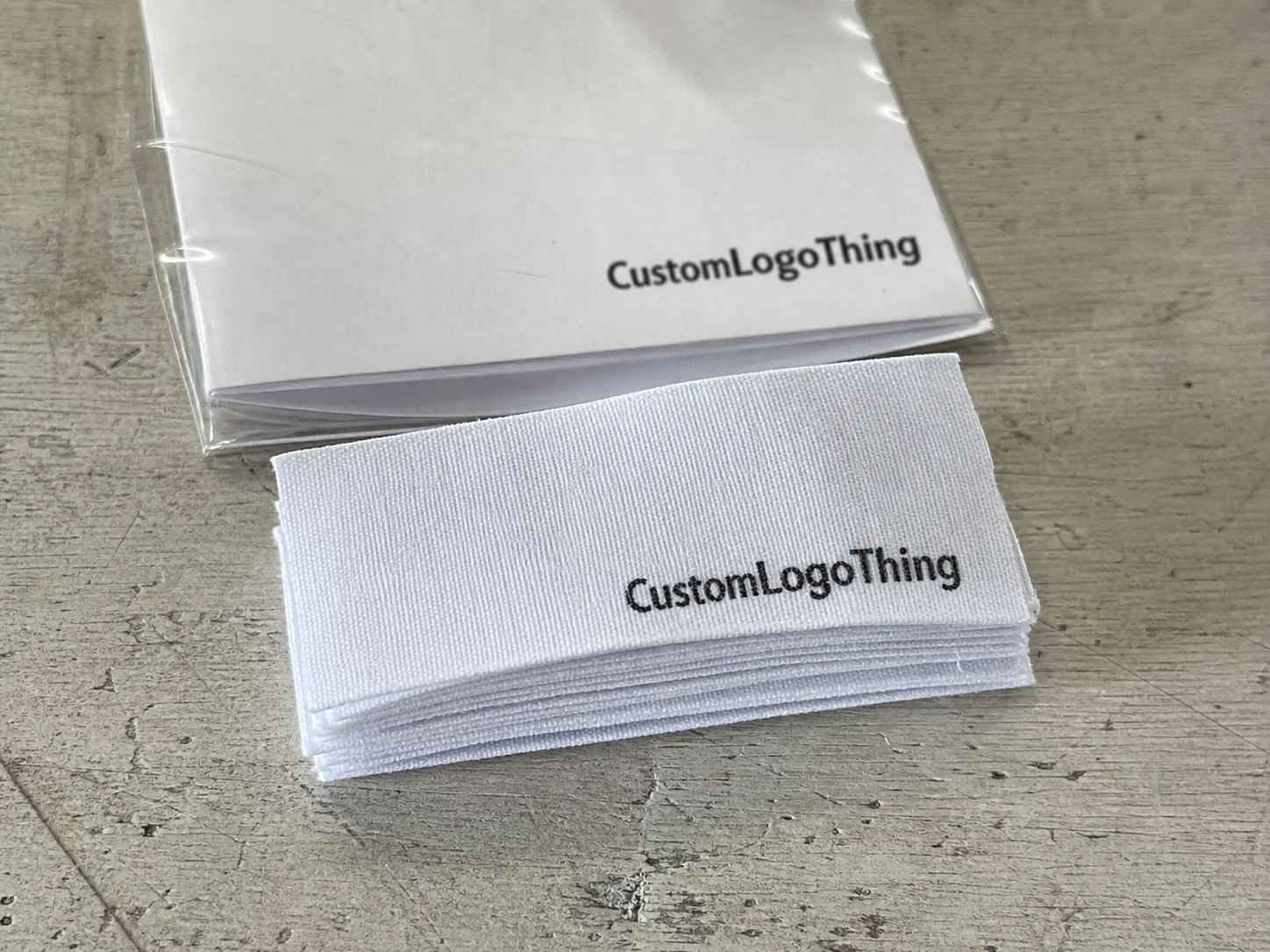
In practice, cloth labels fall into a few main buckets: woven labels, printed labels, and labels made from fabric options such as satin, taffeta, or damask. The material and construction decide how much detail the label can carry, how soft it feels against skin, and how well it holds up once the garment starts moving through real life.
That sounds straightforward until you compare actual use cases. A premium tee may need a soft woven neck label with a clean fold and only a few words. A work uniform may need a durable care label that stays readable after repeated laundering. A children’s garment needs both legibility and comfort, because rough edges get noticed fast. One label style rarely solves all three.
Personalized cloth labels also sit somewhere between branding and operations. A brand logo alone may look fine in a mockup, but retail and fulfillment often need more than a logo. Size, fiber content, care symbols, origin statements, and batch consistency all matter. Buyers who separate “design” from “compliance” usually end up redoing one or the other.
The useful way to think about these labels is as a working component, not decoration. They are part of the product spec. That means they should be judged by legibility, softness, wash durability, edge finish, and how they behave when sewn into the garment. A label that looks good on screen but curls, fades, or scratches the wearer is not a good label, even if the proof looked clean.
A useful label has to survive the same conditions as the garment. If it only looks right before sewing, it is not finished enough for production.
For buyers comparing formats, the Custom Labels & Tags category is usually the right place to start because it lets you compare construction, attachment method, and order volume before you commit to artwork. That order matters. A design decision made before the spec is settled often costs time later.
How production actually moves from artwork to delivery
Label production has a predictable path, and the best suppliers keep the same checkpoints because each one prevents a different kind of failure. The sequence is usually artwork review, technical setup, proofing, sample approval when needed, full production, finishing, and packing. The steps are simple; the details inside each step are where the risk lives.
Artwork review is the first filter. Fine lines, tiny lettering, and tight spacing often break down at label scale, especially on woven formats. A logo that is crisp at 2000 pixels can become a blur if it is pushed too small. Buyers sometimes expect a direct shrink from their website art, but label artwork needs to be designed for the physical size, not adapted after the fact.
Technical setup takes more time than people expect because the label is not just a picture. A woven label requires thread decisions and stitch mapping. A printed label needs ink coverage and wash-performance thinking. A folded label needs a layout that survives the fold line without hiding important details. Even cut style matters, because heat-cut edges, end folds, and center folds all behave differently in sewing and in wear.
Proofing is where a lot of avoidable mistakes are caught. For simple reorders, a digital proof may be enough if the brand already approved the construction. For a first run, or any label with fine text, a physical strike-off is more reliable. It lets the buyer check scale, contrast, hand feel, and edge behavior instead of trusting a screen image that cannot show texture.
Lead time is usually less about a mysterious factory schedule than about approval speed. Clean files, fast responses, and stable specs save more time than almost anything else. The reverse is also true. Missing copy, outdated logos, delayed color confirmation, or repeated changes to the fold type can push the job back even if the production line is ready.
Shipping and packing matter more than many buyers expect. A label can be perfect in production and still arrive bent, dirty, or mixed if carton packing and sorting are weak. For buyers who care about handling quality, it helps to look at transport and packaging standards with the same seriousness used for finished goods. Organizations such as the ISTA transport testing guidance are useful references for thinking about damage prevention during shipping.
Typical timing depends on complexity, but a clean order often moves faster than a rushed messy one. Straightforward woven or printed labels can be relatively quick once artwork is approved. Fine-detail damask, special folds, or custom finishing add time. Rush production exists, but it usually trades away flexibility, inspection depth, or price. That tradeoff should be explicit rather than hidden.
Materials, weaves, folds, and finish details
Material choice changes the entire feel of the label. Satin is smooth and slightly glossy, which is why it shows up often in softer fashion applications and neck labels. Taffeta is flatter and usually more economical, so it is a practical fit when the label needs to work hard without looking luxurious. Damask is tighter and more detailed, which makes it better for small logos, precise lettering, and premium garments that need cleaner edges.
Printed cloth labels solve a different problem. They can handle small text and complex layouts more easily than a loose weave in some cases, and they are useful when a design includes care information, multiple languages, or a low-contrast mark. The tradeoff is that print durability has to be checked honestly. Some labels look excellent out of the box but soften, crack, or fade after repeated washing. That may be acceptable for low-stress items, but not for garments that are washed frequently.
Fold style affects both appearance and usability. An end fold is common when the label is sewn into a seam and only part of it should remain visible. A center fold works well for neck labels because it creates a neat hanging point. A loop fold gives visibility on both sides and can be useful when the brand needs more usable surface. Straight cut labels are simpler and often used for care panels or flat applications.
There is also a practical comfort question that buyers sometimes overlook. A beautifully detailed label can still fail if the edge feels abrasive on skin. That is why soft-hand finish, edge treatment, and stitching placement matter. Heat-cut edges can reduce fraying. Backing choices can reduce irritation. A label that avoids scratchiness can improve the wearer’s perception of the whole garment, even if they never consciously think about why it feels better.
Color choice should be handled with more restraint than enthusiasm. High contrast is the safest path for legibility, especially after sewing and repeated laundering. Tonal branding can work, but only when the label has enough size and the type is not overly thin. A subtle logo with thin letters and low contrast may look refined in a mockup and disappear completely in the seam.
Material specifications should also match the product’s use case. A label for a fashion blouse does not face the same wear as one on a children’s tee, a towel, or a uniform. The best spec is not the fanciest one. It is the one that survives the actual garment lifecycle with the fewest compromises.
| Label type | Typical use | Strengths | Tradeoffs | Usual cost direction |
|---|---|---|---|---|
| Satin woven | Soft apparel, neck labels | Soft hand, clean appearance | Less ideal for very small detail | Moderate |
| Taffeta | Basic brand and care labels | Economical, easy to spec | Less premium feel | Lowest |
| Damask | Premium garments, fine logos | Sharper detail, better definition | Higher setup and unit cost | Higher |
| Printed cloth | Care info, variable data, small text | Good for text-heavy layouts | Ink durability must be checked | Moderate to higher |
Pricing, MOQ, and where cost really comes from
Pricing is usually shaped by quantity, size, color count, weave or print complexity, fold style, and finishing. Two labels with the same logo can still price very differently if one is a simple straight-cut taffeta piece and the other is a fine-detail damask with a center fold and premium finishing.
MOQ is one of the first things that surprises new buyers. Smaller runs usually cost more per unit because the setup is spread across fewer labels. That does not make short runs a bad idea. It only means that the economics are different. A 500-piece order may be sensible for a launch, while a 5,000-piece order often brings the unit price down enough to support a lower replenishment cost later.
Buyers should look at landed cost, not just the quote line. Sampling, packing, shipping, rush handling, and split deliveries can all change the final number. A label that looks cheap can become expensive if the first run is undercounted, the artwork changes after approval, or the buyer has to reorder with an expedited timeline. The hidden cost is rarely the material itself; it is usually the change control around the material.
Real-world pricing ranges vary by supplier and volume, but a few broad patterns are common:
- Basic taffeta labels: often around $0.03 to $0.08 per unit at higher quantities, with smaller runs sitting above that range.
- Satin woven labels: often around $0.05 to $0.12 per unit depending on size, folds, and stitch detail.
- Damask labels: often around $0.08 to $0.20 per unit when the artwork needs tighter construction and more care in production.
- Printed cloth labels: often around $0.04 to $0.15 per unit, with wash requirements and ink coverage affecting the quote.
Those ranges are directional, not fixed. Shipping lane, raw material cost, and the exact finishing package can shift them. A buyer comparing cloth clothing labels personalized for different garment lines should compare only like-for-like specs. Same size. Same fold. Same color count. Same attachment method. Same delivery terms. Without that discipline, the lowest quote is often just the least comparable one.
There is also a quality cost that rarely appears in the quote. If the label is too stiff, too rough, or too hard to read after sewing, the brand may pay for complaints, replacements, or a second production run. A slightly higher unit price can be the cheaper outcome if it avoids those downstream problems.
How to prepare artwork that will print or weave cleanly
Start with the garment and the label placement, not the artwork file. A neck label on a T-shirt has different constraints from a seam label in a jacket lining, and a care label in a waistband behaves differently again. Once the placement is known, the acceptable size and the safe amount of information become much clearer.
Gather the essentials before requesting a proof: logo files, exact copy, label dimensions, brand color references, and the intended attachment method. If the label has to include size, fiber content, care symbols, or country-of-origin text, that content should be written clearly before production starts. Tiny layout errors are easy to miss on a screen and annoying to fix later.
Small labels reward restraint. Thin typefaces, compressed line spacing, and crowded layouts often fail once they are woven or printed at real size. If a brand wants a quieter visual style, the safer route is usually fewer words and stronger contrast rather than squeezing in more information. The label has to read quickly and stay readable after repeated handling.
Four checks reduce mistakes:
- Review spelling, sizes, and placement on the digital proof.
- Check the fold direction and make sure the visible side matches the garment use.
- Confirm colors against actual references, not just a monitor.
- Approve a sample or strike-off at true size before releasing the full run.
Ask direct questions before the order is released. Will the label survive repeated wash cycles? Does it need a softer backing for skin contact? Will it be sewn in, heat-applied, or otherwise attached? Does the care copy match the market the garment will ship into? These questions surface hidden assumptions early, which is exactly where they are cheapest to correct.
Once the spec is settled, keep it in one control document. The best spec sheets include dimensions, approved colors, fold type, attachment method, version date, and sample reference. That becomes the baseline for future reorders and keeps the label consistent across batches. Consistency matters more than chasing small unit-price swings from one run to the next.
Mistakes that cause rework, delay, or wasted inventory
The most common mistake is approving artwork that looks fine on a monitor but fails once reduced to label size. Fine text gets crowded, thin lines disappear, and low-contrast branding becomes hard to read after weaving or printing. A mockup can hide those weaknesses very easily.
Another mistake is choosing by appearance alone. Buyers sometimes select a label because it looks premium in a sample image, then discover it is too stiff, too rough, or not durable enough for the product’s wash cycle. That is avoidable if the label spec starts from the garment’s actual use instead of from a visual mood board.
Incomplete files slow everything down. Mixed dimensions, outdated logos, inconsistent color references, and unlabeled revisions often trigger extra proof rounds. Each round creates delay, but the bigger issue is that too many revisions make it harder to know which version was actually approved.
Skipping samples can be expensive, especially on a first order. If the hand feel is wrong, the edges are sharp, or the logo is not readable when folded, the full run may need to be redone. That can disrupt packing, delay shipping, and force a reorder under pressure.
Under-ordering is another common trap. A brand may only want enough labels for the first drop, but if sales move faster than expected, the replenishment order can cost more and may not match the earlier batch exactly. Labels are small, but inconsistent labels are noticeable. Once a product has sold, the buyer often wishes the first spec had been locked more carefully.
There is also a quiet failure mode that shows up later: using the wrong label for the wrong product line. A soft satin label may work for one garment and fail on a rugged piece that needs tougher construction. A clean printed care label may be fine for one market and too weak for another. Matching the label to the product line is not overthinking. It is basic control.
Practical buying checklist for first and repeat orders
Start with the garment, then move to the label. That order avoids most of the mistakes above. A soft tee, a lined jacket, and a heavy work uniform need different label behavior even if they all carry the same brand mark.
For a first order, a small test run is often the right move. It gives the buyer a real read on color, softness, wash behavior, and finish without tying too much inventory to an untested spec. Once the label is approved, it should be held steady unless the product itself changes. Reordering the exact same spec is usually cheaper and safer than revising it just to chase a small quote difference.
A useful checklist for label buying is practical, not glamorous:
- Confirm finished label size and placement on the garment.
- Choose the construction based on wear and wash expectations.
- Check legibility at actual size, not only in a mockup.
- Request a proof or sample before full production.
- Compare quotes only after matching all key specs.
- Lock the approved version and keep it as the reorder reference.
If the program needs compliance language or market-specific details, build that into the spec from the start. Rewriting care content after the proof stage is one of the easiest ways to delay a label order. It is also avoidable. The clearer the brief, the less room there is for a wrong assumption.
That is the practical path for cloth clothing labels personalized for brand orders: define the use case, Choose the Right construction, approve the sample against the actual garment, and keep the spec stable so repeat production stays consistent.
What are cloth clothing labels personalized for brand garments usually made from?
They are commonly made from woven or printed textile materials such as satin, taffeta, or damask. The best choice depends on how detailed the artwork is, how soft the label needs to feel, and how much washing the garment will go through.
How long does it usually take to produce personalized cloth clothing labels?
Lead time depends on artwork readiness, sample needs, quantity, and finishing details such as folds or cut style. Clean files and fast approval usually shorten the schedule more than anything else.
What affects the price of personalized cloth clothing labels the most?
Quantity, size, color count, weave complexity, fold style, and finish options are the main drivers. Shipping, rush timing, and sample requests can also move the final cost.
What is a typical MOQ for cloth clothing labels personalized to order?
MOQ varies by supplier and label construction. Smaller runs usually carry a higher unit cost because setup is spread across fewer pieces, so it is worth confirming MOQ before artwork is finalized.
How can I make sure my label stays readable after sewing and washing?
Use enough contrast, keep text large enough for the finished size, and avoid overcrowding the layout. A proof or sample at actual size is the most reliable way to catch problems before full production.
Is woven always better than printed for cloth labels?
No. Woven labels are often stronger for branding and texture, but printed labels can be better for small text, compliance details, or more complex layouts. The right choice depends on the garment and the information the label has to carry.