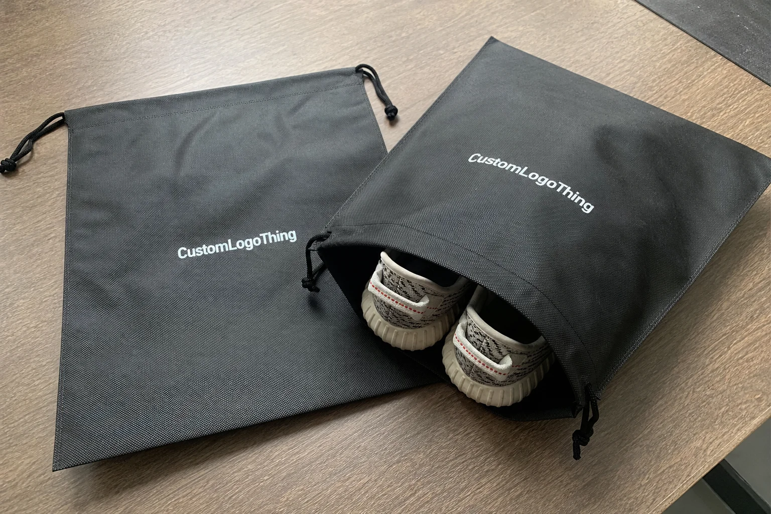
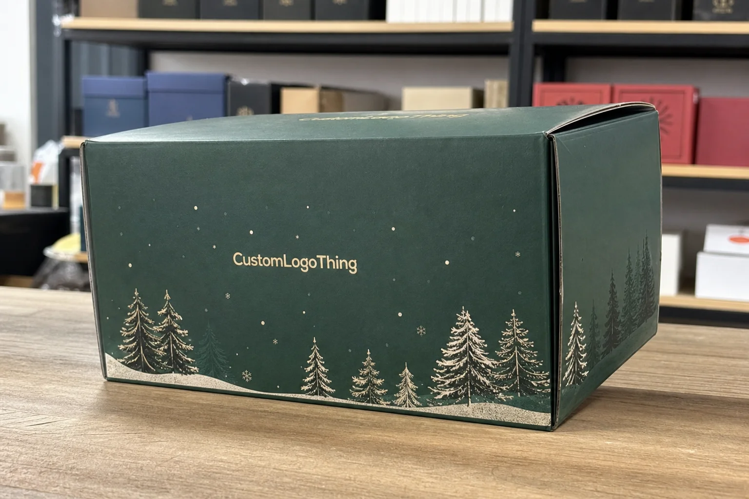
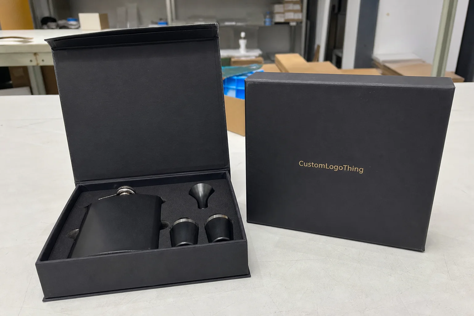
Buyer Fit Snapshot
| Best fit | compare luxury rigid box finishes options for packaging buyers comparing material specs, print proof, MOQ, unit cost, freight, and repeat-order risk where brand print, material, artwork control, and repeat-order consistency matter. |
|---|---|
| Quote inputs | Share finished size, material target, print colors, finish, packing count, annual reorder estimate, and delivery region. |
| Proofing check | Approve dieline scale, logo placement, barcode or warning zones, color tolerance, and any recyclable or compostable wording before bulk production. |
| Main risk | Vague material claims, crowded artwork, or missing packing details can create delays even when the unit price looks attractive. |
Fast answer: Compare Luxury Rigid Box Finishes Options: Dieline, Finish, Proof, and Buyer Review should be specified like a repeatable production item. The safest quote includes material, print method, finish, artwork proof, carton packing, and reorder notes in one written spec.
What to confirm before approving the packaging proof
Check the product dimensions against the actual filled item, not only the sales mockup. Ask for tolerance on folds, seals, hang holes, label areas, and retail display edges. If the package carries a logo, QR code, warning copy, or legal claim, reserve that space before decorative graphics fill the panel.
How to compare quotes without losing quality
Compare board or film grade, print process, finish, sampling route, tooling charges, carton quantity, and freight assumptions side by side. A lower quote is only useful if the supplier can repeat the same color, closure quality, and packing count on the next order.
I’ve spent enough time on corrugate lines, wrapping tables, and final QA benches to know one thing for sure: when people compare luxury rigid box finishes, the finish that looks most expensive under a bright showroom spotlight is not always the one that survives fingerprints, shipping rub, and a week of shelf handling. I remember standing on a factory floor in Dongguan watching a beautiful sample get passed around like a trophy, only to see the corners start whitening after a few aggressive hand-offs. Gorgeous. Useless. On a real factory floor, wrap tension, board corners, and adhesive cure time change the story fast, and that is why I always compare luxury rigid box finishes on actual rigid setup boxes, not flat swatches.
Most brands start in the wrong place. They ask which finish looks the fanciest, then only later ask whether it can hold up in transit, whether it prints cleanly on 120gsm art paper, or whether a soft-touch laminate will scuff after five hand-offs from packing bench to warehouse pallet. Honestly, I think that’s backwards. If you compare luxury rigid box finishes the way a production manager does, you end up choosing based on appearance, durability, tactility, turnaround, and unit cost all together. Less fantasy. More Boxes That Actually make it to the customer in one piece.
Quick Answer: Compare Luxury Rigid Box Finishes Fast
If you need the short version, here it is: compare luxury rigid box finishes by matching the finish to the product, the handling conditions, and the brand story, not by chasing the prettiest sample card. In a showroom, soft-touch often feels like the winner because it has that velvety, almost suede-like hand feel, but I’ve seen matte lamination outlast it in e-commerce because matte hides light scuffs and fingerprints better once the box starts moving through packing and returns. And yes, the “pretty” option sometimes gets knocked out by the boring one. Packaging loves irony.
The core finish families are straightforward. Soft-touch lamination gives you a plush, high-end feel with a muted surface. Matte lamination gives you a clean, understated premium look and usually better everyday durability. Gloss lamination brings color punch and shine. Foil stamping adds metallic or pigmented contrast. Embossing and debossing create real dimensional branding. Spot UV gives selective shine. Textured paper wraps offer tactile character, and specialty coatings can fine-tune feel or resistance.
The practical takeaway is simple: the best finish depends on brand positioning, product category, shipping environment, and budget. A fragrance brand with retail counters in soft lighting may compare luxury rigid box finishes very differently from a gaming accessory brand shipping 20,000 units through a fulfillment center with carton friction on every conveyor turn. I’ve watched the same foil logo look stunning on a jewelry box and then get lost on a deep navy lid because the artwork was too small for the box face. Context matters. Always.
When my team checks a rigid setup box, we look at the finish under warehouse fluorescents, retail track lighting, and natural window light. We also run gloved and bare-handed handling, because compare luxury rigid box finishes properly means seeing what happens when someone’s hands are warm, oily, or rushed. That is where the truth shows up, not on a flat printed sheet. A sample that passes in a photo shoot and fails in a packing room is not a win. It’s a very expensive joke.
“A finish that photographs well can still fail in the hand. I’ve seen that mistake cost a client a full reprint because the first sample looked rich online but showed corner whitening after just one handling cycle.”
Compare Luxury Rigid Box Finishes Side by Side
To compare luxury rigid box finishes in a way that actually helps purchasing and brand teams, I use six checkpoints: luxury look, scratch resistance, fingerprint visibility, texture, branding impact, and production complexity. Those six tell you nearly everything you need to Know Before You approve a prototype. I’d love to say it’s more glamorous than that, but most packaging decisions are just expensive trade-offs wearing a nicer suit.
| Finish | Luxury Look | Scratch Resistance | Fingerprint Visibility | Texture | Production Complexity |
|---|---|---|---|---|---|
| Soft-touch lamination | Very high, especially for beauty and gift boxes | Moderate | Low to moderate | Velvety, smooth, warm | Moderate |
| Matte lamination | High, understated and refined | High | Low | Dry, smooth, clean | Low to moderate |
| Gloss lamination | High for bold visuals | Moderate to low | Moderate to high | Slippery, polished | Low |
| Spot UV | High contrast, attention-grabbing | Moderate | Moderate | Mixed matte and glossy areas | Moderate to high |
| Foil stamping | Very high when used with restraint | High on the foil area | Low | Smooth metallic or pigmented | Moderate to high |
| Embossing/debossing | Very high for tactile branding | High | Low | Raised or recessed texture | Moderate to high |
| Textured paper wraps | High for artisanal or quiet-luxury brands | High | Low | Fibrous, linen, leather-like, natural | Moderate |
| Specialty coatings | Varies, often premium and technical | High to very high | Low to moderate | Depends on coating chemistry | High |
Soft-touch lamination versus matte lamination is the comparison I get asked about most in cosmetic and skincare packaging. Soft-touch wins on first impression because it feels luxurious the moment a customer picks it up, but matte usually wins if the box is going to pass through multiple hands, be stacked in a retail backroom, or sit in a shipping carton for days. I once visited a contract packer in Dongguan where a soft-touch lid looked beautiful on day one, then started showing corner rub after a 48-hour fulfillment test; the matte sample next to it still looked nearly new. That little face-off saved the client from a very awkward reprint conversation. I still remember the sigh from the brand manager.
Gloss lamination versus spot UV is a different kind of decision. Gloss gives you full-surface shine, richer color saturation, and a more vibrant look on large graphics, while spot UV is about contrast and emphasis. If your logo sits on a matte black rigid box, a raised glossy spot can look sharp, especially under store lighting. If your design is busy, though, spot UV can become visual noise fast. I’ve had clients approve a spot UV pattern on screen, then reject it in hand because the pattern looked louder on the actual board than it did in the PDF. Screens are liars. Sometimes very polite liars, but still liars.
Foil stamping, embossing, and debossing are the finishes that most clearly signal “premium” without needing a lot of ink coverage. A single gold foil monogram on a 90mm by 90mm jewelry box lid can do more for perceived value than a full-color print with three extra effects. The catch is registration. If the die is off by even 0.5mm, the whole piece can look sloppy, and on a rigid setup box that flaw is harder to hide because the edges and corners are so visible. People notice the corners. Always the corners. They have a weird talent for ruining otherwise perfect days.
Textured paper wraps and specialty coatings deserve more attention than they get. A linen wrap on a fragrance box, or a slightly fibrous uncoated wrap on a premium stationery set, can communicate restraint and craftsmanship better than anything glossy. Compare luxury rigid box finishes this way, and you start seeing how “quiet luxury” is often built from touch, not shine. That’s not a trendy phrase to me. It’s a real production choice.
Detailed Reviews of Luxury Rigid Box Finishes
Here is where I slow down and talk like a packaging person who has watched boxes come off a wrapping line at 2:00 a.m. after a long run. When you compare luxury rigid box finishes in detail, each finish has a personality, and each one fails in a different way if the structure, glue line, or board score is not right. There’s no magic finish that fixes bad construction. If only. My life would be quieter.
Soft-touch lamination
Soft-touch lamination feels expensive because it breaks the usual expectation of “plastic film.” Instead of a shiny or dry surface, you get a velvety hand feel that makes people slow down and hold the box for a second longer. That pause matters for jewelry, premium cosmetics, fragrance, and gift sets, where the tactile experience is part of the product story.
Soft-touch is not always the easiest finish to live with. On high-handling packages, especially the kind that move through sample rooms, influencer kits, or repeated store demos, it can pick up rub marks sooner than matte. It also shows edge wear on corners if the wrap tension is too aggressive or the board thickness is inconsistent. On a 2mm or 3mm greyboard setup box, that edge detail becomes visible quickly if the converting line is not dialed in. I’ve seen operators blame the film, the glue, the humidity, and once even the moon phase. The board, naturally, was the real problem.
Matte lamination
Matte is the finish I trust most when a client wants to compare luxury rigid box finishes and still keep their options practical. It has a clean, modern appearance, and it does a better job hiding fingerprints and minor scratches than gloss. For luxury electronics, skincare, wellness, and premium apparel accessories, matte feels controlled and confident without trying too hard.
Matte is also easier to pair with foil stamping or embossing, because the contrast is crisp. One of my favorite samples came from a client meeting in a Shenzhen showroom where we had a charcoal matte box with a silver foil logo and a shallow deboss around the lid edge. The result looked expensive without shouting, and it passed our handling test better than the soft-touch option beside it. That kind of outcome is why I often recommend matte first when clients compare luxury rigid box finishes for the first time. It just behaves better. No drama. A rare and welcome thing.
Gloss lamination
Gloss is the bold one. It reflects light, boosts color density, and works especially well when the brand identity relies on saturated photography or punchy graphics. If you want the box to pop from six feet away, gloss can do that. It is common in promotional packaging, consumer electronics, and some beauty launches where visual impact matters more than quiet refinement.
The downside is easy to see. Gloss shows fingerprints, scuffs, and fine abrasions more readily than matte, and it can slide into “less premium” territory if the design system is not disciplined. On a rigid box, especially one with large surface areas, the reflective finish also exaggerates any imperfections in the wrap or the glue beneath it. I’ve seen one tiny adhesive ridge become glaringly obvious under gloss that would have disappeared under matte. It was the kind of flaw that makes everyone suddenly stare at the ceiling like it’s the most interesting thing in the room.
Spot UV
Spot UV is really a contrast play. It puts gloss only where you want the eye to stop, usually on a logo, pattern, or illustrative detail. When done well, it creates a very polished, tactile contrast between the flat base finish and the shiny elements. For launch boxes, gift sets, and promotional kits, that contrast can be powerful.
Still, spot UV can be tricky. The varnish has to align tightly, the artwork has to be spaced properly, and the base substrate should not be too busy. If the design is crowded, spot UV loses its impact. When I compare luxury rigid box finishes for graphic-heavy brands, I usually reserve spot UV for stronger, more disciplined layouts with plenty of negative space. Otherwise it starts feeling like someone spilled gloss and called it design.
Foil stamping
Foil stamping remains one of the quickest ways to elevate a rigid box. Gold, silver, black, rose gold, copper, holographic, and even colored foils can make a logo or monogram look formal and valuable. For limited editions, high-end skincare, and jewelry packaging, foil still carries a lot of weight.
The practical issue is consistency. The heat, pressure, dwell time, and substrate all matter, and if the setup is off, the foil can appear patchy or slightly blurred at the edges. On a rigid box, especially with a textured wrap, the foil needs enough pressure to bite cleanly without crushing the board beneath. That balance is not automatic. It takes a good operator and a well-made die. And a supplier who answers messages before the job is already late. Miracles are not part of the standard process.
Embossing and debossing
Embossing and debossing are about depth. They create a physical interaction that customers feel before they even process the design. A raised logo on a watch box or a pressed monogram on a cosmetic set gives the packaging a sense of craft that ink alone cannot match.
I like embossing best when the artwork is simple. If the detail is too fine, the structure can blur it or flatten the effect at the corners. Debossing has a more understated, almost stamped-in feel, and it works especially well on leather-like wraps and premium paper textures. When brands compare luxury rigid box finishes and ask for “something elegant but not flashy,” embossing and debossing often solve the problem faster than another layer of print. Simple usually wins. Quietly. Politely. Unlike some clients’ revision notes.
Textured paper wraps
Textured wraps are underrated because they do not rely on shine to create value. Linen textures, lightly grained papers, soft felt-like wraps, and natural fibers can make a rigid box feel handcrafted and expensive. This is a strong direction for bridal packaging, artisan beauty, premium stationery, and fashion accessories.
Textured wraps also hide small handling marks better than smoother films, although they can be harder to print cleanly on if the texture is heavy. On one supplier visit in a paper mill outside Suzhou, I watched a textured wrap struggle with fine typography because the surface topography swallowed the thin strokes. That is why I always recommend larger logos and slightly heavier line weights if the brand wants texture plus print. Tiny serif fonts on rough texture? Cute in theory. A headache in production.
Specialty coatings
Specialty coatings include things like anti-scratch finishes, tactile varnishes, pearl effects, and some water-based protective layers. They are attractive when a brand wants a finish that feels engineered rather than decorative. The chemistry matters here, and not every coating behaves the same on every wrap stock.
These coatings can add protection, but they usually increase process control demands and QC time. They are not my first suggestion for short runs unless the client has a very specific performance target. Still, for teams trying to compare luxury rigid box finishes with both appearance and handling in mind, specialty coatings deserve a spot on the shortlist. They can be the right answer, just not the easy one.
For industry context on packaging materials and sustainability expectations, I often point clients to sources like the PMMI packaging association and the Forest Stewardship Council. Those resources help anchor finish decisions in broader material and sourcing conversations, especially when board, wrap paper, and recycling claims are part of the brief.
Compare Luxury Rigid Box Finishes by Price and Value
Price is where a lot of buyers get surprised, because the finish name alone does not tell the full story. You can compare luxury rigid box finishes all day long, but if the structure is complex, the artwork needs multiple setup passes, or the production run is short, the economics change quickly. I’ve watched people budget for the “finish” and then get ambushed by tooling. That’s not a budgeting plan. That’s a trap with a spreadsheet.
As a rough working guide, I break finish budgets into three bands for Custom Rigid Boxes: budget-friendly premium, mid-range luxury, and high-end specialty. A simple matte lamination with one foil hit usually sits in the most efficient premium tier. Soft-touch, spot UV, and textured wraps often move into mid-range. Multi-step combinations like foil plus emboss plus specialty coating can push a project into the high-end bracket, especially on short runs of 1,000 to 3,000 pieces.
| Finish Option | Typical Value Tier | Common Relative Cost Driver | Best Use Case |
|---|---|---|---|
| Matte lamination | Budget-friendly premium | Low setup, efficient converting | General luxury branding, electronics, wellness |
| Soft-touch lamination | Mid-range luxury | Special film cost, handling sensitivity | Beauty, fragrance, premium gifts |
| Gloss lamination | Budget-friendly premium | Low material complexity | Bright graphics, promotional kits |
| Spot UV | Mid-range luxury | Extra coating pass and alignment | Logo emphasis, contrast-based design |
| Foil stamping | Mid-range to high-end specialty | Tooling, heat, die setup | Monograms, seals, limited editions |
| Embossing/debossing | Mid-range to high-end specialty | Die making and press control | Luxury marks, tactile branding |
| Textured paper wraps | Mid-range luxury | Wrap material premium and conversion care | Quiet luxury, artisanal presentation |
| Specialty coatings | High-end specialty | Custom chemistry and QC | Technical premium applications |
The part most buyers miss: labor and setup often cost more than the finish itself. Foil stamping needs a die. Embossing needs a matched tool. Spot UV needs alignment and curing. If the box has a lid-and-base structure with a deep wrap and tight corner folds, the finishing cost rises because the wrapping operator has to control tension more carefully. I’ve seen a project where a matte box with one gold foil logo ended up less expensive than a supposedly “simpler” decorative box that used two print passes, spot gloss, and an extra inspection step. Everyone hates that moment when the “cheaper” idea arrives with a bigger invoice.
Short runs change the math too. If you only need 2,000 pieces, one premium detail on a matte or soft-touch base often delivers better perceived value than stacking three or four finishing effects. Buyers sometimes ask for everything at once, and I understand the impulse, but a crowded finish stack can look busy instead of luxurious. Compare luxury rigid box finishes with restraint, and the box often feels more expensive because the design has room to breathe. Luxury likes space. Crowding it is the packaging equivalent of wearing five watches.
For environmental context and packaging material discussions, the EPA recycling guidance is a useful reference when you are balancing coated paper choices, board content, and end-of-life messaging. Not every luxury finish is equally friendly to recycling streams, and that reality should be part of the brand conversation, especially if sustainability claims appear on pack or online.
Process and Timeline: How These Finishes Are Made
Production is where romantic ideas meet the press line. The real sequence for a rigid box usually starts with structural sampling, then artwork prep, digital proofing, wrap printing, finishing application, die cutting, board wrapping, and finally final QC. Each step has a chance to add value, and each step can also add delay if the finish is complicated. I’ve lost count of how many “simple” projects turned into a week of chasing tiny alignment issues. Packaging has a talent for making people humble.
Simple matte or gloss laminated boxes are generally quicker because the process is familiar and less sensitive to registration drift. Soft-touch adds a little more care because the film and adhesive behavior can vary by supplier batch. Foil stamping, embossing, debossing, and specialty coatings extend timelines because they often require a dedicated machine setup, more curing time, and tighter inspection.
One of the most common bottlenecks I’ve seen is foil alignment on a logo that sits too close to a fold or lid edge. Another is corner wrap quality, especially when a textured paper wants to spring back and a less forgiving adhesive has been chosen to save cost. On a factory floor in Shenzhen, I watched a team lose nearly half a day adjusting press pressure because a deep deboss was collapsing the paper fibers more than expected. That is the kind of detail that never shows up in a mockup deck. It also never shows up in a “looks good enough” email, which is usually how trouble starts.
The timeline also changes with substrate. Coated art paper behaves differently from specialty paper, and a heavily textured wrap requires more careful handling in the converting line. If a brand needs a fast launch, I usually steer them toward a cleaner matte or soft-touch build with one controlled premium detail. That is simply easier to manage than a stacked decorative package with three separate finishing systems.
What to expect in timing terms
- Simple laminated rigid boxes: often the fastest option once the structure is approved.
- Foil or emboss/deboss builds: add tool prep and press setup time.
- Spot UV or specialty coatings: add curing, registration, and QC checks.
- Prototype approval: is the biggest safeguard because finish changes are much cheaper before mass production.
In practical terms, I’ve seen straightforward premium rigid box jobs move from proof approval to shipment in about 12 to 15 business days at efficient plants, while multi-step luxury builds can stretch beyond that depending on tool readiness and inspection load. That is not a promise, just a realistic floor-level range. If a supplier claims every finish can ship at the same speed, I would ask for the line schedule and a sample approval plan before believing it. And maybe a second opinion from someone who’s actually stood near the machine.
How to Choose the Right Finish for Your Brand
To compare luxury rigid box finishes properly, start with the product, not the finish. A $280 fragrance bottle, a $90 skincare set, and a $12 consumer gadget do not need the same visual language, and they certainly do not need the same handling durability. The right finish is the one that supports the purchase decision and survives the route from packing bench to customer hands.
If your brand lives in beauty, fragrance, wellness, or luxury gifting, soft-touch or matte usually makes sense because tactility and visual calm matter so much. Soft-touch works especially well when the product story is intimate and sensory. Matte works when the brand wants polish without excess. I have seen both used on rigid setup boxes with excellent results, as long as the logo size is controlled and the print contrast is planned early. That early planning part is boring, yes, but boring is how you avoid expensive surprises.
If the box is for consumer electronics, a promotional kit, or a high-volume e-commerce drop, gloss or spot UV may be a better fit. Those finishes can deliver stronger shelf visibility and a sharper first look on social unboxing clips. Just remember that the same reflectivity that looks dramatic on camera can make scuffs visible in transit. That trade-off is real, and a good packaging team will talk through it rather than hiding it. I trust the supplier who warns me, not the one who says every option is perfect. Perfect usually means “we haven’t shipped it yet.”
For jewelry, fashion accessories, and limited editions, foil stamping, embossing, debossing, and textured wraps often create the right amount of ceremony. A monogram in gold foil on a black matte lid still works because it feels deliberate. A textured wrap with blind deboss can feel even more exclusive because the finish is quiet and the craftsmanship is obvious in the hand.
Do not choose only one finish because you think that is the safest route. Often, the best result comes from pairing two controlled effects, like matte lamination plus foil, or soft-touch plus a simple deboss. That combination usually gives better value than a single overloaded effect that tries to do too much. A luxury box is not a buffet. You do not need to pile everything on just because it is available.
“The strongest sample we ever approved was not the flashiest one. It was a matte black rigid box with one silver foil mark and a 1.2mm deboss. No clutter. No extra shine. It just felt expensive.”
When I compare luxury rigid box finishes for clients, I also ask about the handling environment. Will the box sit in a luxury retail store under warm spotlights, or will it travel in double-wall shipping cartons and get opened on a kitchen table? Will it live behind glass or inside a warehouse bin? Those details change the recommendation fast. A finish choice made for a boutique shelf can fall apart in a parcel network, and the box does not care about your mood board.
Our Recommendation for Compare Luxury Rigid Box Finishes
If you want my honest ranking after years of sampling, press checks, and damaged-box callbacks, here it is. Best all-around finish: matte lamination with one premium detail like foil or embossing. Best premium-looking finish: soft-touch lamination, especially for beauty and gifting. Best durable finish: matte lamination or a textured wrap that hides wear well. Best budget luxury finish: clean matte with a single foil stamp. Best for high-contrast branding: spot UV on a matte base or gloss with restrained artwork.
Why do I keep returning to matte with foil or embossing? Because it balances elegance, Cost, and Production reliability better than most combinations. The box feels current without being trendy, the logo reads clearly, and the risk of visible scuffing stays manageable. For a lot of brands, that is the sweet spot when they compare luxury rigid box finishes for the first time and need a recommendation they can defend in a budget meeting. Nobody wants to walk into finance with a beautiful disaster and call it strategy.
Soft-touch is my top pick when the tactile experience is central to the brand story and the box will not be abused in transit. If your customer opens the package at home and the first contact matters more than warehouse durability, soft-touch can be the right emotional choice. It is especially strong for skincare and fragrance launches where the brand wants the packaging to feel like part of the ritual.
Spot UV and gloss can be excellent, but they ask for discipline. Bold color systems, high-contrast layouts, and strong retail environments make them shine. Subtle luxury positioning usually benefits more from matte, foil, and texture than from a shiny full-surface treatment. That is the mistake I see most often: a brand says “luxury,” then asks for every visual effect in the catalog. The result is usually less luxury and more “we ran out of restraint.”
My practical next steps are always the same. Define the product category clearly. Request finish samples on actual rigid board, not just printed cards. Compare those samples under warehouse lighting and retail lighting. Then approve a packed prototype, because corner performance and lid fit can change the way a finish reads once the box is fully assembled. If you compare luxury rigid box finishes that way, you make a decision with fewer surprises and less waste.
For brands working with Custom Logo Things, that is usually the most efficient route: start with the use case, narrow the finish family, then test the real box under real handling conditions. Compare luxury rigid box finishes on a live sample, not a sales sheet, and the answer becomes much clearer.
FAQ
How do I compare luxury rigid box finishes for a product that ships online?
Prioritize scratch resistance, fingerprint hiding, and corner durability over pure shine. Request samples that have been folded, wrapped, and handled, not just flat print swatches, because the wrap tension and board corners change the result. In most e-commerce programs, matte lamination with foil or embossing is the safest balance of premium look and everyday handling.
Which luxury rigid box finish feels the most premium in hand?
Soft-touch lamination usually feels the most velvety and upscale at first touch, especially on rigid setup boxes with clean edges and tight wrapping. Embossing also adds a strong tactile moment when customers run their fingers over a logo or seal. The best choice depends on whether you want soft elegance or a more sculpted, dramatic feel.
Is foil stamping worth the extra cost on rigid boxes?
Yes, when branding needs to look clearly high-end and memorable. Foil works especially well for logos, monograms, and limited-edition packaging, and it can make a small design element carry a lot of perceived value. It becomes less cost-effective if the artwork is too large or requires multiple foil colors.
What is the most durable finish for luxury rigid boxes?
Matte lamination is usually the most forgiving for everyday handling, because it hides minor rub and fingerprints better than gloss. Textured papers can also hide wear well while keeping a premium appearance. Gloss finishes look rich, but they tend to show scratches and scuffs faster.
How long does it take to produce custom rigid boxes with premium finishes?
Simple laminated boxes are generally faster than multi-step premium builds. Foil stamping, embossing, and specialty coatings add setup and QC time, especially if the box has tight registration or complex corner wrapping. Prototype approval is the biggest timeline safeguard because finish changes are easier before mass production.