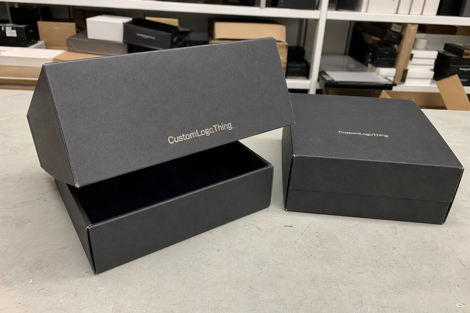
Custom 2 piece boxes do one job better than most packaging formats: they make the product feel intentional before the product is even seen. The separate lid and base create a slower reveal, and that pause changes how the contents are judged. A candle, skincare set, watch, accessory kit, or launch sample can feel materially more valuable in a two-piece rigid box than it does in a standard folding carton.
That effect is not cosmetic fluff. Packaging is part of the product experience, and buyers notice whether the structure signals care or corner-cutting. A rigid setup box, even without heavy decoration, usually reads as more premium because the box has weight, depth, and a clear opening sequence. For Brands That Sell presentation as much as utility, that matters immediately.
The format is not universal, though. Shipping needs, budget limits, and the product’s fragility still decide whether a two-piece structure makes sense. The point is not to choose the fanciest box. It is to choose the one that fits the item, the channel, and the margin.
What custom 2 piece boxes are, and when they outperform mailers
A two-piece box is a separate lid and base system, usually made as a rigid box with wrapped board walls or a thicker paperboard presentation build. The form is simple, but the execution can vary a lot. Board thickness, wrap stock, lid depth, and insert design all affect how the box feels and performs. In practical terms, custom 2 piece boxes are used when the packaging needs to contribute to the perceived value of the product rather than merely protect it.
They are common in cosmetics, jewelry, apparel accessories, candles, premium snacks, technology accessories, stationery sets, influencer kits, and holiDay Gift Packaging. They also work well for bundled products because the base can hold inserts, dividers, or formed cavities that keep multiple items in place. That makes them useful for sets where presentation and order matter just as much as protection.
Mailers still win in plenty of situations. They cost less, ship flatter, and are easier to run at scale. If the product is low-margin, lightweight, and expected to move through high-volume fulfillment, a mailer or folding carton is often the better financial decision. A rigid two-piece box adds material, labor, and assembly steps. You pay for that structure whether or not the customer notices it.
The distinction is usually clear once the use case is defined. If the box must help sell the product, custom 2 piece boxes earn their place. If the box only needs to survive distribution, a simpler structure can be smarter. For teams comparing options, our Custom Packaging Products page is a useful reference point because it shows how presentation, protection, and cost shift across formats.
There is also a middle case worth acknowledging. Some brands want a premium look but do not need full rigid construction. In those projects, a heavy paperboard presentation box can work as a lighter alternative. It will not feel identical to a true rigid setup, but it can reduce cost and improve shipping efficiency without giving up all the visual value.
How the lid-and-base structure changes the unboxing experience
The unboxing experience is shaped by motion. The lid lifts, the base stays planted, and the contents are revealed in stages. That sequence feels deliberate. It also creates a sense of control that standard tuck boxes rarely match. The product does not spill into view; it is presented.
Small structural choices change that feeling more than most buyers expect. A lid with a deeper overlap reads as more secure and more substantial. A lid that is too tight can scuff print or frustrate the customer. A lid that is too loose erodes the premium impression because it looks careless even if the box is expensive. The opening should feel clean, not fussy.
Thumb cutouts make removal easier, but they can interrupt the visual line if they are oversized or cut into the wrong panel. Magnetic closures create a crisp finish and a more engineered feel, though they add cost, weight, and extra assembly time. Ribbon pulls can be elegant on gift packaging, yet they are not always durable in repeat handling. None of these features is inherently better. Their value depends on how often the box will be opened and who is opening it.
Inside the box, inserts do a lot of the heavy lifting. Tissue paper softens the reveal. Foam protects fragile items, but it can look industrial if the rest of the package is designed to feel natural or recyclable. Paperboard dividers are clean, efficient, and easier to align with retail expectations. Molded pulp can be a practical choice for sustainability claims, though it needs the right design to avoid looking like a commodity tray instead of a considered component.
“If the lid feels loose, the box feels cheaper. If it takes two hands and too much effort, it feels overbuilt.” That balance is often the real target.
There is a broader brand effect here. Ordered presentation suggests quality control. Loose contents suggest indifference. The box may only be one part of the product, but customers often infer manufacturing discipline from the way the package behaves in their hands.
Key specifications that control fit, protection, and print quality
Most packaging problems begin with dimensions, and not just the dimensions written on the quote. Internal space matters more than outside measurements because the product has to fit after board thickness, insert material, and lid overlap are accounted for. A difference of 1 to 2 mm can be enough to change the way the box closes, shift the product during transit, or scuff a coated surface.
Material choice is the next major variable. Lightweight paperboard can work for presentation-style boxes that are not expected to carry much structural load. Rigid chipboard gives the box more body, more weight in hand, and better wall performance. Wrap stock changes the tone again. Smooth matte wrap, textured paper, soft-touch lamination, and linen-style finishes all communicate differently before the artwork even enters the picture.
Print decisions affect both appearance and cost. CMYK handles detailed imagery efficiently. Spot colors are better when brand color consistency matters. Foil stamping can sharpen a logo or mark a special edition, but too much foil starts to look busy. Embossing adds depth. Debossing can be quieter and more restrained. Soft-touch lamination feels excellent in hand, though dark colors can show fingerprints more easily under retail lighting and heavy handling.
Protection variables need equal attention. Board caliper, corner strength, insert density, and the shipping path all influence performance. A beautiful box that allows the product to rattle is not a premium box. If the package will move through parcel networks, transit testing is worth discussing early. The ISTA test standards provide a practical reference because they move the conversation from opinion to repeatable handling conditions.
For materials and sourcing, a certification request may be relevant if procurement or retail partners expect it. FSC-certified board or wrap does not automatically improve box performance, but it can support compliance language and simplify buyer review. That is especially useful when the packaging is part of a larger retail onboarding process.
One detail that is frequently underestimated is how the finish interacts with the die line. A logo placed too close to a fold can distort. Fine text can disappear into a seam. Deeply textured wraps can reduce sharpness on small type. The best-looking render is not always the best production spec. Packaging has to survive manufacture, not just the mockup stage.
For that reason, the real question is often not “What looks best?” but “What performs best for this product, this line, and this budget?” Those are different things, and the cheapest mistake is usually a spec that looked correct in a PDF but fails when the actual item is inserted.
Production steps, timeline, and lead time for a custom run
Production usually follows a tighter sequence than buyers expect. It starts with dimensions and structure approval, then moves to dieline review, artwork setup, sampling, and only then into printing, wrapping, assembly, and final inspection. If one step is incomplete, the rest slows down. Packaging rarely fails because the factory is moving too slowly. It more often fails because the handoff between spec, artwork, and approval was not clear.
The sample stage is where many schedules get rescued or lost. A sample reveals whether the lid fit is acceptable, whether the insert actually holds the product, and whether the finish behaves the way the team expected. It also exposes practical issues that do not show up in a render: scuffing near the edge, a barcode sitting too close to a fold, or a logo landing under the lid lip.
Lead time depends on complexity. A simple custom run with a straightforward wrap and standard insert can move quickly after approval. A premium build with specialty paper, foil, embossing, or hand-assembled insert work takes longer. A practical planning window for uncomplicated orders is often 12 to 15 business days after final proof approval, but that estimate can stretch when artwork changes, sampling rounds increase, or the order volume requires more assembly labor.
Late changes are the fastest way to extend the schedule. A revised dimension after the dieline is approved forces a new proof cycle. Missing barcode data or compliance text can pause production. Color adjustments after sample sign-off are another common source of delay, especially when the final look depends on a specific coating or metallic effect. The schedule is usually most stable when the spec is frozen early and the sample is treated as a decision point, not a draft.
If speed matters, discipline matters more. Finalize the measurements before artwork begins. Send print-ready files in the required format. Approve the sample quickly or reject it clearly. There is not much mystery in the timeline. The risk comes from hesitation and avoidable revisions.
Cost, pricing, and MOQ factors that shape your quote
Pricing for custom 2 piece boxes is driven by more than size. Material grade, board thickness, wrap choice, print coverage, insert type, assembly method, and freight assumptions all feed into the final number. Two quotes can look similar and still represent very different builds. One may include full assembly and custom inserts; the other may exclude them. That gap is easy to miss if the quote is read too quickly.
Order quantity has a direct effect on unit cost. Setup work gets spread across more pieces in a larger run, so the unit price usually drops as the quantity rises. That does not mean the project is cheaper overall. It means the fixed costs are being absorbed more efficiently. Brands still need to consider inventory holding, storage space, and the risk of design changes before the run is fully used.
Minimum order quantities exist for practical reasons. There is make-ready waste, machine setup, proofing time, and labor on the finishing table. A very low MOQ may be possible, but it often comes with tradeoffs: simpler construction, stock dimensions, fewer finish options, or higher unit pricing. That is not a bad thing. It just means the box is being produced with different constraints.
| Build type | Best use | Typical unit range | What affects price most |
|---|---|---|---|
| Paperboard presentation box | Lighter items, short-run launches, retail packaging | $0.45-$1.10 at 3,000 units | Print coverage, coating, die complexity |
| Standard rigid two-piece box | Gift sets, cosmetics, accessories, branded packaging | $1.05-$2.60 at 5,000 units | Board thickness, wrap stock, insert type |
| Premium rigid box with foil and custom insert | High-value launches, influencer kits, luxury product packaging | $2.25-$4.25 at 5,000 units | Special finishes, hand assembly, rigid insert work |
Those numbers are only a working range. Freight can change them quickly. So can sample costs, import duties, or a last-minute decision to upgrade inserts. Comparing unit price alone is a weak way to buy packaging. Full landed cost is the better measure because it includes the pieces that actually affect margin.
If the project includes multiple package formats, it helps to compare them as a system rather than one by one. A rigid box, an outer shipper, and an insert set may look expensive separately but produce fewer returns and less damage when they are designed together. The cheapest box is not always the lowest-cost packaging choice.
Common mistakes that raise unit cost or weaken the box
The first mistake is oversizing. A box with too much empty space wastes material and makes the contents feel smaller. A box that is too tight creates friction during packing and can chip edges or damage finishes. Either problem makes the product look less considered. Empty air is expensive. So is a damaged corner.
Another common error is stacking too many finishes on one project. Foil, embossing, spot UV, matte lamination, soft-touch coating, and specialty paper can all work. Used together without restraint, they push the design toward clutter and inflate cost without improving the packaging in proportion. Strong packaging design usually depends on one or two clear decisions, not five competing effects.
Fit failures often hide in the sample stage. A lid that lifts too easily lowers the perceived value. A lid that resists too much creates a poor first impression. Inserts that compress over time stop doing their job after repeated handling. Artwork can also drift into unsafe territory if logos sit too close to folds or copy is placed where the lid lip will obscure it.
Operational mistakes can be even more expensive. Approving artwork before final dimensions are locked is risky. Skipping a sample is riskier. Assuming a stock structure will work for a custom product without modification is one of the fastest ways to create rework. None of those mistakes is dramatic in isolation, but together they can turn a controlled launch into a correction cycle.
There is a practical rule that helps: simplify the structure before adding decoration. A well-built box with a single strong finish usually performs better than a busy box with weak construction. Most buyers can feel that difference immediately, even if they do not describe it in technical terms.
Expert tips for approving samples and locking the final order
A sample should be tested as if it were the final package, because in production terms it is the closest thing to a final package. Open and close the lid several times. Check whether the fit changes after repeated use. Look at the print under normal light, not just under controlled studio conditions. Place the sample near the actual product display environment if possible. Context changes how the finish reads.
Side-by-side comparison is useful when the team is deciding between two specs. Board thickness, wrap texture, and insert material can change the perceived value more than artwork changes do. A slightly heavier board can make the box feel more expensive at touch. A cleaner wrap can make a simpler design look more deliberate. These are subtle shifts, but they shape how the customer reads the package.
Before final sign-off, use a checklist that covers the practical issues, not just the visual ones:
- Internal and external dimensions match the product and insert.
- The lid opens cleanly without scuffing the finish.
- Colors match the approved standard as closely as the process allows.
- Barcodes, warnings, and compliance text sit in the correct position.
- Quantity, freight assumptions, and delivery timing are confirmed in writing.
That last point deserves attention because quote clarity prevents expensive surprises. A sample approval is not only a design milestone. It is also a commercial decision. Once the order is released, changes usually cost more than they should. If the launch date is fixed, the box spec needs to be fixed with it.
It also helps to confirm what the final box includes and what it does not. Some quotes cover the rigid shell but exclude insert work, tissue, assembly, or outer cartons. Others include all of those items but only at a higher quantity. Buyers who compare only the headline number can get the wrong answer because the scope is not identical.
For teams choosing between options, the cleanest process is usually simple: review the dieline, test the sample, compare quotes on the same specification, and only then release the run. That sequence reduces rework and gives custom 2 piece boxes the best chance of delivering the premium impression the brand is paying for.
FAQ
What are custom two piece boxes used for?
They are used for products that benefit from a more structured reveal and a higher perceived value. Common examples include gift sets, cosmetics, jewelry, candles, apparel accessories, and curated kits. The separate lid and base create a presentation style that standard folding cartons usually cannot match.
Are custom 2 piece boxes strong enough for shipping?
They can be, but strength depends on board grade, insert design, and how the product is secured inside the box. For parcel shipping, many brands place the presentation box inside an outer shipper. If the rigid box itself is expected to survive transit, it should be tested under the actual handling conditions it will face.
What drives the price of custom 2 piece boxes?
Size, board thickness, wrap material, print coverage, insert style, assembly labor, and order quantity all affect price. Higher volumes usually reduce the unit cost because setup time is spread across more pieces. Freight, samples, and finish upgrades can change the final total, so it is better to compare landed cost than a single unit number.
How long does it take to make custom two piece boxes?
Lead time depends on the complexity of the build, the number of approvals, and whether specialty finishes or hand assembly are involved. Straightforward orders can move quickly after final proof approval. More complex runs take longer, especially if artwork revisions or structural changes happen late in the process.
What should I check before approving a sample?
Check the dimensions, lid fit, print accuracy, finish quality, and the way the product sits inside the box. Confirm that barcodes, warning text, and other compliance details are placed correctly. Make sure the sample matches the materials and inserts intended for production, not just the appearance of the artwork.


