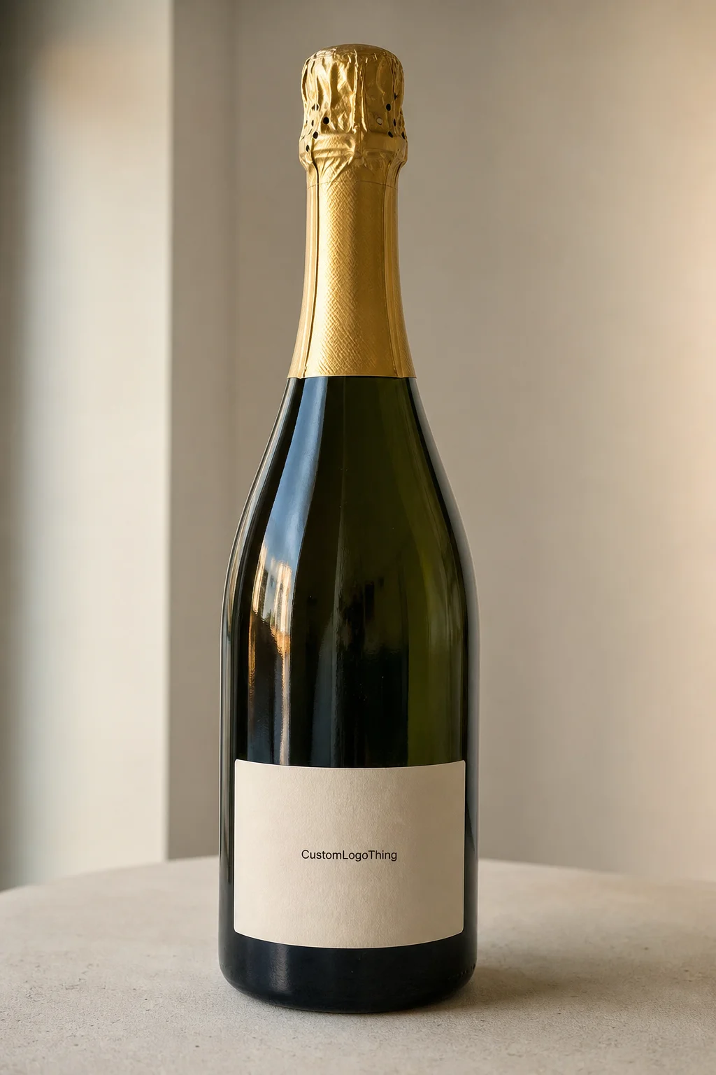
Custom Champagne Labels do more work than most buyers expect. They have to look sharp on the bottle, survive cold storage and condensation, and still sit flat on curved glass after handling, stacking, and chilling. That is why fit, adhesive, and finish matter just as much as the artwork.
From a packaging buyer’s point of view, the label is not only decoration. It is part of the bottle’s package branding, and it often becomes the first thing people notice at a table, on a shelf, or in a gift presentation. For celebrations, private-label runs, retail packaging, and event bottles, the right label can make a standard bottle feel deliberate without changing the glass itself. That is the appeal of custom champagne labels: fast branding, low structural risk, and a large amount of visual impact per square inch.
The challenge is that champagne bottles are less forgiving than flat product packaging. Curvature, taper, moisture, and cold all work against the label. A design that looks excellent on screen can still wrinkle at the edges or soften in an ice bucket if the material choice is wrong. Good packaging design starts with the bottle, not the artwork.
What Custom Champagne Labels Do for the Bottle
A label for sparkling wine is usually a pressure-sensitive label or wrap built for glass, chill, and handling. In practice, that means two things: the face stock has to stay clean and printable, and the adhesive has to hold on a cold surface that may already have light moisture on it. If either piece is off, the bottle starts looking tired fast.
Buyers choose custom champagne labels for different reasons. Event planners want a bottle that feels specific to the occasion. Retail teams want a stronger shelf signal. Private-label brands want a repeatable way to carry identity across product packaging without investing in a new molded bottle or a full carton change. Sometimes the label is doing the work that a carton or secondary package would do for another product line, only with less material and a shorter production cycle.
A common mistake is treating champagne labels like ordinary beverage labels. A chilled bottle is handled with wet hands, passed from person to person, and often set into ice. That means the label has to resist edge lift, smudging, and surface dulling. In that sense, the label is part of the structural performance, not just the visual layer.
A bottle can carry a strong design and still look cheap if the label curls, clouds over, or loses adhesion in cold moisture.
Finish changes the way the bottle reads from a distance. Matte, gloss, soft-touch, foil, and clear film all create different signals. A strong label can improve retail packaging without shouting, while a weak label can make the whole presentation feel rushed. For buyers comparing options, the goal is not only decoration. It is a label that supports the brand, stays legible, and survives the conditions the bottle will actually face.
That is also why the best projects start with practical questions rather than visual ones. How cold will the bottle get? Will it sit in ice for ten minutes or an hour? Is the label being applied by hand or on a line? The answers decide more about the outcome than a color palette ever will.
How the Production Process Works From File to Bottle
The process usually starts with artwork setup. The designer sends a print-ready file, and the printer checks the size, bleed, safe area, color build, and die line. If the bottle shape is unusual, the template matters more than the art itself. A label that fits a round Bordeaux bottle may not behave the same way on a wider sparkling bottle with a shoulder or taper.
After that comes proofing. This is the stage where spelling, barcode placement, finish selection, and dimensions should be checked line by line. A paper proof or digital proof helps, but it is not a substitute for a real bottle test when the project is sensitive. If the label needs a metallic accent, clear stock, or tight registration, confirm that before production starts.
Printing method depends on quantity and complexity. Short runs often go digitally because setup is lighter and revisions are easier. Larger orders may move to flexographic production, especially when repeat volume matters. Either way, finishing can add time: varnish, foil stamping, lamination, and custom die-cutting all need coordination. A simple flat label may move quickly, while a layered, premium finish usually takes longer.
There is also a practical difference between label-only orders and labels meant for in-house application. If a bottling line is applying the labels, roll direction, core size, unwind, and spacing matter. If the labels are shipping flat, packaging and storage matter more. The label may be perfect on press and still create problems if it is packed in a way that bends corners or traps moisture during transit.
Typical timing depends on the job, but a straightforward order often lands in the 7-10 business day range after proof approval. Add foil, specialty die cuts, or unusual adhesive requirements, and 12-15 business days is more realistic. If the labels are tied to an event or seasonal launch, leave room for one correction cycle. That buffer is cheaper than a rush fee and much less stressful than reworking a file after the schedule is already locked.
Experienced buyers also ask for a sample on the exact bottle, not a nearby substitute. The difference between a true production test and a generic mockup shows up fast once the bottle is cold. A sample may reveal a subtle issue with opacity, curl, or edge lift that never appears on a monitor.
Custom Champagne Label Pricing: What Changes the Unit Cost
Pricing is mostly a function of quantity, size, material, finish, and setup complexity. A small run carries a higher unit price because the prepress work, proofing, cutting, and press setup are spread across fewer labels. Once the volume climbs, that setup cost gets diluted, and the per-unit number usually drops in a noticeable way.
Here is a realistic way to think about it. A simple label on coated paper for a small event run may land around $0.55 to $1.20 per label at 500 pieces, while a 5,000-piece order can drop into the $0.12 to $0.30 range depending on coverage and finish. Heavy foil, textured stock, or custom shapes can lift the number again. The exact price is always tied to the spec sheet, not just the artwork.
| Run Size | Typical Unit Cost | What Pushes Price Up | Best Fit |
|---|---|---|---|
| 500 labels | $0.55-$1.20 | Setup spread across fewer pieces, specialty dies, extra proof rounds | Weddings, tastings, prototype runs |
| 1,000 labels | $0.28-$0.60 | Foil, clear stock, custom adhesive, tighter color matching | Small retail launches, private events |
| 5,000 labels | $0.12-$0.30 | Premium finishes, complex artwork, multiple SKUs | Recurring brand runs, hospitality programs |
| 10,000+ labels | $0.08-$0.20 | Very detailed art, special coatings, secondary operations | Higher-volume retail packaging |
The lowest quote is not always the best buy. Compare the adhesive type, whether proof revisions are included, what finish is actually being quoted, and whether the printer is pricing the real die shape or a generic rectangle. A label that costs a few cents more but stays flat in an ice bucket is usually the better value. That matters even more if the bottle is part of a broader Custom Packaging Products program and the label has to match other branded packaging pieces.
Premium looks do not always require premium spend. A strong design on a well-chosen stock can outperform a crowded layout with too many special effects. That is a useful lesson for retail packaging, event bottles, and smaller product packaging runs alike. In many cases, the costliest choice is not foil or film. It is a label that fails after the first chill cycle and forces a reprint.
For comparison, buyers often treat labels the way they would treat a sleeve, carton insert, or custom printed box: as a branding layer that should be priced against the total presentation, not just the print area. That mindset usually leads to better decisions. It also keeps the conversation focused on performance rather than on the cheapest line item.
Materials and Finishes That Hold Up in Ice and Moisture
For chilled bottles, the face stock matters a lot. Paper can work if it is coated and paired with the right adhesive, but films are usually more forgiving. BOPP and polyester are common choices because they resist moisture better than unprotected paper and hold a cleaner edge when the bottle gets cold. If the label will sit in ice for a long stretch, that extra stability is worth paying for.
The adhesive matters just as much as the stock. A permanent acrylic adhesive is often the safer choice for cold, wet surfaces because it keeps its hold once the bottle is chilled. A weaker adhesive may look fine on a dry bottle and then start to fail after condensation forms. This is where samples matter. A good-looking proof tells you almost nothing about how the label will behave after 10 minutes in a damp bucket.
Finish changes both appearance and readability. Gloss boosts shine and can help metallic artwork pop. Matte feels quieter and more premium in the hand, especially for minimalist branding. Soft-touch adds a tactile feel, but it can show marks if the bottle is handled a lot. Clear labels create a more integrated look on glass, although they demand careful contrast management so the text does not disappear on the bottle.
If the artwork includes fine typography or small legal text, matte and soft-touch finishes can reduce glare, but they can also mute contrast slightly. Gloss can make color feel deeper, yet it can reflect light in photos or under event lighting. That tradeoff matters more than many buyers expect, especially for bottles that will be photographed on tables.
If your team is validating a label for transport or rough handling, the test methods from ISTA test methods are a useful reference point. They are not a label recipe by themselves, but they help teams think clearly about handling, vibration, and transit stress. For paper-based labels, buyers who care about sourcing can also review FSC options when the project calls for certified fiber.
The simplest reliable test is still the best one: apply the label to the actual bottle, chill it, and leave it in the same conditions the customer will use. That is the only trustworthy way to judge edge hold, opacity, and whether the finish still looks clean after moisture builds. If a label passes that test, it will usually behave well in real use. If it fails there, the rest of the spec sheet is academic.
Step-by-Step Ordering Checklist for a Clean Fit
Getting the size right starts with measuring the bottle, not guessing from a catalog photo. Measure the body width at the intended label area, check the taper, and note any shoulder curve or recessed panel. A label that is too wide can buckle at the ends. A label that is too narrow can look undersized and visually awkward.
For most projects, I recommend measuring three things:
- The label panel width at the exact placement point
- The usable height before the shoulder or base curve interrupts the layout
- The bottle diameter or circumference if you are considering a wrap
Artwork should be prepared as print-ready vector whenever possible. Keep important text inside a safe margin, allow bleed around the edge, and make sure raster images are at least 300 dpi at final size. On small labels, legibility matters more than fancy detail. If the bottle will be seen across a table or in low light, a design with strong contrast usually performs better than one loaded with fine lines and tiny type.
Proof review is where most avoidable mistakes are caught. Check spelling, punctuation, barcode placement, quantity, finish selection, and the approval of the correct bottle template. A good proof review should also ask a practical question: does this still read well when reduced to real-world viewing distance? That is a package branding question, not just a prepress question.
If you are coordinating broader branded packaging, it helps to keep the label spec aligned with any Custom Labels & Tags order or with a larger Custom Packaging Products program. Buyers who manage multiple SKUs often keep one spec sheet for bottle dimensions, approved stock, finish, adhesive notes, and artwork version. That habit saves time on reorders and reduces the chance of matching the wrong revision later.
A clean ordering sequence is simple enough to repeat:
- Measure the bottle and confirm the label area
- Choose the material and finish based on the storage condition
- Prepare or update the artwork file
- Review and approve the proof carefully
- Schedule production with enough buffer for testing and shipping
The point of this checklist is not bureaucracy. It is control. Labels are one of the few parts of a bottle program that can still be adjusted late in the process, but only if the dimensions and spec are already solid. That is where experienced buyers save money: they reduce surprises before the press ever starts.
Common Mistakes That Cause Lifts, Wrinkles, and Delays
The first mistake is designing for a flat panel that does not really exist. Champagne bottles often curve more than the designer expects, and a label that looks balanced on a screen can distort once it wraps around glass. That is especially true near shoulders and tapered body sections. The fix is boring but effective: use the actual bottle die line and do not rely on generic dimensions.
The second mistake is choosing a standard adhesive for a cold application. If the bottle is going into refrigeration or an ice bucket, the adhesive spec is not optional. It is part of the label’s performance. A dry-room label can fail within minutes when condensation starts forming, and once the edge lifts, the whole piece looks compromised.
The third problem is overcomplicating the artwork. Small labels can carry elegant typography, but too many line weights, color shifts, or fine decorative elements make the design fragile. On a bottle, the viewer is rarely holding still in perfect light. Simpler layouts often win because they stay readable and feel more confident from a distance.
There is also a timing error that shows up constantly: rushing proof approval. When a project is tied to a launch, a wedding, or a trade event, buyers sometimes approve a file before they have tested it on the bottle. That saves a day and can cost a week. A quick sample check is far cheaper than correcting a production run after labels are already printed.
If the label will be chilled, handled, and photographed, then the sample test is not a luxury. It is part of the job.
Finally, do not change the file after production is scheduled unless the change is truly necessary. Even a small adjustment can reset proofing or require a new cutter. If you need a different size, finish, or adhesive, say so early. That is the difference between a controlled run and a scramble.
There is a quieter mistake too: using a label that only works at one temperature. A bottle may leave production looking fine, then move through transport, refrigeration, and service before anyone notices the weakness. The better approach is to treat the label as a complete system. Stock, adhesive, finish, die shape, and bottle fit all have to work together.
In practice, the best custom champagne labels are the ones that balance appearance and behavior. They fit the bottle cleanly, stay intact in moisture, and support the brand without forcing extra production drama. That is the point: a label should make the bottle feel intentional, not create another round of fixes.
How are custom champagne labels different from standard wine labels?
Champagne bottles are usually chilled more often, handled more frequently, and shaped with more curve at the body and shoulder, so the label has to be planned for moisture and fit from the start. The right choice usually comes down to adhesive performance, stock durability, and how the label looks after time in an ice bucket.
What size should custom champagne bottle labels be?
The right size depends on the exact bottle diameter, taper, and whether the label is going on the body, neck, or both. Measure the intended area and test the layout on a sample bottle before approval, because a few millimeters can change how the label lays flat.
Will custom champagne labels hold up in an ice bucket?
They can, if the material and adhesive are chosen for cold, moisture, and handling. The safest check is a sample test on the actual bottle in the same conditions the customer will use.
How much do custom champagne labels usually cost?
Pricing depends on quantity, size, finish, stock, and setup requirements, so the unit cost changes a lot between short runs and larger orders. The most accurate quote comes from a complete spec list that includes bottle dimensions, artwork complexity, and the finish you want.
How far in advance should I order custom champagne labels?
Order early enough to allow for proofing, revisions, and production scheduling, especially if you need custom shapes or premium finishes. If the labels are tied to a launch or event, build in extra time for sample review and one correction cycle so you are not forced into rush production.

