Custom chapstick labels carry more weight than the size of the package suggests. On a tube that fits in the palm of your hand, a few square inches have to do the work of a logo, a flavor cue, a compliance label, and often the entire first impression. That is why custom chapstick labels are more than a finishing touch. They are part of the product experience, especially for brands, salons, nonprofits, wedding favors, and promotional kits that need a small item to look intentional.
The challenge is straightforward: the format is tiny, but the expectations are not. Buyers want a label that looks clean, stays put, and survives being tossed into bags, pockets, shipping cartons, and sample boxes. If the artwork is off, the finish is weak, or the adhesive fails, the whole package feels rushed. A good label does the opposite. It makes a modest tube feel considered.
Most of the decisions that matter happen before print. Tube dimensions, wrap length, adhesive type, and finish all shape how the final label performs. A basic stock label can work well if the fit is right and the design is simple. A premium stock with laminate or coating can add durability, but only if the use case justifies the extra spend. The best order is usually not the fanciest one. It is the one that balances appearance, durability, and cost without creating production headaches.
“On small cylindrical packaging, one millimeter can change the whole look.”
Why tiny lip balm labels can make a big branding difference
A small label gets handled more than most packaging. People pick up lip balm, twist it open, read it, and often pass it along. That repeated contact gives the label more visibility than a larger package that sits on a shelf and is never touched. For retail, event giveaways, and amenity kits, that makes the label one of the most efficient branding surfaces you can buy.
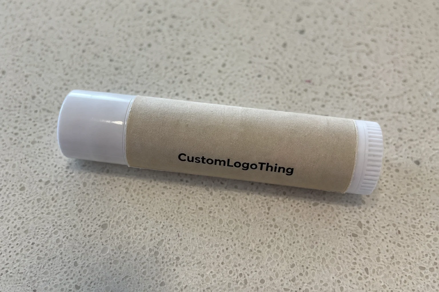
Custom chapstick labels are usually pressure-sensitive labels or wraps made to fit standard or custom tubes. They are common in product packaging, hospitality programs, fundraising items, and branded mailers. In practical terms, they are printed on narrow stock, cut to a tight dieline, and applied by hand or with simple labeling equipment. Because the surface is curved and small, the design has to be deliberate. Too much copy makes it hard to read. Too little structure makes the tube feel generic.
Well-designed labels do not only make the product look better. They also help buyers understand what they are holding at a glance. Flavor, scent, ingredient claims, brand mark, and sometimes a website or QR code need to coexist without fighting each other. On a large carton, there is room for hierarchy to spread out. On a lip balm tube, hierarchy has to be immediate. The logo should not compete with a flavor name, and a compliance line should not crowd the edge.
That is why consistency matters across the rest of the package. If a brand already uses Custom Labels & Tags for jars, pouches, or boxes, the lip balm should feel like it belongs to the same line. Matching typography, color values, and finish choices can make a small product look like part of a broader system rather than an isolated add-on.
There is also a commercial side to the decision. The balm itself may be inexpensive to make, but the label often carries much of the perceived value. A matte label with clean typography can make a basic tube feel boutique. A sloppy wrap can erase that effect quickly, even if the formula is good. In small packaging, the label is not decoration. It is part of the product quality signal.
How the labeling process works from artwork to application
The workflow is more practical than many first-time buyers expect. It starts with measurement, not design. Measure the tube height and circumference, or ask for a dieline if the supplier has one ready. Do not build artwork around a generic template and hope it fits. Lip Balm Tubes vary enough that a few millimeters can create an overlap, leave a visible gap, or force the seam into an awkward position.
Once the dimensions are confirmed, the artwork should be built around the actual wrap. That means keeping text inside safe margins, avoiding cramped elements near the seam, and making sure the most important information reads clearly from arm’s length. If the label includes ingredients or regulatory text, those lines need to remain legible after reduction. Tiny packaging punishes decorative clutter. A cleaner hierarchy almost always prints better and looks more expensive.
Stock and finish come next. Matte is often the safest choice for a boutique or natural look. Gloss tends to feel brighter and more promotional. Soft-touch lamination, UV coating, metallic accents, and specialty papers can all elevate the package, but they also add cost and may not improve performance for a short-life giveaway. If the label is going on a tube that will be handed out in bulk, the most practical choice is often a durable standard stock with a finish that protects the ink without overcomplicating the job.
Adhesion is the point where the label either behaves or turns into a problem. A narrow label has less tolerance for error than a larger carton label. It needs to grip a smooth plastic surface without wrinkling, lifting at the seam, or sliding when pressure is applied. If the tubes will be stored in warm conditions, shipped in dense kits, or handled repeatedly, ask about adhesive strength and surface compatibility. A stronger adhesive is useful, but so is a clean application surface. Wiping down the tube before labeling can improve results more than many buyers expect.
There are two common formats. A full-wrap label covers more of the tube and gives room for branding, scent, ingredients, and small compliance details. The tradeoff is that the seam must be managed carefully, because any misalignment will show immediately. A front-only label is simpler and can feel cleaner, especially on minimalist packaging, but it gives up space. The right choice depends on how much text you need and whether the product should read as premium, promotional, or strictly functional.
Proofing is where many small orders succeed or fail
Proofing deserves more attention than buyers usually give it. On a label this small, the difference between polished and awkward can come down to a logo that is 1 to 2 mm off-center or a font that is too thin to survive print. Digital proofs are useful, but they do not always reveal how a curved tube will affect the visual balance. A printed sample is better when the order uses a special finish, a metallic accent, or brand colors that need to match other packaging pieces.
If the label will sit beside custom boxes, inserts, or other packaging components, it helps to proof the set as a whole. A lip balm label that looks fine on its own can feel disconnected if the tone, color, or finish drifts from the rest of the line. Small packages are unforgiving that way. They expose inconsistency fast.
Hand application also changes the process. A layout that looks fine on screen may become frustrating if there is not enough border to guide placement. The wider the production run, the more useful a dispenser or simple semi-automatic applicator becomes. For short runs, careful hand labeling is normal. For larger quantities, repeatability matters more, because even small placement drift becomes visible across a full batch.
Cost, pricing, and MOQ factors that shape your order
Pricing for custom chapstick labels usually comes down to quantity, size, material, finish, and cut complexity. Print coverage matters too. A simple design with limited color use on a stock label is usually less expensive than a full-bleed design with specialty coating and a custom dieline. If you are comparing quotes, do not treat unit price as the whole story. Two quotes can look similar on paper and still produce very different results once proofing, setup, and finishing are included.
Minimum order quantity, or MOQ, changes the economics quickly. Small runs carry higher per-unit costs because setup time, file preparation, proofing, and press time are spread across fewer labels. Larger runs lower the unit cost, but the upfront spend rises. That is normal. A 500-piece order can easily cost much more per label than a 5,000-piece run, even when the design is identical. The difference is usually less about the ink and more about how the production cost is allocated.
These are broad market ranges, not fixed promises, but they are useful for planning:
| Order size | Typical unit cost | What usually drives the price | Best fit |
|---|---|---|---|
| 300-500 units | $0.22-$0.45 | Setup, proofing, small-run efficiency | Events, samples, limited promotions |
| 1,000-2,500 units | $0.12-$0.28 | Material choice, print coverage, finish | Small retail tests, recurring giveaways |
| 5,000+ units | $0.06-$0.18 | Volume efficiency, reduced setup cost per piece | Retail programs, mailers, larger campaigns |
Matte and gloss are the most common starting points. Matte usually reads as more restrained and boutique. Gloss makes colors pop and can feel more promotional. Specialty finishes such as soft-touch, UV coating, or metallic ink can look strong, but they should be chosen for a reason. If the product is a one-time event giveaway, the premium finish may not return enough value to justify the cost. If the labels are going into retail, the durability and shelf presence may be worth it.
Setup costs matter as much as material choice. A supplier may need to prepare the dieline, check color builds, confirm seam placement, and review artwork for printability. If the file needs cleanup, revisions can add time. From a buyer’s perspective, a cheap quote that leads to peeling labels or a reprint is not a bargain. Reordering costs time, and time often ends up being the more expensive line item.
If the labels are part of a larger packaging order, it is worth comparing the label price against the rest of the package. Sometimes a small upgrade in finish makes more sense than changing the tube or outer carton. Other times, the better move is to keep the label simple and put the budget into a coordinated box, insert, or mailer through Custom Packaging Products. The right split depends on where the product is being used and how much handling it will see.
Step-by-step ordering process and lead time basics
Step 1 is measurement. Get the tube height and circumference, or request a template. If the product uses several scents or variants, confirm whether each tube is truly identical before committing to one dieline. A design that fits one tube style may not fit another closely enough to print without adjustment.
Step 2 is artwork prep. Keep the most important information large enough to read after the label is wrapped. Strong contrast helps. So does a simple layout. Small packaging does not reward decorative clutter. The design should be clear at first glance, even if the entire surface is only a few inches wide. If the label has to include flavor, ingredients, and brand details, let typography do the heavy lifting rather than stacking on extra graphics.
Step 3 is material and finish selection. A trade show giveaway has different needs than a retail balm sold near cosmetics or wellness products. Promotional items can often use a straightforward stock and still look good. Retail packaging usually benefits from sharper print, better scuff resistance, and more controlled finishing. If the labels will be packed with other items, ask whether the adhesive and coating hold up in transit.
Step 4 is proof review. Check spelling, logo scaling, barcode placement, and exact color values. Zoom in on thin fonts. Compare the proof against your brand standards, not just against the screen preview. On a narrow label, a slight shift in alignment or a minor typo becomes obvious very quickly.
Step 5 is production timing. Standard printed runs often land around 12-15 business days after proof approval, though the real timeline depends on quantity, finishing, and current queue length. Shipping time sits on top of that. If the launch date is fixed, build in slack rather than assuming the job will move faster than average.
Step 6 is a test application. Before you commit the entire run, apply a few labels to the actual tubes. That quick check can reveal edge lift, bubbles, poor registration, or artwork that reads too small after wrapping. It is a small step that prevents expensive surprises. For event packaging, wedding favors, or a fundraising kit, it can be the difference between a smooth assembly day and a last-minute scramble.
- Measure first so the wrap fits the tube, not just the idea of the tube.
- Proof carefully because small labels magnify small errors.
- Choose the finish for the use case instead of defaulting to the most expensive option.
- Plan lead time honestly if samples, revisions, or shipping constraints are involved.
Common sizing, adhesion, and artwork mistakes to avoid
The most common sizing mistake is measuring only the height. Circumference matters just as much. If the wrap is too long, the seam overlaps awkwardly. If it is too short, the gap breaks the visual line and makes the label look undersized. With small packaging, a few millimeters can change the entire impression.
Another frequent issue is copy that is technically printable but not practically readable. Busy layouts are hard to read on a narrow tube. A product name, flavor, or scent should not have to compete with five extra lines of text and a cluster of icons. The same applies to ingredient lists and legal copy. They matter, but they should not overwhelm the front of the label if the brand mark is the real focal point.
Adhesion problems often come from the tube surface, not just the label. Textured plastic, oils from handling, moisture, and heat can all affect performance. A stronger adhesive helps, but it will not solve every issue. Clean application and proper storage matter too. If tubes are printed or filled and then sit in a warm room before labeling, the adhesive may behave differently than expected.
Design clutter is another trap. Too many badges, claims, and decorative elements can make a tiny package feel crowded and cheap. For custom chapstick labels, restraint usually wins. A simple structure often looks more polished: logo first, flavor or scent second, small support text third. That order makes the product easier to read and easier to trust.
Skipping a sample is risky when the labels support a wedding, trade show, holiday giveaway, or nonprofit fundraiser. Those projects usually have hard deadlines, and there is rarely room for a reprint. If the labels will sit beside Custom Printed Boxes or other branded components, one mismatched color or off-center wrap can make the whole set feel less deliberate.
If sustainability matters to your program, ask about the label stock and any paper components before placing the order. FSC certification may apply to some materials, and documentation can help when packaging decisions are being reviewed across a larger line. For broader recycling context, the EPA and the FSC are useful references, but the practical question is whether the specific material choice fits your product, your print method, and your disposal goals.
Expert tips for a cleaner finish and better shelf appeal
If the goal is a cleaner-looking tube, start with one clear focal point. That may be the logo, the scent name, or a single benefit statement. Once the eye knows where to land, the whole label feels more intentional. This is a basic design choice, but it gets ignored often when brands try to make a small label do too much.
High contrast matters more than decorative detail. Dark text on a light background, or light text on a deep brand color, is easier to read on a curved tube than a low-contrast design with delicate elements. Typography matters just as much. A sturdy sans serif often performs better than an ornate font on a narrow wrap, especially if the label is meant to be read quickly.
Finish should support the brand story. Matte suggests a quieter, more refined product. Gloss feels brighter and more promotional. Soft-touch can add a premium tactile note, but it can also be unnecessary if the product will be distributed heavily. The choice should reflect how the package will actually be used, not just how it looks in a render.
For handled products, ask about a protective laminate or coating. Smudging and abrasion can flatten a good print job before the product even reaches a customer. A more durable finish may add a little cost up front, but it can preserve the look through shipping, merchandising, and daily use. That matters on a compact item that customers may keep in a pocket or bag for weeks.
Think about the tube color and the surrounding packaging too. A white label on a dark tube reads differently than the same label on clear or pastel packaging. If the brand has a larger packaging system, the lip balm should fit inside it visually. A small product can still look premium when the label, tube, cap, and outer packaging share the same visual logic.
Next steps: compare specs, request samples, and lock your quantity
Before requesting pricing, gather the basics: tube dimensions, artwork status, target quantity, and whether the label needs a standard cut or a custom dieline. A clean spec sheet helps suppliers quote accurately and quickly. It also reduces the back-and-forth that tends to slow small packaging orders.
If your design uses tiny text, metallic ink, or a special coating, ask for a proof or sample. One sample can prevent an expensive mistake. That matters most for event labels, because a late reprint can miss the date entirely. It also matters when the label is part of a wider product launch and every component has to align.
Side-by-side quotes are useful. Compare a standard stock label, an upgraded finish, and a larger quantity run. That makes the tradeoffs visible. Sometimes the unit price drops enough to justify ordering extra. Sometimes it does not, and the smaller run is the cleaner decision. The numbers should guide the choice rather than habit or guesswork.
Give yourself enough time for proof review, production, and shipping. Labels only help if they arrive before assembly begins. If they are part of a broader packaging program, coordinate them with cartons, inserts, and fulfillment timing so one item does not hold the rest hostage.
The best first order is often a test batch. Use it to see how the adhesive behaves, how fast application goes, and whether the design reads the way you expected on the actual tube. Then refine the quantity, finish, or copy for the reorder. That is usually the most practical way to treat custom chapstick labels: not as a trivial detail, but as a small-format branding decision with outsized impact.
FAQ
How do custom chapstick labels stay on the tube without peeling?
Good adhesion starts with the right fit and a label stock designed for smooth cylindrical surfaces. Clean, dry tubes and firm pressure during application improve performance. If the product will be handled often or stored in warmer conditions, a stronger adhesive or protective finish can help reduce edge lift.
What size should custom chapstick labels be for standard tubes?
The right size depends on the exact tube shape and whether you want a full-wrap or front-only label. Measure both height and circumference, then leave safe margins so the label does not overlap seams or bubble. Ask the supplier for a dieline or template before designing to avoid a reprint.
Are custom chapstick labels expensive for small orders?
Small orders usually have a higher unit cost because setup, proofing, and production are spread across fewer labels. The total price depends on quantity, finish, material, and whether the label uses custom cutting. A small test run is often worth it if you are checking a new design or event-specific artwork.
What is the typical turnaround for custom lip balm label orders?
Turnaround depends on proof approval speed, print queue, quantity, and shipping method. Simple orders move faster when artwork is ready and dimensions are confirmed early. Build extra time into the schedule if you need samples, revisions, or a launch tied to an event date.
Can I use the same design for different chapstick flavors or scents?
Yes, but it is usually better to keep one master layout and change only the scent name, color accent, or variant code. That keeps the line consistent while making each flavor easy to identify. Check every version for spacing and readability before approving production.

