Custom Designed Labels for Clothing: How to Order Smart
Custom designed labels can make clothing look sharper and feel premium. Learn materials, costs, timelines, and how to order without expensive do-overs.
Most shoppers notice custom designed labels before they consciously read them. The label sits in a strange but powerful place: hidden enough to avoid the spotlight, visible enough to influence how the whole garment feels. A woven neck label, a soft printed satin tab, or a clean heat-transfer mark can make a shirt read as considered and finished instead of generic.
That matters because clothing is judged by touch as much as by sight. Customers pull at neck seams, check size marks, and feel whether the inside of the garment scratches or folds awkwardly. If the label twists after one wash, peels at the edge, or turns stiff at the seam, the quality perception drops fast. A good label does the opposite. It disappears into the wear experience while still reinforcing the brand every time the garment is handled.
There is also a commercial side to this. Labels are one of the few brand elements that can raise perceived value without changing the fabric, pattern, or cut. That is why they matter for basics, private-label apparel, and small fashion lines trying to look more established than their order volume would suggest. The same logic applies across branded packaging, where a box insert or care card can make a simple product feel intentional instead of thrown together.
Why custom designed labels change the first impression fast
People touch clothing before they evaluate it. That is not a theory; it is a habit. They feel the neck, check the side seam, and look for the size mark without thinking about it. A label is one of the first physical proof points that tells them whether the brand paid attention to details.
The best labels do two jobs at once. They support the brand visually, and they stay comfortable and legible after real use. That second part is where many projects fail. A label can look clean in a digital proof and still become a problem once it is stitched into stretch fabric, washed in hot water, or exposed to repeated friction. The production sample matters because the screen never tells you how a thread edge will curl or how a heat-transfer mark will hold up on rib knit.
For tees, hoodies, kidswear, and private-label basics, the label is often the easiest place to lift the perceived price point. Buyers compare tiny things. A tidy neck label, a properly sized care label, and a consistent size tab can make a $20 garment feel more credible than a louder logo ever will. That is why custom designed labels are usually treated as a finishing detail by beginners and as a brand-control tool by experienced apparel teams.
A crooked or itchy label can drag down a good garment faster than weak fabric weight. Customers rarely praise labels when they are fine. They notice them when they are bad.
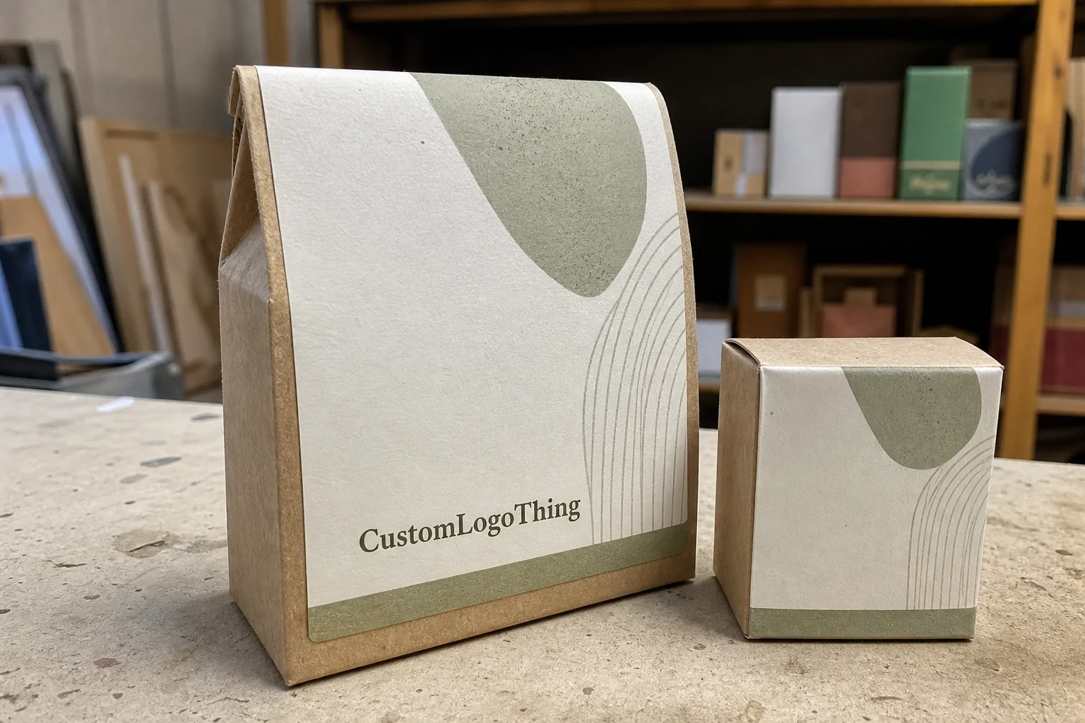
If your clothing line also uses Custom Packaging Products, the label should fit the same visual system. Not identical, just aligned. When the garment, hang tag, carton, and insert all speak the same visual language, the product feels planned rather than assembled from separate purchases.
What material and construction actually matter
Most label projects come down to a short list of choices. Material, fold style, size, finish, and attachment method do most of the work. Artwork is important, but material and construction determine whether the label feels premium, survives laundering, and sits correctly on the garment.
- Woven labels use thread to build the design. They usually feel the most premium and are a good fit for fashion basics, outerwear, denim, and brands that want a tactile finish.
- Printed satin labels are smoother and softer against skin. They are common in kidswear, lingerie, and lightweight garments where comfort is a bigger priority than texture.
- Heat-transfer labels sit directly on the fabric and remove seam bulk. They work well for activewear, fitted tees, and garments where a sewn-in label would irritate the wearer.
- Care labels carry wash instructions, fiber content, and origin details. They need to stay readable after repeated laundering, which is where low-grade printing tends to fail.
- Brand neck labels and size tabs help with sorting, retail presentation, and reorder consistency across multiple SKUs.
The choice is not just aesthetic. A woven label can hold fine detail, but it may feel firmer than a printed satin version. A heat-transfer label can feel nearly invisible, but it is more dependent on correct application temperature, pressure, and fabric compatibility. Fleece, rib knits, and stretch blends all behave differently, so the same label spec can work on one garment and fail on another.
Construction also affects how the label sits. Center fold, end fold, loop fold, and straight cut each change the way the label lays against the garment. A poor fold choice can make even strong artwork look clumsy. If the edge finish is wrong, the label may fray, curl, or create a stiff point that rubs against the wearer’s skin.
Size matters more than most brands expect. A label that looks balanced in a mockup can become unreadable once it is reduced to actual garment scale. Thin fonts, tiny legal text, and decorative lines all get less forgiving as the physical size drops. If the label must carry size, brand name, fiber content, and care instructions, the layout needs breathing room. That means editing the copy, not just shrinking the art.
For brands that care about sustainability claims, supporting materials deserve attention too. If the project includes hang tags, inserts, or outer cartons, ask about recycled stock, FSC-certified paper, or adhesive options that fit your packaging format. The FSC system is useful for traceable paper sourcing when the broader product presentation matters.
| Label Type | Feel | Durability | Best Use | Typical Unit Cost at 1,000+ |
|---|---|---|---|---|
| Woven | Textured, premium | High | Fashion basics, outerwear, denim | $0.12-$0.30 |
| Printed satin | Smooth, soft | Medium to high | Kidswear, soft garments, linings | $0.10-$0.24 |
| Heat transfer | Minimal, low bulk | High if applied correctly | Activewear, lightweight tees | $0.14-$0.35 |
| Care label | Plain, functional | High | Compliance and wash info | $0.08-$0.20 |
These numbers move with order size, color count, finish, and whether the supplier has to create new artwork setup from scratch. A small run with custom folds and specialty thread can cost dramatically more per piece than a larger, simpler reorder. Fancy details are rarely free. The same logic applies across custom printed boxes and broader package branding work: every added finish adds cost, setup time, or both.
Cost, pricing, MOQ, and unit price drivers
Label pricing is driven by a short list of variables. Material is one. Size is another. Color count, fold style, finish, and quantity all matter. So does the level of artwork complexity. A logo with fine detail and multiple thread colors will cost more than a simple mark with two colors and a plain fold.
The biggest mistake new brands make is comparing quotes only by unit price. That number is useful, but incomplete. Setup fees, sampling costs, revision charges, and shipping can change the real landed cost enough to make the cheapest quote more expensive in practice. If a supplier does not spell out those items, the quote is not fully useful.
MOQ, or minimum order quantity, shapes the conversation quickly. A startup may need 300 labels to test a product. A larger brand may want 5,000 or more because the unit price drops materially at that level. Both approaches are valid. The issue starts when someone wants premium finishing, low volume, and immediate turnaround all at once. Suppliers can do some of that, not all of it at once, and usually not at the best price.
A simple benchmark helps. Small custom label runs can land near a dollar per label once setup and proofing are included, especially when the order is tiny or the design is complex. Larger woven orders often move into the low cents per unit. Exact pricing depends on how many colors are used, whether the label is folded, and whether the art has to be simplified for production. If the quote looks unusually cheap, check what was omitted.
Use the quoting process to force clarity. Ask for label dimensions, material, fold type, printing or weaving method, finish, sample policy, revision cost, turnaround time, and shipping. Also ask whether the sample fee is credited back on the bulk order. That question alone often separates a transparent supplier from one that relies on vague line items and surprise add-ons.
If you want a rough yardstick for handling and shipping expectations in packaged goods, ISTA publishes widely used testing standards for transport environments. Labels are not cartons, but the same mindset helps: think beyond the mockup and look at how the finished item behaves during storage, packing, and transit.
Production steps and timeline from artwork to delivery
The label process should be predictable. If it feels chaotic, the spec probably is not clean enough yet.
- Brief: define the label type, garment category, placement, and required text.
- Artwork review: confirm the file can reproduce clearly at actual size.
- Digital proof: check spelling, dimensions, color references, and fold details.
- Sample or strike-off: verify texture, color, finish, and hand feel on real material.
- Approval: sign off only after the sample matches the garment and the spec.
- Bulk production: weaving, printing, cutting, folding, and finishing.
- Shipping: packed for delivery to your warehouse, 3PL, or factory.
Typical lead times for straightforward orders often run around 12 to 15 business days after proof approval, but that number moves quickly if the project needs sampling, special thread, unusual adhesives, or multiple revisions. The hidden delay is usually not production itself. It is waiting for client sign-off. Slow approvals are one of the easiest ways to miss a launch date.
Simple designs move faster. More colors, tighter tolerances, and specialty finishes add time. If your label has to launch alongside a collection, treat it like any other production milestone, not like a minor detail that can be squeezed in later. A finished garment sitting in a warehouse without the correct neck labels is not ready for market, no matter how good the photography looked.
If the apparel line also includes hang tags, inserts, cartons, or retail-ready outer packaging, build the label schedule into the larger packaging timeline. That prevents the common mismatch where the product is ready but the finishing pieces arrive late or with slightly different color standards.
Step-by-step: how to order labels without rework
Start with the garment, not the artwork. That is the cleanest way to avoid rework. Decide where the label goes, how it will be attached, and how the wearer will interact with it. Neck labels, side seam labels, hem tabs, and care labels serve different functions. A label placed for visual impact but ignored by the wearer is usually wasted money.
Create one spec sheet and use it for every supplier. That sounds basic because it is basic, but it prevents a lot of bad quoting. Include dimensions, label type, fold style, quantity, colors, artwork file type, care text, fiber content, and any compliance details. Add the intended garment type too. Suppliers make better recommendations when they know whether the label is going onto cotton jersey, fleece, nylon, or stretch knit.
Prepare the artwork properly. Vector files are the safest starting point because small text and thin lines need crisp edges. Outline fonts before sending the file. Check contrast at actual size, not just on a large monitor. A logo that looks elegant at 500 pixels wide can become hard to read once it is reduced to garment scale.
Then ask for a proof or sample. Do not approve based only on a PDF if the label is going onto a fabric with any real production risk. Compare the sample to the actual garment color, stretch, and texture. If the label will be washed before sale or worn against skin, test it once. A single wash cycle can reveal whether ink bleeds, thread loosens, or heat transfer lifts at the corners.
If you need a starting point for the product range, review Custom Labels & Tags and match the options to your garment requirements before requesting a quote on custom designed labels. That short comparison step usually saves time later because the supplier gets a tighter brief from the start.
Keep the first version simple. A primary brand label, a size marker, and a care label are usually enough for the first production run. Crowding the label with a slogan, legal text, extra marks, and decorative elements often creates more problems than value. Simple specs are easier to approve, easier to reorder, and less likely to trigger a production stall.
Common mistakes that make clothing labels look amateur
The most common mistake is trying to cram too much into too little space. A label is not a brochure. If the logo, care instructions, origin text, size, and brand message all compete for the same small area, readability collapses. The result is cluttered, not premium.
Low contrast causes another familiar failure. Thin lettering on dark or textured fabric can disappear after stitching or heat application. This is especially risky when teams approve artwork from a bright screen and never test how it behaves on black, charcoal, navy, or ribbed fabric. If those colors are in your line, test them early.
Placement errors are easy to miss in proofs and hard to forgive in wear. A label that sits too close to the seam allowance can twist after washing, create a lump under a fitted shirt, or rub against the skin. On kidswear, that discomfort becomes a complaint quickly. On workwear, it can affect repeat purchases. A neat design placed badly is still a bad label.
Another weak spot is material mismatch. A label that feels fine on a cotton tee may behave badly on fleece, denim, or stretch jersey. Fabric texture, stitch tension, and laundering patterns all change the outcome. The goal is not to pick the label that looks best in isolation. The goal is to pick the label that performs on the actual garment.
For brands building clothing and packaging together, the label should also match the rest of the system. If the garment feels premium but the box looks like a discount shipment, the customer notices the mismatch even if they cannot name it. That is where custom designed labels either support the brand or expose weak planning.
Most label problems do not come from the printer. They come from vague specs, rushed approvals, and artwork that was never checked at actual size.
Expert tips for a cleaner spec before you request a quote
Use one master spec for every supplier. That keeps quotes comparable and prevents accidental drift between versions. If one vendor sees a different dimension, fold note, or care text than another, the pricing conversation becomes misleading before it starts.
Order a small test run on the exact fabric blend you plan to sell. Cotton is not nylon. Heavy fleece is not lightweight jersey. Stretch knit is not canvas. Labels behave differently on each one, and the only honest test is the garment you actually plan to ship. That small test is usually cheaper than a full reprint.
Keep the first version restrained. Many teams want the logo, slogan, size, care text, origin line, and a brand message on the same inch of fabric. That usually creates visual noise and weakens the hierarchy. A focused label reads better and looks more expensive because it has room to breathe.
Before you place the order, confirm washing expectations, trim compatibility, and reorder consistency. A label that matches on the first run but shifts in tone or texture on the second run is a real issue, even if the customer never identifies the cause. Consistency matters once you have repeat customers and replenishment cycles.
If your brand sells clothing alongside retail packaging, keep the label spec in step with the broader presentation. The garment, carton, hang tag, and insert should feel like they belong to the same line. That is what strong package branding looks like in practice. Not loud. Just disciplined.
If you need the whole set to work together, cross-check the label against the broader branded packaging plan and compare it with the other items in Custom Packaging Products. The goal is not decoration. It is a repeatable system that survives handling, production changes, and reorder cycles. That is where custom designed labels earn their place.
How much do custom clothing labels usually cost?
Price depends on material, size, folds, color count, and quantity. Small runs usually cost more per label because setup and proofing are spread over fewer pieces. Ask for the full quote structure, including sample fees, revisions, and shipping, so you can compare vendors on real landed cost instead of just unit price.
What is the best material for custom designed labels on apparel?
Woven labels work well for a premium, durable feel, while printed satin or heat-transfer options are better when softness and low bulk matter. The best choice depends on the garment type and wash cycle, so test the label on the actual fabric before you place a large order.
How long does it take to produce custom labels for clothing?
Most timelines include proofing, approval, production, finishing, and shipping, so the schedule is usually longer than buyers expect if revisions are needed. Faster turnaround is possible when artwork is clean and decisions are final, but sampling or complex finishes will extend lead time.
Can I order a small batch before committing to a bigger run?
Yes, and that is often the smarter move if you are still testing fit, branding, or retail response. Expect a higher unit price on small runs, but the tradeoff is lower risk and fewer expensive mistakes.
What file should I send for custom designed labels?
Vector artwork is best, usually AI, EPS, or PDF, because it keeps text crisp at small label sizes. Include exact dimensions, color references, fold style, and all required text so the supplier does not have to guess.


