Custom Gatorade Labels: Buyer’s Guide to Specs & Pricing Custom gatorade labels tend to get noticed before the drink does. At tournaments, sponsor tables, and hotel coolers, the bottle becomes the display, and that makes fit, adhesive, and print clarity more important than most buyers expect.
What custom Gatorade labels are and when they matter
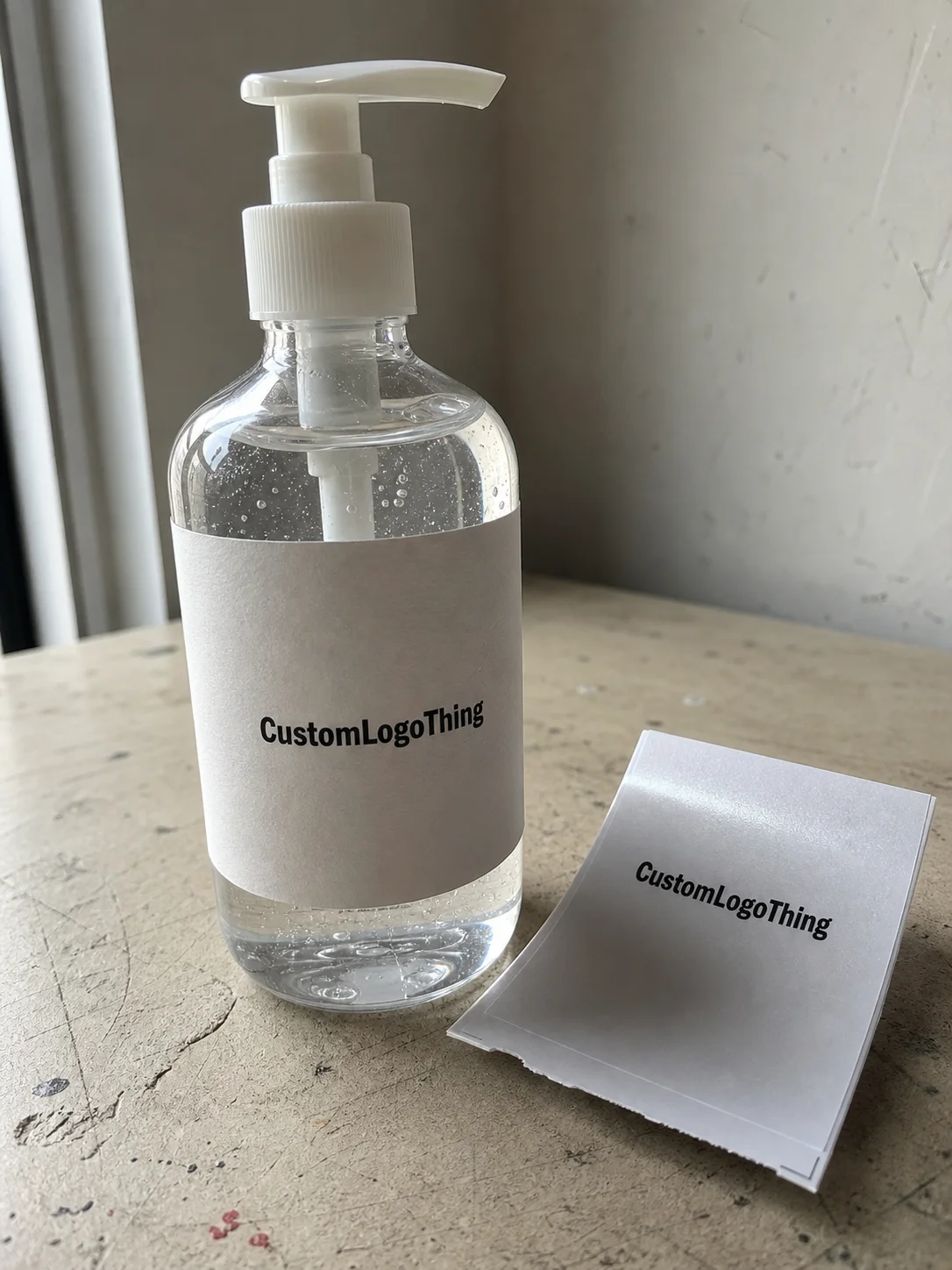
Custom Gatorade labels are pressure-sensitive or wrap-style labels made to fit sports drink bottles, usually with a finish and adhesive that can handle cold storage, condensation, and fast application. They are not generic sticker paper. That distinction matters, because a label that looks fine on a desk can start lifting once it hits an ice bucket.
From a packaging buyer’s perspective, these labels sit between branded packaging and event signage. They are small, but they carry a lot of visual weight. At sports events, team tables, race-day hydration stations, weddings, and corporate wellness kits, the label is often the first thing people read. The bottle may hold a standard drink, but the presentation tells people whether the setup feels intentional or improvised.
The most common uses are straightforward: tournament sideline drinks, sponsor activations, branded hospitality, employee appreciation kits, and giveaway coolers. They are a fast way to improve package branding without redesigning the whole supply chain. That is the appeal. You get a polished look without moving into fully custom packaging across every item.
What they do best is improve recognition. A handwritten tag is readable, but it rarely feels finished. A properly sized label gives Stronger Shelf Appeal, clearer brand recall, and a more disciplined look across the table. That matters even more if the label is part of a broader product packaging system that includes cups, cartons, inserts, or other custom packaging products for the event kit.
There is also a practical limit. These labels are for presentation and branding, not for cramming in every possible detail. The best designs prioritize legibility, fit, and fast application. In practice, that means fewer tiny lines of text, stronger contrast, and enough breathing room so the logo does not look crushed once it wraps around a curved bottle.
How the production process and turnaround usually work
The workflow looks simple on paper, but it breaks down quickly when buyers skip measurement. It usually starts with bottle confirmation, then moves to proof creation, approval, print production, finishing, and shipping. If the vendor cannot confirm the exact bottle format, the rest of the job becomes guesswork.
Common delay points are easy to identify: missing bottle dimensions, logo files that need cleanup, color corrections, and slow proof approval. A low-resolution logo can look acceptable in an email preview, then fall apart once it is enlarged for a wrap. A proof that looks clean on a flat screen may reveal seam issues when mapped around the bottle.
Turnaround depends on the printer’s queue, material availability, and how quickly the proof gets approved. A clean order with ready artwork may move in about 5 to 7 business days for printing after approval, with total delivery often landing around 10 to 15 business days once shipping is included. Rush work is sometimes possible, but the fastest jobs still depend on stock, finishing capacity, and whether the file is actually production-ready.
For event work, it helps to think like a packaging engineer. The ISTA testing framework is a useful reference when labels or kits will travel, get stacked, or sit in changing temperatures. If the labels are part of a larger activation, the same discipline applies to the boxes, cartons, and inserts around them.
Labels are usually delivered in one of three formats:
- Sheets for smaller quantities and hand application.
- Rolls for faster application or semi-automated work.
- Cut pieces for specific setups or tighter presentation control.
Before ordering, ask direct questions: does the timeline include proof revisions, finishing, packing, and carrier transit time? Will the printer send a digital proof, a bottle mockup, or both? If the answer is vague, the schedule is probably looser than the quote makes it sound.
Custom label cost, pricing, and minimum order math
Pricing usually comes down to six variables: label size, material, print method, finish, quantity, and whether design or file cleanup is included. Buyers often focus only on unit price, but that is rarely the best comparison. A quote that looks cheap can hide setup charges, proof fees, or shipping that erase the savings.
For small runs, the math is simple. Fixed setup costs get spread across fewer labels, so the per-unit price stays high. Once the run gets larger, that same setup cost is diluted. That is why many vendors set a minimum order quantity. It is not just a sales choice; it is how short-run production stays viable.
Typical pricing can look like this, though every printer structures quotes differently:
| Order size | Typical unit range | What usually affects the price |
|---|---|---|
| 250-500 labels | $0.45-$0.90 each | Setup, proofing, and smaller-run inefficiency |
| 1,000-2,500 labels | $0.22-$0.45 each | Better spread on setup and more efficient print sheets |
| 5,000+ labels | $0.12-$0.28 each | Volume efficiency, repeat artwork, and simpler finishing |
Premium specs cost more, but there is usually a reason. A moisture-resistant film, stronger adhesive, and tighter color control will often outperform a budget paper label in a cold bucket. If the bottles will sit in ice or condensation-heavy coolers, the cheaper option can become expensive quickly because failed labels have to be replaced.
If the order is part of a broader retail packaging or branded packaging program, ask for line-item pricing. Separating print cost, setup, artwork support, and shipping makes it easier to compare quotes across different suppliers. It also helps when the same team is buying labels, cartons, inserts, or other custom printed boxes for an event or promotion. For paper-based collateral or secondary packaging, the FSC chain-of-custody standards at FSC can matter if sustainability claims are part of the brief.
A good pricing request is specific. Include bottle size, quantity, finish, application environment, and deadline. A quote for 300 labels on a standard sports bottle is a different job from 3,000 labels for a regional race with refrigerated storage. The more exact the brief, the less guesswork in the estimate.
Specs that control fit, durability, and shelf appeal
In practice, bottle measurements matter more than artwork. Diameter, label height, and seam placement determine whether the design wraps cleanly or lands awkwardly across the curve. A sharp logo cannot fix a label that is too tall, too narrow, or built for the wrong bottle profile.
Material choice is just as important. Moisture-resistant films and cold-friendly adhesives are the safer choice for refrigerated cases, ice buckets, and handouts that may sit out for hours. If the environment is dry and short-lived, paper-based options may work, but they are a weaker bet when condensation is part of the plan.
Print quality affects how the bottle reads from three feet away, not just from a close-up photo. High-resolution files, solid contrast, and proper color matching keep logos crisp on curved surfaces. Thin type and pale tones can disappear fast, especially once the label bends around the bottle body. If the design includes a QR code or barcode, test it at proof stage, because even slight distortion can make scanning unreliable.
Finishing changes both appearance and durability. A gloss finish can make colors pop and help the label feel more promotional. Matte can look calmer and more premium. Clear zones can be useful if you want parts of the bottle to show through, but they also raise the stakes on alignment. Every finish shifts the final read a little, and those differences matter more on a small wrapped bottle than on a box or carton.
If the bottle will spend the day in ice, choose the label for the environment first and the artwork second. Pretty graphics do not matter much if the adhesive starts lifting halfway through the event.
There is another detail buyers often miss: the label has to work with the rest of the system. If the event also uses table tents, coolers, sample cartons, or branded inserts, the artwork should feel like one family. That is the difference between a useful package branding exercise and a random assortment of promotional pieces.
Step-by-step ordering workflow for a clean first run
The cleanest first run starts with measurement. Step one is to confirm the exact bottle format before touching the design. Even within sports drink packaging, small changes in shoulder shape, body width, and label area can create a different layout requirement. Do not assume one size fits every bottle just because the product name is familiar.
Step two is artwork prep. Use vector logos when possible, keep small text to a minimum, and leave safe margins around all critical elements. If the design includes sponsor marks, event dates, or legal text, place them with enough spacing that the wrap does not crowd them once it is applied.
Step three is the proof. This is where buyers should slow down. Check the wrap line, the seam, the color balance, any barcode or QR placement, and any required text. If the vendor can provide a mockup against the exact bottle format, that is better than a generic image because curved packaging tends to reveal issues that flat previews hide.
Step four is approval. Do not approve based on a quick glance if the order is going to a live event. Print a sample if possible, or at least review a proof on a scaled bottle template. That extra pass can catch a logo that sits too close to the edge or a name line that wraps into the seam.
Step five is production timing. Build in buffer for shipping, application, and last-minute corrections. If a sponsor or event manager asks for changes after approval, the schedule can slip fast. That is normal, but it is still avoidable with a disciplined proof review.
From a buyer’s perspective, the best workflow is the one that gives you a clean handoff. A clear brief, precise bottle specs, and a fast approval loop usually produce better results than a last-minute rush with uncertain files. If the team is already coordinating other Custom Packaging Products, keep the labels on the same approval calendar so the visual system stays aligned.
Common mistakes that lead to peeling, blur, or delays
The first mistake is assuming a generic label size will fit every bottle. It will not. Gatorade-style bottles vary, and even small dimensional differences can shift the seam or pull the design out of alignment. Buyers who skip measurement often discover the problem after printing, when there is no easy way to recover.
The second mistake is using a low-resolution logo or a screenshot. Curved surfaces expose weak files faster than flat packaging does. A logo that looks acceptable on a laptop can blur once it is enlarged. Small type suffers even more, which is why sponsor names and short event lines should be checked at actual size.
The third mistake is skipping proof review on critical details. Event dates, sponsor names, QR codes, and legal copy are the lines people check last, but they are often the hardest to fix after production starts. The proof stage exists to catch these problems before they become expensive.
Moisture is the fourth issue. Labels applied to cold, wet bottles can fail if the adhesive is not designed for that environment. If the bottles are coming straight from refrigeration or sitting in ice, choose the label spec for those conditions, not for a dry tabletop application. That choice can be the difference between a clean presentation and a stack of peeling edges.
The fifth mistake is treating the timeline as a rough guess. Shipping deadlines should be confirmed before the event date becomes immovable. Once a tournament, wedding, or corporate launch is on the calendar, there is very little tolerance for late proofs or file revisions. The fastest orders are always the ones with clean files and quick approvals.
One more practical point: if the label is part of a broader retail packaging or event kit, do not let each piece drift into a different visual style. A sharp bottle label beside an unrelated box, insert, or backdrop looks unfinished. Strong branding is often less about adding decoration and more about keeping every touchpoint consistent.
Practical buyer tips before you request a quote
Start with a short checklist: bottle size, quantity, finish, application environment, and deadline. That alone filters out a lot of avoidable confusion. If the bottle spec is still unknown, measure it or ask the supplier for the exact dimensions before sending artwork.
Use the artwork brief to decide what the label should feel like. Athletic, premium, promotional, or event-specific are not interchangeable directions. A corporate wellness rollout needs a different visual tone than a race-day giveaway, and that decision affects type size, color contrast, and how much white space the design should keep.
Ask for a quote that separates print cost, setup, and shipping. That makes comparison easier and prevents false savings. A low unit price can disappear once freight and file work are added, especially on short runs.
Request a proof against the exact bottle format you plan to use, not a generic mockup. If the label wraps awkwardly in the proof, it will not improve in production. This is the point where a buyer should be picky, because the file is still editable.
One useful habit is to think beyond the label itself. If the event also needs display pieces, carton inserts, or other branded packaging, keep the design system consistent from bottle to box. That is where custom printed boxes, labels, and supporting materials start working together instead of competing for attention.
The strongest requests are the ones that remove ambiguity. Include exact dimensions, quantity, finish, and delivery timing, then ask for proofing terms in writing. That small bit of discipline tends to save more money than trying to fix a rushed run later. If the goal is to make the bottle do real work as a promotional asset, custom gatorade labels should make it easier to notice, easier to trust, and easier to hand out at scale.
How do custom Gatorade labels stay on cold bottles?
Use a moisture-resistant film with adhesive rated for refrigerated or iced surfaces. Apply the label to a dry bottle whenever possible, then press firmly along the wrap edges so the adhesive has full contact before the bottle goes back into ice.
What size should custom Gatorade labels be?
Measure the exact bottle body and leave room for the seam so the design does not overlap awkwardly. Ask the printer for a bottle-specific template before finalizing artwork, because the fit matters more than the artwork style.
Are custom Gatorade bottle labels expensive in small quantities?
Yes, small runs usually cost more per label because setup costs are spread across fewer pieces. The unit price usually improves once quantity increases and production becomes more efficient.
How long does the custom Gatorade labels process usually take?
Timing depends on proof approval, print queue, finishing, and shipping distance. Rush options may be available, but the fastest orders need clean files and quick approval.
Can custom Gatorade labels include logos and QR codes?
Yes, as long as the files are high resolution and the label has enough space for clear reproduction. Test QR codes in the proof stage so they still scan after the label is wrapped.


