Buyer Fit Snapshot
| Best fit | custom labels practices stronger branding for packaging buyers comparing material specs, print proof, MOQ, unit cost, freight, and repeat-order risk where brand print, material, artwork control, and repeat-order consistency matter. |
|---|---|
| Quote inputs | Share finished size, material target, print colors, finish, packing count, annual reorder estimate, and delivery region. |
| Proofing check | Approve dieline scale, logo placement, barcode or warning zones, color tolerance, and any recyclable or compostable wording before bulk production. |
| Main risk | Vague material claims, crowded artwork, or missing packing details can create delays even when the unit price looks attractive. |
Fast answer: Custom Labels Practices Stronger Branding: Dieline, Finish, Proof, and Buyer Review should be specified like a repeatable production item. The safest quote includes material, print method, finish, artwork proof, carton packing, and reorder notes in one written spec.
What to confirm before approving the packaging proof
Check the product dimensions against the actual filled item, not only the sales mockup. Ask for tolerance on folds, seals, hang holes, label areas, and retail display edges. If the package carries a logo, QR code, warning copy, or legal claim, reserve that space before decorative graphics fill the panel.
How to compare quotes without losing quality
Compare board or film grade, print process, finish, sampling route, tooling charges, carton quantity, and freight assumptions side by side. A lower quote is only useful if the supplier can repeat the same color, closure quality, and packing count on the next order.
Custom Labels Best Practices are not glamorous, but they decide whether a label sells or peels off in a chilled display after two days at 38°F. I remember standing in a warehouse in Atlanta, Georgia with a buyer who was furious because a lavender cosmetic label failed for one annoying reason: the adhesive was wrong for frosted jars that had been stored at 41°F. I’ve also seen a $0.14 paper label make a $22 candle look like $40 because the finish, type size, and die-line were chosen correctly. That’s the part most teams miss, and the part I wish more brands would obsess over with the same energy they spend on logo fonts.
Start with the container, not the artwork. Match the material to the surface, whether that surface is a 28 oz amber bottle in Chicago or a frosted 120 ml jar in Austin. Keep the copy readable at real size. Pick a finish that supports the brand story. Test a physical sample on the actual bottle, jar, pouch, or mailer. Digital mockups help, but they do not get the final say. The real judge is the package in the real environment, with the real adhesive and the real temperature swing from 72°F to 38°F. Honestly, that is where a lot of otherwise smart brands wander into the weeds.
At Custom Logo Things, I’ve seen smart buyers save thousands by ordering a clean sample round before full production. I’ve also seen people burn money on reprints because they wanted to move quickly and skipped a test on the actual container. A sample set might cost $35 to $85 and take 5 to 7 business days in a supplier hub like Dongguan or Ningbo, but a reprint can cost 10x that once freight, relabeling, and lost time are added. That always costs more. Every time. It is a special kind of corporate faceplant.
Quick Answer: Custom Labels Best Practices That Actually Matter
The shortest version of custom labels best practices is this: pick the right substrate, use a readable design, choose a finish that fits the product, and test on the real package before you approve a full run. Sounds simple. It is not. A label can look perfect and still fail if the adhesive is too weak, the die-line is off by 1.5 mm, or the barcode gets buried in a textured finish. I have been in meetings where everyone nodded at a proof like it was a sacred artifact, then the first production sample came back with edge lift and a QR code that refused to scan at a warehouse belt 18 inches away. Nobody looked thrilled. Shocking.
After years of factory visits and supplier negotiations in Shenzhen, Dongguan, and Ningbo, the pattern is clear. For premium skincare or candles, matte or soft-touch labels usually look more expensive than gloss. For beverage, bath, or refrigerated products, BOPP or vinyl is often safer than paper because moisture does not care about your branding mood board. For minimalist brands, clear labels can look sharp, but only if the container surface is clean and the white ink is handled properly. For short runs and cost control, paper still wins on price, as long as the product stays dry and is handled gently during shipping from Guangzhou or Suzhou.
Proofing matters too. I have watched brands approve a beautiful digital proof, then discover edge lift, color drift, and QR code failure on physical samples. That is why custom labels best practices always include a real test on the actual container, under the actual conditions, with the actual filling line or hand-application method. If anyone tries to tell you a screen preview is “basically the same,” I would like to introduce them to a cooler full of ruined stickers and 240 bottles that had to be relabeled by hand.
Commercially, labels are small, but they punch way above their weight. They affect shelf impact, perceived value, shipping damage, reprint rates, and even whether a retailer thinks your product packaging looks ready for the shelf. A retailer in Dallas or Minneapolis does not care that the brand spent six weeks on a color palette if the corner lift starts on day three. If your branding budget is tight, labels are usually the smartest place to tighten the system without making the brand look cheap.
Top Custom Labels Options Compared
Buyers usually want a simple answer. Paper, BOPP, vinyl, clear, or foil accent? The honest answer is that each one behaves differently. I have had clients swear they wanted the luxury material, then realize it created extra waste because they changed bottle sizes every quarter in two factories, one in Dongguan and one in Ho Chi Minh City. Fancy is great. Reordering headaches are not. Nobody ever put “more headaches” on a mood board, yet here we are.
Paper labels are usually the lowest-cost option. On a 5,000-piece run, a standard uncoated paper label can land around $0.06 to $0.10 per unit, depending on size and print complexity. They print well, feel familiar, and work nicely for dry goods, handmade goods, short-run retail packaging, and shipping labels. They are also the easiest to dent, scuff, or wrinkle. If the product sees moisture, condensation, or abrasion, paper can get ugly fast. I have seen a small coffee brand lose shelf consistency in Portland because the bags rubbed against each other in transit and the label corners curled. A $0.06 savings per unit turned into a reprint. Lovely.
BOPP labels are the workhorse. A matte white BOPP label with a standard permanent adhesive often runs around $0.09 to $0.18 per unit at 5,000 pieces, while larger orders can fall closer to $0.07 to $0.12 per unit at 10,000 pieces. They resist moisture better than paper and are common in food, beverage, bath, and personal care. Matte BOPP feels cleaner and softer. Gloss BOPP gives more pop and can help colors stand out under store lights in Los Angeles, Miami, or Toronto. If you need durability without jumping into higher-cost specialty materials, this is usually where I start. For many brands, BOPP is one of the most practical parts of custom labels best practices.
Vinyl labels are strong and flexible. They can handle curved surfaces and rougher use better than basic paper. In many jobs, a 3 mil vinyl with a high-tack adhesive is the better answer for matte bottles, metal tins, or textured containers. I use them carefully, though, because not every vinyl choice is ideal for food or beauty depending on compliance needs and the application process. They can be a smart pick for products that get handled often, moved around, or stored in less controlled environments like pop-up shops in Brooklyn or warehouse clubs in Phoenix.
Clear labels are for the brands that want the packaging itself to show through. I like them for minimalist branding, but they are not forgiving. If the bottle color is inconsistent, the label placement is sloppy by 2-3 mm, or the white ink underlayer is weak, the whole look falls apart. Clear labels reward clean execution. They punish lazy execution. Honestly, they have zero patience for chaos. On a transparent 250 ml PET bottle, a misaligned clear label can make a $12 serum look like it came from a back-room experiment.
Foil accents are not a full label material by themselves in most jobs, but they add shine, contrast, and shelf appeal. Used well, foil can make a modest package look premium. Used badly, it looks like a discount greeting card. A small foil stamp on a 90 mm x 45 mm label can cost an extra $0.03 to $0.08 per unit depending on quantity and setup, which is why this choice needs a business case, not just enthusiasm. That is the difference between intentional packaging design and kitchen-table enthusiasm.
| Label type | Look | Water resistance | Typical lifespan | Best for | Order flexibility |
|---|---|---|---|---|---|
| Paper | Classic, economical | Low | Short | Dry goods, shipping, short-run retail packaging | Excellent |
| BOPP | Clean, versatile | High | Medium to long | Beverage, beauty, food, bath products | Very good |
| Vinyl | Durable, flexible | High | Long | Handled products, curved containers | Good |
| Clear | Minimalist, premium when done right | High | Medium to long | Transparent bottles, modern branding | Good |
| Foil accent | High-impact, decorative | Depends on base stock | Medium | Luxury cues, seasonal product packaging | Moderate |
For food brands, I usually push buyers toward BOPP unless the budget is extremely tight and the label never meets moisture. For beauty, matte BOPP or clear labels with strong white ink are common sweet spots. For candles, paper can work beautifully if the jar stays clean and the product line is consistent. For shipping labels, nobody cares about luxury. They care about adhesion, scannability, and whether the label survives a rough day in transit through FedEx hubs in Memphis or Indianapolis.
I once sat in a client meeting in San Diego where the team argued for four hours over a premium label finish for an artisanal sauce line. The sample looked nice. Then we did a kitchen test with a cold rinse at 45°F and the condensation made the paper swell within ten minutes. Problem solved in fifteen minutes. That is why custom labels best practices should start with the actual use case, not the mood board.
Custom Labels Best Practices for Design and Print
Good label design is not just pretty artwork. It is readable information, brand alignment, and production reality packed into a tiny surface. One of the most overlooked custom labels best practices is simple: design for the distance at which the customer will actually see the label. If your jar sits on a shelf three feet away, a 5 pt ingredient line is a joke. If your shipping label gets scanned at a warehouse belt from 18 inches away, tiny type becomes a problem fast. A 12 pt minimum for body copy and a 6 pt minimum for legal microcopy is often a much safer starting point.
I always start with contrast. Dark text on a light background is still the safest bet. Reverse type can look elegant, but small reverse type on a textured or glossy substrate can become unreadable. Safe margins matter too. Leave 2 mm to 3 mm from the die-cut edge, or your copy will look cramped and your logo will feel like it is screaming for air. Nothing says amateur quite like a design that kisses the cut line and loses a letter.
Color management is where a lot of brands get humbled. Design in CMYK. Expect slight shifts by substrate. White BOPP will not print like kraft paper. Clear labels will not behave like opaque labels. If a brand color is critical, I ask for a physical proof, not just a screen file. In my experience, a Pantone match on paper can shift by about 5-10% once you move to a different stock and finish. Sometimes less. Sometimes enough to annoy everyone in the room. Which, to be fair, happens more often than anyone wants to admit, especially on jobs produced in Suzhou or Shenzhen.
Finish is not decoration. It is part of the design system. Matte gives softness and restraint. Gloss creates light reflection and stronger color pop. Soft-touch feels expensive in hand and works well for premium branded packaging. Clear gives the floating effect for minimalist package branding. A soft-touch label on 350gsm C1S artboard-style carton packaging can lift perceived value, but the same finish can look muddy if the print contrast is too low. The wrong finish can fight the design. I have seen a brilliant floral label lose its charm under an overly shiny gloss that made the colors look louder than the product deserved.
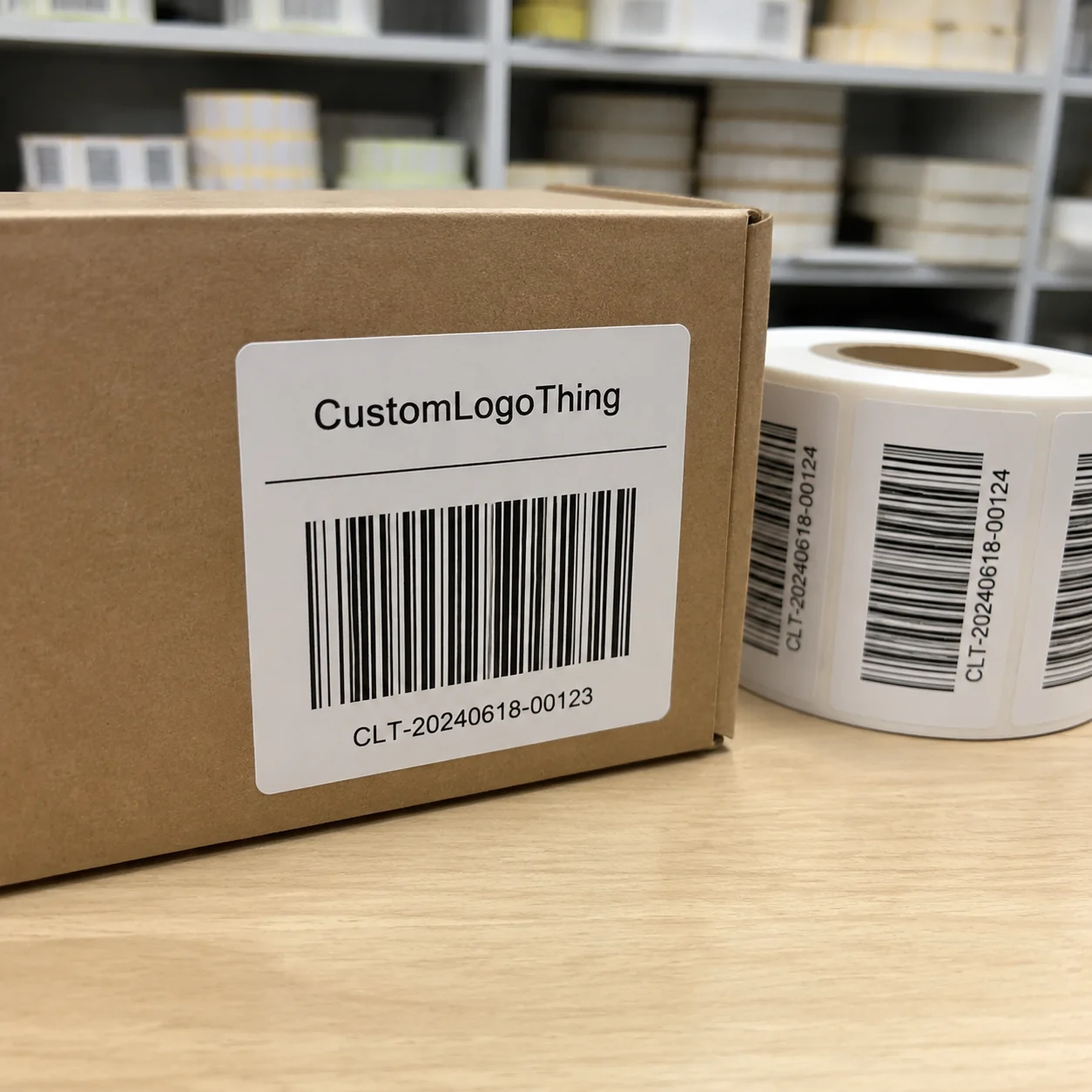
Barcodes and QR codes deserve actual testing at production size. On screen, a QR code can look perfect at 400%. At real size, with a textured finish or a busy background, it becomes a broken square. Use a quiet zone of at least 2.5 mm around the code, and scan it before approval. Then scan it again after application and after 24 hours of cure time. That is one of the most practical custom labels best practices in the entire process.
Application method matters too. A label that wraps around a cold bottle needs different tolerance than one that goes on a flat pouch. Curved containers can cause wrinkling at the edges. Cold surfaces can create condensation and reduce initial tack. If you are using hand application, you want a forgiving adhesive and a shape that is easy to place straight. If you are using automatic application, your die-line and core specs need to match the machine exactly, often a 3-inch core on 8-inch rolls with a 0.125-inch gap. Close enough is not a production standard.
“The prettiest label in the room means nothing if it peels in the fridge or will not scan at retail.” That is something I told a client in Los Angeles after we fixed their yogurt jar label with a stronger adhesive and a wider quiet zone around the barcode.
My advice: keep legal copy legible, keep the hierarchy simple, and stop hiding important information in tiny text at the bottom. Better branding comes from clarity, not clutter. That is another reason custom labels best practices matter across all kinds of product packaging, from candles to supplements to specialty beverages. A 15 mm ingredient block is not glamorous, but it prevents headaches in retail compliance reviews in New York and Toronto.
If your label is part of a larger packaging system, it should also coordinate with the rest of the line. A label that feels premium on its own can look out of place next to flimsy cartons or inconsistent Custom Packaging Products. Packaging works best when the label, box, pouch, and mailer all speak the same visual language. If the carton is printed on 350gsm C1S artboard and the label is a dull, low-contrast paper stock, the mismatch shows up before the customer even opens the box.
Pricing, MOQ, and Process Timeline
People love asking, “What do custom labels cost?” Fair question. The answer is annoying because it depends on material, size, quantity, finish, adhesive, die-cut shape, and how many times the artwork gets changed after approval. Still, I will give you real numbers because vague pricing helps nobody. Custom labels best practices include knowing where the money goes before you place the order.
For simple paper labels in a standard rectangle, I have seen pricing land around $0.05 to $0.12 per unit at 10,000 pieces, depending on size and color count. At 5,000 pieces, a standard matte BOPP label with a simple four-color print can sit around $0.12 to $0.19 per unit. Specialty shapes, foil accents, or soft-touch finishes can push that higher, sometimes to $0.25 to $0.45 per unit or more on smaller orders. If you are ordering only 500 to 1,000 pieces, the per-unit cost can jump sharply because setup gets spread over fewer labels. That is not a trick. That is arithmetic.
Here are the cost drivers I watch most closely:
- Material — paper usually costs less than BOPP, and specialty films cost more.
- Shape — standard rectangles are cheaper than custom die-cut flowers, arches, or odd contours.
- Finish — matte is often easier on budget than soft-touch or foil treatments.
- Color count — more complex artwork can raise print complexity, especially on specialty substrates.
- Adhesive type — refrigerated, removable, or high-tack adhesives can change pricing.
- Quantity — larger runs almost always lower the per-label cost.
MOQ matters too. Some suppliers will print custom labels in very low volumes, but the unit price can be ugly. I have quoted a small brand $180 for 1,000 paper labels and $260 for 1,000 BOPP labels on a simple test run in the Greater Shanghai manufacturing corridor, while a larger order of 10,000 brought the same basic structure down dramatically. A brand ordering 5,000 units might pay $0.15 per unit for a standard BOPP spec, while 20,000 units can fall near $0.08 to $0.10 per unit once the die and press setup are amortized. That is why it makes sense to think in phases: test, validate, then scale. Custom labels best practices are rarely about ordering the cheapest option once. They are about buying the right thing in the right quantity.
The process timeline usually looks like this: artwork review, proofing, sample approval, print, finishing, packing, and shipping. If the file is clean and the specs are locked, a normal run might take 12 to 15 business days from proof approval. Add faster shipping from Hong Kong or Shenzhen and you can move more quickly, but do not confuse transit time with production time. They are not the same. I have had brands blame the printer for delays that were actually caused by five rounds of logo color revision and a last-minute size change from 90 mm to 95 mm. That extra 5 mm sounds tiny until it forces a new die-line and restarts the clock.
Common bottlenecks show up in predictable places. Artwork revisions slow everything down. Color matching can take extra time if the brand wants a specific Pantone target. Edge testing takes a bit longer for curved containers. And if someone decides the label needs to feel more premium after proof approval, congratulations, you may be redoing the whole spec. That is why custom labels best practices include locking the design before the order goes to production. A one-day delay in proof signoff can turn into a three-day delay in the shipping queue in Shenzhen or Ningbo.
One factory visit in Guangzhou sticks with me. The production manager had three label jobs paused because clients kept changing the adhesive after samples were approved. The machines were ready. The stock was loaded. The line sat there because someone in marketing wanted a last-minute tweak. That delay cost more than the label upgrade would have. Labels are cheap until they hold up an entire schedule.
How to Choose the Right Label for Your Product
Choose labels by environment first. That is one of the simplest custom labels best practices, and one of the most ignored. Ask what the product will face: dry storage, refrigeration, oily hands, constant shipping, or a shelf with bright lights and weekly handling. A candle label in a cozy boutique in Charleston has different requirements than a shampoo bottle in a humid bathroom in Houston. Obvious? Sure. Yet I still get requests for paper labels on chilled beverages. Every week, somebody is trying to fight physics, and physics keeps winning.
If the product is dry and handled lightly, paper may be enough. If it is chilled, damp, or exposed to condensation, BOPP or vinyl usually wins. If the container is transparent and the brand wants a floating look, clear labels can be excellent. If the product gets thrown into boxes, stacked, and shipped across states, durability matters more than romantic design ideas. That is where packaging design and production reality need to meet in the middle, preferably before a 2,000-unit order leaves a factory in Dongguan.
Brand position matters too. Budget brands do not need to look cheap, but they do need to avoid unnecessary extras. Artisanal brands can use textured paper or matte finishes to create warmth. Premium brands often benefit from soft-touch, foil accents, or careful minimalism. Luxury brands need restraint, precise alignment, and materials that feel intentional. If your label says premium but the edges are lifting, the message collapses. A premium brand with a $0.08 label can still look expensive if the print is crisp and the application is clean.
Ask suppliers specific questions. Not polite, generic ones. Practical ones.
- What surface is this going on?
- Will it see moisture, refrigeration, or heat?
- Is it applied by hand or machine?
- What adhesive do you recommend for that environment?
- Can I see a sample on the actual container?
- What happens if I need to reorder in six weeks?
Order samples of both the material and the adhesive when possible. One without the other does not tell the full story. A gorgeous stock with the wrong adhesive is a very expensive sticker that fails silently. I have seen brands obsess over the print stock and forget that the adhesive is doing the actual work. That is like buying expensive shoes and never checking if they fit. Fancy shoes, miserable feet. Very on brand for bad purchasing decisions.
Sometimes performance should win over aesthetics. That is not a failure. It is smart buying. For refrigerated goods, bath products, beverage bottles, and shipping applications, a slightly less beautiful material that survives the environment is the correct call. I would rather sell a label that stays on than a gorgeous label that falls off in the cooler. That sounds obvious. In practice, it is where most label mistakes happen.
If you are also buying boxes, inserts, or outer packaging, keep the label decision aligned with your wider branded packaging and retail packaging system. A label should not feel like it came from a different company. If your labels are modern and the Custom Labels & Tags are inconsistent with the rest of your line, the whole package loses coherence. That coherence is what makes the shelf look expensive, whether the line ships from Shenzhen or lands on a boutique shelf in Denver.
Our Recommendation: Best Practices by Use Case
If you want my straight answer, here it is: the best all-around choice for many small brands is a matte BOPP label with a clean die-cut and a strong adhesive tested on the actual container. It is not the fanciest option. It is usually the safest balance of price, durability, and print quality. A 5,000-piece run in this spec often lands around $0.13 to $0.20 per unit, which is a far better bet than replacing 1,200 lifted labels after launch. That balance is a core part of custom labels best practices.
For candles, I like paper or matte BOPP depending on jar finish and handling. If the candle line is dry, consistent, and sold in boutiques, paper can be gorgeous and cost-effective. For skincare, matte BOPP or clear labels with white ink usually look polished and hold up to bathroom moisture. For beverages, BOPP or vinyl with moisture-resistant adhesive is the boring but correct answer. Boring labels often make the most money because they survive. On a 12 oz cold brew bottle in a cooler at 36°F, survival matters more than a trendy finish.
For food products, I lean toward BOPP unless the application is strictly dry. For supplements, clarity matters. You need readable copy, strong compliance handling, and a label that does not create a trust problem on shelf. For shipping labels, I care about thermal performance, barcode readability, and tack. Pretty is optional. Functional is mandatory. Custom labels best practices look different depending on the category, and pretending otherwise is how people waste budget in batches of 2,500 or 10,000 units.
If you are a first-time buyer, here is the safest combination I would recommend:
- Material: matte BOPP for moisture-prone products, or paper for dry goods
- Finish: matte unless you have a specific gloss-driven brand look
- Shape: simple rectangle or rounded-corner die-cut
- Adhesive: tested for your surface and storage condition
- Proofing: digital proof plus physical sample before full production
Before final production, approve the following: size, bleed, dieline, color targets, barcode quality, adhesive choice, and application method. If you do not approve those pieces, you are not really approving the label. You are approving a guess. And guesses are expensive. A missed bleed by 2 mm can ruin a full 8,000-label run faster than a bad logo can.
I have also seen cases where a custom label beats a full packaging redesign. If the budget is tight, a smart label refresh can modernize the product without changing the carton, the bottle, or the shipping format. That is one reason custom labels best practices are so useful for growing brands. Labels can pull a lot of visual weight without forcing a complete packaging overhaul, especially when the carton is already printed on a 350gsm C1S artboard box.
And yes, sometimes labels are the hero of the entire package. I worked with one subscription brand that spent only $420 on label revisions and got a much stronger shelf presence than a competitor who spent thousands on an oversized carton system. Great labels do that. They quietly make the whole line look better, whether the product lands in Seattle, London, or Melbourne.
Next Steps for Better Custom Labels
Start with measurements. Then surface conditions. Then material options. In that order. Measure your container diameter, flat panel width, or wrap area. Check whether the surface is glossy, textured, frosted, curved, or chilled. Decide whether you need paper, BOPP, clear, or vinyl. Then request samples. That workflow is one of the simplest and strongest custom labels best practices I can give you, and it keeps you from ordering a 4-inch label for a 3.75-inch panel.
Next, review your artwork at 100% size. Not zoomed in. Not “it looks fine on my monitor.” Actual size. Make sure type is readable, margins are safe, and the barcode or QR code scans cleanly. If your design uses thin lines or tiny icons, ask for a print test. Some details disappear when they hit production reality. A hairline that looks elegant at 300% can vanish on a press sheet in minutes.
Then test adhesion on the actual package. Leave it for 24 hours if possible. Chill it if the product is refrigerated. Wipe it if the container will be exposed to handling. Press the corners. Check for edge lift. Check for bubbles. If you are doing any volume at all, build a reorder folder with the final dieline, approved proof, substrate details, and notes about adhesive and finish. That folder saves time later. A lot of time.
Ask for at least two quotes side by side, one for a standard material and one for an upgraded option. Compare the price difference against the durability difference. Sometimes the upgrade is worth it. Sometimes it is decorative vanity. I love beautiful packaging, but I love not reprinting more. Frankly, my blood pressure prefers the second option. If the upgrade adds $0.04 per unit and prevents a 6% damage rate, that math usually favors the upgrade.
If you want a wider packaging system beyond labels, review Custom Packaging Products and keep the label specs consistent across your boxes, inserts, and outer mailers. The more aligned your packaging design is, the more polished the brand feels. That is not theory. That is what buyers notice on a shelf in Atlanta, on an unboxing bench in Dallas, and in a fulfillment center outside Reno.
My last piece of advice is simple. Do not guess. Test. Custom labels best practices start with testing because testing catches the adhesive failures, color shifts, and application problems that mockups hide. So here’s the actionable takeaway: pick one real container, order one physical sample in the exact material and adhesive you plan to use, and run a 24-hour stress test in the environment your product will actually face. Then decide. That one step saves more money than a stack of pretty PDFs ever will.
FAQ
What are the most important custom labels best practices for small brands?
The three biggest ones are: match the material and adhesive to the actual container surface, keep typography readable with strong contrast, and test a physical sample before full production. If you skip those, you are basically asking for edge lift, scan failures, or a label that looks great in a PDF and awful on a jar. A 24-hour adhesion test on the real bottle in a 38°F cooler can catch more problems than six design reviews.
Which label material is best for moisture or refrigeration?
BOPP or vinyl usually performs better than paper in wet or cold conditions. You also need an adhesive rated for chilled or high-humidity environments. I always push people to test on the real container after refrigeration, not just at room temperature, because condensation changes the game fast. A label that survives a 40°F walk-in cooler for 48 hours is far more trustworthy than one that only looked good on a desk in Los Angeles.
How much do custom labels usually cost?
Cost depends on size, shape, material, finish, color count, and quantity. Simple paper labels are often the lowest-cost option, while specialty finishes raise the price. For example, a 5,000-piece matte BOPP run might cost around $0.13 to $0.20 per unit, while a foil-accented small run can land closer to $0.30 per unit or higher. Smaller orders tend to cost more per label because setup fees get spread across fewer pieces.
How long does the custom label production process take?
Timing usually includes artwork review, proofing, printing, finishing, and shipping. If the file is clean and the proof is approved quickly, production typically takes 12 to 15 business days from proof approval. Delays commonly come from revisions, color matching, or changing size after proof approval. If your file is clean and you approve samples quickly, the process moves noticeably faster.
What should I ask a supplier before ordering custom labels?
Ask what substrate the label will go on and whether it will face moisture, heat, or friction. Confirm the adhesive type, finish, proofing method, and Minimum Order Quantity. Request a sample or test run before approving the full order. Ask whether they can print in Shenzhen, Dongguan, Ningbo, or another named manufacturing region, and get a written spec sheet. That is not being difficult. That is being smart.