If you're pricing Custom Lip Gloss labels, the sticker is only one part of the job. The real issue is whether the label survives curved plastic, oily hands, warm shipping boxes, and repeated handling. A mockup can look clean and still fail on the container, so the decisions that matter are usually technical: fit, adhesive, stock, finish, and inspection.
Why labels fail or shine on the shelf
Most label problems are fit problems, not print problems. The wrong adhesive, a label that is slightly too wide, or a stock that does not work well on curved plastic will show up after the product leaves approval. That is the gap between a clean PDF and a working package.
Gloss packaging is unforgiving. Surfaces are slick, small, and touched constantly. Add hand oils, condensation, and shipping friction, and a label that looked perfect on screen can start lifting at the edge or wrinkling near the seam.
From a buyer's point of view, the standard is simple: the label should stay readable, stay stuck, and still look intentional after handling. If it does that, it has done its job. If it does not, the packaging feels cheap even when the artwork is strong.
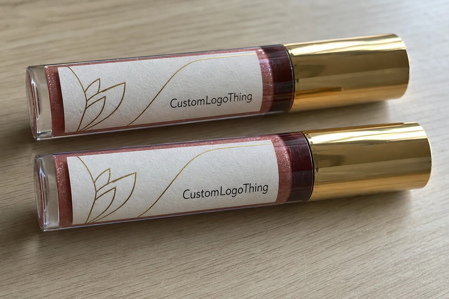
A label can look expensive on a monitor and still fail on a tube. The tube does not care about the mockup.
On small cosmetic packaging, one millimeter matters. A tube may need a different panel width than the catalog spec suggests, especially if the bottle has a seam, a shoulder curve, or a cap edge that crowds the label zone. That is why a measured dieline matters more than a generic size recommendation.
How the label build works on cosmetic packaging
A good label is a stack of decisions. The face stock carries the art. The adhesive keeps it in place. The laminate or varnish protects it. The liner gets removed during application. Change one part and the final result changes with it.
Surface material matters more than many buyers expect. Glass, frosted plastic, PET, polypropylene, and soft-touch tubes do not all accept the same adhesive the same way. Some containers need a low-surface-energy adhesive. Others hold fine with a standard permanent adhesive if the surface is clean, dry, and free of release agents.
Placement also changes the construction. A front-panel label is not the same as a wrap label, and neither behaves like a tamper seal, ingredient panel, or cap sticker. Small cosmetic packaging often needs more than one label zone if you are listing shade names, barcodes, or regulatory copy.
- Face stock: paper, BOPP, clear film, metallic film, or specialty stock.
- Adhesive: standard permanent, extra-aggressive, removable, or low-temperature.
- Finish: gloss laminate, matte laminate, varnish, or no overlaminate.
- Shape: rectangle, oval, custom cut, or full wrap with a precise seam.
Artwork hierarchy matters too. The logo, shade name, size, and required copy should not compete for space. On small packaging, too much information turns into visual noise. The better answer is usually tighter type, cleaner layout, and less unnecessary copy.
For broader package branding, the label system should match the rest of the line, including cartons and inserts. If you need companion pieces, the same art direction can carry through Custom Labels & Tags and Custom Packaging Products without making the shelf presentation feel disconnected.
Material and finish choices that change durability
For custom lip gloss labels, the first material question is simple: paper or synthetic. Paper can work for short runs, low-contact packaging, or products that will not live in oily environments. Synthetic stocks such as BOPP usually hold up better around moisture, fingerprints, and the friction of normal retail handling.
Finish changes more than appearance. Gloss catches light and reads louder on shelf. Matte looks calmer and more controlled. Clear labels can feel minimal, but they demand stronger contrast and cleaner typography because weak design choices show immediately on transparent film.
There is no universal best build. A sample kit, a boutique retail launch, and a high-touch influencer set do not need the same construction. A label that only has to survive one unboxing can be lighter. A retail item that sits under warm lights and gets handled all day needs more protection.
Common finish and decoration options include:
- Rounded corners to reduce edge lift on curved containers.
- Foil accents for premium branding, usually on logos or short copy blocks.
- White ink for clear labels and dark containers where contrast matters.
- Spot UV for controlled shine on specific artwork elements.
- Custom cut shapes when a standard rectangle would look clumsy on the tube.
Adhesive choice deserves the same attention as the visual finish. Permanent adhesive is standard for most cosmetic uses, but some launches need removable adhesive for short-term promotions, while others need a stronger bond for cold storage, oily formulas, or difficult plastics. A printer that ignores the container substrate is guessing.
If you need a practical quality check, ask for a sample on the actual container before approving the full run. That one test tells you more than a polished mockup ever will. It also surfaces alignment, seam placement, and adhesion issues before the order is locked.
If the package is small, the design has to behave small. Fine hairline rules, tiny reversed text, and crowded legal copy can become hard to read fast. The label should fit the container and the workflow, not just the mood board.
Cost and MOQ: what changes the quote
Pricing is driven by a handful of variables: size, quantity, stock type, finish, color count, custom shape, proofing, and any extra handling. If a quote looks too simple, it probably left out one of those items.
MOQ exists because setup costs are real. Material waste, press calibration, die cutting, and proof handling all happen before the first sellable label reaches the box. Lower quantity means higher unit cost, but it also means less dead inventory if your formula, scent, or container changes after launch.
| Build option | Typical use | Approx. price at 5,000 pcs | Notes |
|---|---|---|---|
| Paper label, gloss varnish | Short-run, low-contact packaging | $0.08-$0.14 per unit | Lowest entry cost, but least resistant to oils and moisture |
| White BOPP, matte laminate | Standard retail packaging | $0.12-$0.22 per unit | Strong balance of durability, print quality, and price |
| Clear BOPP with white ink | Minimal package branding | $0.16-$0.30 per unit | Needs careful artwork and good contrast |
| Foil, custom shape, or multi-step finish | Premium launch or hero SKU | $0.28-$0.55 per unit | Higher setup cost, stronger shelf presence |
Those ranges are not fixed. They move with print coverage, die complexity, and whether you need one SKU or a multi-shade set. A 1,000-piece run will usually carry a noticeably higher unit price than a 5,000-piece run, and a rush order can distort the quote even more.
Hidden costs are where buyers get surprised. Watch for setup fees, die-cut or plate charges, multiple SKUs in one order, extra proof rounds after artwork changes, and rush production or split shipping.
A clean way to budget is to ask for two versions of the same job: a practical build and a premium build. That makes the tradeoff visible. You can see exactly what the matte laminate, white ink, or foil detail adds before you commit. It also keeps the conversation grounded in facts instead of vague quality claims.
For small launches, the cheapest label is not always the smartest purchase. If the stock peels, scuffs, or warps in transit, the reprint wipes out the savings. A slightly better construction often costs less in the end because it avoids the second order.
Process and turnaround: from proof to delivery
The production path is straightforward, but every step has a failure point. First comes dieline review. Then artwork setup. Then the digital proof. After that, sample approval if the job needs it, followed by print production, finishing, packing, and shipment. Custom lip gloss labels move faster when the file is clean at the start.
Proof review should not be casual. Check dimensions, bleed, safe area, barcode readability, ingredient text, and whether the color expectations are realistic for the chosen stock. A bright pink on coated white film will not look the same on clear film or matte BOPP.
Production timelines depend on construction. Simple digital runs can move in about 5 to 8 business days after proof approval. Custom shapes, foil, or specialty finishing often land closer to 10 to 15 business days. If the artwork is messy, fonts are missing, or copy keeps changing after approval, the clock stretches fast.
Fast approvals save more time than rush fees. Send final copy, use vector artwork, confirm Pantone references early, and assign one person to own approvals. One approval chain beats four people editing the same PDF.
Before the order is released, ask for the estimated ship date, the approval cutoff, the reprint policy, and whether freight is included. Those answers matter more than a vague promise that the job will be handled quickly.
If the labels need to travel well, ask whether the order has been checked against ISTA-style transit assumptions. That matters for abrasion, vibration, and box compression, especially if the labels are shipping with other product packaging like Custom Printed Boxes. If paper-based sourcing is part of the brand story, keep an eye on FSC paper options too.
One more practical point: if the labels are being applied by hand, ask how forgiving the adhesive is during placement. Some materials grab fast. That is fine on a machine line and annoying on a manual one.
Common mistakes that make labels look off
The biggest sizing mistake is ordering from a catalog default instead of measuring the actual container. Tubes vary by supplier. Caps vary. Seams vary. Even two bottles that look identical can have different usable label zones once you put a ruler on them.
Small typography gets punished on cosmetic packaging. Fonts that read fine on a laptop can disappear on a 10 ml tube. Low-contrast colors can make a polished design look muddy, especially if the background is clear or the product color shows through the label.
Weak artwork files cause more trouble than most people expect. Thin lines, low-resolution images, and bad crop settings show up fast on close-up packaging. If the logo is soft at 100% zoom, it will be worse on press.
- Wrong label dimensions that wrap into seams or cap edges.
- Too much text crammed into a small face area.
- Weak contrast between artwork and container color.
- Inflexible placement that ignores fill lines and shoulder curves.
- Poor finish match for the brand direction and formula use.
Real-world wear is another problem. Oils, fingerprints, warm shipping environments, and repeated handling can make a label curl, scratch, or fade if the stock and finish are too light for the job. A label that looks fine in a studio can still feel wrong once it reaches the shelf.
Regulatory copy can also get squeezed until it becomes unreadable. Ingredients, weight, batch coding, and distributor info should not be treated like afterthoughts. If the label is too small to carry the required information cleanly, the answer is usually a layout change, not smaller type.
Expert next steps for a cleaner label buy
Start with samples or material swatches before you commit to a full run. The cost of testing one or two options is small compared with the cost of reprinting labels that peel at the edges. That is especially true for custom lip gloss labels on slippery tubes or high-touch formulas.
Measure the actual packaging, not the catalog spec. Real containers vary. A one-millimeter mistake can matter on a narrow format, and the effect gets worse if you need a wrap label or a second panel for barcodes and ingredients.
Ask for two quote versions: one practical, one premium. Use the first to get a working label out the door. Use the second to see what extra finish, shape, or stock quality buys you. That approach keeps the decision honest instead of emotional.
A short approval checklist helps more than a long email thread:
- Final size and dieline
- Stock and finish
- Quantity and SKU count
- Target ship date
- Artwork owner and approval contact
- Reorder plan
If you are building a wider line with Custom Packaging Products, lock the label system to the rest of the shelf presentation so the tubes, boxes, and inserts all feel like one family. Consistency matters more than decorative extras.
Keep the dieline and artwork locked together once they are approved. That is the easiest way to keep the labels consistent across batches, shades, and future reorders, without having to rediscover the same mistakes every time.
What size should custom lip gloss labels be for small tubes?
Measure the flat printable area on the actual tube, not the marketing spec. Leave safe margins so the label does not wrap into a seam, curve, or cap edge. Ask the printer for a dieline or sample layout before approving full production.
What material works best for custom lip gloss labels that get oily?
Synthetic stocks such as BOPP usually hold up better than uncoated paper. Pair the stock with a strong adhesive and a protective finish so oil and friction do not damage the print. Test the label on the real container if the formula or environment is unusually harsh.
How many custom lip gloss labels should I order for a small launch?
Start from the printer's MOQ, then add a buffer for spoilage, misapplication, and early reorders. If the product is still being tested, a smaller run may be smarter than locking cash into excess inventory. Order enough to cover the launch plus a little breathing room.
How long does production usually take for lip gloss labels?
Timeline depends on artwork readiness, proof approvals, material choice, and special finishes. Simple runs move faster than custom shapes, foil, or multi-step finishing. Ask for the estimated ship date up front, then confirm when the approval cutoff starts.
Can I use the same label design across multiple gloss shades?
Yes, if the core branding stays consistent and only the shade name, SKU, or barcode changes. Variable data can help keep each version organized without redesigning the whole label. Keep the hierarchy clear so customers can tell the shades apart at a glance.


