Why custom printed postal boxes punch above their weight
Custom printed postal boxes are a working part of the customer experience, not just a transit layer. They move through courier networks, sit in warehouses, and arrive at the door still carrying the brand. That makes them more valuable than a plain shipping carton, but only if the structure, print, and size are chosen with the route in mind.
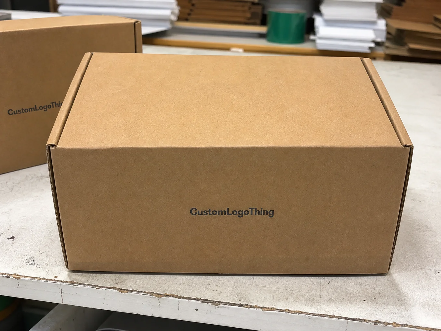
The terminology is often blurred. Postal boxes, mailer boxes, and corrugated shippers overlap, but they are not identical. Postal boxes usually mean corrugated cartons built for parcel networks, often with tuck-in or crash-lock closures. Mailer boxes tend to focus more on presentation and opening experience. Corrugated shippers is the wider category. The difference matters because it affects print area, seam placement, and crush performance.
A printed carton also changes perception before the product is opened. A restrained one-color design on kraft board can feel more deliberate than a busy full-color layout that ignores folds and handling wear. The useful question is not whether to print the outer carton, but whether the packaging supports recall, protects the product, and fits the route without adding avoidable cost.
Size matters as much as artwork. Oversized cartons increase freight volume and let products move around inside the box. Undersized cartons compress inserts and raise the risk of damage or closure failure. The best spec is usually the smallest format that still protects the product and survives the shipping lane.
How the box structure and print method work together
Board grade is the first technical decision, and it drives print appearance and protection. E-flute is popular when print quality and a cleaner finish matter, since its finer profile usually reproduces small text and line work more sharply. B-flute is thicker and generally better for cushioning and crush resistance. Heavier constructions improve protection, but more aggressive flute profiles can soften print detail at the edges.
Print method is the next decision. Digital printing is usually best for short runs, artwork changes, and multi-SKU projects because it avoids plate costs. Flexographic printing tends to be the lower-cost option at scale, especially for simple logos, blocks of color, and straightforward text. Litho-lamination delivers a premium look by laminating a printed liner to the board, but it raises cost and is usually better suited to presentation-led packaging than everyday transit cartons.
The dieline is where many projects gain or lose money. A good-looking layout can still fail if folds, glue zones, and closure flaps were not built into the artwork early. Tabs consume space. Scores can distort type. A logo too close to a crease may look fine on screen and awkward in the finished box. Packaging design needs a technical eye, not just a visual one.
Material and ink behavior also matter. Kraft board usually mutes color compared with white-lined board, so Brands That Need crisp contrast often use a white underprint. That improves clarity but adds cost. Heavy ink coverage can show more texture on corrugated board, especially on rougher substrates. Safe zones are not optional. A margin of 3-5 mm around scores is a sensible starting point, though the exact allowance depends on the box style and board thickness.
For teams that want a more structured way to think about shipping performance, the standards published by ISTA and broader packaging references from industry groups are useful. They do not choose the aesthetic, but they help define what the carton must survive in transit.
Cost, pricing, and MOQ factors that move the quote
If two quotes look close, they often are not. The unit price for custom printed postal boxes depends on board grade, flute profile, dimensions, ink count, print method, finishing, packing format, freight, and quantity. MOQ is the first lever buyers feel. A run of 1,000 boxes can carry a much higher per-unit price than 10,000 because setup, proofing, and machine time are spread across fewer units.
Board grade affects cost because stronger materials are more expensive and can be slower to process. Finish choice matters too. Aqueous coating can reduce scuffing and improve handling. Soft-touch lamination raises perceived value, but it adds cost and is not always practical for a carton that will be stacked, crushed, or recycled quickly after delivery. Spot varnish and special effects can sharpen the look, yet every extra step raises the quote and may extend lead time. Variable data, such as unique QR codes or campaign codes, adds another layer of complexity.
| Option | Typical use | Indicative unit cost | Best for |
|---|---|---|---|
| Digital print, short run | 1,000-3,000 units | $0.55-$1.20 | Launches, testing, fast artwork changes |
| Flexo print, mid to high volume | 5,000-20,000 units | $0.18-$0.45 | Simple logos, repeat reorders, cost control |
| Litho-lam premium carton | 2,000-10,000 units | $0.70-$1.80 | Retail packaging, presentation-led shipments |
These are broad ranges, and they move with board thickness, freight lane, and carton size. A compact mailer for a lightweight skincare item will price very differently from a larger ecommerce shipper carrying glass, hardware, or bundled products. Ask suppliers to separate the quote into unit cost, plates or tooling, proof charges, sample cost, and freight. If those lines are hidden inside one number, comparison gets fuzzy fast.
The best benchmark is landed cost. A low factory price can stop being attractive once pallet freight, rush charges, and reprints are counted. Freight class can jump if the carton dimensions are inefficient. Extra void fill can quietly erase the savings from a cheaper box. If you are sourcing Custom Packaging Products across more than one format, keep the quote structure consistent so the true cost drivers stay visible.
Production steps and lead time from proof to delivery
The production path usually starts with a brief: internal dimensions, product weight, board preference, print coverage, quantity, destination, and delivery date. From there, the supplier checks the dieline, fits the artwork, issues a digital proof, and sometimes produces a preproduction sample. Once approval lands, the job moves into printing, cutting, gluing, finishing, packing, and shipment.
Artwork readiness is usually the biggest schedule variable. Low-resolution logos, files built on outdated dielines, or layouts that ignore scores can each add several business days. The first proof is often where structural issues appear. A buyer may find that the closure changed, the insert needs extra clearance, or the brand elements sit too close to the fold. Those revisions are common and cheaper to catch on proof than on press.
For standard corrugated cartons, turnaround often falls around 12-15 business days after proof approval, but that is a planning range rather than a promise. More complex finishes, higher volumes, seasonal congestion, or unusual board specs can push that out. Rush production can help, but it does not remove shipping time.
Seasonality matters more than many buyers expect. Q4 orders, launch windows, and subscription-box refreshes compete for the same press capacity. When a shipment has a hard date, build buffer into the schedule before the order is placed. One extra week is often enough for routine jobs, and more is better if approvals pass through several people.
Testing is worth mentioning because it is often skipped until damage claims start. If the box carries heavier products or needs to survive long postal routes, it can be sensible to check compression, drop tolerance, and overall pack-out against recognised transit methods. ISTA references help move the conversation away from guesswork.
Design choices that protect print quality and brand consistency
Color is the first place brand consistency can slip. Corrugated board is not coated paperboard, and the substrate changes how ink behaves. Kraft often warms colors and dulls lighter tones. White-lined board gives a cleaner base, which makes delicate colors and fine detail easier to preserve. For reorders, a restrained palette is usually safer than a design that depends on subtle gradients or pale pastels.
Typography deserves more care than it usually gets. Small text can disappear after folding, especially when the carton is handled by scanners, sorting lines, and delivery crews. Thin fonts are risky. High contrast helps. So does keeping critical copy away from score lines and closure edges. If the logo is the main feature, let it occupy real space.
Outer and inner panels do different jobs. The outside panel handles transit visibility and first impression. The inside can carry reveal messaging, instructions, or brand details once the box opens. For ecommerce and subscription packaging, the outer print builds recall on the way to the customer. For gift sets or onboarding kits, the inner print can add more value at opening.
Finishes also affect how the box ages in the real world. Matte aqueous coating reduces scuffing while keeping the surface understated. Soft-touch can create a more premium feel, though it is not always the best match for a transit-heavy route. Uncoated kraft gives a natural look, but it shows rub marks and fingerprints differently from coated board. The right finish is the one that fits product value, shipping path, and handling.
“A carton is judged less by the mockup than by what it looks like after a warehouse shift and a delivery route.”
That is the point most packaging decisions eventually reach. The render is the opening argument. Transit is the verdict.
Common mistakes that make postal box projects expensive
The first expensive mistake is approving artwork before the structure is final. A small change in tuck depth, glue flap width, or insert clearance can shift the entire layout. If a logo sits too close to the edge, a structural revision can force a rework of the print file. That means more prepress time and, in some cases, new tooling.
The second mistake is assuming the on-screen color will match the printed result. It rarely does exactly, especially on brown board. Screens are backlit; cardboard is not. That gap matters most on small type, pale tones, and brand marks that depend on precision.
Buying on unit price alone is another common trap. A cheaper box can increase total spend if it needs more void fill, ships in a less efficient freight class, or causes product damage because the fit is loose. A slightly larger box may lower manufacturing cost but raise transit cost and packing labor. The savings move from one column to another.
Skipping a physical sample can also become expensive. A proof shows layout. It does not show closure tension, board rigidity, or how the product settles inside the carton. A sample can expose a 2 mm clearance issue that would otherwise turn into a warehouse problem. For jobs with tight margins or fragile products, it is often the cheapest insurance available.
Procurement teams sometimes ignore compliance or sourcing claims until late in the process. If FSC-certified board matters to the brand or the retailer, it needs to be specified early. The same goes for recycled content targets, ink restrictions, or food-contact concerns. The FSC framework is one example of a claim that is easy to misunderstand after the fact and tedious to retrofit once production has started.
Next steps for a cleaner quote and faster launch
The fastest way to get a useful quote is to send a complete brief the first time. Minimum inputs should include internal dimensions, product weight, board preference, print coverage, quantity, target ship date, and delivery postcode or freight zone. If you have a preferred closure style or finish, include that too. “We need boxes for ecommerce” is not enough to price accurately.
Send one approved logo file, one dieline, and one reference image. That combination removes a lot of back-and-forth. If the supplier has to guess at artwork placement or board type, the quote either becomes padded or stays incomplete. For apples-to-apples comparison, ask every vendor to quote the same spec and to show the same line items: setup, sampling, freight, and finishing.
It also helps to lock the spec before final approval. One board grade. One print method. One finish. One exact quantity. That reduces revision loops and keeps procurement, design, and operations aligned. Once those variables are fixed, ordering gets simpler and the timeline is easier to defend internally.
The practical goal is not decorative packaging. It is a carton that protects the product, supports the brand, and stays economical at reorder stage. Start with a clear brief, compare landed cost, and approve the proof only after the dieline is final. If those three things are in order, the rest of the project tends to behave.
What size should custom printed postal boxes be for ecommerce orders?
Use the smallest internal size that still protects the product and allows for inserts or void fill if needed. Start with the packed product dimensions, then add clearance for board thickness, compression tolerance, and any protective material used in transit. A box designed around the actual pack-out is far more reliable than one guessed from exterior dimensions.
Which print method is best for small-batch postal box orders?
Digital printing is usually the most practical choice for short runs because setup is lighter and artwork changes are easier to manage. Flexographic printing becomes more attractive as quantity rises, particularly when the artwork is simple and repeatable. The best method depends on unit count, color complexity, board choice, and how much image detail the design needs.
How do I estimate the cost of custom printed postal boxes?
Start with dimensions, board grade, print coverage, quantity, and freight zone. Then add setup charges, sample cost, and any finish or tooling fees so you can see total landed cost rather than just factory price. Unit cost usually falls as volume rises because fixed setup costs are spread across more boxes.
What affects lead time the most on printed postal boxes?
Artwork readiness is usually the biggest factor. Missing dielines, low-resolution files, or repeated proof changes can add days before production even starts. Sampling, finishing, seasonal demand, and freight transit all add time as well, so schedule buffers are useful even on standard runs.
How can I avoid print quality problems on corrugated postal boxes?
Use high-resolution artwork, proper bleed, and safe margins around folds and closure edges. Match the board and print method to the design instead of forcing a premium look onto an incompatible substrate. When the print coverage is critical, approve a physical sample or a preproduction proof before the full run begins.

