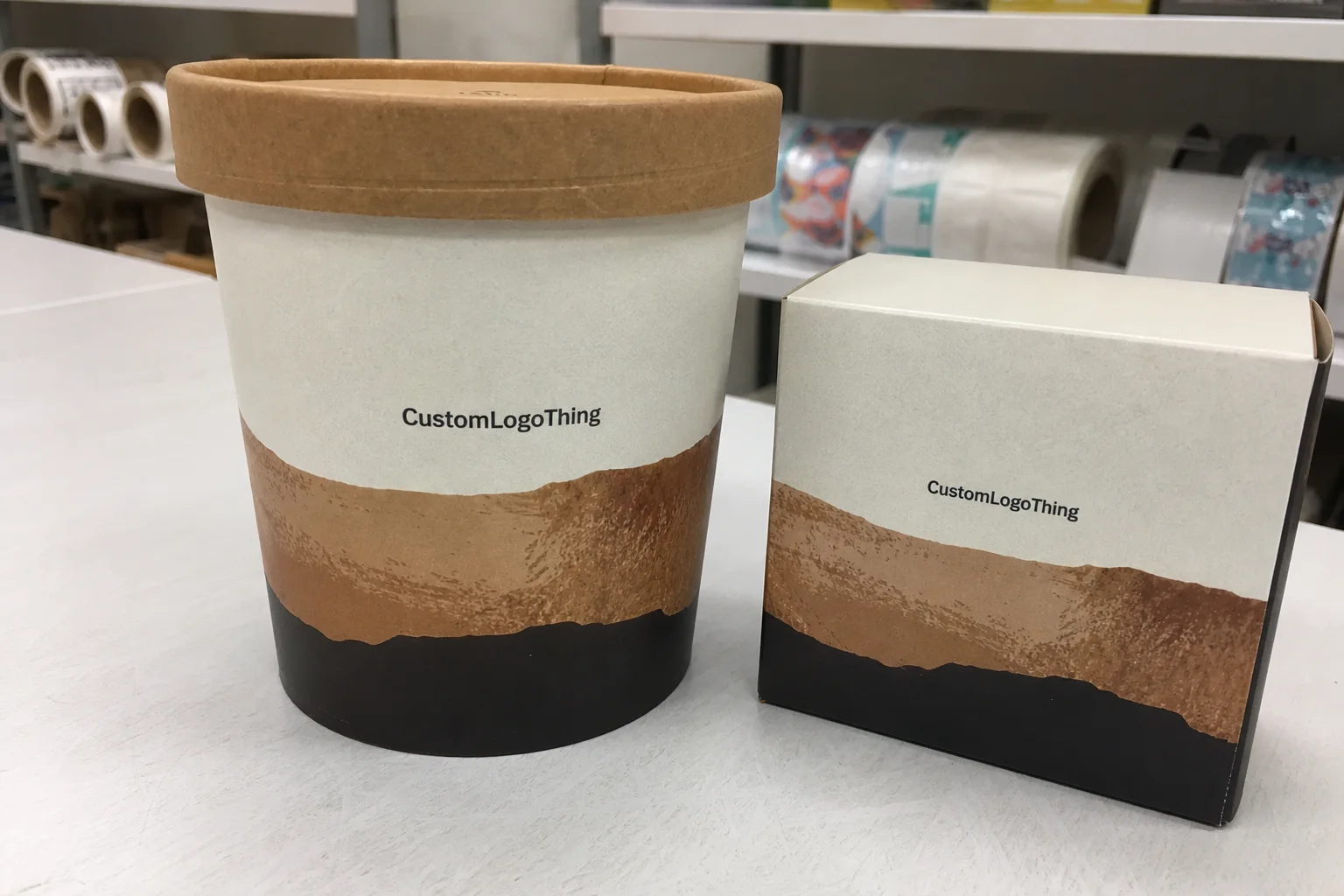
Custom Shape Labels for Clothing: Order the Right Fit
Most label problems are not about color. They are about shape, proportions, and how much the design can survive once it leaves the screen. Custom shape labels can make a basic tee, a kidswear run, or a premium hoodie feel deliberate instead of generic, but only if the contour fits the garment, the stitch line, and the fabric weight. A good shape does quiet work. A bad one announces itself immediately.
That difference matters more than buyers usually expect. The outline changes how a label sits at the neck, how it reads on a hem tag, and whether the brand mark feels refined or cramped. In apparel, tiny decisions carry disproportionate weight. A label is small, but it is visible at close range and repeated across an entire run, which means any mistake becomes part of the product identity.
There is also a practical side. A label with a clean silhouette is easier to sew, easier to align, and less likely to curl after washing. A shape with too many points or internal cutouts may look clever in artwork review and awkward in production. That is the part people discover only after the first sample. By then, the problem is no longer theoretical.
What Custom Shape Labels Actually Change on a Garment
A standard rectangle is common because it is simple to produce. That does not make it the right answer for every garment. Custom shape labels let the outline reflect the brand personality and the placement. A rounded badge, a small shield, a banner, or a contour that echoes the logo can look like it was made for the product rather than borrowed from a template library.
The effect is strongest on neck labels, hem tags, side-seam branding, kidswear, and limited drops where each element has to justify itself. In those placements, the outline often gets remembered before the typography. People may not recall the exact typeface, but they remember whether the label felt sharp, soft, playful, or expensive. That kind of recall is useful across apparel and related product packaging, because the brand starts to feel consistent at touchpoints that customers actually handle.
The real value is control. A well-considered contour reduces visual clutter and can make a small logo read as premium instead of overcrowded. The reverse is also true. If the shape is too busy, too wide, or too delicate, it can fight the garment and look fussy. There is a narrow line between distinctive and distracting, and label design crosses it more often than brands like to admit.
“If the shape needs a long explanation, it is already too complicated for a garment label.”
Fabric type changes the result. On lighter knits and softer tees, an oversized or angular label can feel stiff and sit poorly. On heavier hoodies or outerwear, a bolder contour can hold up better and look intentional. Kidswear brings a different requirement: comfort. Rough edges and scratchy finishes create complaints quickly, and those complaints are usually more expensive than a slightly safer design choice would have been.
That is why shape should always be judged in context. Not in isolation. Not on a white background. On the garment, at actual size, under the same sewing conditions the final product will see.
How the Design and Production Process Works
Good custom shape labels start with a dieline, not just a logo file. That is where many first-time buyers slip. The outline is the cut pattern. It defines the safe zone, the trimmed edge, and the room the artwork has before it reaches a seam or a sealed border. If you treat the shape like extra canvas, the finished piece usually disappoints. The label is not a flyer. It is a small object that has to be cut, sewn, handled, and washed.
The process is usually straightforward: submit the artwork, confirm the final size, review a cut template, and approve a proof. For more complex shapes, a physical sample or strike-off is worth requesting. A digital mockup can confirm placement and proportions, but it cannot tell you how a narrow point behaves at production size or how the edge feels in hand. Those details matter more than they sound.
Artwork cleanup often takes longer than buyers expect. Thin strokes, tiny text, internal corners, and elements placed too close to the edge are the usual trouble spots. Woven labels have limits on how fine a line can be before it becomes soft or unreadable. Printed labels are more forgiving with detail, but even then, the cut shape must leave enough margin for finishing. If a design depends on perfect sharpness right at the boundary, it is already fragile.
Vector files make the job easier. AI, EPS, and clean PDF files are ideal because they let the supplier adjust the dieline without introducing distortion. If the file arrives as a low-resolution image, the first proof may still look acceptable on a screen and fail in production. That failure is avoidable, and it usually starts with one simple issue: the file was not prepared at actual label scale.
Typical delays are not dramatic. They come from missing dimensions, unclear placement, too many revision rounds, or a shape that cannot be cut cleanly at the requested size. None of that is mysterious. It just eats time. If speed matters, the brief should include the final width and height, the attachment method, and a locked artwork version before the quote is approved.
For buyers comparing garment labels with broader branded materials, the same discipline applies to Custom Labels & Tags and Custom Packaging Products: clean files, accurate dimensions, and a realistic finish specification reduce mistakes. Shape does not fix a weak brief. It only makes the weak brief more visible.
Material, Edge Finish, and Durability Choices
Material changes the feel more than most artwork revisions do. Woven labels usually deliver the strongest texture and a more traditional garment-label look. They are a good fit for premium basics, hoodies, and brands that want a durable, tactile finish. Fine detail is possible, but only within the limits of the weave. Very small text and extremely thin lines are where woven construction starts to show its boundaries.
Printed labels are better for small text, gradients, and simpler applications where the artwork needs more visual flexibility. They can also be softer against the skin, which matters for kidswear and lighter garments. Satin, cotton, and other specialty substrates sit in the middle depending on the garment and the hand feel you want. No substrate is universally best. The right choice is the one that fits the garment, the price point, and the wash expectation.
Edge finish matters even more with shaped labels than with simple rectangles because every curve and corner is exposed. Rounded corners usually look cleaner. Heat-cut or sealed edges can reduce fraying. A rough cut edge is obvious on a custom outline, especially if the design has narrow points or notches. That is where a label can shift from polished to careless in a single wash cycle.
Durability is not just about the base material. It also depends on stitch placement, edge geometry, and how much flex the garment has in wear. A soft tee with a rigid label can buckle. A heavy hoodie can tolerate a firmer build. Kidswear needs extra attention because comfort complaints arrive fast and do not stay small. If a label scratches, twists, or looks crooked after laundering, the material spec was probably too ambitious for the garment.
Below is a practical pricing snapshot. These figures are typical at around 5,000 pieces and can move up or down based on artwork, finish, and quantity. Smaller runs usually cost more per piece because setup gets spread across fewer units.
| Label Type | Best For | Typical Unit Price | Practical Notes |
|---|---|---|---|
| Woven custom shape | Premium basics, hoodies, heritage branding | $0.18-$0.35 at 5,000 pcs | Good texture and durability; fine details need enough size to read cleanly. |
| Printed custom shape | Small text, flexible branding, kidswear | $0.12-$0.28 at 5,000 pcs | More forgiving for artwork; softer feel, but edge finish still matters. |
| Satin or soft-touch label | Loungewear, babywear, lighter garments | $0.14-$0.30 at 5,000 pcs | Comfort first. Keep the outline simple so it sits well on fabric. |
| Specialty custom cut | Streetwear, limited drops, premium collections | $0.22-$0.45 at 5,000 pcs | Higher setup and cutting complexity; worth it only if the shape adds clear value. |
If a supplier cannot explain the effect of material, edge finish, and wash durability in plain language, that is a problem. Good vendors should be able to tell you where the limit is. They should also be able to explain what fails first: the print, the edge, the stitch, or the hand feel. A vague answer here usually means the process is vague too.
For transit-related packaging work, groups like the ISTA publish methods for testing how materials behave under shipping stress, while the FSC addresses responsible sourcing for paper-based materials. Clothing labels are not transit cartons, but the same mindset applies: verify the material claim instead of assuming it.
Cost, MOQ, and Unit Price: What Changes the Quote
Price for custom shape labels is driven by a short list of concrete factors: size, material, color count, cut complexity, finish, and whether the job needs a custom setup or additional tooling. A simple contour with one or two colors tends to stay in the lower range. Add multiple colors, tiny details, or a shape with sharp interior angles, and the quote moves quickly.
MOQ exists for a reason. There is prepress, proofing, machine setup, trimming, quality checks, and packaging before the first usable label is shipped. That overhead gets smaller as volume grows. A 500-piece order can feel expensive next to a 5,000-piece run because the setup burden has not changed much. The supplier is still preparing the same tooling, color matching, and finishing process.
Typical MOQ ranges for garment labels often sit between 500 and 1,000 pieces per style, though some suppliers will quote below that if the job is simple or the brand accepts a higher unit rate. Below MOQ, the pricing logic shifts from manufacturing efficiency to one-off production. That can be acceptable for a launch or a sample program. It is less attractive for a full retail rollout.
Hidden costs matter too. Artwork cleanup may be included or billed separately. Strike-offs and samples are sometimes charged on top of production. Rush fees are common if the date is tight. Shipping can be a larger variable than buyers expect, especially if the order is split across cartons or sent by air instead of sea. One revision after approval can also change the schedule. That is normal, not exceptional.
A useful way to read a quote is to ask what the supplier is actually carrying in the price. If the response is only a number with no structure behind it, the quote is less useful than it looks. A clear quote should separate the base unit cost from setup, sampling, and shipping whenever possible.
- Simple shape, one or two colors, standard material: lower quote, faster approval.
- Moderate shape, multiple colors, special edge finish: mid-range quote.
- Complex contour, premium substrate, sample requirement: higher quote and longer lead time.
Production Steps and Turnaround: From Proof to Delivery
The production path is usually inquiry, quote, artwork proof, sample approval, production, quality check, and shipment. The process is not complicated. What matters is where time gets lost. A clean order moves in a straight line. A messy one circles through revisions because the shape still has open questions.
Turnaround depends on complexity and quantity, not just how quickly someone replies to email. A simple run with clear artwork and a standard contour can move faster than an intricate cut with several proof rounds. If the order is time-sensitive, send final dimensions, a locked color list, and a production-ready file from the start. That removes most of the friction.
For straightforward work, a realistic lead time is often around 12 to 15 business days after proof approval, with more time needed for unusual shapes, sampling, or larger quantities. That is a planning range, not a promise. If a vendor says every shaped label order is instant, they are selling speed instead of capacity. Those are not the same thing.
Production checks should not stop at visual inspection. A useful QC routine includes verifying cut accuracy, edge consistency, color fidelity, stitch alignment, and sample fit on the actual garment fabric. If the label will be washed frequently, a wash test matters too. The label can look correct in a tray and still behave badly after a few cycles.
Placement also affects turnaround indirectly. A neck label has different tolerances than a side-seam badge. A hem tag may need tighter dimensions to avoid hanging off the garment edge. These are small changes, but they influence the die line, the stitch plan, and the approval cycle. The fewer assumptions in the brief, the fewer corrections later.
Common Mistakes That Make the Labels Look Wrong
The most common mistake is overcomplicating the outline. Too many points, tiny corners, and decorative cutouts can make a label look busy and lower its perceived quality. They also make sewing harder. If the shape needs a long explanation, it probably does not belong on the garment. Simplicity is not a lack of design. It is design pressure tested against production.
Unreadable text is another failure point. What looks crisp on a monitor can disappear once it is woven, printed, or reduced to label scale. Thin lines are especially risky. At small sizes, detail turns into texture fast, and texture is not the same as clarity. Buyers who want a premium result should preserve contrast and use typography that still reads at actual size.
Seam allowance gets ignored more often than it should. If the shape does not account for how it will be stitched onto the garment, the result can wrinkle, twist, or sit crooked. That looks careless even when the artwork itself is strong. A label needs to belong on the fabric, not just on paper.
Testing the sample on the real garment fabric is worth the time. A contour that looks sharp on a proof can feel oversized on a lightweight tee or too rigid on a soft knit. The garment changes the label more than people expect. That is why a sample should always be judged in context, not in isolation.
“The proof can be correct and still be wrong for the garment.”
Another mistake is treating novelty as proof of quality. A clever outline is not automatically better than a restrained one. Often the strongest result is the least noisy. It supports the garment, the brand, and the production process without demanding attention that the product does not need.
Expert Tips and Next Steps Before You Request a Quote
Start with the garment, not the artwork. Decide where the label will live, how much stitch space exists, and whether the shape should be decorative or restrained. That sequence matters. If you design first and place later, the label ends up carrying compromises it should never have had to absorb.
Ask for a dieline or cut template before you approve the design. It forces the artwork to respect the production method and shows the real contour instead of a guess. In packaging work, this is standard practice. Garment labels need the same discipline, especially when the label is part of a larger branded system that includes inserts, hangtags, or retail packaging.
If the order supports a launch, a premium line, or any product where a weak label would hurt perception, request a sample. One sample is cheap insurance compared with a full run that feels too rigid, reads too small, or lands awkwardly on the garment. That is especially true for custom shape labels used in visible placements like hems and side seams.
Before requesting a quote, lock in the essentials:
- Quantity.
- Final size.
- Material preference.
- Color count.
- Finish or edge style.
- Target delivery window.
That is how you avoid quote roulette. The more precise the brief, the fewer surprises on cost and timing. If you are also planning Custom Packaging Products for the same line, it helps to align the label finish with the rest of the product presentation so the collection feels coherent rather than assembled from unrelated parts.
A label is not a tiny afterthought. It is one of the first physical reads a customer gets on the product. Keep the shape deliberate, the artwork readable, and the structure simple enough to survive real production. That is the cleanest way to order custom shape labels that improve the garment instead of distracting from it.
FAQ
Are custom shape labels more expensive than standard clothing labels?
Usually yes. The cut shape, setup, and proofing can add cost compared with a basic rectangle. The gap gets smaller at higher quantities, where unit price matters more than the initial setup. Complex outlines, extra colors, and special finishes push the quote up faster than most buyers expect.
What information do I need to get a quote for custom shape labels?
Have your approximate size, preferred material, artwork file, and target quantity ready before you ask. Include where the label will be used on the garment, because placement affects shape, thickness, and finish. If you need a deadline, give the delivery window up front. That changes the production plan.
Can custom shape labels work on small clothing items?
Yes, but the shape needs to stay simple enough to fit the garment without crowding the stitch area. Small labels need readable text and enough border space so the cut edge does not swallow the design. For tiny items, a cleaner outline usually works better than a highly decorative shape.
How long does it usually take to produce custom shape labels?
Timeline depends on proof approval, quantity, and how complex the cut shape is. Simple orders move faster; custom contours and samples add time before production starts. If you need a rush order, ask early, because shipping and factory capacity can change the schedule.
What is the best way to make custom shape labels look premium?
Use a shape that supports the brand instead of competing with it. Keep typography clean, edges deliberate, and colors controlled so the label feels designed, not noisy. Match the label material and finish to the garment quality. Cheap labels on expensive clothes are a tell.

