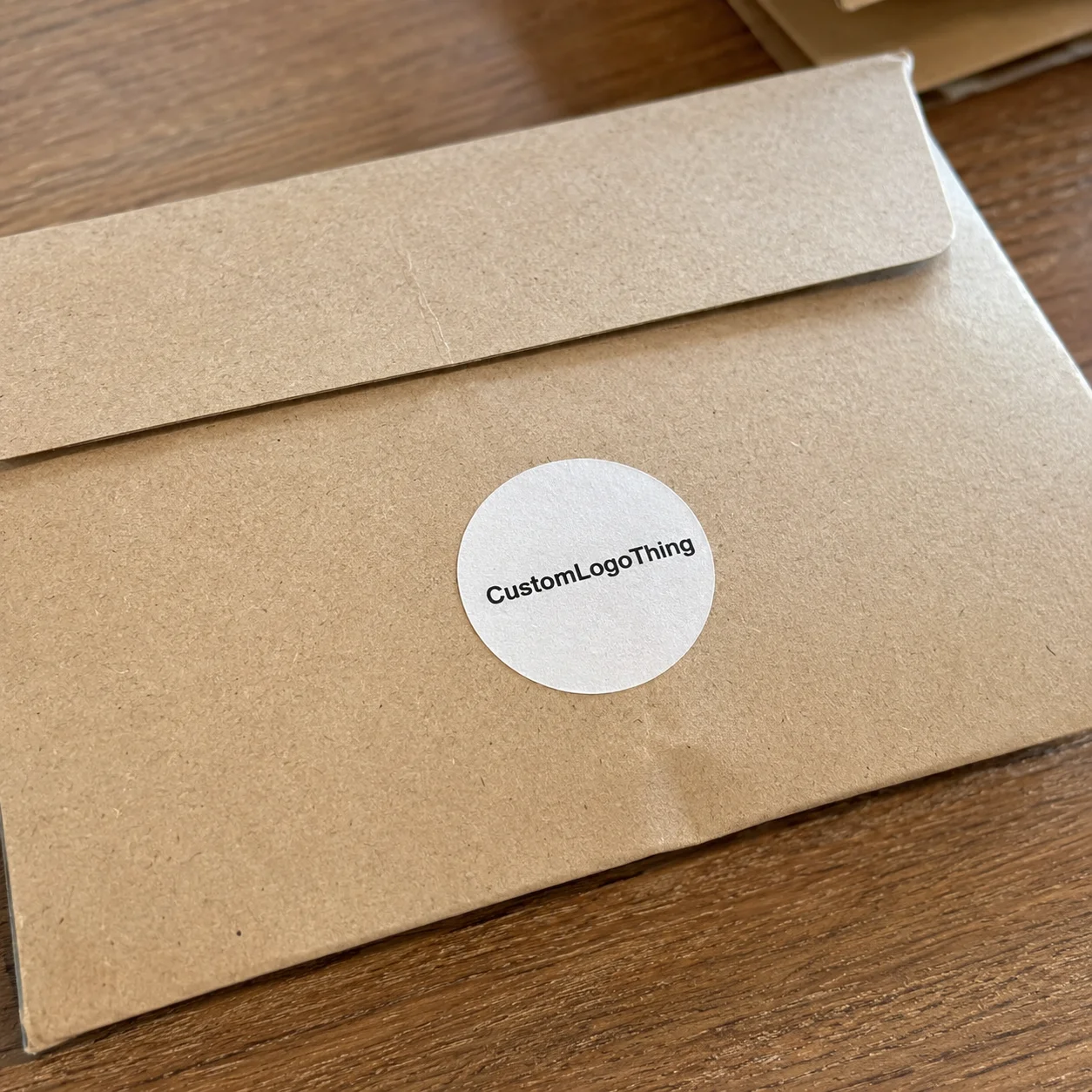
Custom Sized Stickers are one of those packaging details that look simple right up until the dimensions are wrong. A label can be printed cleanly, cut accurately, and still miss the mark if it is a few millimeters too tall, too wide, or too cramped for the surface it has to live on. On a bottle, jar, carton, mailer, or pouch, the fit changes the whole read of the package.
That is why size should be treated as a production decision, not just a design preference. It affects visibility on shelf, how fast the label can be applied, how much artwork survives at final scale, and how much material is consumed per run. For brands evaluating Custom Labels & Tags or planning a broader Custom Packaging Products program, the best result usually comes from matching the sticker to the real package instead of forcing the package to accept a stock dimension.
There is also a commercial side to this. A label that fits well tends to look more intentional, and intentional packaging generally reads as more credible. That does not mean bigger is better or that every SKU needs a unique format. It means the proportions need to support the product, the artwork, and the application method, all at once.
Why size matters more than most buyers expect
A sticker can do its job only if the eye can take it in quickly. If the label is too large, it can crowd a container and make the package feel overdesigned. If it is too small, the logo shrinks, type becomes harder to read, and the label can look like an afterthought instead of part of the brand system.
For packaging buyers, custom sized stickers are useful because they let the artwork follow the container, not the other way around. A rectangle that looks fine on a flat box may sit awkwardly on a curved bottle. The same art adjusted for the right width and height can suddenly feel balanced, even if the design itself did not change much.
Size also affects how the label behaves in real handling. Larger pieces need more care during application and can be more sensitive to surface imperfections. Smaller pieces are easier to place, but only if the artwork still has enough breathing room to remain legible. That is especially true when the label carries legal copy, QR codes, barcodes, or small product details that cannot be compressed without consequence.
A good sticker size is not the one that fills the most space. It is the one that fits the package cleanly, prints clearly, and applies without fighting the surface.
When brands build multiple SKUs, size consistency becomes part of the visual system. One label might work beautifully on a 4 oz jar and still need an adjustment for an 8 oz version. That is normal. The goal is not one universal sticker; it is a family of dimensions that respects the product line while keeping the brand recognizable.
How custom sizing moves from dieline to print
The process starts with the dieline, which is the exact cut path that defines the sticker’s final shape. That can be a simple square, rectangle, circle, or something more specific to the package. The dieline matters because it controls both appearance and production accuracy. A label that is even slightly off in cut position can change how the design sits on the surface.
Once the size is set, the artwork needs to be built around the realities of printing and trimming. Three parts of the setup matter most: bleed, safe area, and corner treatment. Bleed extends the background past the cut line so there is no white edge if the trim shifts. Safe area keeps text and critical graphics away from the border. Corner radius helps reduce stress on small labels, where sharp corners can be more likely to lift or catch during handling.
Custom sizing is usually handled in one of three formats:
- Sheeted stickers for hand application, short runs, and mixed layouts.
- Roll labels for faster application, especially in higher-volume production.
- Kiss-cut stickers where the top layer is cut but the backing remains intact for easy peeling.
Digital printing is what makes truly custom dimensions practical at modest order sizes. It allows a label to be built around the actual need rather than a fixed inventory size. That flexibility is especially helpful when the package dimensions fall between common templates. A 2.125 x 3.75 inch rectangle, for example, may be a better fit than a standard 2 x 4 inch format because the artwork and package proportions both benefit from the extra width.
The size also affects what material makes sense. A refrigerated bottle, a dry retail carton, and a bathroom product all ask for different performance characteristics. Paper may be enough for a short-term indoor use. Film may be the better choice when moisture, abrasion, or handling are part of the environment. The sticker size and the substrate should be chosen together, not one after the other.
The factors that shape fit, finish, and performance
Surface shape is the first constraint to check. Flat surfaces are forgiving. Curved bottles, tapered jars, textured cartons, and flexible pouches are not. A label that looks perfect on a flat mockup may start to lift, wrinkle, or distort once it wraps around a curved edge. The more pronounced the shape change, the more important it becomes to test the actual package rather than rely on a screen rendering.
Artwork complexity is another limit. Fine type, borders, barcode quiet zones, QR codes, and small icons all need room. When the size shrinks too far, the design starts to compress. Thin lines can break up. Type can crowd. Borders can lose crispness. If the label has to carry both branding and functional information, the layout has to be honest about how much space the message really needs.
Material selection changes the equation too. Common options include:
| Material | Typical use | Strengths | Watchouts |
|---|---|---|---|
| Paper | Dry indoor packaging, short-run promos, lightweight retail labels | Good print feel, often lower cost, easy to use for many applications | Less resistant to water, abrasion, and extended handling |
| BOPP | Food, beverage, bath, and general retail packaging | Moisture resistant, durable, clean surface for printing | Usually costs more than paper and may be unnecessary for simple indoor use |
| Vinyl | Outdoor use or high-handling applications | Flexible, tough, and useful when conformability matters | Can be over-specified for straightforward packaging jobs |
| Clear film | Minimalist branding, clear containers, premium presentation | Can create a near-invisible edge and a clean modern look | Artwork needs strong contrast or it may disappear on the container |
Finish matters almost as much as the substrate. Gloss usually makes color feel brighter and works well under retail lighting. Matte softens the look and can feel more restrained. Lamination or a protective coating may add resistance to scratches and moisture, but it also affects price and, in some cases, how the label lies on the package. For products that are chilled, handled often, or shipped through rougher conditions, those details are not decorative. They are practical.
Use conditions should shape the final size and material choice. Refrigeration, condensation, UV exposure, frequent touching, and textured substrates all create different stresses. A sticker that fits perfectly in a proof may need a stronger adhesive or a slightly different proportion to hold up in the real world. The same goes for multi-SKU programs, where a single artwork family may need one size for a jar, another for a bottle, and a third for a carton.
Production efficiency is part of the story too. Very small or unusually shaped labels can reduce how many pieces fit on a sheet or roll, which affects waste and setup efficiency. That does not mean unusual sizes should be avoided. It just means they should be chosen with the production layout in mind.
How pricing is actually built
Pricing for custom sized stickers usually comes down to dimensions, quantity, material, finish, print coverage, and cut complexity. A simple 2 x 2 inch paper label with light coverage may be priced very differently from a 4 x 6 inch laminated BOPP label with a contour cut. The larger or more complex option is not always proportionally more expensive, because press layout, nesting efficiency, and material waste all affect the final number.
That is why the cheapest unit price is not always the best value. A slightly larger label may fit better on a sheet, waste less material, and reduce the risk of artwork feeling cramped. A strange contour might look appealing but cost more because it needs tighter trimming and more careful layout. Once the order moves beyond a standard shape, the geometry itself becomes part of the cost structure.
Typical digital pricing can land around $0.10 to $0.30 per piece at moderate quantities, but that range moves quickly depending on the job. Smaller runs usually carry a higher unit cost because setup effort does not shrink much. Multiple SKUs, custom cutting, special coatings, and more demanding proof requirements can all push pricing upward.
Buyers usually get the clearest comparison by asking for a few alternate sizes and reviewing them side by side. A 2.5 x 3 inch version may be cheaper than a 3 x 4 inch version, but if the smaller one forces the logo to shrink and the support copy to crowd the border, the savings may not be worth it. In practice, the right size often becomes the one that preserves clarity and reduces the need for rework later.
The main pricing drivers are easy to isolate:
- Dimensions, including whether the shape is simple or contour cut
- Quantity, since setup cost spreads more efficiently at higher volume
- Material, especially paper versus film
- Finish, such as gloss, matte, lamination, or specialty coating
- Artwork setup, proofing, and cut-line preparation
For recurring packaging programs, price should be reviewed across the whole run, not just per label. A size that applies cleanly and reduces waste can save time in packing and lower the likelihood of a reprint. That is a real cost advantage, even when the unit price looks similar on paper.
Production flow and turnaround: realistic timelines
The usual sequence is quote, artwork review, proof approval, printing, cutting, finishing, inspection, and packing. The actual print run is often the fastest part. Delays usually happen when files are incomplete, dimensions are unclear, the bleed is missing, or the cut path does not match the requested size.
For simple digital orders, production commonly moves in roughly 5 to 10 business days after proof approval. Larger quantities, special finishes, multiple SKUs, or unusual material requirements can extend that window. If a specific film width or coating has to be sourced, lead time can shift again. The more custom the build, the more useful it is to confirm the details before artwork starts moving through production.
A few habits keep the schedule moving:
- Send vector artwork when possible.
- Confirm the final dimensions before design revisions begin.
- Mark any special cut instructions clearly.
- Review proof notes quickly.
- Explain how the label will be applied in production.
That last point matters more than many buyers realize. A hand-applied label on a small packaging line has different requirements than a label applied by machine. A refrigerated jar, a textured mailer, and a high-touch retail carton all put different demands on the adhesive and material. When that context is known up front, the size recommendation is usually better from the beginning.
Packaging standards can also help teams think beyond the sticker itself. Organizations such as ISTA are useful when packaging has to survive shipping and handling, and the broader Packaging School and Packaging Association resources can be helpful when the label needs to sit within a larger packaging system.
Common sizing errors and how to avoid them
The most common mistake is guessing from a mockup. Screen images are useful, but they rarely show the true scale relationship between the label and the container. A label that looks right on a monitor can feel much smaller or larger in the hand. Measuring the actual surface is always better, especially when the package curves or tapers.
Another problem is trying to force too much content into too little space. Fine lines, tiny type, and dense layouts often look acceptable in design software and then fall apart at final size. If the sticker needs to carry brand identity, ingredients, instructions, and a QR code, it may simply need more room. A well-sized label makes hierarchy easier to read.
Curved and textured packaging create their own issues. A design may look balanced in a flat proof but wrinkle at the edge once applied. Sometimes the fix is a different material. Sometimes it is a wider or narrower proportion. Sometimes it is a small corner adjustment that relieves tension and helps the label sit flat.
Missing bleed is another avoidable error. If the artwork stops too close to the trim line, even a tiny cut variation can reveal a white edge or clip a border. That risk is especially visible on custom sized stickers with strong outlines, dark backgrounds, or heavy frames. Safe margins are not optional if the goal is a clean finish.
There is also the mistake of designing one label for a product family without checking how it will scale. A size that works on a small jar may not transfer well to a taller bottle or wider carton. Planning a size family early is usually easier than trying to force one dimension to do every job later.
Practical guidance for choosing dimensions
Start with the actual package, not the rendering. Measure the usable flat area and note any taper, curve, or texture that could change how the sticker sits. If there are multiple SKUs, measure the most constrained version first so the size choice does not get optimistic.
Paper mockups are still one of the most effective tools in the room. Print a rough full-size version, trim it, and tape it onto the container. That quick check shows whether the label is too tall, whether the logo feels crowded, and whether the margins are doing what they should. It is a simple test, but it catches a surprising number of sizing errors before they turn into a reprint.
Build the dimensions around the most important element first. If the logo is the priority, protect it with enough whitespace to breathe. If the sticker carries functional information, let legibility drive the layout. Either way, the size should support the message instead of boxing it in.
For product lines with several packages, a size family often works better than a single universal format. One dimension may fit the standard SKU, another the larger container, and another the seasonal or limited-edition version. That approach keeps the brand coherent without forcing unnecessary compromises across the range.
When requesting proofs, ask for the dimensions to be marked clearly. Seeing the exact size on the proof makes it easier to judge balance, border weight, and type scale. A 3.25 x 2 inch sticker can look very different from a 3 x 2 inch version once the edges and margins are shown accurately.
If sustainability is part of the packaging brief, paper-based options can be evaluated alongside structural goals and sourcing standards. In those cases, FSC-certified paper may be worth considering, and the FSC reference is a practical place to verify paper credentials before materials are finalized.
Ordering with confidence
The most reliable ordering process is straightforward: measure the surface, choose the format, review the proof carefully, and approve only after the sticker has been checked against the actual package. That may sound basic, but it is where many sizing problems are solved before they become production waste.
Before requesting a quote for custom sized stickers, gather the dimensions, quantity, material preference, finish, file type, and target timeline. If the label will be exposed to refrigeration, moisture, outdoor light, frequent handling, or a textured substrate, mention that early. Those details often change the recommendation on material and adhesive, and they influence whether the final size should be adjusted slightly for better fit.
Comparing options is most useful when you look at readability, durability, and total cost together. A cheaper sticker that peels, scuffs, or compresses the artwork is not a better buy. A slightly larger label that improves balance, keeps text readable, and reduces the chance of rework often wins in practice, especially when packaging has to perform on a shelf and in the customer’s hand.
Good sizing is quiet when it works. The label sits where it should, the print looks deliberate, and the package feels finished without drawing attention to the mechanics behind it. That is the real value of custom sized stickers: they let the artwork, the substrate, and the package geometry support one another instead of competing for space.
FAQ
How do I choose the right size for custom sized stickers?
Measure the actual application area on the final package, not just a mockup. Leave enough room for bleed, safe margins, and legibility, then test a paper sample or proof on the real surface before placing a full order.
Do custom sized stickers cost more than standard sizes?
They can, especially if the size creates waste, requires a custom cut path, or adds finishing complexity. Quantity, material, and finish usually matter as much as the dimensions, so a slightly larger custom label is not always much more expensive than a standard one.
What file do I need to order custom sized stickers?
A vector file is ideal because it keeps edges crisp and type clean at final size. Include the exact dimensions, bleed area, and any special cut instructions. If the artwork has small text or a QR code, ask for a proof so legibility can be checked carefully.
How long does production usually take?
Simple digital sticker jobs often take about 5 to 10 business days after proof approval. Orders with special finishes, multiple SKUs, or unusual materials can take longer, so it helps to confirm all details early.
Can custom sized stickers be used on curved or textured packaging?
Yes, but material and adhesive selection matter more on curved or textured surfaces. Flexible films usually conform better than rigid stock, and the final size may need a small adjustment so the sticker lies flat and resists lifting at the edges.


