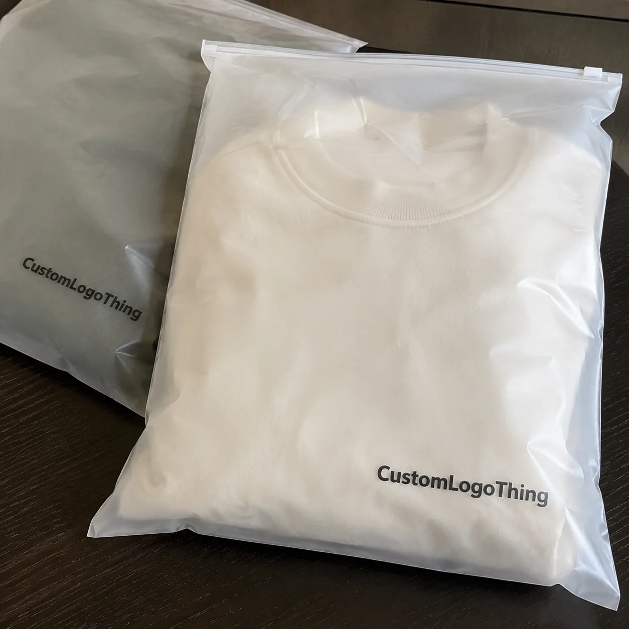
Put the same artwork on a white label and on custom transparent stickers, and the package can feel like two different products. A design that looks bold on paper sometimes looks crowded on a white box or jar, while a clear label lets the container, coating, or fill color do part of the visual work. That shift explains why transparent stock shows up so often on bottles, jars, mailers, window decals, product seals, and retail packaging that aims for a cleaner finish.
Transparent stickers are usually printed on clear film, most often BOPP or vinyl, with adhesive on the back and a release liner behind that. The appeal is easy to understand: branding stays present without a heavy block of white material interrupting the surface. On glass, PET bottles, cosmetic containers, and minimalist product packaging, that “no-label” look can read as sharper and more premium than a full paper label.
Clear does not mean invisible. Ink density, white ink underprinting, finish, and the color of the package underneath all change the result. A pale beige logo may disappear on kraft paperboard. Tiny black copy may read well on frosted plastic but feel too harsh on a crystal-clear bottle. The strongest results usually come from treating the container as part of the artwork, not just the surface beneath it.
There is also a real difference between truly clear film, frosted film, and white-backed constructions. Clear film is see-through. Frosted material diffuses light and gives a soft translucent effect. White-backed labels block the package color entirely. Buyers sometimes ask for clear labels but actually need selective opacity for text, ingredients, or barcodes. That is a print-structure question, not just a material choice.
Why custom transparent stickers can change how your packaging looks
The biggest visual advantage is restraint. Rather than covering the pack with a full label panel, transparent stock lets the bottle, jar, pouch, or carton remain visible. That can make a filled beverage look fresher, a skincare bottle look more refined, or a mailer seal feel less intrusive. For package branding, especially on premium or minimalist lines, that lighter touch often reads as more intentional.
This matters most on products where the substrate already carries visual value. Amber glass, soft-touch coated cartons, metallic tins, and colored PET all bring something to the table. A solid white label can fight those surfaces. A clear construction can support them. That is one reason custom transparent stickers appear so often in cosmetic, beverage, candle, and boutique food packaging programs.
There is a practical side too. On smaller packs, a full label can make layout crowded fast. Using transparency creates breathing room, which improves perceived quality even before anyone reads the copy. Good packaging design is not only about adding graphics. Sometimes it is about knowing what to leave open.
Clear labels also help when the package itself is part of the brand story. A filled sauce bottle, a tinted serum container, or a matte black jar can carry a lot of visual weight already. Transparent stock lets the container stay visible while still giving room for required copy, a logo, or a seal. That balance is often what buyers are after, even if they ask for “clear labels” in very general terms.
How printing and finishing work
At a basic level, transparent label construction has four layers: the clear face stock, printed inks, adhesive, and the release liner. The face stock is often clear BOPP for mainstream consumer labeling because it balances cost, clarity, and moisture resistance. Clear vinyl is more common for decals, outdoor use, and applications that need extra flexibility or weathering performance. Polyester films also appear in industrial settings where heat, chemical exposure, or dimensional stability matter.
Print structure matters more on clear stock than many buyers expect. Colors can be printed directly onto the film for a transparent effect, or backed with white ink to restore opacity and improve color accuracy. White ink acts like a foundation. Put cyan, magenta, and yellow on clear film without white beneath, and the package color will influence the final shade. Add a white underprint, and those same inks look denser and closer to what you saw on screen or on a paper proof.
Digital printing is common for short to medium runs, versioned artwork, and faster setup. It usually makes sense for hundreds to a few thousand pieces, depending on size and coverage. Flexographic printing tends to make more economic sense on larger volumes because setup is higher but unit cost drops as quantity rises. For buyers ordering tens of thousands of clear labels, flexo often gives stronger value, especially if the design is stable and repeatable.
Finishing affects both appearance and workflow. Die-cut singles work for hand application, kiss-cut sheets help with smaller label sets, and roll format is preferred for machine application. If you are labeling at speed, roll direction and core size should be specified early. A 3-inch core with outside unwind may be standard for one applicator and wrong for another.
Lamination or overprint varnish adds protection against scuffs, abrasion, moisture, and oils from handling. Gloss lamination boosts shine and color pop. Matte cuts glare and can feel more upscale on beauty, wellness, and higher-end retail packaging. Ultra-clear coatings aim to preserve the barely there look.
For technical guidance on materials and converting standards, the Institute of Packaging Professionals is a useful industry reference.
Key factors that affect durability, clarity, and adhesion
Surface type changes everything. Glass is usually the easiest substrate because it is smooth, stable, and high energy, which helps adhesive wet-out. Many plastics are also friendly, but not all. HDPE, for example, can be trickier than PET because of lower surface energy. Coated paperboard may work well if it stays dry, while textured coatings and heavily varnished cartons can reduce bond strength. Painted metal brings its own variables depending on the paint chemistry and cure.
Curved containers create another challenge. A flat label on a tight-radius bottle shoulder may wrinkle unless the film is conformable enough and the shape is designed for that surface. That is why narrow wraps, tapered containers, and squeezable bottles often need more testing than a straight-wall glass jar.
Adhesive selection deserves more attention than it usually gets. Permanent acrylic adhesives are common for most product packaging. Removable adhesives suit short-term promotions, window decals, and labels meant to peel away without residue. Freezer-grade and moisture-resistant systems are made for refrigerated drinks, frozen goods, and cold-chain handling. If labels will face condensation, hand washing, or ice-bucket conditions, mention that upfront. Otherwise, a quote may be built on a standard adhesive that looks fine in the sample room and fails in actual use.
Readability is another make-or-break issue. Transparent backgrounds reduce contrast by definition. Fine type under 5 pt, thin sans-serif weights, and soft pastel inks can disappear on darker fills or patterned contents. The fix is usually straightforward: increase type size, strengthen line weight, simplify the background interaction, or use selective white underprint behind logos, ingredients, and legal copy.
Environmental exposure also matters. For indoor shelf use, clear BOPP with laminate is often enough. Outdoor use, UV exposure, and repeated moisture contact may call for vinyl or a tougher film plus UV-stable inks. Wash resistance varies widely. A hand soap bottle in a bathroom has very different demands from a pantry spice jar. That is where many buying mistakes begin: the design decision gets made first, and the use condition gets mentioned later.
Finish choice changes the look more than people think:
- Gloss: brighter color, stronger shine, more reflective under retail lighting
- Matte: reduced glare, softer appearance, often easier to read in bright environments
- Ultra-clear: minimal visual interruption, ideal for the cleanest no-label effect
Pricing, MOQ, and quote basics
Pricing on custom transparent stickers is driven by a short list of variables: size, shape, material, print coverage, white ink usage, finish, quantity, and format. Clear film itself is usually a bit more expensive than standard paper label stock, and adding white ink almost always increases cost because it adds coverage, press time, and registration control.
As a realistic range, a small 2-inch by 3-inch clear BOPP label in a 5,000-piece run might land around $0.06 to $0.14 per piece, depending on decoration and finish. A larger die-cut clear sticker with heavy white coverage and matte laminate can move into the $0.18 to $0.35 range at similar quantities. At 25,000 to 50,000 pieces, unit pricing often drops significantly, especially on flexo-produced work. Total spend still rises, of course, but the per-piece number becomes much more attractive.
MOQ often follows print method and converting setup. Digital jobs may start around 250 to 500 pieces for simple sheeted labels. Flexographic runs frequently begin much higher because plates, setup, and press waste need to be justified. Some clear materials also have supplier minimums by roll width or master roll conversion, which can affect jobs with unusual dimensions.
Here is a simple comparison buyers can use as a starting point:
| Option | Typical Quantity | Common Use | Approx. Unit Cost | Notes |
|---|---|---|---|---|
| Clear BOPP, digital, sheeted | 500-2,500 | Short runs, product testing, hand application | $0.12-$0.32 | Lower setup, good for frequent design changes |
| Clear BOPP, digital, roll | 1,000-10,000 | Small production runs | $0.08-$0.18 | May include extra cost for roll direction and finishing |
| Clear BOPP, flexo, roll | 10,000-50,000+ | Established SKUs, machine application | $0.04-$0.11 | Better unit economics at volume, higher setup cost |
| Clear vinyl, laminated | 500-5,000 | Decals, outdoor use, higher abuse environments | $0.18-$0.45 | More durable, usually more expensive than BOPP |
Die fees, proofing, and artwork cleanup can also affect the quote. If your file lacks a cut path, white ink mask, or usable vector logo, prepress time may be added. The fastest way to get an accurate number is to send dimensions, quantity, surface type, use environment, and finish preference in the first request.
If you are comparing labels with broader packaging needs, it helps to review related formats through Custom Packaging Products so the label system matches the rest of your pack presentation.
Process and timeline: from artwork to delivery
Most transparent label jobs move through the same production sequence:
- Artwork prep and file review
- Material and adhesive selection
- Proof creation
- Proof approval or revision
- Printing
- Curing or drying
- Die-cutting or sheeting
- Inspection and count verification
- Packing and shipping
For a standard production run, proofs are often ready in 1 to 3 business days. Manufacturing after approval commonly takes 7 to 12 business days for straightforward digital work and 10 to 15 business days for more complex or volume flexo jobs. Freight adds another 2 to 5 business days domestically, depending on location and service level. Rush service can compress that, but usually at a premium and not always for every construction.
What causes delays most often? Weak files. Low-resolution raster logos, missing dielines, no bleed, and unclear white ink instructions create preventable back-and-forth. Transparent jobs also need tighter visual discipline because registration errors show more easily on clear edges. A slight shift between white underprint and top color that might pass unnoticed on paper can look obvious on a clear bottle.
White ink callouts should be explicit. If only the logo and legal text need opacity, mark that on a separate layer. If the whole design needs a flood white beneath it, state that too. Ambiguity in prepress turns into delays in proofing, and delays in proofing usually push the ship date.
Another factor is application method. Machine-applied roll labels require details like unwind direction, maximum outer diameter, and core size. If those specs arrive late, labels may need to be rerun or repacked. Hand-applied sheet labels are more forgiving, but even then, buyers should confirm stack count, sheet size, and orientation if a fulfillment team is involved.
Plan around your launch date, trade show, or replenishment window with margin built in. That is especially true if the design uses fine registration, multiple spot areas of white, or unusual clear effects. For shipping validation on finished packaged products, resources from ISTA can be helpful if the label must hold up through distribution testing.
Practical advice: If your transparent label is part of a product launch, do not approve only from a screen proof. Ask how the art will look on the actual package color and request a physical sample if the budget allows.
Common mistakes that make clear stickers look cheap
The first mistake is weak contrast. Light gray ingredients on a clear bottle filled with amber liquid may be technically printed, but they will not be easy to read. The second is treating clear film like white paper. Artwork built for paper often relies on the paper itself to provide brightness, edge definition, and separation. Remove that white base, and the whole composition can flatten out.
Thin fonts are another common problem. Elegant hairline type may look refined on screen and nearly vanish after printing and application. For most consumer packs, a slightly heavier weight and 6 pt type usually performs better than an ultra-thin 4 pt style struggling against glare and product color.
Edge discipline matters too. Poor bleed, artwork too close to the trim, or awkward clear margins can make even expensive labels feel cheap. On transparent stock, every cut edge is easier to notice, so clean die-lines and balanced spacing matter more than many teams expect. If the label shape is custom, test it on the actual container before approving volume.
Gradients and tiny decorative details can also backfire. The package surface already brings visual noise, whether that is liquid color, carton texture, or reflections from retail lighting. Adding delicate fades or intricate patterns on top of that often reduces clarity instead of increasing sophistication.
Then there is adhesive mismatch. A standard permanent adhesive may look fine on a room-temperature mockup but fail on a chilled beverage bottle, a lotion bottle in a damp bathroom, or a frequently handled retail packaging sample. Material and adhesive choices need to match the real environment, not just the design intent.
Expert tips for cleaner application and a better final result
Start with one sample on the real package. Not a similar bottle. Not a digital mockup. The real surface. This single step catches more issues than any amount of internal discussion because it reveals glare, contrast, edge visibility, and bond performance immediately.
Design with negative space on purpose. The strongest transparent label designs usually do not try to fill every inch. They leave room for the substrate to participate. That can be especially effective with custom printed boxes, clear jars, or colored containers where the base material already communicates quality.
Use white ink strategically, not automatically. Flooding white beneath the full design gives stronger color, but it also reduces the transparent effect. Selective white under logos, small type, and barcodes often creates a better balance between readability and a clean, minimal look. For many product packaging programs, that hybrid structure is the sweet spot.
Choose finish based on how the package will be seen. Gloss performs well where you want visual energy and shine, such as beverages or promotional decals. Matte helps under strong retail lighting or photography because it controls glare. Ultra-clear constructions are great for a refined no-label appearance, but they require disciplined artwork because there is nowhere for weak contrast to hide.
Application conditions matter. Surfaces should be clean, dry, and free of dust, silicone, oil, or release residue. Apply at the recommended temperature range, often around 50°F to 100°F depending on the adhesive. If labels are stored before use, keep them in a stable indoor environment, ideally around 68°F to 77°F and moderate humidity. Heat, cold, and moisture can affect release, curl, and final bond.
For sustainability-minded buyers, ask about FSC-certified paper components in the wider packaging system where relevant, even though the label face stock itself may be film-based. That broader view of retail packaging and shipping materials often matters more than focusing on one label component alone. The Forest Stewardship Council is a good reference for certified fiber standards.
What to do next before placing an order
Before requesting pricing, build a short spec sheet. Include label size, shape, quantity, package surface, indoor or outdoor use, temperature exposure, and whether the label will face water, oils, or abrasion. Add your preferred finish and note if you need roll or sheet format. A one-page summary saves time and improves quote accuracy.
Next, review the artwork carefully. Check safe margins, bleed, type size, and contrast. Mark transparent areas clearly. If white ink is required, indicate where it goes and whether it is selective or full flood. Compare the proof against the actual package color, not only a monitor. Screens are useful, but they do not show how a clear construction will interact with a tinted bottle or a coated carton.
Then decide on adhesive based on the product lifecycle. Permanent for long-term use. Removable if the sticker needs to peel away cleanly. Specialty adhesive if cold storage, condensation, or repeated handling are part of the job. If the item ships in e-commerce channels, think about scuff resistance as well, especially for heavy-contact package branding areas.
Finally, plan the reorder before you need it. If your average consumption is 8,000 labels a month and standard lead time is 10 to 15 business days plus transit, do not wait until 2,000 pieces remain. Build a reorder point with cushion for proof revisions, freight delays, or seasonal demand spikes.
Done right, custom transparent stickers can make packaging feel cleaner, more modern, and more expensive without changing the container itself. The smartest buy usually comes down to a few simple things: Choose the Right film, specify the right adhesive, use white ink where readability demands it, and test on the actual package before you commit to volume.
FAQ
Do custom transparent stickers work on dark packaging?
Yes, but they usually need white ink or stronger contrast to stay readable. Dark or patterned surfaces can make thin text, pale colors, and fine details much harder to see, so selective white underprint is often the safest fix.
Are transparent stickers waterproof?
They can be water-resistant or waterproof depending on the film, adhesive, and finish. Clear BOPP with laminate handles many consumer applications well, but refrigeration, condensation, or repeated handling may require a tougher construction and a more aggressive adhesive.
What’s the difference between clear and frosted stickers?
Clear stickers are see-through and create the strongest no-label effect. Frosted stickers have a soft translucent appearance that diffuses light and can improve contrast for some designs, especially where a fully transparent background feels too stark.
Why do custom transparent stickers sometimes look lighter than expected?
Because ink is printed on a clear surface, the package color shows through and affects the final appearance. If the artwork depends on white paper for brightness, colors can look less saturated unless a white underprint is added beneath them.
How do I get an accurate quote for transparent label stickers?
Send exact dimensions, quantity, artwork, surface type, application format, and your preferred finish. Include whether you need gloss, matte, or white ink, and describe the use environment so the quote reflects real production needs rather than a rough estimate.

