Custom Logo Things
Embossed Kraft Bags for Retail: Buyer's Guide to Specs
Learn how embossed kraft bags for retail are made, what drives cost, lead time, and MOQ, and how to spec a bag that feels premium on shelf without overspending.
Plain kraft has a useful but limited look. It says paper, practicality, and a little honesty, but it can fade fast next to louder packaging. Embossing changes that. The surface catches light, the logo gains depth, and embossed kraft bags for retail start doing some of the brand work before a customer even reads the name. That tactile hit matters in boutiques, gift shops, cosmetics, specialty food, and anywhere the bag is part of the experience instead of just a carryout container.
From a buyer's seat, embossing lands in a good middle ground. It feels more deliberate than a standard printed sack, but it does not push the bag into glossy or overdesigned territory. The effect is subtle, and that is the point. The real question is not whether embossing looks good. It is whether the paper, die, structure, and artwork are set up well enough for the texture to stay clean in production and hold up in use.
What embossed kraft bags for retail signal on shelf
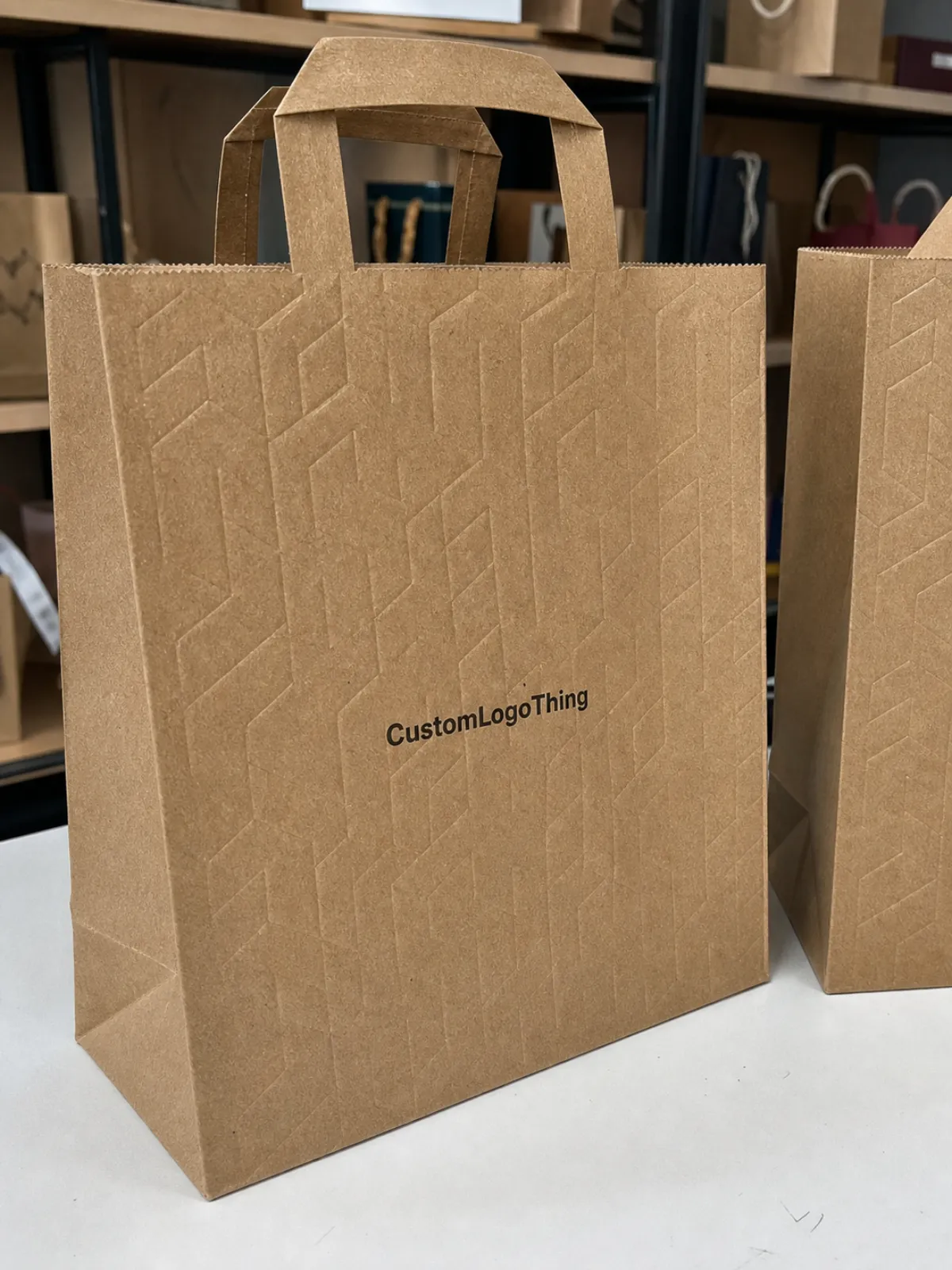
A plain kraft bag can disappear into the background. Embossing changes the first impression. A raised logo throws a small shadow, and a shopper's hand notices texture faster than copy or color. That is one reason embossed kraft bags for retail often read as more premium even though the base material is still humble, natural-looking paper.
The signal is quiet but useful. The bag says the brand cared enough to finish the details, and that matters because many retail bags keep working after the sale. They are carried down the street, set in a car, hung over a wrist, or seen again later at home. In that sense, the bag becomes a moving touchpoint. Texture helps it stick in memory without trying too hard.
These bags fit retailers that want an upscale feel without moving into lamination, foil-heavy decoration, or a high-shine finish that fights the brand story. Small apparel stores, candle brands, specialty chocolate shops, museum stores, and gift retailers often use this route because it keeps the presentation clean. Embossed kraft bags for retail work best when the brand language is edited, thoughtful, and material-driven.
“A shopper will forgive a simple logo. They rarely forgive a bag that feels flimsy or looks generic.”
For buyers trying to ground sustainability claims, FSC certification is still the clearest shared reference point for paper sourcing and chain-of-custody language. It does not answer every packaging question, but it gives teams a practical way to talk about fiber origin and documentation without guessing at terms. The more precise the claim, the easier it is to line up marketing, compliance, and purchasing.
The bag is not just a carrier. It shapes perceived value, supports brand fit, and affects how the customer remembers the transaction. That is a lot to ask from one sheet of paper, which is why the details matter.
How the embossing process transforms plain kraft paper
Embossing works by pressing a die and counter-die into the paper fibers. The design is compressed into relief, so the logo rises above the surface instead of relying only on ink. On kraft, that compression can look sharp and refined, or soft and muddy, depending on the paper and the artwork.
The technical part matters more than many buyers expect. Paper weight, fiber quality, caliper, and where the embossed area sits on the panel all affect the result. A simple mark usually holds better than a dense emblem with fine strokes. If the design sits too near a fold, seam, or handle anchor, the pressure can distort the image and flatten the edges.
There are two common looks. Blind embossing uses texture alone, which is clean and restrained when the brand already has a strong shape or monogram. Embossing plus print adds ink for contrast, which helps when the logo needs to be read quickly from a few feet away. Buyers often overcomplicate the choice. In practice, the simpler version is often the sharper one because the eye reads relief faster than crowded detail.
One limitation shows up fast: ultra-fine type, hairline rules, and highly detailed icons do not always translate well. Coated surfaces can soften the impression, and weak stock can flatten during converting or shipping. That is why physical samples matter. A digital proof can confirm layout, but it cannot show how the paper responds to pressure, humidity, or stack weight.
On a production line, the press operator is looking for more than visual alignment. The die has to land cleanly, the impression depth has to stay even, and the bag panel has to remain square after the pressure cycle. If the paper is too soft, the logo may spread slightly. If the stock is too stiff, the raised area can look shallow or uneven. Those are the small failures that separate an average bag from one that feels deliberate.
The specs that control strength, clarity, and feel
Before artwork gets too far along, the structure needs to be locked. Width, gusset, height, paper weight, handle style, and bottom reinforcement all shape the final result. Change one variable and the hand feel can shift quickly, even if the logo stays the same.
A typical retail paper bag may use 120-200 gsm kraft, but the right weight depends on the carry load and the brand position. Lightweight apparel bags can sit near the lower end if the handles and folds are built well. Heavier gift items, bottles, or boxed sets need more paper and usually a stronger bottom patch. For embossed kraft bags for retail, structure is part of the appearance, not a hidden technical line item.
Logo size matters more with embossing than with standard print. Small text can fill in. Thin strokes can vanish. A useful rule is to leave enough open space around the mark so the die can push the paper cleanly without crowding the edges. If the design is too intricate, simplify it before the tooling stage. That usually saves time and produces a cleaner bag.
Paper tone changes the effect too. Natural brown kraft gives a warmer, earthier result with less contrast, while bleached kraft creates a sharper impression and can make fine edges easier to read. Neither is universally better. The right choice depends on whether the brand wants rustic, gallery-like, clean, or luxury-minimal. The best spec is the one that matches the product category, the store environment, and the way the bag will actually be used.
Handle and bottom construction are easy to overlook because they are not the visual hero, but they affect customer satisfaction every day. A twisted paper handle feels casual and economical. Rope handles feel more substantial and are easier on the hand for heavier purchases. Ribbon handles look elegant but are less forgiving under load. Die-cut handles reduce material but can read more like a takeaway bag unless the whole spec is tuned carefully.
Bottom build matters for stability. A flat folded bottom is economical and common. Reinforced bottoms help with bottles, boxed sets, and anything with edge weight. Glue quality and seam alignment are worth checking on samples because a bag can look good and still fail where the customer cannot see it.
- Carry weight: start with the heaviest item the bag must hold, then build in a margin.
- Panel size: leave enough flat space for a clean emboss and a readable logo.
- Handle style: rope, ribbon, twisted paper, and die-cut handles change cost and feel in different ways.
- Bottom build: folded, glued, or reinforced bottoms affect both strength and stability.
- Paper finish: natural, bleached, or lightly coated stock changes texture and emboss clarity.
Buyers who lock structure first usually move faster later. Artwork is easier to adjust than a bag spec that already misses the use case.
Cost, pricing, and MOQ: what changes the quote
Embossing adds tooling, setup time, and a little more scrutiny in production, so the quote is rarely just paper weight plus ink. The biggest cost driver is usually the die. A simple logo die is manageable. A multi-level, large-format, or highly detailed die takes more work to make and to run. Once tooling is made, unit cost still depends on size, paper, handle choice, and whether the bag needs extra print steps.
MOQ tends to move with those same choices. Custom dies, specialty paper, and unusual handles can push the minimum higher because the factory has to justify setup time. Standard sizes and familiar constructions are easier to schedule. If the order is small, keeping the spec disciplined matters more than chasing extras. It is better to have one strong emboss on a sensible bag than three finishes that never quite come together.
There is also a hidden cost in revision. Every time the artwork changes after die creation, someone has to check whether the die can still be used. Every time the structure changes after sampling, the factory may need to restart testing. That is why clean instructions save money. Give the vendor the bag size, paper weight, handle type, logo size, print method if any, and target use case upfront.
Shipping affects the real number too. Bags are light, but they take up volume. Flat-packed bags can be economical until carton counts climb. If the bags need long-distance freight, packaging efficiency starts to matter almost as much as the bag itself. Retail buyers who compare quotes only on unit price often miss that part.
The easiest way to think about pricing is this: every extra decision adds risk, and risk has a cost. Keep the spec tight where the customer will not notice a difference, and spend where the tactile and visual payoff is obvious.
Production timeline and turnaround: from proof to delivery
Lead time usually starts with artwork review and dies, then moves into sampling, approval, production, and shipping. Simple projects can move fairly quickly once the spec is settled. Complex embossing jobs take longer because the factory may need to test pressure, alignment, and paper response before production starts.
The sample stage is where most delays happen, and for good reason. A bag can look fine on screen and still fail in hand. If the logo sits too close to a crease, the emboss can distort. If the paper stock is too soft, the detail may collapse. If the handle placement is off, the front panel loses the clean area it needs. Fixing those issues before the run saves more time than trying to recover them during production.
Buyers should also leave room for seasonal traffic. Gift retail, holiday orders, and campaign launches all compress the calendar. A factory that looks fast in a quiet month may slow down when other customers are pushing the same window. That is normal, not a warning sign. The practical move is to ask where the bottleneck is before placing the order.
For embossed kraft bags for retail, a realistic timeline is more helpful than a glossy promise. If a vendor says the bag can be rushed but cannot explain how proofing, die making, and finishing will be handled, take that as a sign to slow down and ask more questions. Fast is good only if the bag still arrives square, readable, and sturdy.
Common mistakes that flatten the premium effect
The most common mistake is trying to emboss too much detail. Fine type, packed icons, and busy compositions often blur once pressure hits the paper. The fix is usually simpler than buyers expect: remove clutter, enlarge the mark, and give the design room to breathe.
Another problem is choosing a weak stock because it looks nice in a sample photo. Embossing needs enough body to hold the relief. If the paper is too thin, the logo loses definition and the whole bag feels tired before it reaches the customer. A bag can be pretty and still be the wrong tool for the job.
Placement gets people too. If the emboss sits too low, too close to the seam, or directly under a handle anchor, the cleanest die in the world will not rescue it. The front panel needs usable space. That sounds obvious, but it is easy to forget once the layout starts filling up.
Then there is the urge to add every finish at once. Embossing plus foil plus heavy print plus special handles can sound impressive in a meeting and look crowded in production. The result often loses the quiet confidence that made embossing appealing in the first place. A single strong tactile move usually does more for perceived value than a stack of effects.
One last issue: skipping samples. That is where buyers usually pay twice. The first time is on the wrong spec. The second time is on the rework. A physical sample takes longer, but it shows the bag honestly.
- Over-detailed artwork: simplify the logo before tooling if the lines are too tight.
- Underpowered paper: use enough body for the relief to stay visible.
- Poor placement: keep the emboss away from folds, seams, and handle anchors.
- Too many finishes: let the texture do the work instead of layering everything at once.
Next steps: build a brief, request samples, compare vendors
If the goal is a bag that feels premium without wasting budget, the brief should be plain and specific. Include the bag dimensions, carry weight, paper stock, handle type, emboss location, artwork file, order quantity, and target delivery date. If sustainability or certification matters, say exactly which claims need to appear on the finished packaging.
Then ask for samples that match the real use case, not just a nice showroom version. A sample on the wrong stock or with the wrong handle will not tell you much. It is worth asking for one version that tests the exact logo size, paper weight, and structure you plan to order. That is the sample that will tell the truth.
When comparing vendors, look past the lowest quote and pay attention to what they question. A good supplier will push back on impossible artwork, flag weak paper choices, and explain where the emboss will and will not hold. That kind of friction is useful. It means they are thinking about production, not just taking the order.
If two quotes are close, choose the one that asks sharper questions. In packaging, that usually saves more money than a small upfront discount.
FAQ
Are embossed kraft bags for retail strong enough for daily use?
Yes, as long as the paper weight, handles, and bottom build match the load. Embossing itself does not weaken the bag if the structure is set up correctly.
Do embossed kraft bags need printed ink too?
Not always. Blind embossing can look very clean on its own. Printing helps when the logo needs faster recognition from a distance.
What logo types work best?
Simple marks, monograms, and bold shapes usually hold up best. Fine lines and tiny type are the first things to simplify.
Does brown kraft or white kraft work better?
Brown kraft feels warmer and more natural. White kraft gives sharper contrast. The right choice depends on the brand mood and how much detail the emboss needs to show.
What should buyers ask for in a sample?
Ask for the exact paper stock, handle style, emboss placement, and logo size you plan to use. A near-match is not enough when the detail is this tactile.